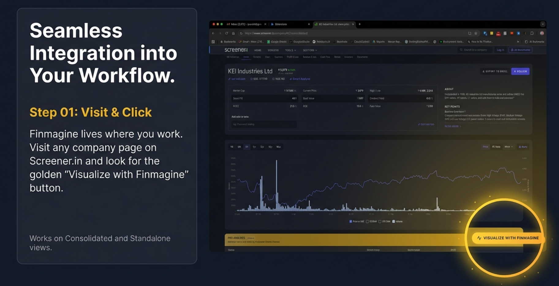
See It In Action
This is what you'll see when you install the extension and visit any Screener.in company page:
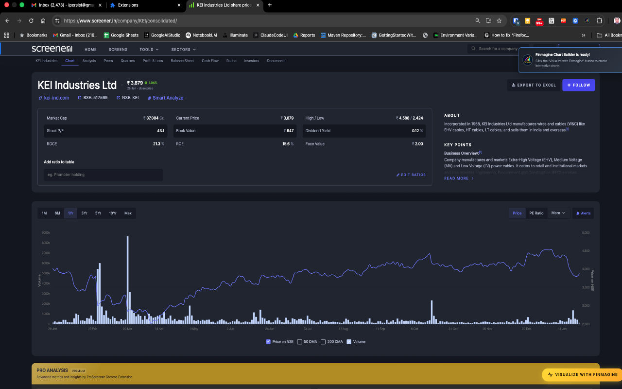
The golden "Visualize with Finmagine" button appears automatically at the bottom of every company page on Screener.in
Why Finmagine Chart Builder?
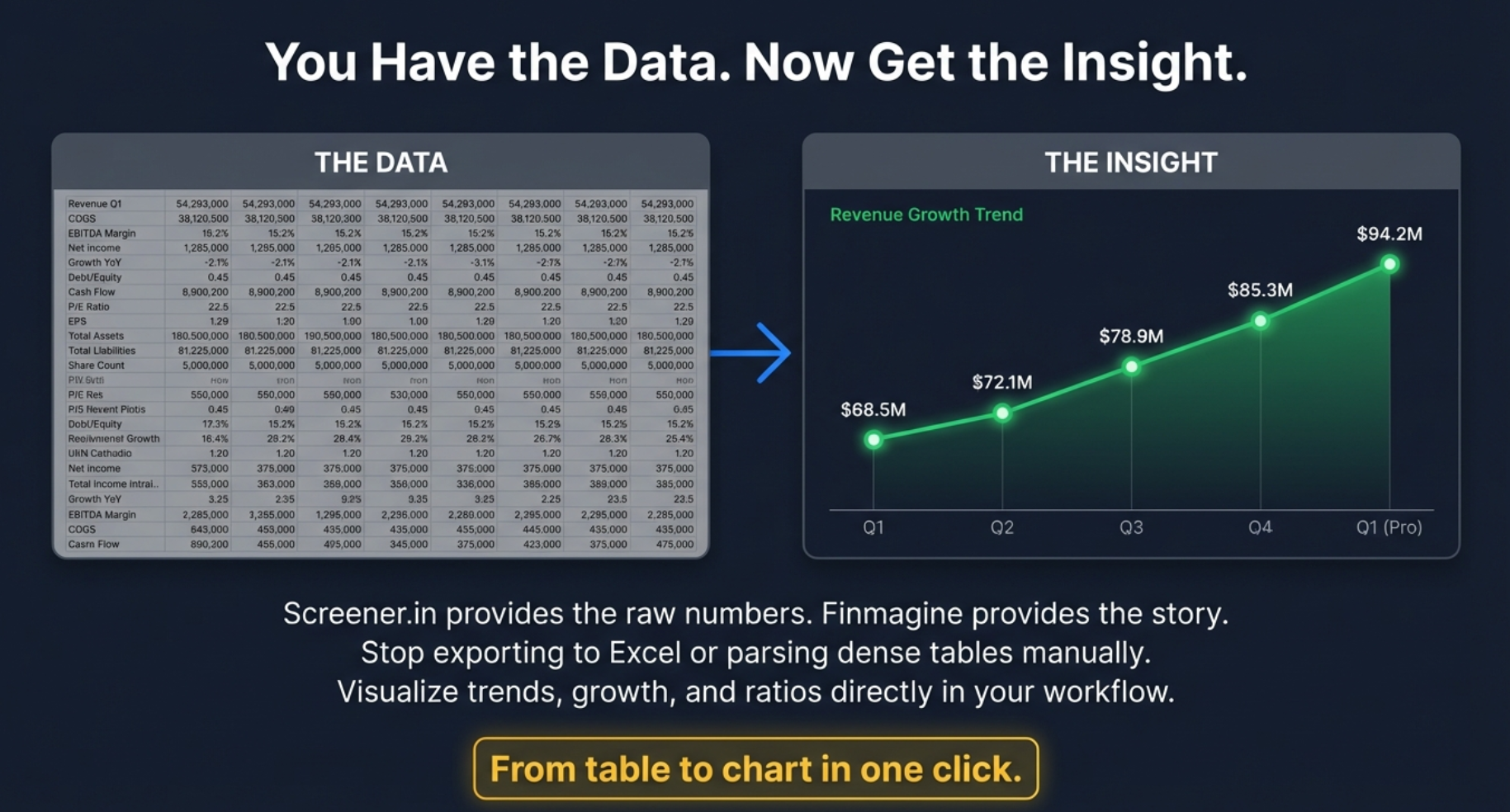
Screener shows raw data. Finmagine turns it into insight.
- 📈 Instantly see growth acceleration or deceleration across any metric
- 📊 Compare margins and ratios historically — in seconds, on the same page
- 🔍 Detect valuation compression or expansion without a spreadsheet
- ⚠️ Identify risk via drawdown, volatility, and Z-Score overlays
- 🗂️ Avoid exporting to Excel — the analysis happens where the data lives
Designed for serious long-term investors and data-driven traders.
⚡
Instant Visualization
One-click transformation of any Screener.in company page into interactive charts. No manual data entry, no export/import hassle.
📊
Dual-Axis Charting
Plot metrics with different scales simultaneously. Compare revenue growth with profit margins, or visualize P/E ratios alongside ROE trends.
🎯
40+ Financial Metrics
Revenue, profits, ratios, cash flows, debt metrics, and more — every metric from Screener.in's financial tables is chartable.
🔒
Local-First Privacy
Your charts, analysis, and research habits stay entirely in your browser — never transmitted to any server. Stock fundamentals for pages you visit are passively contributed to Finmagine's shared cache to improve speed for all users.
🖱️
Interactive Features
Hover for exact values, toggle metrics on/off, and download charts as PNG. Click the Lines button to switch all metrics to line format instantly — click Bars to switch back. Or click the "Bar" / "Line" badge on any legend item to toggle just that one metric's chart type.
💰
100% Free
No subscriptions, no trials, no hidden costs. Professional-grade visualization tools completely free for all Indian stock investors.
📋
Display Modes
Switch the data tables between four views with one click: Values (raw numbers), YoY % (year-on-year growth vs same period last year), QoQ % (sequential quarter momentum with acceleration/deceleration badges), and % of Sales (every metric as a % of revenue — with ↑/↓ margin delta indicators vs prior year). Filter to Last 4, Last 8, or All periods. Export any view as CSV.
🇺🇸
US Stock Intelligence
On stockanalysis.com: Altman Z-Score (bankruptcy risk), Piotroski F-Score (financial strength), ROIC-WACC spread, Analyst Outlook with consensus & price target, Institutional/Insider Ownership, and Market Position with Beta, RSI, and Golden/Death Cross detection.
📐
Scenario Valuation Calculator
Auto-computed Bull/Base/Bear scenarios using PAT growth × Exit PE and EBITDA growth × EV/EBITDA. Includes a reverse DCF insight bar showing the implied growth rate priced in at the current market cap. Fully editable assumptions.
🇮🇳
Indian Investor Returns
For US stocks: see your actual ₹ return, not just the USD return. Combines the stock's cumulative USD gain with the structural rupee depreciation bonus (₹68 → ₹87 over 10 years). Powered by 10 years of Yahoo Finance monthly history.
👤
Profile Tab v2.9.0
Screener.in only. About section, Pros, and Cons extracted directly from the page — no extra clicks, no new tabs. Two-column Pros/Cons grid with a direct link to Screener Insights for deeper research.
📡
Trader Signals Ribbon v2.10.0
If you have Finmagine Trader installed, momentum signals (Stage 2, Near 52W High, VCP, etc.) appear as a persistent ribbon above the tab bar — visible on every tab, no switching needed. Highest-conviction signals highlighted in gold.
How It Works
Transform your Screener.in research workflow in 3 simple steps:
Step 1: Install & Click
Download from the Chrome Web Store with one click. Visit any company page on Screener.in (e.g., KEI Industries, Reliance, TCS). The golden "Visualize with Finmagine" button appears automatically at the bottom of the page.
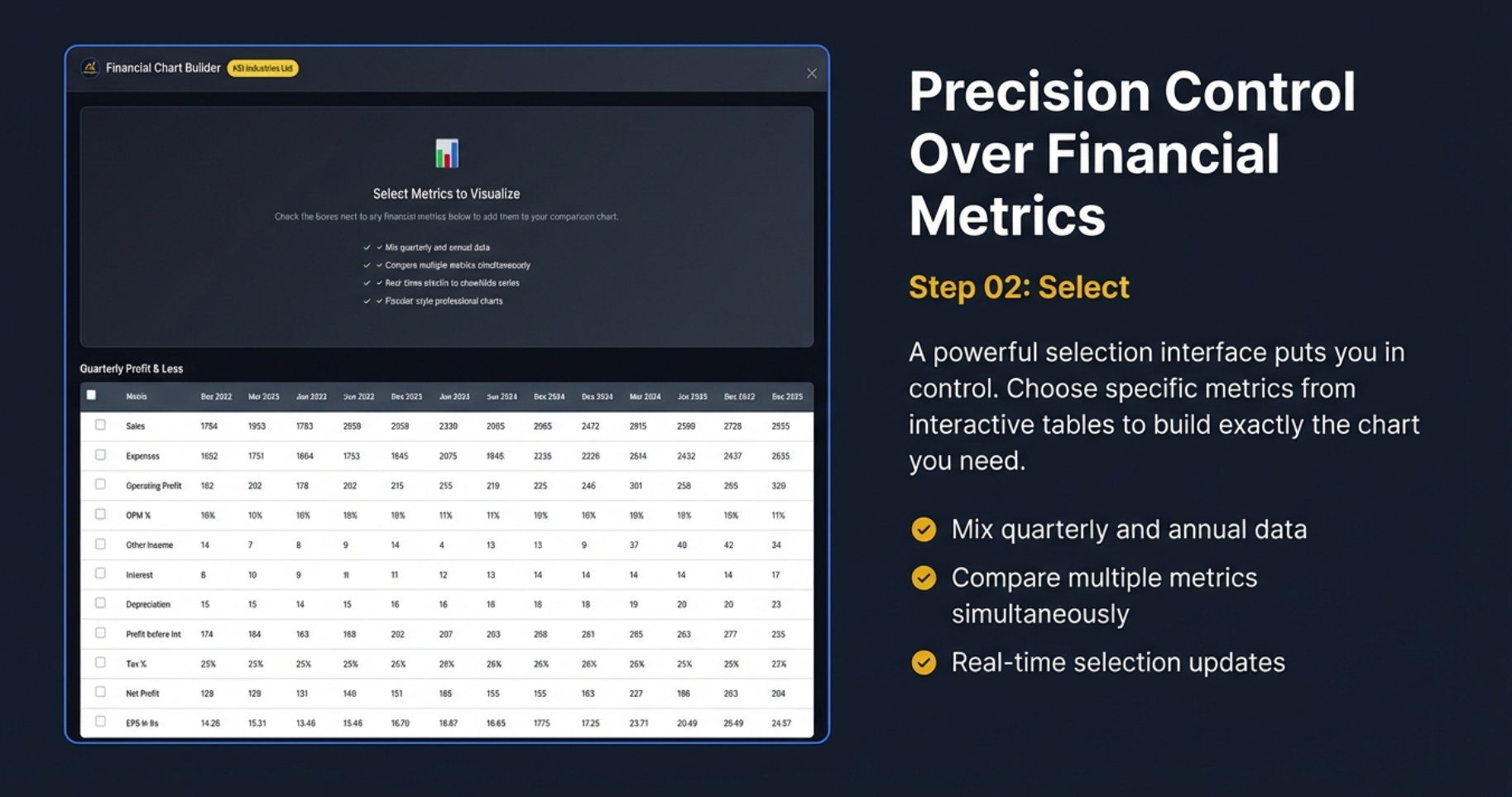
Step 2: Select Metrics
Click the button to open the Chart Builder interface. Choose from 40+ financial metrics using checkboxes. Mix quarterly and annual data, compare multiple metrics simultaneously, and see real-time selection updates.
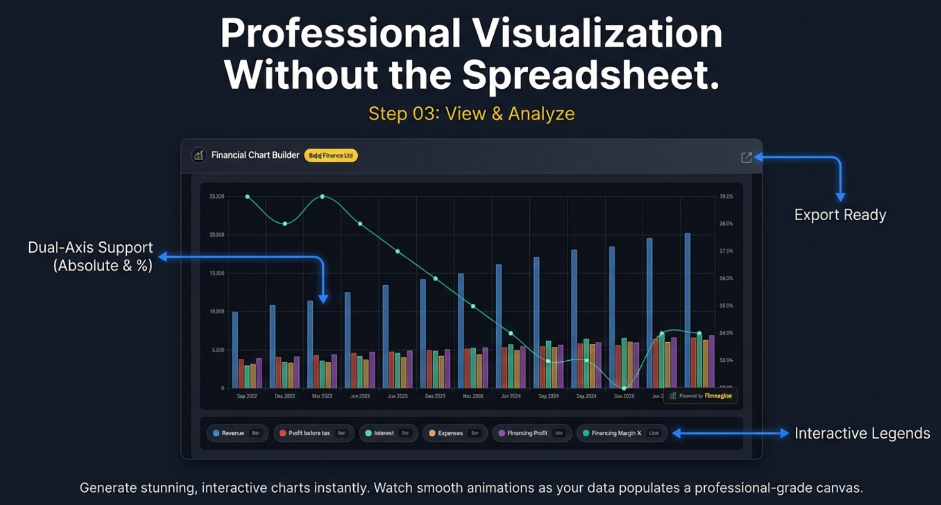
Step 3: Analyze & Export
Watch as stunning, interactive charts generate instantly. Dual-axis support lets you compare metrics with different scales. Toggle the Display Mode to switch the data tables between raw Values, YoY %, QoQ %, and % of Sales views — with period filters (Last 4 / Last 8 / All) and CSV export. Click the Lines button to switch all charts to line format, or click individual "Bar"/"Line" badges in the legend to control each metric separately. Export the chart as a watermarked PNG for presentations. Drag the panel anywhere on screen, or press Ctrl+Shift+F (Mac: ⌘⇧F) to toggle it open/closed.
Tutorials & Resources
Everything you need to master the Chart Builder extension:
📋 Display Modes & Chart Type Flexibility
Transform financial tables into four analytical lenses: YoY% to spot growth inflection points, QoQ% with acceleration badges for momentum, % of Sales for margin structure with PP deltas, and Values for absolute benchmarks. Plus period filters, CSV export, and the v2.7.0 Lines/Bars toggle with per-metric control. Live Alphabet (GOOGL) case study, video guide, audio deep dive, and 60 interactive flashcards.
v2.6.0+
20-minute read
📈 Price Analysis Tab: The Complete Guide (The Dollar Trail)
Master all 7 panels of the Price Analysis tab: Price vs Fundamentals badges (CATCHING UP / RUNNING AHEAD), CAGR Comparison Table, Indian Investor Returns (USD→₹ with FX boost), Cyclical Quarter Analysis, Risk Metrics (52-week context), and Market Position (Beta, RSI, Golden/Death Cross). Real examples with AMZN, NVDA, META, MSFT, Polycab, M&M, and LTTS. Video guide, audio deep dive, and 90 interactive flashcards.
v2.4.1+
30-minute read
🇺🇸 Complete US Stock Analysis Guide
Institutional-grade US stock analysis on stockanalysis.com. Covers all 5 tabs, 10-page parallel fetch architecture, Altman Z-Score, Piotroski F-Score, ROIC-WACC spread, DuPont Analysis, sector-weighted valuation verdicts across 19 sectors, and the 5-Minute Analysis Framework. 70 flashcards included.
v2.3.0+
25-minute read
🎯 Complete v2.2.0 Guide: The Analyst's Manual
The definitive deep dive covering all 5 tabs: Charts, Quick Analysis, Calculated Ratios, Price Analysis, and Valuation. Includes sector-aware weighted verdicts, PEG ratio, NIFTY 50 benchmark, DuPont Analysis, panel width toggle, and 74 flashcards.
v2.2.0+
30-minute read
⚖️ Valuation Tab Deep Dive
Master the 4-layer valuation framework: 5-year median comparisons, sector-aware weighted scoring (19 sectors), PEG ratio for growth-adjusted valuation, and NIFTY 50 benchmark context. Real case studies with Affle India, Bajaj Finance, National Aluminium, and GRSE.
v2.2.0+
25-minute read
📈 Price Analysis: Decoding Value
Master the 3-point framework: Price vs Fundamentals valuation, Cyclical Quarter Analysis for timing, and Risk Metrics for entry assessment. Learn to spot falling knives vs value opportunities with real examples.
v2.1.0+
15-minute read
🎓 Complete v2.1.0 Guide: 4-Step Workflow
The definitive tutorial covering all 4 tabs: Charts, Quick Analysis, Calculated Ratios, and Price Analysis. Includes DuPont Analysis, sector-aware scoring, metric persistence, valuation badges, cyclical analysis, and risk metrics.
v2.1.0+
30-minute read
📘 Complete Tutorial (Screener.in)
Step-by-step guide covering installation, metric selection, dual-axis charting, interactive features, and advanced analytical techniques for Indian stocks.
v2.1.0+
Beginner-Friendly
12-minute read
🌍 Google Finance Tutorial
Master the unique workflow for global stocks. Learn the Golden Rule, minimize-restore cycle, and analytical recipes for US, European, and Asian markets.
v2.2.0+
Global Stocks
15-minute read
🏥 Quick Analysis Tutorial
Get instant financial health scores (0-100) with sector-aware analysis. Learn the 4 core pillars, CAGR trends, and customizable thresholds for your investment style.
v2.1.0+
Health Scores
18-minute read
📊 Screener.in Visualization Guide
Master the art of transforming Screener.in data into actionable insights. Learn best practices for metric combinations and analytical workflows.
v2.1.0+
Advanced
15-minute read
🔒 Privacy Policy
Complete transparency on data handling. Understand exactly what stays local in your browser and what is passively contributed to Finmagine's shared fundamentals cache.
Legal
5-minute read
🌐 Google Finance Integration
Discover how Chart Builder now works with both Screener.in AND Google Finance. One gold button, two platforms — the engineering story behind conquering two fundamentally different web architectures.
v2.2.0+
Technical Deep Dive
🔬 Calculated Ratios & DuPont Analysis
Learn to separate quality compounders from financial zombies. Master DuPont Analysis, understand why high ROE can be a trap, and use calculated ratios to identify leverage-driven illusions vs real operational excellence.
v2.1.0+
20-minute read
🧮 The Analyst's Lab: Complete Calculated Ratios Guide
The definitive ratio-by-ratio reference for the Calculated Ratios tab. All 11 ratios with exact thresholds, real Indian company examples (Polycab, IndiGo, Bajaj Finserv), DuPont synthesis, the Banking Exception, and a 6-step analysis workflow. Video, audio deep dive, and 50 interactive flashcards.
v2.1.0+
25-minute read
🔭 Reverse DCF & Scenario Valuation Calculator
Stop guessing stock prices — decode what growth rate the market is already pricing in. Covers Reverse DCF, Earnings (PE-based) and OPM (EV/EBITDA) scenario tabs, Edit Mode, and real examples with TCS, Polycab, PDD Holdings, and Lam Research. 50 flashcards included.
v2.4.0+
20-minute read
Also From Finmagine
The Chart Builder pairs naturally with our other free Chrome extensions — each solves a different part of the research workflow.
🤖
Finmagine AI Advisor
Instantly extract financial data from Screener.in or stockanalysis.com and generate institutional-grade AI research prompts. 9 templates including Forensic Analysis with Altman Z-Score, Piotroski F-Score, and ROIC-WACC. Works with ChatGPT, Gemini, or any AI. Free.
View AI Advisor →
📊
Finmagine Trader
Scan 2000+ NSE stocks in 10 seconds. Six strategy tabs — Stage 2, VCP Breakouts, Near 52W High, High Volume, and the All Three intersection. One click from raw data to your TradingView watchlist. Free.
View Finmagine Trader →
💼
Finmagine Portfolio Manager
Track multi-broker positions with per-broker stop-loss discipline. XIRR returns, live prices, Zerodha/Groww CSV import, and cross-device sync. Designed for investors who split the same stock across Zerodha, Upstox, Groww, and 9 other brokers. Free.
View Portfolio Manager →
Key Features in Detail
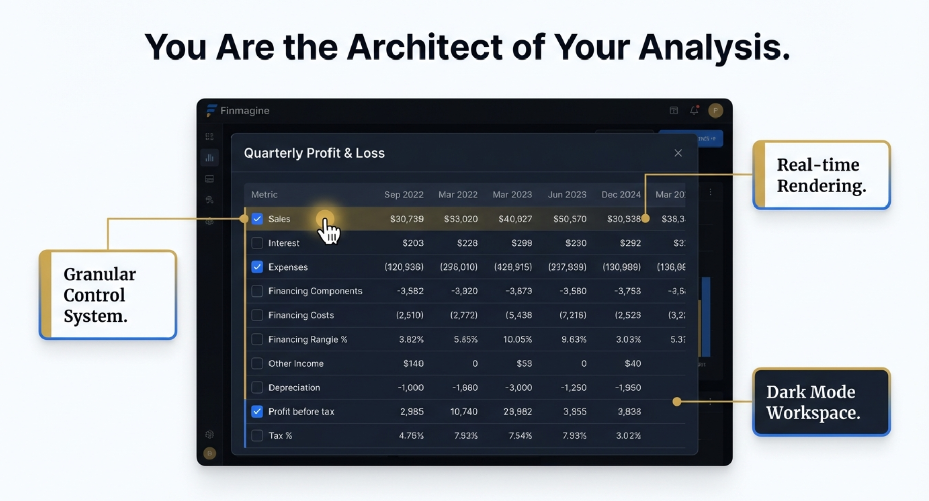
🎛️ Intelligent Design & User Experience
The Chart Builder isn't just a visualization tool—it's a complete analytical workspace designed for professional investors.
Three Pillars of Design Excellence:
- Granular Control System: Checkbox-based metric selection lets you build exactly the analysis you need. Select individual metrics or combine multiple data points for comprehensive insights.
- Real-time Rendering: Charts update instantly as you select metrics. No waiting, no page refreshes—immediate visual feedback as you explore different combinations.
- Dark Mode Workspace: Professional dark interface reduces eye strain during extended analysis sessions and provides better contrast for financial charts.
🎨 Professional Chart Types
Line charts optimized for financial time-series data with smooth curves, clear legends, and responsive design that works on any screen size.
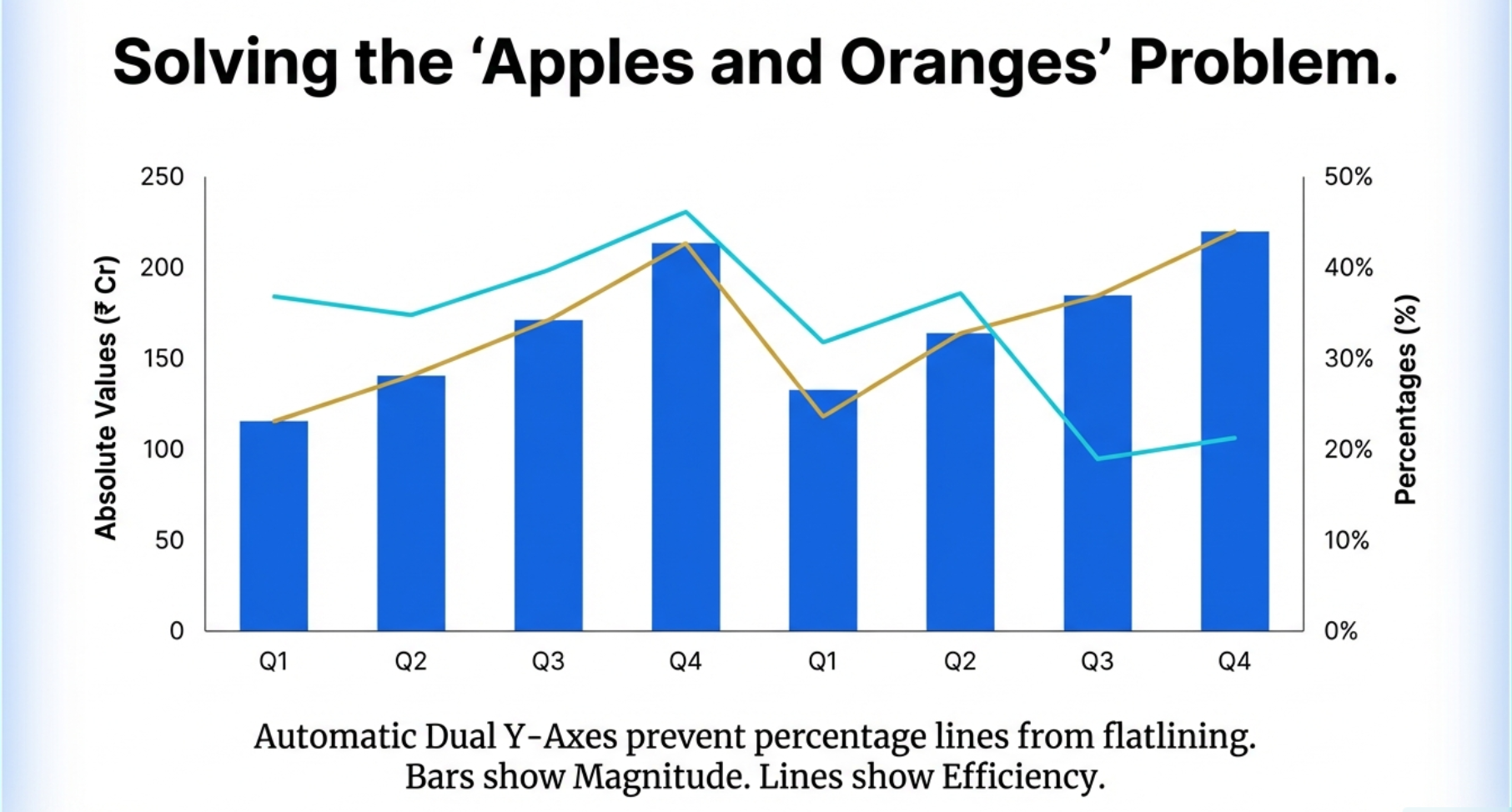
📈 Dual Y-Axis Support: Solving the 'Apples and Oranges' Problem
One of the most powerful features of the Chart Builder is its automatic dual Y-axis support, which solves a critical problem in financial analysis: comparing metrics with vastly different scales.
Why Dual Axes Matter: When you plot absolute values (like Revenue in ₹ Crores) alongside percentages (like ROE%), a single axis would flatten the percentage line, making trends invisible. The Chart Builder automatically assigns:
- Left Axis (Bars): Absolute values showing magnitude—Revenue, Profit, Debt, Cash Flow
- Right Axis (Lines): Percentages showing efficiency—Margins, ROE, ROCE, Growth Rates
This intelligent scaling ensures both metrics remain clearly visible and their trends are immediately apparent—no more choosing between magnitude and efficiency!
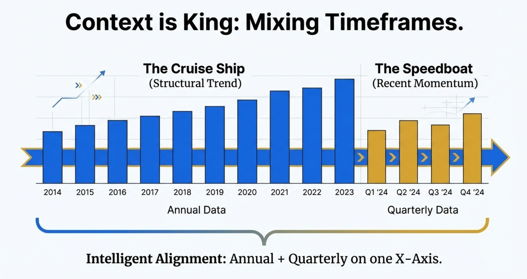
⏱️ Context is King: Mixing Timeframes
Understanding business performance requires both the "cruise ship" view (long-term structural trends) and the "speedboat" view (recent quarterly momentum).
Intelligent Timeframe Alignment: The Chart Builder seamlessly combines annual and quarterly data on a single X-axis, giving you:
- The Cruise Ship (Annual Data): 10+ years of historical data reveals structural trends, cyclical patterns, and long-term growth trajectories
- The Speedboat (Quarterly Data): Recent 4-8 quarters show current momentum, seasonal variations, and emerging inflection points
- Perfect Alignment: Both datasets share the same X-axis timeline, making it easy to see where long-term trends meet short-term dynamics
This dual-timeframe view is essential for identifying whether recent quarterly performance represents temporary noise or a genuine shift in business fundamentals.
🔍 Interactive Analysis & Workspace Features
The Chart Builder is designed as an active workspace where you manipulate views to isolate variables—not just a static picture.
Four Key Interactive Features:
- Interactive Toggle (Bottom Legend): Click any metric name to instantly hide/show it on the chart. Perfect for isolating specific relationships or removing visual noise.
- Hover Tooltips: Move your cursor over any data point to see exact values, dates, and metric names. No more squinting at axis labels.
- Clear All Button: One-click reset to start fresh with a new analysis. Quickly test different metric combinations without manual deselection.
- TradingView Button (Panel Header): Opens the current stock directly in TradingView for technical analysis — one click, zero copy-pasting. Works for NSE stocks, BSE-only stocks (automatically extracts the BSE ticker), Google Finance stocks, and US stocks on stockanalysis.com.
These features transform the chart from a passive visualization into an active exploration tool—manipulate the view to reveal hidden correlations and test hypotheses in real-time.
Example: Analyze working capital efficiency by charting Debtor Days, Inventory Days, Days Payable, Cash Conversion Cycle, Working Capital Days, and ROE% simultaneously. Instantly spot trends in operational efficiency.
💾 Export Capabilities
Download charts as high-resolution PNG images with a Finmagine watermark — ideal for presentations, reports, or sharing with investment committees. The PNG button is in the Charts tab header; exports include the full chart at native screen resolution.
⚙️ Customization Options
Choose from 10+ color schemes, adjust line thickness, show/hide gridlines, and customize axis labels for perfect presentation charts.
🚀 Performance Optimized
Handles 10+ years of financial data for multiple metrics simultaneously without lag. Instant rendering powered by Chart.js library.
Perfect For
👨💼
Individual Investors
Quickly visualize company performance trends before making investment decisions. Spot growth patterns and red flags instantly.
📊
Financial Analysts
Create presentation-ready charts for client reports and investment committee meetings without Excel gymnastics.
🎓
Finance Students
Learn fundamental analysis by visualizing real company data. Understand relationships between metrics through interactive exploration.
📝
Investment Bloggers
Generate professional charts for blog posts, Twitter threads, and YouTube videos. Stand out with data-driven visual storytelling.
Real-World Case Studies: Finding Hidden Signals
The Chart Builder's true power emerges when you use it to uncover insights hidden in tables. Here are two real examples:
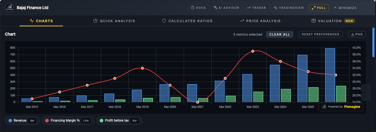
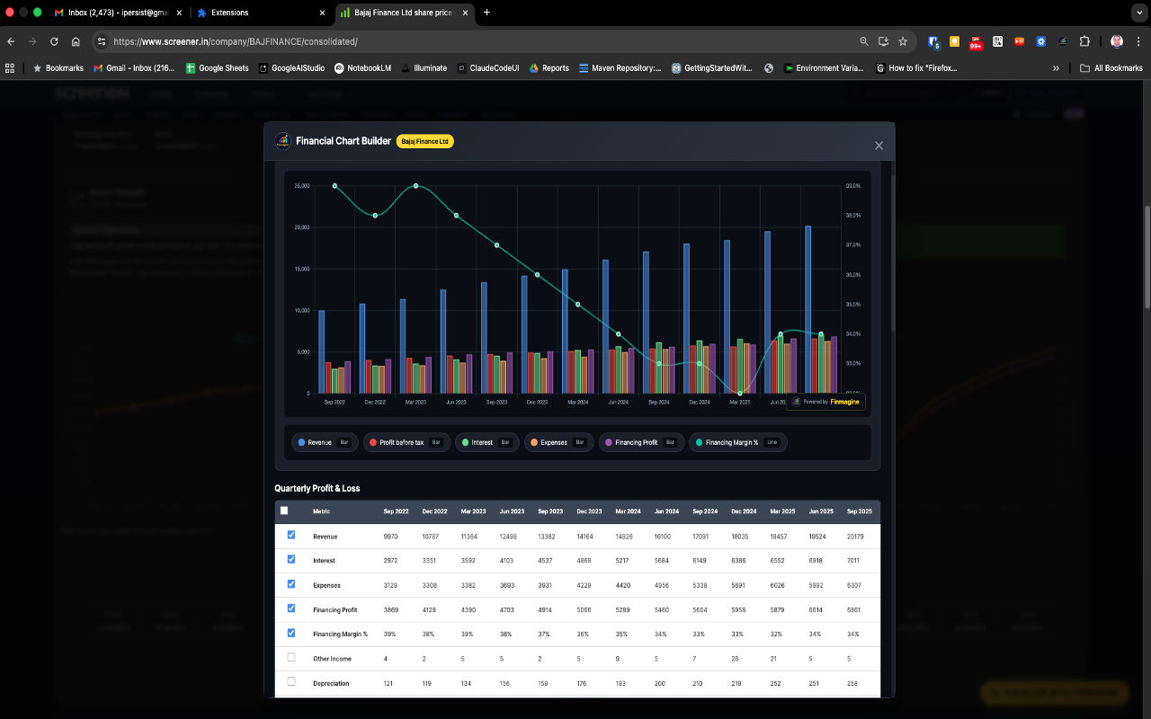
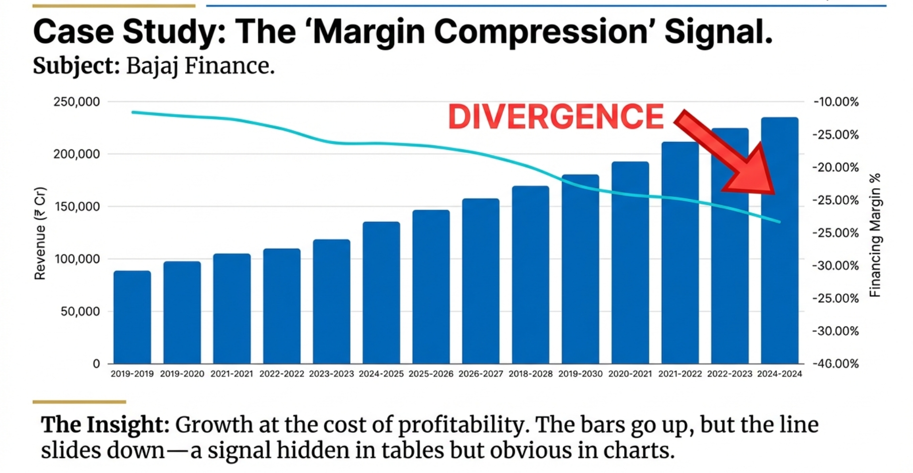
📉 Case Study 1: The Margin Compression Signal
Subject: Bajaj Finance | Discovery: Growth at the cost of profitability
The Insight: When you plot Revenue (bars, left axis) against Financing Margin % (line, right axis), a critical divergence emerges:
- The bars go up: Revenue is growing consistently year over year—looks great in a table
- The line slides down: Financing margins are compressing—hidden pressure on profitability
- The red flag: This divergence signals that growth is coming at the cost of pricing power or rising costs
Why Tables Miss This: In a table, you'd see two separate columns with numbers. Only when visualized together does the divergence pattern become obvious—and it's a critical warning signal that demands further investigation.
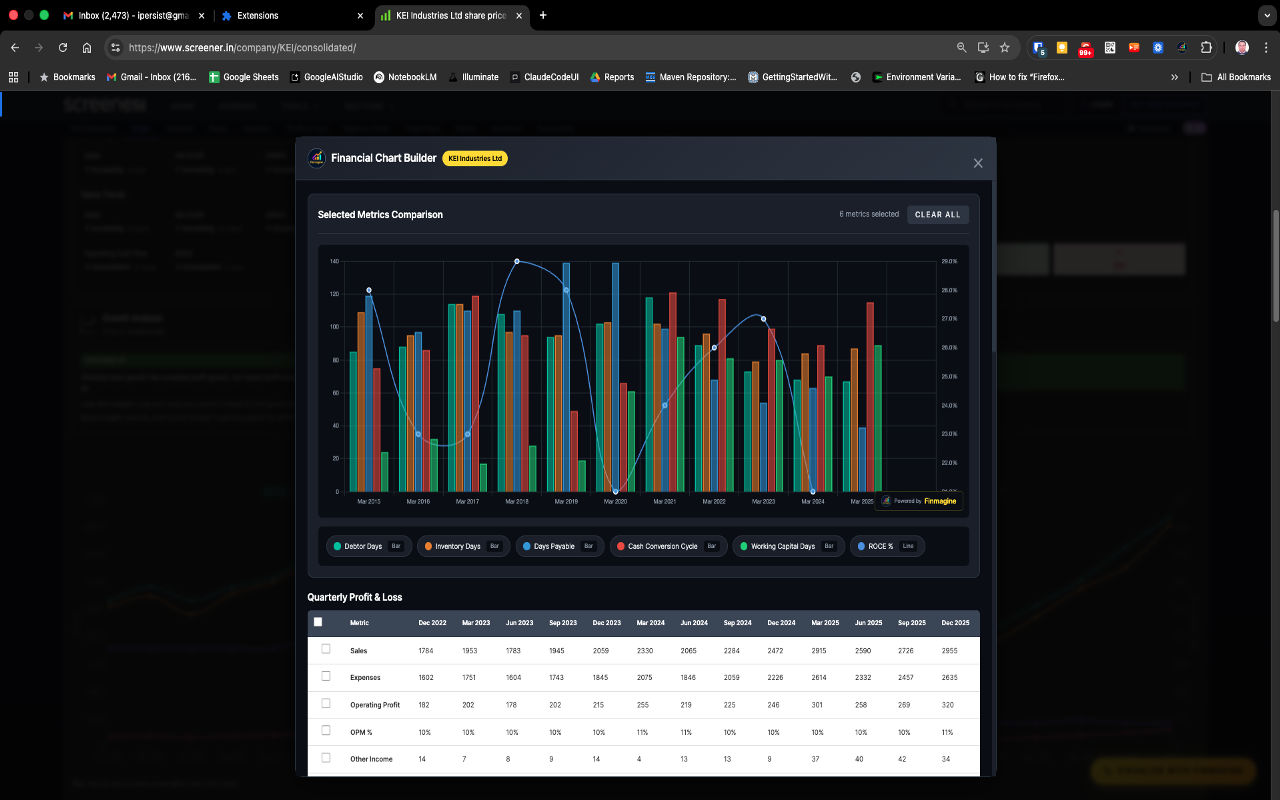
⚙️ Case Study 2: The Efficiency Engine
Subject: KEI Industries | Discovery: Operational efficiency driving shareholder returns
The Analysis Workflow:
- Start broad: Select all working capital metrics—Debtor Days, Inventory Days, Working Capital Days, Cash Conversion Cycle
- Add the outcome: Include ROCE% to see the impact on shareholder returns
- Use interactive legend: Toggle off noisy metrics (like Debtor Days and Inventory Days) to reveal the core relationship
- The revelation: As Cash Conversion Cycle improves (bars decrease), ROCE% increases (line rises)—a clear correlation
The Power of Interactive Exploration: You couldn't discover this relationship by staring at a table. The interactive legend lets you toggle off noise (Debtor Days, Inventory Days) to reveal the signal (Cash Conversion Cycle's impact on ROCE). This is active analysis, not passive viewing.
Advanced Analytical Techniques
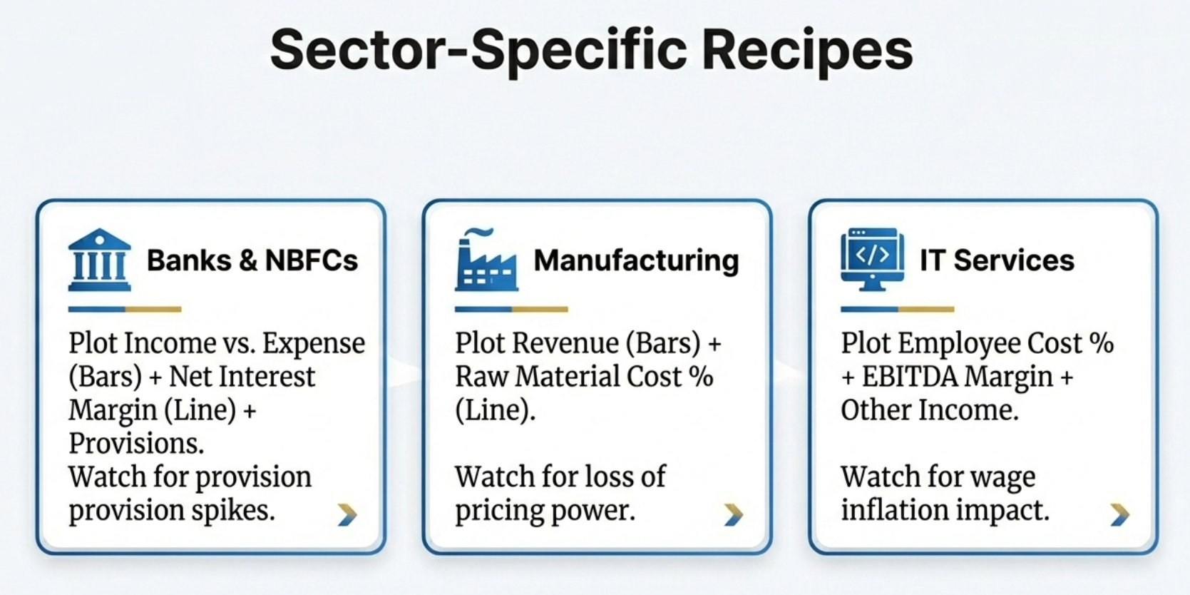
📊 Sector-Specific Analysis Recipes
Different sectors require different metric combinations. Here are proven recipes for three major sectors:
🏦
Banks & NBFCs
Plot: Income vs. Expense (Bars) + Net Interest Margin (Line) + Provisions
Watch for: Provision spikes that signal asset quality deterioration even when headline income grows.
🏭
Manufacturing
Plot: Revenue (Bars) + Raw Material Cost % (Line)
Watch for: Loss of pricing power when raw material costs rise but can't be passed to customers.
💻
IT Services
Plot: Employee Cost % + EBITDA Margin + Other Income
Watch for: Wage inflation impact on margins and dependency on treasury income.
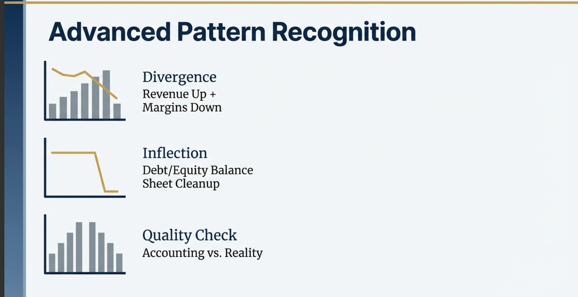
🔍 Advanced Pattern Recognition
Once you master basic charting, look for these three critical patterns that signal important business changes:
- Divergence (Revenue Up + Margins Down): Growth is masking underlying profitability pressure. The business is gaining scale but losing pricing power—investigate competitive dynamics and cost structure.
- Inflection (Sharp Change in Debt/Equity): Sudden balance sheet cleanup or deterioration. Could signal deleveraging success, equity raising, or debt spiral beginning. Context determines whether it's positive or negative.
- Quality Check (Accounting vs. Reality): Compare accounting profits with cash flow metrics. Divergence between P&L growth and cash generation suggests aggressive accounting or working capital issues.
🔒 Privacy & Security Guarantee
Local-First Privacy by Design
Your research stays private. Charts, analysis, display preferences, and the stocks
you investigate are never transmitted anywhere — all processing happens locally in your browser.
- No personal information collected
- No browsing history or research habits tracked
- No cookies or persistent server-side storage
- Stock fundamentals (ROCE, sector, etc.) for pages you visit are passively contributed to Finmagine's shared cache, improving load speed for all users
- No data is tied to your identity — contributions are anonymous and aggregate
Read our complete Privacy Policy →
Frequently Asked Questions
Is the extension really free?
Yes! 100% free with no trials, subscriptions, or hidden costs. We built this tool to help the Indian investor community analyze stocks more effectively.
Does it work with other websites besides Screener.in?
Yes — the extension supports four platforms: Screener.in (Indian stocks, full feature set including Quick Analysis), Google Finance (global stocks via the Charts tab), stockanalysis.com (US stocks, including all 5 tabs, Altman Z-Score, Piotroski F-Score, and sector-aware analysis across 19 industries), and Perplexity Finance (global stocks including US, India, and international markets — all 5 tabs, same-origin REST API, no extra permissions required). Each platform has a dedicated tutorial in the resources section above.
Can I use this for fundamental analysis?
Absolutely! The Chart Builder is designed specifically for fundamental analysis. Visualize revenue growth, margin trends, debt reduction, ROE improvements, and more.
Does it require any login or registration?
No registration required. Install and start using immediately. Your privacy is paramount.
What browsers are supported?
Chrome and all Chromium-based browsers (Edge, Brave, Opera) on desktop — Windows, macOS, Linux, and ChromeOS.
Mobile devices are not supported. Google Chrome does not support extensions on Android or iOS/iPadOS — this is a platform limitation, not specific to this extension. Google has confirmed this in their own support forums: "Chrome extensions is only supported for the Chrome desktop web browser. And not for iOS and Android." You will need a desktop or laptop to use the Finmagine Financial Chart Builder. — Full reference with all sources →
Does it open TradingView?
Yes — there is a TradingView button in the extension panel header. Click it to open the current stock directly in TradingView for technical analysis, without any copy-pasting. It works for all supported platforms: NSE stocks (e.g., NSE:RELIANCE), BSE-only stocks (the extension automatically extracts the BSE ticker from the page), Google Finance stocks, and US stocks on stockanalysis.com.
How do I report bugs or request features?
The best place is the ValuePickr community thread — other investors are there, questions get answered, and feature requests are tracked. You can also use the Chrome Web Store reviews section or the Finmagine contact page.
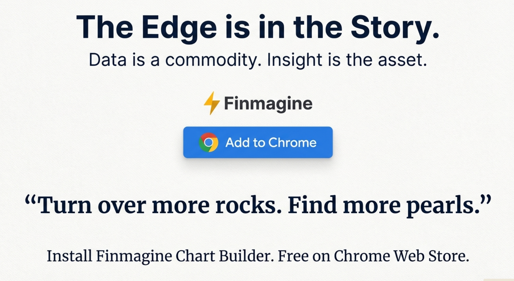
The Edge is in the Story
In today's markets, data is a commodity—everyone has access to the same numbers on Screener.in.
The real asset is insight: the ability to see patterns, spot divergences, and understand
what the numbers are really telling you.
Finmagine Chart Builder doesn't just visualize data—it helps you turn over more rocks to find more pearls.
Transform tables into stories. Discover hidden signals. Make better investment decisions.