Following along? Install the extension first
Finmagine Financial Chart Builder — free • no account needed • Chrome, Edge, Brave
Multimedia Learning Hub
Master Finmagine's US stock analysis through video tutorial, audio deep dive, comprehensive overview, and interactive knowledge testing
Complete Learning Path
This comprehensive tutorial covers every feature of the Finmagine Chrome Extension for US stock analysis on stockanalysis.com. From the 10-page parallel data fetch architecture to sector-weighted valuation verdicts, you will learn how to perform institutional-grade equity research in under five minutes per stock—entirely free, entirely in your browser, with zero data collection.
What You Will Learn:
- Installation & Setup: Adding the extension and understanding SPA navigation detection on stockanalysis.com
- Panel Controls: Every button—TradingView, Width Toggle, Minimize, Close, Refresh—and what each does
- Charts Tab: Dual-axis charting, metric selection, persistence, interactive legends, and the Golden Quartet
- Quick Analysis Tab: Health Scores, 19-sector intelligence, Altman Z-Score, Piotroski F-Score, ROIC-WACC spread, Analyst Outlook, and Ownership data
- Calculated Ratios Tab: DuPont Analysis decomposition, 40+ ratios across 10 categories, and color-coded badges
- Price Analysis Tab: Price vs. Fundamentals comparison, Risk Metrics, Beta, RSI, Moving Averages, Golden/Death Cross
- Valuation Tab: 5 valuation multiples, sector-weighted verdicts, PEG Ratio, and Forward PE
- The 5-Minute Framework: A complete stock analysis workflow with decision matrix
- Sector Playbooks: Customized analysis strategies for Technology, Finance, Energy, Healthcare, and Consumer Staples
Tutorial Contents:
- The Finmagine Advantage: Why this extension exists and what makes it unique
- Installation: Getting started on stockanalysis.com
- Panel Interface: Every button and control explained
- The 10-Page Fetch: How data is extracted in two phases
- Tab 1 — Charts: Visualizing fundamental trends
- Tab 2 — Quick Analysis: Sector-aware health intelligence
- Tab 3 — Calculated Ratios: The DuPont engine room
- Tab 4 — Price Analysis: Reality check on price vs. growth
- Tab 5 — Valuation: The sector-weighted verdict
- The 5-Minute Framework: Putting it all together
- Sector Playbooks: Technology, Finance, Energy, Healthcare, Consumer Staples
- Troubleshooting & FAQ: Common issues and solutions
Watch the Complete Tutorial
Follow along with this comprehensive video demonstration of Finmagine's US stock analysis features in action on stockanalysis.com.
Video Title: Five-Minute Institutional Stock Analysis (FREE Tool) | Finmagine v2.3.0 Deep Dive
Complete video demonstration with real US stock examples and live analysis walkthrough
Listen to the Audio Deep Dive
Prefer to listen? This complete audio walkthrough covers every tab, every metric, and every sector-specific strategy for US stock analysis.
Duration: Full tutorial | Format: Professional narration
Deep dive audio guide exploring institutional-grade US stock analysis techniques and sector-aware analytical best practices
Test Your Knowledge
Click any flashcard to reveal the answer. Use the search box to find specific topics. 70 cards covering every aspect of US stock analysis with Finmagine.
The Finmagine Advantage: Why This Extension Exists
stockanalysis.com is one of the most data-rich free platforms for US equity research. It provides income statements, balance sheets, cash flow statements, financial ratios, statistics, analyst forecasts, and historical price data for thousands of US-listed companies. But that data is spread across ten separate pages, each requiring manual navigation, mental arithmetic, and the cognitive burden of converting raw numbers into investment insights.
The Finmagine Financial Chart Builder transforms that fragmented experience into a unified, institutional-grade analysis panel that sits directly on top of stockanalysis.com. No new tabs. No exports to Excel. No subscription. Everything runs in your browser — your research habits and analysis stay completely private.
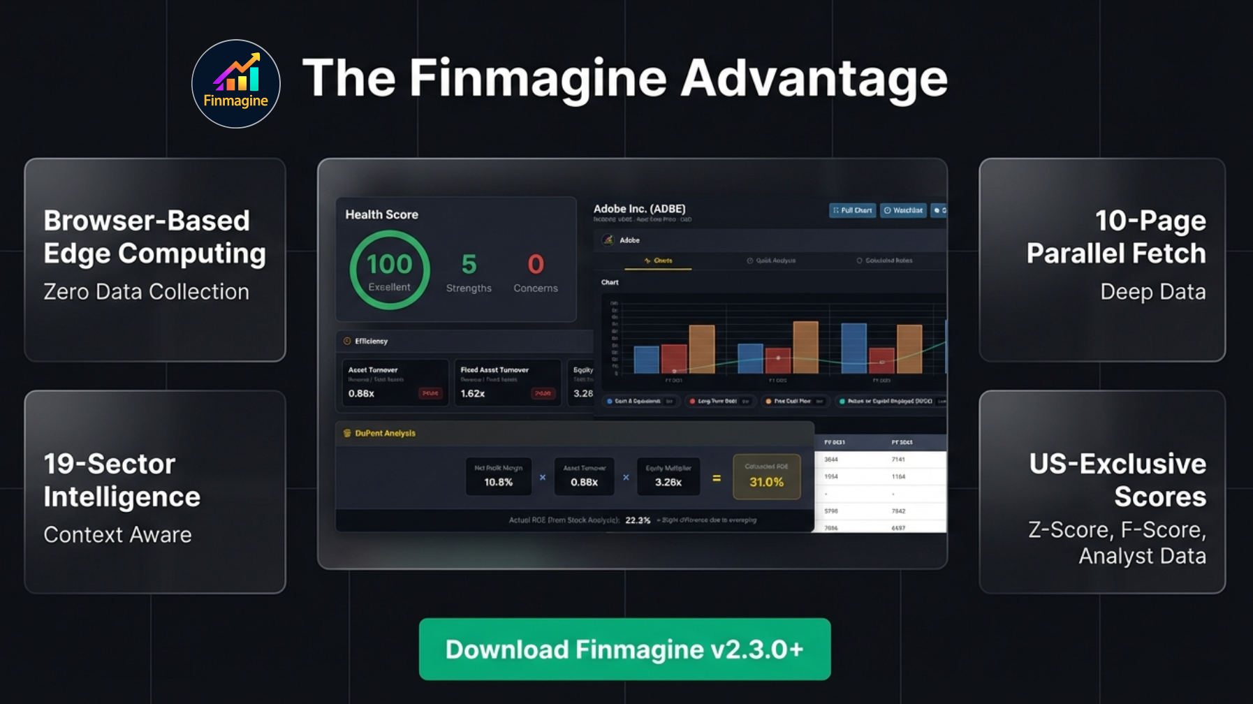
What Makes Finmagine Unique
- Browser-Based Edge Computing: All analysis and chart generation happens locally in your browser. Your research habits, investment thesis, and analysis results stay completely private. Stock fundamentals from pages you visit are passively contributed to Finmagine's shared cache — anonymously, with no personal tracking.
- 10-Page Parallel Fetch: The extension fetches and parses ten different stockanalysis.com pages in two staggered phases—Income Statement, Balance Sheet, Cash Flow, Ratios, Profile, three Quarterly variants, Statistics, and History—giving you deeper data than most paid terminal services.
- 19-Sector Intelligence: Instead of applying one-size-fits-all thresholds, the engine maps over 145 specific industries (via the Global Industry Classification Standard) to 19 distinct sector profiles. A bank is analyzed differently from a tech company, which is analyzed differently from an energy producer.
- US-Exclusive Academic Models: Access to Altman Z-Score (bankruptcy risk), Piotroski F-Score (financial strength), ROIC-WACC spread (value creation), analyst consensus, and institutional ownership data—metrics that were previously reserved for Bloomberg and Capital IQ terminals.
Installation & Getting Started
The extension is free forever—no trial, no premium tier, no account creation required.
Installation Steps
- Open Chrome (or any Chromium-based browser: Edge, Brave, Opera, Arc)
- Visit the Chrome Web Store: Search for “Finmagine Chart Builder” or use this direct link
- Click “Add to Chrome” and confirm the popup
- Navigate to any stock page on stockanalysis.com (e.g.,
stockanalysis.com/stocks/aapl/) - Look for the golden “Visualize with Finmagine” button in the bottom-right corner
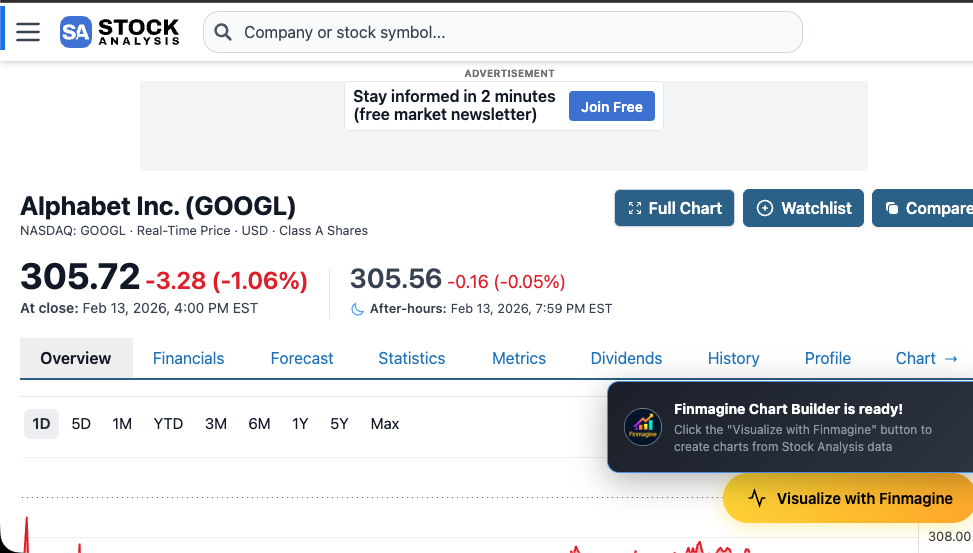
The golden “Visualize with Finmagine” button and notification toast on Alphabet’s stockanalysis.com page
How It Detects stockanalysis.com
The extension’s manifest declares content scripts for *://stockanalysis.com/stocks/*. When you land on any stock page, the content script activates and injects the floating button.
SPA Navigation Handling
stockanalysis.com is built with Next.js, which uses client-side navigation (Single Page Application architecture). This means clicking from Apple to Microsoft does not trigger a full page reload—the URL changes silently via history.pushState.
The extension handles this with a URL polling mechanism that checks the current URL every 1.5 seconds. When it detects a stock change, it automatically:
- Cleans up the old panel and data
- Re-injects the “Visualize with Finmagine” button
- Prevents duplicate initialization via a lock mechanism
The Panel Interface: Every Button & Control Explained
When you click the golden button, a full-height panel slides in from the right side of the page. This is your complete analysis workspace. Let us walk through every element.
Panel Header
The header bar at the top of the panel contains:
- Finmagine Logo: 32×32px rounded icon on the far left
- Company Name: The currently analyzed stock (e.g., “Apple Inc. (AAPL)”), truncated if necessary
- Active Tab Badge: Shows the current financial context, such as “Income · Quarterly”
Header Control Buttons (Left to Right)
The right side of the header contains five control buttons in this exact order:
1. TradingView Button
- Appearance: Gray-bordered button with “TradingView” text (11px font)
- Function: Opens a TradingView chart for the current stock in a new browser tab
- Symbol Extraction: For US stocks, the extension extracts the ticker from the URL path (e.g.,
/stocks/aapl/becomesAAPL) - Hover Effect: Blue highlight matching TradingView’s brand color (#2962FF)
2. Width Toggle Button
- Labels: Toggles between “Wide” and “Normal”
- Normal Mode: Panel width is 88% of viewport
- Wide Mode: Panel width expands to 96% of viewport for more chart space
- Persistence: Your width preference is saved to
localStorageand persists across sessions - Visual Feedback: Brighter gold accents when in Wide mode
3. Minimize Button
- Icon: Upward chevron with “Minimize” text
- Function: Collapses the full panel into a thin horizontal bar at the top
- Re-expanding: Click the bar to restore the full panel. If data has changed while minimized, it auto-refreshes
4. Close Button
- Icon: Gray X
- Function: Completely removes the panel and the floating button from the page
- Recovery: Refresh the page to bring back the “Visualize with Finmagine” button
Tab Navigation Bar
Below the header, five horizontally arranged tabs provide access to the complete analysis suite:
| Tab | Icon | Purpose | Default |
|---|---|---|---|
| Charts | Line chart | Visualize financial trends with interactive dual-axis charts | Active on open |
| Quick Analysis | Pie chart | Health Score, sector intelligence, financial models, analyst data | — |
| Calculated Ratios | Shield | DuPont Analysis, 40+ color-coded financial ratios | — |
| Price Analysis | Trending line | Price vs. fundamentals, risk metrics, market position | — |
| Valuation | Table + “NEW” badge | Sector-weighted valuation verdict vs. 5-year history | — |
Scroll Controls
- Mouse Wheel: Wheel events are automatically forwarded to the active tab’s scrollable container, allowing natural scrolling within the panel
- Scroll Buttons: Small up/down arrow buttons at the edges of the panel body for fine-grained navigation (200px per click with smooth animation)
Behind the Scenes: The 10-Page Fetch
When you click “Visualize with Finmagine” on a US stock, the extension initiates a sophisticated multi-phase data extraction pipeline entirely within your browser. This is the engine that powers every tab.
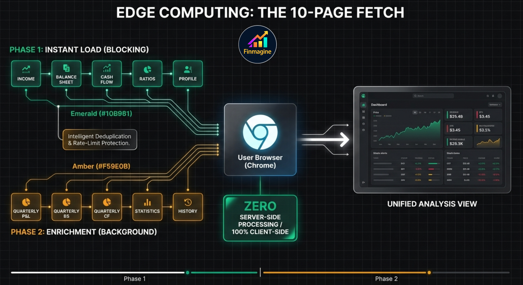
Phase 1: Instant Load (Blocking — 5 Pages)
These five pages are fetched first in staggered batches of three, with 400ms delays between batches to avoid rate limiting:
| Page | URL Pattern | Data Extracted |
|---|---|---|
| Income Statement | /stocks/{SYMBOL}/financials/ |
Revenue, Net Income, EPS, EBITDA, Margins (5 years) |
| Balance Sheet | /financials/balance-sheet/ |
Total Assets, Liabilities, Equity, Debt, Working Capital |
| Cash Flow | /financials/cash-flow-statement/ |
Operating CF, CapEx, Free Cash Flow, Financing Activities |
| Ratios | /financials/ratios/ |
PE, P/B, EV/EBITDA, ROE, ROA, Annual Margins |
| Profile | /stocks/{SYMBOL}/company/ |
Sector, Industry (for sector detection), Company Description |
The UI renders immediately after Phase 1 completes—you see the Charts and Quick Analysis tabs within seconds.
Phase 2: Background Enrichment (5 Pages)
While you are already exploring the panel, these additional pages load in the background:
| Page | URL Pattern | Data Extracted |
|---|---|---|
| Quarterly Income | /financials/?p=quarterly |
Recent quarterly revenue, profit, EPS trends |
| Quarterly Balance Sheet | /financials/balance-sheet/?p=quarterly |
Recent quarterly asset/liability changes |
| Quarterly Cash Flow | /financials/cash-flow-statement/?p=quarterly |
Recent quarterly cash generation patterns |
| Statistics | /stocks/{SYMBOL}/statistics/ |
50+ current metrics: valuations, scores, analyst forecasts, ownership, technicals |
| History | /stocks/{SYMBOL}/history/ |
Daily OHLCV price data for 52-week calculations |
When Phase 2 completes, the Quick Analysis and Price Analysis tabs automatically refresh to include the enriched data (Financial Scores, Market Position, etc.).
Intelligent Data Processing
- Paywall Detection: Some stockanalysis.com columns show “Upgrade” text for premium-only data. The extension detects columns where more than 50% of cells contain “Upgrade” and automatically filters them out.
- TTM Column Removal: The Trailing Twelve Months column is removed since it does not represent a full fiscal year.
- Metric Aliasing: US accounting terminology is mapped to Indian equivalents for analysis consistency: “Net Income” becomes “Net Profit”, “Retained Earnings” becomes “Reserves”, “Profit Margin” becomes “NPM”.
- Value Parsing: Handles all stockanalysis.com formats:
729.00M,5.90B,25.3%, negative values with dashes, and blank cells. - Deduplication: Prevents the same metric from appearing twice in the same time period while allowing it to exist in both quarterly and annual views simultaneously.
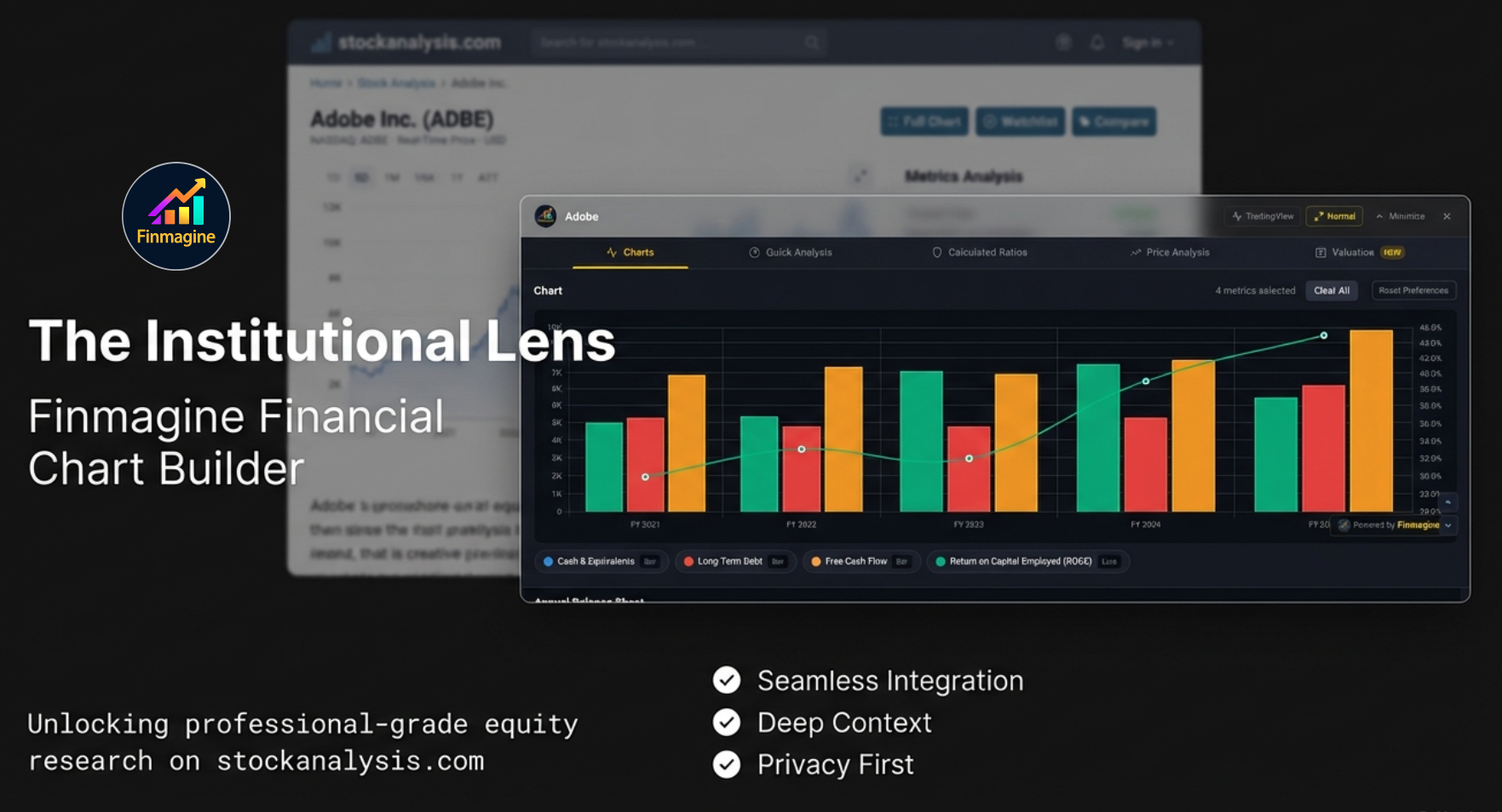
Charts: Visualizing Fundamental Trends
The Charts tab is the default view when you open the panel. It presents all extracted financial data as interactive tables with checkboxes, allowing you to build custom visualizations by selecting any combination of metrics.
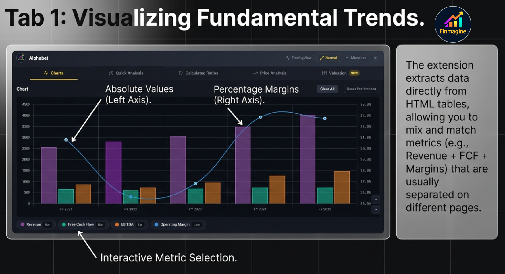
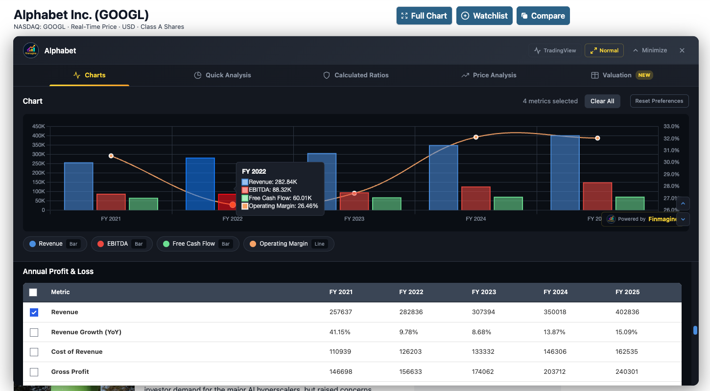
Live example: Alphabet (GOOGL) — Revenue & EBITDA bars with FCF & Operating Margin lines. Note the hover tooltip, interactive legend, and metric checkboxes below.
Metric Selection System
The Checkbox Interface
Every financial metric in every table section has a checkbox next to it. Click any checkbox to instantly add that metric to the chart—no “Generate” or “Submit” button required. The chart updates in real time with smooth animations.
Select All
Each table section has a “Select All” checkbox in its header row. Click it to add every metric from that section to the chart simultaneously. Click again to deselect all.
Available Data Sections (in order)
- Annual Profit & Loss: Revenue, Cost of Goods Sold, Gross Profit, Operating Expenses, Operating Income, Net Income, EPS, EBITDA, and associated margins
- Annual Balance Sheet: Total Assets, Total Liabilities, Shareholders’ Equity, Total Debt, Cash & Equivalents, Working Capital, Retained Earnings
- Annual Cash Flow: Operating Cash Flow, Capital Expenditures, Free Cash Flow, Investing Activities, Financing Activities
- Financial Ratios: ROE, ROA, ROCE, Current Ratio, D/E, PE, P/B, EV/EBITDA, Margins (annual ratios table)
- Quarterly Profit & Loss: Same metrics as annual but for recent quarters (loads after Phase 2)
- Quarterly Balance Sheet: Recent quarterly asset/liability snapshots
- Quarterly Cash Flow: Recent quarterly cash generation patterns
The Dual-Axis Chart System
The chart uses Chart.js to render a mixed bar-and-line visualization with two Y-axes:
- Left Y-Axis (Bars): Absolute financial values in dollars—Revenue, Net Income, Free Cash Flow, Total Debt, etc. Displayed as colored stacked bars.
- Right Y-Axis (Lines): Percentage-based metrics—Operating Margin, ROE, ROCE, Debt/Equity, etc. Displayed as colored lines with dot markers.
- X-Axis: Time periods aligned chronologically (FY 2021, FY 2022, FY 2023, FY 2024, FY 2025 for annual; Q1 2024, Q2 2024, Q3 2024, etc. for quarterly).
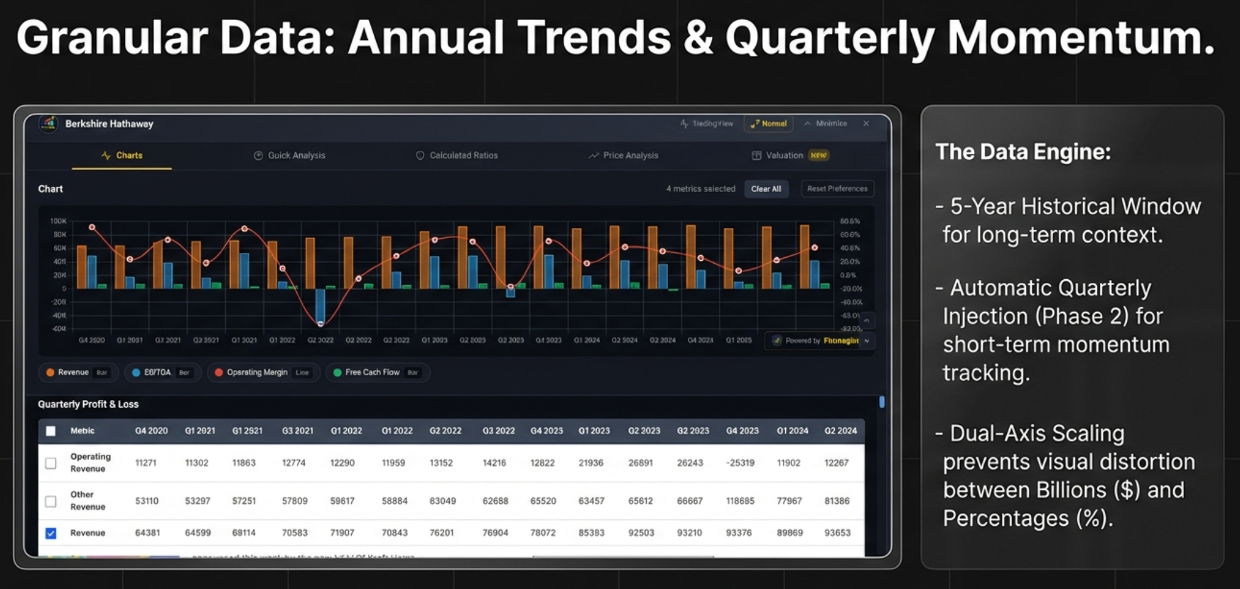
Chart Controls
Clear All Button
- Location: Top of the chart section
- Function: Unchecks all selected metrics and removes the chart
- Use Case: Starting a fresh analysis without closing the panel
Reset Preferences Button
- Location: Next to Clear All
- Function: Clears both the current selection AND the saved metric preferences from
localStorage - Use Case: When you want a completely clean slate without any auto-restored selections
Interactive Legend
- Location: Below the chart canvas
- Format: Color square + metric name + chart type (e.g., “Revenue [Bar]” or “Operating Margin [Line]”)
- Click Action: Clicking a legend item toggles that metric’s visibility on the chart. Hidden items appear grayed out.
- Use Case: Start with 6 metrics selected, then click legend items to isolate specific relationships (e.g., hide everything except Revenue and Free Cash Flow to check cash conversion).
Hover Tooltips
Hovering over any bar or line point triggers a dark-themed tooltip (#1a1f29 background) showing:
- The time period (e.g., “FY 2024”)
- Exact values for ALL metrics at that time point
- Formatted with appropriate units ($, %, x)
Metric Persistence
The extension automatically saves your selected metrics to localStorage (keyed per site). When you revisit the same stock or navigate to a different stock on stockanalysis.com, your metric selections are automatically restored. This means if you always analyze Revenue + Net Income + FCF + Operating Margin, you never have to re-select them.
Color Palette
The chart uses a rotating 10-color palette to distinguish metrics: Blue (#4A90E2), Red (#E94B3C), Green (#6FDC8C), Orange, Purple, Cyan, Yellow, Pink, Teal, and Coral. If you select more than 10 metrics, colors repeat.
The “Golden Quartet” of Essential Metrics
For any stock analysis, start with these four metrics to get the story in under 60 seconds:
- Revenue: Is the top line growing? (baseline health check)
- Operating Margin: Is the company becoming more or less profitable as it scales? (efficiency check)
- Net Income: Bottom-line profitability (the accounting opinion)
- Free Cash Flow: Actual cash generated after capital expenditures (the truth-teller)
Value Formatting
The extension parses and displays values using standard financial notation:
- K: Thousands (e.g., $729K = $729,000)
- M: Millions (e.g., $729M = $729,000,000)
- B: Billions (e.g., $5.9B = $5,900,000,000)
- T: Trillions
- Percentages: Stripped of % symbol for calculation, but displayed with % in tooltips and labels
- Negative values: Displayed with minus sign; dashes (“—”) treated as null
Finmagine Watermark
A small “Powered by Finmagine” watermark appears in the bottom-right corner of the chart. It is clickable and opens finmagine.com in a new tab. This adds credibility when sharing chart screenshots.
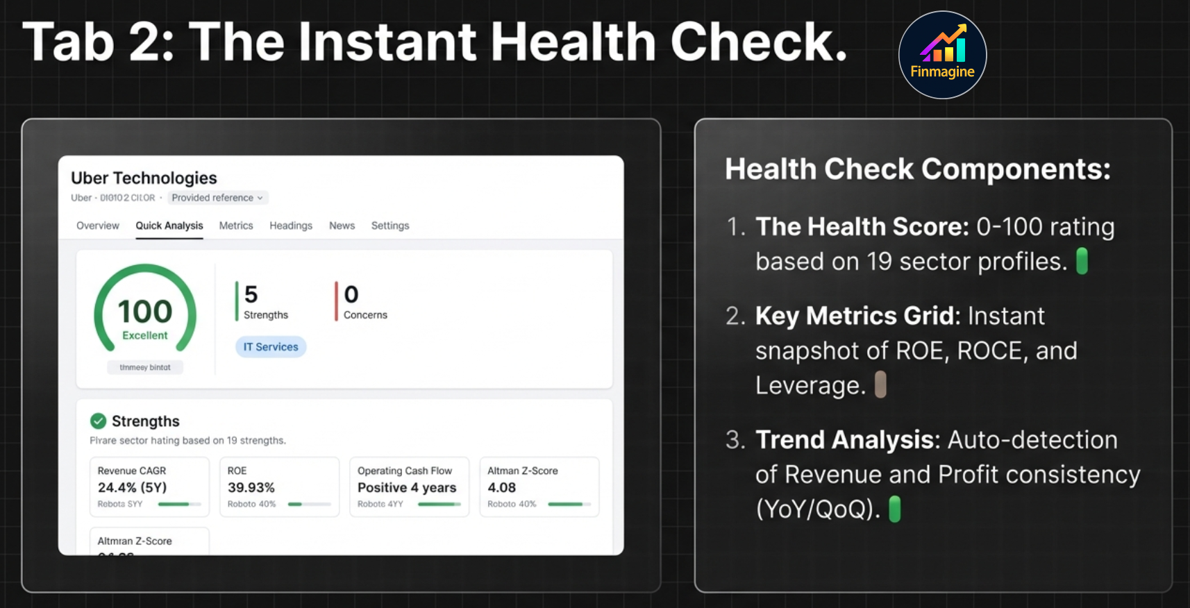
Quick Analysis: Sector-Aware Health Intelligence
The Quick Analysis tab is the flagship feature of the extension. It synthesizes data from all 10 fetched pages into a single-screen health assessment that takes seconds to read but would take a human analyst 30+ minutes to compile manually.
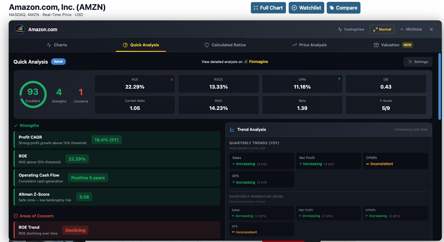
Live example: Amazon (AMZN) — Health Score 93 (Excellent), key metrics grid with 8 indicators, Strengths & Concerns, and Quarterly Trend Analysis
The Health Score (0–100)
At the top-left of the tab, a large circular SVG gauge displays the company’s overall health score:
| Score Range | Rating | Color | Interpretation |
|---|---|---|---|
| 70–100 | Excellent | Green | Strong fundamentals. Proceed to valuation to check if price is reasonable. |
| 50–69 | Good | Orange | Mixed signals. Investigate the specific concerns before making investment decisions. |
| Below 50 | Fair/Poor | Red | Weak fundamentals. Only consider as turnaround plays with a clear catalyst thesis. |
How the Health Score Is Calculated
The score is a weighted average across five categories:
- Growth (25%): Revenue CAGR, Profit CAGR, EPS CAGR across 1Y/3Y/5Y horizons
- Profitability (25%): ROE, ROCE, Operating Margin, Net Profit Margin
- Leverage (20%): Debt/Equity, Current Ratio, Interest Coverage
- Cash Flow (15%): Operating Cash Flow trend, Free Cash Flow generation
- Financial Scores (15%): Altman Z-Score, Piotroski F-Score (for US stocks)
For each category, the engine counts strengths vs. concerns against sector-specific thresholds, then computes: (positive points × 100) / max possible points.
Sector Detection: 19-Sector Intelligence
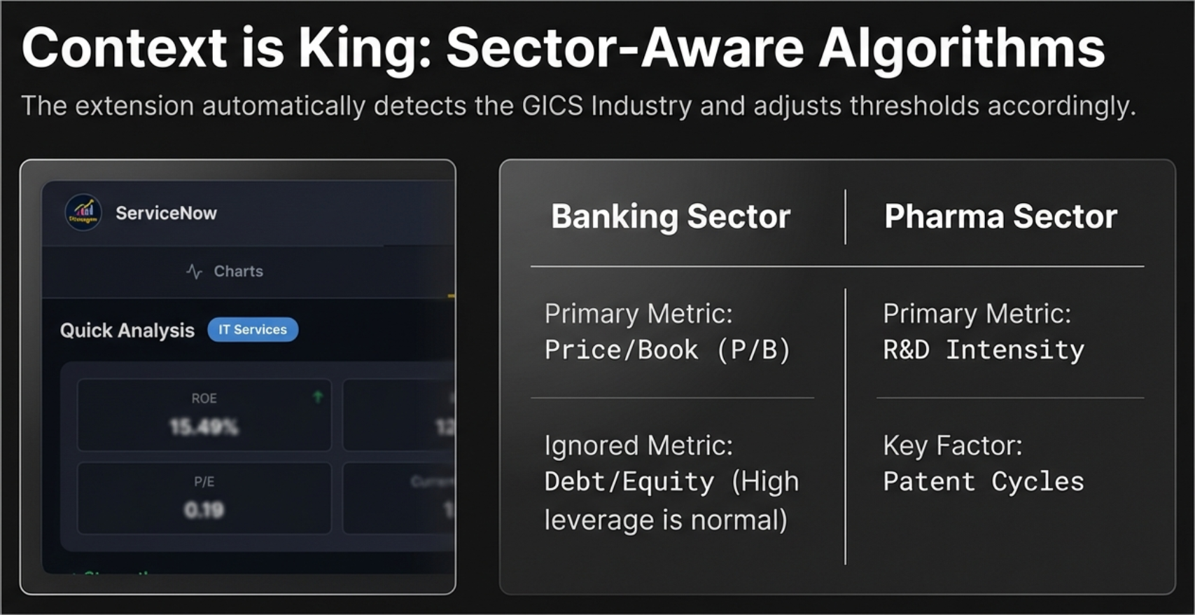
The extension reads the company’s GICS Industry from the Profile page and maps it to one of 19 analysis profiles using a comprehensive 145+ industry mapping table. This is not a simple sector lookup—it checks the specific industry first (exact match), then falls back to the broad sector if no industry match is found.
Why Sector Awareness Matters
- Banks: High Debt/Equity is normal (customer deposits are liabilities). Negative Operating Cash Flow is normal (cash flows out as loans). The extension disables D/E concerns and uses Price/Book as the primary valuation metric.
- Technology: Asset-light businesses make Price/Book irrelevant (P/B of 30x is typical for software companies). The engine focuses on PE, Revenue Growth, and ROIC-WACC spread.
- Energy: Earnings are wildly cyclical. PE can swing from 5 to 500 in a commodity cycle. The engine uses EV/EBITDA as the primary metric and ignores PE.
- Pharma: Patent cliffs create irregular revenue patterns. The engine considers R&D intensity and Pipeline value signals.
Key Metrics Grid
To the right of the Health Score, a grid displays up to 8 contextual metrics based on the detected sector:
| Metric | Shown For | What It Tells You |
|---|---|---|
| ROE | All sectors | Return on Equity — how efficiently the company uses shareholders’ capital |
| ROCE | All sectors | Return on Capital Employed — includes debt in the denominator |
| OPM | All sectors | Operating Profit Margin — core business profitability |
| ROIC | US stocks | Return on Invested Capital — the “truth” of capital allocation |
| Beta | US stocks | 5-year volatility relative to S&P 500 |
| F-Score | US stocks | Piotroski F-Score (out of 9) — financial strength |
| Z-Score | US stocks | Altman Z-Score — bankruptcy risk prediction |
| D/E | Non-banking | Debt to Equity ratio — financial leverage |
Each metric card shows the value, and a trend indicator arrow (up, down, or stable).
Strengths & Concerns
Below the Health Score, two columns list specific findings:
- Strengths (green checkmarks): Positive findings such as “Revenue CAGR above 15% (5Y)”, “Debt-free balance sheet”, “Consistent positive FCF”, “ROE above 20%”
- Areas of Concern (red warnings): Negative findings such as “Operating margin declining trend”, “High leverage (D/E above 1.5)”, “Negative Free Cash Flow”, “FII holding declining”
Each item shows the metric name, a description, and the actual value.
Growth (CAGR) Analysis
A dedicated section shows Compound Annual Growth Rates across four time horizons:
- 1-Year: Most recent growth (momentum indicator)
- 3-Year: Medium-term trend
- 5-Year: Long-term structural growth
- 10-Year: Full business cycle view (if data available)
For each period: Revenue CAGR, Profit CAGR, and EPS CAGR. Color-coded: green for 15%+ growth, orange for 5–15%, red for below 5%.
Trend Analysis
The right column shows three types of trend analysis:
- YoY (Year-over-Year): Compares same quarters across years—is Q4 revenue consistently higher than the previous Q4?
- QoQ (Quarter-over-Quarter): Sequential quarter changes—short-term momentum
- Yearly Trends: Annual-to-annual direction for long-term consistency
US-Exclusive Panels (Replace Shareholding)
For Indian stocks, the right column shows Shareholding Movement (Promoter, FII, Pledging). For US stocks, this is replaced by three institutional-grade panels:
Panel 1: Financial Scores
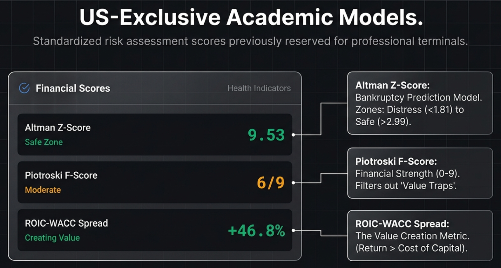
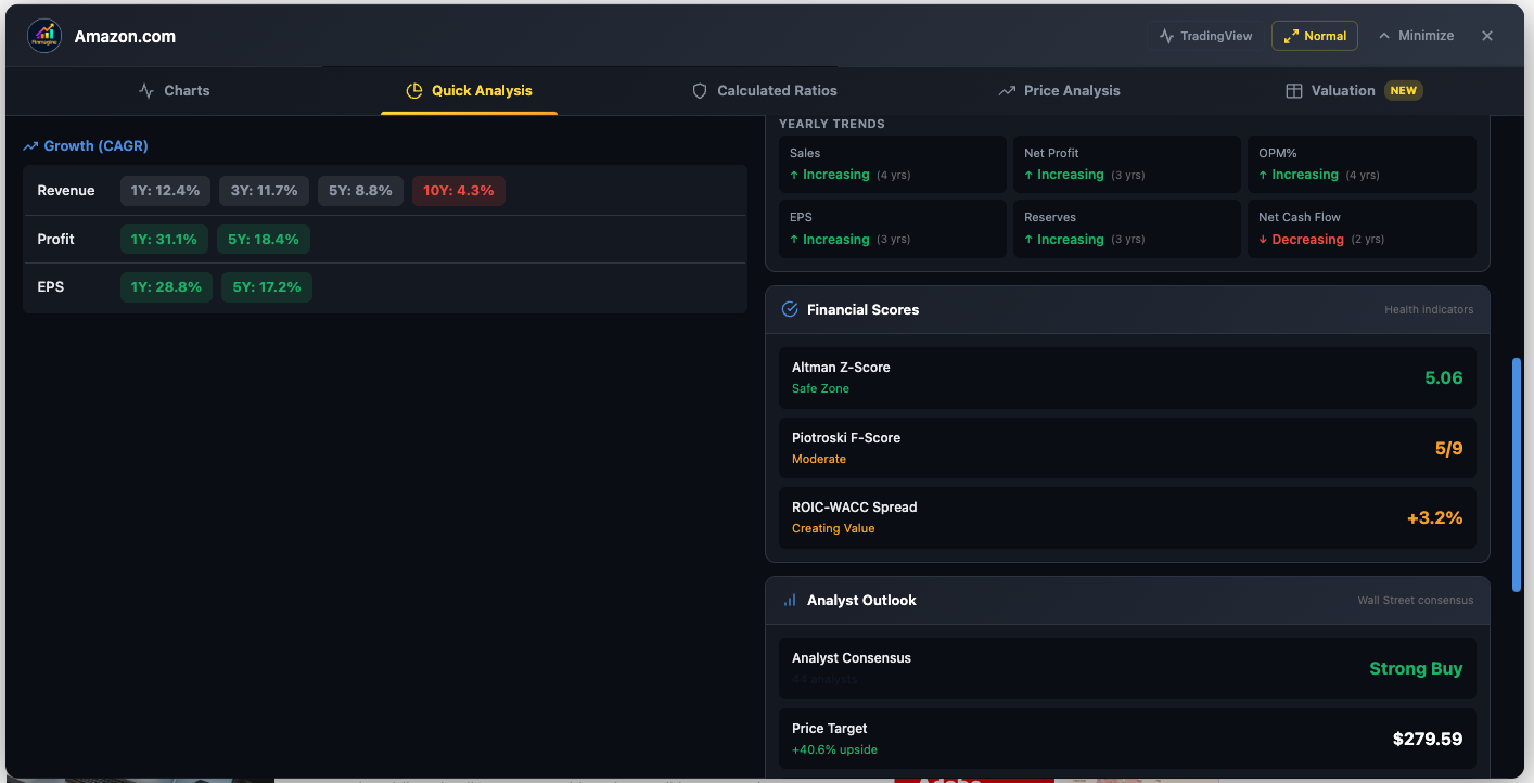
Amazon (AMZN) — Growth CAGR across all horizons, Financial Scores (Z-Score 5.06 Safe, F-Score 5/9, ROIC-WACC +3.2%), and Analyst Consensus
Altman Z-Score (Bankruptcy Risk Predictor)
Developed by Professor Edward Altman in 1968, this formula combines five financial ratios into a single score that predicts bankruptcy probability:
Z = 1.2×(Working Capital/Total Assets) + 1.4×(Retained Earnings/Total Assets) + 3.3×(EBIT/Total Assets) + 0.6×(Market Cap/Total Liabilities) + 1.0×(Revenue/Total Assets)
| Z-Score | Zone | Color | Interpretation |
|---|---|---|---|
| > 2.99 | Safe Zone | Green | Low probability of bankruptcy. Healthy balance sheet. |
| 1.81 – 2.99 | Grey Zone | Orange | Uncertain. Elevated risk requiring further investigation. |
| < 1.81 | Distress Zone | Red | High probability of bankruptcy. Major red flag. |
Piotroski F-Score (Financial Strength, 0–9)
Developed by Joseph Piotroski in 2000, this score awards one point for each of nine binary criteria across three categories:
| Category | Criterion | Pass Condition |
|---|---|---|
| Profitability (3 points) | Net Income | Positive |
| Operating Cash Flow | Positive | |
| ROA Trend | Improved year-over-year | |
| Leverage (3 points) | Debt Trend | Long-term debt decreased |
| Current Ratio Trend | Improved | |
| Share Dilution | No new shares issued | |
| Efficiency (3 points) | Gross Margin Trend | Improved |
| Asset Turnover Trend | Improved | |
| Cash Flow Quality | Operating CF > Net Income |
| Score | Rating | Color | Investment Implication |
|---|---|---|---|
| 7–9 | Strong | Green | Robust, improving fundamentals |
| 4–6 | Moderate | Orange | Mixed signals — investigate further |
| 0–3 | Weak | Red | Deteriorating financials — high risk |
ROIC-WACC Spread (Value Creation Signal)
This metric answers the most fundamental question in investing: Is this company creating or destroying value?
- ROIC (Return on Invested Capital): The percentage return the company generates on all capital invested (both equity and debt)
- WACC (Weighted Average Cost of Capital): The blended interest rate the company pays to fund itself
- Spread = ROIC − WACC
| Spread | Status | Color | What It Means |
|---|---|---|---|
| > 5% | Creating Value | Green | Every dollar invested generates returns well above the hurdle rate |
| 0% – 5% | Moderate | Orange | Generating returns close to the cost of capital |
| < 0% | Destroying Value | Red | Growth is actually harmful — the company is selling dollars for 90 cents |
Panel 2: Analyst Outlook
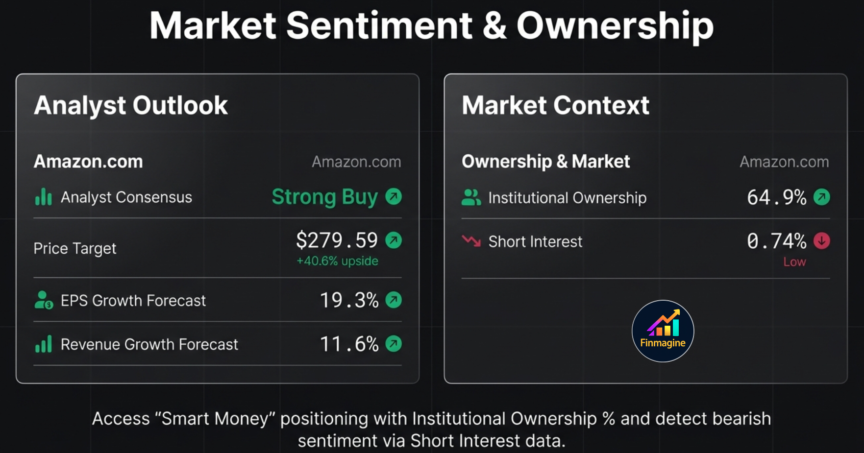
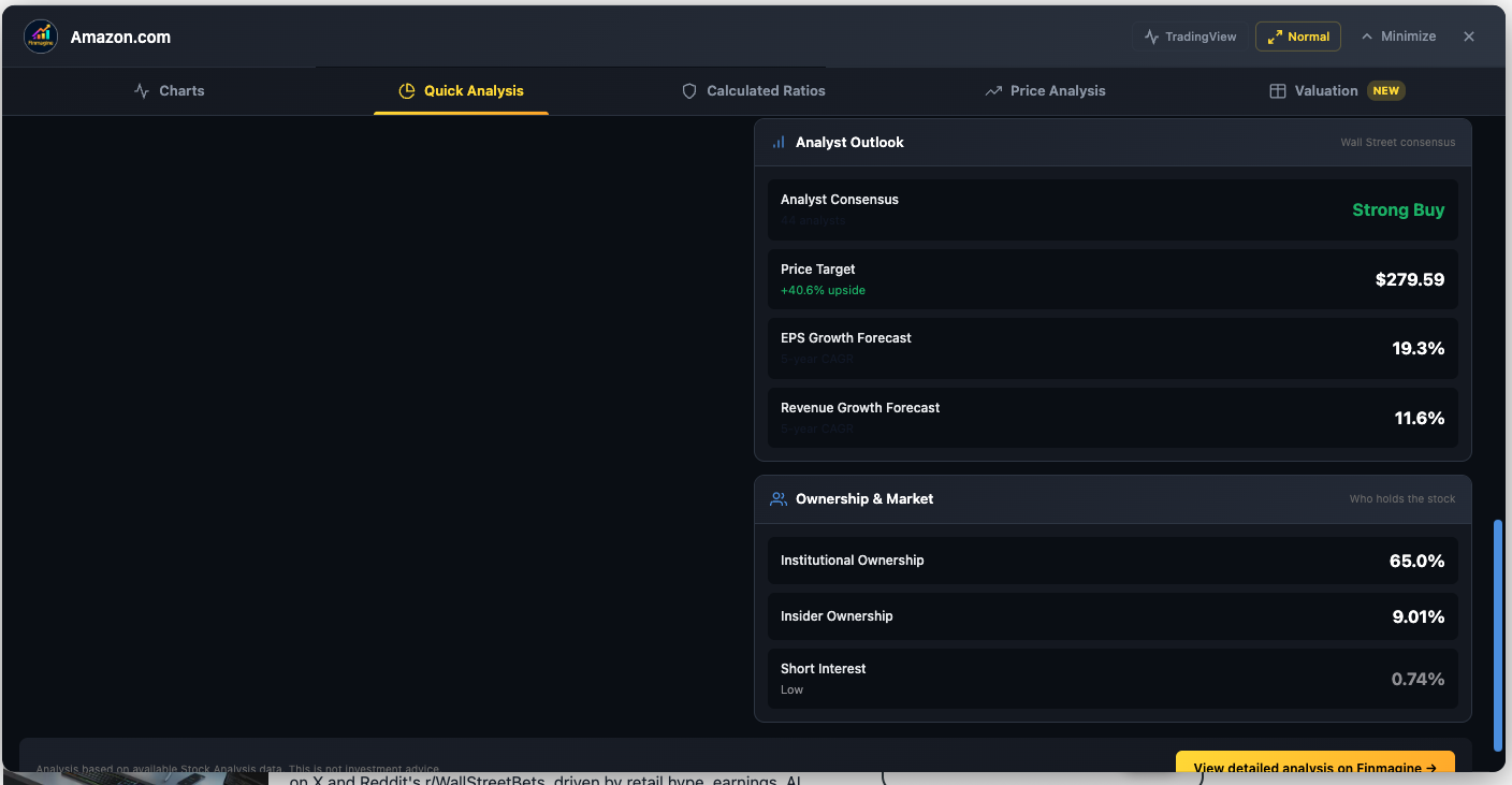
Amazon (AMZN) — Analyst Outlook (Strong Buy, $279.59 target, +40.6% upside) and Ownership panel (65% Institutional, 9% Insider, 0.74% Short Interest)
- Analyst Consensus: Aggregated Buy/Hold/Sell rating from Wall Street analysts (displayed as “Strong Buy”, “Buy”, “Hold”, “Sell”, “Strong Sell”)
- Price Target: Average analyst price target with percentage upside/downside from current price
- EPS Growth Forecast: Expected earnings per share growth rate
- Revenue Growth Forecast: Expected revenue growth rate
Panel 3: Ownership & Market
- Institutional Ownership: Percentage held by funds, pension plans, and institutional investors. 60–80% is the sweet spot (smart money confidence). Above 80% may indicate a “crowded trade.” Below 30% suggests an under-covered stock.
- Insider Ownership: Percentage held by executives and directors. Higher is better—it means management has skin in the game.
- Short Interest: Percentage of shares being bet against. Below 3% is minimal. 3–10% shows some skepticism. Above 10% is significant—either there are fundamental problems, or it is a short squeeze candidate.
- Dividend Yield: Annual dividend as a percentage of stock price (if applicable)
Settings: Customizable Thresholds
A gear icon in the Quick Analysis header opens a settings panel with three strictness presets:
| Preset | Revenue CAGR | ROE Min | D/E Max | Current Ratio |
|---|---|---|---|---|
| Conservative | ≥20% | ≥20% | ≤0.5 | ≥2.0 |
| Moderate (Default) | ≥15% | ≥15% | ≤1.0 | ≥1.5 |
| Aggressive | ≥10% | ≥12% | ≤1.5 | ≥1.2 |
Individual thresholds can also be customized per metric. All settings are saved to localStorage.
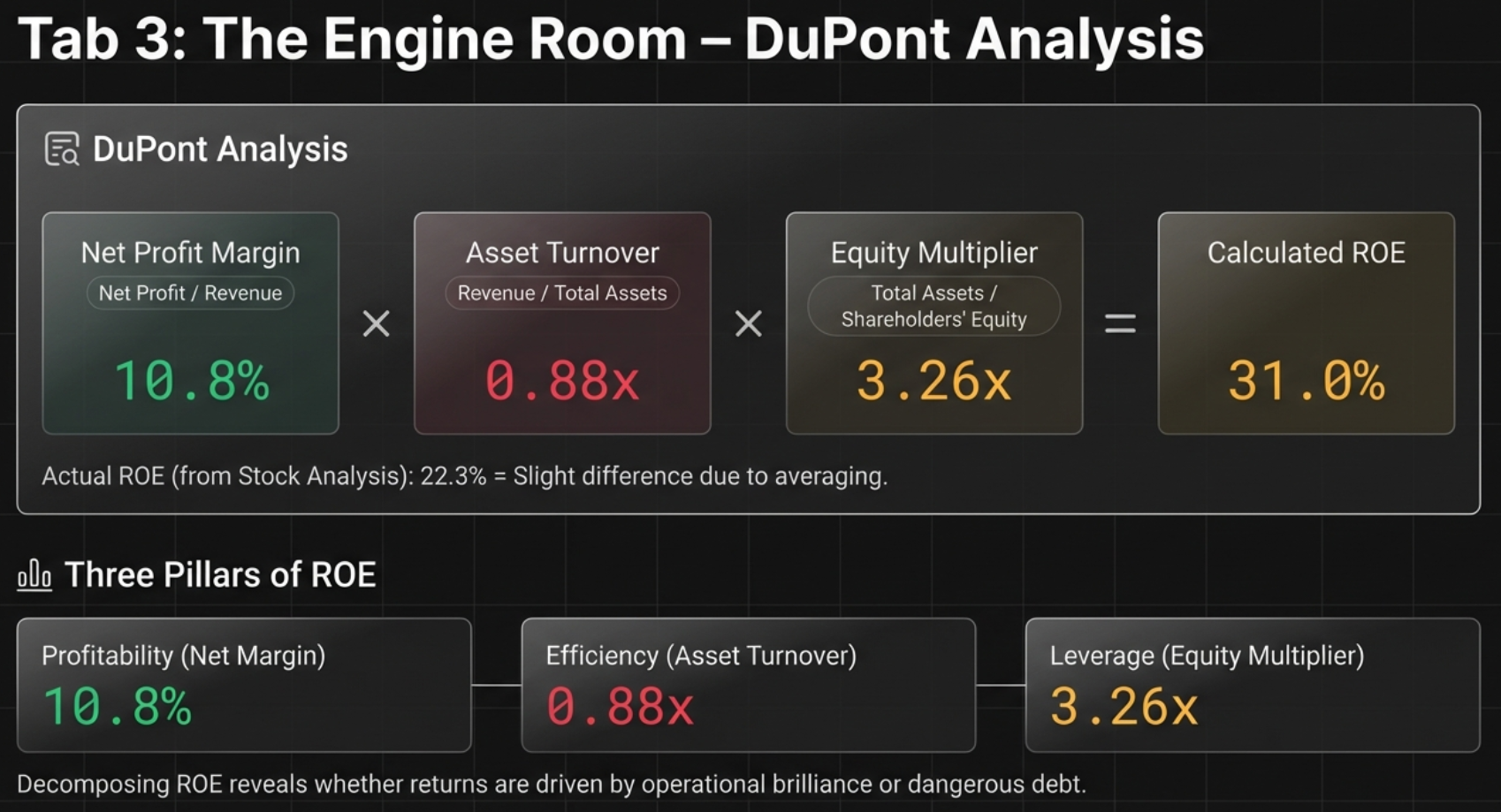
Calculated Ratios: The Engine Room
The Calculated Ratios tab is where you dissect the mechanics of a company’s returns. The headline feature is the DuPont Analysis, followed by a comprehensive display of 40+ financial ratios organized into categories.
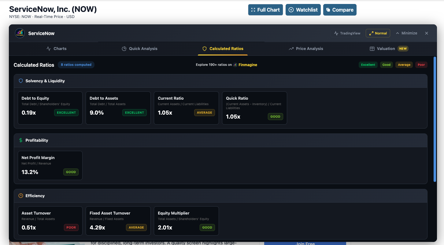
Live example: ServiceNow (NOW) — Solvency, Profitability, and Efficiency ratios with color-coded badges (Excellent, Good, Average, Poor)
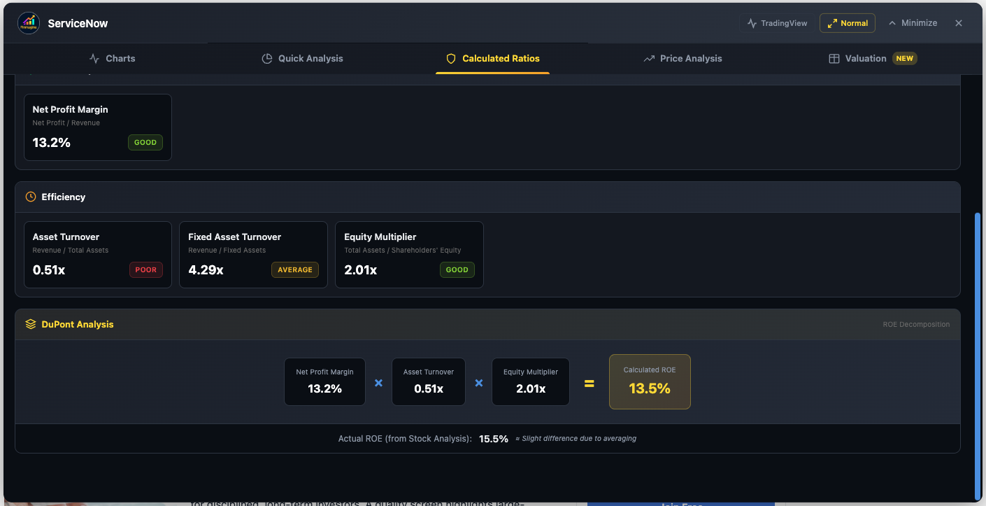
ServiceNow (NOW) — DuPont Analysis: NPM 13.2% × Asset Turnover 0.51x × Equity Multiplier 2.01x = 13.5% Calculated ROE (vs. 15.5% actual)
DuPont Analysis: Decomposing ROE
The DuPont Analysis breaks Return on Equity into three component levers:
Net Profit Margin × Asset Turnover × Equity Multiplier = ROE
| Component | Formula | What It Reveals |
|---|---|---|
| Net Profit Margin | Net Profit / Revenue | Pricing Power: High margins indicate competitive advantage and sustainable profitability (e.g., Microsoft at ~35%) |
| Asset Turnover | Revenue / Total Assets | Operational Efficiency: How fast the company turns its assets into revenue (e.g., Costco at ~3.5x) |
| Equity Multiplier | Total Assets / Shareholders’ Equity | Financial Leverage: How much debt amplifies returns—higher is riskier (e.g., a highly leveraged company at 5x+) |
The extension displays each component with color-coded ratings and shows a “Three Pillars of ROE” visualization comparing Profitability (margin-driven), Efficiency (turnover-driven), and Leverage (debt-driven).
Complete Ratio Categories (40+ Metrics)
Below the DuPont section, ratios are organized into categories with color-coded badges (green for Excellent, yellow for Average, red for Poor—all adjusted for the detected sector):
Valuation Ratios
PE Ratio, Forward PE, Price/Sales, Price/Book, Price/FCF, PEG Ratio
Enterprise Value Metrics
EV/Earnings, EV/Sales, EV/EBITDA, EV/EBIT, EV/FCF
Financial Position (Leverage & Liquidity)
Current Ratio, Quick Ratio, Debt/Equity, Debt/EBITDA, Debt/FCF, Interest Coverage
Profitability & Efficiency
ROE, ROA, ROIC, ROCE, WACC, Asset Turnover, Inventory Turnover
Margins
Gross Margin, Operating Margin, Profit Margin, EBITDA Margin, FCF Margin
Dividend Metrics
Dividend Yield, Dividend Growth, Payout Ratio, Buyback Yield, Years of Dividend Growth
Stock Technical Metrics
Beta (5Y), 52-Week Price Change, 50-Day SMA, 200-Day SMA, RSI, Short % of Float, Short Ratio
Analyst Forecast
Price Target, Price Target Upside %, Analyst Consensus, Analyst Count, Revenue Growth Forecast (5Y), EPS Growth Forecast (5Y)
Financial Health Scores
Altman Z-Score, Piotroski F-Score
Share Statistics & Ownership
Shares Outstanding, Insider Ownership %, Institutional Ownership %
Each ratio is displayed in a compact table format with the label, value, and a color-coded background. Null or unavailable values display as “N/A”. Units are preserved: $ for dollar amounts, % for percentages, x for multiples.
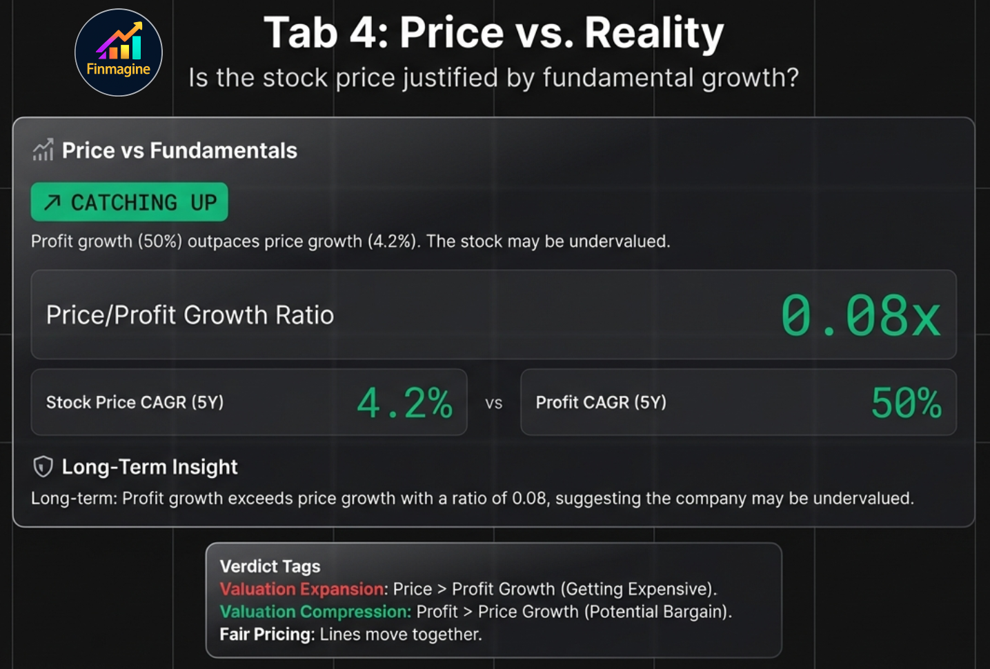
Price Analysis: The Reality Check
The Price Analysis tab answers a deceptively simple question: Is the current stock price justified by the company’s fundamental growth? A stock can have excellent fundamentals but still be a bad investment if the price has already run far ahead of earnings.
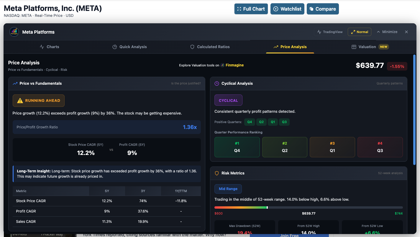
Live example: Meta Platforms (META) — Price vs Fundamentals and Cyclical Analysis overview
Price vs. Fundamentals
The extension compares Stock Price CAGR against Sales CAGR and Profit CAGR over 3-year and 5-year periods:
| Scenario | Signal | Verdict Tag |
|---|---|---|
| Stock Price CAGR >> Profit CAGR | Valuation Expansion — price has outrun fundamentals. Potentially overvalued. | Valuation Expansion |
| Stock Price CAGR ≈ Profit CAGR | Fair Pricing — price and fundamentals are moving in lockstep. | Fair Pricing |
| Profit CAGR >> Stock Price CAGR | Valuation Compression — fundamentals outpacing price. Potentially undervalued. | Catching Up |
A Price/Profit Growth Ratio quantifies this relationship. A ratio below 1.0 suggests the stock may be undervalued relative to its growth; above 1.0 suggests the price has gotten ahead.
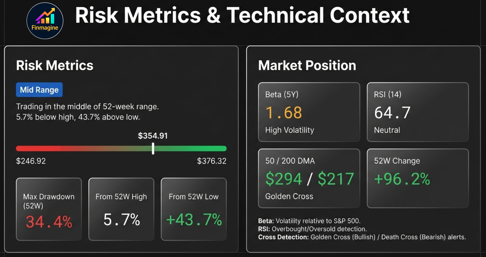
Risk Metrics
- Current Price Position: Where the stock trades within its 52-week range (e.g., “Mid Range: Trading at 5.7% below high, 43.7% above low”)
- 52-Week High/Low: Exact price levels
- Maximum Drawdown (52W): The largest peak-to-trough decline during the past year
US-Exclusive: Market Position Panel
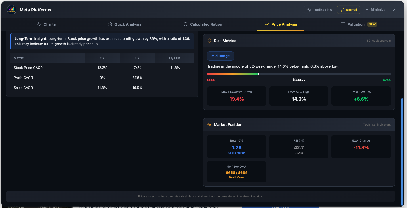
Meta (META) — Price/Profit CAGR comparison, Risk Metrics (Mid Range, 19.4% drawdown), and Market Position (Beta 1.28, RSI 42.7, Death Cross at 50/200 DMA)
Beta (5-Year Volatility)
Measures how much the stock moves relative to the S&P 500:
- < 0.5: Much less volatile (utilities, consumer staples)
- 0.8 – 1.2: Market-like volatility
- 1.2 – 1.5: More volatile (tech, consumer discretionary)
- > 1.5: Significantly more volatile (biotech, high-growth tech, small caps)
RSI (Relative Strength Index, 14-day)
- > 70: Overbought — stock may be due for a pullback
- 30 – 70: Neutral — normal trading range
- < 30: Oversold — stock may be due for a bounce
Moving Averages & Cross Signals
- 50-Day SMA: Short-term price trend
- 200-Day SMA: Long-term price trend
- Golden Cross: 50-Day SMA crosses above 200-Day SMA — bullish reversal signal
- Death Cross: 50-Day SMA crosses below 200-Day SMA — bearish reversal signal
52-Week Change
Total percentage price change over the past year, providing context for whether the stock is in an uptrend or downtrend.
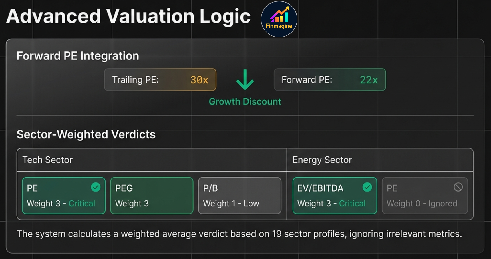
Valuation: The Sector-Weighted Verdict
The Valuation tab is the final piece of the puzzle. It compares the company’s current valuation multiples against their own 5-year historical medians, weighted by sector relevance, to produce a clear verdict: Undervalued, Fairly Valued, or Overvalued.
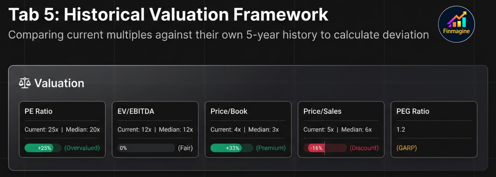
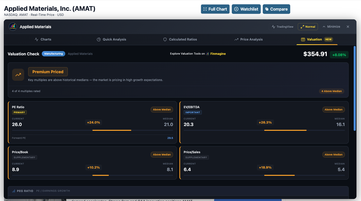
Live example: Applied Materials (AMAT) — “Premium Priced” verdict with all 4 multiples above their 5-year medians. Note the Forward PE annotation (29.5) and sector-aware weight tags (Primary, Important, Supplementary).
The Five Valuation Cards
Each card displays:
- Current Value: The stock’s current multiple
- 5-Year Median: The historical midpoint (less sensitive to outliers than averages)
- Deviation Percentage: How far current is from the median (e.g., “+25% Premium” or “−15% Discount”)
- Verdict: Premium (overvalued), Fair, or Discount (undervalued)
- Weight Tag: How much this metric matters for the detected sector (Primary, Important, Supplementary, or Not Key Metric)
| Metric | What It Measures | Best For |
|---|---|---|
| PE Ratio | Price relative to earnings | Stable earners (FMCG, IT Services) |
| EV/EBITDA | Enterprise value relative to operating profit | Capital-intensive sectors (Energy, Infrastructure, Industrials) |
| Price/Book | Price relative to book value | Asset-heavy sectors (Banking, NBFC, Metals) |
| Price/Sales | Market cap relative to revenue | High-growth companies (Tech, Retail) |
| PEG Ratio | PE normalized by growth rate | Comparing growth stocks fairly |
Sector-Weighted Verdict System
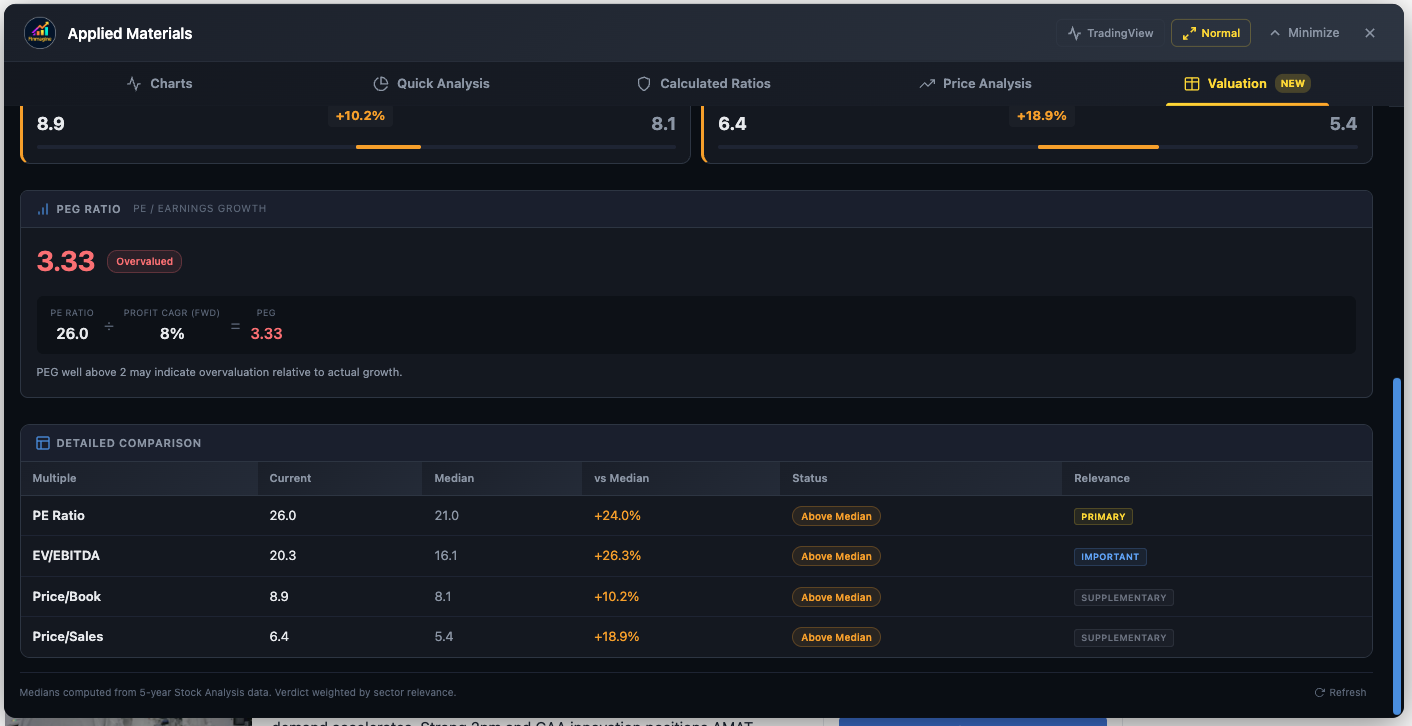
AMAT — PEG Ratio 3.33 (Overvalued) and Detailed Comparison table showing Current vs. Median with % deviation, status, and sector relevance weights (Primary, Important, Supplementary)
Not all metrics are equally relevant for every sector. The extension assigns relevance weights (0–3) to each valuation metric per sector profile:
| Weight | Significance | In Verdict Calculation |
|---|---|---|
| 3 (Primary) | THE metric for this sector | Highest influence on final verdict |
| 2 (Important) | Standard complementary metric | Strong influence |
| 1 (Supplementary) | Provides context only | Minimal influence |
| 0 (Not Key Metric) | Irrelevant for this sector | Excluded entirely; shown dimmed in UI |
Complete Sector Weight Matrix
| Sector | PE | EV/EBITDA | P/B | P/Sales | Primary Metric |
|---|---|---|---|---|---|
| Banking | 1 | 0 | 3 | 0 | P/B (banks trade on equity base) |
| NBFC / Finance | 1 | 0 | 3 | 0 | P/B |
| IT / Technology | 3 | 2 | 1 | 2 | PE (profitability + growth focus) |
| Pharma / Healthcare | 3 | 2 | 0 | 2 | PE and EV/EBITDA |
| FMCG / Consumer Staples | 3 | 2 | 0 | 2 | PE (stable, predictable earnings) |
| Energy | 0 | 3 | 1 | 1 | EV/EBITDA (PE is useless for cyclicals) |
| Metals / Mining | 0 | 3 | 2 | 0 | EV/EBITDA (cyclical earnings) |
| Infrastructure | 2 | 3 | 1 | 0 | EV/EBITDA (capital-intensive) |
| Telecom | 0 | 3 | 0 | 0 | EV/EBITDA (dominant metric) |
| Manufacturing / Auto | 3 | 2 | 1 | 1 | PE |
| Retail | 3 | 2 | 0 | 2 | PE (with Price/Sales context) |
| Chemicals | 3 | 2 | 1 | 0 | PE |
PEG Ratio: The Growth Equalizer
The PEG Ratio normalizes PE by the company’s profit growth rate, making it possible to compare high-growth and slow-growth stocks fairly.
Formula: PEG = Trailing PE / 5-Year Profit CAGR (with 3-year fallback)
| PEG Range | Interpretation |
|---|---|
| < 0.5 | Deeply Undervalued — growth is severely discounted |
| 0.5 – 1.0 | Undervalued — attractive entry point |
| 1.0 – 1.5 | GARP Zone — Growth at a Reasonable Price |
| 1.5 – 2.0 | Getting Expensive — premium is being paid |
| > 2.0 | Overvalued — price has outrun growth |
Forward PE Annotation (US-Exclusive)
For US stocks, the PE card includes a Forward PE annotation based on analyst estimates for the next 12 months. This provides critical context:
- Forward PE < Trailing PE: Market expects earnings to increase (growth stock signal)
- Forward PE > Trailing PE: Market expects earnings to decline (earnings contraction expected)
- Forward PE ≈ Trailing PE: Stable earnings expectations
Verdict Calculation
- For each metric, calculate the deviation from 5-year median (e.g., current PE 28 vs. median 22 = +27%)
- Multiply each deviation by its sector weight
- Sum weighted scores and divide by total weight
- Final verdict based on the aggregate weighted deviation
Metrics with weight 0 are shown dimmed with a “Not Key Metric” tag—visible for context but excluded from the verdict.
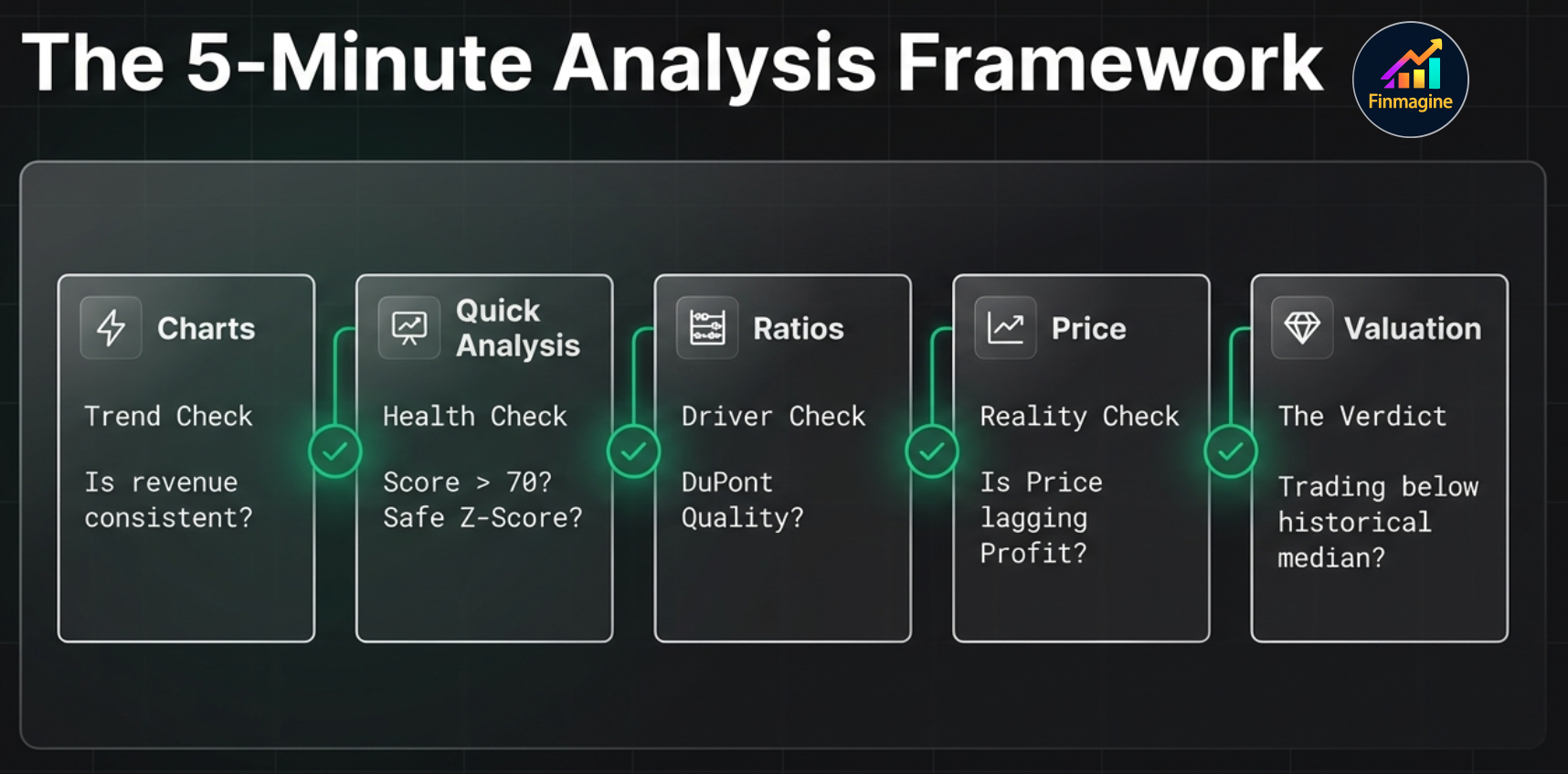
The 5-Minute Analysis Framework
With all five tabs understood, here is how to perform a complete stock analysis in under five minutes:
Step 1: Charts Tab (1 minute)
Goal: Visualize fundamental trends.
Select the Golden Quartet: Revenue, Operating Margin, Net Income, Free Cash Flow. Look for:
- Is revenue growing consistently?
- Are margins expanding, stable, or contracting?
- Is FCF positive and growing?
- Does FCF diverge from Net Income? (accounting quality check)
Step 2: Quick Analysis (1 minute)
Goal: Instant health check.
- Health Score > 70: Proceed to valuation
- Health Score 50–70: Investigate the specific concerns
- Health Score < 50: Only for turnaround plays
- Check Z-Score (safe zone?), F-Score (7+?), ROIC-WACC (positive spread?)
- Any major concerns flagged?
Step 3: Calculated Ratios (30 seconds)
Goal: Understand what drives ROE.
Focus on DuPont Analysis: Which lever drives returns?
- Margin-driven: Pricing power (sustainable competitive advantage)
- Turnover-driven: Operational excellence (efficient business model)
- Leverage-driven: Financial engineering (riskier, less sustainable)
Step 4: Price Analysis (30 seconds)
Goal: Is the price justified?
- Compare Stock Price CAGR vs. Profit CAGR
- Check Beta (acceptable volatility?), RSI (overbought/oversold?)
- Golden Cross or Death Cross?
Step 5: Valuation (1 minute)
Goal: Historical context.
- Are sector-primary multiples above or below their 5-year medians?
- Check Forward PE: does the market expect growth?
- Check PEG: is growth fairly priced?
The Decision Matrix
| Fundamentals | Valuation | Market Position | Decision |
|---|---|---|---|
| Strong | Cheap | Uptrend | Strong Buy |
| Strong | Cheap | Downtrend | Accumulate (wait for reversal) |
| Strong | Fair | Uptrend | Hold / Buy |
| Strong | Expensive | Overbought | Trim (take partial profits) |
| Weak | Cheap | Downtrend | Avoid (value trap) |
| Weak | Expensive | Uptrend | Avoid |
| Mixed | Fair | Neutral | Research More |
Common Pitfalls to Avoid
- Treating Z-Score as universal: It is unreliable for banks, insurance companies, and REITs. Always apply sector context.
- Ignoring Forward PE: A trailing PE of 30 looks expensive, but if Forward PE is 22, the market expects 36% earnings growth.
- Comparing PE across sectors: AAPL at PE 30 vs. XOM at PE 12 does not mean XOM is cheaper. Compare each stock to its own sector and history.
- Anchoring to a single metric: F-Score of 8 means quality, not value. Cross-reference with the Valuation tab.
- Treating short interest as always bullish: 40% short interest with a low F-Score and negative ROIC-WACC means the shorts may be right.
- Overweighting analyst consensus: Consensus lags reality. The best opportunities often have divergent consensus + strong financial data.
- Ignoring 5-year median context: PE of 25 is overvalued if the 5-year median is 18, but undervalued if the median is 35.
- Value trap misidentification: Cheap + Weak F-Score = TRAP. Cheap + Strong F-Score = OPPORTUNITY.
Sector-Specific Analysis Playbooks
Technology (AAPL, MSFT, GOOG, META, NVDA)
Priority Metrics:
- Revenue Growth (Charts) — Is the company still growing?
- Operating Margin (Charts) — Are margins expanding with scale?
- ROIC-WACC Spread (Quick Analysis) — Capital allocation efficiency?
- Forward PE vs. Trailing PE (Valuation) — What growth is priced in?
- PEG Ratio (Valuation) — Is growth fairly priced?
Key Thresholds:
- OPM > 25% = excellent for software
- ROIC-WACC > 15% = strong moat
- PEG < 1.5 = growth at a reasonable price
- Revenue CAGR 5Y > 15% = strong trajectory
Financial Services (JPM, BAC, GS, WFC, BRK.B)
Priority Metrics:
- P/B Ratio (Valuation) — PRIMARY metric. P/B < 1 means below book value.
- ROE (Calculated Ratios) — Should be above 10–12%
- Institutional Ownership (Quick Analysis) — Proxy for management quality perception
- Dividend Yield (Calculated Ratios) — Total return component
Watch Out For:
- Z-Score warnings are UNRELIABLE for banks (ignore them)
- Negative CFO is NORMAL (deposits flowing out as loans)
- D/E ratio is NOT useful (banks are naturally highly leveraged)
Energy (XOM, CVX, COP, SLB)
Priority Metrics:
- EV/EBITDA (Valuation) — PRIMARY metric. Ignore PE entirely.
- FCF (Charts) — Cash generation through commodity cycles
- D/E Ratio (Quick Analysis) — Balance sheet resilience
- Dividend Sustainability (Calculated Ratios) — Can they maintain payouts in low-price environments?
Key Thresholds:
- EV/EBITDA < 6x = attractive for majors
- D/E < 0.5 = well-positioned for downturns
- FCF yield > 8% = strong cash generation
Healthcare / Pharma (JNJ, LLY, UNH, PFE, ABBV)
Priority Metrics:
- Revenue Stability (Charts) — Patent cliff risk visible as revenue deceleration
- Operating Margin (Charts) — R&D vs. profitability balance
- Piotroski F-Score (Quick Analysis) — Early warning system
- Forward PE (Valuation) — Critical for pipeline catalysts
- Beta (Price Analysis) — Defensive sector, should be < 1.0
Consumer Staples (PG, KO, WMT, COST)
Priority Metrics:
- PE Ratio (Valuation) — PRIMARY metric for stable earners
- Revenue Growth (Charts) — 3–5% consistent growth is healthy for this sector
- Operating Margin Stability (Charts) — Consistency matters more than level
- Dividend Growth (Calculated Ratios) — Classic dividend compounders
- DuPont Analysis (Calculated Ratios) — Usually margin-driven ROE
Key Thresholds:
- PE 20–25 = typical range (rarely looks “cheap”)
- Revenue CAGR 3–7% = healthy for consumer staples
- OPM variance < 2% YoY = strong consistency
Industrials (CAT, BA, HON, 3M)
Priority Metrics:
- EV/EBITDA (Valuation) — PRIMARY due to capital intensity and large depreciation
- ROA (Calculated Ratios) — Efficiency in using heavy asset bases
- Free Cash Flow (Charts) — Through business cycles
- CapEx Trends (Charts) — Maintenance vs. expansion spending
Troubleshooting & FAQ
Common Issues
| Issue | Possible Cause | Fix |
|---|---|---|
| “Visualize” button does not appear | Not on a stock page, extension disabled, or page still loading | Navigate to stockanalysis.com/stocks/aapl/. Check chrome://extensions/. Refresh the page. |
| Button appears slowly (3–8 seconds) | Phase 1 data fetch in progress | Normal behavior. The button appears after core data loads. |
| Chart is empty after selecting metrics | Paywalled data or browser cache issue | Click “Reset Preferences”. Reload the extension. |
| Quick Analysis shows incomplete data | Phase 2 (Statistics/History) still loading | Wait 1–3 seconds. Tabs auto-refresh when enrichment completes. |
| Panel shows old stock after navigating | SPA navigation not detected | Refresh the page (Cmd+R or Ctrl+R). |
| TradingView opens wrong symbol | Symbol extraction conflict | Verify the stock ticker in the URL matches what you expect. |
| Scrolling does not work in panel | Wheel events not forwarding | Use the scroll buttons inside the panel, or try scrolling directly on the tab content area. |
Frequently Asked Questions
Is this extension really free?
Yes. 100% free forever. No trial, no premium tier, no hidden costs, no account creation required.
Does it collect my data?
Your research habits, which stocks you analyze, and your analysis results are never transmitted — they stay in your browser. Stock fundamentals from pages you visit are passively contributed to Finmagine's shared cache (anonymously, aggregate only) to improve load speed for all users. No personal data or research profile is ever built.
Can I use it on mobile?
No. Chrome extensions only work on desktop browsers. However, you can take screenshots of charts for mobile-friendly sharing.
How accurate is the data?
The extension extracts data directly from stockanalysis.com’s HTML tables. It is exactly as accurate as the source data. The extension does not estimate, impute, or modify any financial figures.
Does it work on Screener.in and Google Finance too?
Yes. The extension supports three platforms: stockanalysis.com (US stocks), Screener.in (Indian stocks), and Google Finance (limited). This tutorial focuses on the US stock experience, which has the most features.
Why are some metrics showing “N/A”?
stockanalysis.com locks some historical data behind a paywall. The extension detects columns with “Upgrade” text and filters them out, which may reduce the number of years displayed.
Can I change the analysis thresholds?
Yes. Click the gear icon in the Quick Analysis tab header to choose between Conservative, Moderate, and Aggressive presets, or customize individual thresholds.
You Are Now an Institutional-Grade Analyst
You now have a complete understanding of every tab, every button, every metric, and every sector-specific strategy in the Finmagine Chrome Extension for US stocks. What used to require a Bloomberg terminal, a CFA charter, and 30 minutes per stock now takes a single browser extension and five minutes.
What you have mastered:
- The 10-page fetch architecture and how data flows through the extension
- Every panel control: TradingView, Width Toggle, Minimize, Close
- Charts tab: dual-axis system, metric persistence, interactive legends, the Golden Quartet
- Quick Analysis: Health Scores, 19-sector intelligence, Altman Z-Score, Piotroski F-Score, ROIC-WACC
- Calculated Ratios: DuPont Analysis, 40+ ratios across 10 categories
- Price Analysis: Price vs. Fundamentals, Risk Metrics, Beta, RSI, Golden/Death Cross
- Valuation: Sector-weighted verdicts, PEG Ratio, Forward PE
- The 5-Minute Framework with Decision Matrix
- Sector-specific playbooks for Technology, Finance, Energy, Healthcare, and Consumer Staples
Next Steps:
- Install the extension and run your first analysis on a stock you already own
- Practice the 5-Minute Framework on three different sectors
- Pay special attention to where fundamentals and market position diverge
- Build your own sector playbooks based on your investment style
Explore more tools and resources at Finmagine.com—where financial analysis becomes effortless.
Free Chrome Extension
Ready to try this yourself?
Install the Finmagine Financial Chart Builder and transform any Screener.in, Google Finance, or stockanalysis.com page into interactive charts in one click.
Install from Chrome Web Store →No account required • Works on Chrome, Edge, Brave, Opera
Explore the Complete Chart Builder Hub
Discover all Chart Builder resources—tutorials for Indian stocks, US stocks, Google Finance integration, case studies, and more.
Visit Chart Builder Hub →