Following along? Install the extension first
Finmagine Financial Chart Builder — free • no account needed • Chrome, Edge, Brave
🎓 Multimedia Learning Hub
Master Finmagine Chart Builder through video tutorial, audio guide, comprehensive learning overview, and interactive knowledge testing
📚 Complete Learning Path
This comprehensive tutorial will teach you how to use the Finmagine Chart Builder Chrome extension to instantly visualize financial data from Screener.in. No downloads, no exports, no friction—just professional charts with one click.
🎯 What You'll Learn:
- Installation & Setup: Adding the extension and understanding its privacy-first architecture
- Finding the Golden Button: Locating the visualization interface on Screener.in
- Metric Selection Mastery: Choosing which financial metrics to visualize for different analysis types
- Reading Dual-Axis Charts: Understanding how absolute values and percentages work together
- Interactive Features: Using legends, tooltips, and real-time metric toggling
- Advanced Techniques: Mixing quarterly/annual data, sector-specific recipes, pattern recognition
- Troubleshooting: Solving common issues and optimizing your workflow
💡 Key Skills You'll Master:
- Transform static tables into dynamic visualizations with one click
- Spot divergence patterns (revenue up, margins down) that tables hide
- Mix time horizons to compare recent momentum vs structural trends
- Build sector-specific analytical dashboards for Banks, Manufacturing, IT
- Export professional-quality charts for reports and presentations
- Reduce analysis time from 10 minutes to 10 seconds per company
📖 Tutorial Contents:
- Welcome & Context: The "wall of numbers" problem and cognitive load
- Setup: Installation with privacy-first architecture explanation
- Step 1: Navigate to Screener.in and find the golden button
- Step 2: Click the button and explore the Chart Builder interface
- Step 3: Select financial metrics using the checkbox system
- Step 4: Analyze professional charts with the dual-axis system
- Step 5: Master interactive legends, tooltips, and export features
- Advanced: Sector-specific recipes and pattern recognition
- Troubleshooting: Common issues, FAQ, and solutions
🚀 Why This Tutorial Matters:
- Time Savings: Replace 10-minute Excel workflows with 10-second visualizations
- Better Insights: Visual patterns reveal trends that tables hide
- Professional Quality: Export-ready Fiscal.ai-style charts
- Complete Privacy: Client-side processing, zero data tracking
- Zero Cost: Free tool with no subscriptions or limitations
Watch the Complete Tutorial
Follow along with this comprehensive video demonstration of the Finmagine Chart Builder in action.
Video Title: Turn Screener.in Numbers into Powerful Charts (FREE Finmagine Chart Builder and Demo)
📺 Complete video demonstration with real company examples and live chart building
Listen to the Audio Guide
Prefer to listen? This complete audio walkthrough covers all features and use cases.
Duration: Full tutorial | Format: Professional narration
🎧 Deep dive audio guide exploring instant financial visualization techniques and analytical best practices
🎯 Test Your Knowledge
Click any flashcard to reveal the answer. Use the search box to find specific topics.
Welcome to Your Complete Finmagine Chart Builder Tutorial
If you're a serious investor using Screener.in, you know it's an absolute goldmine of financial data. But turning all those numbers into a clear story? That can be a real headache. Welcome to the tool that completely changes the game.
Picture this scenario: It's 11 PM, the house is finally quiet, you've got a coffee (or something stronger if it's been a rough week), and you're sitting at your computer trying to really understand a company. You've got Screener.in open, staring at what we call the wall of numbers.
You're looking at rows and rows of spreadsheet-like data: sales figures going back 10 years, operating profit, interest, depreciation, net profit, EPS—it just scrolls on and on. You're trying to scan these tiny numbers with your tired eyes, doing mental math, subtracting this from that, dividing that by this, just to see if there's even a trend. Is growth accelerating? Is the margin getting squeezed?
After about 10 minutes of scrolling up and down, your brain just starts to melt. This is what psychologists call cognitive load—a real psychological bottleneck. Your brain is spending so much energy just processing the raw digits that it has very little bandwidth left to actually spot the patterns or the story behind those numbers.
That is exactly where the Finmagine Chart Builder enters the picture. It's not some massive, expensive enterprise software suite that costs a lakh a year. It's a simple, elegant browser extension that shatters that wall of numbers in milliseconds.
Today, we're doing a deep dive into how this free Chrome extension transforms dull static tables into professional, interactive, dual-axis charts—and more importantly, how it fundamentally changes the way you think about financial analysis.
Installation: Adding the Extension to Chrome
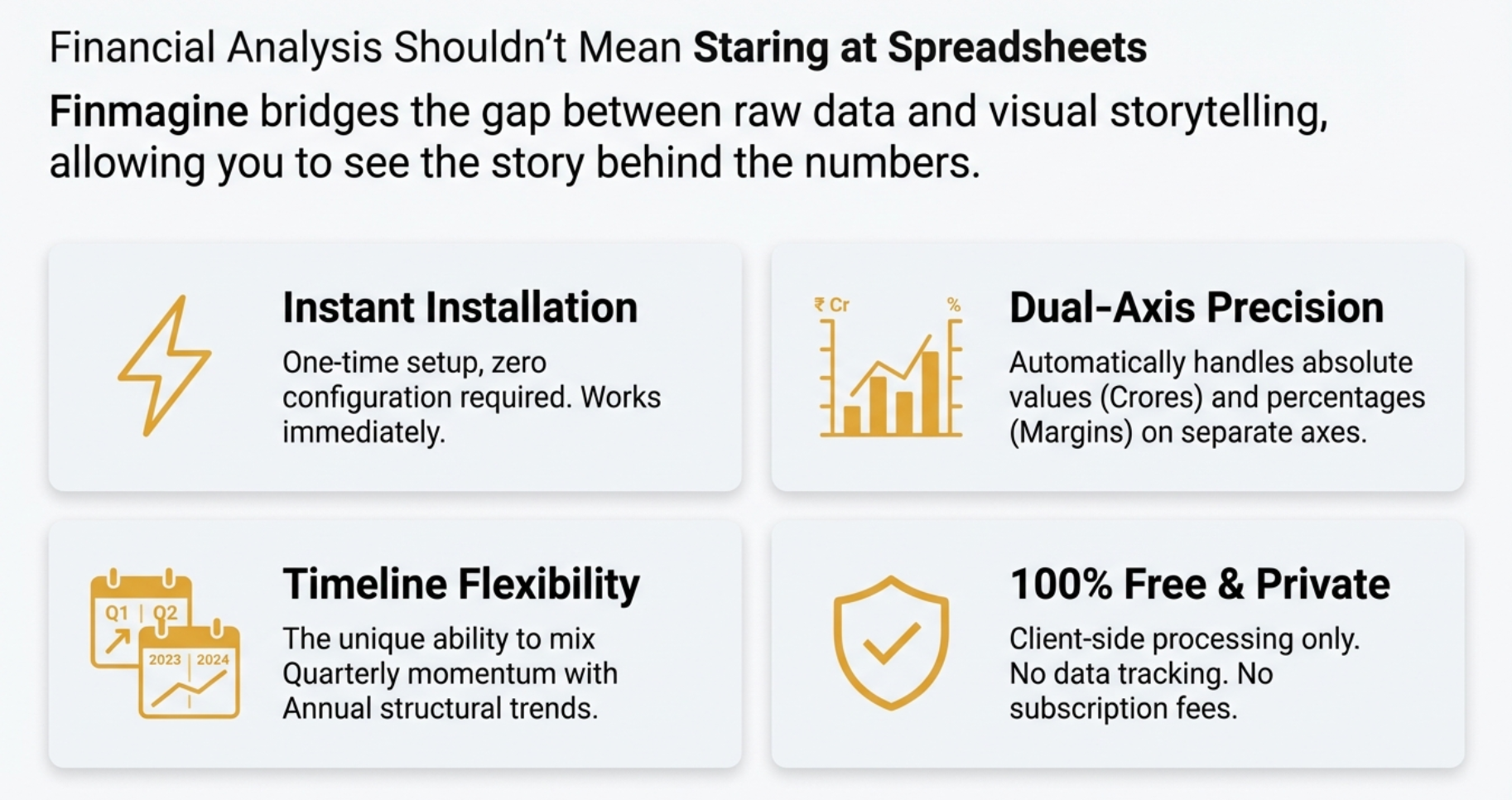
The remarkable thing about the Finmagine Chart Builder is the absolute absence of barriers to entry. It's 100% free—no subscription tier, no pro version that gatekeeps the good features, and you don't even have to create an account or sign in.
Privacy-First Architecture
Before we get into installation, let's talk about why this matters. The extension runs entirely client-side. Think of it like having a hibachi grill right at your table instead of ordering food from the kitchen. The ingredients (data) are already there on your screen, and the chef (software) cooks it right in front of you.
Installation Steps
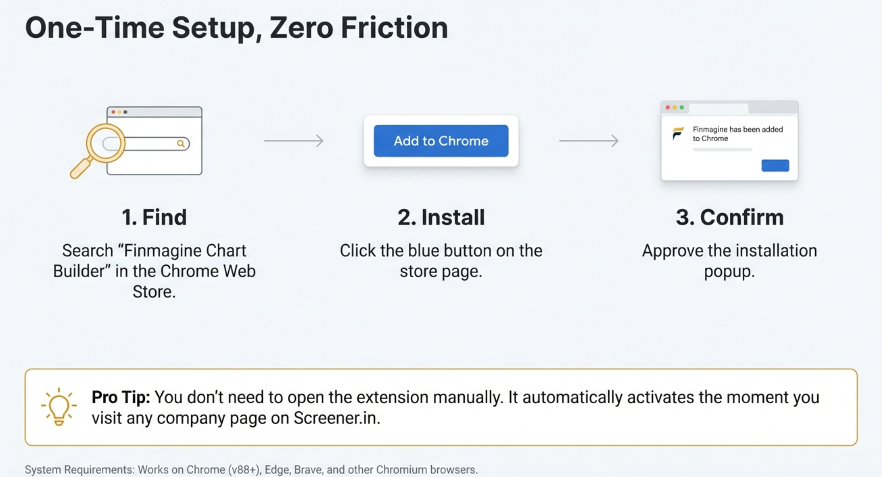
- Open Google Chrome: The extension works on Chrome and all Chromium-based browsers (Microsoft Edge, Brave, etc.)
- Visit the Chrome Web Store: Search for "Finmagine Chart Builder" or click here for direct link
- Click "Add to Chrome": Blue button in the top-right corner
- Confirm Installation: Click "Add extension" in the popup
- Installation Complete: Takes about 2 seconds total
What Happens Next?
Once installed, the extension sits dormant in the background. It's smart enough to detect page types. If you're on the Screener.in homepage or search results, it stays hidden. But the moment you click on a company page (like HDFC Bank or Maruti Suzuki), the integration appears.
The extension wakes up, recognizes the page structure, sees the P&L tables, balance sheet data, and injects its own interface onto the page. You get the distinctive golden "Visualize with Finmagine" button floating in the bottom-right corner.
Navigate to Screener.in and Find the Golden Button
With the extension installed, you can now visualize any company's financial data. Let's walk through finding and activating the Chart Builder.
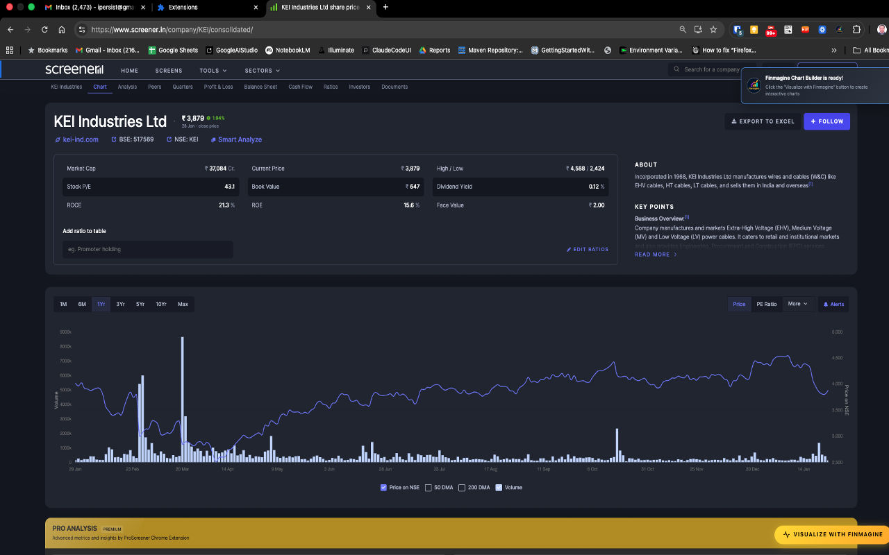
Getting to a Company Page
- Visit Screener.in: Go to www.screener.in
- Search for a Company: Use the search bar to find any Indian publicly-traded company (examples: "KEI Industries", "Bajaj Finance", "HDFC Bank", "Maruti")
- Open the Detail Page: Click on the company from search results
Locating the Visualization Button
Once you're on a company page (like KEI Industries shown in the screenshot above), look for the distinctive golden "VISUALIZE WITH FINMAGINE" button.
Button Characteristics:
- Location: Bottom-right corner, floating above content
- Appearance: Golden/orange gradient background with lightning bolt icon (⚡)
- Behavior: Stays visible when you scroll (sticky positioning)
- Availability: Works on both consolidated and standalone financial views
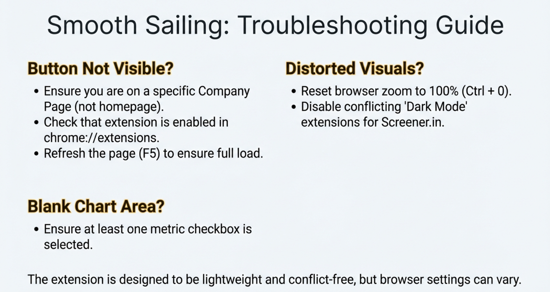
Troubleshooting: Button Not Visible?
If you don't see the golden button, check these common issues:
- Wrong Page Type: Ensure you're on a company detail page, not the homepage
- Extension Not Enabled: Visit
chrome://extensions/and verify the toggle is ON - Page Not Loaded: Try refreshing (F5 or Ctrl+R)
- Browser Compatibility: Must be using Chrome or Chromium-based browser
Click the Button: Opening the Chart Builder
Now comes the magic moment. When you click that golden button, milliseconds later, a full-screen modal window appears overlaying the Screener.in page. This is your complete visualization workspace.
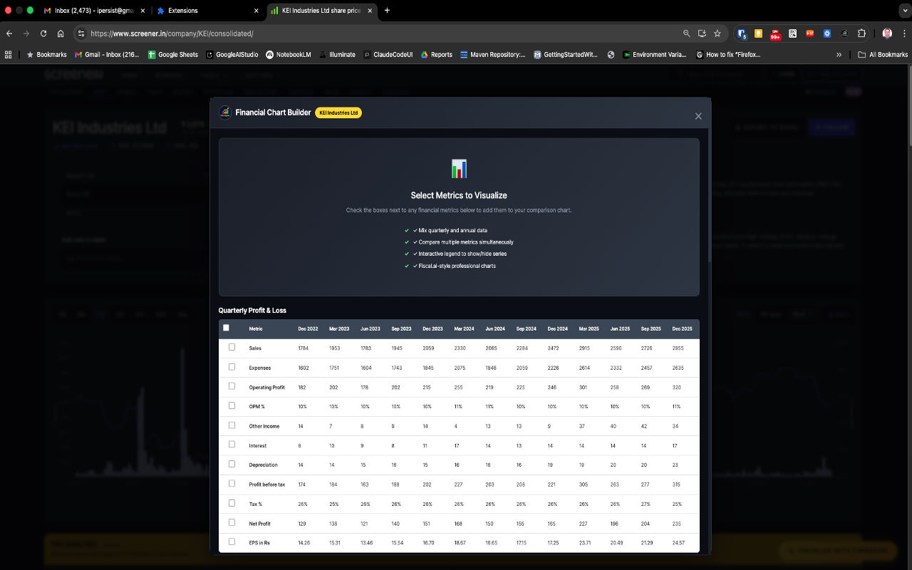
The Chart Builder Interface
The modal features a professionally designed dark-theme interface with several key components:
Header Section
- Title: "Financial Chart Builder" with company name displayed
- Close Button (X): Top-right corner to return to Screener.in
Feature Highlights
The center displays key capabilities:
- ✓ Mix quarterly and annual data
- ✓ Compare multiple metrics simultaneously
- ✓ Interactive legend to show/hide series
- ✓ Fiscal.ai-style professional charts
Data Tables Section
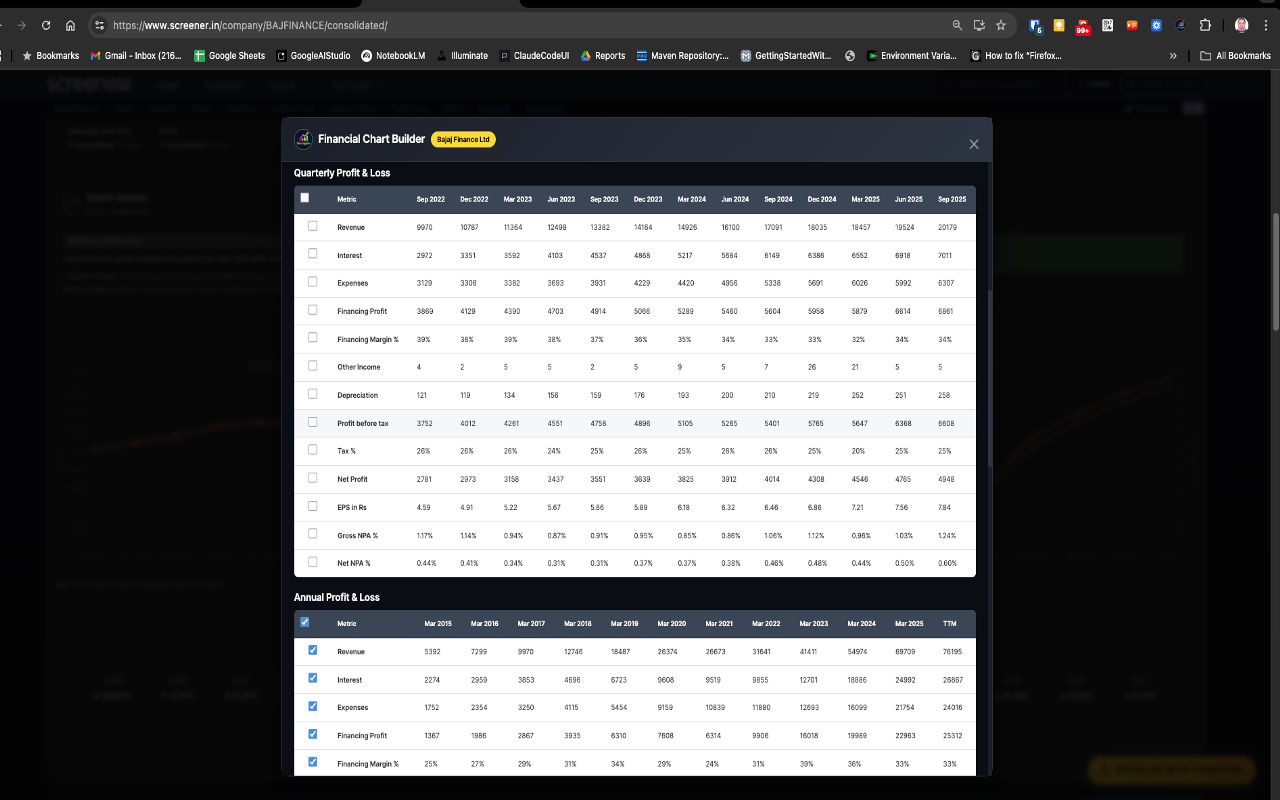
Below the feature description, you'll see financial data organized in sections. The screenshot shows the Quarterly Profit & Loss table with actual KEI Industries data spanning Dec 2022 to Dec 2025.
What Just Happened (Behind the Scenes)
When you clicked the button, the extension performed several sophisticated operations in under one second:
- HTML Parsing: Scanned the entire Screener.in page structure
- Table Detection: Identified all financial tables (P&L, Balance Sheet, Cash Flow, Ratios, Shareholding)
- Data Extraction: Pulled numbers, dates, and metric names
- Data Sanitization: Stripped commas, currency symbols, handled nulls, converted to pure numbers
- Data Structuring: Organized into JSON format for Chart.js
- UI Generation: Created interactive modal with checkboxes
- Chart Preparation: Loaded Chart.js library for instant visualization
Select Your Financial Metrics
This is where you take control. The Chart Builder gives you complete freedom to choose exactly which financial metrics you want to visualize.
The Checkbox Selection System
Every financial metric in every table has a checkbox next to it. Click any checkbox to add that metric to your chart. The chart updates in real-time with smooth animations—no "Generate" or "Submit" button required.
Available Financial Sections
The Chart Builder organizes data into distinct sections:
📊 Quarterly Profit & Loss
Metrics: Sales, Expenses, Operating Profit, OPM%, Interest, Depreciation, Profit before tax, Tax%, Net Profit, EPS
📈 Annual Profit & Loss
Metrics: Same as quarterly but showing full fiscal year data with longer historical trends
💰 Balance Sheet
Metrics: Equity Capital, Reserves, Total Assets, Liabilities, Fixed Assets, Working Capital, Net Worth
💵 Cash Flow
Metrics: Cash from Operations, Investing, Financing activities, Free Cash Flow
📉 Financial Ratios
Metrics: ROCE, ROE, Current Ratio, Debt/Equity, Interest Coverage, efficiency ratios
👥 Shareholding Patterns
Metrics: Promoter Holdings, FII/DII Holdings, Retail Investor percentages
Selection Best Practices
- Begin with 2-3 related metrics to keep charts readable
- Add more metrics incrementally
- Use interactive legends (Step 5) to toggle visibility
- Avoid selecting 15+ metrics simultaneously
Practical Selection Examples
Example 1: Revenue Growth Analysis
Goal: See if the company is growing its top line consistently
Select:
- Quarterly P&L: "Sales"
- Quarterly P&L: "OPM %" (to see if growth maintains profitability)
Result: Chart showing revenue bars growing over time with line showing margin percentages
Example 2: Profitability Deep Dive (Bajaj Finance)
Goal: Understand complete profitability structure
Select:
- Revenue (scale)
- Interest (for NBFCs, cost of funds)
- Expenses (operational costs)
- Financing Profit (net revenue after costs)
- Financing Margin % (profitability percentage)
Example 3: Working Capital Efficiency (KEI Industries)
Goal: Monitor capital deployment efficiency
Select:
- Balance Sheet: Debtor Days
- Balance Sheet: Inventory Days
- Balance Sheet: Cash Conversion Cycle
- Balance Sheet: ROCE %
Mixing Quarterly and Annual Data
One of Finmagine's most powerful features is mixing time horizons. You can compare recent quarterly momentum against long-term annual structural trends.
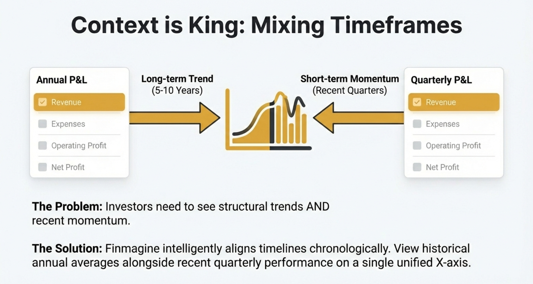
Why This Matters:
- Long-term Trends: Annual data shows 5-10 year structural patterns
- Recent Momentum: Quarterly data reveals recent acceleration or deceleration
- Inflection Detection: Spot when quarterly trends diverge from historical patterns
How to Use:
- Check "Revenue" from Quarterly P&L section
- Scroll to Annual P&L section
- Also check "Revenue" from Annual section
- Both time series appear on same chart with proper alignment
Analyze Your Professional Chart
With metrics selected, Finmagine generates a beautiful, professional-grade Chart.js visualization. Let's learn how to read and interpret these charts effectively.
Understanding Chart Components
The Dual-Axis System
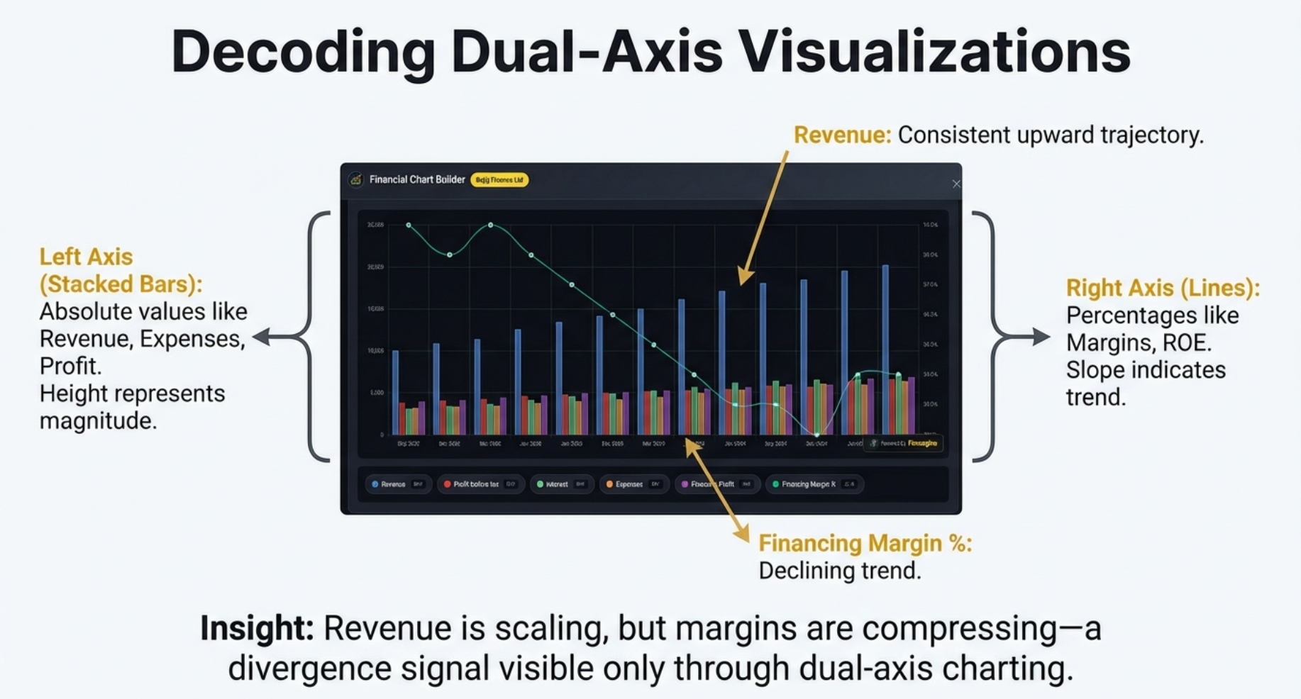
The chart displays your metrics using a sophisticated dual-axis system:
- Left Y-Axis: Absolute values (Revenue, Profit, Expenses in crores)
- Right Y-Axis: Percentage values (Margins, ROE%, Growth rates)
- X-Axis: Time periods automatically aligned
Visual Encoding: Bars vs Lines
- Stacked Bars: Absolute financial values
- Height represents magnitude
- Colors distinguish different metrics
- Convey "how much"
- Lines with Markers: Percentage-based metrics
- Slope shows trend direction
- Smoothness shows consistency
- Convey "how efficient"
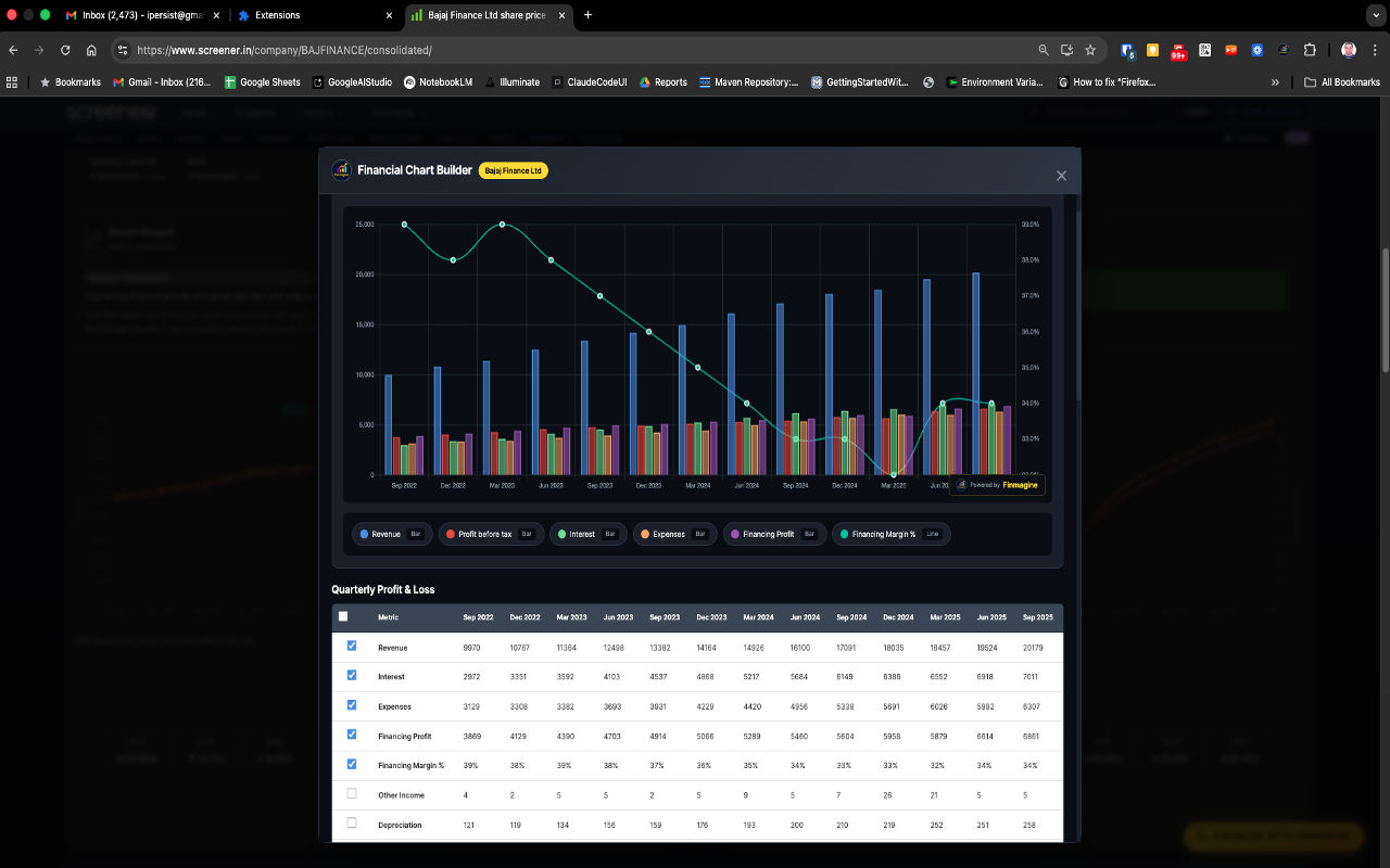
Reading the Bajaj Finance Example
What's Being Visualized:
- Blue Bars: Revenue (~10,000 to 20,000 crores)
- Red/Pink Bars: Profit before tax
- Green Bars: Interest expenses
- Orange Bars: Operational expenses
- Purple Bars: Financing Profit
- Cyan Line: Financing Margin % (right axis, ~25-28%)
Key Insights Visible:
- Revenue Growth: Blue bars showing consistent upward trajectory
- Margin Compression: Cyan line declining from ~28% to ~25% despite revenue growth
- Cost Structure: Interest and Expenses growing proportionally
- Profitability Trend: Purple bars growing but margin pressure visible
Investment Thesis from This Chart:
"Bajaj Finance is growing revenue strongly (nearly doubling), but facing margin compression from ~28% to ~25%. This suggests competitive pricing pressure or shift to lower-margin products. Investors should investigate whether this is strategic (market share grab) or structural (industry compression)."
Why Dual-Axis Matters
If you plot ₹20,000 crores and 27% on the same axis, the 27 becomes an invisible flat line at the bottom. The margin trend—often the most important analytical insight—disappears into visual noise.
Finmagine's Solution:
- Automatically detects value types (currency vs percentage)
- Creates two Y-axes with appropriate scales
- Both metrics utilize full vertical height
- Every trend clearly visible and readable
Use Interactive Features
Your chart isn't static—it's a dynamic analytical workspace with powerful interactive features.
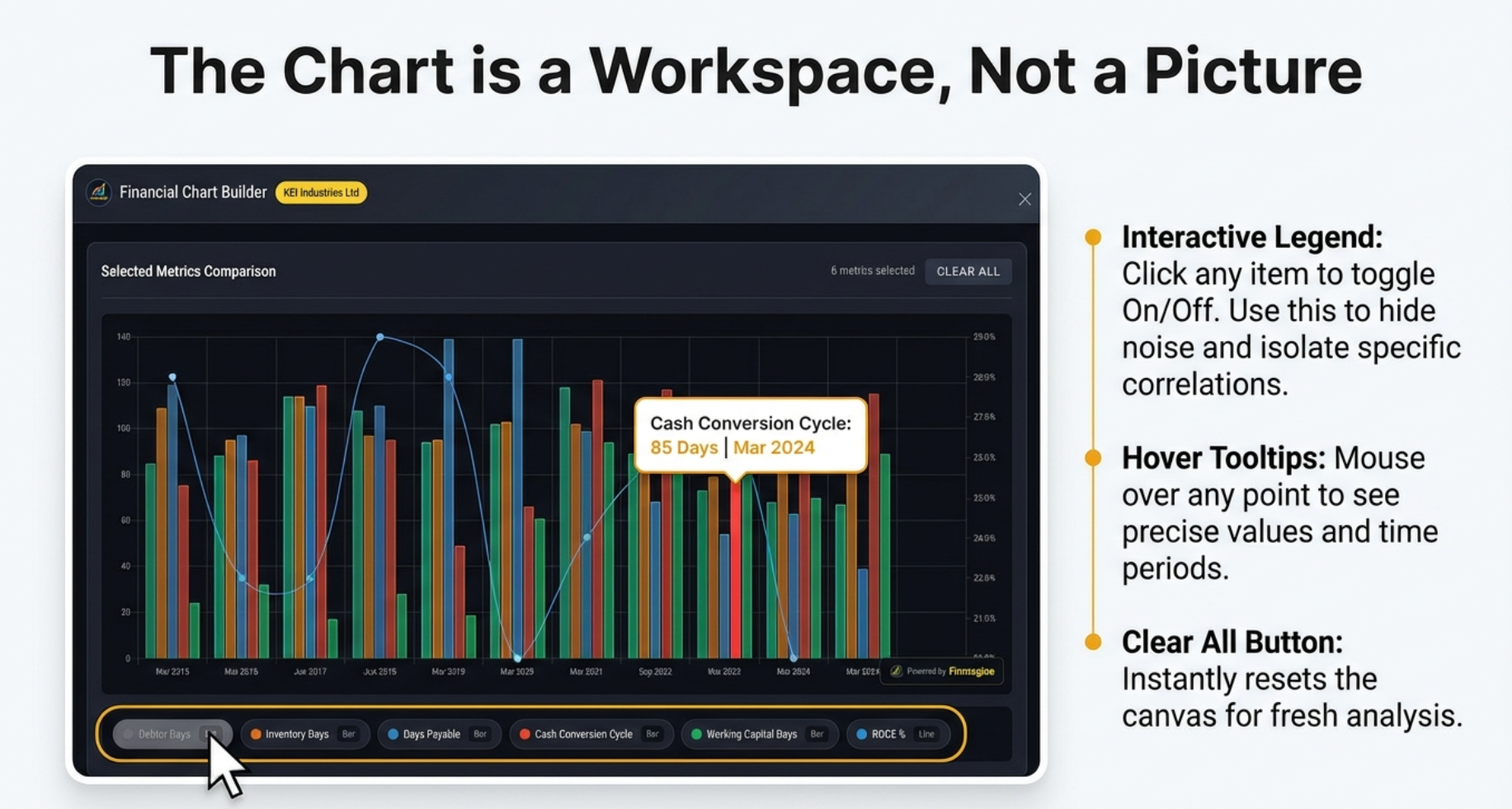
Interactive Legends: Click to Show/Hide
Below every chart is a legend row with all selected metrics. These aren't just labels—they're interactive controls.
How It Works:
- Click Any Legend Item: Hides that metric from chart
- Click Again: Brings metric back
- Toggle Multiple: Hide/show any combination
- Visual Feedback: Hidden metrics appear grayed out
Practical Use Case: Isolating Relationships
In the KEI Industries chart showing 6 working capital metrics:
- Initial view shows all 6 metrics (crowded)
- Click to hide "Debtor Days", "Inventory Days", "Days Payable"
- Now see only "Cash Conversion Cycle" and "ROCE%"
- Test hypothesis: Does efficiency improvement correlate with profitability?
The "Clear All" Button
Near the top of the modal, the "CLEAR ALL" button:
- Function: Unchecks all selected metrics instantly
- Effect: Chart disappears, returns to blank state
- Use Case: Starting fresh analysis without closing modal
Hover Tooltips: Precise Values
Hover your mouse over any bar or line point:
- Tooltip Appears: Shows exact numeric value
- Context: Displays metric name and time period
- Multi-Metric: If metrics overlap, shows all values
Example: Hovering over Revenue bar for "Mar 2024" shows:
Revenue: ₹15,234 crores | Q4 FY2024
Exporting Charts
While there's no dedicated "Export" button (privacy-first, no cloud account), you can capture charts using:
Method 1: System Screenshots
- Windows: Windows + Shift + S, select chart area
- Mac: Cmd + Shift + 4, drag to select chart
Method 2: Browser Developer Tools
- Right-click chart, select "Inspect"
- Press Ctrl+Shift+P (Cmd+Shift+P on Mac)
- Type "screenshot", select "Capture node screenshot"
- Perfect PNG of just the chart element
Advanced Features & Analytical Techniques
Sector-Specific Analytical Recipes
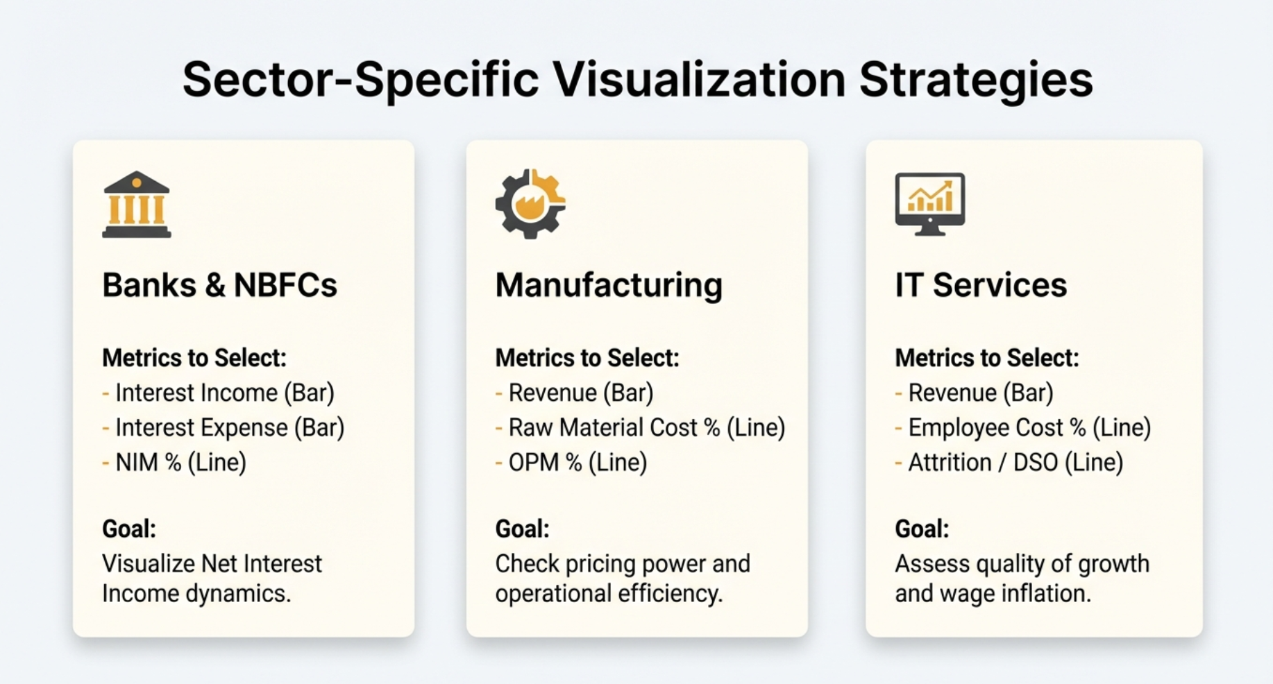
For Banks & NBFCs
Key Metrics:
- Interest Income + Interest Expense → See Net Interest Income (NII)
- Net Interest Margin (NIM%) → Profitability of lending
- Provisions & Contingencies → Asset quality indicator
- Gross NPA% and Net NPA% → Non-performing asset trends
For Manufacturing Companies
Operating Efficiency Dashboard:
- Revenue (top line)
- Raw Material Cost % → Pricing power indicator
- Employee Cost % → Labor efficiency
- OPM% → Overall operational efficiency
- Asset Turnover Ratio → Capital intensity
- Working Capital Days / Cash Conversion Cycle
For IT/Services Companies
Quality of Growth Metrics:
- Revenue
- EBITDA Margin% → Operational leverage
- Days Sales Outstanding (DSO) → Collections efficiency
- Employee Cost % → Wage inflation impact
Pattern Recognition Techniques
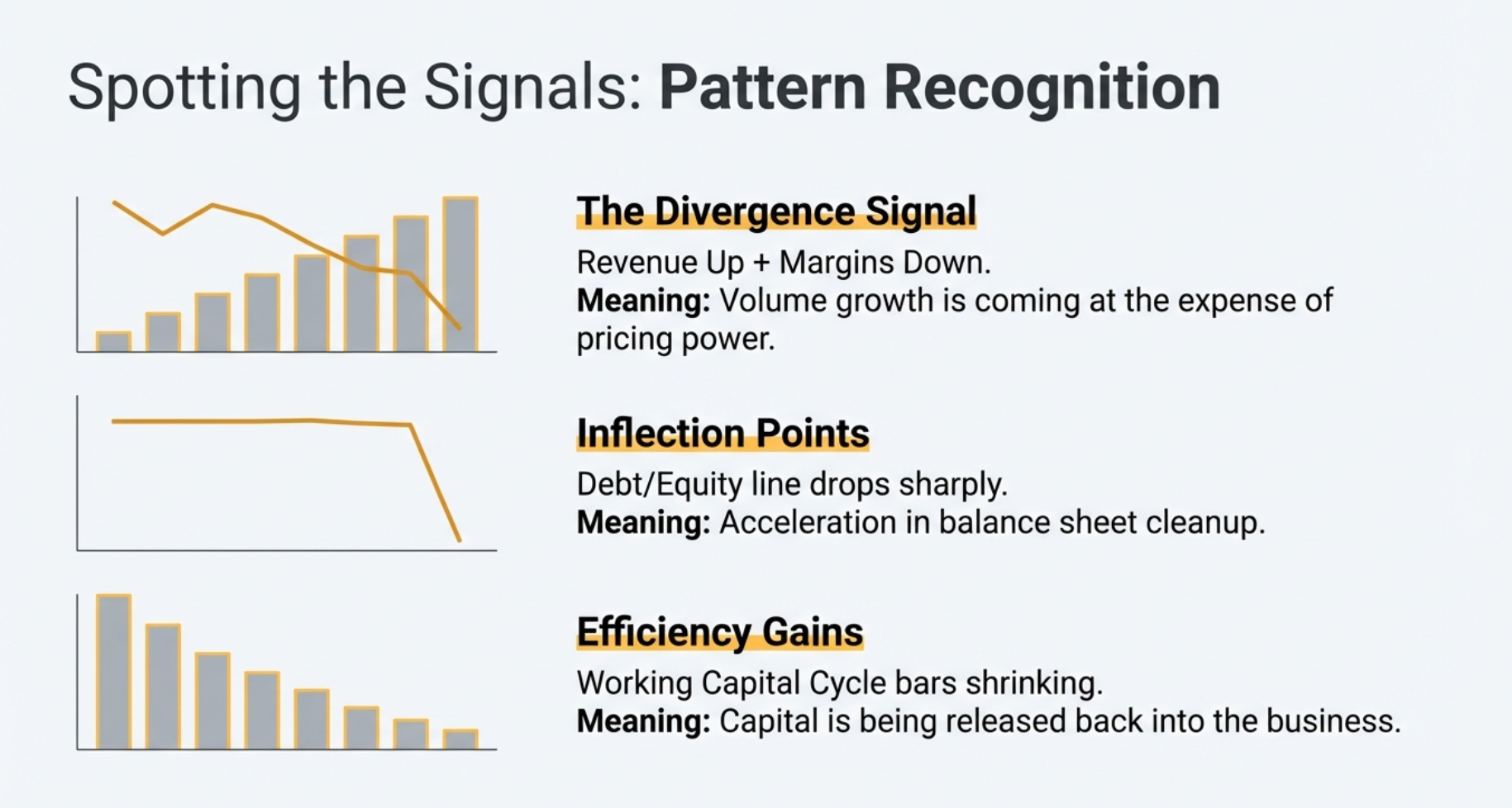
The "Divergence Signal"
Look for metrics moving in opposite directions:
- Revenue ↑ + Margin ↓: Volume growth at expense of pricing power
- Profit ↑ + Cash Flow ↓: Accounting profits not converting to cash
- Assets ↑ + ROCE Flat: Growth without efficiency improvement
The "Inflection Point Detection"
Charts make inflection points visually obvious:
- Margin Bottoming: OPM% line reaches low point and starts rising
- Debt Reduction Acceleration: Debt/Equity slope changes from gradual to steep
- Working Capital Improvement: Cash Conversion Cycle dropping sharply
Keyboard Shortcuts
- Escape Key: Closes Chart Builder modal instantly
- Scroll Wheel: Navigate through financial sections
- F5: Refresh page if extension seems stuck
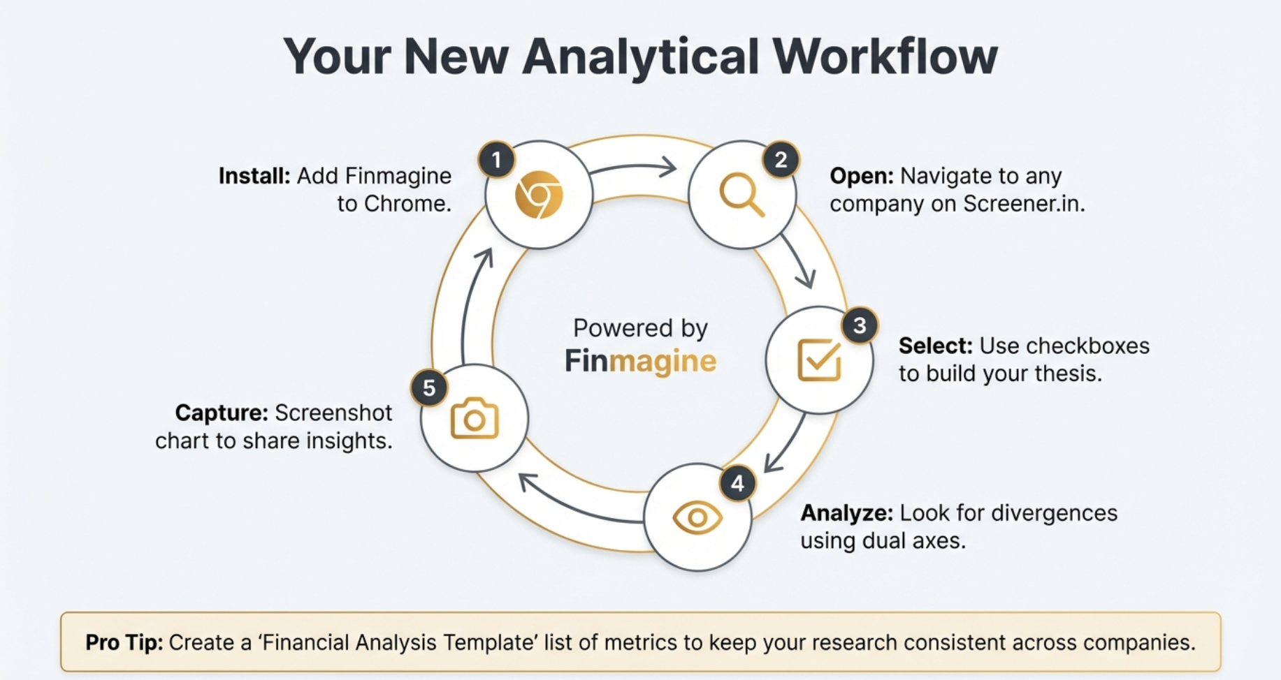
Your Complete Analytical Workflow
Here's a visual summary of the complete workflow from installation to insight capture:
Troubleshooting & FAQ
Common Issues & Solutions
Problem: Button Not Appearing
Solutions:
- Check you're on a company detail page (not homepage)
- Verify extension is installed and enabled at
chrome://extensions/ - Refresh page (F5)
- Ensure using Chrome/Edge/Brave browser
Problem: Charts Not Rendering
Solutions:
- Select at least one metric (charts require data)
- Check internet connection (Chart.js loads from CDN)
- Try incognito mode (test without other extensions)
Problem: Charts Look Distorted
Solutions:
- Reset browser zoom to 100% (Ctrl/Cmd + 0)
- Disable dark mode extensions for Screener.in
Frequently Asked Questions
Is this extension really free?
Answer: Yes, 100% free forever. No trial, no premium tier, no hidden costs.
Does it collect my data?
Answer: Your charts, analysis, and research habits are never transmitted. Stock fundamentals from Screener.in pages you visit are passively contributed to Finmagine's shared cache (anonymously, aggregate only) — no personal data or browsing history is tracked.
Can I use on mobile?
Answer: No, Chrome extensions only work on desktop browsers. However, screenshots are mobile-responsive.
Can I compare multiple companies?
Answer: Not on one chart, but you can screenshot each company's charts and place side-by-side in presentation software.
How many metrics can I plot simultaneously?
Answer: Technically unlimited, but for readability, we recommend 6-8 metrics maximum. Beyond that, use the interactive legend to toggle visibility.
You're Now a Finmagine Power User!
Congratulations on completing this comprehensive tutorial. You now know how to transform static Screener.in tables into professional financial visualizations in seconds.
What You've Learned:
- ✅ Installing and activating the extension
- ✅ Navigating the Chart Builder interface
- ✅ Selecting metrics for different analysis types
- ✅ Understanding dual-axis charts and visual encoding
- ✅ Using interactive legends and tooltips
- ✅ Mixing quarterly and annual data
- ✅ Sector-specific analytical recipes
- ✅ Pattern recognition techniques
- ✅ Troubleshooting common issues
Financial analysis just got dramatically faster and more visually intuitive. What used to require Excel exports, manual formatting, and 10+ minutes per company now takes seconds.
Next Steps:
- Practice creating charts for companies you're researching
- Experiment with different metric combinations
- Build analytical templates for recurring patterns
- Share screenshots (with Finmagine watermark for credibility!)
Explore more tools and resources at Finmagine.com—where we transform financial analysis from tedious to effortless.
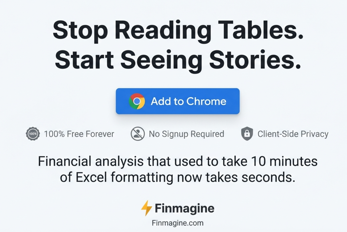
Free Chrome Extension
Ready to try this yourself?
Install the Finmagine Financial Chart Builder and transform any Screener.in, Google Finance, or stockanalysis.com page into interactive charts in one click.
Install from Chrome Web Store →No account required • Works on Chrome, Edge, Brave, Opera
Explore the Complete Chart Builder Hub
Discover all Chart Builder resources — tutorials, Google Finance integration, case studies, and more. Transform Screener.in & Google Finance data into professional charts.
Visit Chart Builder Hub →