Following along? Install the extension first
Finmagine Financial Chart Builder — free • no account needed • Chrome, Edge, Brave
Multimedia Learning Hub
Master every feature of the Finmagine Financial Chart Builder through video, audio, comprehensive overview, and interactive knowledge testing
Complete Learning Path
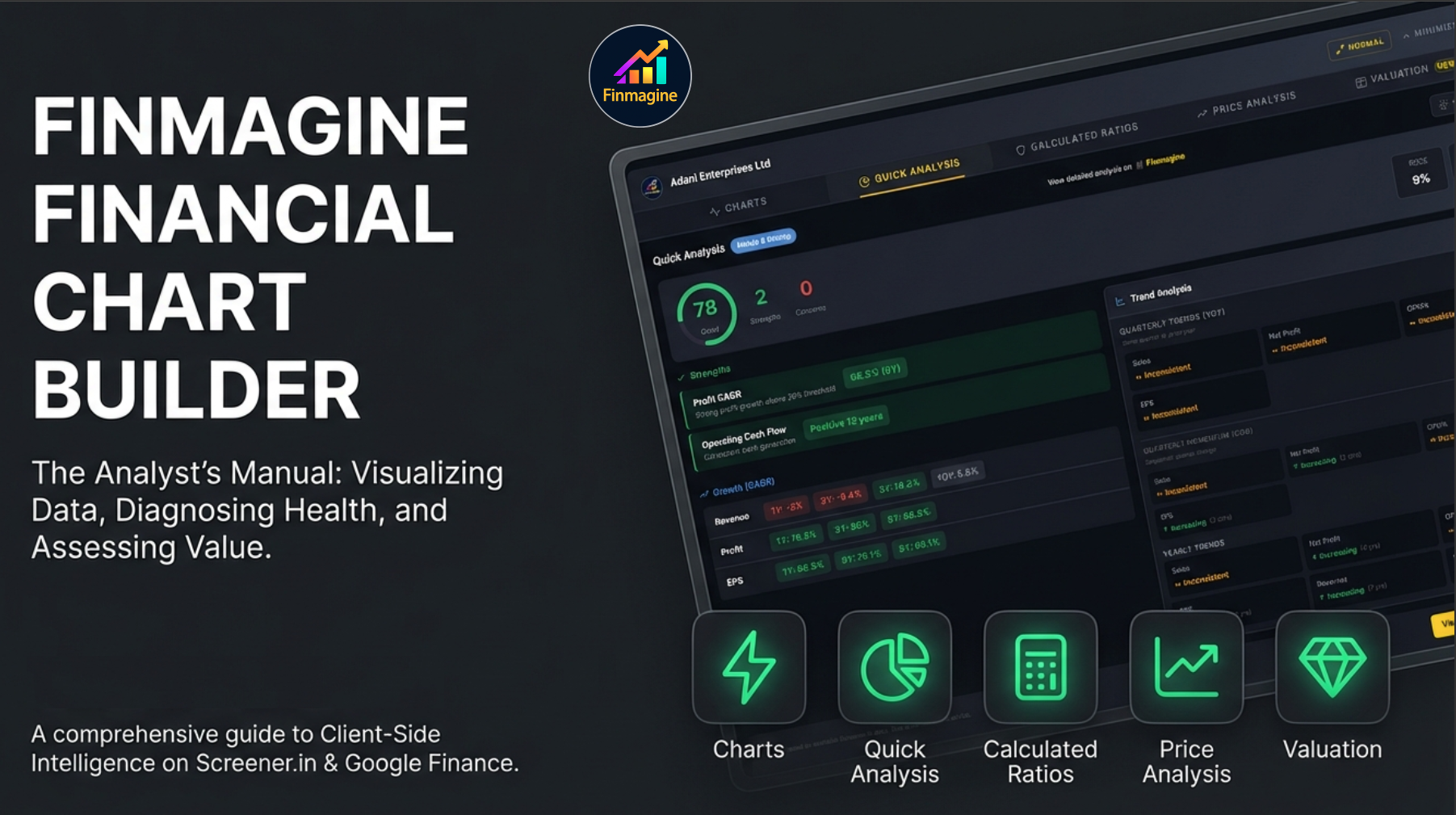
This is the definitive tutorial for version 2.2.0 of the Finmagine Financial Chart Builder Chrome extension. It goes beyond the basics to cover every tab, every button, every customization, and every analytical technique built into the tool. Whether you use Screener.in for Indian equities or Google Finance for global stocks, this guide transforms you from a first-time user into a power analyst.
What You Will Master:
- Tab 1 — Charts: Dual-axis visualization, metric persistence, Select All, Clear All, Reset Preferences, 10-color palette, bar/line auto-detection, and the Google Finance Minimize-Restore workflow
- Tab 2 — Quick Analysis: Sector-aware health scoring (0–100), strengths/concerns engine, CAGR analysis, YoY/QoQ trend analysis, shareholding movement tracking, and the Settings modal with 3 strictness presets and individual threshold sliders
- Tab 3 — Calculated Ratios: 11+ derived solvency, profitability, and efficiency ratios, DuPont Analysis (ROE decomposition), the color-coded Excellent/Good/Average/Poor rating system, and formula transparency on hover
- Tab 4 — Price Analysis: Price vs Fundamentals comparison with CATCHING UP / FAIRLY VALUED / RUNNING AHEAD verdicts, Cyclical Quarter Analysis with seasonal rankings, 52-week Risk Metrics with Max Drawdown, and the CAGR comparison table across 4 time horizons
- Tab 5 — Valuation: 4 historical multiples (PE, EV/EBITDA, P/B, Mkt Cap/Sales) vs 5-year median, sector-aware weighted verdicts across 19 sectors, PEG Ratio with growth-adjusted interpretation, NIFTY 50 Benchmark comparison, relevance tags, and dimmed card logic
- Panel Controls: Width Toggle (Normal 1100px / Wide 1400px), Refresh button, Minimize/Restore, Finmagine header branding, and the Powered by Finmagine watermark
- Google Finance Protocol: The single-view limitation, auto-detection indicators, MutationObserver auto-refresh, and the Select View First golden rule
Who This Tutorial Is For:
- Indian equity investors using Screener.in for fundamental research
- Global stock analysts using Google Finance for US, European, and Asian equities
- Finance students learning DuPont Analysis, valuation multiples, and ratio interpretation
- Value investors seeking sector-aware undervaluation signals
- Growth investors wanting to validate PE multiples with PEG ratios
- Anyone who has stared at a wall of numbers on Screener.in and wished for clarity
The Ultimate Stock Valuation Framework | Deep Dive
Watch a comprehensive deep dive into the Valuation tab's 4-layer framework — historical context, sector-specific weighted scoring, PEG growth sanity checks, and NIFTY 50 market benchmarks — with real company examples.
Video: The Ultimate Stock Valuation Framework | Finmagine Financial Chart Builder v2.2.0 Deep Dive
Complete video demonstration featuring Affle India, National Aluminium, Bajaj Finance, and more
Listen to the Audio Deep Dive
Prefer to listen? This comprehensive audio walkthrough covers the complete v2.2.0 feature set — from installation through all five tabs — with real-world investment analysis examples.
Duration: Full deep dive | Format: Professional narration
Deep dive audio exploring the 4-pillar valuation framework, sector-weighted verdicts, PEG ratios, and NIFTY benchmarks
Test Your Knowledge — 74 Flashcards
Click any flashcard to reveal the answer. Use the search box to filter by topic. These cover every tab, every metric, every threshold, and every workflow in the extension.
Table of Contents
- The Wall of Numbers Problem — and the 5-Tab Solution
- Installation & Architecture
- Panel Controls & Width Toggle
- Tab 1: Charts — The Visualization Engine
- Tab 2: Quick Analysis — Instant Health Diagnostics
- Tab 3: Calculated Ratios — The Engine Room
- Tab 4: Price Analysis — Timing the Entry
- Tab 5: Valuation — The Decision Engine
- Sector Intelligence in Action — 7 Companies, 3 Verdicts
- The 5-Tab Workflow in Action: Affle (India) Ltd
- The Complete Analyst Workflow & Speed Screening
- Troubleshooting & FAQ
The Wall of Numbers Problem — and the 5-Tab Solution
If you have ever sat in front of Screener.in or Google Finance at 11 PM, staring at row after row of financial data, trying to mentally subtract column C from column F while remembering what was in column A, you know the feeling. Your eyes glaze over. Your brain does mental gymnastics just to spot a trend. After 10 minutes of scrolling, the cognitive load is so overwhelming that you miss the very signals you were looking for.
That is exactly where the Finmagine Financial Chart Builder enters the picture. It is a free Chrome extension that shatters that wall of numbers in milliseconds. But version 2.2.0 goes far beyond simple charting. It delivers a complete, five-tab analytical workflow that takes you from raw data to a confident investment decision:
- Charts Tab — The Crime Scene: What actually happened? What do the numbers say?
- Quick Analysis Tab — The Background Check: Is this company reliable? Does it have a good history?
- Calculated Ratios Tab — The Forensics Lab: How exactly did they achieve their results? What is the hidden mechanism?
- Price Analysis Tab — The Evidence: Is the price of admission justified by the underlying value?
- Valuation Tab — The Verdict: What does the market say? How does this compare to its own history and the broader market?
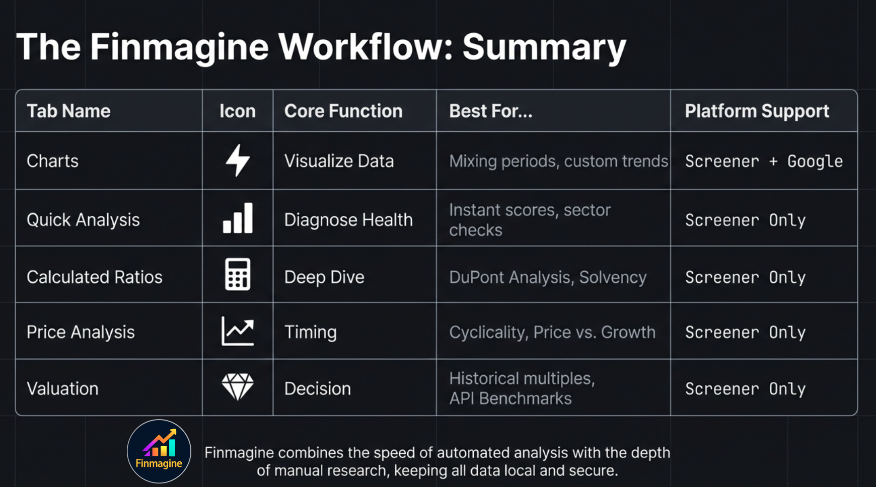
Here is the logical progression of the five tabs:
| Tab | Icon | Core Question | Data Source | Screener.in | Google Finance |
|---|---|---|---|---|---|
| Charts | ⚡ | What does the financial data look like visually? | DOM extraction | Yes | Yes |
| Quick Analysis | 📊 | How healthy is this company, sector-adjusted? | DOM extraction | Yes | No |
| Calculated Ratios | 🧮 | What do the derived financial ratios reveal? | DOM extraction | Yes | No |
| Price Analysis | 📈 | Is the price justified by fundamentals? | DOM extraction | Yes | No |
| Valuation | 💎 | Is the stock cheap or expensive vs its own history? | Screener.in API | Yes | No |
Installation & Architecture
The Finmagine Financial Chart Builder is a free Chrome extension with zero configuration required. It works on Chrome, Microsoft Edge, Brave, and all Chromium-based browsers.
Installation Steps
- Visit the Chrome Web Store: Search for "Finmagine Financial Chart Builder" or click here for the direct link
- Click "Add to Chrome" and confirm the installation
- Navigate to a company page on Screener.in or click "Financials" on Google Finance
- Click the golden "Visualize with Finmagine" button (bottom-right corner)
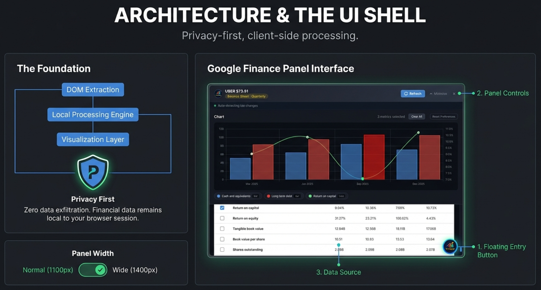
Privacy-First Architecture
Every computation — from health scores to DuPont Analysis to valuation verdicts — runs entirely in your browser. Your charts, analysis, and research habits are never transmitted to any server. Think of it as having a financial analyst sitting inside your browser tab, reading the same page you see, and computing everything locally in real time.
Platform Support
Screener.in (India): All five tabs available. Screener delivers server-rendered static HTML, so the extension extracts up to 8 data sections simultaneously: Quarterly P&L, Annual P&L, Quarterly Balance Sheet, Annual Balance Sheet, Quarterly Cash Flow, Annual Cash Flow, Financial Ratios, and Shareholding Pattern.
Google Finance (Global): Charts tab only. Google Finance is a React single-page application that shows only one financial statement at a time. The extension adapts with auto-detection, a Refresh button, MutationObserver auto-refresh, and the Minimize-Restore workflow for switching views.
Panel Controls & Width Toggle
Before diving into the five tabs, let's master the panel itself. Every tab shares the same shell, and understanding the controls will make your workflow faster.
Panel States
| State | Description | How to Access |
|---|---|---|
| Closed | Panel hidden, golden float button visible | Click X or outside panel |
| Minimized | Thin bar docked at bottom showing metric count | Click Minimize button |
| Expanded | Full panel, viewport-centered | Click float button or minimized bar |
Header Controls (Left to Right)
- Company Name: Displayed with the Finmagine logo
- Statement Badge (Google Finance only): Shows which statement and period is loaded (e.g., "Income Statement · Quarterly")
- Finmagine Header Brand (Non-Charts tabs): Subtle branded link — "View detailed analysis on Finmagine" / "Explore 190+ ratios on Finmagine" / "Explore Valuation Tools on Finmagine"
- Refresh Button (Google Finance only): Re-extracts data after switching views
- Width Toggle: Switches between Normal (88%, max 1100px) and Wide (96%, max 1400px). Your preference is saved in localStorage and persists across sessions. In Wide mode, the toggle shows a subtle gold tint. A smooth 0.3s CSS transition animates the change.
- Minimize: Collapses to thin bar at bottom
- Close (X): Closes the panel entirely
Chart Section Controls
- Metric Count: Shows "3 metrics selected" dynamically
- Clear All: Wipes the current chart clean but preserves your saved metric preferences in the background. Use 99% of the time.
- Reset Preferences: Clears the current chart and wipes all saved preferences from browser storage. Factory reset. Use rarely.
- Select All (per section): Checkbox in each table header to select/deselect all metrics in that section
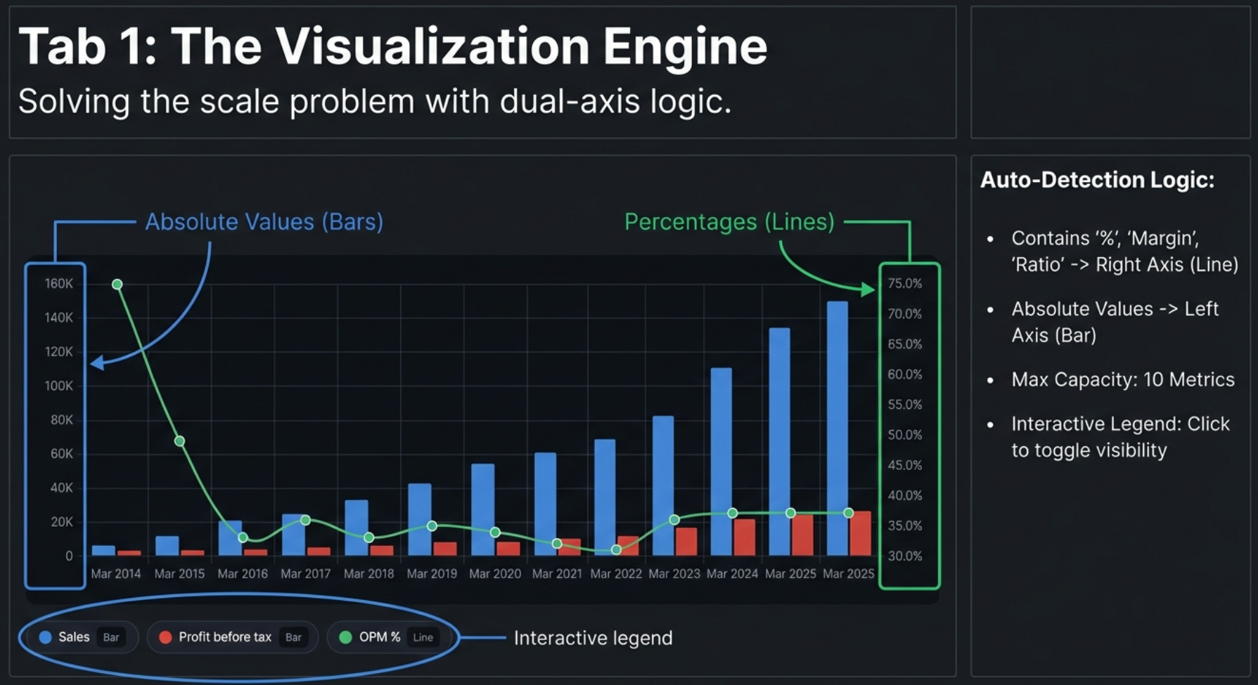
- Interactive Legend: Click any legend item to toggle that metric's visibility. Hidden items appear grayed out
- Powered by Finmagine: Watermark link in the chart area
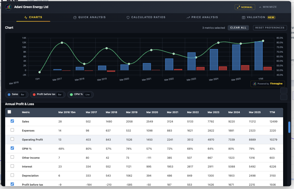
Charts — The Visualization Engine
The Charts tab is the foundation of the extension and the only tab available on both Screener.in and Google Finance. It transforms financial data tables into interactive, dual-axis charts with a single click.
Screener.in: 8 Data Sections at Once
When you open the panel on Screener.in, the extension has already extracted up to 8 distinct data sections from the page. All are available simultaneously — no tab switching required:
| Section | Period | Example Metrics |
|---|---|---|
| Quarterly Profit & Loss | 12+ quarters | Sales, Expenses, Operating Profit, OPM%, Net Profit, EPS |
| Quarterly Balance Sheet | 12+ quarters | Equity, Reserves, Borrowings, Fixed Assets |
| Quarterly Cash Flow | 12+ quarters | Cash from Operations, Investing, Financing |
| Annual Profit & Loss | 10+ years | Same as quarterly but full fiscal year data |
| Annual Balance Sheet | 10+ years | Total Assets, Net Worth, Working Capital |
| Annual Cash Flow | 10+ years | Free Cash Flow, Operating CF, Financing CF |
| Financial Ratios | 10+ years | ROCE, ROE, Current Ratio, Debt/Equity |
| Shareholding Pattern | Recent quarters | Promoter %, FII %, DII %, Public % |
Selecting Metrics
Click the checkbox next to any metric name. The chart updates in real time with smooth animations — no "Generate" or "Submit" button needed. You can mix metrics from different sections on the same chart. Want quarterly Revenue alongside annual ROCE? Just check both. The extension creates a unified chronological X-axis.
Dual-Axis System
This is the core innovation that makes the charts actually useful. If you plot Revenue (₹20,000 Cr) and OPM% (27%) on the same axis, the 27% becomes an invisible flat line at the bottom. The extension solves this automatically:
- Left Y-Axis (Bars): Absolute values — Revenue, Net Profit, Expenses, Assets, Borrowings
- Right Y-Axis (Lines): Percentage values — OPM%, ROCE%, ROE%, margins, ratios
Auto Chart Type Detection
The system determines chart type from the metric name:
- Contains "%" → Line chart (right axis)
- Contains "margin", "ratio", "return", "ROE", "ROCE" → Line chart
- Everything else → Bar chart (left axis)
Color Palette
A 10-color palette (Blue, Red, Green, Orange, Purple, Teal, Dark Orange, Light Blue, Crimson, Emerald) assigns colors in order. Beyond 10 metrics, colors repeat. For readability, 3–5 metrics per chart is recommended; maximum is 10.
Metric Persistence (v2.1.0+)
Your metric selections are automatically saved and restored when you navigate to a different company. If you select Revenue, Net Profit, and OPM% on TCS, then navigate to Infosys, those same metrics will be pre-selected if Infosys has matching data.
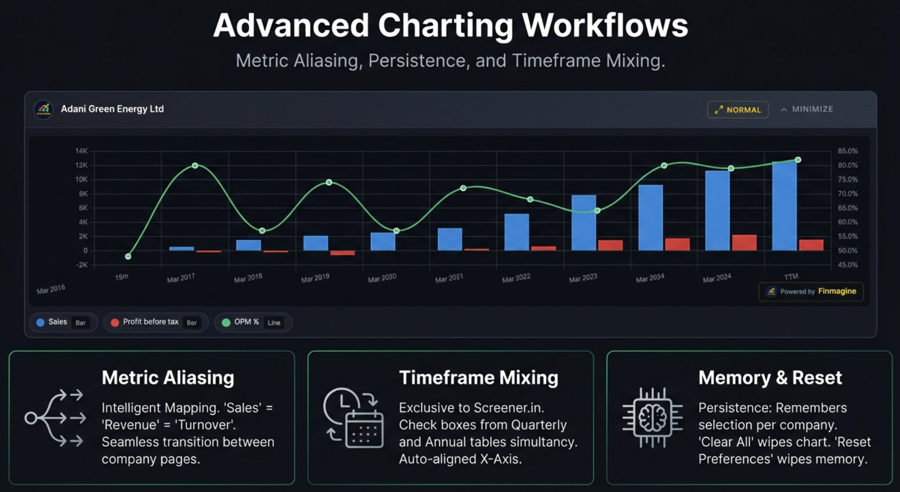
Metric Aliasing
Companies are not always consistent with their terminology. One calls it "Sales," another calls it "Revenue," a third uses "Net Sales." Finmagine handles this with a built-in thesaurus:
| These Terms Are Equivalent | Canonical Name |
|---|---|
| Sales, Revenue, Net Sales, Turnover | Revenue |
| Net Profit, PAT, Profit After Tax, Net Income | Net Profit |
| Operating Profit, EBIT, PBIT | Operating Profit |
| OPM %, Operating Margin %, Operating Margin | OPM % |
| EPS, Earnings Per Share, Diluted EPS | EPS |
This means your preferences seamlessly carry across companies that use different naming conventions.
Section Context
Metrics are saved with their section context. Annual P&L "Revenue" only restores to Annual P&L "Revenue" — it won't accidentally pre-select the Quarterly version. This prevents data confusion.
Site-Specific Storage
Screener.in and Google Finance have separate preference storage. Your Screener selections don't affect Google Finance and vice versa.
Google Finance: The Minimize-Restore Protocol
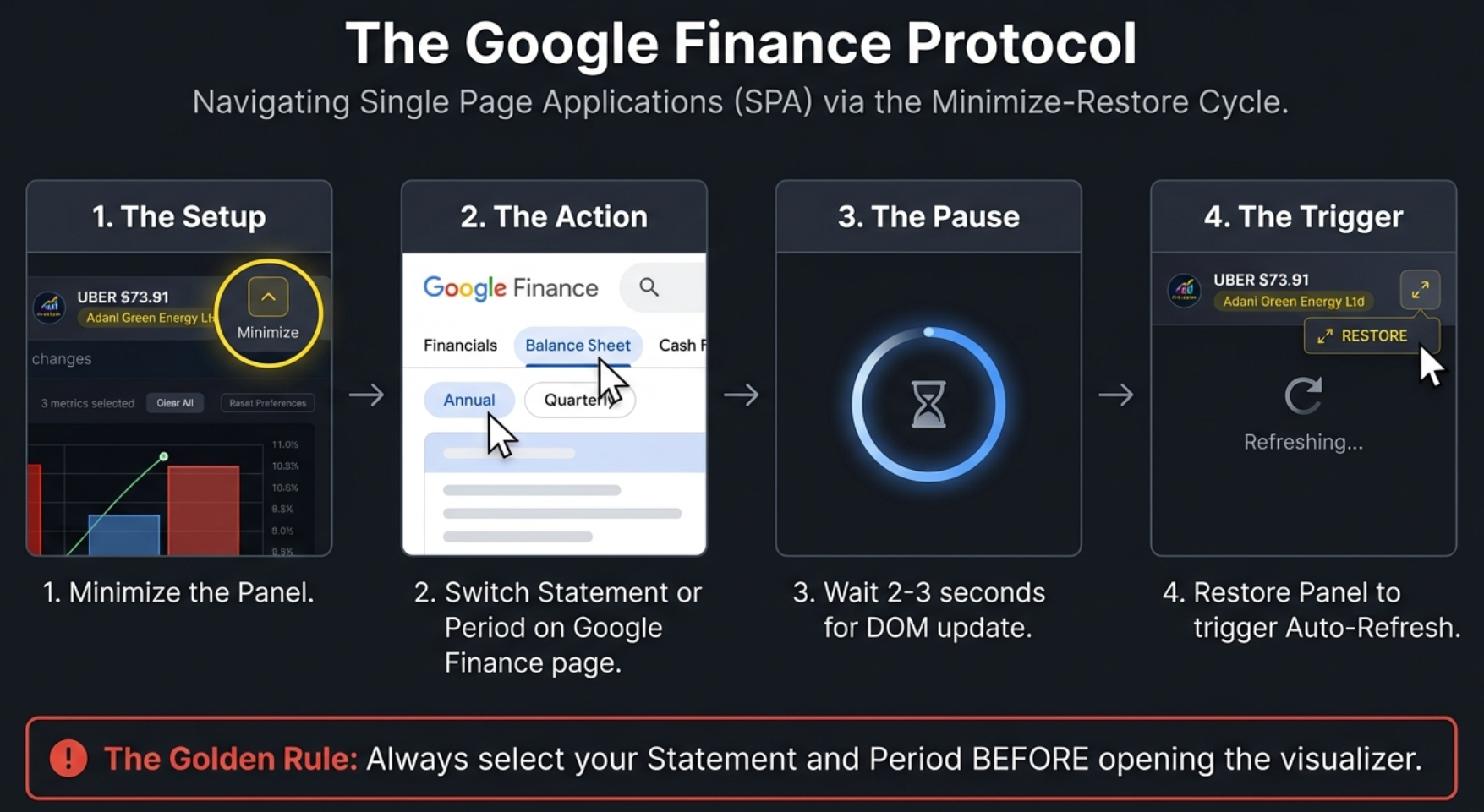
Before we dive into the Google Finance workflow, there is one important thing to understand: Screener.in is a buffet — everything is laid out on one long page. Google Finance is a vending machine — you push a button to see one specific thing at a time. This architectural difference is why Google Finance shows only one statement at a time, and the extension adapts with a specialized workflow:
The Golden Rule
The Minimize-Restore Cycle (4 Steps)
- Minimize the panel (click Minimize button)
- Switch the view on Google Finance (change statement tab or period toggle)
- Wait 2–3 seconds for React to render the new data
- Click the minimized bar to restore — auto-refresh fires automatically
Google Finance Interface Differences
- Statement Badge: Shows which statement and period is loaded (e.g., "Cash Flow · Quarterly")
- Refresh Button: Click after switching views for manual re-extraction
- Auto-Refresh Indicator: Green pulsing dot (idle), yellow spinning (refreshing), red (error)
- MutationObserver: Watches for DOM changes with a 1200ms debounce — auto-updates when Google Finance swaps table content
- Instructions Panel: Context-aware guidance explaining the one-view-at-a-time limitation
Charting Recipes for Google Finance
The Profitability Trend (Income Statement, Quarterly)
Select Revenue, Operating Income, and Net Income. Look for compression — if Revenue bars climb nicely but Operating and Net Income bars stay flat or shrink, costs are eating the growth. This pattern reveals margin erosion that a quick glance at the financial table often misses.
The Buyback Detection (Income Statement, Annual)
Select Net Income and EPS. In companies like Apple, Google, or Microsoft that do massive buybacks, you will see EPS climbing much faster than Net Income. That divergence is pure financial engineering — they are reducing the denominator (shares outstanding) rather than growing the numerator (actual profits). Finmagine's dual-axis chart makes this divergence instantly visible.
Interactive Features
- Hover Tooltips: Hover over any bar or line point to see exact values with metric name and time period
- Interactive Legend: Click any legend item to hide that metric. Click again to restore it. Hidden items appear grayed out. This is essential for isolating relationships — start with all metrics visible, then progressively hide to test hypotheses
- Escape Key: Closes the panel instantly
- Export: Use system screenshots (Windows: Win+Shift+S, Mac: Cmd+Shift+4) or browser DevTools node screenshot
Real-World Examples
Here is the Charts tab in action on two different platforms:
Screener.in — Adani Green Energy (Annual P&L)
Sales, OPM%, and Profit Before Tax charted together on a dual-axis view. Bars show absolute values (left axis), while the OPM% line tracks margin trends on the right axis. Notice how Sales grew exponentially from 28 Cr to 12,499 Cr while OPM climbed from 68% to 82%.
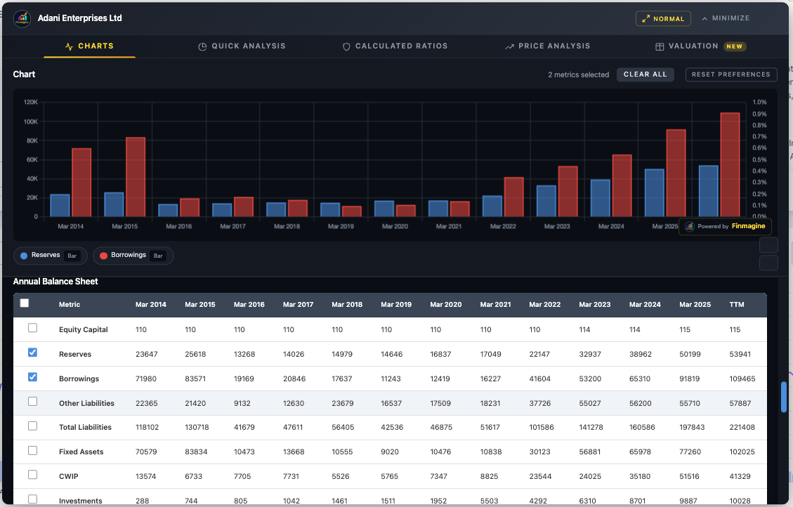
Screener.in — Adani Enterprises (Annual Balance Sheet)
Reserves vs Borrowings comparison revealing the capital structure evolution. This chart instantly shows how borrowings surged past reserves from 2021 onward — a red flag that warrants further analysis in the Calculated Ratios tab.
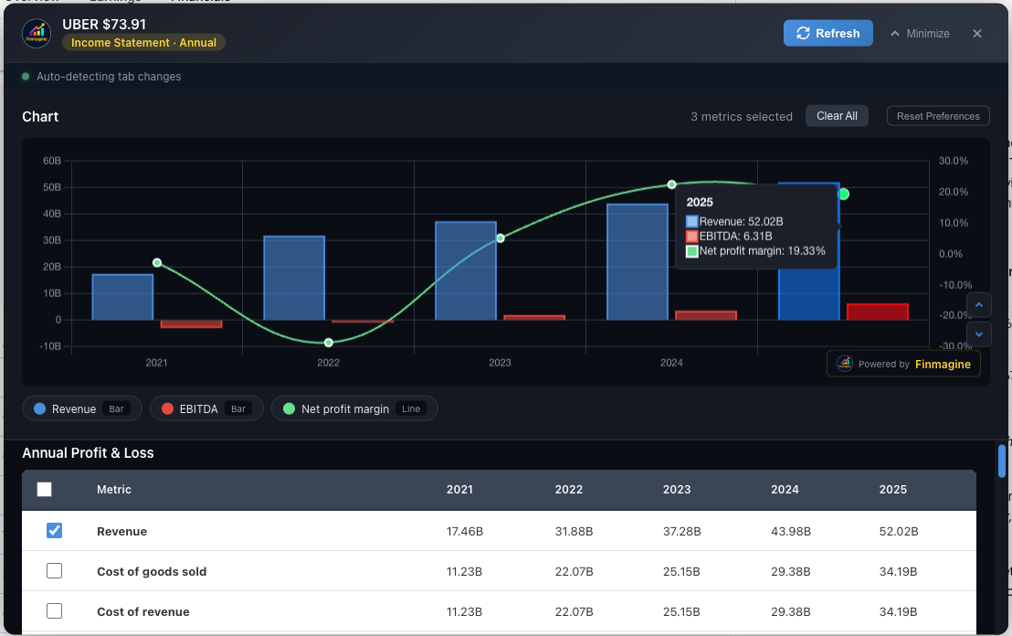
Google Finance — Uber (Annual Income Statement)
Revenue, EBITDA, and Net Profit Margin charted on Google Finance. The dual-axis logic works identically — Revenue and EBITDA as bars, NPM% as a line. Uber's turnaround from negative margins to 19.33% NPM is immediately visible.
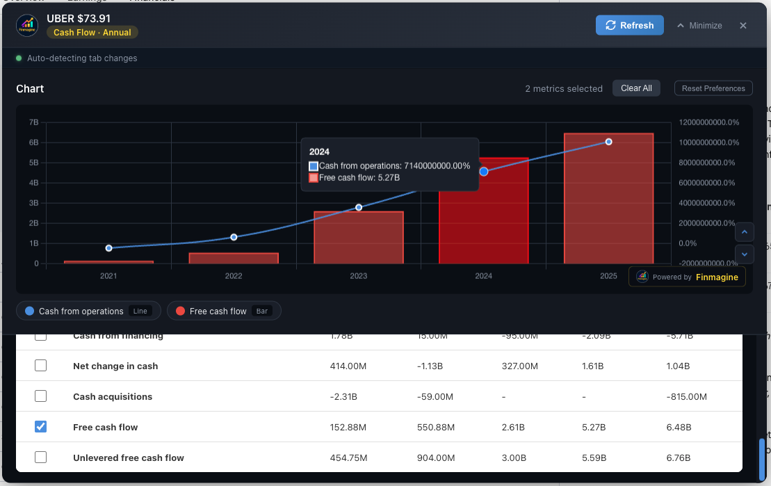
Google Finance — Uber (Annual Cash Flow)
Cash from Operations and Free Cash Flow showing Uber's dramatic FCF inflection. From $152M in 2021 to $6.48B in 2025 — a story that only a chart can tell at a glance.
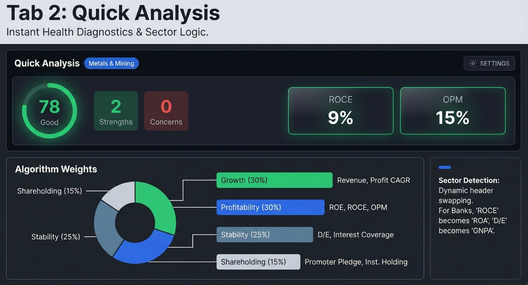
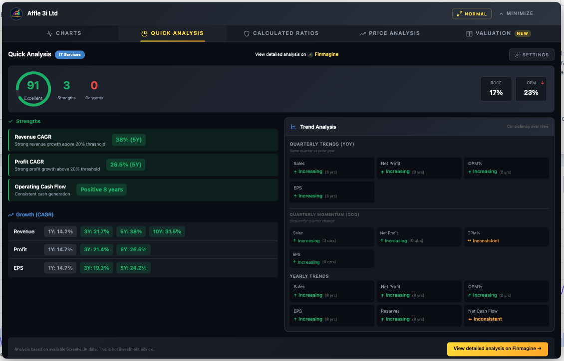
Quick Analysis — Instant Health Diagnostics
Quick Analysis transforms 10+ years of financial statements into a single health score with sector-aware intelligence. It answers: "How healthy is this company?" in under one second. Available on Screener.in only (requires 10+ years of P&L data).
Health Score Algorithm
The circular health score indicator (0–100) is a composite weighted score:
| Component | Weight | What It Measures |
|---|---|---|
| Growth | 30% | Revenue CAGR, Profit CAGR across multiple time horizons |
| Profitability | 30% | ROE, ROCE, Operating Profit Margin |
| Stability | 25% | Debt/Equity, Interest Coverage, Cash Flow consistency |
| Shareholding | 15% | Promoter holding level, pledge status, institutional trends |
| Score Range | Label | Color | Interpretation |
|---|---|---|---|
| 80–100 | Excellent | Green | Outstanding financial health |
| 65–79 | Good | Light Green | Solid financial position |
| 50–64 | Average | Yellow | Acceptable, monitor closely |
| 35–49 | Below Average | Orange | Significant concerns |
| 0–34 | Poor | Red | Major financial stress |
Key Metrics in Header
The header row displays key ratios alongside the health score for quick reference: ROCE, OPM, ROE, and D/E. For Banking/NBFC companies, these dynamically swap to NIM (Net Interest Margin), GNPA (Gross NPA), CASA ratio, and ROA. Each metric shows a trend arrow: ↑ Green (improving), ↓ Red (declining), → Gray (stable).
Sector Detection
The extension auto-detects the company's sector from the Peer Comparison breadcrumb on Screener.in. It recognizes 18 sectors plus a General fallback. Sector detection drives the entire analysis — threshold adjustments, special handling rules, and metric selection.
Strengths & Concerns Engine
The left column lists positive characteristics (green check marks) and risk flags (red warnings):
- Strengths: Strong Revenue/Profit CAGR, high ROCE, consistent operating cash flow, debt-free status, increasing promoter holding
- Concerns: Declining OPM (3+ years), negative operating cash flow, high D/E ratio, declining promoter holding, high pledge percentage, FII selling
Growth (CAGR) Analysis
Compound Annual Growth Rates across four time horizons: 1Y, 3Y, 5Y, and 10Y for Revenue, Profit, and EPS. Color-coded: Green (≥15%), Gray (5–15%), Red (<5%). The pattern across timeframes reveals the growth trajectory:
| Pattern | Example | Interpretation |
|---|---|---|
| Accelerating | 1Y: 25%, 5Y: 15% | Growth is speeding up (bullish) |
| Decelerating | 1Y: 5%, 5Y: 20% | Growth is slowing (watch closely) |
| Consistent | 1Y: 18%, 5Y: 17% | Stable, predictable growth |
| Volatile | 1Y: -5%, 5Y: 25% | Erratic, needs investigation |
Trend Analysis & Shareholding Movement
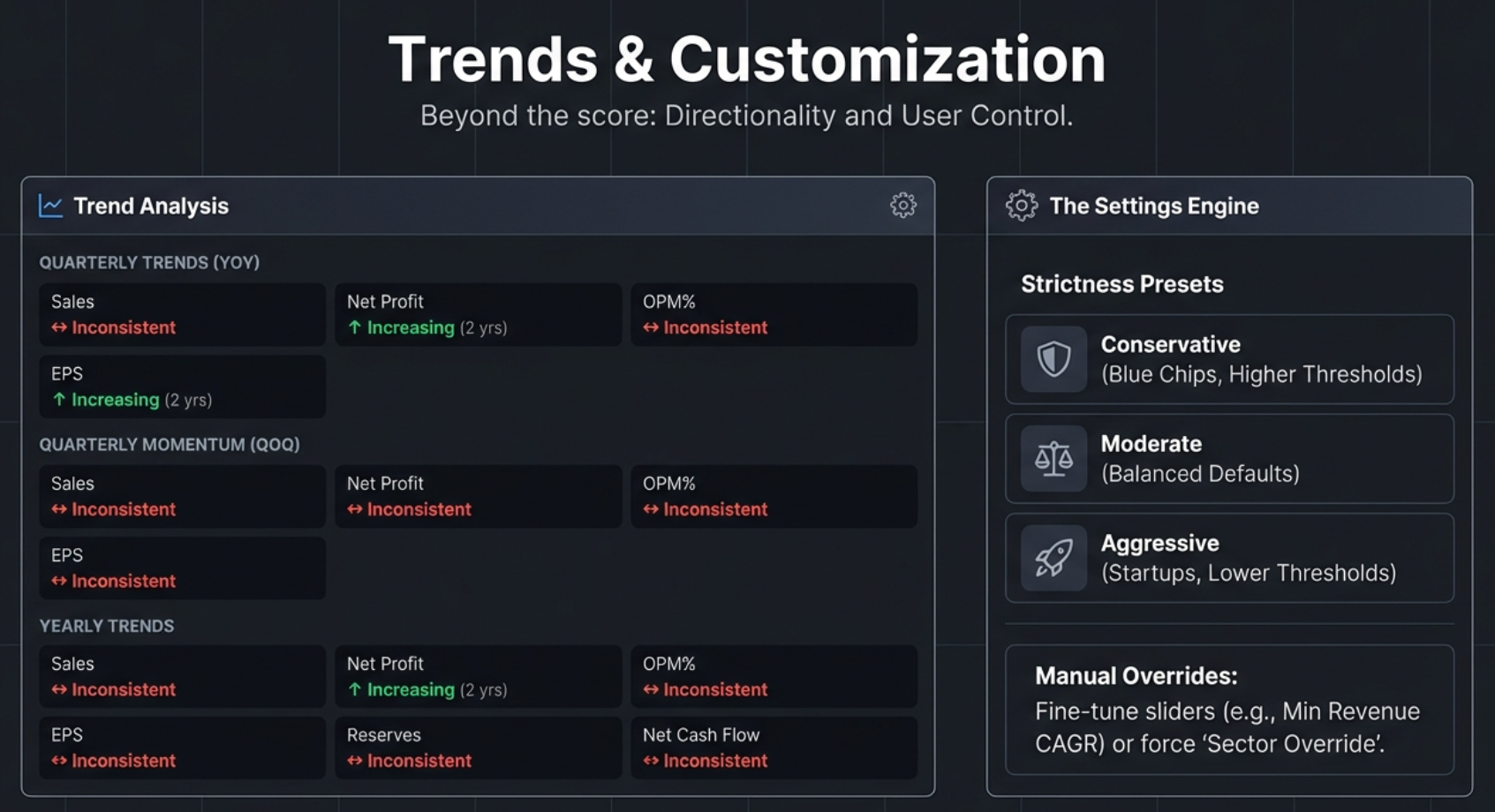
Quarterly Trends (YoY) — Primary
Year-over-Year comparison removes seasonality: Q3 FY26 vs Q3 FY25 vs Q3 FY24. Shows Sales, Net Profit, OPM%, EPS direction with ↑ (Increasing/Green), ↓ (Decreasing/Red), ↔ (Inconsistent/Yellow).
Quarterly Momentum (QoQ) — Secondary
Sequential quarter comparison (Q3 → Q2 → Q1) shows recent momentum. Good for detecting turning points but noisy due to seasonality.
Yearly Trends
Annual comparison for structural analysis: Sales, Net Profit, OPM%, EPS, Reserves, Net Cash Flow, Operating CF, ROCE.
Shareholding Movement
Tracks Promoter, FII, DII, and Public ownership changes over recent quarters. Shows direction (↑/↓/→), duration ("4 qtrs"), and current level. Key warning signs: Promoter declining 4+ quarters, both FII and DII selling simultaneously, high pledge percentage.
Settings Modal
Click the gear icon to open Settings. Three components:
1. Sector Override
Auto-detect (recommended) or manual selection from 18 sectors. Use manual override for conglomerates or when the breadcrumb misclassifies the company.
2. Strictness Presets (One-Click)
| Preset | Philosophy | Best For |
|---|---|---|
| Conservative | Strict standards, fewer false positives | Blue-chip, established companies |
| Moderate (default) | Balanced approach | General analysis |
| Aggressive | Lenient standards, growth-focused | Startups, turnaround stories |
How Thresholds Shift Across Presets
| Metric | Conservative | Moderate | Aggressive |
|---|---|---|---|
| Revenue/Profit CAGR Min | 20% | 15% | 10% |
| ROE / ROCE Min | 20% | 15% | 12% |
| OPM Min | 15% | 10% | 8% |
| D/E Max (Non-Banking) | 0.5x | 1.0x | 1.5x |
| GNPA Max (Banking) | 2.0% | 3.0% | 4.0% |
| Promoter Pledge Max | 5% | 10% | 20% |
3. Individual Threshold Sliders
Fine-tune after selecting a preset. Adjustable thresholds include: Revenue CAGR Min, Profit CAGR Min, ROE Min, ROCE Min, OPM Min, D/E Max, Current Ratio Min, Promoter Min, Pledge Max, and banking-specific NIM Min, GNPA Max, CASA Min. Click "Apply & Re-analyze" to save and refresh. Settings persist in browser localStorage.
Banking/NBFC Special Handling
Calculated Ratios — The Engine Room
Unlike Quick Analysis (which reads pre-calculated ratios from Screener.in), the Calculated Ratios tab derives 11+ ratios from raw P&L and Balance Sheet data. This means it works on ANY company on Screener.in — not just the 72 covered on finmagine.com. Available on Screener.in only.
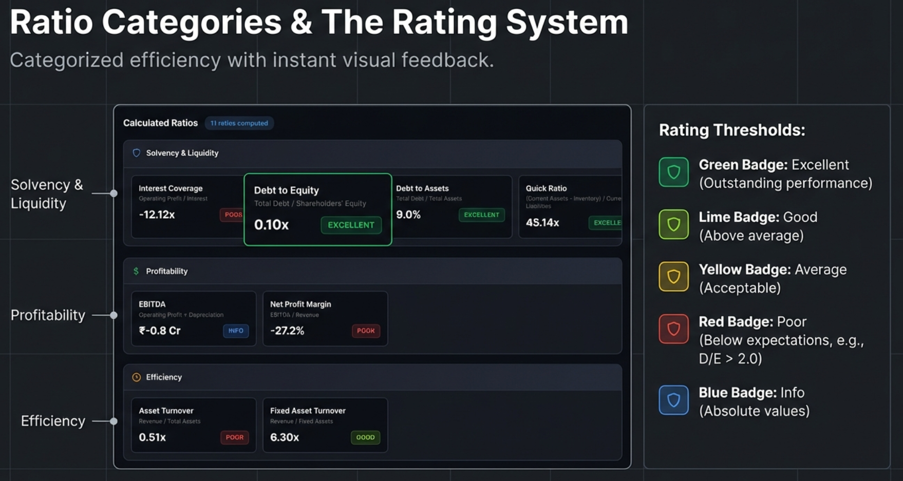
Solvency & Liquidity Ratios
| Ratio | Formula | Excellent | Good | Average | Poor |
|---|---|---|---|---|---|
| Interest Coverage | Operating Profit / Interest Expense | ≥5.0x | 3.0–5.0x | 2.0–3.0x | <2.0x |
| Debt to Equity | Total Borrowings / Shareholders' Equity | ≤1.0x or Debt-free | 1.0–1.5x | 1.5–2.5x | >2.5x |
| Debt to Assets | Total Borrowings / Total Assets | ≤20% | 20–40% | 40–60% | >60% |
| Current Ratio | Current Assets / Current Liabilities | ≥2.0x | 1.5–2.0x | 1.0–1.5x | <1.0x |
| Quick Ratio | (Current Assets - Inventory) / Current Liabilities | ≥1.5x | 1.0–1.5x | 0.8–1.0x | <0.8x |
The Quick Ratio (Acid Test) is particularly powerful. It asks a brutally simple question: If your sales stopped tomorrow and you could not sell a single piece of inventory, could you still pay off all your immediate debts? If a company has a high Current Ratio but a low Quick Ratio, it may be hoarding unsold stock to make its balance sheet look healthier than it is.
Profitability & Efficiency Ratios
| Ratio | Formula | Excellent | Good | Average | Poor |
|---|---|---|---|---|---|
| EBITDA | Operating Profit + Depreciation | Info only (absolute value, no rating) | |||
| EBITDA Margin | EBITDA / Revenue × 100 | ≥40% | 25–40% | 15–25% | <15% |
| Net Profit Margin | Net Profit / Revenue × 100 | ≥20% | 10–20% | 5–10% | <5% |
| Asset Turnover | Revenue / Total Assets | ≥3.0x | 2.0–3.0x | 1.0–2.0x | <1.0x |
| Fixed Asset Turnover | Revenue / Fixed Assets | ≥10.0x | 5.0–10.0x | 2.5–5.0x | <2.5x |
| Equity Multiplier | Total Assets / Shareholders' Equity | ≤1.5x | 1.5–2.5x | 2.5–4.0x | >4.0x |
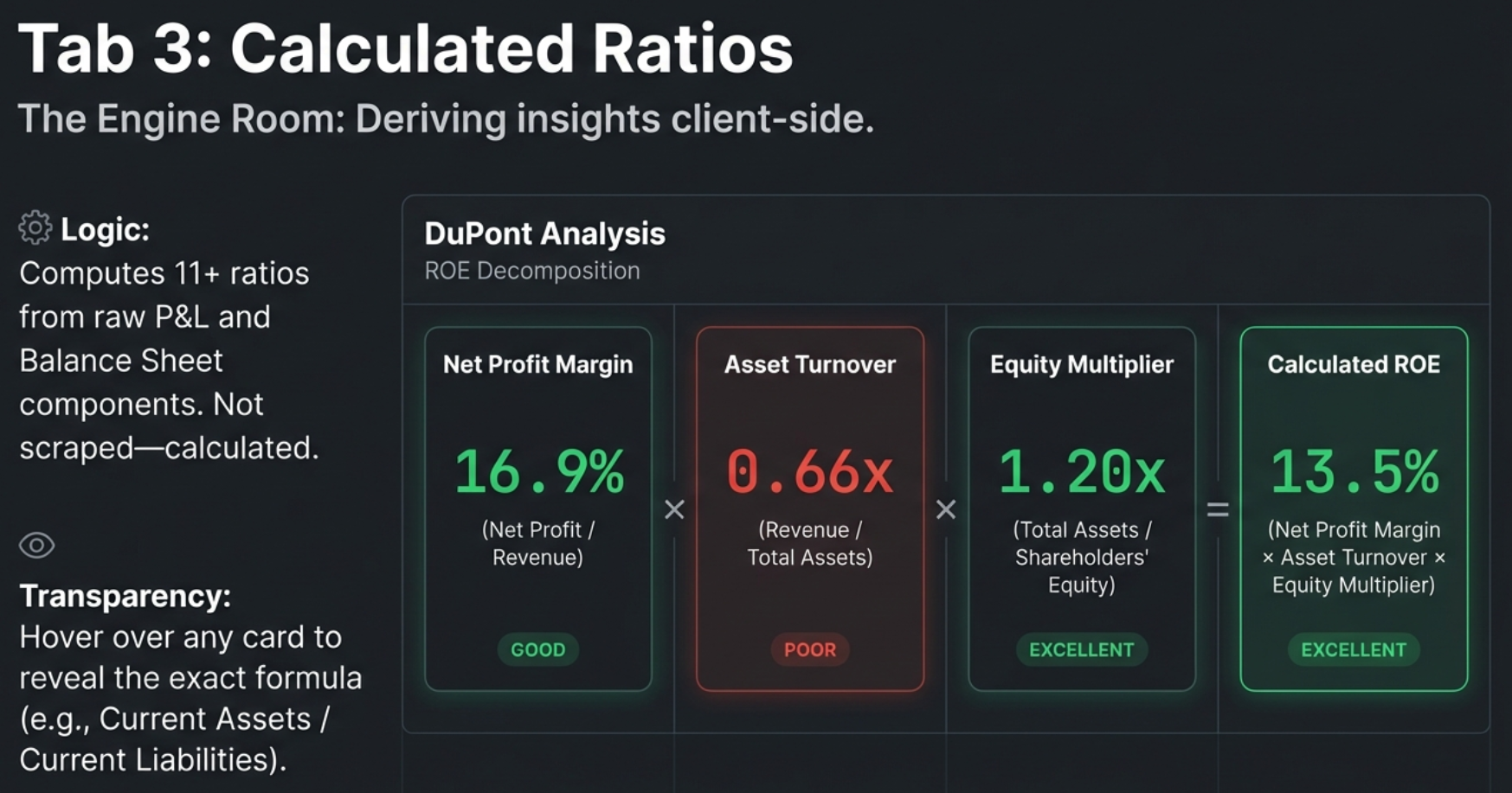
DuPont Analysis: ROE Decomposition
The crown jewel of the Calculated Ratios tab. DuPont Analysis decomposes Return on Equity into three drivers:
This formula reveals where the returns come from. A 25% ROE could be driven by high margins (quality), efficient asset use (operational excellence), or high leverage (debt risk). The DuPont decomposition tells you which one, and that distinction changes the entire investment thesis.
| Company Profile | NPM | Asset Turnover | Equity Multiplier | Interpretation |
|---|---|---|---|---|
| Quality Compounder | High | Moderate | Low | Sustainable, low-risk ROE — the ideal |
| Efficient Operator | Moderate | High | Moderate | Good capital utilization |
| Leveraged Growth | Low | Low | High | ROE inflated by debt — risky |
| Turnaround Candidate | Low | Low | Low | Poor across all dimensions |
The tab also compares the DuPont-calculated ROE against Screener.in's reported ROE. A difference under 2% shows "Matches" (verified). Larger differences are labeled "Slight difference" — typically due to averaging or timing.
DuPont for Banks: Read with Caution
The Calculated Ratios tab uses universal formulas — it does NOT adjust for sector. This means a bank will always show a high Equity Multiplier (rated "Poor" in red) because banks are inherently leveraged. This is expected and normal. Cross-reference the Quick Analysis tab (which does adjust for banking) to confirm the leverage is being managed safely via NIM and GNPA.
Quick Analysis vs. Calculated Ratios: When to Use Which
| Aspect | Quick Analysis (Tab 2) | Calculated Ratios (Tab 3) |
|---|---|---|
| Role | The Dashboard — tells you if a company is healthy | The Diagnostics Tool — tells you why |
| Primary Output | Health Score (0–100) | 11+ Financial Ratios |
| Sector Awareness | Yes — auto-detects and adjusts | No — universal formulas (user provides context) |
| Unique Feature | Shareholding Tracker, Trend Analysis | DuPont Analysis |
| Customization | 3 strictness presets + individual sliders | Fixed formulas and standard thresholds |
| Use First? | Yes — get the "pass/fail" verdict first | Second — investigate the "why" behind the score |
Price Analysis — Timing the Entry
Price Analysis answers the critical question: "Is the current stock price justified by fundamental growth?" It combines Price vs Fundamentals comparison, Cyclical Quarter Analysis, and 52-Week Risk Metrics into a single view. Available on Screener.in only.
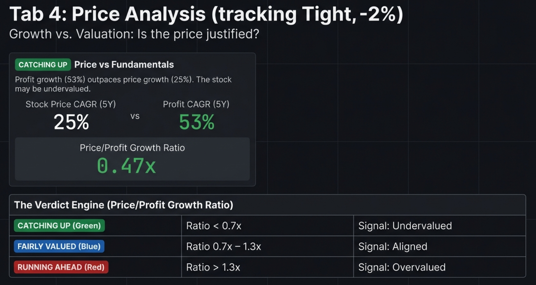
Price vs Fundamentals Panel
Valuation Status Badges
| Badge | Color | Condition | Interpretation |
|---|---|---|---|
| CATCHING UP | Green | Price CAGR < Profit CAGR × 0.7 | Fundamentals outpacing price — potential undervaluation |
| FAIRLY VALUED | Blue | Price ≈ Profit growth (±30%) | Price and profits aligned |
| RUNNING AHEAD | Red | Price CAGR > Profit CAGR × 1.3 | Price ahead of fundamentals — potential overvaluation |
Price/Profit Growth Ratio
Calculated as Stock Price CAGR / Profit CAGR. Below 0.7x = significantly undervalued. Between 0.7–1.3x = fairly valued. Above 1.3x = potentially overvalued. Uses 5Y data primarily, falls back to 3Y.
CAGR Comparison Table
Shows Stock Price CAGR, Profit CAGR, and Sales CAGR across 10Y, 5Y, 3Y, and 1Y horizons. Look for: Price consistently above Profit (multiple expansion), 1Y Price CAGR >> 5Y (recent rally needing verification), or 1Y Profit CAGR >> 1Y Price CAGR (accelerating fundamentals not yet reflected in price).
Cyclical Quarter Analysis
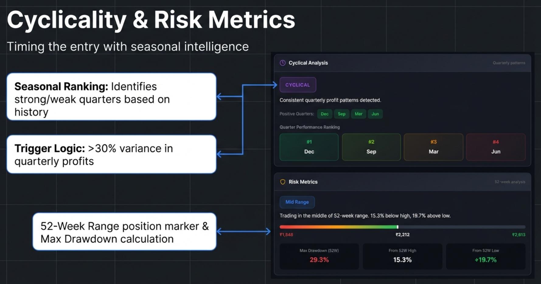
This panel identifies seasonal patterns by grouping quarterly profits by month (Mar, Jun, Sep, Dec), calculating average profit per quarter type, and measuring variance. If variance exceeds 30% of the mean, the company is flagged as CYCLICAL.
Quarter Performance Ranking
Quarters are ranked #1 through #4 by average profitability. Color-coded: #1 Dark Green (strongest), #2 Light Green, #3 Yellow, #4 Red/Brown (weakest). Positive Quarters have ≥70% historical positive profits. Negative Quarters have ≥50% historical negative profits.
Typical Strongest Quarters by Industry
| Industry | Typically Strongest Quarter | Driver |
|---|---|---|
| Infrastructure | Q4 (March) | Government spending/billing before fiscal year-end |
| Retail / FMCG | Q3 (Oct–Dec) | Diwali, festive season, Christmas |
| Auto | Q2 (Sep) and Q4 (Mar) | Festive demand + year-end incentives |
| Agriculture | Seasonal | Harvest cycles and monsoon patterns |
52-Week Risk Metrics
| Badge | Color | Condition | Interpretation |
|---|---|---|---|
| Near 52W High | Yellow | Within 10% of 52W high | Potentially expensive entry |
| Mid Range | Blue | Between extremes | Neutral positioning |
| Near 52W Low | Green | Within 20% of 52W low | Could be value opportunity or falling knife |
The visual 52-week range bar shows current price position between the yearly low and high. Three metrics are displayed: Max Drawdown ((High-Low)/High), From 52W High (how far below peak), and From 52W Low (how far above trough).
Max Drawdown Strategy
| Drawdown | Risk Level | Strategy |
|---|---|---|
| < 20% | Low | Safe to buy on momentum. Corrections are shallow. |
| 20–40% | Moderate | Normal volatility. Standard entry rules apply. |
| 40–60% | High | Avoid buying at peaks. Wait for deep pullbacks. |
| > 60% | Very High | Extreme volatility. Requires strict stop-losses. |
The Falling Knife Distinction
When a stock is "Near 52W Low," is it a bargain or a trap? The answer lies in combining the price position with profit momentum:
- Value Opportunity: Near 52W Low + CATCHING UP status + 1Y Profit CAGR is positive/accelerating. The price dropped but the business is healthy. The decline is likely sentiment-driven.
- Falling Knife: Near 52W Low + 1Y Profit CAGR is negative or drastically lower than 5Y average. The price is falling because the business is deteriorating. Do not catch it.
Composite Signal Patterns
The most powerful insights come from combining multiple Price Analysis metrics:
- Strong Buy Consideration: Near 52W Low + CATCHING UP + 1Y Profit CAGR positive + Max Drawdown < 30%. All signals align — the market is underpricing a healthy, growing business with low historical volatility.
- High Risk Triple Threat: Near 52W High + RUNNING AHEAD + Max Drawdown > 40%. All signals warn — the stock is expensive, ahead of fundamentals, and historically volatile. Extreme caution required.
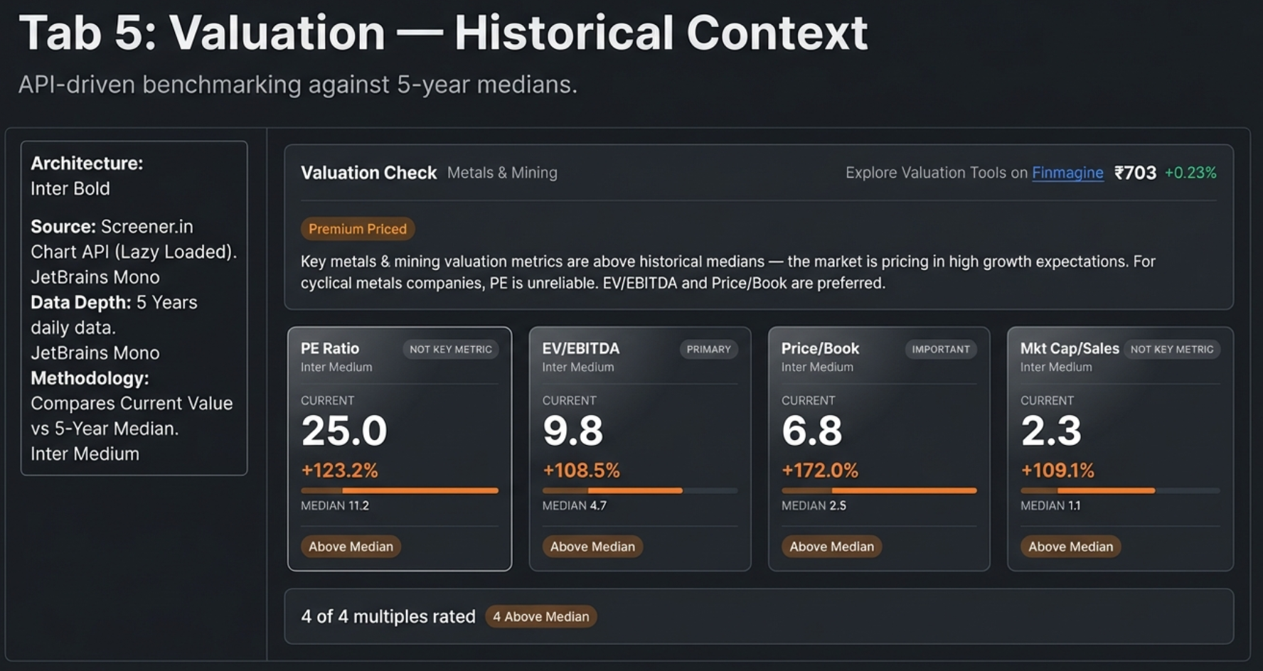
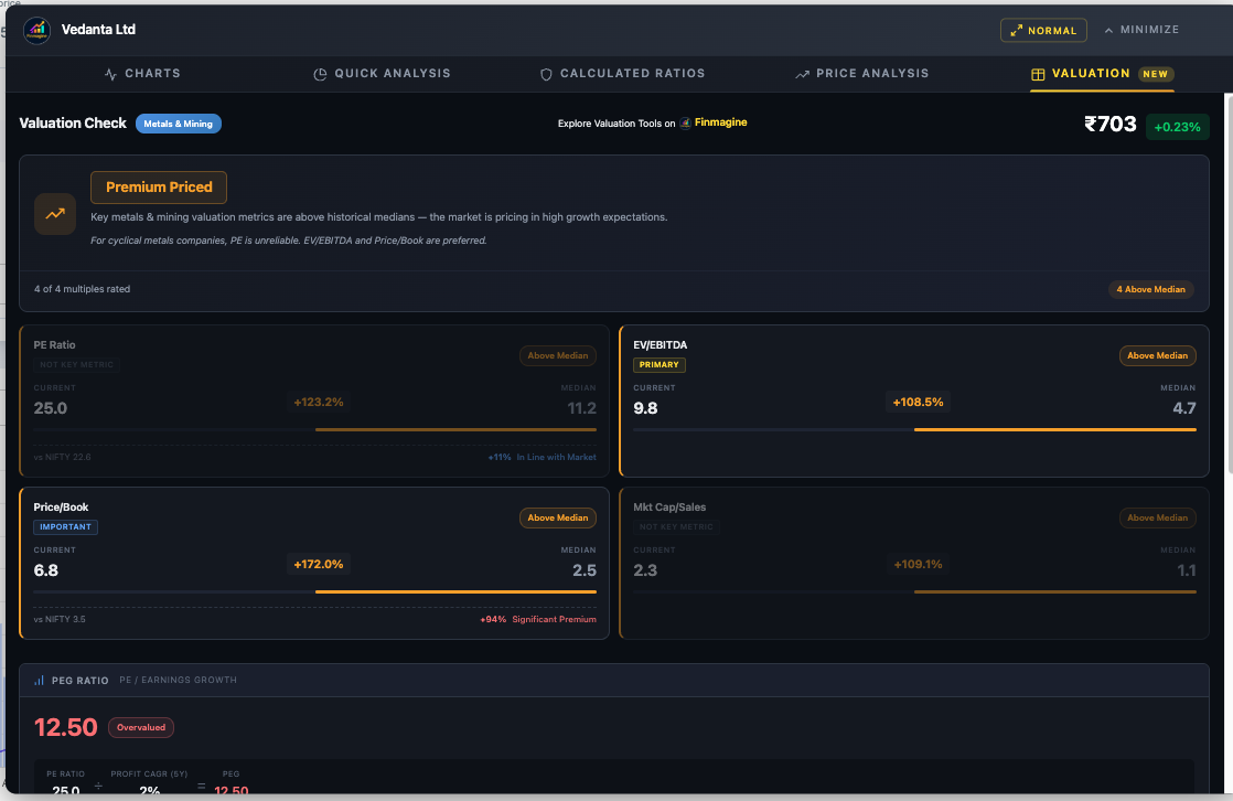
Valuation — The Decision Engine
The Valuation tab is the most sophisticated feature in the extension and the first to use an API-based data source. It fetches 5 years of daily historical valuation data via the Screener.in Chart API, computes 5-year medians client-side, applies sector-aware weighted verdicts, calculates PEG ratios, and benchmarks against NIFTY 50. Available on Screener.in only.
Lazy Loading
Data is fetched only when you first click the Valuation tab. A loading spinner appears ("Fetching valuation data...") while up to 4 API calls execute (one per multiple). Results are cached — switching tabs and returning is instant. Each metric is fetched independently via Promise.allSettled, so one failure doesn't block the others.
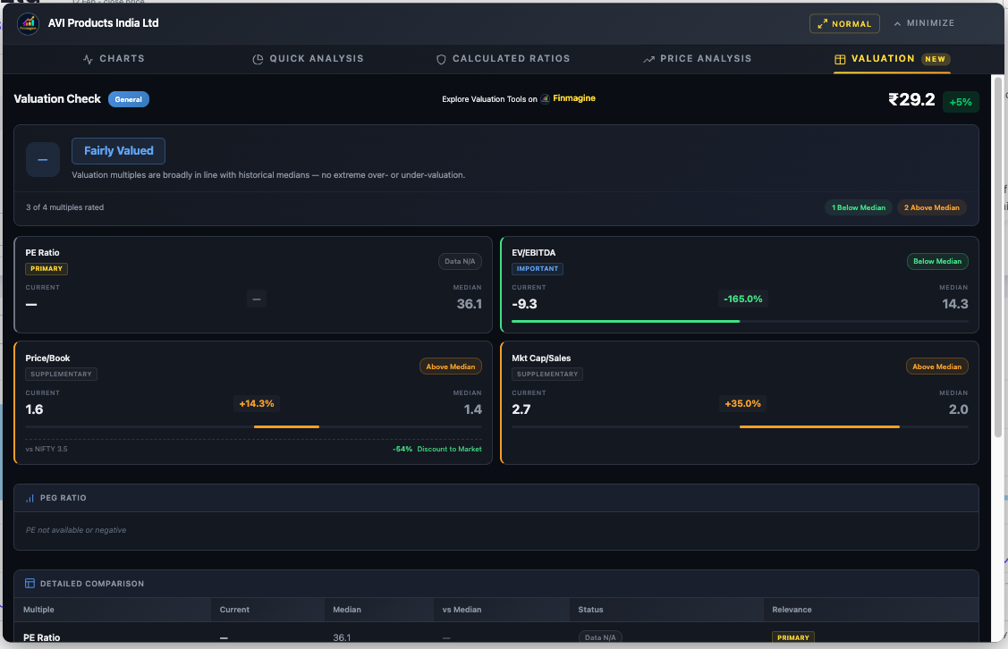
The Four Multiples & 5-Year Median
| Multiple | Formula | Best For | Not Useful For |
|---|---|---|---|
| PE Ratio | Market Price / EPS | Stable, profitable companies (IT, FMCG, Manufacturing) | Loss-making, cyclical (metals), banking |
| EV/EBITDA | Enterprise Value / EBITDA | Capital-intensive businesses (infrastructure, metals, telecom) | Financial companies (banks, NBFCs) |
| Price/Book | Market Price / Book Value per Share | Banks, NBFCs, asset-heavy industries | Asset-light businesses (IT, services) |
| Mkt Cap/Sales | Market Cap / Annual Revenue | Growth-phase companies, fintech, FMCG | Banking, metals, infrastructure |
Deviation Calculation
The 5-year median is computed client-side from ~1,200 daily data points. Deviation = (Current - Median) / |Median| × 100. The absolute value in the denominator prevents negative medians from flipping the sign.
Status Badges
- Below Median (Green): Deviation < -5% — trading below historical normal
- Near Median (Blue): -5% to +5% — in line with history
- Above Median (Amber): Deviation > +5% — trading at a premium to history
- Data N/A (Gray): API returned no data
Sector-Aware Weighted Verdicts
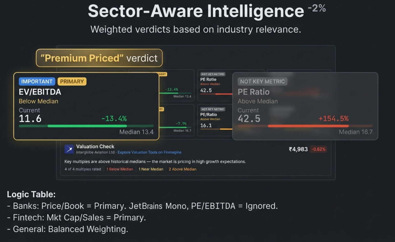
This is the most powerful feature. Instead of treating all 4 multiples equally, the verdict weights each by sector relevance using a 0–3 scale:
| Weight | Label | Card Appearance | Verdict Impact |
|---|---|---|---|
| 3 | Primary | Normal card, gold tag | Dominates the verdict |
| 2 | Important | Normal card, blue tag | Strong influence |
| 1 | Supplementary | Normal card, gray tag | Minor influence |
| 0 | Not Key Metric | Dimmed (45% opacity) | Excluded from verdict |
Key Sector Weights
| Sector | PE | EV/EBITDA | P/B | Mkt Cap/Sales | Primary Metric |
|---|---|---|---|---|---|
| Banking/NBFC | 0 | 0 | 3 | 0 | Price/Book only |
| IT Services | 3 | 2 | 0 | 2 | PE Ratio |
| Metals | 0 | 3 | 2 | 0 | EV/EBITDA |
| Telecom | 0 | 3 | 0 | 0 | EV/EBITDA (only) |
| Fintech | 2 | 1 | 0 | 3 | Mkt Cap/Sales |
| Manufacturing | 3 | 2 | 1 | 1 | PE Ratio |
| FMCG | 3 | 2 | 0 | 2 | PE Ratio |
| Infrastructure | 2 | 3 | 1 | 0 | EV/EBITDA |
Verdict Badges
- Mostly Undervalued: Weighted undervalued score > weighted premium AND ≥ weighted fair
- Fairly Valued: No dominant category, or fair has highest weight
- Premium Priced: Weighted premium > weighted undervalued AND ≥ weighted fair
- Insufficient Data: No key metrics available
PEG Ratio: Growth-Adjusted Valuation
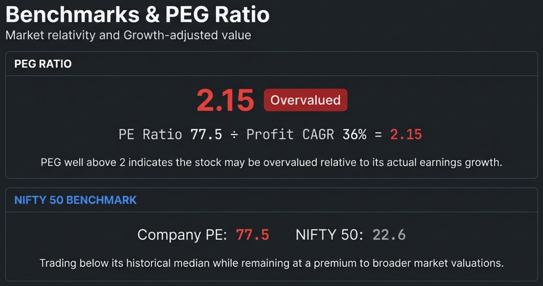
The PEG ratio adjusts the PE multiple for earnings growth: PEG = Current PE / Profit CAGR (%). PE source: API data first, falls back to DOM extraction from "#top-ratios" ("Stock P/E"). Growth source: 5Y Compounded Profit Growth preferred, 3Y fallback.
| PEG Range | Status | Color | Interpretation |
|---|---|---|---|
| < 0.5 | Deeply Undervalued | Dark Green | Getting growth practically for free |
| 0.5 – 1.0 | Undervalued | Green | Growth not fully priced in |
| 1.0 – 1.5 | Fairly Valued | Blue | Reasonably priced for growth |
| 1.5 – 2.0 | Getting Expensive | Amber | High expectations priced in |
| > 2.0 | Overvalued | Red | Paying too much for growth |
The PEG card shows the computed value, status badge, breakdown formula (e.g., "PE (44.8) ÷ Profit CAGR 5Y (36.4%) = PEG 1.23"), and a plain-English insight. PEG is not computed if PE is negative, profit growth is zero or negative, or data is unavailable.
NIFTY 50 Benchmark Comparison
The benchmark panel compares the company's PE and P/B against the NIFTY 50 index, providing broader market context:
| Band | Range | Color | Meaning |
|---|---|---|---|
| Significant Premium | > +75% | Red | Company trades far above market levels |
| Moderate Premium | +25% to +75% | Amber | Company trades above market levels |
| In Line with Market | -25% to +25% | Blue | Company trades near market levels |
| Discount to Market | < -25% | Green | Company trades below market levels |
When the historical verdict and market comparison point in different directions, an interpretive context line resolves the conflict: "Trading below its historical median while remaining at a premium to broader market valuations." This bridges the mental gap — it tells you the stock is cheap for itself but still expensive vs the average company.
Sector Intelligence in Action — 7 Companies, 6 Sectors, 3 Verdicts
Theory is useful. Seeing the framework in action across real companies is transformative. Below are real screenshots from 7 companies spanning 6 different sectors — showing how the same extension adapts its analysis based on industry context. Notice how the sector badge, relevance tags, metric weights, and final verdict all change dynamically.
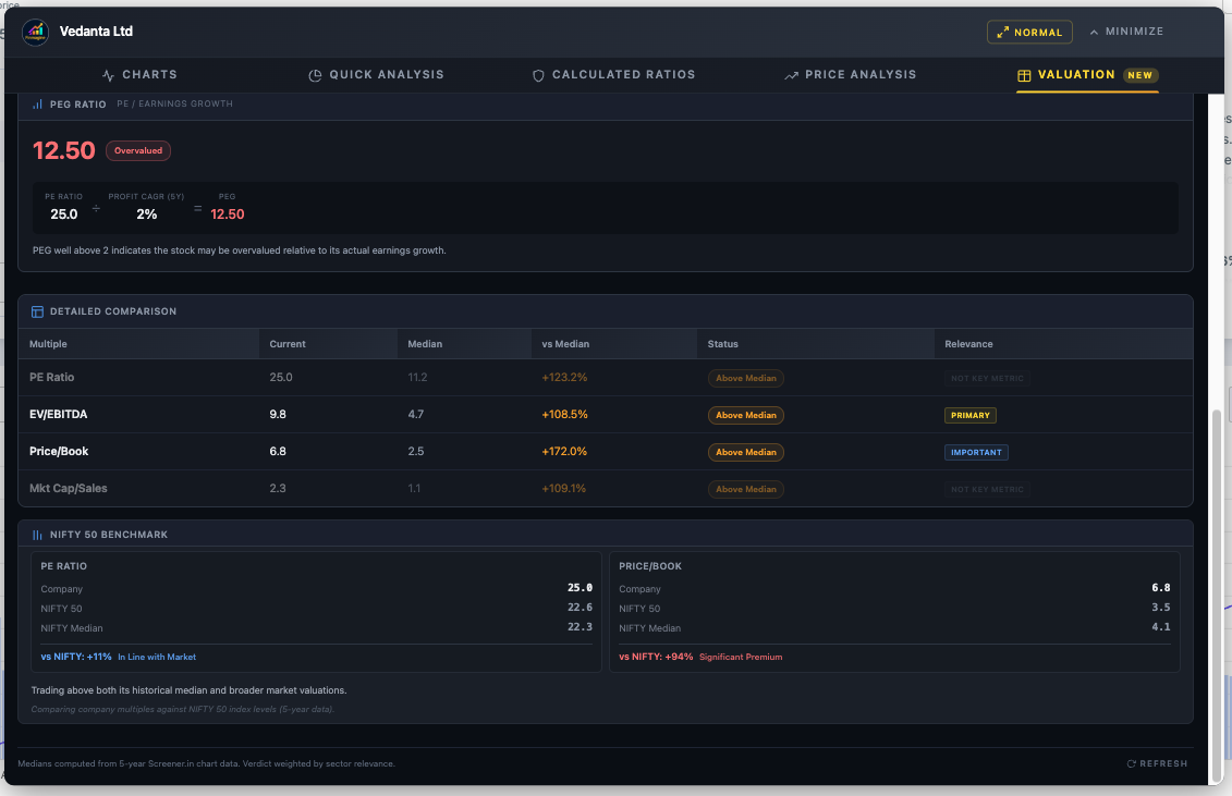
Vedanta — Metals & Mining: "Premium Priced"
For cyclical metal companies, PE is unreliable (marked "Not Key Metric" with weight 0). EV/EBITDA is the primary valuation multiple. Despite a PEG of 12.50, the sector note explains: "For cyclical metals companies, PE is unreliable. EV/EBITDA and Price/Book are preferred."
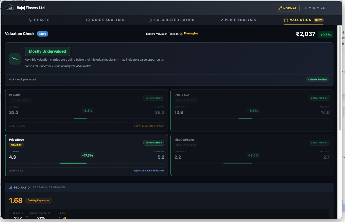
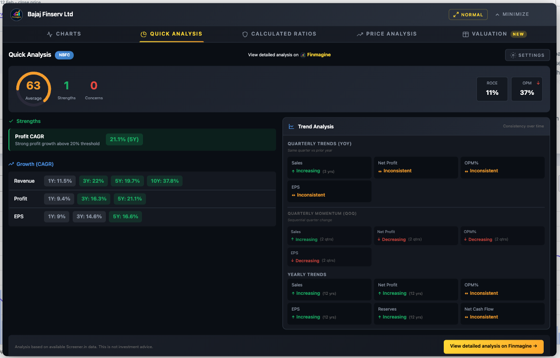
Bajaj Finserv — NBFC: "Mostly Undervalued"
For NBFCs, Price/Book is the only metric that matters (marked PRIMARY with weight 3). PE, EV/EBITDA, and Mkt Cap/Sales are all dimmed. The sector note reads: "For NBFCs, Price/Book is the primary valuation metric." Health Score: 63 (Average) with only Profit CAGR as a strength.
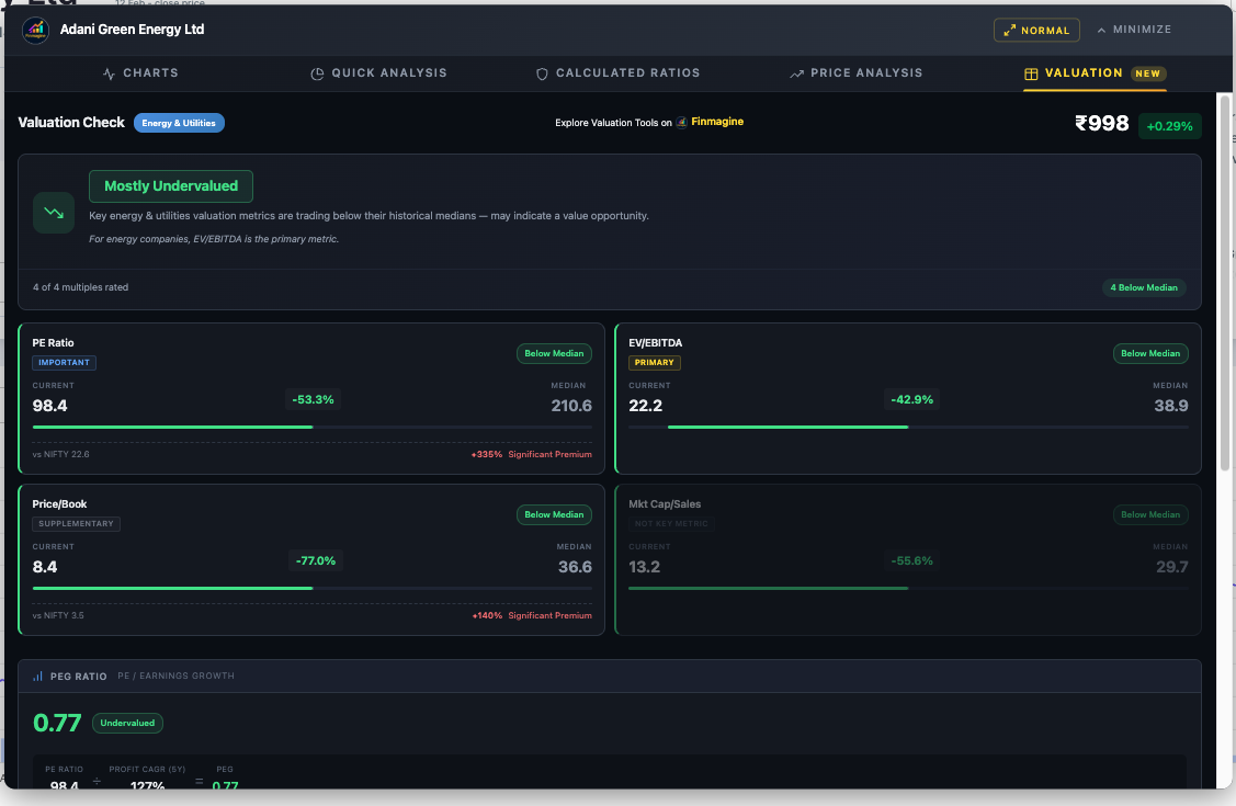
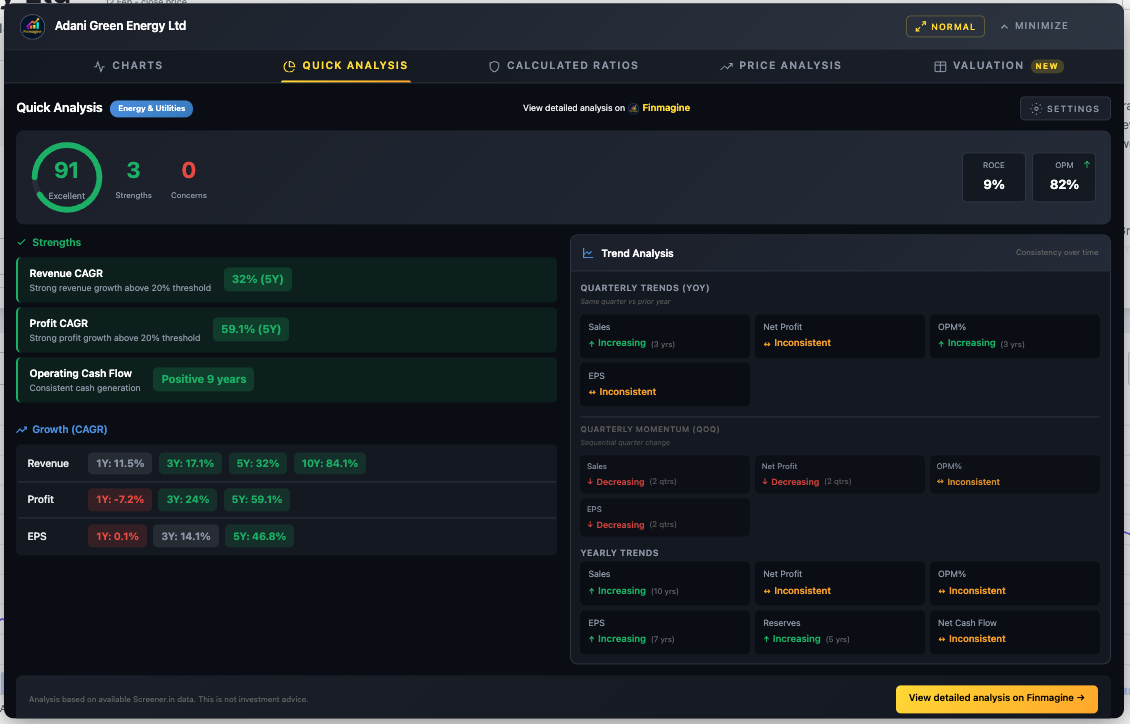
Adani Green Energy — Energy & Utilities: "Mostly Undervalued"
All four multiples are below their 5-year medians — a strong undervaluation signal. For energy companies, EV/EBITDA is the primary metric. PEG of 0.77 (Undervalued) confirms: earnings growth is outpacing the valuation. Health Score: 91 (Excellent) with 3 strengths and 0 concerns.
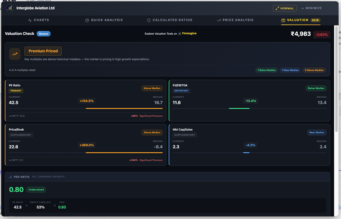
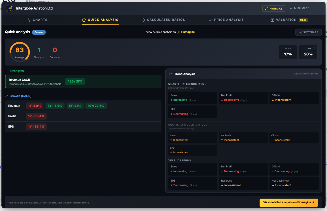
InterGlobe Aviation (IndiGo) — General: "Premium Priced"
IndiGo falls into the "General" sector profile where all four multiples carry balanced weights. All metrics are above median, driving the "Premium Priced" verdict. Yet the PEG of 0.80 (Undervalued) tells a different story — this is where the PEG ratio adds nuance that median-only analysis misses. The NIFTY benchmark shows a +88% PE Significant Premium.
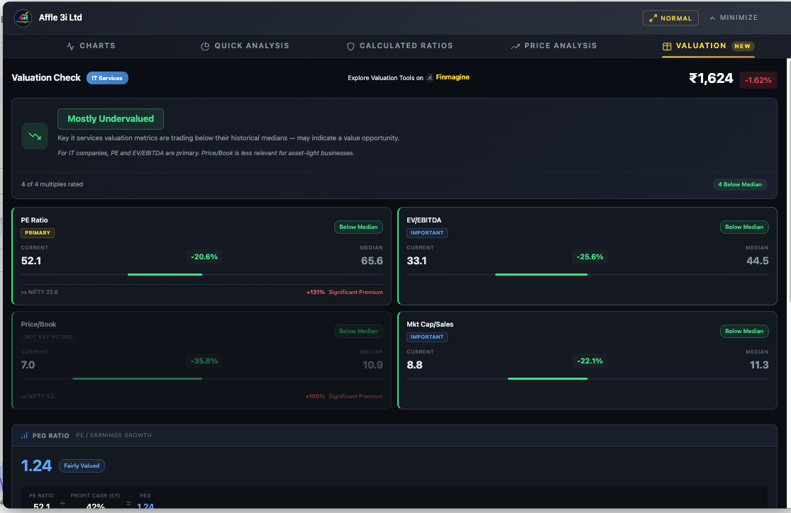
Affle India — IT Services: "Mostly Undervalued"
For IT companies, PE and EV/EBITDA are both primary metrics. All four multiples are below their 5-year medians. The sector note: "For IT companies, PE and EV/EBITDA are primary. Price/Book is less relevant for asset-light businesses." PEG of 1.24 sits in the "Fairly Valued" zone, adding a balanced perspective.
AVI Products — General: "Fairly Valued"
When multiples split between Above and Below Median, the verdict lands on "Fairly Valued" — the most balanced outcome. Note the PE and EV/EBITDA cards: PE has no current data (dash), and EV/EBITDA is negative (-9.3) which gets flagged as "Above Median" at -155%. The system handles edge cases gracefully.
Uber — Google Finance (Charts Only)
Google Finance companies get the full Charts experience but not the analysis tabs (which require Screener.in's structured data). Here are two views showing Uber's income statement and cash flow evolution — demonstrating that the dual-axis engine works identically across platforms.
The 5-Tab Workflow in Action: Affle (India) Ltd
Theory is clear. Now let us walk through a single company across all five tabs to see how the complete analytical workflow builds a coherent investment thesis. We will use Affle (India) Ltd — an IT Services company — and analyze it exactly as you would in practice.
Step 1: Charts Tab — Visualize the Trends
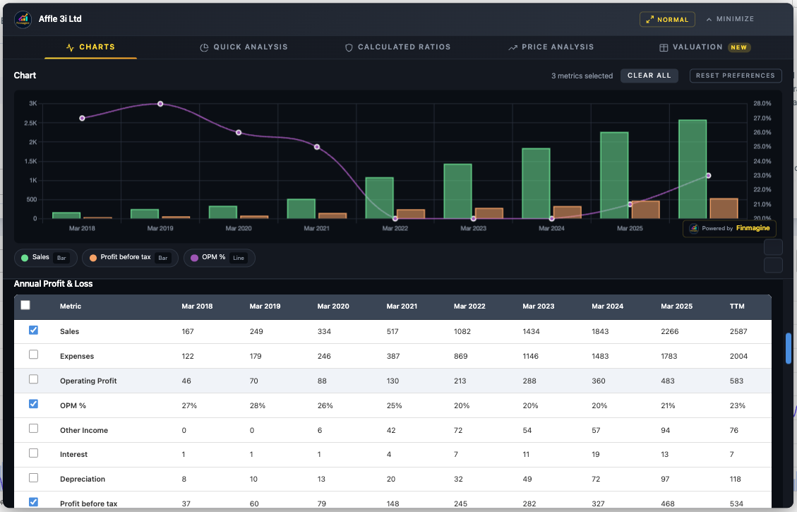
The chart instantly reveals a powerful growth story: Sales climbing consistently over the years with OPM% stabilizing around 21–23% after initially being higher, showing mature but healthy margins. Profit before tax shows a consistent upward trajectory. The dual-axis chart makes the revenue scale and margin trends equally visible — something a raw data table can never do.
Step 2: Quick Analysis Tab — The Health Check
The IT Services sector badge appears automatically. The health score comes in strong with multiple strengths flagged and zero concerns. Revenue and Profit CAGR are both robust across multiple timeframes. The trend analysis shows increasing direction for key metrics. This is a textbook quality company passing the "Background Check."
Step 3: Calculated Ratios Tab — The Diagnostics
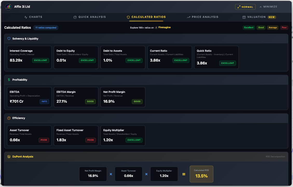
The solvency picture is clean: low debt, strong interest coverage, healthy current ratio. Now look at the DuPont Analysis: the ROE comes from profit margins with almost zero reliance on debt. The low asset turnover is typical for IP/tech businesses — they generate revenue from intellectual property, not physical assets. This is a Quality Compounder profile.
Step 4: Price Analysis Tab — The Valuation Check
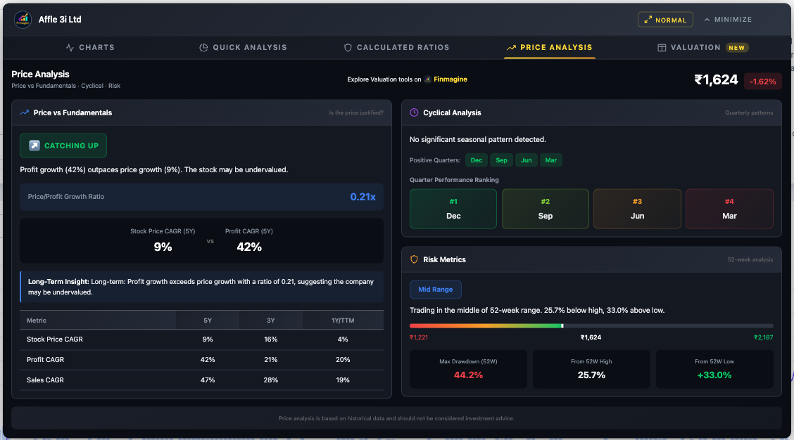
The Price vs Fundamentals panel reveals whether the market has priced in the company's growth. Check the Price/Profit Growth Ratio and the resulting badge. The Cyclical Analysis and Risk Metrics add timing and positioning context. Combined with Steps 2 and 3, we now know the company is healthy, the earnings are quality, and we have a price-vs-value assessment.
Step 5: Valuation Tab — The Final Verdict
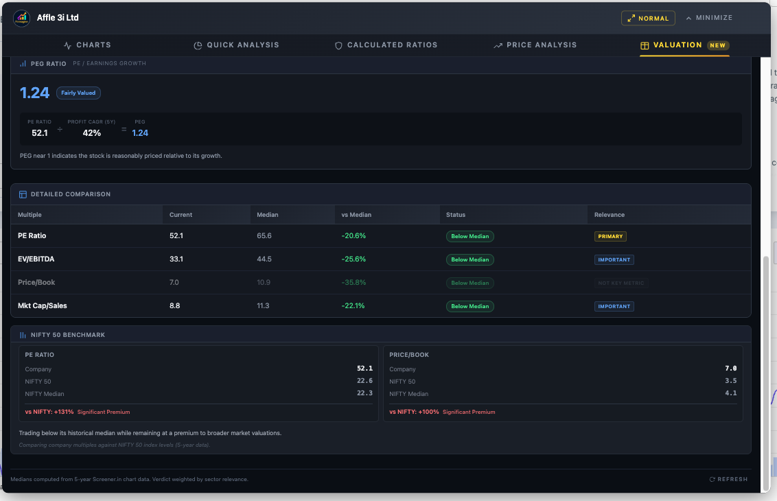
The Valuation tab brings it all together with sector-aware intelligence. For IT Services, PE and EV/EBITDA are both primary metrics. All four multiples are compared against their 5-year medians. The PEG Ratio adds a growth dimension — validating whether the PE is justified by earnings growth. And the NIFTY 50 Benchmark provides broader market context.
The Complete Analyst Workflow
The five tabs are designed to work as a complete end-to-end workflow. Here is the recommended analytical sequence:
- Quick Analysis first: Get the instant health score. If the score is below 40, you may want to skip to the next company unless you are specifically hunting turnarounds.
- Calculated Ratios second: Understand why the score is what it is. Check the DuPont Analysis to verify ROE quality. If you see a "Leveraged Growth" profile, proceed with extreme caution.
- Price Analysis third: Is the stock catching up or running ahead? Check cyclical patterns for timing. Assess risk metrics for entry positioning.
- Valuation fourth: Compare current multiples against 5-year medians with sector-aware weighting. Check the PEG ratio for growth-adjusted context. Review NIFTY benchmark for market comparison.
- Charts last: Now that you know what to look for, build targeted visualizations. Chart the specific metrics that matter for your thesis — margins, cash flow, shareholding trends.
Troubleshooting & FAQ
Common Issues
Button not appearing
- Screener.in: Ensure you're on a company page (
/company/...), not the homepage - Google Finance: Click the "Financials" tab first, wait 2–3 seconds
- Check
chrome://extensions/— is the extension enabled? - Refresh the page (F5)
Quick Analysis / Calculated Ratios / Price Analysis / Valuation tabs not showing
These four tabs are Screener.in only. They do not appear on Google Finance because the site lacks sufficient data depth.
Valuation tab stuck on "Fetching valuation data..."
- Refresh the Screener.in page and reopen the panel
- Ensure you're logged into Screener.in (some API data requires login)
- Check internet connection
- Try a different company to verify API accessibility
Wrong sector detected
The extension reads sector from the Peer Comparison breadcrumb. For conglomerates, the classification may not match. In Quick Analysis, use Settings > Sector Override for manual correction. The Valuation tab currently uses auto-detection only.
PEG shows "Not available"
- Company may be loss-making (negative PE)
- Profit growth may be zero or negative
- Neither API nor DOM has a valid Stock P/E value
Google Finance shows stale data after switching views
Click Refresh in the panel header, or use the Minimize-Restore cycle: Minimize → Switch view → Wait 2–3 seconds → Restore.
Charts look distorted
- Reset browser zoom to 100% (Ctrl/Cmd + 0)
- Disable dark mode extensions for Screener.in
"Clear All" doesn't prevent metrics from coming back
"Clear All" only clears the current chart — saved preferences remain. Use "Reset Preferences" to clear both.
Frequently Asked Questions
Is this extension really free?
Yes. 100% free, no premium tier, no subscriptions, no accounts required.
Does it collect my data?
Your charts, analysis, and research habits are never transmitted. The only network calls are: (1) Screener.in Chart API for the Valuation tab — goes directly to Screener.in; (2) Finmagine's shared cache, which receives stock fundamentals from pages you visit to improve load speed for all users. No personal data, browsing history, or research identity is ever tracked.
Can I compare multiple companies on one chart?
Not on one chart, but you can screenshot each company's analysis and compare side-by-side. Metric persistence makes this fast — your selections carry over automatically.
How many metrics can I plot?
Maximum 10 (limited by the color palette). For readability, 3–5 is recommended.
Can I use this on mobile?
No. Chrome extensions require desktop browsers.
Can I use this on Yahoo Finance or NSE?
No. The manifest only matches Screener.in and Google Finance. Adding new sites requires new extractors.
You Are Now a Finmagine Power Analyst
You have now explored every tab, every button, every metric, every threshold, and every workflow in the Finmagine Financial Chart Builder v2.2.0. Here is what you can now do:
- Charts: Transform any Screener.in or Google Finance page into interactive dual-axis visualizations with metric persistence and the 10-color palette
- Quick Analysis: Diagnose company health in under one second with sector-aware scoring, customizable thresholds, trend analysis, and shareholding tracking
- Calculated Ratios: Derive 11+ financial ratios from raw data, decompose ROE with DuPont Analysis, and verify against Screener.in's reported values
- Price Analysis: Compare price growth vs profit growth, identify cyclical quarters, assess 52-week risk positioning, and time your entries
- Valuation: Benchmark current multiples against 5-year medians with sector-aware weighted verdicts, validate PE with PEG ratios, and contextualize with NIFTY 50 benchmarks
Next Steps:
- Install the extension and practice on companies you know well
- Work through all five tabs sequentially: Charts → Quick Analysis → Calculated Ratios → Price Analysis → Valuation
- Use the 74 flashcards above to test your knowledge
- Build sector-specific analytical templates for your watchlist
- Explore more tools and resources at finmagine.com
Free Chrome Extension
Ready to try this yourself?
Install the Finmagine Financial Chart Builder and transform any Screener.in, Google Finance, or stockanalysis.com page into interactive charts in one click.
Install from Chrome Web Store →No account required • Works on Chrome, Edge, Brave, Opera
Explore the Complete Chart Builder Hub
Discover all Chart Builder resources — tutorials, Google Finance integration, case studies, and more. Transform Screener.in & Google Finance data into professional charts.
Visit Chart Builder Hub →