Following along? Install the extension first
Finmagine Financial Chart Builder — free • no account needed • Chrome, Edge, Brave
Multimedia Learning Hub
Master the complete Finmagine 4-step workflow through video, audio deep dive, comprehensive overview, and interactive knowledge testing
Complete Learning Path
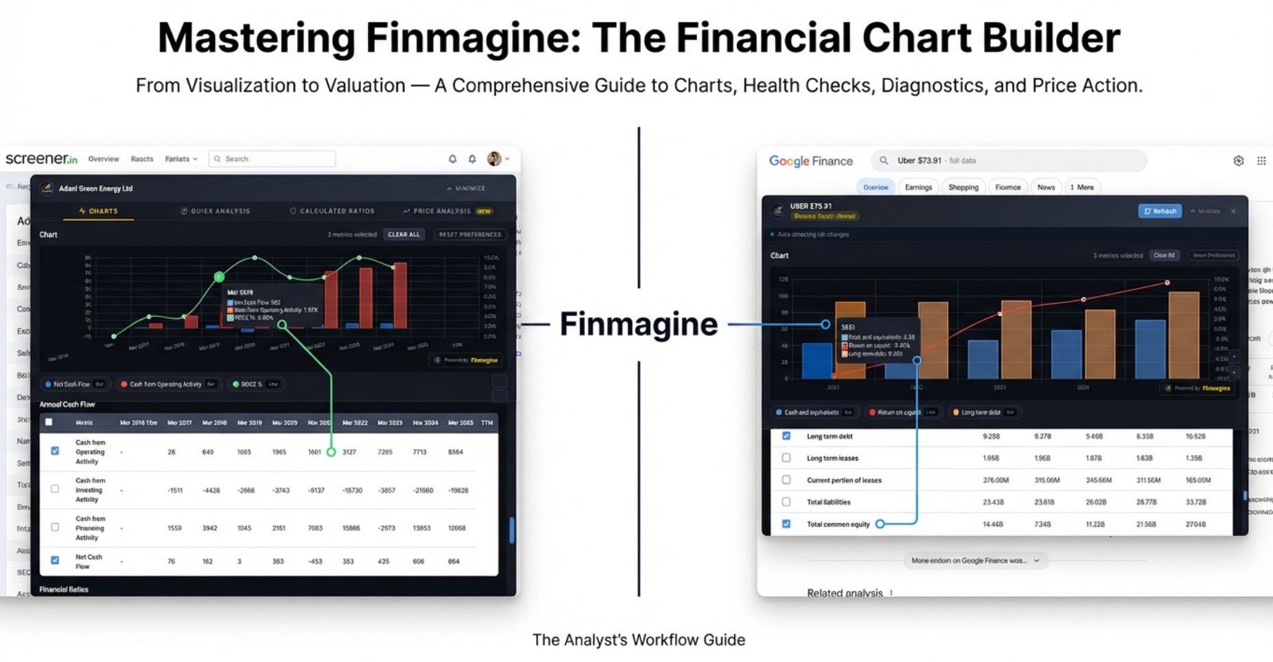
This comprehensive tutorial covers the entire Finmagine Financial Chart Builder v2.1.0 from visualization to valuation. You will master all four tabs, understand the differences between Screener.in and Google Finance workflows, and learn the analytical techniques that transform raw financial data into investment insights.
The 4-Step Workflow:
- Step 1 — Charts Tab (Visualization): Transform P&L, Balance Sheet, and Cash Flow tables into interactive dual-axis charts with metric persistence
- Step 2 — Quick Analysis Tab (Health Check): Get instant sector-aware health scores (0-100) with customizable strictness presets
- Step 3 — Calculated Ratios Tab (Diagnostics): Investigate 11+ derived ratios and decompose ROE with DuPont Analysis
- Step 4 — Price Analysis Tab (Valuation): Compare price growth vs. profit growth, identify cyclical patterns, assess risk metrics
Key Skills You Will Master:
- Dual-axis charting with automatic bar/line detection on both Screener.in and Google Finance
- The Minimize-Restore workflow for Google Finance (essential for switching views)
- Clear All vs. Reset Preferences — when to use which
- Sector-aware health scoring that adjusts for Banking, IT, FMCG, Infrastructure, and 14 more sectors
- Customizable thresholds: Conservative, Moderate, and Aggressive presets
- DuPont Analysis to distinguish Quality Compounders from Leveraged Growth traps
- Price/Profit Growth Ratio to identify Catching Up (undervalued) and Running Ahead (overvalued) stocks
- Cyclical Analysis to time entries around seasonal patterns
- Risk Metrics (52-week range, Max Drawdown) to avoid falling knives
Platform Coverage:
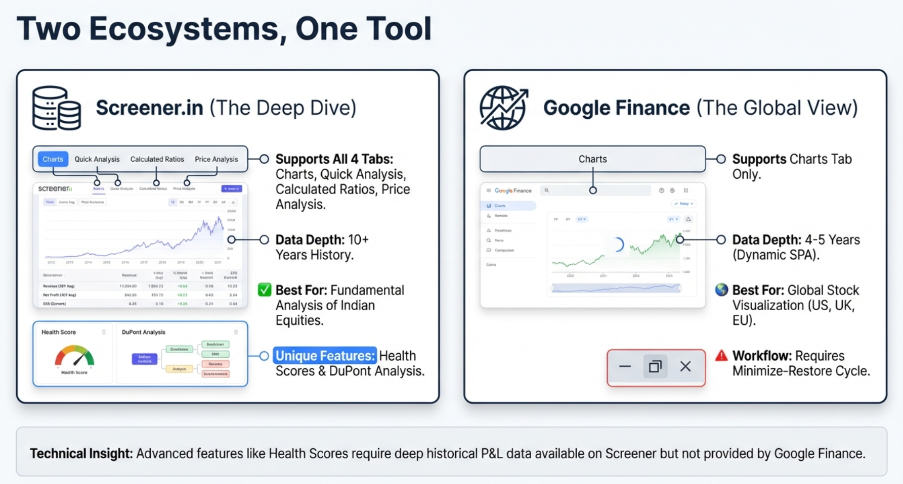
- Screener.in: Full 4-tab experience — Charts, Quick Analysis, Calculated Ratios, Price Analysis
- Google Finance: Charts tab with Minimize-Restore workflow for global stocks (NASDAQ, NYSE, NSE, LSE, etc.)
- Privacy: Local-first architecture — your charts, analysis, and research habits stay in your browser; stock fundamentals passively contributed to Finmagine's shared cache
Watch the Complete 4-Step Workflow
Follow along with this comprehensive video walkthrough covering all four tabs, platform differences, and real company examples.
Video Title: Visualize Screener.in & Google Finance Data Like a Pro | Finmagine 4-Step Stock Analysis Workflow
Complete video demonstration covering Charts, Quick Analysis, Calculated Ratios, Price Analysis, and the Minimize-Restore workflow
Listen to the Audio Deep Dive
This in-depth audio guide explores all four tabs with real-world examples, analytical techniques, and the reasoning behind every feature.
Duration: Full deep dive tutorial | Format: Professional narration
Deep dive audio covering the complete 4-step workflow, Google Finance quirks, DuPont Analysis, and the Price vs. Fundamentals framework
Test Your Knowledge
Click any flashcard to reveal the answer. Use the search box to find specific topics across all four tabs.
The Wall of Numbers Problem — and the 4-Step Solution
If you have ever sat in front of Screener.in or Google Finance at 11 PM, staring at row after row of financial data, trying to mentally subtract column C from column F while remembering what was in column A, you know the feeling. Your eyes glaze over. Your brain does mental gymnastics just to spot a trend. After 10 minutes of scrolling, the cognitive load is so overwhelming that you miss the very signals you were looking for.
That is exactly where the Finmagine Financial Chart Builder enters the picture. It is a free Chrome extension that shatters that wall of numbers in milliseconds. But version 2.1.0 goes far beyond simple charting. It delivers a complete, four-step analytical workflow that takes you from raw data to a confident investment decision:
- Charts Tab — The Crime Scene: What actually happened? What do the numbers say?
- Quick Analysis Tab — The Background Check: Is this company reliable? Does it have a good history?
- Calculated Ratios Tab — The Forensics Lab: How exactly did they achieve their results? What is the hidden mechanism?
- Price Analysis Tab — The Verdict: Is the price of admission justified by the underlying value?
Before we dive into each tab, there is one thing to understand: Screener.in is a buffet — everything is laid out on one long page. Google Finance is a vending machine — you push a button to see one specific thing at a time. This architectural difference creates workflow quirks that we will master in this tutorial.
Charts Tab — The Core Visualization Engine
The Charts tab is the default view when you open Finmagine. It transforms dense financial tables into interactive, fiscal.ai-style visualizations. Whether you are on Screener.in looking at Tata Consultancy Services or Google Finance looking at Apple, the charting engine works identically.
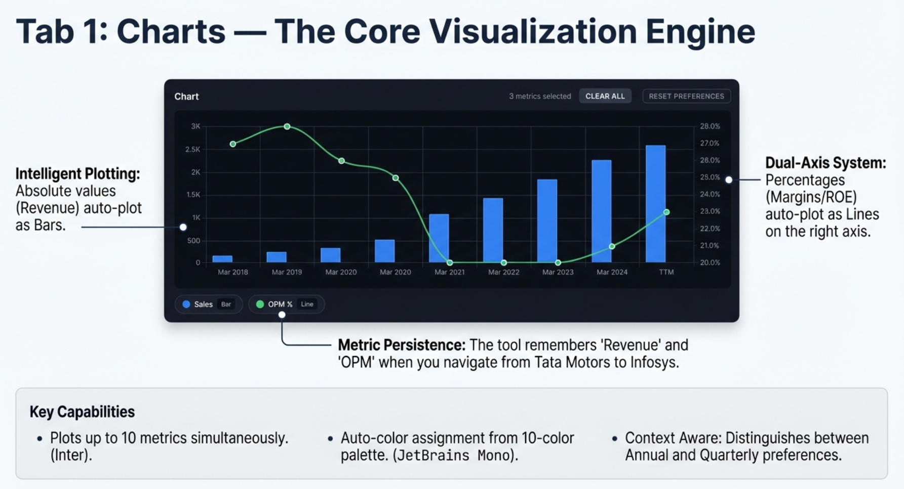
The Dual-Axis System: Solving the Flat Line Problem
If you have ever plotted revenue (50,000 crores) and operating margin (15%) on the same chart in Excel, you know the margin line becomes an invisible flat line hugging the bottom. The 15% is microscopic compared to 50 billion. This is the flat line problem, and Finmagine solves it automatically.
The tool scans every metric you select and asks: is this a raw number, or is this a percentage? Based on that determination:
- Absolute values (Revenue, Net Profit, Reserves, Borrowings) are plotted as bars on the left Y-axis
- Percentages and ratios (OPM%, ROE%, D/E Ratio) are plotted as lines on the right Y-axis
Both metrics utilize the full vertical height of the chart. No fiddling with settings, no right-clicking to "Move to secondary axis." It just knows.
Metric Persistence: Your Preferences Follow You
Before v2.1.0, every time you navigated to a new company, your chart was blank. You had to click Sales, Net Profit, OPM% all over again. Metric persistence changes this completely.
Set up your preferred view on TCS. Navigate to Infosys. Open the panel — and your metrics are already selected and plotted. The chart is waiting for you.
Metric Aliasing
Companies are not always consistent with their terminology. One calls it "Sales," another calls it "Revenue," a third uses "Net Sales." Finmagine handles this with a built-in thesaurus:
| These Terms Are Equivalent | Canonical Name |
|---|---|
| Sales, Revenue, Net Sales, Turnover | Revenue |
| Net Profit, PAT, Profit After Tax, Net Income | Net Profit |
| Operating Profit, EBIT, PBIT | Operating Profit |
| OPM %, Operating Margin %, Operating Margin | OPM % |
| EPS, Earnings Per Share, Diluted EPS | EPS |
Section Context
Persistence is scoped to the section you are viewing. If you select metrics from the Annual P&L, those preferences are saved separately from your Quarterly P&L preferences. This prevents the dangerous error of accidentally comparing a full year of revenue to a single quarter.
Site-Specific Storage
Screener.in and Google Finance have separate preference storage. Your Screener.in selections will not affect Google Finance and vice versa.
Clear All vs. Reset Preferences
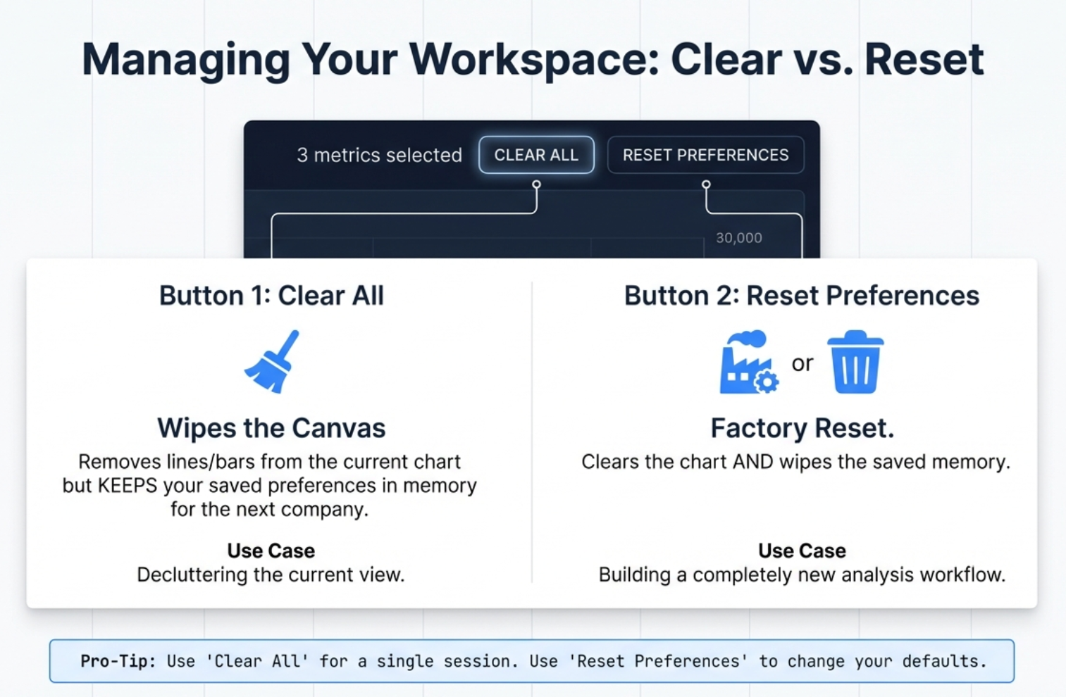
These two buttons look similar but do very different things:
| Button | What It Does | When to Use |
|---|---|---|
| Clear All | Wipes the current chart clean but preserves your saved metric preferences in the background | 99% of the time. Use to declutter your current view and start fresh for this company. |
| Reset Preferences | Clears the current chart and wipes all saved preferences from browser storage. Factory reset. | Rarely. Use when you want to completely change your analytical workflow or if the tool is behaving unexpectedly. |
The Google Finance Workflow: Minimize-Restore
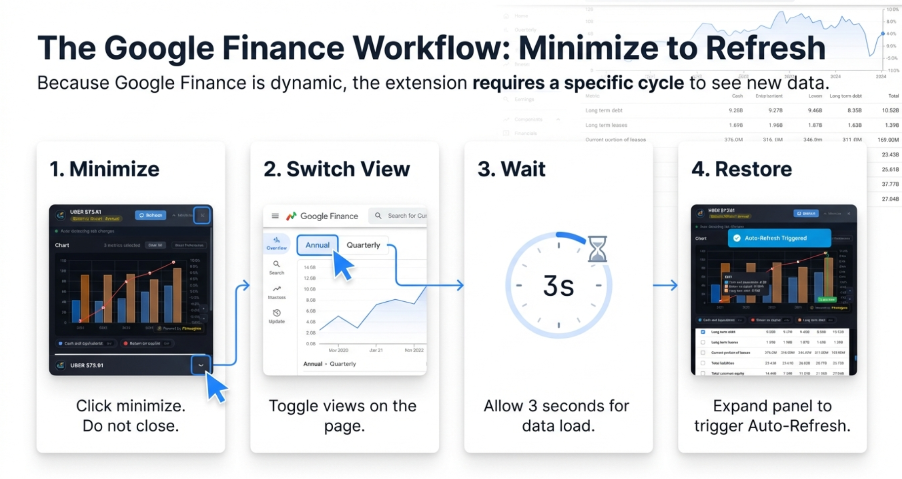
Google Finance is a Single Page Application (SPA). It only loads the data for the statement you are currently viewing. When you are looking at the Income Statement, the Balance Sheet data literally does not exist in your browser yet.
But what if you have already opened the panel and want to switch views? This is where the Minimize-Restore cycle becomes essential:
- Minimize: Click the minimize button (underscore icon in the top-right of the panel). The panel shrinks to a thin bar at the bottom.
- Switch View: Now interact with Google Finance freely. Click "Balance Sheet," toggle from Quarterly to Annual — set the stage.
- Wait: Give Google 2-3 seconds to fetch the new data and render the table.
- Restore: Click the minimized bar to expand the panel. The extension detects the table has changed and triggers an auto-refresh with the new data.
Why You Cannot Mix Statements on Google Finance
On Screener.in, you can create a chart that mixes Revenue from the P&L with Borrowings from the Balance Sheet because everything is on one page. On Google Finance, when you switch to the Balance Sheet tab, Google removes the Income Statement data from the browser. You can only chart metrics from one statement at a time.
Charting Recipes for Google Finance
The Profitability Trend (Income Statement, Quarterly)
Select Revenue, Operating Income, and Net Income. Look for compression — if Revenue bars climb nicely but Operating and Net Income bars stay flat or shrink, costs are eating the growth.
The Buyback Detection (Income Statement, Annual)
Select Net Income and EPS. In companies like Apple, Google, or Microsoft that do massive buybacks, you will see EPS climbing much faster than Net Income. That divergence is pure financial engineering — they are reducing the denominator (shares outstanding) rather than growing the numerator (actual profits).
Screener.in Charts: The Full Buffet
On Screener.in, you have access to 8 data sections with up to 10+ years of history:
| Section | Data Type | Examples |
|---|---|---|
| Quarterly P&L | 12+ quarters | Sales, Expenses, OPM%, Net Profit, EPS |
| Quarterly Balance Sheet | 12+ quarters | Equity, Reserves, Borrowings, Assets |
| Quarterly Cash Flow | 12+ quarters | CFO, Investing, Financing activities |
| Annual P&L | 10+ years | Same as Quarterly with longer history |
| Annual Balance Sheet | 10+ years | Net Worth, Working Capital, Fixed Assets |
| Annual Cash Flow | 10+ years | Free Cash Flow, Net Cash Flow |
| Financial Ratios | 10+ years | ROCE, ROE, Current Ratio, D/E |
| Shareholding Pattern | Multiple quarters | Promoter, FII, DII, Public holdings |
You can freely cross-pollinate: mix Revenue from the P&L with Borrowings from the Balance Sheet and Cash from Operations from the Cash Flow statement — all on the same chart.
Quick Analysis Tab — The Financial Health Check
If the Charts tab shows you what happened, Quick Analysis tells you how healthy the patient is. It generates a composite Health Score from 0-100, identifies strengths and concerns, tracks growth rates, analyzes quarterly trends, and monitors shareholding movements — all in one view.
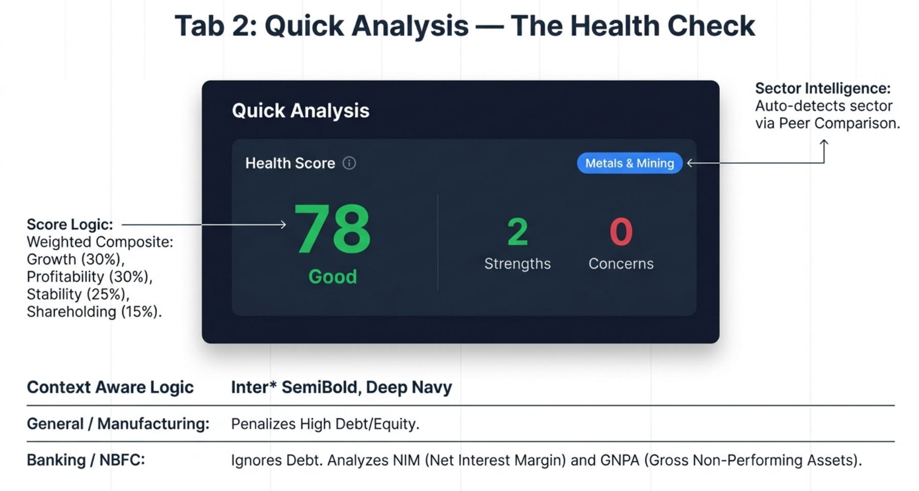
The Health Score: Your Verdict at a Glance
The large circular indicator shows the overall financial health score, color-coded for instant interpretation:
| Score Range | Label | Color | Interpretation |
|---|---|---|---|
| 80-100 | Excellent | Green | Outstanding financial health |
| 65-79 | Good | Light Green | Solid financial position |
| 50-64 | Average | Yellow | Acceptable, monitor closely |
| 35-49 | Below Average | Orange | Significant concerns |
| 0-34 | Poor | Red | Major financial stress |
The score is a weighted composite of four pillars:
- Growth (30%): Revenue and Profit CAGR over multiple timeframes
- Profitability (30%): ROE, ROCE, Operating Margin trends
- Stability (25%): Debt levels, cash flow consistency, earning reliability
- Shareholding (15%): Promoter holding trends, institutional flows
Sector-Aware Intelligence: Why Banks Are Not Factories
This is the critical insight that separates Finmagine from generic scoring tools. If you judge a bank by the same rules you judge a steel plant, the bank will fail every time. Why? Because a bank's product is debt. Their entire business model is taking in deposits (liabilities) and lending them out at higher rates. A bank with zero debt is a bank with no customers.
Finmagine scans the Peer Comparison breadcrumb on the Screener.in page and automatically detects the sector. When it identifies a Banking or NBFC company, it flips the entire scoring logic:
| Metric | General/Manufacturing | Banking/NBFC |
|---|---|---|
| Debt-to-Equity | Penalizes high debt (> 1.0x) | Ignored — leverage is the business model |
| Negative Cash Flow (CFO) | Major red flag | Not flagged — lending = cash outflows = growth |
| FCF Analysis | Performed | Skipped — not applicable to banks |
| Focus Metrics | ROCE, OPM, D/E | NIM, GNPA, CASA, ROA |
The tool supports 18 sectors with adjusted expectations: Banking, NBFC, Fintech, Auto, IT, Pharma, FMCG, Infrastructure, Metals, Energy, Chemicals, Telecom, Retail, Services, Media, Textiles, Agriculture, and Manufacturing.
Strengths and Concerns
Below the health score, the tool highlights specific strengths (green) and areas of concern (red):
- Strengths: Revenue CAGR above threshold, strong ROCE, consistent operating cash flow, debt-free status, increasing promoter holding
- Concerns: Declining OPM, negative OCF, high D/E ratio, promoter selling for 4+ quarters, high pledge percentage, FII selling
Growth (CAGR) Analysis
The growth section displays Compound Annual Growth Rates across four timeframes — 1Y, 3Y, 5Y, and 10Y — for Revenue, Profit, and EPS. The pattern across timeframes reveals the growth trajectory:
| Pattern | Example | Interpretation |
|---|---|---|
| Accelerating | 1Y: 25%, 5Y: 15% | Growth is speeding up (bullish) |
| Decelerating | 1Y: 5%, 5Y: 20% | Growth is slowing (watch closely) |
| Consistent | 1Y: 18%, 5Y: 17% | Stable, predictable growth |
| Volatile | 1Y: -5%, 5Y: 25% | Erratic, needs investigation |
Trend Analysis Panel (Right Column)
The right side of the Quick Analysis tab shows a momentum summary with three sections:
Quarterly Trends (YoY) — Primary
Year-over-Year comparison removes seasonality. It compares Q3 FY26 vs Q3 FY25 vs Q3 FY24. This is the most reliable indicator for seasonal businesses like FMCG, Retail, and Auto.
Quarterly Momentum (QoQ) — Secondary
Sequential quarter comparison (Q3 vs Q2 vs Q1) shows recent momentum. Good for detecting turning points, but can be noisy due to seasonality.
Yearly Trends
Annual data comparison covering Sales, Net Profit, OPM%, EPS, Reserves, Net Cash Flow, Operating CF, and ROCE trend.
Shareholding Movement: Follow the Big Money
At the bottom of the right column, the tool tracks the behavior of three key institutional groups over recent quarters: Promoters (founders/owners), FIIs (foreign institutional investors), and DIIs (domestic institutions like mutual funds).
If you see promoters selling for 4+ consecutive quarters, that is a massive red flag — the captain is quietly getting off the ship. If FII and DII are both selling simultaneously, it signals an institutional exodus.
Customizing the Algorithm: Settings Modal
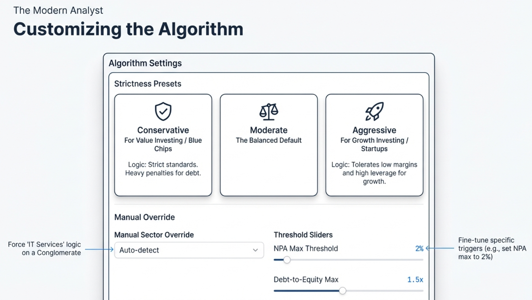
Click the Settings gear icon to access the configuration modal with three levels of customization:
Strictness Presets
| Preset | Philosophy | Score Impact | Best For |
|---|---|---|---|
| Conservative | Only the safest, most bulletproof companies pass | Expect lower scores. Getting a 70 is practically a miracle. | Value investing, blue-chip hunting |
| Moderate (Default) | Balanced approach for general analysis | Neutral baseline assessment | Daily research, standard screening |
| Aggressive | Prioritizes growth potential over safety | Expect higher scores. Turnarounds look much better. | Growth investing, turnaround stories |
How Thresholds Shift
| Metric | Conservative | Moderate | Aggressive |
|---|---|---|---|
| Revenue/Profit CAGR Min | 20% | 15% | 10% |
| ROE / ROCE Min | 20% | 15% | 12% |
| OPM Min | 15% | 10% | 8% |
| D/E Max (Non-Banking) | 0.5x | 1.0x | 1.5x |
| GNPA Max (Banking) | 2.0% | 3.0% | 4.0% |
| Promoter Pledge Max | 5% | 10% | 20% |
Manual Sector Override
For conglomerates like Reliance Industries (oil, retail, telecom), the auto-detection may only reflect one part of the business. Use the Sector Override dropdown to manually select from 18 sectors and force the Health Score to use that industry's grading logic.
Individual Threshold Sliders
After selecting a base preset, you can fine-tune individual sliders. For example, you might want strict debt rules (Conservative) but lenient growth rules (Aggressive). Click "Apply & Re-analyze" to save and refresh the score.
Calculated Ratios Tab — The Diagnostic Engine
If Quick Analysis tells you the patient has a fever of 104, Calculated Ratios is the blood test that tells you why. Is it a bacterial infection (poor margins)? A virus (excessive debt)? This tab computes 11+ financial ratios from raw data and, most importantly, features the powerful DuPont Analysis that decomposes Return on Equity into its three drivers.
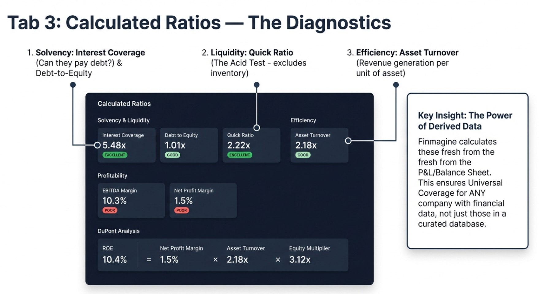
Universal Coverage: The Key Advantage
Unlike Quick Analysis (which relies on pre-calculated data from Screener.in), the Calculated Ratios tab derives ratios from raw financial statements entirely client-side. This means it works for any company on Screener.in — even small microcaps that other tools do not cover. As long as a P&L and Balance Sheet exist, Finmagine can calculate the key ratios.
Solvency & Liquidity Ratios
These answer the fundamental question: Can this company survive?
| Ratio | Formula | Excellent | Good | Average | Poor |
|---|---|---|---|---|---|
| Interest Coverage | Operating Profit / Interest Expense | ≥ 5.0x | 3.0-5.0x | 2.0-3.0x | < 2.0x |
| Debt to Equity | Total Borrowings / Shareholders' Equity | ≤ 1.0x | 1.0-1.5x | 1.5-2.5x | > 2.5x |
| Debt to Assets | Total Borrowings / Total Assets | ≤ 20% | 20-40% | 40-60% | > 60% |
| Current Ratio | Current Assets / Current Liabilities | ≥ 2.0x | 1.5-2.0x | 1.0-1.5x | < 1.0x |
| Quick Ratio (Acid Test) | (Current Assets - Inventory) / Current Liabilities | ≥ 1.5x | 1.0-1.5x | 0.8-1.0x | < 0.8x |
The Quick Ratio (Acid Test) is particularly powerful. It asks a brutally simple question: If your sales stopped tomorrow and you could not sell a single piece of inventory, could you still pay off all your immediate debts? If a company has a high Current Ratio but a low Quick Ratio, it may be hoarding unsold stock to make its balance sheet look healthier than it is.
Profitability Ratios
| Ratio | Formula | Excellent | Good | Average | Poor |
|---|---|---|---|---|---|
| EBITDA | Operating Profit + Depreciation | Informational only (absolute value, no rating) | |||
| EBITDA Margin | EBITDA / Revenue × 100 | ≥ 40% | 25-40% | 15-25% | < 15% |
| Net Profit Margin | Net Profit / Revenue × 100 | ≥ 20% | 10-20% | 5-10% | < 5% |
Efficiency Ratios
| Ratio | Formula | Excellent | Good | Average | Poor |
|---|---|---|---|---|---|
| Asset Turnover | Revenue / Total Assets | ≥ 3.0x | 2.0-3.0x | 1.0-2.0x | < 1.0x |
| Fixed Asset Turnover | Revenue / Fixed Assets | ≥ 10.0x | 5.0-10.0x | 2.5-5.0x | < 2.5x |
| Equity Multiplier | Total Assets / Shareholders' Equity | ≤ 1.5x | 1.5-2.5x | 2.5-4.0x | > 4.0x |
DuPont Analysis: The Crown Jewel
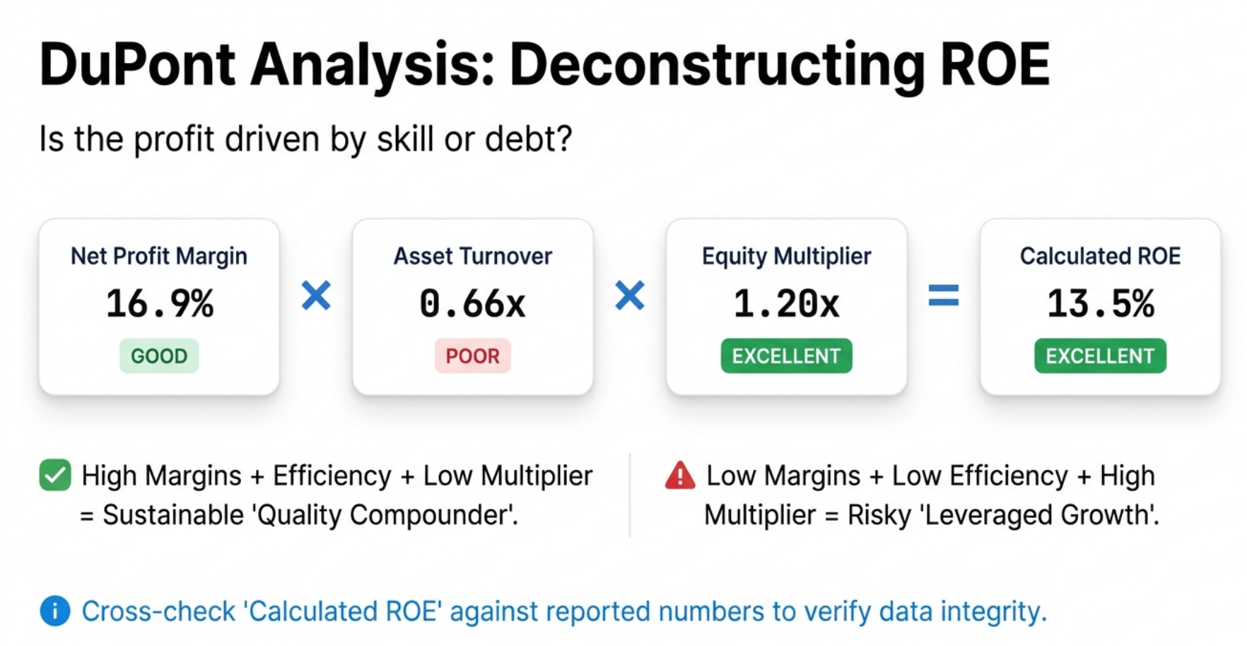
DuPont Analysis is the single most powerful feature in the entire extension. It decomposes Return on Equity (ROE) into three components:
ROE = Net Profit Margin × Asset Turnover × Equity Multiplier
This reveals how a company achieves its ROE — and whether that ROE is sustainable or fragile.
Three Company Profiles
| Profile | NPM | Asset Turnover | Equity Multiplier | Verdict |
|---|---|---|---|---|
| Quality Compounder | High | Moderate | Low | Sustainable, low-risk ROE. Driven by pricing power and efficiency. This is the gold standard. |
| Efficient Operator | Moderate | High | Moderate | Good capital utilization. Think discount grocery chains — thin margins but incredible inventory turnover. |
| Leveraged Growth | Low | Low | High | ROE inflated by debt. A house of cards. One bad quarter or interest rate hike and it collapses. |
Calculated vs. Actual ROE
The tool compares its DuPont-calculated ROE against Screener.in's reported ROE. A match (within ~2%) confirms data consistency. A larger difference may indicate timing or averaging differences.
DuPont for Banks: Read with Caution
The Calculated Ratios tab uses universal formulas — it does NOT adjust for sector. This means a bank will always show a high Equity Multiplier (rated "Poor" in red) because banks are inherently leveraged. This is expected and normal. Cross-reference the Quick Analysis tab (which does adjust for banking) to confirm the leverage is being managed safely via NIM and GNPA.
Quick Analysis vs. Calculated Ratios: When to Use Which
| Aspect | Quick Analysis | Calculated Ratios |
|---|---|---|
| Role | The Dashboard — tells you if a company is healthy | The Diagnostics Tool — tells you why |
| Primary Output | Health Score (0-100) | 11+ Financial Ratios |
| Sector Awareness | Yes — auto-detects and adjusts | No — universal formulas (user provides context) |
| Unique Feature | Shareholding Tracker | DuPont Analysis |
| Customization | 3 strictness presets + individual sliders | Fixed formulas and standard thresholds |
| Use First? | Yes — get the "pass/fail" verdict first | Second — investigate the "why" behind the score |
Price Analysis Tab — The Valuation Verdict
You have visualized the trends (Charts), assessed the health (Quick Analysis), and investigated the fundamentals (Calculated Ratios). Now comes the question that actually determines if you make money: Is the price you are paying justified?
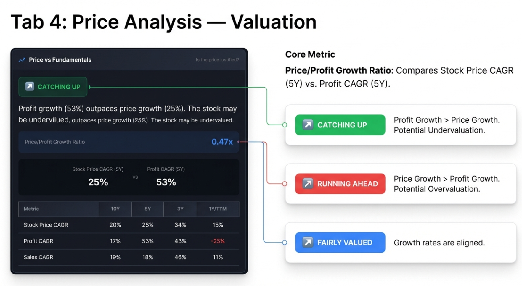
Price vs. Fundamentals: The Core Question
This panel directly challenges the basic psychology of investing. A stock that is up 50% feels great. But the sober question is: did the business grow 50%? The tool compares the stock's price CAGR against its profit CAGR (primarily over 5 years, falling back to 3 years if unavailable).
The Price/Profit Growth Ratio
Price/Profit Growth Ratio = Stock Price CAGR ÷ Profit CAGR
| Badge | Ratio | Meaning | Investor Action |
|---|---|---|---|
| CATCHING UP | < 0.7x | Profit growth significantly outpaces price growth. Stock may be undervalued. | Research for potential undervaluation. This is what value investors dream of. |
| FAIRLY VALUED | 0.7x - 1.3x | Price and profit growth roughly aligned. | Neutral. Focus on future growth expectations. |
| RUNNING AHEAD | > 1.3x | Price growth far exceeds profit growth. Stock may be overvalued. | Caution. The gap between price and value is pure sentiment/hype. |
CAGR Comparison Table
Below the Price vs. Fundamentals panel, a table shows Stock Price CAGR, Profit CAGR, and Sales CAGR across 10Y, 5Y, 3Y, and 1Y/TTM timeframes. Key patterns to watch:
- Price CAGR > Profit CAGR (all periods): Consistently expensive — multiple expansion
- Price CAGR < Profit CAGR (all periods): Consistently undervalued — multiple compression
- 1Y Price CAGR >> 5Y Price CAGR: Recent rally — verify if fundamentals support it
- 1Y Profit CAGR >> 1Y Price CAGR: Fundamentals accelerating — potential opportunity
Cyclical Analysis: Timing the Entry
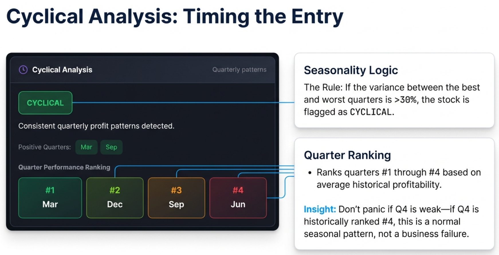
Many businesses are seasonal or cyclical. AC companies, auto companies, infrastructure firms, FMCG — their quarterly profits follow predictable patterns tied to festivals, government budgets, and harvest cycles.
How It Works
- Groups all historical quarterly profits by month: Mar, Jun, Sep, Dec
- Calculates average profit for each quarter type across multiple years
- Measures the variance between best and worst quarter averages
- If variance exceeds 30% of the mean, the company gets the purple CYCLICAL badge
Quarter Performance Ranking
Quarters are ranked from #1 (strongest, dark green) to #4 (weakest, red/brown). This lets you know which quarters to expect strong results and which to expect weakness.
Why This Matters
If an AC company posts a small loss in December, the market might overreact and sell it off. But if the tool tells you December is historically their #4 quarter, you know this is normal. Instead of panic-selling, seasoned investors use the seasonal dip as a buying opportunity — knowing the strong #1 and #2 quarters are ahead.
| Industry | Typically Strongest Quarter | Driver |
|---|---|---|
| Infrastructure | Q4 (March) | Government spending/billing before fiscal year-end |
| Retail / FMCG | Q3 (Oct-Dec) | Diwali, festive season, Christmas |
| Auto | Q2 (Sep) and Q4 (Mar) | Festive demand + year-end incentives |
| Agriculture | Seasonal | Harvest cycles and monsoon patterns |
Risk Metrics: The 52-Week Analysis
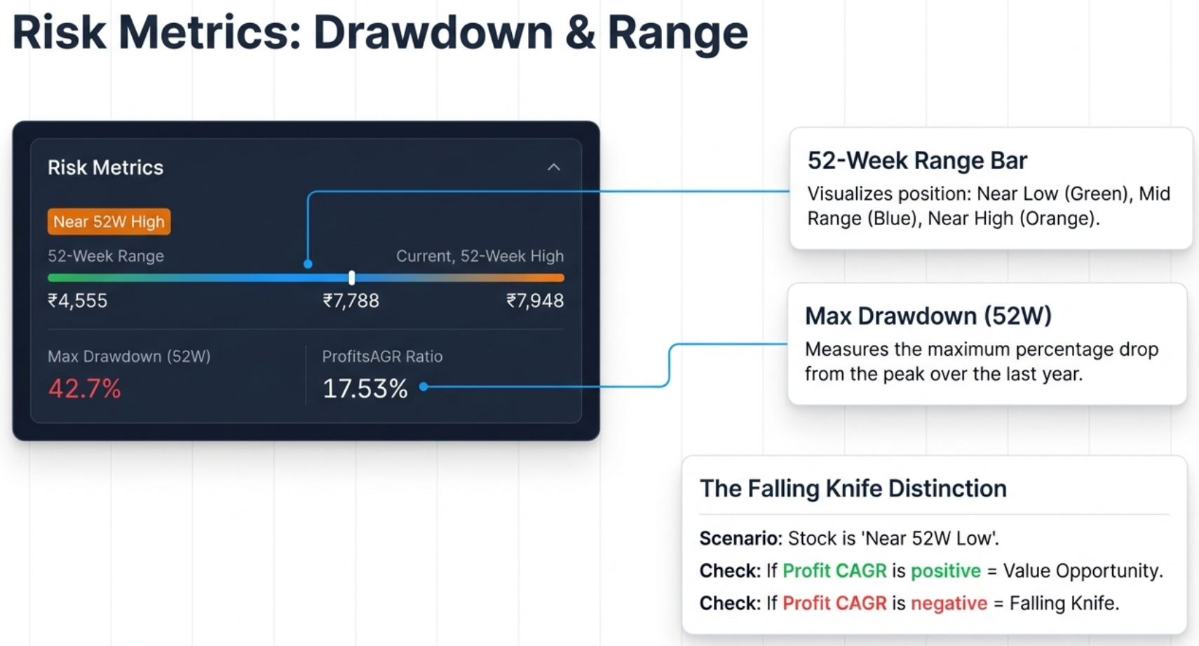
The Risk Metrics panel visualizes where the current stock price sits within its 52-week range and quantifies the historical volatility.
52-Week Range Bar
A visual bar from 52W Low to 52W High with a marker showing current price position. The tool classifies the position into three zones:
| Badge | Condition | Interpretation |
|---|---|---|
| Near 52W High | Within 10% of high | Potentially expensive. The tool warns: "Consider if the valuation is justified." |
| Near 52W Low | Within 20% of low | Could be a value opportunity or a falling knife. Must verify fundamentals. |
| Mid Range | Between the above | Neutral territory. Balanced risk/reward. |
Max Drawdown (52W)
Measures the maximum peak-to-trough drop over the last year: (High - Low) / High × 100. This quantifies the "pain tolerance" required to hold the stock:
| Drawdown | Risk Level | Strategy |
|---|---|---|
| < 20% | Low | Safe to buy on momentum. Corrections are shallow. |
| 20-40% | Moderate | Normal volatility. Standard entry rules apply. |
| 40-60% | High | Avoid buying at peaks. Wait for deep pullbacks. |
| > 60% | Very High | Extreme volatility. Requires strict stop-losses. |
The Falling Knife Distinction
When a stock is "Near 52W Low," is it a bargain or a trap? The answer lies in combining the price position with profit momentum:
- Value Opportunity: Near 52W Low + CATCHING UP status + 1Y Profit CAGR is positive/accelerating. The price dropped but the business is healthy. The decline is likely sentiment-driven.
- Falling Knife: Near 52W Low + 1Y Profit CAGR is negative or drastically lower than 5Y average. The price is falling because the business is deteriorating. Do not catch it.
The 4-Step Workflow in Action: Real Company Analysis
Let us walk through the complete workflow with a real company to see how all four tabs work together to build a complete investment thesis.
Example: Affle (India) Ltd — Quality Compounder
Step 1: Charts Tab — Visualize the Trends
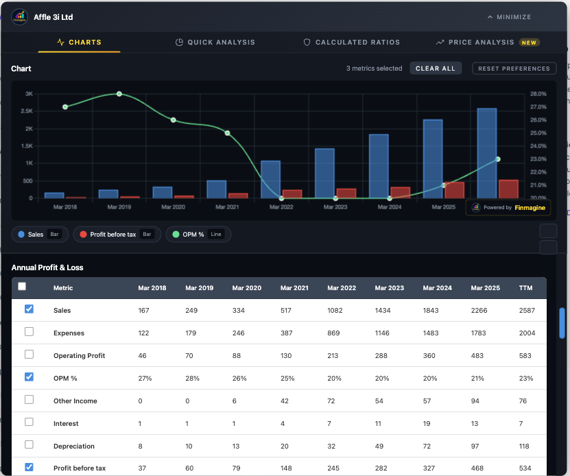
The chart instantly reveals a powerful growth story: Sales (blue bars) climbing from 167 crores in Mar 2018 to 2,266 crores in Mar 2025 — a 13x increase. The OPM% line (green) has stabilized around 21-23% after initially being higher, showing mature but healthy margins. Profit before tax (red bars) shows consistent upward trajectory.
Step 2: Quick Analysis Tab — The Health Check
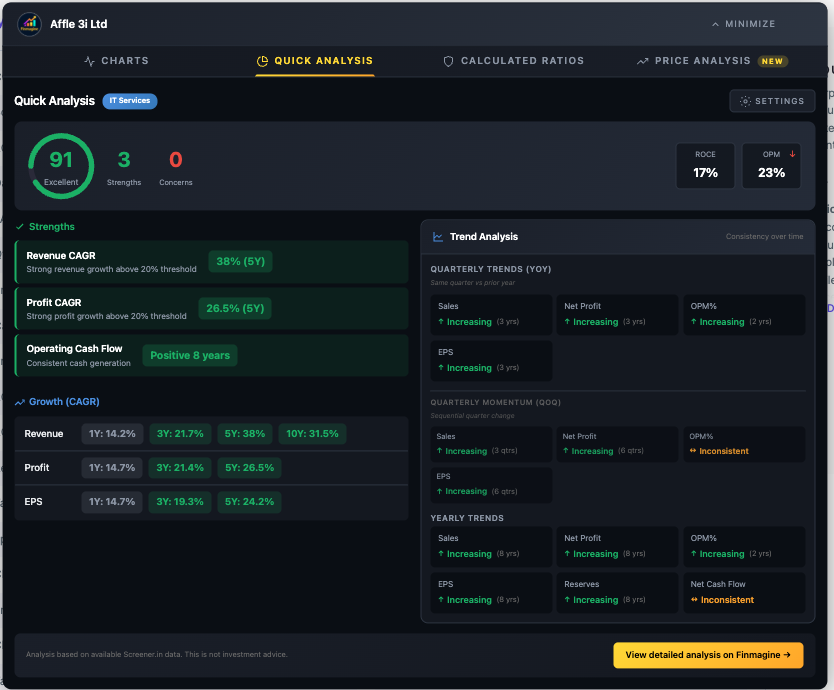
Health Score: 91 (Excellent). Three strengths flagged, zero concerns. Revenue CAGR of 28% (5Y), Profit CAGR of 26.5% (5Y), and consistent positive operating cash flow for 8 years. The trend analysis shows increasing sales and profits YoY. This is a textbook quality company.
Step 3: Calculated Ratios Tab — The Diagnostics
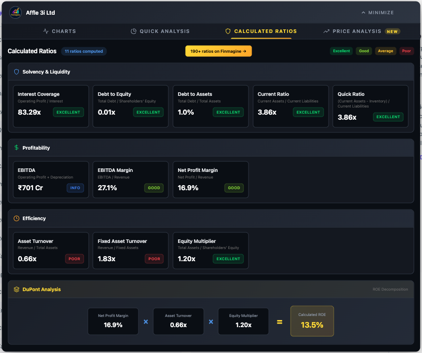
The solvency picture is pristine: virtually debt-free (D/E of 0.01x), Interest Coverage of 83x, Current Ratio of 3.86x. Now look at the DuPont Analysis: NPM 16.9% (Good) × Asset Turnover 0.66x (Poor) × Equity Multiplier 1.20x (Excellent) = 13.5% ROE. This is a Quality Compounder profile — the ROE comes from profit margins with almost zero reliance on debt. The low asset turnover is typical for IP/tech businesses.
Step 4: Price Analysis Tab — The Valuation
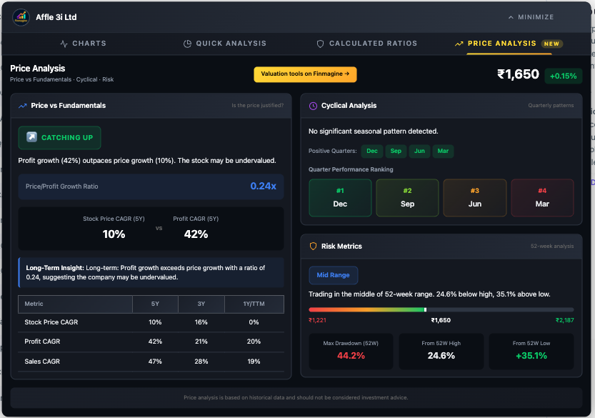
CATCHING UP with a Price/Profit ratio of just 0.24x. Profit growth (42%) massively outpaces price growth (10%). The stock is in the Mid Range of its 52-week range. Despite a high Max Drawdown (44.2%), the fundamentals are accelerating. This is a classic value setup where the market has not fully appreciated the company's profit growth.
The Complete Analyst Workflow
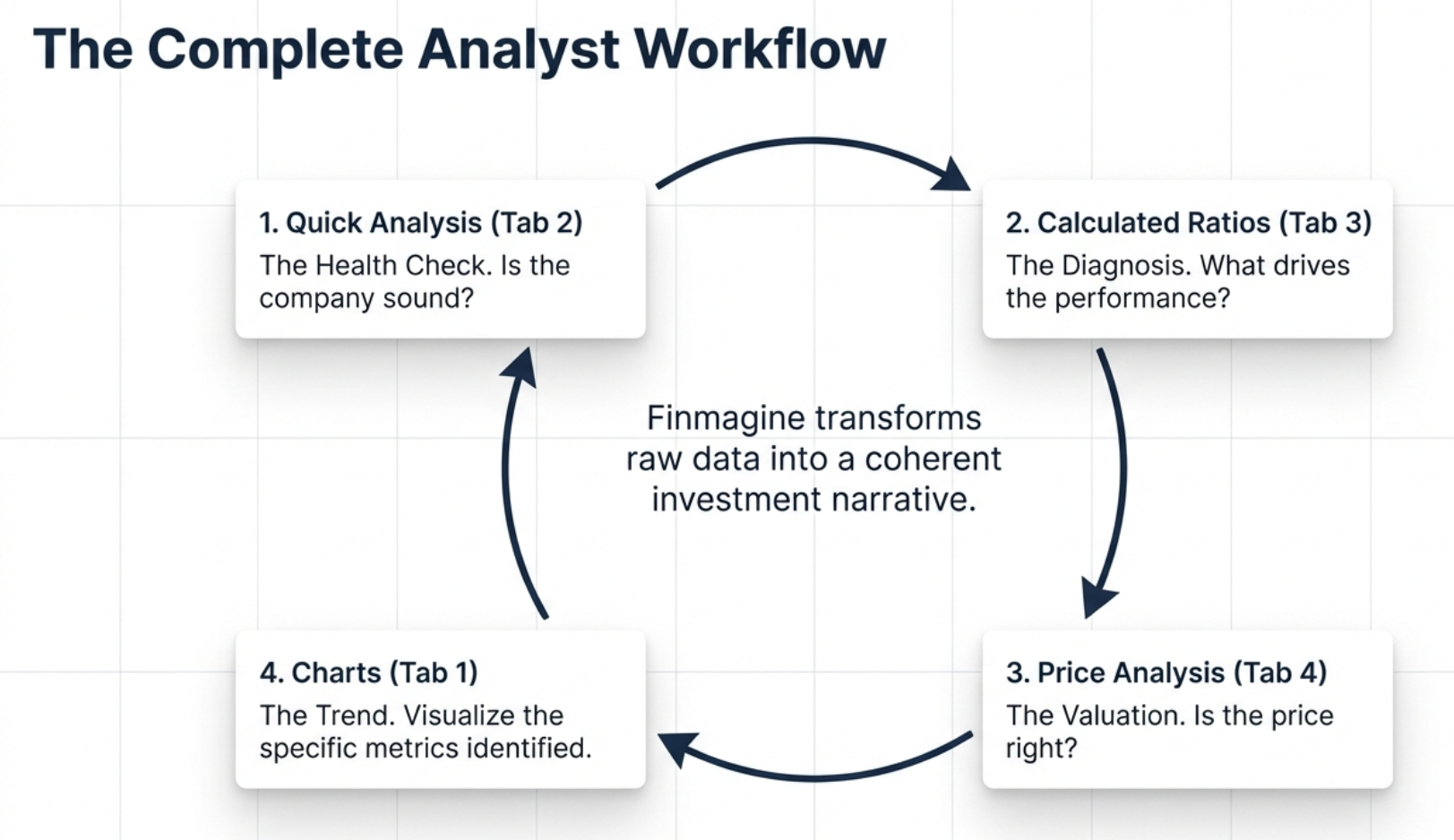
The four tabs are designed to work as a complete end-to-end workflow. Here is the recommended analytical sequence:
- Quick Analysis first: Get the instant health score. If the score is below 40, you may want to skip to the next company unless you are specifically hunting turnarounds.
- Calculated Ratios second: Understand why the score is what it is. Check the DuPont Analysis to verify ROE quality. If you see a "Leveraged Growth" profile, proceed with extreme caution.
- Price Analysis third: Is the stock catching up or running ahead? Check cyclical patterns for timing. Assess risk metrics for entry positioning.
- Charts last: Now that you know what to look for, build targeted visualizations. Chart the specific metrics that matter for your thesis — margins, cash flow, shareholding trends.
Troubleshooting & FAQ
Common Issues & Solutions
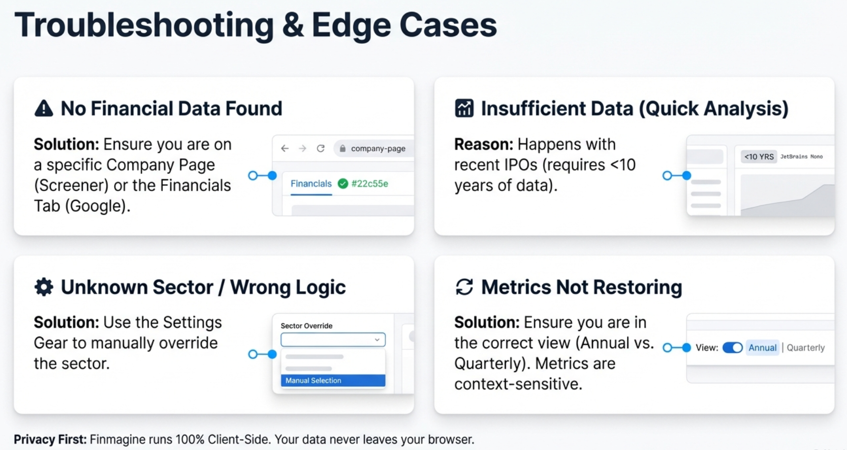
"No Financial Data Found"
- Screener.in: Ensure you are on a company page (URL contains
/company/), not the homepage - Google Finance: Click the "Financials" tab first and wait 2-3 seconds for data to load before clicking the Finmagine button
Button Not Appearing
- Check
chrome://extensions/and verify the extension is enabled - Refresh the page (F5)
- On Google Finance, you must click the "Financials" tab first
Quick Analysis Tab Not Appearing
- Quick Analysis is Screener.in exclusive. It does not appear on Google Finance.
- Ensure you are on a company detail page
"Insufficient Data" in Quick Analysis
- The health score requires 10+ years of P&L data. Recent IPOs may not have enough history.
- Try the consolidated page instead of standalone
Sector Shows Wrong Industry
- The extension reads sector from the Peer Comparison breadcrumb
- Use Settings > Sector Override to manually select the correct sector
"Clear All" Does Not Prevent Metrics from Coming Back
- "Clear All" only clears the current chart, not saved preferences
- Use "Reset Preferences" to clear the saved metric memory
Metrics Not Restoring on New Company
- Metrics are section-scoped: Annual P&L preferences do not restore to Quarterly P&L
- Unusual metric names may not alias correctly — re-select manually
Google Finance: Chart Shows Stale Data
- You switched tabs while the panel was fully expanded. The extension cannot detect changes underneath it.
- Solution: Use the Minimize-Restore cycle (Minimize → Switch → Wait → Restore)
DuPont ROE Does Not Match Screener.in ROE
- Minor differences (within 2%) are normal due to timing and averaging
- DuPont uses latest annual values; Screener.in may use TTM or averaged data
Frequently Asked Questions
Is the extension really free?
Yes, 100% free. No trial, no premium tier, no hidden costs, no account required.
Does it collect my data?
Your charts, analysis, and research habits stay in your browser — never transmitted. Stock fundamentals from pages you visit are passively contributed to Finmagine's shared cache (anonymously, aggregate only) to improve speed for all users. No personal data or research identity is tracked.
Why are Quick Analysis, Calculated Ratios, and Price Analysis only on Screener.in?
These features require deep historical data (10+ years P&L, balance sheet, shareholding, growth rates). Screener.in provides this depth for thousands of Indian companies. Google Finance typically provides only 4-5 years, which is insufficient for reliable health scoring, ratio calculation, and CAGR comparison.
Can I compare multiple companies on one chart?
Not simultaneously. The tool analyzes one company at a time. For comparisons, screenshot each company's charts and place them side-by-side, or open multiple browser tabs.
What browsers are supported?
Chrome and all Chromium-based browsers: Microsoft Edge, Brave, Opera, etc. Mobile browsers are not supported (Chrome extensions are desktop-only).
From Data Overload to Confident Decisions
You now have the complete Finmagine 4-step workflow in your analytical toolkit:
- Charts Tab: Visualize trends with dual-axis intelligence, metric persistence, and the Minimize-Restore workflow for Google Finance
- Quick Analysis Tab: Get sector-aware health scores with customizable Conservative/Moderate/Aggressive presets
- Calculated Ratios Tab: X-ray the quality of earnings with DuPont Analysis and 11+ derived ratios
- Price Analysis Tab: Ground yourself in reality with Price/Profit Growth Ratios, cyclical timing, and risk metrics
Financial analysis just got dramatically faster and more intuitive. What used to require Excel exports, manual calculations, and 20+ minutes per company now takes seconds. The data is abundant and free — the edge is entirely about the story you can read in that data. Finmagine automates the looking so you can spend all your time on the thinking.
Next Steps:
- Install the extension from the Chrome Web Store
- Run through all four tabs on a company you are currently researching
- Experiment with the Settings modal — try Conservative vs. Aggressive on the same company
- Practice the Minimize-Restore cycle on Google Finance
- Build analytical templates: consistent metrics you check for every company in a sector
Free Chrome Extension
Ready to try this yourself?
Install the Finmagine Financial Chart Builder and transform any Screener.in, Google Finance, or stockanalysis.com page into interactive charts in one click.
Install from Chrome Web Store →No account required • Works on Chrome, Edge, Brave, Opera
Explore the Complete Chart Builder Hub
Discover all Chart Builder resources — tutorials, case studies, and more. Transform Screener.in & Google Finance data into professional charts.
Visit Chart Builder Hub →