🎓 Multimedia Learning Hub
Master the engineering behind the Chart Builder through a comprehensive learning overview, audio deep dive, and 59 interactive flashcards
📚 Complete Learning Path
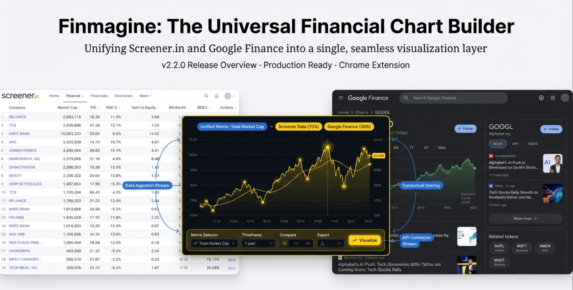
This article tells the inside story of the Finmagine Chart Builder — a Chrome extension that works on both Screener.in and Google Finance simultaneously. It's not just a "how-to" guide. It's an engineering war story: the bugs that nearly broke it, the architectural decisions that saved it, and what it reveals about the modern web.
🎯 What You'll Master:
- The Two-World Problem: Why Screener.in (static, server-rendered) and Google Finance (dynamic SPA) require fundamentally different extraction strategies
- Ghost Tables: How hidden DOM elements corrupt chart data, and why
getBoundingClientRect()is the only reliable fix - The NOW Bug: How Uber's charts got labeled "NOW" due to CSS class obfuscation — and the
document.titlesolution - The Flat Bucket: Why keyword-based categorization lost 80% of Cash Flow metrics, and how "extract first, label later" fixed it
- The Embedded Panel: Hidden → Minimized → Expanded states, and auto-refresh on restore
- MutationObserver + Debounce: How the extension watches a chaotic SPA and waits for the dust to settle
- Dual Number Parsing: M/B/T multipliers for Google Finance vs raw Indian numbers on Screener.in
- The Name Heuristic: How the extension decides bars vs lines — and when it gets it wrong
- The v3.0 Roadmap: Export, multi-company comparison, Yahoo Finance — and the strategic reasoning behind each
💡 Key Insights:
- 85% of the extension's code is shared — only 15% is platform-specific extraction logic
- Google keeps hidden tables in the DOM; geometry checks beat CSS checks for detecting them
- Google obfuscates CSS class names on every deployment —
document.titleis immune to all of it - Cash Flow lost 80% of its data because "Depreciation" was filtered as a P&L item
- The 1,200ms debounce waits for React's multi-step DOM update to fully settle
- The watermark on every chart is a viral acquisition engine — not accidental branding
- Multi-company comparison requires persistent state across SPA navigation — a major architectural challenge
- 1,800 lines of code from one developer provide a better chart experience than Google Finance natively offers
📖 Learning Recommendations:
- Start with the "Two Worlds, One Extension" section to understand the core architectural challenge
- Read the Ghost Tables and NOW Bug sections next — they're the most vivid engineering stories
- Study the number parsing section carefully if you work with financial data across markets
- Pay close attention to the Mutation Observer section — it reveals how messy the modern web really is
- Use all 59 interactive flashcards to test your understanding of the technical details
- Finish with the v3.0 Roadmap and Bigger Picture to see where this is heading
📺 Watch the Complete Tutorial
See the Chart Builder in action on both Screener.in and Google Finance — from installation to creating professional charts.
Video Title: This Free Chrome Extension Turns Screener.in & Google Finance Data Into Instant Charts
📺 Complete walkthrough covering dual-platform support, the gold button workflow, metric selection, dual-axis charting, and live demonstrations on both Screener.in and Google Finance
🎧 Listen to the Deep Dive
Prefer to listen? This audio guide covers the engineering story behind conquering both Screener.in and Google Finance — ghost tables, the NOW bug, mutation observers, and more.
Duration: Full deep dive | Format: Professional podcast-style narration
🎧 Explore the technical challenges of supporting two fundamentally different web architectures, the 1,200ms debounce solution, flat buckets strategy, and the strategic roadmap for future platform expansion
🎯 Test Your Knowledge
59 flashcards covering every technical concept in this article. Click any card to reveal the answer. Use the search box to find specific topics.
The Wall of Numbers
If you have ever sat down to research a stock, you know exactly what happens. You land on a financial website — Screener.in, Google Finance, maybe Yahoo — and what greets you is a table. Rows and columns of numbers. Revenue, Net Profit, EBITDA, EPS, Margins. Ten quarters of data stretching across your screen.
And here is the problem: your brain is not built to read ten numbers in a row and instantly see a trend. You have to mentally simulate the chart. Is Q3 bigger than Q2? How much bigger? What about compared to last year? You're squinting, calculating, comparing — doing all the cognitive heavy lifting yourself.
This is the exact problem the Finmagine Chart Builder was designed to solve. And the way it solved it — on two fundamentally different platforms, simultaneously — is a story worth telling.
🟡 The Gold Button
The Chart Builder's entire premise is zero friction. Visit a supported financial website. Wait for a gold "Visualize with Finmagine" button to appear. Click once. Professional-grade charts overlay the page instantly — no downloads, no CSV exports, no Excel. Just raw data turning into visual insight.
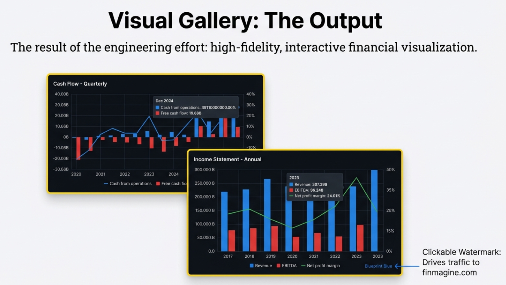
📊 The Output: High-Fidelity Financial Visualization
The result of the engineering effort: professional-grade charts that combine bars (absolute values like Revenue, Cash from Operations) with lines (ratios like Net Profit Margin) on dual Y-axes. Every chart includes the clickable finmagine.com watermark — the viral acquisition engine that drives organic growth through shared screenshots.
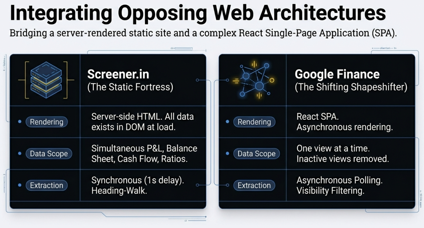
Two Worlds, One Extension
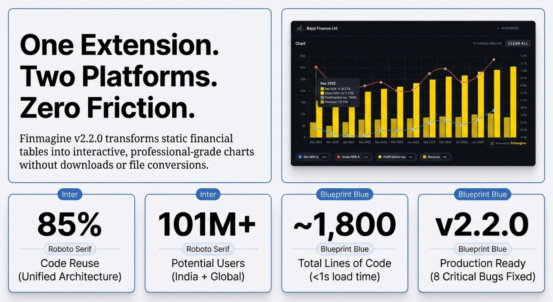
The Chart Builder is a Chrome extension. About 1,800 lines of code spread across 10 core files. That is remarkably small. But the truly impressive number is not the total — it is the split. 85% of that code is shared between two platforms that are built in fundamentally different ways. Only 15% is platform-specific extraction logic.
To understand why that 15% is so hard, you need to understand the two worlds.
Screener.in: The Buffet
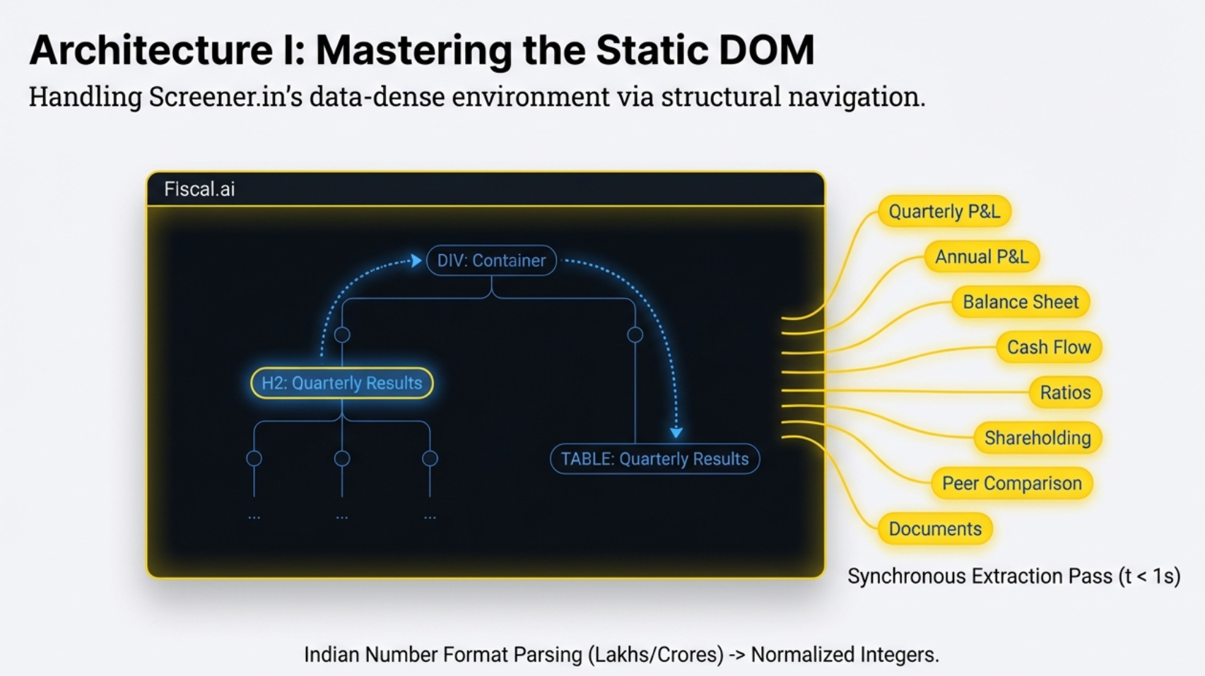
Think of a buffet restaurant. You walk in and everything is already laid out on the tables — the salad, the soup, the main course, the dessert. All visible, all ready to eat. That is Screener.in.
When you visit a company page on Screener, the server assembles the entire page — every financial table, every ratio, every shareholding pattern — and sends it to your browser in one package. When the page finishes loading, everything is in the DOM simultaneously. Profit & Loss, Balance Sheet, Cash Flow, Ratios, Shareholding. Up to 8 populated tables, all waiting.
For the extension, this is a dream. Wait one second. Run a synchronous extraction using a heading-walk strategy — find a section heading like "Balance Sheet," walk the DOM to find its associated table, grab the data. Do this for all sections at once. Fast. Clean. Reliable.
Google Finance: The Chaotic Kitchen
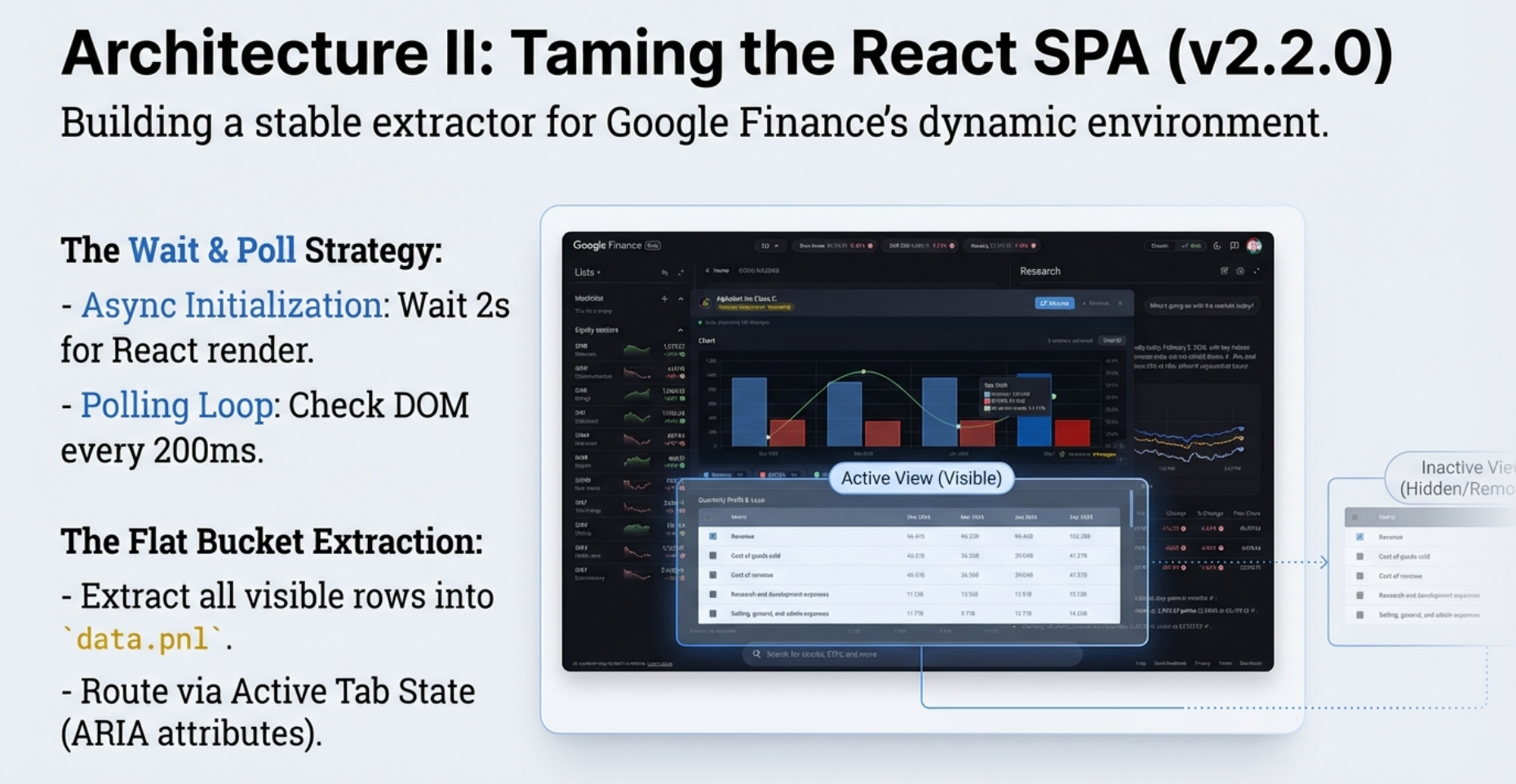
Google Finance is a completely different animal. It is a React-based Single Page Application — an SPA. When you visit a stock page, Google does not send you a full meal. It sends you an empty plate — a shell of a webpage — and then your browser runs JavaScript to fetch specific items, one at a time.
The critical difference: Google Finance only shows you one financial statement at a time. If you are looking at the Income Statement, the Balance Sheet does not exist on the page. It is not hidden somewhere off-screen. It is simply not there for the code to find.
For the extension, this means surveillance. It cannot run once and be done. It must wait, it must watch. It polls the page every 200 milliseconds — five times per second — asking: "Is the table here yet?" With a 5-second timeout before giving up.
📊 The Architectural Divide
This comparison captures the fundamental difference that dictates every technical decision in the extension:
- Screener.in: Server-rendered. All tables exist in the DOM at once. One synchronous extraction grabs everything.
- Google Finance: React SPA. Only the active statement is rendered. Requires async polling, visibility filtering, and a refresh workflow to see new data.
- User Impact: On Screener, you can chart Revenue (P&L) vs Operating Cash Flow (Cash Flow) side by side instantly. On Google Finance, you cannot — switching statements clears your previous chart.
| Feature | Screener.in | Google Finance |
|---|---|---|
| Data Scope | All statements at once (up to 8 tables) | Only the currently visible statement |
| Panel Style | Modal overlay (pop-up) | Embedded bottom-drawer panel |
| Refresh Button | No — data is static | Yes — required when switching statement tabs |
| Extraction Speed | Fast — 1-second synchronous pass | Slower — polls every 200ms, up to 5-second timeout |
| Cross-Statement Charts | Yes — Revenue vs Cash Flow instantly | No — one statement at a time |
| Ratios / Shareholding | Available | Not available (source does not provide them in tables) |
The Two Workflows, Side by Side
The architecture difference is not just abstract. It reshapes every step of the experience. On Screener.in, the workflow is almost musical in its simplicity: page loads → wait one second → extract everything synchronously → all six statement types are instantly available. The gold button appears. You click. Every metric from every table is right there, no further action needed.
Google Finance is a twelve-step symphony. The page shell loads. React begins hydrating tables in the background. The extension waits two seconds, then starts polling every 200 milliseconds — "Is the table here yet?" Once found, it filters for visibility, runs tab detection (checking ARIA attributes first, then CSS classes, then scanning the full page text as a last resort), detects the period type, routes the data through tabRouteMap, and then builds the panel. That is just the setup. The real experience begins when you want to see a different statement — and that is where the MutationObserver, the Refresh button, and the auto-refresh-on-restore all come into play.
if (site === 'screener') branch anywhere in the code. The difference is driven entirely by the shape of the data object. Google Finance's extractor sets a property called data.activeTab. Screener's extractor never sets it — it stays undefined. That single missing property causes the statement badge, the Refresh button, and the auto-refresh indicator to silently not render on Screener. Same code. Same template. Two different products. Data-driven rendering at its cleanest.
Two completely different web architectures. One extension. 85% shared code. The other 15% is where the real engineering stories live.
Real-World Examples: The Same Tool, Two Different Platforms
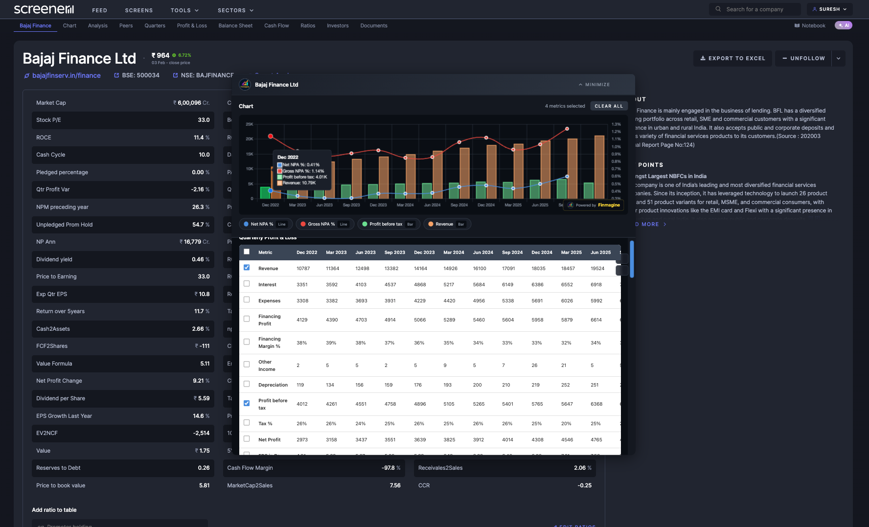
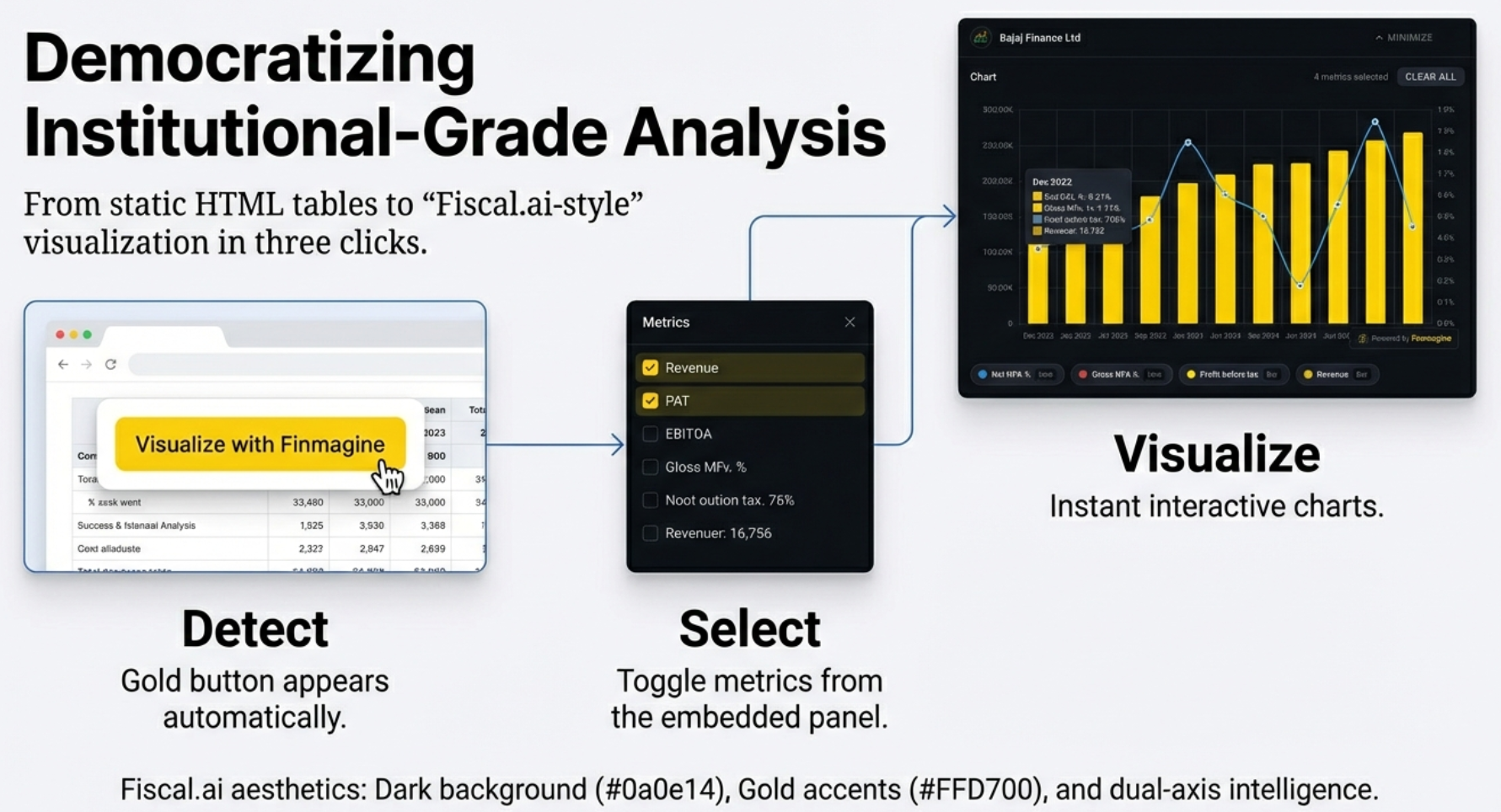
📊 Screener.in: Bajaj Finance Quarterly P&L
The Chart Builder in action on Screener.in. All financial tables are available simultaneously — this chart combines Revenue, Profit Before Tax, Gross NPA, and Net NPA from a single extraction pass. The modal overlay appears in the center of the screen with full metric selection on the left panel.
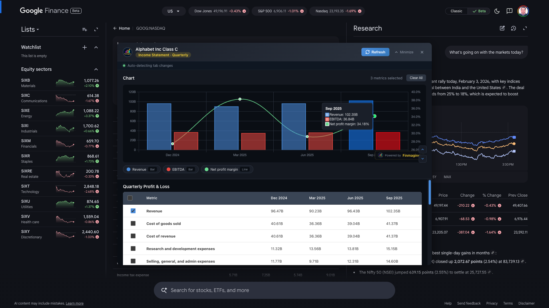
📊 Google Finance: Alphabet Inc Quarterly Income Statement
The same Chart Builder on Google Finance. Note the embedded bottom-drawer panel design — it stays docked while you navigate Google's SPA tabs. Revenue and EBITDA appear as bars on the left axis; Net Profit Margin appears as a line on the right axis. The "Refresh" button is visible because Google Finance only shows one statement at a time.
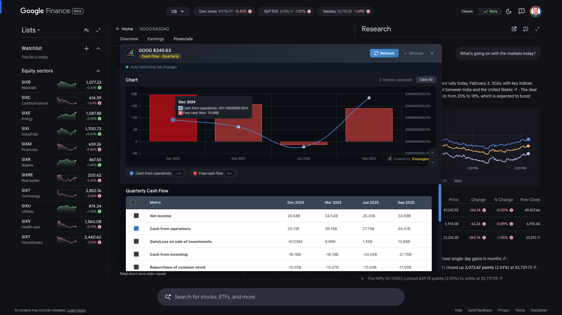
📊 Google Finance: Alphabet Inc Quarterly Cash Flow
Cash Flow statement on Google Finance — this is the statement that was losing 80% of its metrics before the "flat bucket" fix. After v2.2.0, all ~25 Cash Flow metrics are extracted correctly. Cash from Operations and Free Cash Flow are shown here, demonstrating the dual-axis capability with absolute values on the left.
The Ghost Table Problem
Version 2.2.0 closed 8 specific bugs. Let us start with the spookiest one.
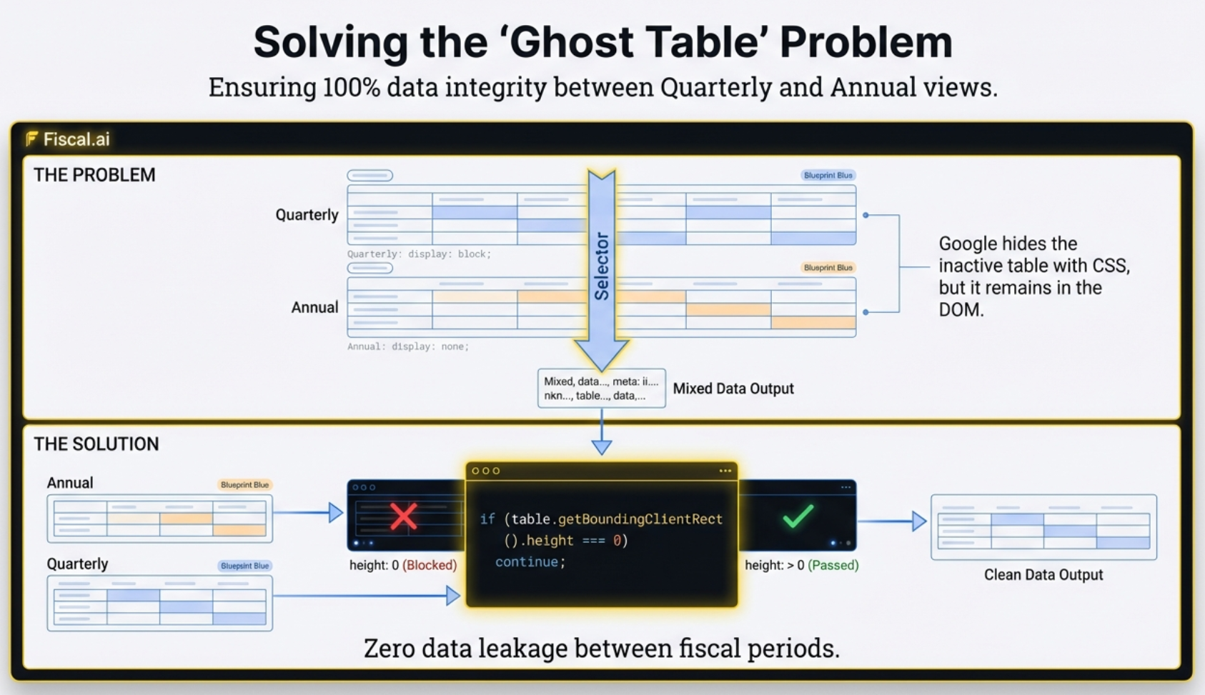
On Google Finance, you can toggle between Quarterly and Annual views. You click "Quarterly." The Annual numbers vanish from your screen. Simple switch, right? Except — and this is the part that trips up every extraction tool — Google does not actually remove the Annual table from the code.
It keeps both tables in the DOM simultaneously. It just hides the inactive one using a CSS rule: display: none.
👻 The Ghost Table: What You See vs What the Code Sees
Your eyes see one table. But a standard extraction command like document.querySelectorAll('table') reads the DOM structure — it does not care about CSS visibility. It returns both tables.
- Before the fix: Quarterly Q1, Q2, Q3 bars sit next to a massive full-year Annual bar. The scale is destroyed. The data is meaningless.
- After the fix: Only the table actually taking up space on screen is extracted. The ghost table is skipped entirely.
The Fix: Checking Reality, Not Instructions
You might think the solution is straightforward: just check if the table has display: none. But that is actually unreliable. What if the table itself is technically "visible" in its own CSS, but the container it sits inside is hidden? Or its grandparent container? You would have to walk up the entire family tree of the element, checking every ancestor. Slow. Fragile. Prone to edge cases.
The actual solution is a single JavaScript property: getBoundingClientRect(). It asks the browser one question: "What are the physical dimensions of this element right now?"
If the height is zero — no matter how it got hidden, whether by its own CSS, a parent container, a collapsed ancestor, anything — the table is taking up no physical space. It is a ghost. The extension skips it.
if (table.getBoundingClientRect().height === 0) continue; — This single check, run on every table found in the DOM, is the difference between a chart that makes sense and one that silently mixes time periods. It checks reality (does this element occupy space on screen?) rather than instructions (what does the CSS say?). If height is zero, ignore it. Period.
This is the difference between asking "Are you supposed to be hiding?" and asking "Can I actually see you?"
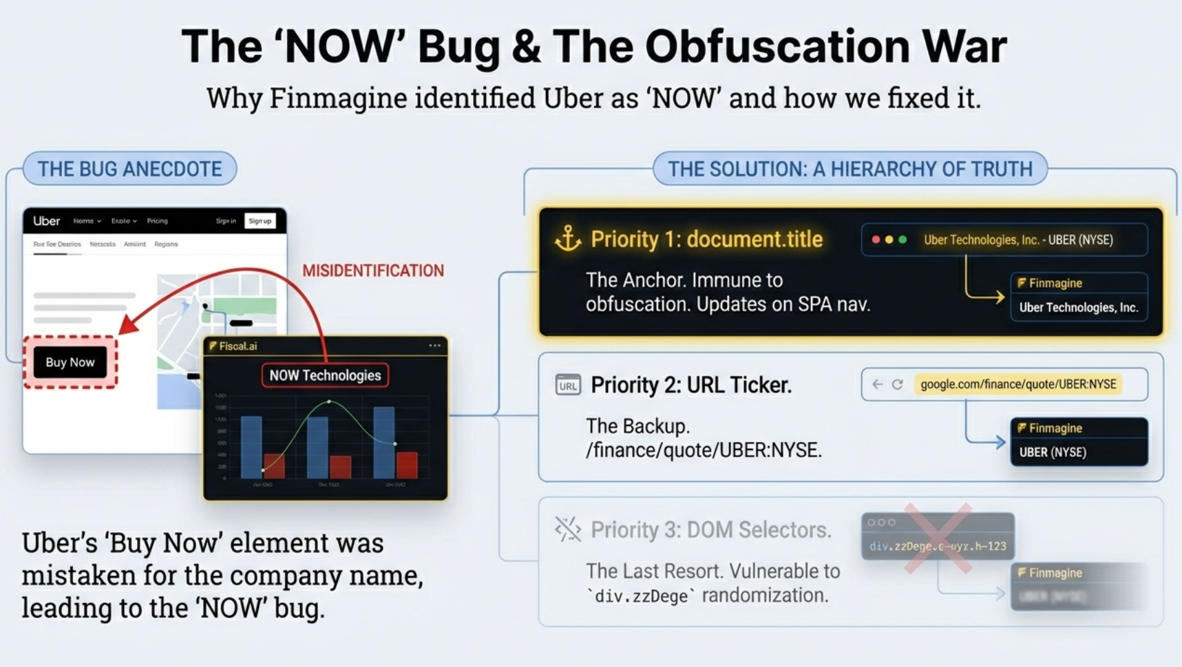
The Identity Crisis: How Uber Became "NOW"
If the ghost table bug was spooky, this one is genuinely absurd. And it forced a fundamental rethink of how the extension extracts data from Google Finance.
The extension needs to know which company you are viewing so it can label the chart. "Alphabet Inc." Revenue. "Tesla" Net Profit. Makes sense. So the developers found a CSS class in Google's code that seemed to reliably hold the company name. Something like div.zzDege. Gibberish, yes — because Google uses automated tools to scramble its class names. But if you find the right one, it works.
It worked fine for months. Until a user visited the Uber Technologies page.
🐛 Bug #5 in the v2.2.0 Changelog: Incorrect Company Names
On the Uber page, the CSS class the extension relied on accidentally matched a sidebar element — likely a "Buy Now" button or advertisement. That element loaded a fraction of a second before the actual company title. The extension grabbed the first match. The text inside? "NOW".
- Uber's financial charts were being labeled "NOW" for every user who visited that page
- The same obfuscated class could match different elements on different company pages
- Any Google deployment that randomized class names would silently break the extraction
div.zzDege today becomes div.aB7kR tomorrow. Any extraction logic built on specific class names will break silently the moment Google pushes an update. This is not a bug in Google's system. It is Google's system working exactly as designed.
The New Strategy: Trust the Browser, Not the Page
Version 2.2.0 made a decisive architectural shift: stop looking at the page body entirely for company names. Instead, read document.title — the text at the very top of your browser tab.
On Google Finance, that title follows a predictable, human-readable format: "Uber Technologies (UBER:NYSE) | Google Finance". The extension parses this string, strips away the parentheses and the pipe, and extracts "Uber Technologies." Clean. Reliable. Completely immune to whatever Google does with its internal CSS tomorrow.
- Priority 1 —
document.title: The browser tab text. Updates correctly on every SPA navigation. Immune to CSS obfuscation. - Priority 2 — URL Ticker: Parse the ticker from the URL pattern
/finance/quote/TICKER:EXCHANGE. Works even if the title format changes. - Priority 3 — DOM Selectors: Only as a last resort, and only using stable ARIA attributes like
button[aria-selected="true"]— never obfuscated class names.
Sometimes the answer is not deeper in the code. It is literally right at the top of the screen.
The Missing Metrics: 5 Lines Instead of 25
The ghost tables and the NOW bug are dramatic stories. But this bug was quietly devastating — and most users who hit it did not even know they were missing data.
When users opened the Cash Flow chart on Google Finance, they saw only 5 metrics. The Cash Flow statement typically has 25 or more rows. The extension was silently dropping 80% of the data, and nobody noticed until someone actually compared the two lists.
🐛 Bug #3: Cash Flow Missing Metrics — Before and After
The extraction logic was trying to be smart. It categorized each row as it was found. "Depreciation" — that sounds like P&L. Skip it here. "Interest Expense" — also P&L. Skip. Row after row of perfectly valid Cash Flow data was being filtered out because the same terms appear in other financial statements.
The Fix: Extract First, Label Later
V2.2.0 introduced what the documentation calls the "flat bucket" approach. The logic is deceptively simple: do not categorize rows during extraction. Just grab every single visible row in the table and throw them all into one bucket.
Once the bucket is full, look at the context: which tab is active on the Google Finance page? If the user is on the "Cash Flow" tab, the entire bucket is Cash Flow data. Route it. Done.
The extension detects the active tab using ARIA attributes — specifically button[aria-selected="true"] — and maps it to the correct data category using a tabRouteMap. No per-row guessing. No keyword filtering. Just context.
The Other Five Bugs Nobody Noticed
The Ghost Table and the Missing Metrics were the headline bugs — the ones that made charts visibly wrong. But version 2.2.0 fixed five more issues that most users would never have been able to name. They were the kind of friction you feel without knowing where it comes from. A scroll that fights you. A button with no label. A chart that silently goes stale. Each one a small but specific failure point, and each one solved with a technique that is worth understanding.
Bug #1: The Invisible Scrollbar
When the metric list on the Google Finance panel grew longer than the panel itself, there was no way to scroll it — or rather, there was, but you could not see it. The native browser scrollbar inside the panel was either hidden entirely or rendered at 1px, effectively invisible against the dark background.
The fix had two layers. First, a custom 12-pixel bright-blue scrollbar was styled directly into the panel using ::-webkit-scrollbar rules. Second — and this is the clever part — a wheel event listener was bound to the metrics container with { passive: false }. That flag is the key. It tells the browser: "I am going to call preventDefault(), so do not assume this scroll event is safe to ignore." The listener catches the user's scroll wheel, calls preventDefault() to stop the entire page from scrolling, and then manually forwards the deltaY value into the metrics list. The page stays locked. The metric list moves.
Bug #2: The Panel That Would Not Leave the Bottom
The embedded panel has three CSS states: hidden, minimized, and expanded. In the minimized state it is supposed to sit as a thin bar at the very bottom of the viewport — that makes sense. But when the panel transitioned to the expanded state, it was still using the same bottom: 0 positioning. It would grow upward from the bottom edge instead of centering itself on screen.
The fix was straightforward once identified: each state got its own positioning rule. Hidden and minimized keep bottom: 0. Expanded switches to top: 50% with translate(-50%, -50%), which places it exactly in the center of the viewport regardless of its size. Simple CSS. The bug was in assuming one positioning rule could serve all three states.
Bug #6: The Refresh That Forgot the Company Name
When a user clicked Refresh on Google Finance, the panel would re-extract data and rebuild the chart. But the company name at the top of the panel would go blank. The name was being written into a <span> element during the initial panel creation, but the applyNewData() function — the one that handles refreshed data — was not updating that same span. It was writing new chart data and new metric lists, but the name span was left untouched from whatever state it was in when the panel first opened.
The fix was a single additional line inside applyNewData(): a direct .textContent assignment to the company-name span using the freshly extracted name from document.title. One line. The name now stays correct across every refresh cycle.
Bug #7: The Minimize Button With No Words
The minimize button in the expanded panel was rendered as an icon-only control. On desktop that might be passable — most users would recognize a down-arrow or a dash icon. But the icon was inconsistent across browsers and the button had no accessible label. On some setups it appeared as an empty rectangle.
Version 2.2.0 added the explicit text label "Minimize" next to the icon, and overrode the button's width from a fixed pixel value to auto so the label would not be clipped. It is a small change, but it is the kind of thing that separates a tool that feels rough around the edges from one that feels finished.
Bug #8: The Stale Chart on Restore
If you minimized the panel, switched to a different financial tab on Google Finance, and then expanded the panel again — the chart would still show data from the previous tab. The panel did not know the page had changed underneath it.
The fix was a two-part mechanism. First, the panel now tracks its previous state using a previousState variable. Second, an auto-refresh is gated specifically on the minimized → expanded transition. When the panel detects that transition, it triggers a fresh extraction before rendering. It does not trigger on the initial open — at that point the data is already fresh. And it does not trigger on other transitions. Only on restore. That single gate prevents stale data from silently persisting after a tab switch.
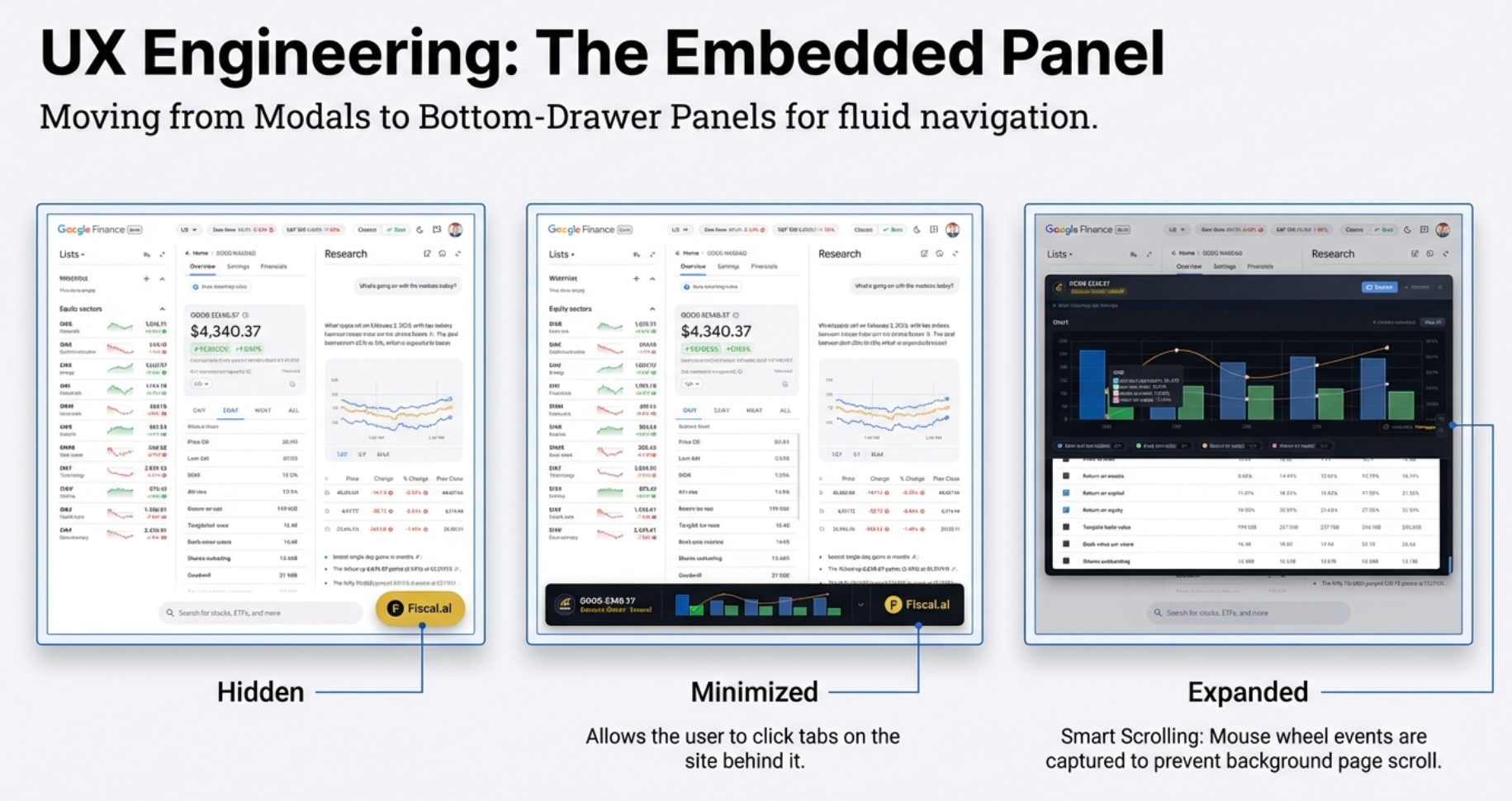
The Embedded Panel: Designing for a Moving Target
On Screener.in, the extension opens as a modal — a pop-up overlay in the center of the screen. That works perfectly: all the data has already been extracted in one pass. You do not need to interact with anything behind the pop-up.
On Google Finance, a modal would be a disaster. You need to click tabs on the website to load new financial statements. A full-screen pop-up would force you to constantly close the extension, switch tabs, and reopen it. High friction. Broken workflow.
📐 The Three-State Panel Architecture
Version 2.2.0 introduced an embedded bottom-drawer panel for Google Finance with three distinct states:
- Hidden: Only the gold "Visualize with Finmagine" button is visible. The extension is present but unobtrusive.
- Minimized: A thin bar docked at the very bottom of the viewport (
bottom: 0). The Google Finance tabs are fully visible and clickable above it. - Expanded: The full chart builder floats in the center of the screen, positioned precisely with
top: 50%; translate(-50%, -50%).
The Minimized State: The Game-Changer
The minimized state is the architectural breakthrough for Google Finance users. It lets you keep the extension "alive" while you navigate the single-page application. Switch from Income Statement to Balance Sheet. The extension is still there, just waiting as a thin bar at the bottom.
Auto-Refresh on Restore
Here is the subtle but brilliant UX detail. The extension knows when it has been minimized. It also watches the page for changes. If you minimize the panel, switch tabs on Google Finance (say, from Income to Cash Flow), and then click the minimized bar to restore it — the extension detects that transition and automatically refreshes the data.
You do not need to click a separate "Refresh" button in this specific workflow. The tool just figures it out.
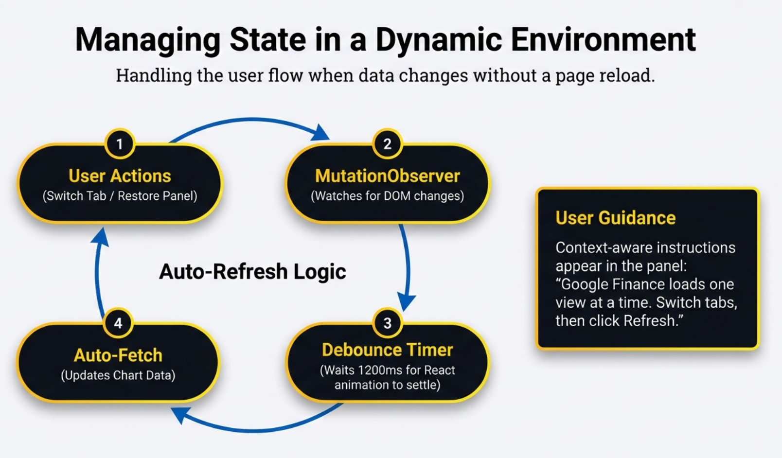
🔄 Auto-Refresh Logic Flow
The four-step cycle that keeps data synchronized: User Actions (switch tab, restore panel) → MutationObserver (watches for DOM changes) → Debounce Timer (waits 1200ms for React to settle) → Auto-Fetch (updates chart data). Context-aware instructions guide users through Google Finance's one-view-at-a-time limitation.
The Mutation Observer: Watching the Earthquake
Google Finance is a Single Page Application. When you switch from "Income Statement" to "Balance Sheet," the page does not reload. React updates the DOM content in place. But "in place" does not mean "instantly." It means a storm of tiny changes firing in rapid succession.
Clear the old rows. Maybe flash a loading indicator. Inject the new rows. Adjust the layout. Settle the styles. Each of these is a separate mutation in the DOM.
⏱️ The Debounce Timeline
This timeline illustrates what happens inside the extension when you switch tabs on Google Finance:
- 0ms — 400ms: Rapid-fire DOM mutations as React clears old data, shows a loading state, and begins injecting new data.
- 400ms — 800ms: More mutations as new rows render and layout settles. Each mutation resets the debounce timer.
- 800ms — 2000ms: The table is completely still. No new mutations. The 1,200ms timer counts down without interruption.
- 2000ms: Debounce fires. Extraction triggers. The extension reads stable, complete data.
The Watcher
The extension attaches a MutationObserver to the financial table element. This is a browser API that fires an alert whenever any part of that DOM subtree changes — a row added, a number updated, a style shifted. It is essentially a security camera on the data table, watching for any movement.
The Problem: Too Much Signal
A single tab switch generates dozens of mutations in a fraction of a second. If the extension tried to extract data on every single one, it would:
- Attempt to read half-rendered tables with missing rows
- Fire 50 or more extraction attempts per second
- Produce charts with incomplete or garbled data
The 1,200ms Debounce
Think of an elevator door. You know how it starts to close, but if you stick your hand in, it opens back up and the timer to close resets? That is debouncing.
When the MutationObserver fires, the extension starts a 1,200-millisecond timer. If another mutation happens before the timer runs out, it resets back to 1,200ms. It keeps resetting until the table has been completely still — zero changes — for a full 1.2 seconds. Only then does extraction trigger.
Speaking Two Languages: Parsing Indian and Global Numbers
The extension reads data from two platforms that format numbers in completely different ways. Getting this right is the difference between a chart that tells a story and one that looks like random noise.
🔢 The Two Parsing Pipelines
Every number that enters the charting engine goes through a normalization step. The two platforms present data very differently, so the extension speaks both dialects:
- Google Finance: Strip currency symbols → detect suffix (M/B/T/K) → apply multiplier → raw number
- Screener.in: Strip commas and whitespace → parse float → raw number
- Chart Output: Raw numbers are compressed back into human-readable labels. 729,000,000 becomes "729M" on the Y-axis.
Google Finance: Multiplier Logic
Google displays values with explicit unit suffixes: "729.00M", "5.90B", "25.3%". The extension's parseFinancialValue() function handles these in three steps:
- Clean the string: Strip currency symbols ($, €, £, ₹) and commas.
- Detect the suffix and multiply: See the table below.
- Handle percentages: If the string ends with %, parse it as a raw number — no multiplier applied.
| Suffix | Meaning | Multiplier | Example |
|---|---|---|---|
| M | Million | 1,000,000 | "729.00M" → 729,000,000 |
| B | Billion | 1,000,000,000 | "5.90B" → 5,900,000,000 |
| T | Trillion | 1,000,000,000,000 | "2.1T" → 2,100,000,000,000 |
| K | Thousand | 1,000 | "450K" → 450,000 |
| % | Percentage | None | "25.3%" → 25.3 |
Screener.in: Raw Indian Numbers
Screener uses Indian number formatting (lakhs, crores) visually, but the raw cell text is typically plain numbers with commas: "7,29,000" or "1,250". The extension simply strips commas and whitespace and parses the float. No suffix multipliers needed — the source data does not use them.
Displaying Numbers Back on Charts
Once parsed into raw values, the chart engine compresses them back for readability. The raw number 729,000,000 becomes "729M" on the Y-axis. Nobody wants to read nine digits on a chart label.
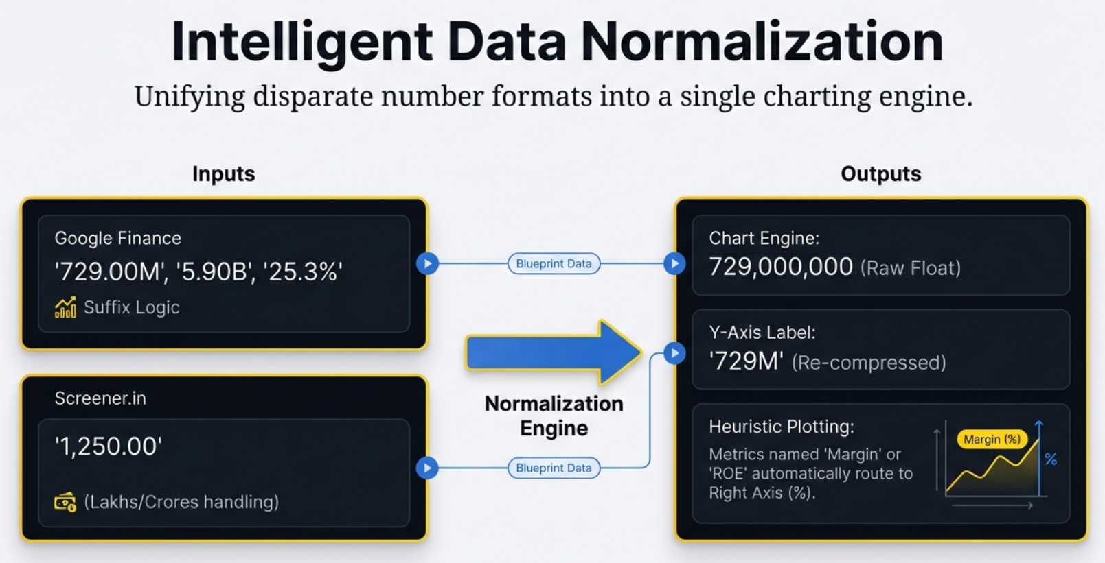
🔢 The Normalization Engine
Unifying disparate number formats into a single charting engine. Google Finance values with M/B/T suffixes and Screener.in values with Indian lakh/crore formatting both flow through the same normalization pipeline — producing raw floats for calculation, compressed labels for display, and automatic routing of ratios to the right Y-axis.
The Smart Heuristic: Bars, Lines, and the Name Trap
The extension has to decide, for each metric, whether to draw it as a bar chart or a line chart. It does not have explicit "this is a percentage" metadata from the source platforms. So it uses a heuristic — an educated guess based on the metric's name.
If the name contains any of these keywords: margin, ratio, return, ROE, ROCE, or % — the extension assumes it is a ratio or percentage. It plots it as a line on the right Y-axis, formatted with a percentage sign.
Everything else gets a bar on the left Y-axis, formatted with M/B/T suffixes for absolute values.
| Metric Name | Keyword Match? | Chart Type | Y-Axis |
|---|---|---|---|
| Revenue | No | Bar | Left (absolute: M/B) |
| Net Profit Margin | Yes — "margin" | Line | Right (%) |
| Return on Equity | Yes — "return" | Line | Right (%) |
| Free Cash Flow | No | Bar | Left (absolute: M/B) |
| EPS | No | Bar | Left (absolute: M/B) |
| ROCE | Yes — "ROCE" | Line | Right (%) |
Read-Only Rows: The Guardrails
If you have used the Chart Builder, you have probably noticed that some metrics in the list do not have checkboxes. The data is visible — you can read the numbers — but you cannot select the metric for charting. Why?
To draw any meaningful chart — a trend line, a bar comparison — you need at least two valid numeric data points. A line through a single point is just a dot. The extension enforces this minimum before allowing selection.
The extension's parseFinancialValue() function counts how many valid numbers exist in each row. If the count falls below 2, the checkbox is hidden. The data remains visible as a read-only row.
- On Screener.in: "TTM" (Trailing Twelve Months) cells often contain the text "TTM" instead of a raw number. Recent quarters may not yet be reported. If fewer than 2 parseable numbers remain, the row becomes read-only.
- On Google Finance: Companies with no data for a specific metric show hyphens ("-") instead of numbers. After filtering these non-numeric values, if fewer than 2 valid numbers remain, the checkbox disappears.
This is defensive programming — a guardrail that prevents blank or broken charts while still giving you full visibility into everything the platform provides. It is the extension saying: "I can show you this data, but I cannot draw a meaningful picture from it yet."
Under the Hood: How the Detection Actually Works
We have talked about what the extension does — extract tables, filter ghosts, route data to the right statement. But the how is where the engineering gets interesting. Detection on Google Finance is not a single step. It is a cascade — a sequence of fallbacks, each one more expensive than the last, each one only triggered when the previous one fails.
Tab Detection: The Four-Level Cascade
When the extension needs to know which financial statement is currently active on Google Finance, it does not guess. It asks the page — but it asks in a specific order:
- ARIA attributes first. The extension queries for
button[aria-selected="true"]. If Google's tab buttons have this attribute set, the answer is immediate and reliable. This is the fast path. - CSS classes second. If ARIA fails — say, because Google changed their markup — the extension looks for a
.selectedor equivalent active-state class on the tab buttons. Still DOM-based. Still fast. - Content keyword scan third. If both attribute-based methods fail, the extension reads the visible text of all tab buttons and matches against known labels: "Income Statement," "Balance Sheet," "Cash Flow." Slower, but resilient to structural changes.
- Unknown fallback last. If none of the above work, the tab is reported as
'Unknown'. This triggers a per-metric keyword heuristic that routes each row individually based on its label — "Revenue" goes to Income Statement, "Total Assets" goes to Balance Sheet. Expensive. Imprecise. But it is better than dropping data entirely.
'Unknown' and the per-metric heuristic also cannot route a row, that row is silently skipped. The auto-refresh indicator on the panel turns red — this is the only visual signal that something went wrong during extraction. If you see a red dot, it means the extension extracted data but could not fully categorize it.
Period Detection: Quarterly vs Annual
Knowing which statement is active is only half the question. The extension also needs to know which time period the data represents — quarterly or annual. The detection logic for this is surprisingly nuanced:
- Toggle buttons first. Google Finance has Quarterly/Annual toggle buttons. The extension checks for
button[aria-pressed="true"]to see which is active. - Column header content second. If the toggle buttons are not readable, the extension scans the table's column headers. Month abbreviations (Jan, Feb, Mar) or quarter identifiers (Q1, Q2) indicate Quarterly. Bare four-digit years (2022, 2023, 2024) with no month or quarter prefix indicate Annual.
- Default to Quarterly. If neither method produces a clear answer, the extension defaults to Quarterly. This is a pragmatic choice: quarterly data is more commonly viewed on Google Finance.
Screener's Heading-Walk Strategy
Google Finance has a single page with toggling tabs. Screener.in has a fundamentally different layout — multiple financial tables arranged vertically on one page, each preceded by a section heading. The extension cannot simply look for "the" table. It needs to find the right table.
The strategy is called a heading-walk. Starting from a matched section title (like "Profit & Loss" or "Balance Sheet"), the extension walks the DOM in two directions: up to 5 sibling levels forward to find the table that follows the heading, and up to 5 ancestor levels to handle cases where the table is nested inside wrapper divs that are not direct siblings of the heading. Screener's DOM structure is not perfectly consistent across all company pages — the nesting depth varies. The 5-level limit is an empirical choice that covers the observed range without risking an infinite walk.
Google's Content Heuristic: Is This Actually a Financial Table?
After the visibility filter removes ghost tables (height === 0), the extension still needs to confirm that what it is looking at is a real financial data table and not some other DOM element that happens to be a <table>. The heuristic checks two conditions:
- The table must have at least 5 rows. Anything smaller is likely a navigation element or a summary widget, not a full financial statement.
- The first row must contain at least one of: the text
"USD", the word"values", or a bare four-digit year. These are the telltale markers of a Google Finance financial table header.
Both conditions must pass. If either fails, the table is skipped entirely. No error. No warning. Just silence — because on Google Finance, non-financial tables are common and expected.
Hidden Child Rows on Screener
Screener.in uses collapsible parent-child row structures. A parent row like "Other Income" can be expanded to reveal sub-rows with more granular breakdowns. When collapsed, those child rows are still in the DOM — they just have display: none in their computed styles.
If the extension extracted those hidden rows, it would produce duplicate data: the parent total and each individual sub-item. The chart would double-count. To prevent this, the extension checks getComputedStyle() on every row before extraction. Any row with display: none is skipped.
style attribute. This is important. A child row might not have display: none written directly on it — the style might be inherited from a collapsed parent container. getComputedStyle() resolves the full style chain, catching inherited and cascaded values that a simple attribute check would miss.
What's Coming: The v3.0 Roadmap
Version 2.2.0 is a milestone — 8 bugs squashed, two platforms unified, a solid architecture in place. But it is also a launching pad. Three major features are on the horizon for version 3.0, and the reasoning behind each one reveals something interesting about how the product thinks.
🗺️ The v3.0 Roadmap
Three features are explicitly listed as long-term goals, each with its own technical and strategic complexity:
- Chart Export: Download charts as PNG or SVG. Currently a "future enhancement."
- Multi-Company Comparison: Plot Google vs Apple on one chart. Requires a persistent state architecture.
- Yahoo Finance: A third platform. Conditional on user demand. A third extraction engine to build and maintain.
1. Chart Export (PNG/SVG)
Right now, if you want to share a chart, you take a screenshot. That screenshot captures everything on screen — including the small "finmagine.com" watermark in the bottom-right corner of every chart. That watermark is a clickable link back to the extension.
Here is the interesting strategic question: is the absence of a native export button a technical limitation or a deliberate choice? Every screenshot shared on Twitter, LinkedIn, or a WhatsApp group chat is a billboard for the extension. A native PNG export could theoretically strip or shrink the watermark — breaking the viral loop.
Export is listed for v3.0. The current screenshot-only workflow is clearly serving a purpose in the meantime.
2. Multi-Company Comparison
The dream feature. Compare Google vs Apple on one chart. Revenue side by side. Margins overlaid. Instant competitive insight.
Why cannot it do this now? State persistence. When you navigate from one stock to another on Google Finance, the extension reboots itself — wipes its memory to prevent data corruption between companies. On Screener, a full page reload destroys the previous chart instance. Either way, the extension has no memory of the last company once you move to the next one.
Multi-company comparison requires a persistent state — like a shopping cart for metrics that survives page navigation. That is a significant architectural challenge, especially on a Single Page Application.
3. Yahoo Finance Support
Listed as a long-term goal with an explicit caveat: "if demand exists." The reasoning is sound.
4. Custom Color Schemes
Right now, every chart renders in the same palette — a dark background with a fixed set of bar and line colors. That works well for quick analysis. But different users have different visual preferences, and some companies have brand colors that make charts more recognizable at a glance.
Custom color schemes would let users pick a theme — or even define their own palette — and have it persist across sessions. It is not just cosmetic. Color is how humans distinguish metrics at speed. A user who associates blue with Revenue and green with Net Income will read a chart faster than one who has to check the legend every time.
5. Annotations
Charts tell you what happened. Annotations tell you why. A spike in revenue means nothing without context — was it a product launch? A one-time deal? A market shift?
The plan is a lightweight annotation layer: margin notes that attach to specific points on the chart timeline. Not a full collaborative tool. Just a way for the user to pin a short note to a date — "Q2 product launch" or "Currency adjustment" — and have it persist the next time they open the same company. The annotations would live in local storage, not a server. Simple. Personal. Useful.
6. Mobile Support
Chrome extensions do not run on mobile browsers. That is a hard platform constraint — not a bug, not an oversight. But the underlying chart-rendering engine does not care what device it runs on. The architecture is already halfway there.
The scroll buttons that appear on the metric list are already hidden below 768px viewport width — a sign that mobile layout was considered during design. Touch-scroll on the metric list works natively. The gap is not rendering; it is delivery. Getting the same experience onto a mobile screen — through a Progressive Web App, a native wrapper, or a dedicated mobile Chrome extension on Android — is the engineering question v3.0 will explore.
Launch Goals: Measuring What Matters
| Milestone | Target | Why It Matters |
|---|---|---|
| Week 1 | 100 installs, 50 watermark clicks | Validates that the install-to-use funnel works. Watermark clicks confirm the viral loop is live. |
| Month 1 | 4.5+ star rating | Rating is the primary ranking signal on the Chrome Web Store. 4.5 is the threshold for featured placement. |
| Month 3 | 1,000+ installs, 50+ reviews | Review volume is the second ranking signal. 1,000 installs with 50 reviews demonstrates genuine community adoption — not just downloads. |
📈 Launch Targets — Success is not just installs. It is the ratio of installs to engaged users, and the ratio of users to reviewers. These targets measure engagement depth, not vanity metrics.
The combined potential user base across Screener.in (over 1 million users) and Google Finance (over 100 million global users) is already staggering — over 101 million potential users. Mastering these two platforms first is a sound strategy before expanding further.
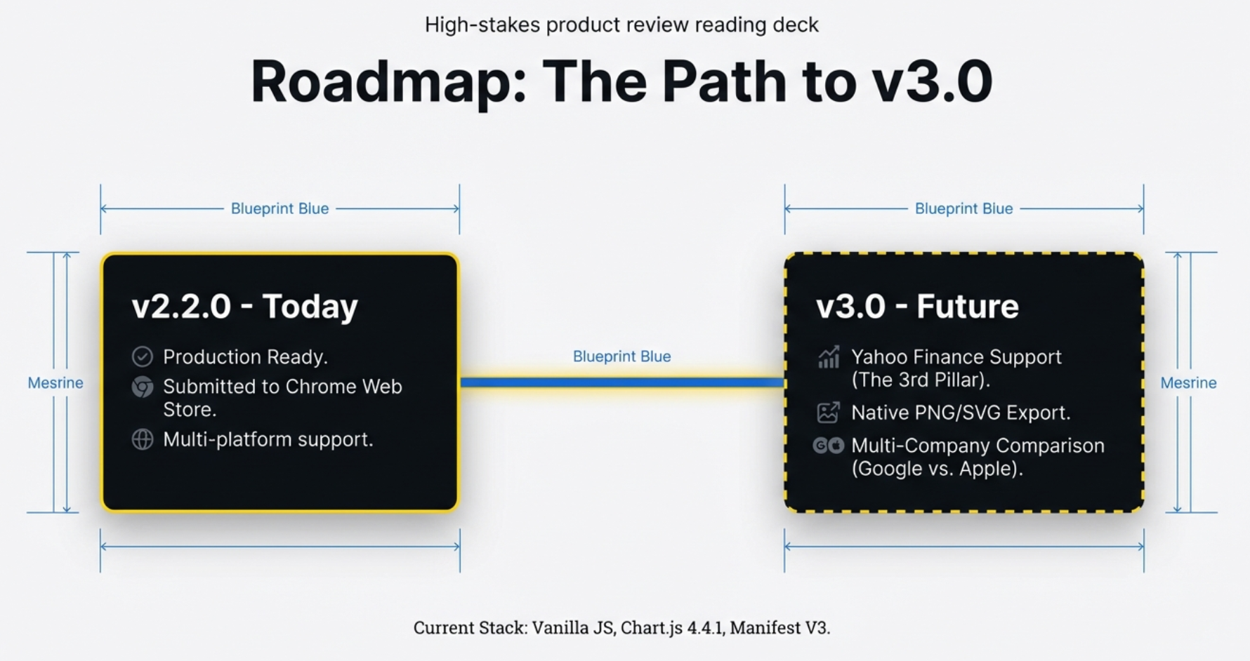
🗺️ The Path to v3.0
v2.2.0 is production-ready with multi-platform support on the Chrome Web Store. v3.0 targets the three most-requested features: Yahoo Finance as the third platform, native PNG/SVG export for sharing, and multi-company comparison for competitive analysis. Current stack: Vanilla JS, Chart.js 4.4.1, Manifest V3.
The Bigger Picture: Augmenting the Web
Here is a question worth sitting with: Why does a single developer, working with 1,800 lines of code, provide a better chart visualization experience than Google Finance itself — a product maintained by one of the most powerful technology companies on Earth?
The answer is not that Google cannot build charts. They obviously can. The answer is that Google Finance is optimized for a different set of goals. Show data. Keep users on the platform. Serve advertisements. The Chart Builder is optimized for exactly one goal: turning a wall of numbers into an instant visual insight.
Google gives you the data. The Chart Builder gives you the story.
Every bug we discussed in this article — ghost tables, the NOW identity crisis, the missing Cash Flow metrics, the invisible scrollbar, the stuck panel, the stale restore, the mutation observer debounce — was a collision between two eras of the web. The old web: static, predictable, server-rendered. The new web: dynamic, chaotic, constantly shifting. The Chart Builder is the bridge between them.
The Watermark: A Billboard in Every Screenshot
There is a small, gold-glowing "finmagine.com" watermark in the bottom-right corner of every chart the extension produces. It is not decorative. It is a growth mechanism.
Every time a user takes a screenshot of a chart — to share on Twitter, paste into a group chat, drop into a research note — that watermark travels with it. It is a clickable link. Someone who sees the chart, wonders how it was made, and clicks the watermark lands on the extension. No ad spend. No SEO campaign. Just the product itself, doing the marketing.
This is why the native export feature (PNG/SVG) is listed for v3.0 but has not shipped yet. A screenshot-only workflow keeps the watermark in every shared image. The moment you add a "Download as PNG" button, users can crop it out. The viral loop breaks.
Performance That Gets Out of the Way
A tool that makes you wait defeats its own purpose. The Chart Builder was designed to be invisible in terms of latency:
- Initialization: Under 1 second from clicking the gold button to the panel appearing.
- Chart rendering: Under 500 milliseconds from data extraction to a fully interactive chart on screen.
- Memory footprint: Approximately 10 MB per tab. Lightweight enough that users with dozens of tabs open will not notice it.
- Background processes: None. The extension does nothing when you are not using it. No polling. No idle connections. No battery drain.
These are not impressive numbers in the abstract. They are impressive because they were achieved in 1,800 lines of code, with no backend server, no database, and no build pipeline more complex than a single manifest file.
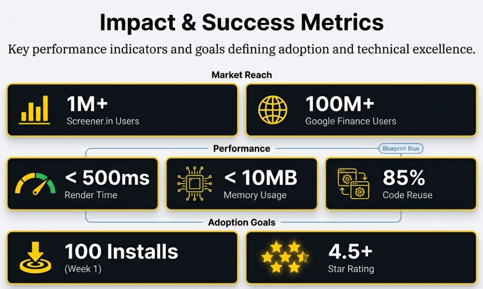
📈 Impact & Success Metrics
The numbers that define success: 101+ million potential users across two platforms, sub-500ms render times, under 10MB memory footprint, and 85% code reuse between fundamentally different web architectures. The adoption funnel targets 100 installs in Week 1 and a 4.5+ star rating by Month 1 — the threshold for Chrome Web Store featured placement.
And it is a bridge built with remarkable elegance. 1,800 lines. 85% shared code. Two fundamentally different platforms. One gold button.
The next time you land on a financial website and see a wall of numbers, you know exactly what is missing. And you know where to find it.
🚀 Get the Extension
The Finmagine Chart Builder is available now on the Chrome Web Store. One click to install. Zero configuration. Works instantly on Screener.in and Google Finance. Transform any financial table into a professional chart — and understand the story behind the numbers.
Explore the Complete Chart Builder Hub
Discover all Chart Builder resources — tutorials, Google Finance integration, case studies, and more. Transform Screener.in & Google Finance data into professional charts.
Visit Chart Builder Hub →