Following along? Install the extension first
Finmagine Financial Chart Builder — free • no account needed • Chrome, Edge, Brave
Multimedia Learning Hub
Master Google Finance charting through video tutorial, audio deep dive, comprehensive learning overview, and interactive flashcards
Complete Learning Path for Google Finance
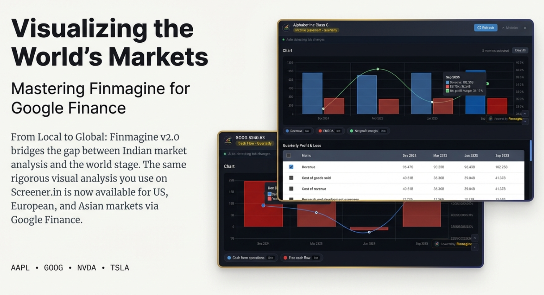
This tutorial teaches you how to use Finmagine Chart Builder with Google Finance to visualize global stocks. Unlike Screener.in where all data lives on one page, Google Finance requires a unique workflow—this guide covers everything you need to know.
What You'll Learn:
- The Single-View Reality: Why Google Finance is like a TV channel (one view at a time) vs Screener.in's library approach
- The Golden Rule: Always select your data view FIRST, then chart
- The Minimize-Restore Workflow: The critical 5-step process for switching between statements
- What You CAN and CANNOT Do: Clear boundaries and workarounds
- Analytical Recipes: Profitability trends, balance sheet health, cash generation power
- Real-World Examples: Analyzing Alphabet (GOOG) with $102B quarterly revenue
Key Differences from Screener.in:
- Cannot mix Quarterly + Annual: Each view is independent
- Cannot combine statements: Income Statement metrics can't be charted with Balance Sheet
- No Financial Ratios section: Google Finance doesn't provide pre-calculated ratios
- Global coverage: Access US, European, Asian, and worldwide stocks
Why This Matters:
- Global Investing: Analyze Apple, Google, Microsoft, NVIDIA, Tesla—any global stock
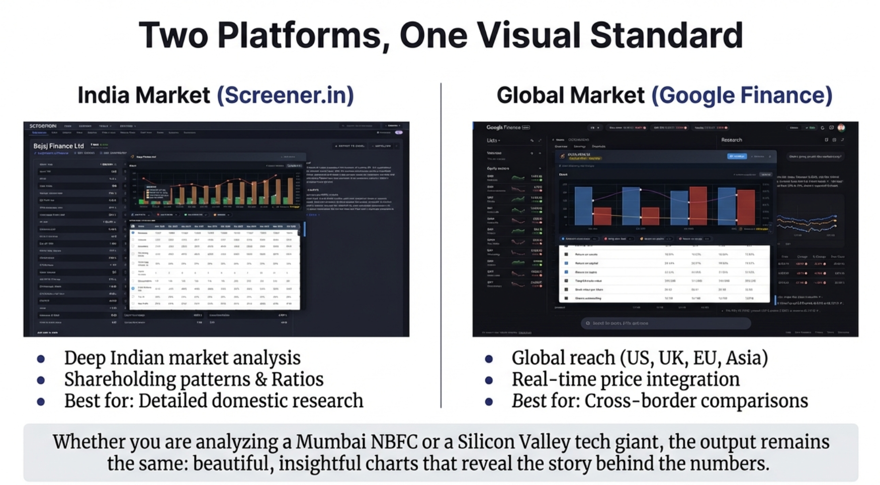
- Same Visual Language: Whether you're analyzing TCS in India or Google in the US, charts tell the same story
- Cross-Border Comparisons: Compare global competitors in your sector
- Real-Time Integration: Google Finance provides live stock price data
Watch the Complete Tutorial
Follow along with this comprehensive video demonstration of using Finmagine Chart Builder on Google Finance with real examples.
Video Title: Chart Global Stocks on Google Finance Like Screener.in | Finmagine Chart Builder v2 Explained
Complete video demonstration with Alphabet (GOOG) analysis, minimize-restore workflow, and analytical recipes
Listen to the Audio Guide
Prefer to listen? This audio deep dive explores the Google Finance workflow, the library vs TV channel analogy, and practical analysis techniques.
Duration: Full tutorial | Format: Professional narration with examples
Deep dive audio exploring global stock visualization, single-view architecture, and the minimize-restore workflow
Test Your Knowledge
Click any flashcard to reveal the answer. Use the search box to find specific topics. 35 questions covering everything from basics to advanced workflows.
Finmagine Chart Builder V2 brings professional charting to global stocks on Google Finance
Welcome: Charting Global Stocks with Finmagine
If you've been using Finmagine Chart Builder with Screener.in, you already know the magic of transforming financial tables into professional visualizations with one click. Now, with version 2.0, that same power extends to Google Finance—giving you access to global stocks from the US, Europe, Asia, and beyond.
But here's the thing: Google Finance works differently than Screener.in. Understanding these differences is crucial to using the extension effectively. This tutorial will show you exactly how to navigate the Google Finance workflow, including its unique "single-view" limitation and the minimize-restore cycle.
The Library vs TV Channel Analogy
Think of Screener.in like a library—all the books (financial statements) are on the shelves simultaneously. You can walk from aisle to aisle, grabbing the quarterly P&L here, the annual balance sheet there, bringing them all to your reading table at once.
Google Finance is more like a TV channel—you can only watch one channel at a time. Want the annual income statement? That's channel 1. Quarterly cash flow? Switch to channel 2. The previous channel vanishes the moment you change. Understanding this fundamental difference is the key to mastering this tool.
What You'll Learn
- How to navigate to Google Finance and access financial data
- The critical "Select View First" rule that saves you frustration
- Using the embedded panel interface (different from Screener.in's modal)
- The Minimize → Switch → Restore workflow for different statements
- What you CAN and CANNOT do on Google Finance
- Analytical recipes for global stocks
Prerequisites
- Extension Installed: Finmagine Chart Builder v2.0+ from Chrome Web Store
- Browser: Chrome, Edge, or Brave (Chromium-based)
- Basic Familiarity: If you're new to Finmagine, read the Screener.in tutorial first for fundamentals
The Single-View Reality: Understanding Google Finance
Before we dive into steps, you must understand the fundamental difference between Screener.in and Google Finance:
Two platforms, one visual standard: Screener.in loads everything at once, Google Finance shows one view at a time
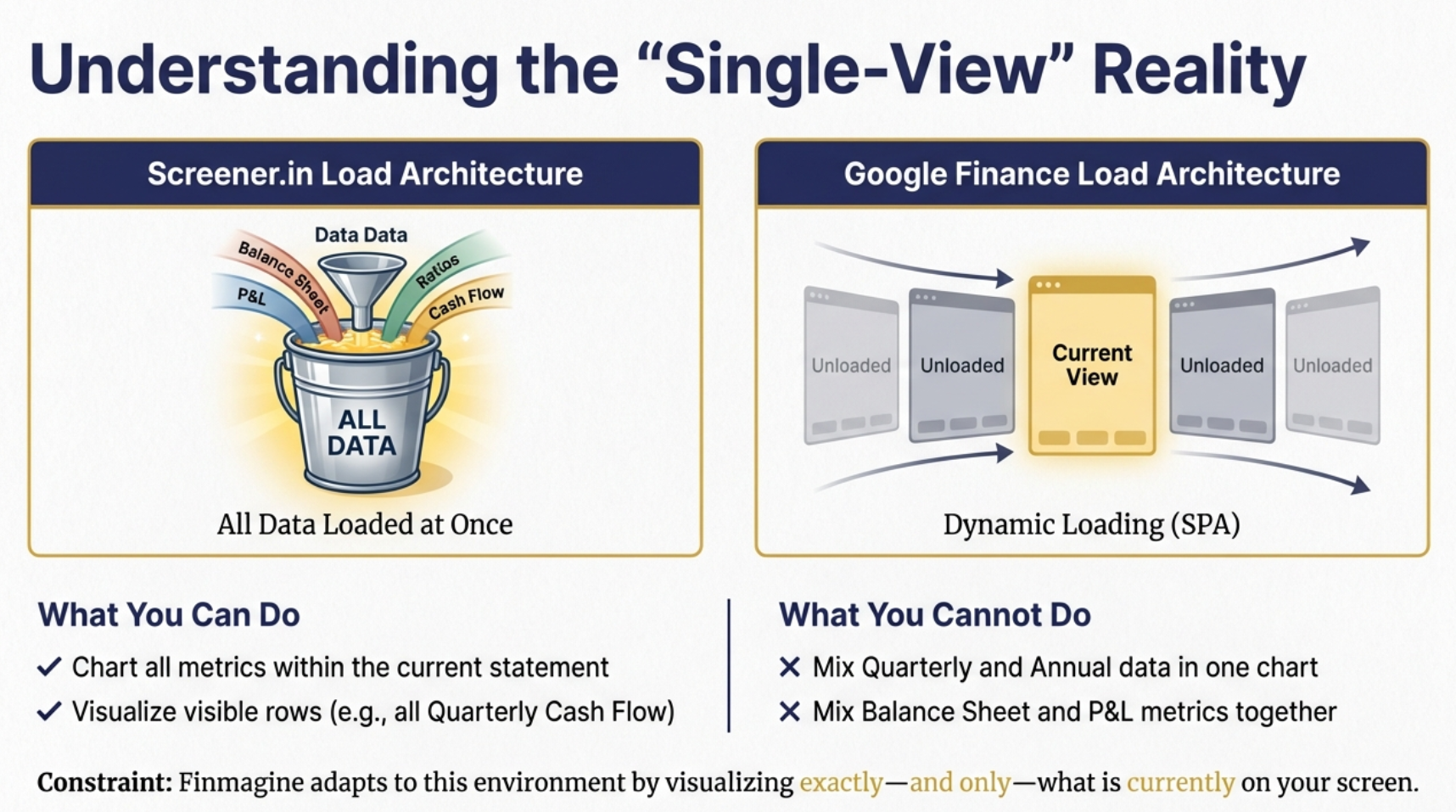
The single-view architecture: Google Finance dynamically replaces data when you switch tabs
What This Means for You
| Feature | Screener.in | Google Finance |
|---|---|---|
| All data on one page | ✓ Yes | ✗ No |
| Mix Quarterly + Annual in one chart | ✓ Yes | ✗ No |
| Mix Income Statement + Balance Sheet | ✓ Yes | ✗ No |
| Financial Ratios section | ✓ Yes | ✗ No |
| Shareholding Patterns | ✓ Yes | ✗ No |
| Global stocks (US, EU, Asia) | ✗ No | ✓ Yes |
| Real-time stock price integration | ✗ Limited | ✓ Yes |
The Golden Rule
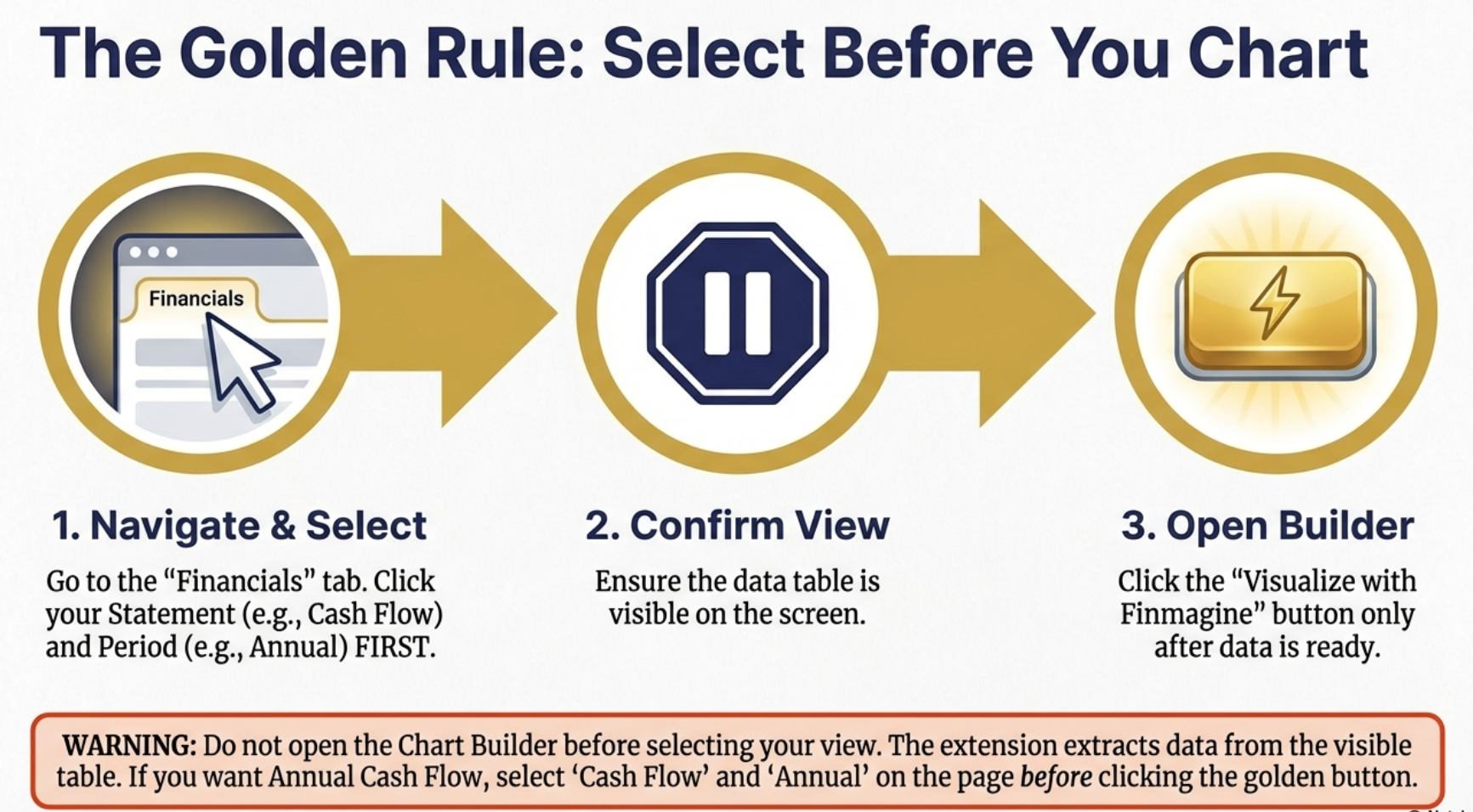
The Golden Rule: Always select your data view FIRST, then open the Chart Builder
Navigate to Google Finance and Find the Financials Tab
Let's start with the basics: getting to the right page on Google Finance.
Getting to a Stock Quote Page
- Visit Google Finance: Go to www.google.com/finance
- Search for a Stock: Use the search bar to find any global stock:
- US: AAPL, GOOG, MSFT, NVDA, TSLA
- UK: BP, HSBC, AZN
- Europe: SAP, ASML, LVMH
- Asia: Toyota, Samsung
- Click the Stock: Open the quote page (URL will be like:
google.com/finance/quote/GOOG:NASDAQ)
Locating the Financials Tab
On the quote page, you'll see several tabs below the stock chart. Look for the "Financials" tab—this is where all the financial statement data lives.
The Financials Interface
Once you click the Financials tab, you'll see:
- Statement Type Tabs: Income Statement | Balance Sheet | Cash Flow
- Period Toggle: Quarterly | Annual
- Financial Data Table: The actual numbers
After 2-3 seconds, the golden "Visualize with Finmagine" button will appear in the bottom-right corner.
Select Your Data View FIRST
This is the most important step that differs from Screener.in. You must choose what you want to visualize BEFORE opening the Chart Builder.
Choose Your Statement Type
Click one of the three tabs:
- Income Statement: Revenue, Operating Income, Net Income, EPS, EBITDA
- Balance Sheet: Total Assets, Total Liabilities, Cash & Equivalents, Debt
- Cash Flow: Cash from Operations, Investing, Financing, Free Cash Flow
Choose Your Period
Toggle between:
- Quarterly: Last 4-8 quarters of data
- Annual: Last 4-5 fiscal years
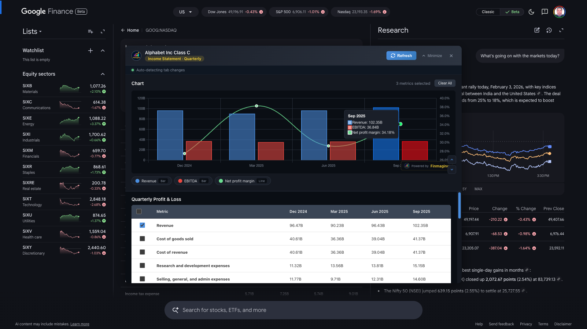
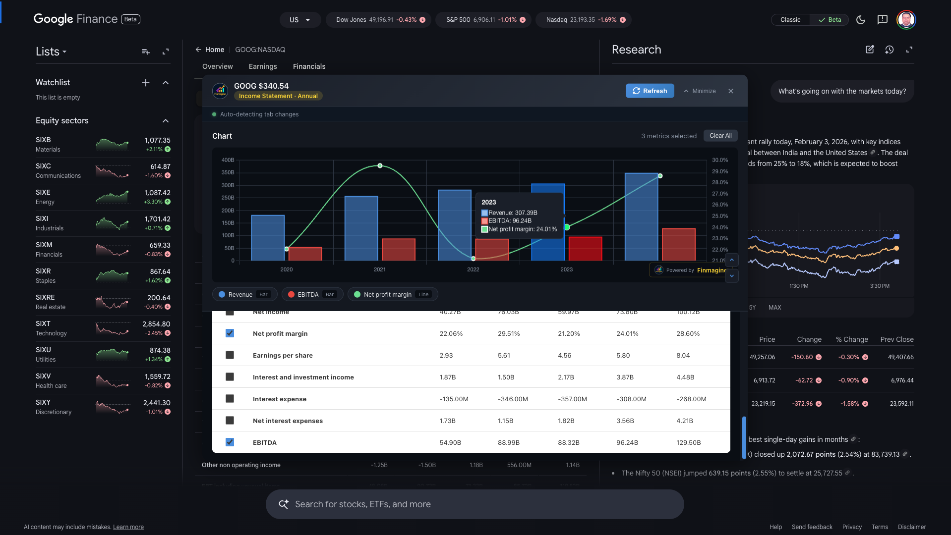
Example: Google (GOOG) Quarterly Income Statement with Revenue, EBITDA, and Net Profit Margin
Why This Order Matters
The Chart Builder extracts data from whatever is currently visible in the browser. If you:
- Open Chart Builder while viewing Quarterly Income Statement
- Then switch to Annual Balance Sheet on Google Finance
Your previous selections are lost. The extension doesn't "remember" across different views.
Open the Chart Builder Panel
With your desired view selected (e.g., Quarterly Cash Flow), you're ready to open the Chart Builder.
Click the Golden Button
Look for the "Visualize with Finmagine" button in the bottom-right corner. It has the familiar golden gradient with lightning bolt icon.
The Embedded Panel (Different from Screener.in)
On Google Finance, the Chart Builder opens as an embedded panel rather than a full-screen modal. This panel:
- Floats centered in your viewport when expanded
- Can be minimized to a thin bar at the bottom
- Has scroll controls for navigating metrics
- Shows company name at the top
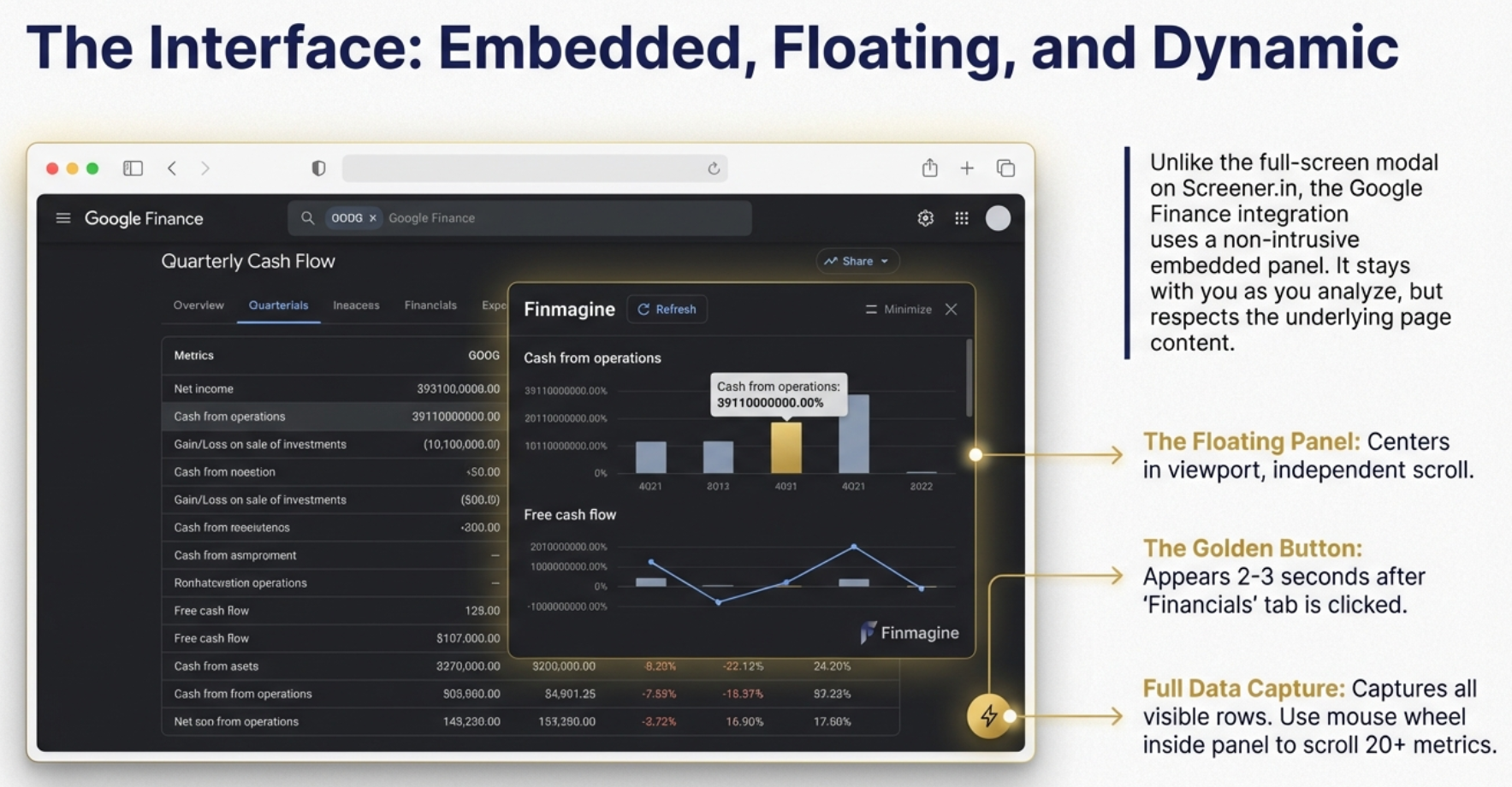
The embedded panel interface: centered, minimizable, and designed for the single-view workflow
Panel States
| State | Appearance | When to Use |
|---|---|---|
| Hidden | Panel invisible, golden button visible | Before starting analysis |
| Expanded | Full panel centered in viewport | Selecting metrics, viewing charts |
| Minimized | Thin bar at bottom with label | When switching Google Finance tabs |
Select Metrics and Analyze Your Chart
Now comes the familiar part—selecting which financial metrics to visualize.
Available Metrics on Google Finance
The metrics available depend on which statement you're viewing:
Income Statement (~15-20 metrics)
- Revenue
- Cost of Revenue
- Gross Profit
- Operating Expenses
- Operating Income
- Interest Expense
- Tax Provision
- Net Income
- EPS (Basic & Diluted)
- EBITDA
Balance Sheet (~20-25 metrics)
- Total Assets
- Total Liabilities
- Total Equity
- Current Assets
- Current Liabilities
- Cash & Equivalents
- Long-term Debt
- Stockholders' Equity
- Retained Earnings
Cash Flow (~25 metrics)
- Cash from Operations
- Cash from Investing
- Cash from Financing
- Free Cash Flow
- Capital Expenditure
- Net Change in Cash
- Depreciation & Amortization
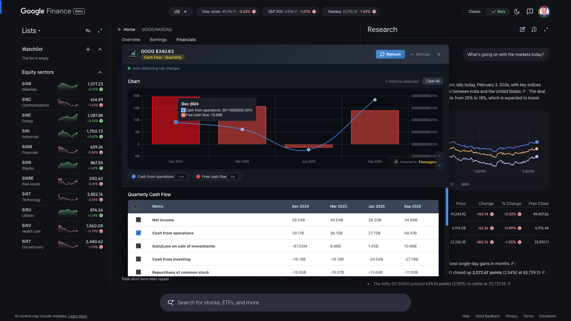
Example: Google (GOOG) Quarterly Cash Flow - Cash from Operations vs Free Cash Flow
The Chart Interface
Just like Screener.in, selected metrics appear in a professional Chart.js visualization with:
- Dual Y-axes: Absolute values (left) and percentages (right)
- Bar charts: For absolute financial values
- Line charts: For percentage/margin metrics
- Interactive legend: Click to show/hide metrics
- Hover tooltips: Exact values for any data point
- Finmagine watermark: Clickable link to finmagine.com
The Minimize-Restore Workflow: Switching Views
Here's where Google Finance gets unique. When you want to see a different financial statement (e.g., switch from Income Statement to Cash Flow), you need to follow a specific workflow.
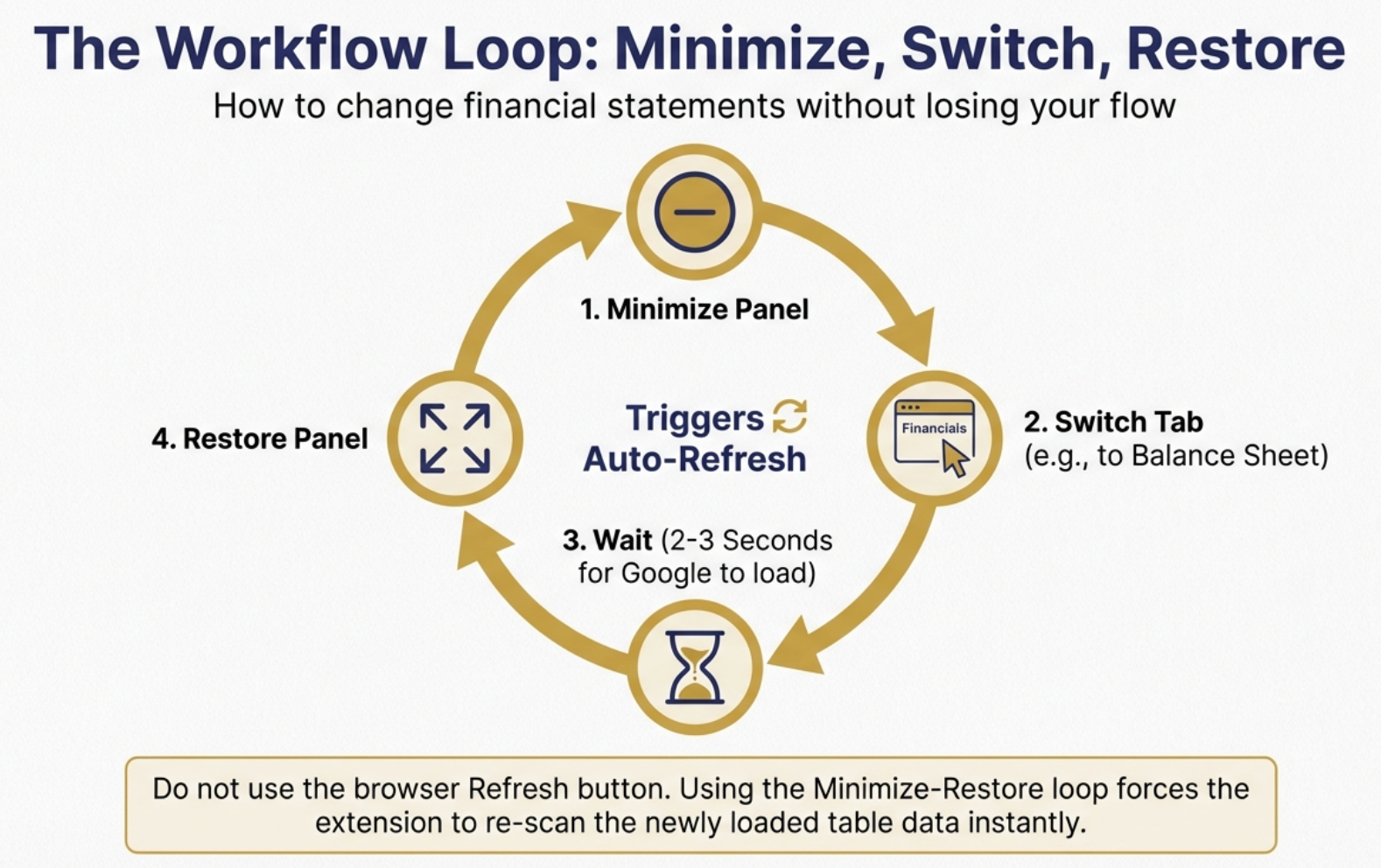
The Minimize-Restore workflow: the critical cycle for switching between financial statements
The Correct Workflow
To View a Different Statement:
- MINIMIZE the Chart Builder panel (click the Minimize button)
- SWITCH to your desired view on Google Finance (e.g., click "Balance Sheet" tab, or toggle to "Annual")
- WAIT 2-3 seconds for Google Finance to load the new data
- RESTORE the Chart Builder panel (click to expand)
- The panel auto-refreshes and loads the new statement's metrics
Why This Workflow?
Google Finance is a Single Page Application (SPA). When you switch tabs, it doesn't reload the page—it dynamically updates the content. The extension uses a MutationObserver to detect these changes, but it only triggers a re-extraction when you restore from minimized state.
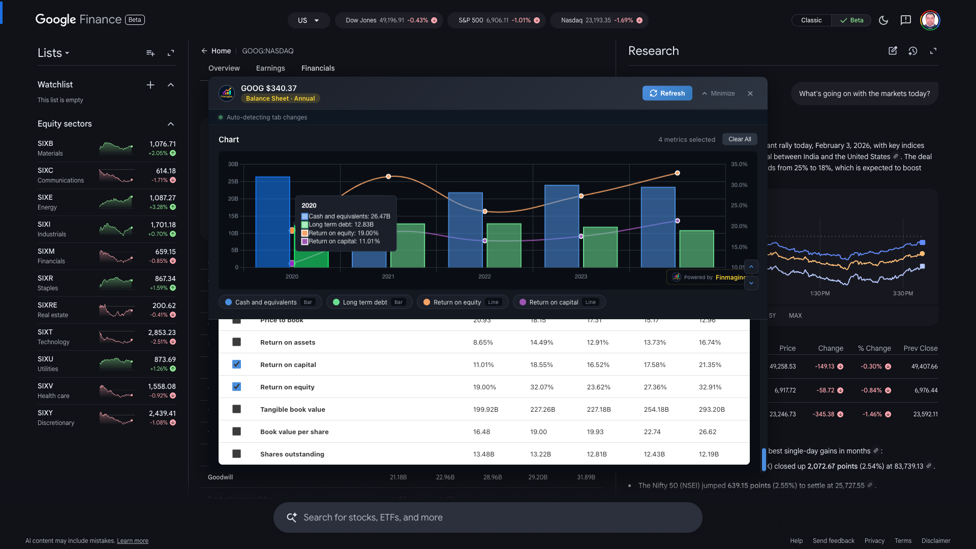
Visual Example: Quarterly to Annual
Let's say you've charted Quarterly Income Statement and want to compare with Annual:
- You have: Quarterly Income Statement chart open
- Click "Minimize" → Panel shrinks to bottom bar
- On Google Finance, click "Annual" toggle
- Wait for table to update (2-3 seconds)
- Click the minimized bar to Restore
- Panel expands with Annual Income Statement metrics!
Example: Google (GOOG) Annual Income Statement after using minimize-restore to switch from Quarterly
What You CAN and CANNOT Do on Google Finance
Let's be crystal clear about the capabilities and limitations when using Finmagine with Google Finance.
✓ What You CAN Do
- Chart all metrics within a single statement type and period:
- All metrics from Quarterly Income Statement together
- All metrics from Annual Balance Sheet together
- All metrics from Quarterly Cash Flow together
- Compare related metrics: Revenue vs Operating Income vs Net Income
- Analyze trends: See how metrics change over time
- Use interactive features: Legend toggles, tooltips, dual-axis
- Switch between views: Using minimize-restore workflow
- Screenshot charts: For reports and presentations
✗ What You CANNOT Do
- Mix Quarterly + Annual data in one chart: Data is lost when switching periods
- Mix different statement types: Can't combine Income Statement metrics with Balance Sheet metrics
- See Financial Ratios: Google Finance doesn't have a dedicated ratios section like Screener.in
- See Shareholding Patterns: Not available on Google Finance
- Keep selections when switching: Each view is independent
Analytical Recipes for Global Stocks
Here are proven metric combinations for different analysis types on Google Finance. We'll use Alphabet (Google) as our example—a company with $102 billion in quarterly revenue and 34% operating margins.
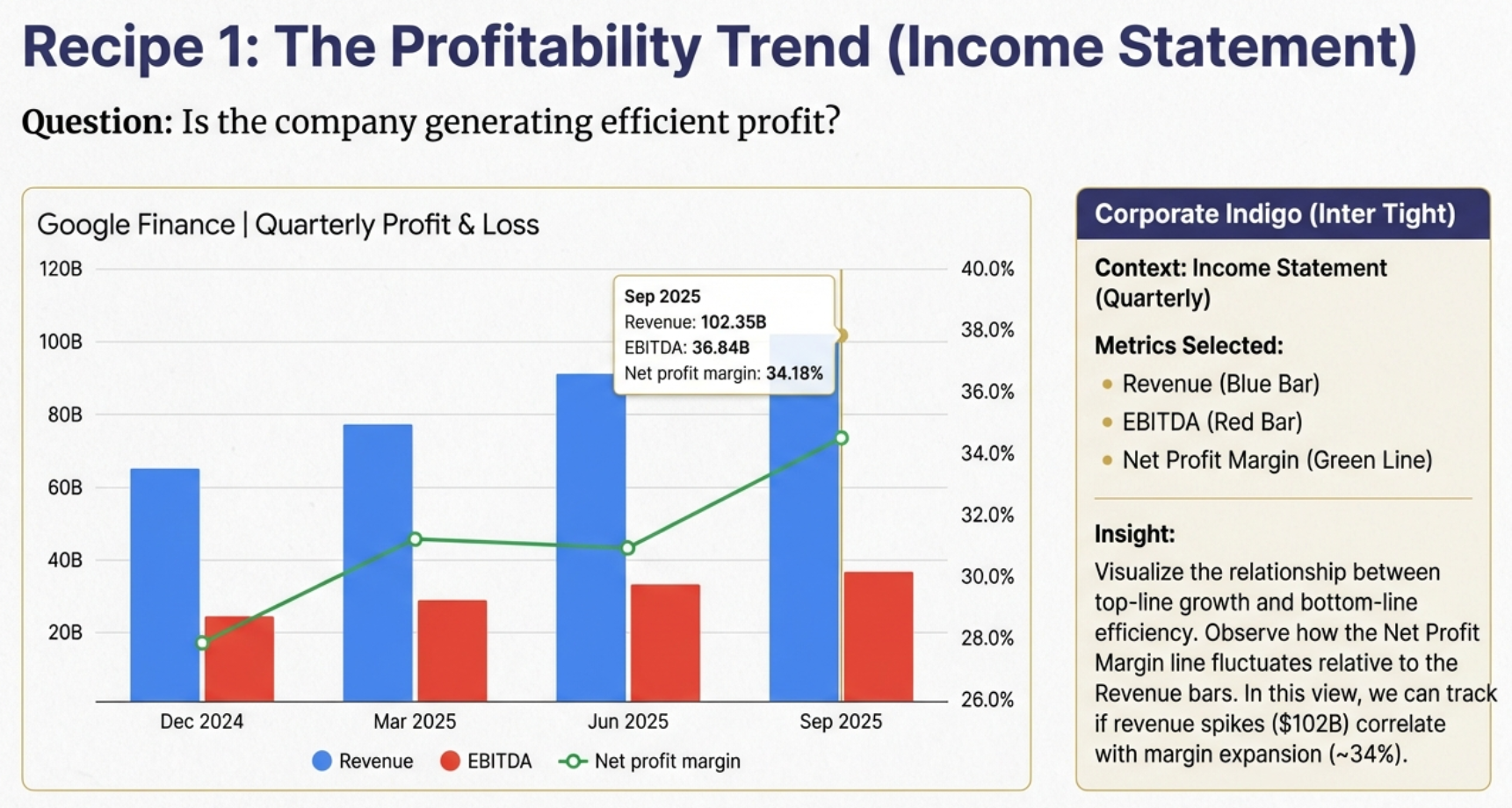
Recipe 1: Track profitability from Revenue through Net Income
Recipe 1: Profitability Trend (Income Statement, Quarterly)
Goal: Assess the company's ability to generate profit at each level
Select:
- Revenue (absolute scale)
- Gross Profit
- Operating Income
- Net Income
What to Look For: Are all profit layers growing proportionally with revenue? Compression between layers indicates cost pressure. For Google, we can see quarterly revenue of ~$88B growing to $102B, with operating margins consistently around 34%—that's exceptional profitability at scale.
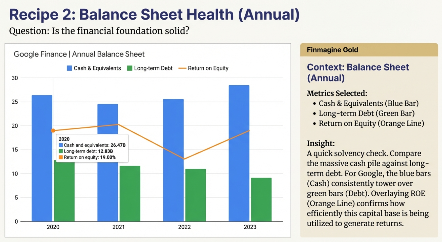
Recipe 2: Assess financial strength through Assets, Liabilities, Cash, and Debt
Recipe 2: Balance Sheet Health (Balance Sheet, Annual)
Goal: Understand the company's financial fortress
Select:
- Total Assets
- Total Liabilities
- Cash & Equivalents
- Long-term Debt
What to Look For: Is cash growing faster than debt? Are assets growing without proportional liability increases? For Google, the chart reveals a fortress balance sheet—massive cash reserves ($95B+) dwarfing long-term debt, with total assets steadily climbing.
Example: Google (GOOG) Annual Balance Sheet - Cash, Debt, and Returns
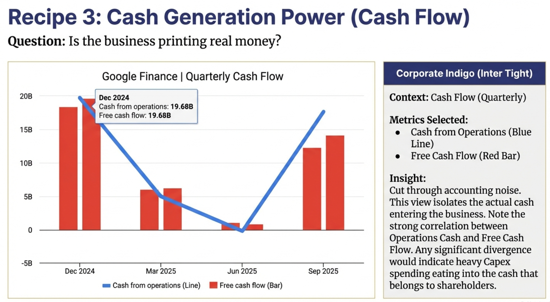
Recipe 3: Follow the cash from Operations through to Free Cash Flow
Recipe 3: Cash Generation Power (Cash Flow, Quarterly)
Goal: Evaluate the company's cash machine
Select:
- Cash from Operations
- Capital Expenditure (negative values)
- Free Cash Flow
- Net Change in Cash
What to Look For: Is operating cash flow consistently positive and growing? Does free cash flow support dividends/buybacks? For Google, operating cash flow exceeds $30B quarterly—and after CapEx, free cash flow remains strongly positive. That's cash available for share buybacks, acquisitions, or simply strengthening the balance sheet.
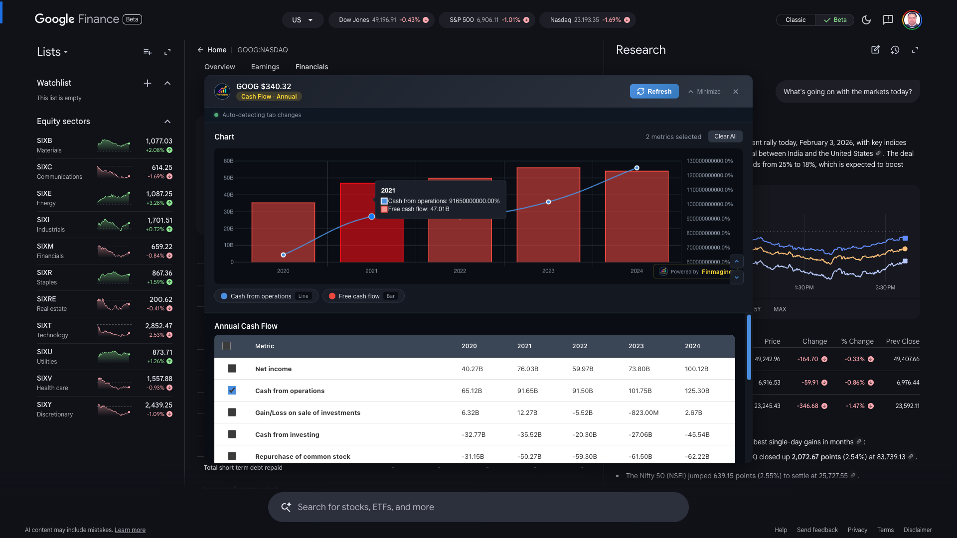
Example: Google (GOOG) Annual Cash Flow - Cash from Operations vs Free Cash Flow
Recipe 4: Growth Sustainability (Income Statement, Annual)
Goal: Long-term growth trajectory
Select:
- Revenue
- EBITDA
- Net Income
- EPS (Diluted)
What to Look For: Is EPS growing faster than Net Income (share buybacks)? Is EBITDA margin stable while revenue grows?
Troubleshooting Google Finance Issues
Problem: Button doesn't appear
Solutions:
- Make sure you clicked the "Financials" tab
- Wait 2-3 seconds for Google Finance to render tables
- Check that the URL contains
/finance/quote/ - Try refreshing the page (F5)
- Verify extension is enabled at
chrome://extensions/
Problem: Only seeing a few metrics (not all 25)
Solution: Make sure you have Finmagine v2.0 or later. Earlier versions had a bug that limited Cash Flow metrics. The extension now extracts ALL rows with data.
Problem: Wrong company name displayed
Solution: This was fixed in v2.0. The extension now reads company name from the page title, which is always correct. Update your extension if you see this issue.
Problem: Annual data appears when only Quarterly selected
Solution: Fixed in v2.0. The extension now uses visibility filtering to skip hidden tables. Update if experiencing this.
Problem: Data doesn't update when I switch Google Finance tabs
Solution: You must use the Minimize → Switch → Restore workflow. The panel doesn't auto-refresh while expanded.
Problem: Panel stuck at bottom / not centering
Solutions:
- Click Close (X) and reopen with the golden button
- Reload the extension at
chrome://extensions/ - Refresh the Google Finance page
You're Now Ready for Global Stock Analysis!
Congratulations! You now understand how to use Finmagine Chart Builder with Google Finance, including its unique workflow requirements.
Key Takeaways
- Select view FIRST: Choose statement type and period before opening Chart Builder
- One view at a time: Can't mix different statements or periods
- Minimize-Restore: The workflow for switching between views
- All metrics included: v2.0 extracts everything visible
- Same great charts: Dual-axis, interactive legend, professional styling
When to Use Which Platform
| Use Screener.in When... | Use Google Finance When... |
|---|---|
| Analyzing Indian stocks | Analyzing US/Global stocks |
| Need to mix Quarterly + Annual | Analyzing a single time period |
| Need Financial Ratios | Need recent quarter data quickly |
| Need Shareholding Patterns | Comparing global competitors |
| Want all data on one page | Focused single-statement analysis |
With Finmagine v2.0, you now have professional financial visualization for both Indian stocks (via Screener.in) and global stocks (via Google Finance). The workflows differ, but the output is the same: beautiful, insightful charts that reveal the story behind the numbers.
New to Finmagine Chart Builder?
Start with the comprehensive Screener.in tutorial to learn the fundamentals.
Read Screener.in Tutorial →Free Chrome Extension
Ready to try this yourself?
Install the Finmagine Financial Chart Builder and transform any Screener.in, Google Finance, or stockanalysis.com page into interactive charts in one click.
Install from Chrome Web Store →No account required • Works on Chrome, Edge, Brave, Opera
Explore the Complete Chart Builder Hub
Discover all Chart Builder resources — tutorials, case studies, and more. Transform financial data into professional charts.
Visit Chart Builder Hub →