Following along? Install the extension first
Finmagine Financial Chart Builder — free • no account needed • Chrome, Edge, Brave
Multimedia Learning Hub
Master stock valuation through video walkthrough, audio deep dive, comprehensive learning overview, and interactive knowledge testing
Complete Learning Path
This deep dive takes you inside the Finmagine Valuation Tab — a sector-aware valuation engine that compares a stock's current multiples against its own 5-year history, weights each metric by sector relevance, adjusts for growth using the PEG ratio, and adds market context via the NIFTY 50 benchmark. It is a four-layer framework that replicates the brain of a financial analyst in your browser.
What You'll Learn:
- The Four Pillars: PE Ratio, EV/EBITDA, Price/Book, and Mkt Cap/Sales — when each matters and when each lies
- Historical Relativism: Why the 5-year median is more powerful than simple averages, and how deviation is calculated
- Sector-Aware Weighted Scoring: The secret sauce that prevents wrong verdicts for banks, metals, telecom, IT, and fintech
- The PEG Ratio: How to tell if a high PE is justified by growth or is a bubble waiting to pop
- NIFTY 50 Benchmark: Adding market context without bias — and how the interpretive context line resolves conflicting signals
- Real Case Studies: Affle India, Bajaj Finance, National Aluminium, Polycab, Eternal Ltd, Garden Reach Shipbuilders
- Edge Cases: Loss-making companies, conglomerates, negative medians, and graceful degradation
Key Skills You'll Master:
- Use the right valuation metric for the right business — never measure a river with a thermometer again
- Avoid the low-PE cyclical trap that catches thousands of retail investors every cycle
- Understand why a PE of 52 can be "undervalued" and a PE of 5 can be "premium priced"
- Read the visual cues: gold tags, dimmed cards, classification bands, and interpretive context lines
- Screen companies in 15 seconds using PEG and sector-weighted verdicts
Article Structure:
- The Problem: Why valuation is the most misunderstood concept in investing
- The Four Pillars: Understanding the four valuation multiples
- Historical Comparisons: The 5-year median and deviation calculation
- The Secret Sauce: Sector-aware weighted scoring system
- Sector Spotlights: Banking, Metals, IT, Telecom, Fintech, Manufacturing
- The PEG Ratio: Balancing price with growth
- The NIFTY 50 Benchmark: Market context and conflict resolution
- Case Studies: Real company analysis walkthroughs
- Edge Cases & Architecture: How the system handles extremes
How to Know If a Stock Is Cheap or Expensive
This step-by-step video walks through the complete four-layer valuation framework with real company examples.
Video Title: How to Know If a Stock Is Cheap or Expensive (Step-by-Step Valuation Framework)
Complete walkthrough covering historical context, sector logic, PEG ratio, and NIFTY 50 benchmarking with live examples
Listen to the Audio Deep Dive
A comprehensive audio exploration of the weighted sector valuation logic — covering the four pillars, sector spotlights, PEG ratio, NIFTY benchmark, and real case studies. Perfect for commutes or workouts.
Duration: Full deep dive | Format: Professional narration
In-depth audio guide exploring sector-aware valuation, weighted scoring, and how the Finmagine engine replicates the brain of a financial analyst
Test Your Knowledge
Click any flashcard to reveal the answer. Use the search box to find specific topics. 75 questions covering all aspects of the valuation framework.
The Eternal Question: Is This Stock a Good Deal?
We have all been there. You find a company you really like — great management, strong product, growing market. But then comes the question that keeps every investor staring at the ceiling: Is the stock actually a good deal, or is it a bubble waiting to pop?
Getting that call wrong can really hurt. It is the difference between buying a house in 2007 and buying it in 2012 — same house, very different financial outcome. And the moment you decide to dig in, it feels like you are lost in a maze. The PE ratio is telling you one thing, the price-to-book is pointing in a completely different direction, and some analyst on TV is yelling about EV/EBITDA.
Usually, to figure this out, you open 10 different tabs — your news site, your broker app, maybe a spreadsheet if you are feeling fancy — and you try to synthesize all this noise. That is analysis paralysis, and it is the number one reason good investors miss good opportunities.
This article deconstructs the Finmagine Valuation Tab — a four-layer framework built into the Finmagine Financial Chart Builder Chrome extension (v2.2.0+) that transforms valuation chaos into structured clarity. It uses code to replicate the brain of a financial analyst, applying sector-aware intelligence to deliver a single, defensible verdict.
What Makes This Different
Most browser extensions for stock analysis are scrapers. They read the webpage, grab the text already there, and maybe make it bold or put it in a box. It is purely cosmetic — a new coat of paint on a crumbling wall.
The Valuation Tab is fundamentally different. It is the first API-based feature in the Finmagine suite. Instead of just reading today's data from the page, it actively reaches out to the Screener.in Chart API and fetches roughly 1,200 data points — five years of daily historical trading data for the specific company. It is the difference between a Polaroid of today and a five-year documentary.
The Four Pillars of Valuation
The tool pulls four specific valuation multiples via the Screener.in Chart API. Why these four? Because different businesses operate on different laws of physics. You need profitability, assets, revenue, and cash flow — the four corners of any business. With these four metrics, you can value anything from a lemonade stand to a satellite company.
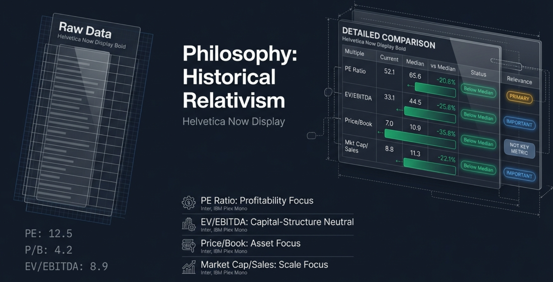
1. PE Ratio (Price to Earnings)
The formula is simple: Market Price / Earnings Per Share. It tells you how many rupees you are paying today for one rupee of the company's annual earnings. If the PE is 10 and earnings stay flat, it takes 10 years for the company to earn back what you paid.
The usual rule of thumb is that lower is better. A PE of 10 is "cheaper" than a PE of 50. But in a vacuum, that thinking is dangerous.
The PE ratio is the gold standard for stable, profitable companies — think IT services, manufacturing, FMCG. If a company makes a steady profit year in and year out, the PE tells you how the market values that profit. But for loss-making companies, the E in PE is negative, and the number becomes mathematically useless. And for cyclical industries like metals, a low PE might actually signal the top of the cycle, not a bargain.
2. EV/EBITDA (Enterprise Value to EBITDA)
Think of Enterprise Value as the takeover price. If you wanted to buy the entire company, you pay the market cap plus assume all their debt. It is like buying a house: the listing price might be one crore, but if there is a 50-lakh mortgage attached, the real cost is 1.5 crores.
EBITDA is earnings before interest, taxes, depreciation, and amortization — a cleaner look at raw operational cash generation. By combining them, you get a capital-structure-neutral metric. Two identical factories, one debt-free and one heavily leveraged, will have the same EV/EBITDA even though their PE ratios look completely different.
This is the superior metric for capital-intensive businesses — telecom, infrastructure, metals — where massive depreciation charges crush reported earnings and make PE unreliable.
3. Price/Book (Price to Book Value)
This is the liquidation value question: if you shut down the company tomorrow, sold every asset, paid off all debts, what is left for shareholders? That leftover is the book value.
This is the holy grail for banks and NBFCs. Their inventory is money — loans, bonds, financial assets. Their value is literally written on their books. A bank at 1x book value is selling for the value of its cash and loans; a bank at 3x is commanding a premium for its brand, safety, and growth ability.
But for an IT company like Infosys? Useless. Their assets are people and code — things that barely show up on the balance sheet. The price-to-book will always look sky high and it means nothing.
4. Mkt Cap/Sales (Market Capitalization to Revenue)
This is the metric for growth-phase companies. Fintechs, early-stage consumer platforms — these companies may not show a profit yet because they are reinvesting every rupee. There is no PE. There may not be heavy assets. But they have revenue. This metric answers: how much am I paying for their market share?
If you tried to value Amazon in 1999 using PE, you would have concluded it was worthless. You had to look at sales to see the beast it was becoming.
Historical Relativism: Compare the Stock to Itself
If someone tells you the PE is 25, you have no idea if that is high or low for that specific company. This is where the historical comparison enters the picture. The tool does not care what the industry average is or what a competitor trades at. It cares what this specific company's normal is.
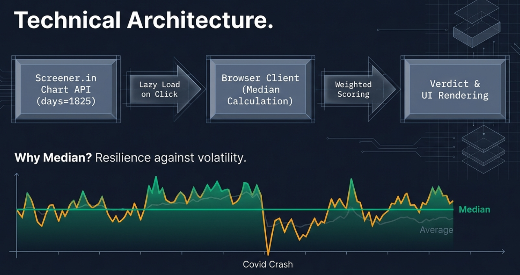
Why Median, Not Average?
The tool fetches roughly 1,200 data points (five years of daily trading data), sorts them from lowest to highest, and picks the median — the middle number. Why not use the average we learned in grade school?
Because averages are easily corrupted. Imagine a stock crashes 50% during a panic like COVID in March 2020. That one month of extreme lows drags down a five-year average significantly. Or think about a euphoric bubble spike where the stock doubles for no good reason — that pulls the average up. The median is robust. It ignores outliers. It finds the center of gravity.
The Deviation Formula
Once the median is established, the tool calculates how far the current value has drifted:
Note the absolute value of median in the denominator. This prevents negative medians (from historically loss-making companies) from flipping the deviation sign and giving you the opposite of reality.
The Traffic Light System
| Badge | Condition | Interpretation |
|---|---|---|
| Below Median | Deviation < -5% | Trading below 5-year median — potentially undervalued |
| Near Median | -5% to +5% | In line with historical valuation — fair territory |
| Above Median | Deviation > +5% | Trading above 5-year median — premium pricing |
| Data N/A | Missing data | API returned no data for this multiple |
But here is where it gets really interesting. If you just looked at those coloured badges and counted them up — say, two amber and one green — a simple counter would say "expensive." And for some sectors, that would be completely, totally wrong. That is the dumb algorithm approach. That is how a spreadsheet thinks, not how an investor thinks.
Sector-Aware Weighted Scoring
This is the most powerful feature of the Valuation Tab. Instead of treating all four multiples equally, the verdict is weighted by sector relevance. Think of it like a voting system in a boardroom. Not everyone gets an equal say — the domain expert's opinion carries more weight than the intern's.
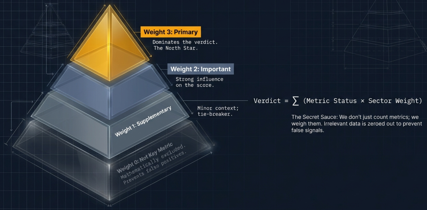
The Weight System
| Weight | Label | Meaning | Verdict Impact |
|---|---|---|---|
| 3 | Primary | The dominant valuation metric for this sector | Full weight — drives the verdict |
| 2 | Important | Significant supporting metric | High weight in verdict |
| 1 | Supplementary | Additional context, lower influence | Low weight in verdict |
| 0 | Not Key Metric | Not applicable or misleading for this sector | Excluded entirely |
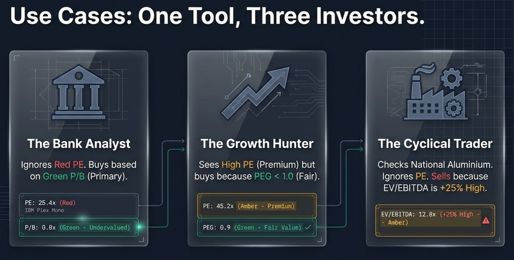
Why This Matters: The Banking Example
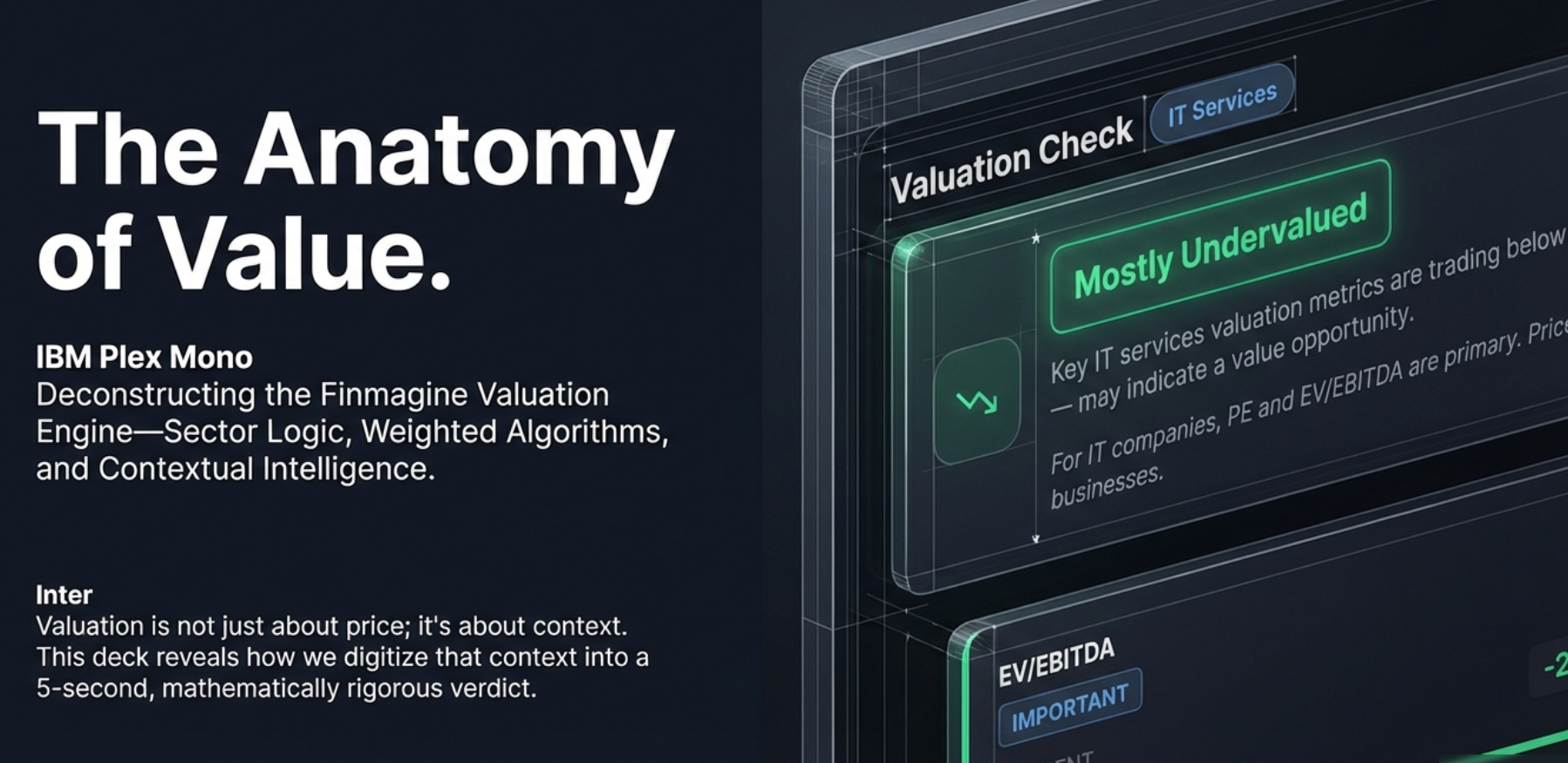
Without sector awareness, a bank with PE above median, EV/EBITDA above median, and P/B below median would show "Premium Priced" (two expensive vs one cheap). But PE and EV/EBITDA are meaningless for banks! Bank earnings are volatile due to provisioning for bad loans. EV is designed for industrial companies, not deposit-taking institutions.
With sector awareness, the same bank shows "Mostly Undervalued" because P/B (weight 3, Primary) is below median, while PE and EV/EBITDA (weight 0, Not Key Metric) are excluded from the verdict entirely.
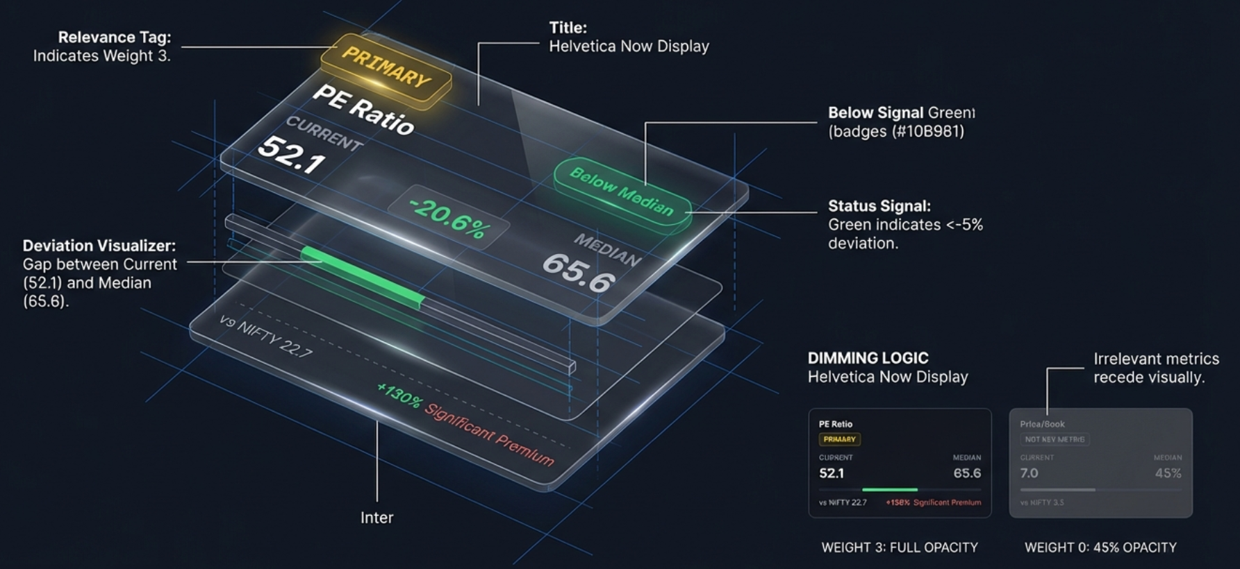
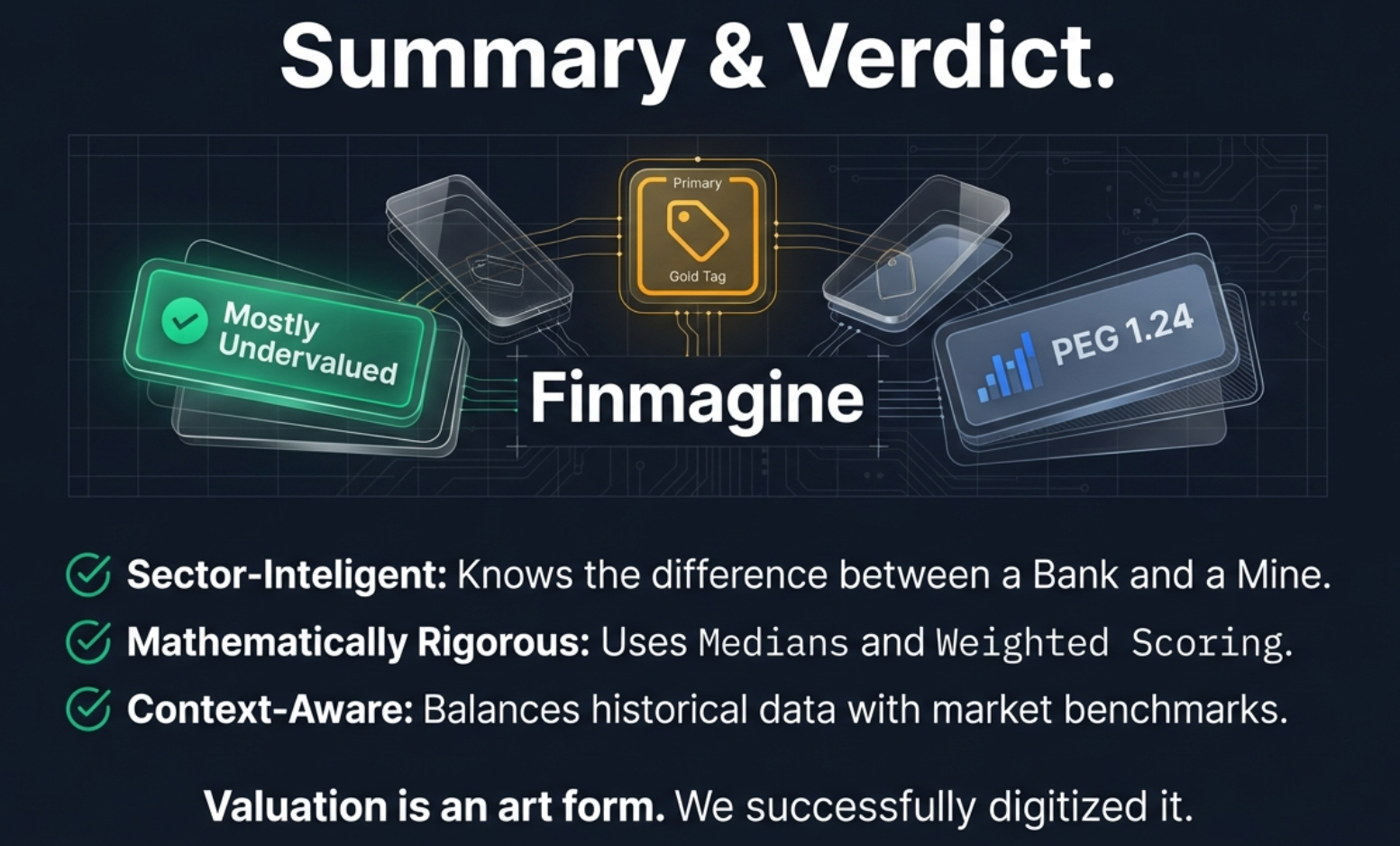
Visual Guidance: Gold Tags and Dimmed Cards
The user interface makes this intelligence visible. Metrics with weight 0 are dimmed to 45% opacity and tagged "Not Key Metric." Your eye is immediately drawn away from the noise and toward the signal. Meanwhile, the primary metric gets a bright gold "PRIMARY" tag.
The verdict appears as one of four badges:
- Mostly Undervalued: Key sector metrics below median — research for potential value opportunity
- Fairly Valued: Key metrics near historical medians — neutral valuation
- Premium Priced: Key sector metrics above median — high expectations priced in
- Insufficient Data: No key metrics available
How Different Sectors Are Valued
The same "Mostly Undervalued" verdict means different things in different sectors because different metrics drive it. Here is how the system adapts across the Indian market's major sectors.
Banking & NBFCs: Money Is the Inventory
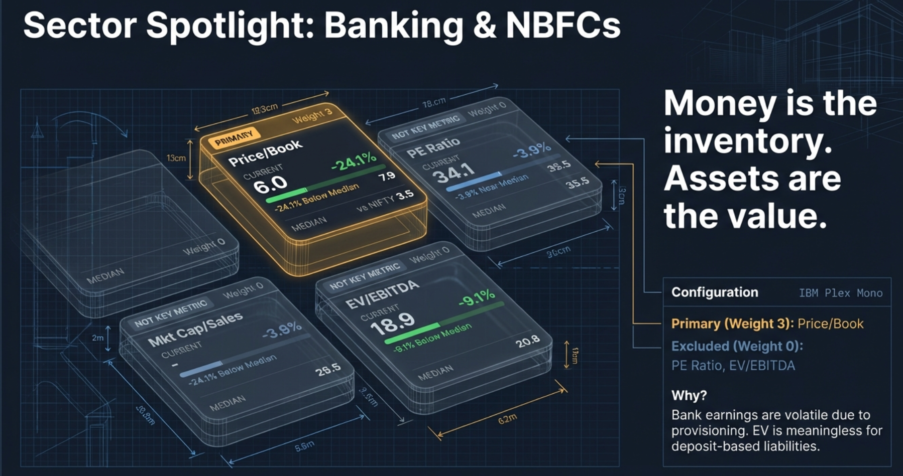
For banks and NBFCs, the value lies in the loan book and financial assets. Price/Book gets weight 3 (Primary). Everything else — PE, EV/EBITDA, Mkt Cap/Sales — gets weight 0 and is excluded. An informational note appears: "For NBFCs, Price/Book is the primary valuation metric."
Metals & Mining: The Cyclical Trap
Metals is the widow maker of investing if you rely on PE ratios. When a metal cycle peaks and aluminium prices are sky high, earnings explode, and the PE ratio drops to 4 or 5. The average investor sees that and thinks it is a steal. But that low PE usually marks the top of the cycle. Then commodity prices crash, earnings disappear, and the PE shoots up to 50 or goes negative.
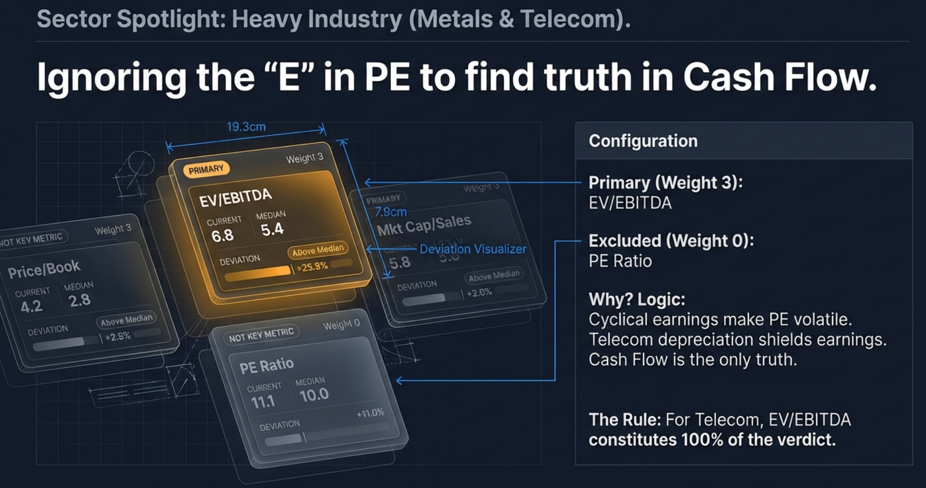
The system assigns EV/EBITDA weight 3 (Primary) and PE weight 0 (Not Key Metric) for metals. The sector note reads: "For cyclical metals companies, PE is unreliable."
Telecom: Winner Takes All
Telecom is even more extreme. EV/EBITDA is the only metric with a non-zero weight. PE is zero. Price/Book is zero. Mkt Cap/Sales is zero. The verdict relies 100% on EV/EBITDA because telecom companies spend thousands of crores on spectrum auctions and towers, creating huge depreciation charges that completely crush reported earnings and make PE meaningless. The massive debt makes book value messy. EV/EBITDA cuts through the fog.
IT & Services: Brainpower Over Assets
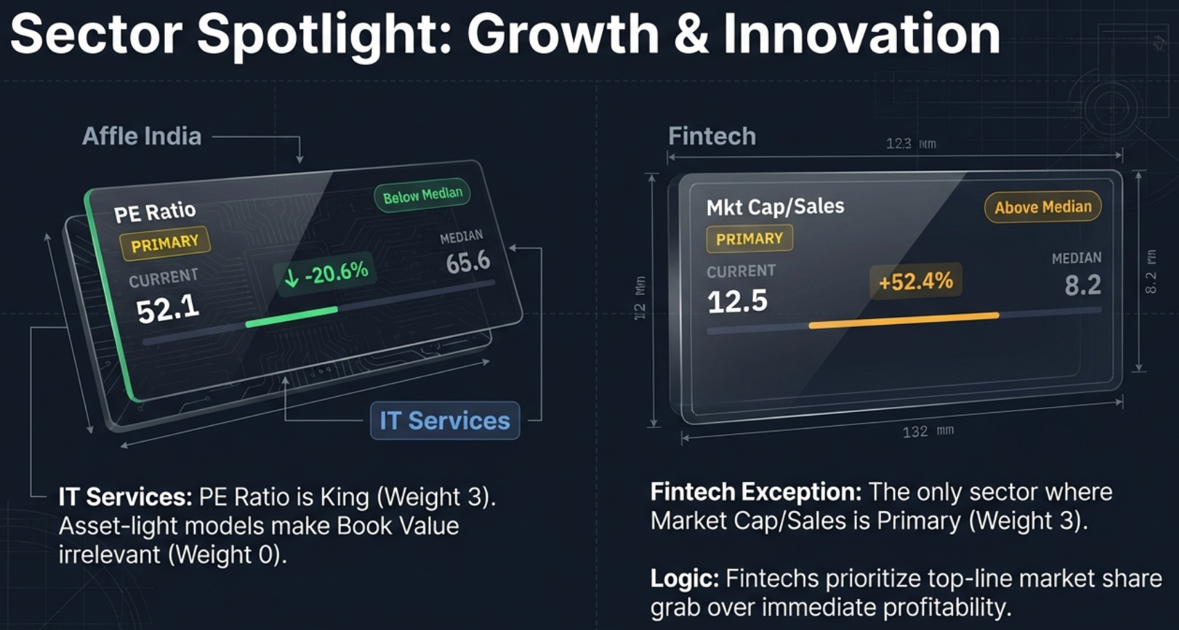
For IT and Services companies, PE Ratio gets weight 3 (Primary) and EV/EBITDA gets weight 2 (Important). Price/Book is weight 0 — because what are the assets of an IT company? People, code, intellectual property. None of that shows up heavily on the balance sheet. The book value is tiny, so price-to-book will always look sky high and it means nothing.
Fintech: The Revenue-First Exception
Fintech is the only sector where Mkt Cap/Sales is Primary (weight 3). These companies are in a land-grab phase where market share matters more than immediate profitability. PE gets weight 2 (Important), EV/EBITDA gets weight 1 (Supplementary), and Price/Book is excluded at weight 0.
Manufacturing vs. Infrastructure: The Subtle Split
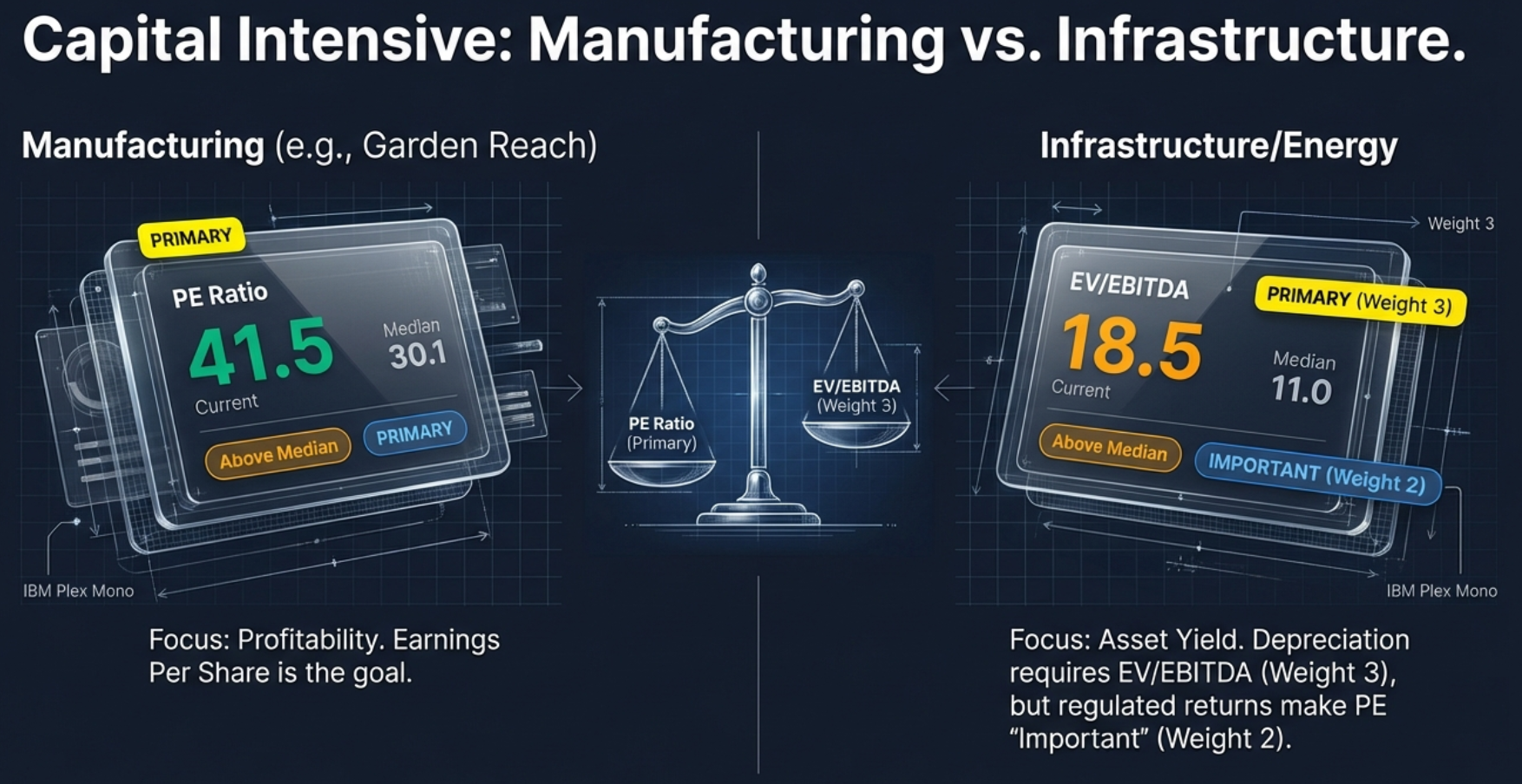
Both are capital-intensive, but the system treats them differently. Manufacturing prioritises PE (weight 3) over EV/EBITDA (weight 2) because these are mature, earnings-driven businesses. Infrastructure and Energy flip this: EV/EBITDA (weight 3) over PE (weight 2) because heavy depreciation and debt distort earnings, but regulated returns and long-term contracts make PE still relevant as a secondary check.
Complete Sector Weights Reference
| Sector | PE | EV/EBITDA | P/B | Mkt Cap/Sales | Primary Metric |
|---|---|---|---|---|---|
| Banking | 0 | 0 | 3 | 0 | Price/Book |
| NBFC | 0 | 0 | 3 | 0 | Price/Book |
| Fintech | 2 | 1 | 0 | 3 | Mkt Cap/Sales |
| IT | 3 | 2 | 0 | 2 | PE Ratio |
| Services | 3 | 1 | 0 | 2 | PE Ratio |
| FMCG | 3 | 2 | 0 | 2 | PE Ratio |
| Pharma | 3 | 2 | 0 | 1 | PE Ratio |
| Manufacturing | 3 | 2 | 1 | 1 | PE Ratio |
| Infrastructure | 2 | 3 | 1 | 0 | EV/EBITDA |
| Energy | 2 | 3 | 1 | 0 | EV/EBITDA |
| Metals | 0 | 3 | 2 | 0 | EV/EBITDA |
| Telecom | 0 | 3 | 0 | 0 | EV/EBITDA |
| Auto | 3 | 2 | 1 | 1 | PE Ratio |
| Chemicals | 3 | 2 | 1 | 1 | PE Ratio |
| Media | 3 | 2 | 0 | 1 | PE Ratio |
| Retail | 3 | 2 | 0 | 2 | PE Ratio |
| Agriculture | 3 | 2 | 1 | 0 | PE Ratio |
| Textiles | 3 | 2 | 1 | 1 | PE Ratio |
| General | 3 | 2 | 1 | 1 | PE Ratio |
The PEG Ratio: Balancing Price with Growth
We have looked at the company versus itself through history, and we have applied sector-aware weighting. But markets look forward. They care about growth. A cheap stock with no growth is just a slow death. This brings us to the PEG ratio — popularised by the legendary fund manager Peter Lynch.
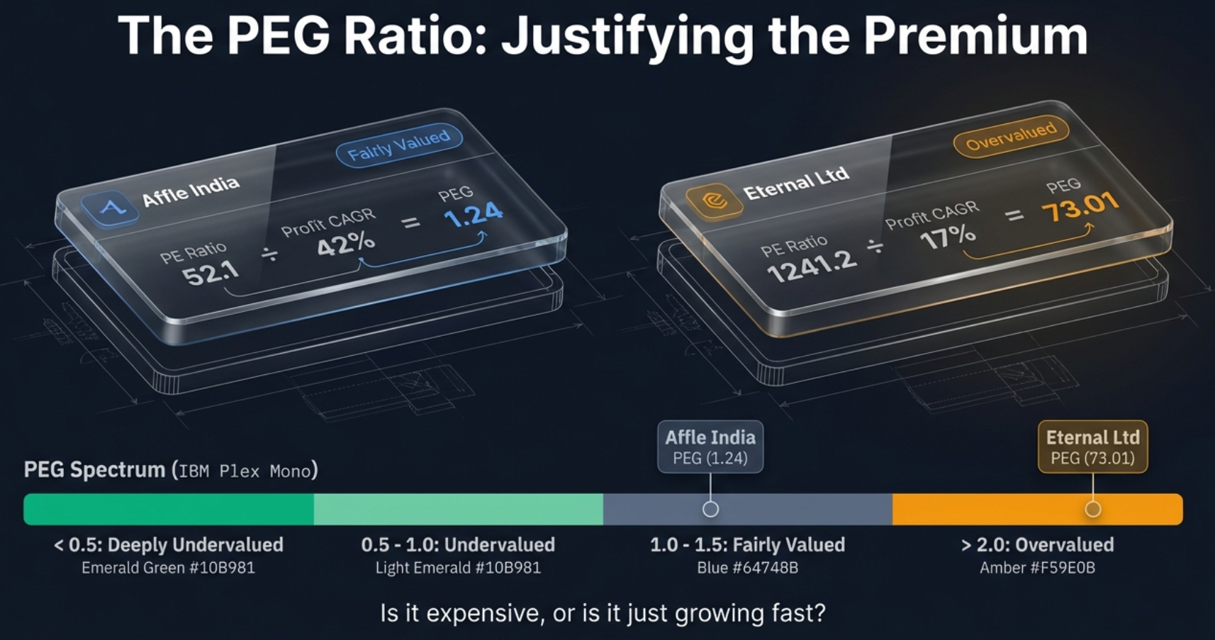
The Formula
The tool prefers the 5-year CAGR to smooth out noise, but falls back to the 3-year if the 5-year is unavailable. Growth must be positive for PEG to be meaningful.
PEG Thresholds
| PEG Range | Status | What It Reveals |
|---|---|---|
| < 0.5 | Deeply Undervalued | The stock is significantly cheap; you are paying very little for high growth |
| 0.5 – 1.0 | Undervalued | The growth is not fully priced in yet; potential opportunity |
| 1.0 – 1.5 | Fairly Valued | The price is reasonable for the growth rate — the sweet spot |
| 1.5 – 2.0 | Getting Expensive | Markets are pricing in significant future expectations; caution advised |
| > 2.0 | Overvalued | You are paying too much for the current growth; wait for a dip |
PEG in Action: Good Expensive vs. Bad Expensive
Affle India: PE of 52.1 looks expensive in isolation. But with a blistering 42% profit CAGR, the PEG is 1.24 (Fairly Valued). The high price is justified by the high growth. Do not be scared of the number.
Eternal Ltd: PE of 1,241.2. Growth of 17%. PEG of 73.01. This is a massive warning sign. The market has priced in a level of growth that simply is not there. It is pure speculation disconnected from reality.
Polycab India: PEG of 2.12 — just tipping into the red zone. The market has priced in expectations that the current 21% growth does not quite support. A little overheated.
The NIFTY 50 Benchmark: Market Context
We have compared the stock to itself, applied sector logic, and balanced price against growth. The final layer zooms out for one last reality check: how does this stock stack up against the market as a whole?
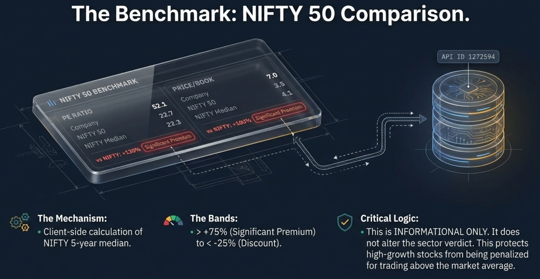
Classification Bands
| Band | Range | Interpretation |
|---|---|---|
| Significant Premium | > +75% | The stock is priced far higher than the market average (common for high-growth firms) |
| Moderate Premium | +25% to +75% | The stock trades somewhat above market levels |
| In Line with Market | -25% to +25% | The stock's valuation is roughly consistent with the broader economy |
| Discount to Market | < -25% | The stock is cheaper than the average market player |
Resolving Conflicting Signals
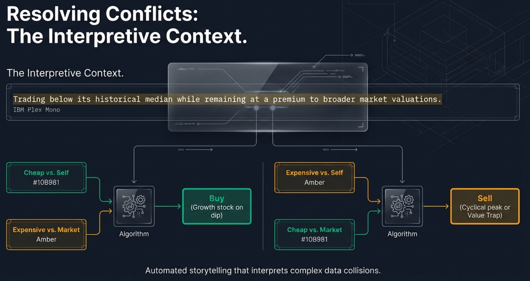
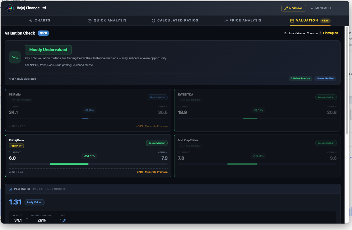
Here is a common puzzle: Bajaj Finance is "Mostly Undervalued" (below its own historical median), but the benchmark shows it trades at a 50% premium to the NIFTY 50. Is it cheap or expensive?
The answer is both, and the tool resolves this with an interpretive context line — a dynamic sentence that bridges the gap:
| Scenario | Context Text Displayed |
|---|---|
| Below Median + Premium to NIFTY | "Trading below its historical median while remaining at a premium to broader market valuations." |
| Above Median + Discount to NIFTY | "Trading above its historical median but at a discount to broader market valuations." |
| Below Median + Discount to NIFTY | "Trading below both its historical median and broader market valuations." |
| Above Median + Premium to NIFTY | "Trading above both its historical median and broader market valuations." |
Real Company Analysis Walkthroughs
Theory is useful. Application is where the learning happens. Let's run several companies through the framework and see the four layers in action.
Case Study 1: Affle India (IT Services)
- Sector: IT Services
- Primary Metric: PE Ratio (weight 3) — Current: 52.1, Median: 65.6, -20.6% Below Median
- EV/EBITDA (Important): 33.1 vs 44.5, -25.6% Below Median
- Price/Book: Dimmed, Not Key Metric (asset-light business)
- Verdict: Mostly Undervalued
- PEG: 1.24 (Fairly Valued) — PE 52.1 / Profit CAGR 42% = 1.24
- vs NIFTY: +130% Significant Premium (normal for high-growth IT)
The Story: A high-growth stock currently trading 20% cheaper than its own history, with growth that justifies the price. Despite the massive NIFTY premium, it is undervalued relative to itself. The context line resolves this: cheap for Affle, expensive for the market average.
Case Study 2: Bajaj Finance (NBFC)
- Sector: NBFC
- Primary Metric: Price/Book (weight 3) — Current: 6.0, Median: 7.9, -24.1% Below Median
- PE, EV/EBITDA: Dimmed, Not Key Metric (weight 0)
- Verdict: Mostly Undervalued
- PEG: 1.31 (Fairly Valued)
- vs NIFTY: +71% Moderate Premium (P/B)
The Story: The verdict ignores PE and EV/EBITDA entirely and focuses on P/B — the metric that matters for a lender. At 24% below its own historical book value premium, Bajaj Finance is cheap for Bajaj, though still expensive compared to the overall market. The tool educates you about the distinction.
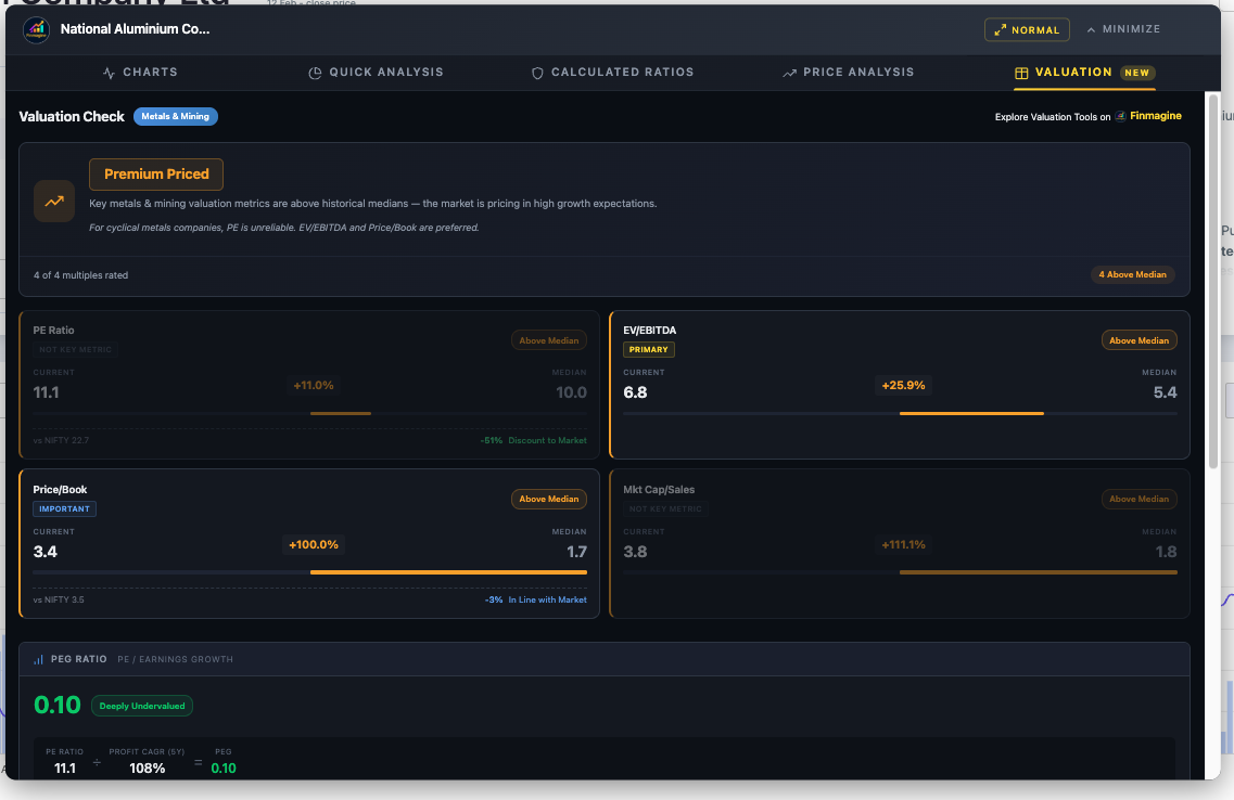
Case Study 3: National Aluminium (Metals)
- Sector: Metals & Mining
- Primary Metric: EV/EBITDA (weight 3) — Current: 6.8, Median: 5.4, +25.9% Above Median
- PE: 11.1 — looks temptingly low, but dimmed as Not Key Metric
- Verdict: Premium Priced
- PEG: 0.10 (Deeply Undervalued) — but based on cyclical PE, so misleading
The Story: This is the value trap avoidance in action. The PE looks low (11.1) and the PEG screams "buy" (0.10). A naive investor would pile in. But the tool knows that metals PE is unreliable. EV/EBITDA tells the real story: the stock is 26% above its normal operating cash flow valuation. Premium Priced. The tool just saved you from buying at the top of a commodity cycle.
Case Study 4: Garden Reach Shipbuilders (Manufacturing)
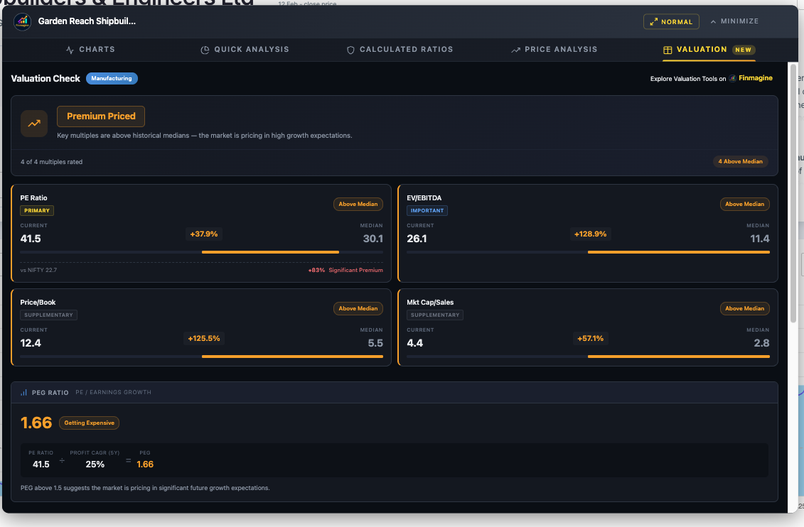
- Sector: Manufacturing
- Primary Metric: PE Ratio (weight 3) — Current: 41.5, Median: 30.1, +37.9% Above Median
- EV/EBITDA (Important): Also significantly above median
- Verdict: Premium Priced
The Story: Both the primary metric (PE) and the secondary check (EV/EBITDA) agree: this stock has run up beyond its historical norms, likely fuelled by the defence sector rally. When both metrics point in the same direction, conviction is high.
Handling Extremes: Edge Cases & Technical Architecture
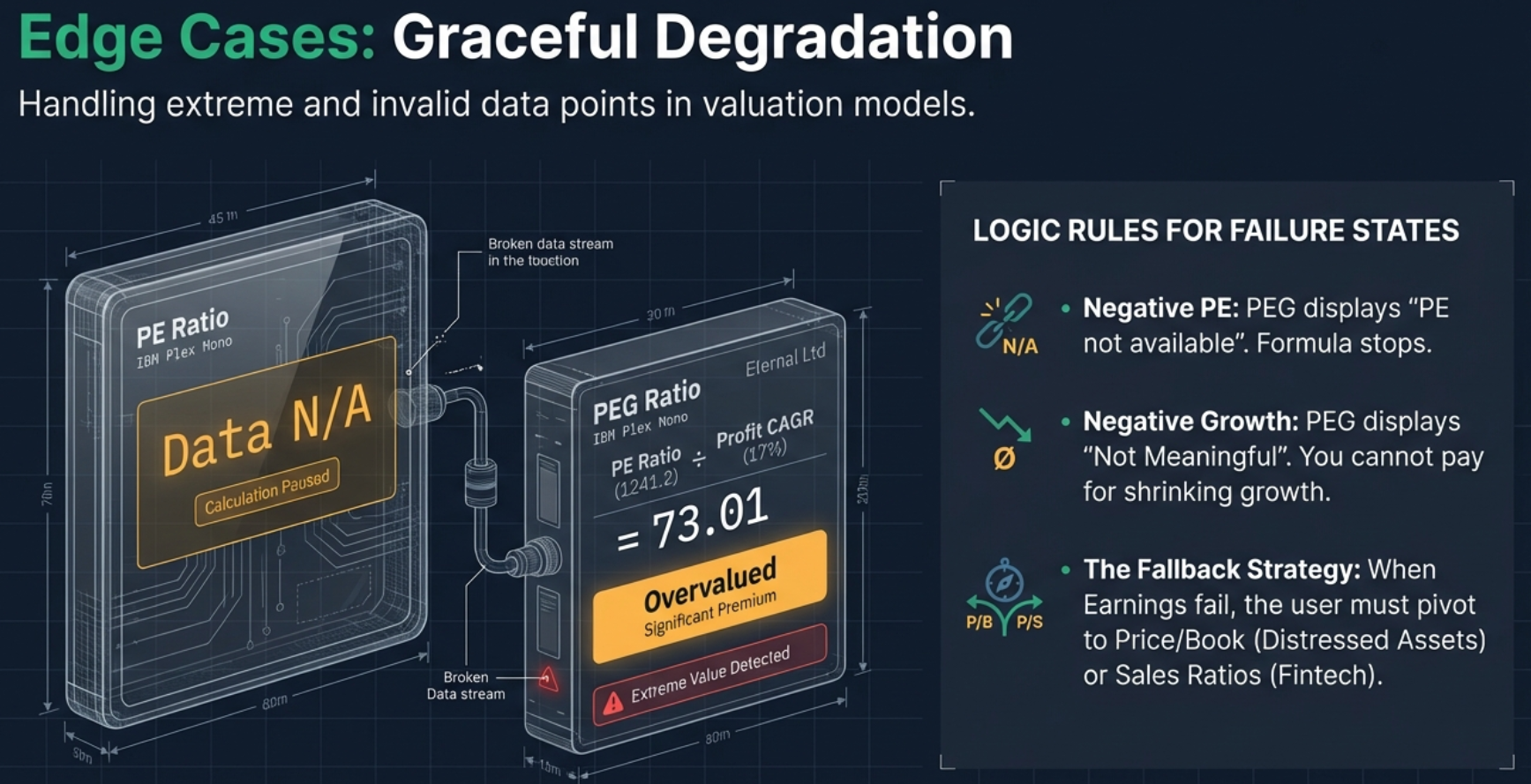
Loss-Making Companies
When a company is losing money, the PE ratio is negative, making PEG impossible to calculate. The tool displays "PE not available or negative" and directs you to other metrics. For fintechs, that is Mkt Cap/Sales. For distressed industrials, that is Price/Book or EV/EBITDA (if EBITDA is still positive despite a net loss).
Conglomerates and Holding Companies
The tool applies the weighting rules of the single primary sector detected from Screener.in's Peer Comparison section. It cannot perform Sum-of-Parts (SOTP) analysis — it cannot split Reliance's oil business from Jio. If the sector chip says "[General]" or "[Manufacturing]" for a company you know is really an investment holding firm, take the verdict with a grain of salt and manually focus on the metric that matters for the underlying businesses.
Negative Medians
The absolute value in the deviation formula (|Median|) prevents negative medians from flipping signs. If a company had a negative median EV/EBITDA (e.g., -35.6), a current value of 132.1 would correctly show +471% Above Median, not a negative percentage.
API Failure and Graceful Degradation
Each of the four metrics is fetched independently. If one fails, the other three still display. If the NIFTY 50 API fails, the benchmark section silently does not render — no error popups, no broken UI. The rest of the valuation analysis continues normally. The NIFTY data is fetched in parallel with company data, so even when it succeeds, it adds zero additional latency.
Lazy Loading and Caching
Data is only fetched from the API when you click the Valuation tab. It does not load in the background while you are looking at charts or the Quick Analysis tab. Once fetched, it is cached in memory — switching tabs and returning is instant without another API call.
How to Access the Valuation Tab
- Install the Extension: Download the Finmagine Financial Chart Builder from the Chrome Web Store (free, no account required)
- Navigate to Screener.in: Open any company page (e.g.,
screener.in/company/HDFCBANK/consolidated/) - Click the Golden Button: The "Visualize with Finmagine" button appears at the bottom-right
- Click the Valuation Tab: It is the fifth tab: Charts | Quick Analysis | Calculated Ratios | Price Analysis | Valuation
- Wait for Data: A loading spinner appears ("Fetching valuation data...") for 1-2 seconds, then the complete analysis renders
The Valuation Tab vs Other Tabs
| Feature | Valuation | Quick Analysis | Price Analysis | Calculated Ratios |
|---|---|---|---|---|
| Focus | Historical multiples | Overall health | Price vs growth | Financial ratios |
| API Data | Yes | No | No | No |
| Sector Aware | Yes (weighted) | Yes (thresholds) | No | No |
| PEG Ratio | Yes | No | No | No |
| NIFTY Benchmark | Yes | No | No | No |
| Health Score | No | Yes | No | No |
| DuPont Analysis | No | No | No | Yes |
The Map, Not the Driver
The Valuation Tab is an automated analyst that bridges the gap between raw data and actionable insight. It knows what to ignore — and in investing, knowing what to ignore is half the battle. Ignoring PE for telecom, ignoring book value for IT — that is where the edge is.
But here is the final, crucial caveat: this tool relies on past medians. It assumes the last five years are a reasonable predictor of the future. If a company has fundamentally reinvented itself — a boring utility that became an AI powerhouse — its historical median PE might be 10, but its new normal might be 40. The tool would call that a bubble when in reality it is a re-rating.
Your next step: Run your portfolio through the Valuation Tab. See which stocks are genuinely undervalued gems — and which are premium-priced traps hiding behind a low PE or a hot narrative. The answer might surprise you.
Free Chrome Extension
Ready to try this yourself?
Install the Finmagine Financial Chart Builder and transform any Screener.in, Google Finance, or stockanalysis.com page into interactive charts in one click.
Install from Chrome Web Store →No account required • Works on Chrome, Edge, Brave, Opera
Explore the Complete Chart Builder Hub
Discover all Chart Builder resources — tutorials, Google Finance integration, Quick Analysis, Calculated Ratios, Price Analysis, and more. Transform Screener.in data into professional charts and analysis.
Visit Chart Builder Hub →