Following along? Install the extension first
Finmagine Financial Chart Builder — free • no account needed • Chrome, Edge, Brave
🎓 Multimedia Learning Hub
Master Reverse DCF & Scenario Valuation through video, deep-dive audio, a comprehensive learning guide, and 50 interactive flashcards
📚 Complete Learning Path
This deep-dive guide unpacks the Finmagine Scenario Valuation Calculator — a powerful, forward-looking feature built into the Finmagine Financial Chart Builder Chrome extension. If you've ever bought a stock without knowing whether its price implies 5% or 25% annual growth, this guide will change how you invest.
🎯 What You'll Learn:
- Why historical PE alone is insufficient — and what forward-looking analysis actually looks like
- Reverse DCF in plain language — how to decode the growth rate a stock price is already pricing in
- The Earnings Tab (PE-based) — a transparent 4-step model to project future price and CAGR
- The OPM Tab (EV/EBITDA-based) — why PE fails for capital-intensive companies and what to use instead
- Edit Mode — live scenario editing with instant feedback, independent tab assumptions
- India vs US adaptation — how the tool automatically adjusts currency, discount rates, and data sources
- Real examples — TCS, Polycab, Affle India, PDD Holdings, Lam Research
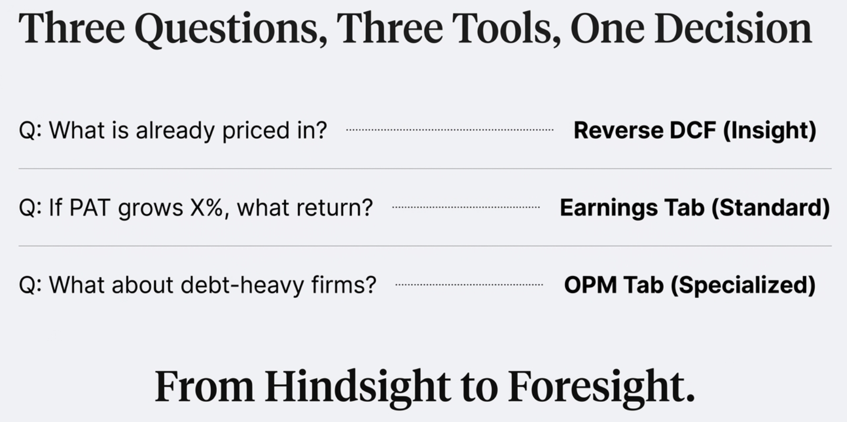
🔑 Three Analytical Pillars Covered:
- The Reality Check — Reverse DCF: what is the market already expecting?
- The Growth Projector — Earnings Tab: if my thesis is right, what return do I get?
- The Heavy Industry Model — OPM Tab: EV/EBITDA for companies where PE breaks down
📖 Article Sections:
- The Rearview Mirror Problem: Why Historical Valuation Isn't Enough
- What Is the Scenario Valuation Calculator? (Layout Overview)
- Pillar 1: Reverse DCF — The Reality Check
- Pillar 2: Earnings Tab — PE-Based Scenario Valuation
- Pillar 3: OPM Tab — EV/EBITDA for Capital-Intensive Companies
- Edit Mode: Stress-Test Your Assumptions Live
- India vs US: Automatic Adaptation
- Real-World Use Cases and Complete Analytical Workflow
🚀 Why This Matters:
- Stop buying based on tips — start owning your analytical assumptions
- Know the bar before you buy — is the market asking for 5% or 25% growth?
- Institutional-quality thinking — the same framework used by fund managers, built into a free extension
- Works on Screener.in & StockAnalysis.com — India and US stocks covered
Watch: Stop Guessing Stock Prices – Use Reverse DCF & Scenario Valuation Like a Pro
A complete walkthrough of the Scenario Valuation Calculator with real stock examples — TCS, Polycab, PDD Holdings, and Lam Research.
📺 Practical video demonstration covering Reverse DCF, Earnings tab, OPM tab, and Edit Mode with live examples
Listen: Reverse Engineering Market Expectations with Reverse DCF
A deep-dive audio discussion covering all three analytical pillars — the Reverse DCF reality check, Earnings projector, and OPM model for heavy industries.
Format: Deep-dive conversational analysis | Topics: Reverse DCF, Earnings Tab, OPM Tab, discount rates, PDD Holdings case study, TCS example
🎧 Institutional-grade valuation thinking explained in plain language — perfect for commutes, workouts, or focused listening sessions
🎯 Test Your Knowledge — 50 Valuation Flashcards
Click any flashcard to reveal the answer. Covers Reverse DCF, Earnings Tab, OPM Tab, Edit Mode, and India vs US differences.
The Rearview Mirror Problem: Why Historical Valuation Isn't Enough
If you're a serious investor, you've almost certainly caught yourself staring at a historical PE chart, trying to decide if a stock looks "cheap" or "expensive" compared to where it has traded before. It's comfortable analysis. The data is factual, it's set in stone, and there's something reassuring about knowing that a stock is trading at a 10-year low PE. But here's the problem: you're driving by looking at the odometer, not the windshield.
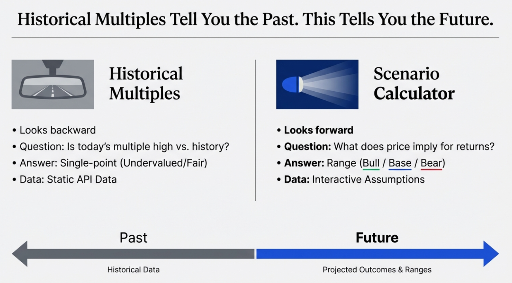
The stock market is a forward-looking machine. It is, fundamentally, an anticipation engine. The price flashing on your screen today is not a reflection of what happened last year — it is a collective bet on what is going to happen in 2027, 2028, and beyond. The question historical PE charts answer is: "Is this multiple high or low compared to its own history?" That's useful context, but it stops short of the more important question:
This is the question the Finmagine Scenario Valuation Calculator is built to answer. It shifts the conversation from passive historical observation to active analysis of market assumptions. You stop asking "is it cheap?" and start asking "what do I have to believe to buy it?" — and that is a much, much more powerful place to begin.
What the Scenario Valuation Calculator Is (and Is Not)
The Scenario Valuation Calculator is a feature inside the Valuation tab of the Finmagine Financial Chart Builder Chrome extension. It is not a standalone app, not a Bloomberg terminal substitute, and not a magic price predictor. What it is:
- A Reverse DCF engine that decodes the implied growth rate baked into any stock price
- A forward scenario projector that shows Bull/Base/Bear return estimates given your own growth and multiple assumptions
- A dual-model calculator — PE-based for compounders and asset-light businesses, EV/EBITDA-based for capital-intensive companies
- A tool that seeds sensible defaults from each company's own historical data rather than generic market averages
- Completely free, runs in your browser on Screener.in and StockAnalysis.com, requires no account or subscription
It is the analytical equivalent of upgrading from a rearview mirror to a full heads-up display — you see where the company has been and, more importantly, what return trajectory the current price implies for where it's going.
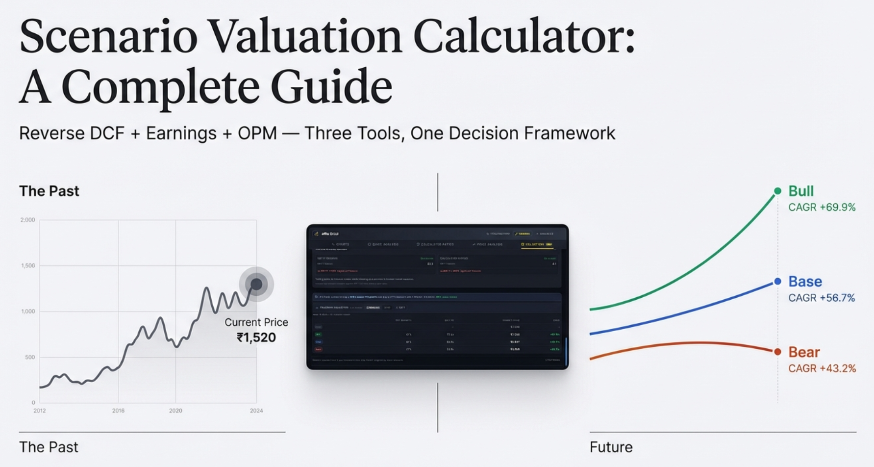
The Scenario Valuation Calculator: Layout at a Glance
The Scenario Valuation Calculator lives inside the Valuation tab of the Chart Builder, appearing below the NIFTY 50 benchmark and historical multiples analysis. It is structured as a self-contained analytical block with three visual layers.
Layer 1: The Reverse DCF Insight Bar
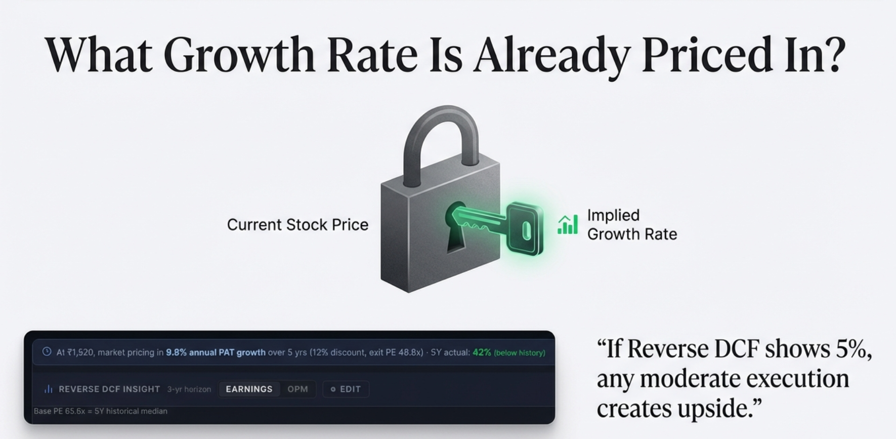
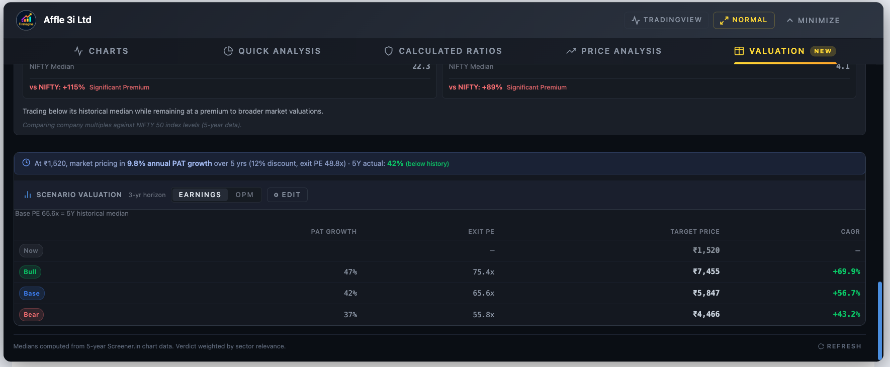
At the very top of the calculator is a single powerful line — the Reverse DCF result. It tells you what PAT (Profit After Tax) growth rate is implied by today's market price. For TCS at ₹2,695, it might read:
This single line immediately tells you whether the market's expectation looks easy or demanding relative to what the company has historically delivered.
Layer 2: The Scenario Tab Switcher
Below the Reverse DCF bar sits the tab switcher with two tabs — [Earnings PE] and [EV/EBITDA] — plus a contextual note showing what anchors the Base scenario (e.g., "Base PE 28.4x = 5Y historical median") and an ⚙ Edit button to open the assumption panel.
Layer 3: The Results Table
The main output is a three-row table — Bull, Base, Bear — showing the current price, projected target price, and CAGR for each scenario. Color coded: green for Bull, blue for Base, amber for Bear.
The calculator renders only when all required data is present: current stock price, TTM Net Profit, market capitalization, and shares outstanding. If any of these are missing, the section does not appear. The OPM tab additionally requires EBITDA data; if unavailable (as with financial/insurance companies), only the Earnings tab shows.
The Reverse DCF: Decoding What the Market Already Believes
The Discounted Cash Flow model is the gold standard of valuation — and also famous for being a dark art. Traditional DCF requires you to play fortune teller: pick a growth rate, pick a discount rate, layer assumption upon assumption, and the spreadsheet produces a "fair value." Change the growth assumption by a single percentage point and your fair value can swing 20%. Garbage in, garbage out.
The Reverse DCF flips this completely. Instead of guessing growth to find price, it uses today's price to find the implied growth. It treats the market price as the single incontrovertible fact — because it is — and asks: for this price to make sense, what growth rate must this company achieve?
The Formula
The Reverse DCF solves for the growth rate g that satisfies the following equation:
+ PAT_N × Exit PE / (1+r)^N
Where:
PAT₀ = TTM Net Profit (current trailing twelve months)
g = implied PAT CAGR (the unknown we're solving for)
r = discount rate (12% India, 10% US — your hurdle rate)
N = exit year (default: 5 years)
Exit PE = Base scenario exit PE multiple
Because g appears in multiple terms raised to different powers, this equation cannot be solved algebraically. The extension uses a binary search algorithm — it guesses a growth rate, tests whether the resulting discounted profit stream matches the market cap, then narrows the search range until convergence (tolerance: 0.01%, typically 20 iterations). This runs in milliseconds, invisibly, every time you open the Valuation tab.
The Interpretation Framework
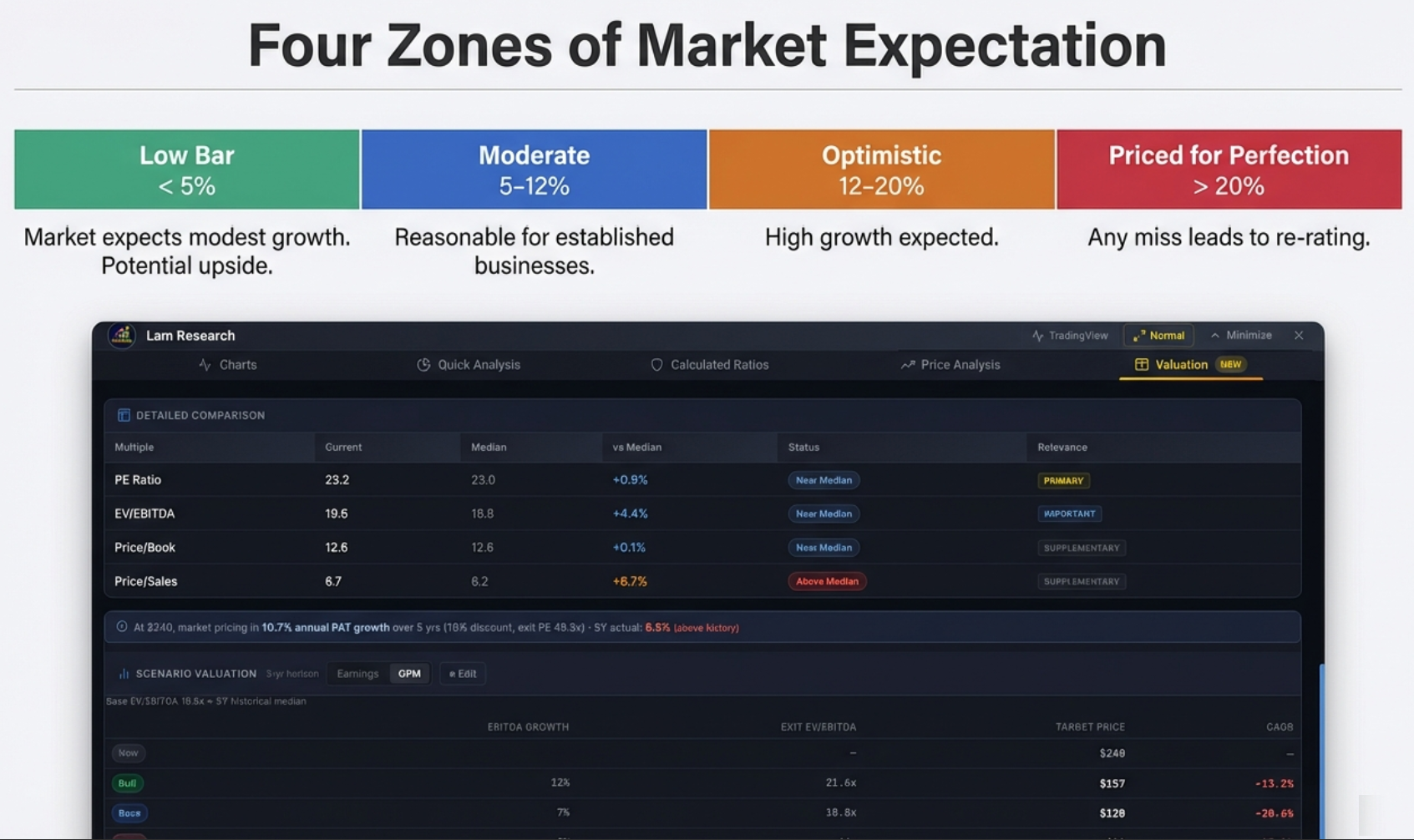
The implied growth rate is only meaningful if you know how to contextualize it. The calculator uses four zones:
| Implied Growth Rate | What It Means | Investor's Question |
|---|---|---|
| < 5% | Very modest growth expected — low bar to clear | Is this a genuine value opportunity, or a value trap? |
| 5–12% | Moderate expectations — typical for established compounders | Can the company maintain this trajectory? |
| 12–20% | High expectations — market is optimistic, limited margin of safety | Do I have a specific reason to believe this acceleration will happen? |
| > 20% | Priced for near-perfection — any miss could cause a sharp correction | Am I buying a story or a business? |
Real Example: TCS at ₹2,695
TCS (Tata Consultancy Services) — one of India's largest and most followed companies — trading at ₹2,695. The stock price alone tells you nothing about whether it's cheap or expensive. But run the Reverse DCF and the tool reveals: at this price, the market is pricing in approximately 6.7% PAT growth over 5 years.
Now you have something actionable. Ask yourself: can TCS grow its profits at 6.7% annually? For most observers of India's IT sector, that's a surprisingly low bar. TCS has historically grown in the 10–12% range. If you believe they can maintain even modest performance — 8%, 9%, 10% — then the stock is undervalued relative to what the market is asking you to believe. That gap between the market's implied expectation and your own analysis is precisely where investment returns are generated.
Counter-Example: PDD Holdings (Extreme Pessimism)
Not every Reverse DCF shows a moderate implied growth rate. PDD Holdings, the parent of Pinduoduo and Temu, at certain price levels has shown the tool returning a negative 45% implied annual growth. The market, at that price, was pricing in a catastrophic near-collapse of the business.
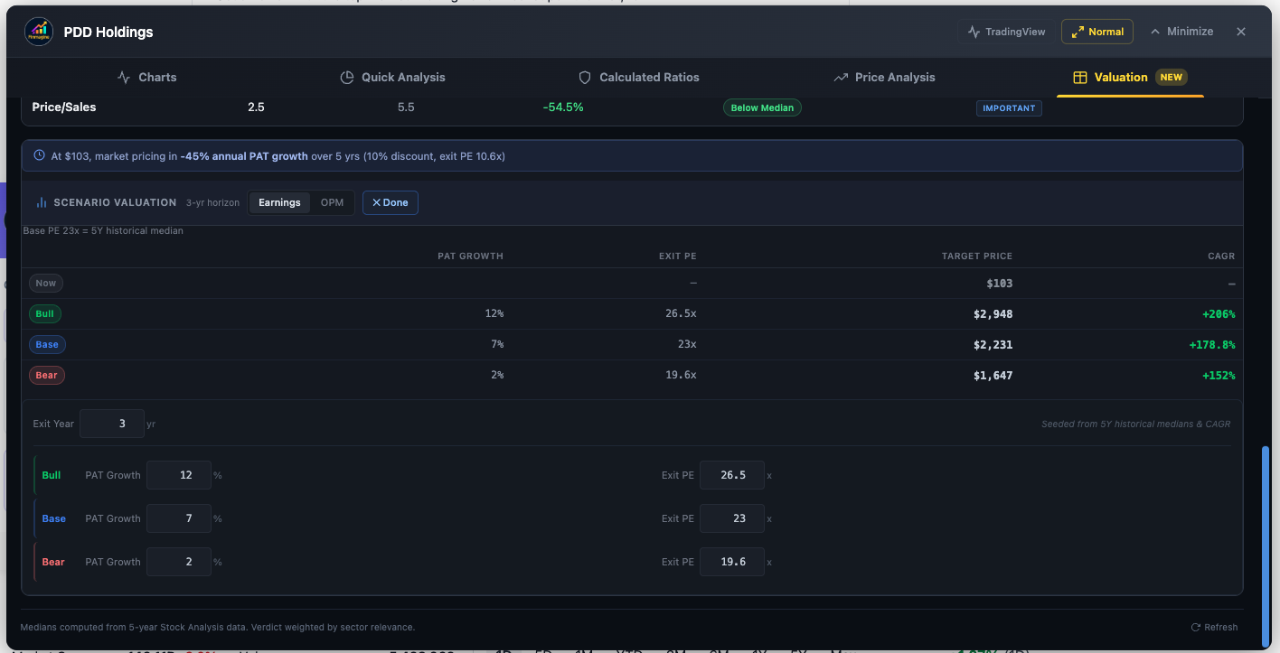
For a contrarian, this creates a specific, testable bet: you aren't betting PDD will thrive. You're betting they will merely survive. If the market prices in −45% annual growth and the company delivers 0% (flat revenue), the stock can still produce massive returns — because any outcome better than catastrophic collapse exceeds the embedded expectation. The Reverse DCF makes this contrarian logic explicit and quantifiable.
Historical Growth Comparison: The Color-Coded Sanity Check
Implied growth rates are easier to judge when compared to what the company has actually delivered. The calculator now shows a second data point alongside the implied rate: the company's own 5-year historical PAT CAGR, color-coded based on the gap:
- Green — Implied rate is lower than historical growth by more than 2pp (market sets a low bar; easy to beat)
- Red — Implied rate is higher than historical growth by more than 2pp (market expects acceleration beyond what's been delivered)
- Blue — Implied rate is approximately in line with historical growth (±2pp)
This single addition transforms the Reverse DCF from a standalone number into a relative signal. A green reading on a stock you're researching suggests the market is setting an easy hurdle. A red reading demands you answer a hard question: what specifically changes to justify that acceleration?
Why the Discount Rate Matters
The discount rate r is your personal hurdle rate — the minimum return you require to justify taking on equity risk. The tool defaults to 12% for India (where you can earn 7–8% risk-free in fixed deposits, so equity demands a meaningful premium) and 10% for US stocks (where risk-free rates are historically lower).
Changing this rate directly affects the implied growth output: a higher hurdle rate forces the implied growth rate upward, because the business must grow faster to deliver the same discounted value at today's price. If you're a more conservative investor who demands 14% returns, you can input that — the tool will tell you the market's implied growth rate from your perspective, which will be higher than the 12% default calculation.
The Earnings Tab: PE-Based Scenario Valuation
Once the Reverse DCF has shown you what the market is pricing in, the natural next question is: if my own analysis is right, what return can I expect? The Earnings tab answers this with a transparent, four-step model that projects future stock price from PAT (Profit After Tax) growth and an exit PE multiple.
The Four-Step Formula
Step 2: Future Market Cap = Projected PAT × Exit PE
Step 3: Future Price = Future Market Cap ÷ Total Shares Outstanding
Step 4: CAGR = (Future Price ÷ Current Price)^(1/N) − 1
Revenue growth is displayed as context inside the Edit panel, but it does not drive the projected price — only PAT matters. This is intentional and important. Revenue without profits creates no shareholder value. A company can double sales by offering products at a loss; in that case, PAT would fall and the stock should trade down, not up. Shareholders get paid from profits, not revenues.
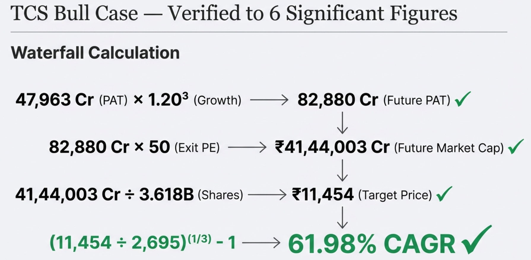
Worked Example: TCS Bull Case (3-Year Horizon)
| Step | Calculation | Result |
|---|---|---|
| 1. Project PAT | ₹47,963 Cr × (1 + 20%)³ | ₹82,880 Cr |
| 2. Future Market Cap | ₹82,880 Cr × 50x (Exit PE) | ₹41,44,003 Cr |
| 3. Future Price | ₹41,44,003 Cr ÷ 3.618B shares | ₹11,454 |
| 4. CAGR | (11,454 ÷ 2,695)^(1/3) − 1 | +61.98% CAGR |
The Bull case here reflects 20% PAT growth (TCS's historical growth accelerated) and a 50x exit PE (AI-driven multiple expansion). That's a highly optimistic scenario — which is the point of a bull case. The Base and Bear scenarios would seed far more conservative assumptions from TCS's actual historical PE median and earnings CAGR.
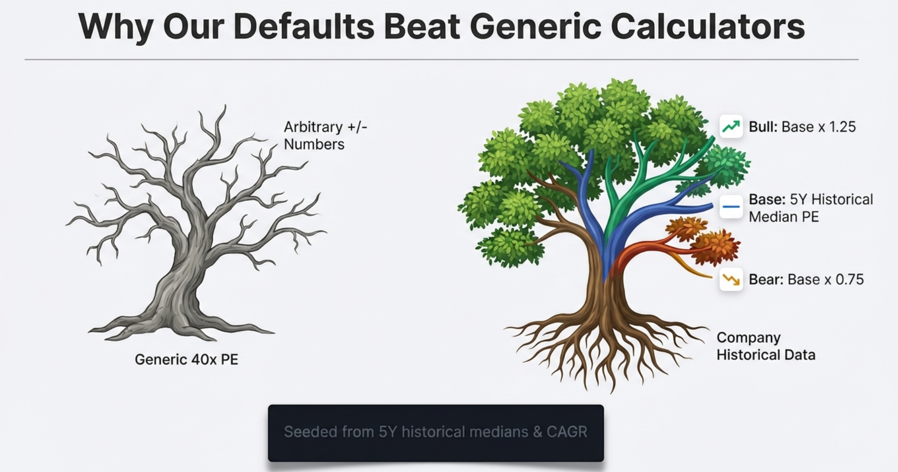
How Scenarios Are Seeded: Intelligence Over Generic Defaults
Most online valuation calculators default to something like "15% growth, 25x PE" for every company. This is meaningless — a utility company and a fast-growing tech company shouldn't share the same defaults. Finmagine's calculator fights this bias with intelligent seeding from each company's own historical data:
| Parameter | India (Screener.in) | US (StockAnalysis.com) | Fallback |
|---|---|---|---|
| PAT Growth — Base | Historical profit CAGR | Historical EPS CAGR | 13% |
| PAT Growth — Bull | Base × 1.5 | Base × 1.5 | 20% |
| PAT Growth — Bear | Base × 0.5 | Base × 0.5 | 8% |
| Exit PE — Base | 5Y historical median PE | TTM PE from statistics | 25x |
| Exit PE — Bull | Base PE × 1.25 | Base PE × 1.25 | 35x |
| Exit PE — Bear | Base PE × 0.75 | Base PE × 0.75 | 18x |
| Exit Year | 3 (default) | 3 (default) | — |
Understanding the Results Table
The three-row results table is the core output. Each row shows:
- Current Price: Today's price (same for all three rows — the starting point)
- → Target Price: The projected price under this scenario's growth and exit multiple assumptions
- CAGR: The annualized return from current price to target, over the exit horizon
CAGR is independently color-coded: positive CAGR appears green, negative CAGR appears red. Even the Bear case can show a positive CAGR if the stock is attractively priced relative to a pessimistic scenario.
Exit Year: Short-Term Re-Rating vs Long-Term Compounding
The Exit Year (default: 3) determines how many years the model projects. Changing this is a strategic decision, not just a technical one:
- 1–3 year horizon: You're looking for a re-rating play. You believe the market is currently mispricing the stock's PE and expect sentiment to normalize. The multiple matters more than the growth rate over short horizons.
- 5–10 year horizon: You're betting on a compounder. Over a decade, the exit multiple matters less because sheer compounding of earnings dominates the return. Business quality and growth rate become the dominant variables.
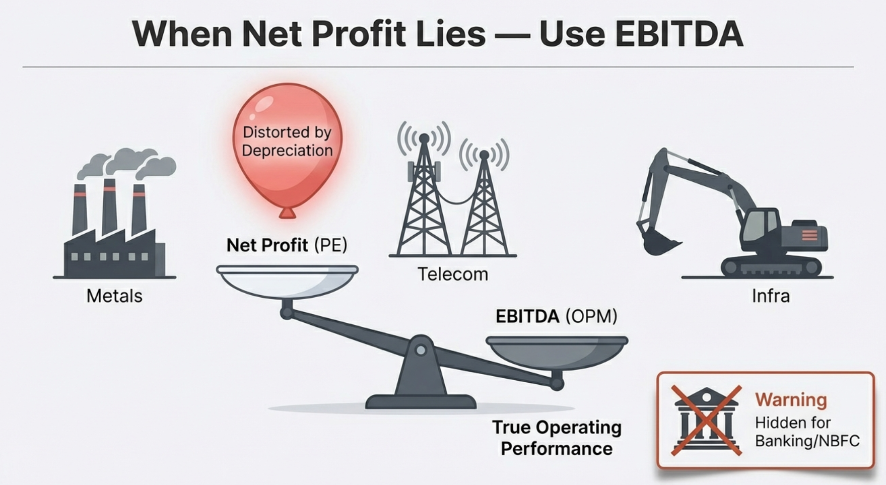
The OPM Tab: EV/EBITDA for Capital-Intensive Companies
PE ratios work beautifully for asset-light businesses: software companies, consumer goods brands, IT services firms — companies where the primary value driver is human capital and intellectual property. But when you try to apply PE to a steel plant, a telecom tower company, or a semiconductor equipment manufacturer, the model breaks down. The culprit is a single accounting line: depreciation.
Why PE Fails for Heavy Industries
Consider Tata Steel. They spent billions building blast furnaces and rolling mills. Accounting rules require spreading that capital cost across many years as depreciation — an expense that flows through the income statement and reduces reported net profit. But here's the critical insight: depreciation is a non-cash expense. The cash isn't flowing out the door each quarter — it was spent years ago when the plant was built. The actual cash coming in from selling steel is far higher than the reported net profit suggests.
As a result, the PE ratio for capital-intensive companies oscillates wildly across economic cycles and can appear sky-high during downturns not because the business is collapsing, but because temporary depreciation headwinds are compressing reported profit. Valuing a steel company on PE is like judging a bakery's profitability by counting only the unsold bread.
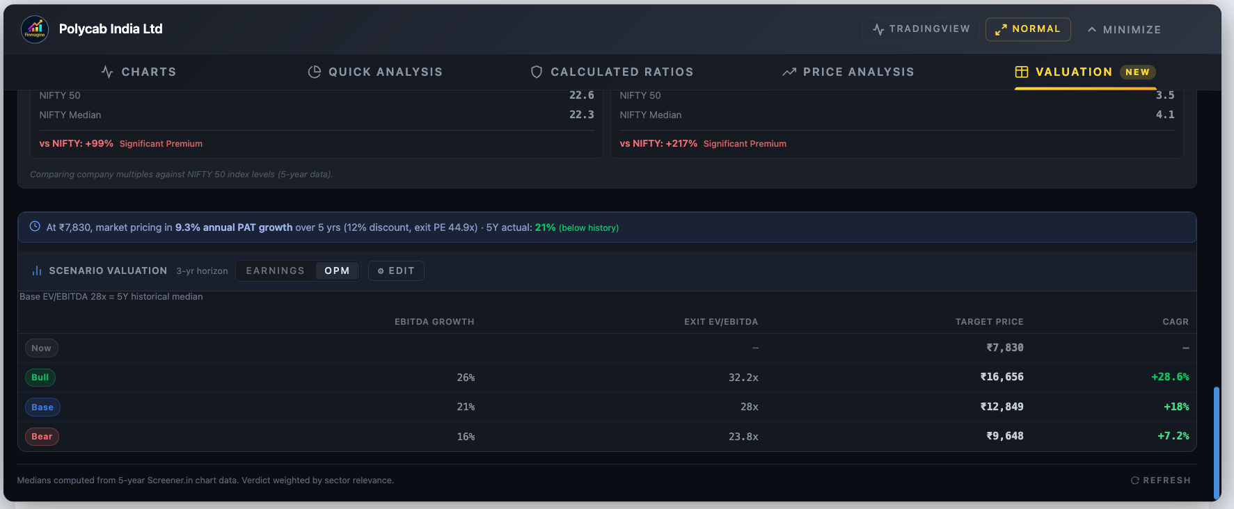
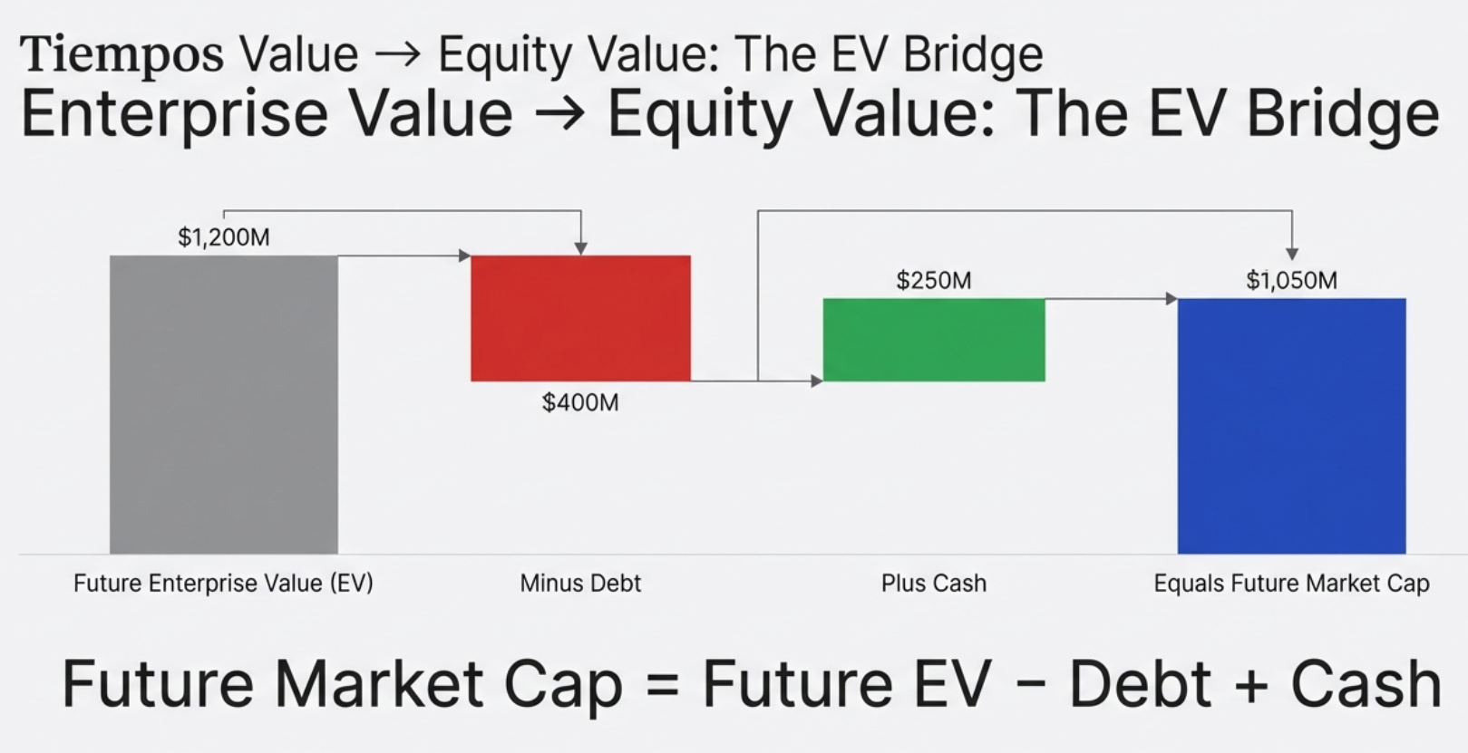
The Five-Step OPM Formula
Step 2: Future EV = Projected EBITDA × Exit EV/EBITDA
Step 3: Future Mkt Cap = Future EV − Total Debt + Cash & Equivalents
Step 4: Future Price = Future Market Cap ÷ Total Shares Outstanding
Step 5: CAGR = (Future Price ÷ Current Price)^(1/N) − 1
Understanding the EV Bridge: Why Debt and Cash Matter
The critical difference from the Earnings tab is Step 3: the EV bridge. Enterprise Value (EV) represents the total value of the entire business — what you'd pay to buy the company outright, including assuming its debt. But as an equity shareholder, you don't own the whole enterprise; you own what's left after the debt holders are paid.
Think of it like buying a house. The house is worth ₹1 crore (Enterprise Value). But it has a ₹70 lakh mortgage (debt). Your equity stake is ₹30 lakh. If the house appreciates to ₹1.2 crore, the mortgage is still ₹70 lakh — your equity is now ₹50 lakh, a 67% gain on a 20% house price increase. Leverage magnifies returns. It also magnifies losses. The OPM model forces you to see this explicitly.
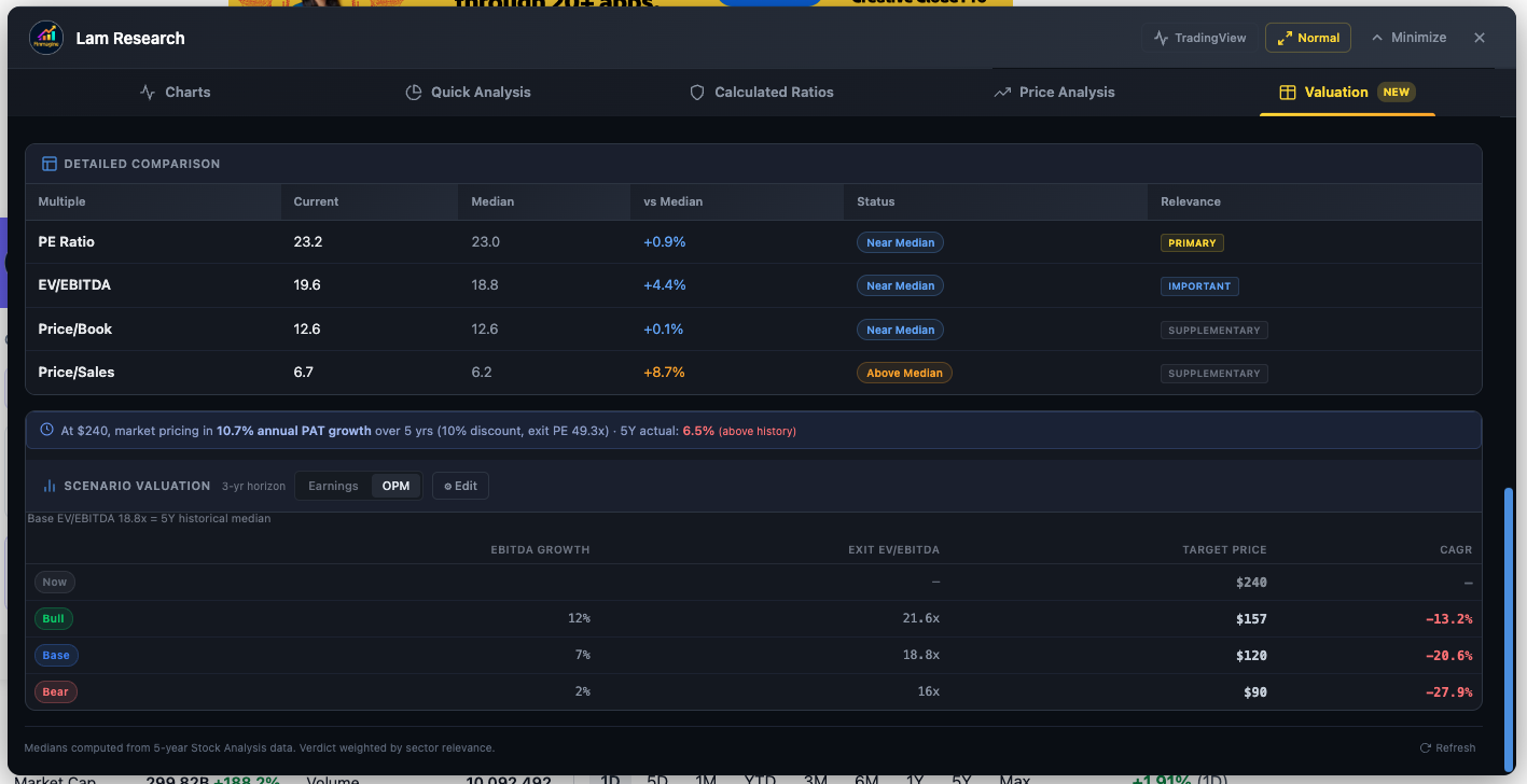
For a company with heavy debt, the OPM model will produce a lower target price than naive EV-only analysis suggests — because the debt holders claim their share first. For a company with a large net cash position, the OPM model adds that cash back to equity value, boosting the target price. Two companies with identical EBITDA trajectories can have vastly different equity return profiles based purely on their balance sheets.
OPM Seeding and the Tighter ±10% Band
Like the Earnings tab, OPM defaults are seeded from each company's actual history:
| Parameter | India (Screener.in) | US (StockAnalysis.com) | Fallback |
|---|---|---|---|
| EBITDA Growth — Base | Historical operating profit CAGR | Historical EBITDA CAGR | 13% |
| EBITDA Growth — Bull | Base × 1.5 | Base × 1.5 | 20% |
| EBITDA Growth — Bear | Base × 0.5 | Base × 0.5 | 8% |
| Exit EV/EBITDA — Base | 5Y historical median EV/EBITDA | TTM EV/EBITDA | 15x |
| Exit EV/EBITDA — Bull | Base × 1.10 | Base × 1.10 | 18x |
| Exit EV/EBITDA — Bear | Base × 0.90 | Base × 0.90 | 12x |
Notice the Bull/Bear EV/EBITDA bands are ±10%, compared to ±25% for PE. This reflects empirical reality: EV/EBITDA multiples are far more stable across market cycles than PE ratios. A company's PE can swing from 8x to 60x in a cycle (as earnings collapse and recover), while its EV/EBITDA might move from 6x to 10x. Tighter bands reflect this stability.
When the OPM Tab Is Hidden: Banking and NBFC Stocks
For Banking and NBFC sector stocks on Screener.in, the OPM tab is deliberately hidden. This is not a bug — it's sound financial logic. For a manufacturing company, debt is a financing tool — it funds equipment and operations. But for a bank, deposits (which are technically debt owed to customers) are the raw material of the business itself. A bank's entire revenue model depends on borrowing money cheaply and lending it at higher rates.
Applying EBITDA or EV/EBITDA to a bank is meaningless. You cannot strip out "interest" from a bank's income statement the way you do for a steel company — interest is the bank's core revenue and core cost simultaneously. The tool automatically detects Banking/NBFC sector classification and hides the OPM tab accordingly, leaving only the Earnings (PE) tab, which is the appropriate lens for financial companies. For US stocks, the same logic applies — financial holding companies like Berkshire Hathaway, which don't report EBITDA, will show only the Earnings tab.
Edit Mode: Stress-Test Your Assumptions Live
The default seeded scenarios are an intelligent starting point — not a prison. The ⚙ Edit button transforms the calculator from a display tool into an interactive analytical workspace. Click it and inline spinners appear for every assumption; change any value and the results table updates in real time. No "Calculate" button. No page refresh. Instant feedback.
What You Can Edit
| Input | Description | Tab |
|---|---|---|
| PAT Growth % (Bull/Base/Bear) | Annual profit growth rate for each scenario | Earnings |
| Exit PE (Bull/Base/Bear) | The PE multiple the market will pay at exit | Earnings |
| EBITDA Growth % (Bull/Base/Bear) | Annual EBITDA growth for each scenario | OPM |
| Exit EV/EBITDA (Bull/Base/Bear) | The EV/EBITDA multiple at exit | OPM |
| Exit Year | Projection horizon (1–15 years) — shared across both tabs | Both |
Tab Independence: Separate Sandboxes
A key architectural decision: the Earnings and OPM tabs maintain entirely independent assumption sets. You can set the Earnings tab to a 20% PAT growth Bull case and switch to the OPM tab — your Earnings assumptions are preserved, and the OPM tab has its own separate growth and multiple inputs. Switching back restores your Earnings inputs exactly as you left them.
The only shared variable is Exit Year — the projection horizon applies uniformly across both valuation approaches.
Four Analytical Use Cases for Edit Mode
Use Case 1: Return Sanity Check Before Investing
Open any stock → Scroll to Scenario Valuation Calculator → Check the Base CAGR. Does it exceed your personal required rate of return? If the Base case shows 12% CAGR and your hurdle rate is 15%, you need the Bull case to materialize — how confident are you in that?
Use Case 2: Stress-Testing the Bull Case
Click ⚙ Edit → Set Bear growth to 0%, Base to 10%, Bull to 20% → Set Exit Year to 5 → Read the CAGR for each scenario. Which scenario gives you at least a 15% CAGR (enough to roughly double in 5 years)? If only the Bull case works, you're making a high-conviction, high-risk bet. Know that before you buy.
Use Case 3: The Reverse DCF Sanity Check
Look at the Reverse DCF bar first. If it shows 18% implied growth, the market is expecting strong execution. Now open Edit Mode → set Base growth to 18% → run the scenarios. What CAGR does Base give you at that implied rate? Often, it's close to your required return — which means you're getting paid only for exactly what the market expects to happen. There's no margin of safety. That's important to know.
Use Case 4: Capital-Intensive Stock Analysis (OPM)
Navigate to a metals or energy company → Click [EV/EBITDA] tab → Review the Base EBITDA growth (seeded from historical operating profit CAGR) → Click Edit → Adjust Exit EV/EBITDA based on where you think the sector cycle ends. If steel is in a upcycle and you expect multiples to expand from 6x to 8x at exit, input that → Read how much the target price changes. The OPM tab makes balance sheet dynamics visible in the output.
India vs US: Automatic Adaptation
The Scenario Valuation Calculator works across both Indian stocks (Screener.in) and US stocks (StockAnalysis.com) without any manual configuration. The tool detects the market automatically and adjusts all parameters accordingly.
| Aspect | India (Screener.in) | US (StockAnalysis.com) |
|---|---|---|
| Market Cap Units | Crores (₹ Cr) | Millions ($ M) |
| Currency Symbol | ₹ (Indian Rupee) | $ (US Dollar) |
| Default Discount Rate | 12% | 10% |
| PAT / Earnings Source | P&L table TTM Net Profit | Income statement TTM Net Income |
| EBITDA Source | P&L Operating Profit row | Income statement EBITDA row (or statistics page margin) |
| Historical PE Seed | Screener.in API 5Y median PE | TTM PE from statistics page |
| Historical EV/EBITDA Seed | Screener.in API 5Y median EV Multiple | TTM EV/EBITDA from statistics page |
| Shares Outstanding | Derived from Market Cap ÷ Price | Directly from statistics page |
The Reverse DCF binary search algorithm is identical for both markets — only the units change. The mathematical logic of solving for an implied growth rate is universal. The tool handles unit consistency internally so the binary search always compares PAT and Market Cap in matching units (Crores for India, Millions for US), preventing the unit-mixing bugs that would otherwise produce null results.
Putting It All Together: A Complete Analytical Workflow
The true power of the Scenario Valuation Calculator emerges when you use its three pillars as a sequential funnel — not in isolation. Here is the complete workflow from initial screen to investment conviction:
Step 1: Historical Context (Is the Multiple High or Low?)
Start with the historical multiples in the Valuation tab. Is the current PE or EV/EBITDA at the high end, low end, or middle of its 5-year range? This is your entry context. A stock at its 5-year PE low deserves more interest than one at an all-time high multiple.
Step 2: Reverse DCF (What Is the Market Pricing In?)
Read the Reverse DCF bar. This is your sanity check. Is the implied growth rate 5% or 25%? Is it above or below the company's historical track record (the color-coded comparison)? This tells you the bar you need to clear — and whether the market is being pessimistic (green, easy bar) or optimistic (red, demanding bar).
Step 3: Scenario Valuation (What Return Do I Get If I'm Right?)
Now move to the Earnings or OPM tab. Review the Base CAGR using company-specific seeded defaults. Does it meet your required rate of return? Then open Edit Mode and stress-test: what does the Bull case require? Can you defend those assumptions with a coherent investment thesis?
Step 4: Decision
You now have three interlocking data points:
- Where the current multiple sits in historical context (Entry attractiveness)
- What the market needs the company to deliver (Bar to clear)
- What you earn if you're right — and how much cushion you have if you're partially wrong (Risk/reward)
The Challenge: Do the Math on Your Highest Conviction Stock
Here's a thought experiment to close with. Pick the stock you currently hold with the most conviction. The one you'd recommend to a friend. The one you feel good about when markets are volatile. Open the Finmagine extension, navigate to its page on Screener.in or StockAnalysis.com, and run the Reverse DCF.
Look at the implied growth rate. Does that number scare you — because it's higher than anything the company has delivered historically? Or does it look like a free lunch — because the market is pricing in far less than you know this business can deliver?
You might discover your "safe" blue-chip compounder is actually priced like a growth stock, with 18% PAT growth embedded in every share. Or you might discover that your "risky" emerging-market bet is priced for near-collapse when the underlying business is growing at 15% annually. Either discovery changes how you manage your portfolio — how much you add, whether you trim, how you think about risk.
The math doesn't lie. The assumptions might be imperfect — they always are — but at least they are your assumptions, made explicit and testable. That is the fundamental difference between investing and guessing. And it's available to you, on any stock, for free, the next time you open the Finmagine Chart Builder.
How to Access the Scenario Valuation Calculator
- Install the Finmagine Financial Chart Builder — free on the Chrome Web Store. Works on Chrome, Edge, and Brave.
- Navigate to any company page on Screener.in (Indian stocks) or StockAnalysis.com (US stocks).
- Click the golden "VISUALIZE WITH FINMAGINE" button — bottom-right corner.
- Navigate to the Valuation tab — fifth tab in the Chart Builder.
- Scroll down past the NIFTY 50 Benchmark to find the Scenario Valuation Calculator.
The extension is 100% free, requires no account or sign-in, and processes all data entirely in your browser. Your research stays private. No data is sent to external servers.
Free Chrome Extension
Ready to try this yourself?
Install the Finmagine Financial Chart Builder and transform any Screener.in, Google Finance, or stockanalysis.com page into interactive charts in one click.
Install from Chrome Web Store →No account required • Works on Chrome, Edge, Brave, Opera
Explore the Complete Chart Builder Hub
Discover all Chart Builder resources — tutorials, Google Finance integration, case studies, Valuation tab deep dives, and more. Transform Screener.in & StockAnalysis.com data into professional analysis.
Visit Chart Builder Hub →