🎓 Multimedia Learning Hub
Master the Finmagine Chart Builder through video, audio, comprehensive learning overview, and interactive flashcards
📚 Complete Learning Path
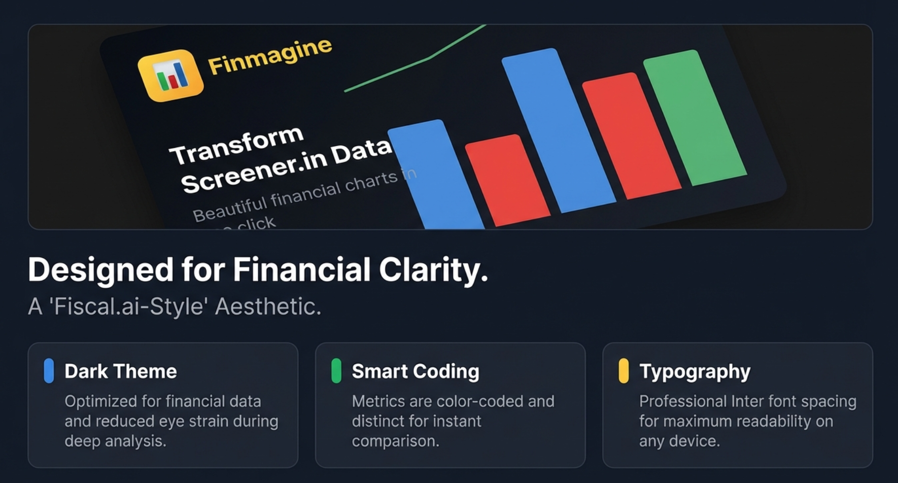
The Finmagine Chart Builder Chrome extension brings professional-grade financial visualization directly to Screener.in. This tool eliminates the tedious Excel export workflow and delivers Fiscal.ai-quality charts with one click. No downloads, no uploads, no friction—just instant, interactive visualizations.
🎯 What You'll Master:
- One-Click Workflow: Transform Screener.in tables into charts without leaving the browser
- Metric Selection: Interactive checkbox system for precise control over visualizations
- Mixed Timeline Analysis: Combine quarterly and annual data seamlessly
- Dual-Axis Mastery: Compare absolute values (revenue) with percentages (margins) intelligently
- Interactive Legends: Click to show/hide metrics for focused comparative analysis
- Complete Coverage: P&L, Balance Sheet, Cash Flow, Ratios, Shareholding patterns
- Professional Quality: Export-ready charts with Fiscal.ai-style dark theme
- Privacy First: 100% client-side operation - zero data collection
- Banking Metrics: NPA%, Financing Margins, and bank-specific KPIs
- Free Forever: No subscriptions or limitations
💡 Key Features:
- Floating "Visualize with Finmagine" button on company pages
- Intelligent data extraction from HTML tables
- Chart.js integration with fiscal.ai-inspired dark theme
- Mixed bar/line charts - bars for absolute values, lines for percentages
- "Select All" functionality per table section
- Real-time chart updates as you select/deselect metrics
- Clickable Finmagine watermark linking to finmagine.com
- Mobile responsive design
- Support for half-yearly and quarterly reporting structures
- Your charts and research habits stay local — stock fundamentals passively contributed to Finmagine's shared cache to improve speed for all users
📖 Learning Recommendations:
- Start with the video guide to see the extension in action
- Listen to the audio deep dive for visualization best practices
- Review the complete article with all 11 visual examples
- Install the extension and test on your favorite company
- Test your understanding with 60 interactive flashcards
- Explore advanced features like dual-axis charts
🚀 Why This Matters:
- Traditional workflow: 8 steps (export → download → open → clean → format → chart → adjust → view)
- Finmagine workflow: 3 steps (visit page → click button → select metrics)
- Time saved: 5-10 minutes per chart × hundreds of analyses per year
- Quality: Professional Fiscal.ai aesthetics vs basic Excel charts
- Privacy: Your research habits and analysis stay in your browser — no personal tracking
- Accessibility: Free tool democratizes professional visualization
📺 Complete demonstration of the Finmagine Chart Builder with real company examples
🎧 Deep dive conversation exploring instant financial visualization
🎯 Test Your Knowledge
Click any flashcard to reveal the answer. Use the search box to find specific topics.
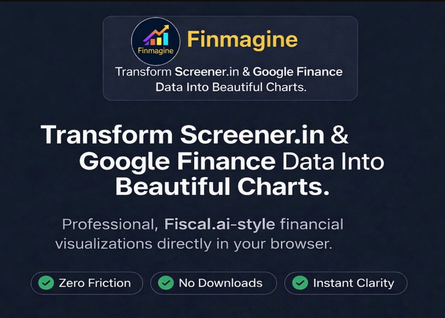
The Promise: Transform Screener.in Data Into Beautiful Charts
Decoding the Hero Image
The opening image establishes three core principles that define the Finmagine Chart Builder experience. Each of these represents a fundamental shift in how financial analysts interact with data:
Zero Friction
The traditional workflow between seeing data and visualizing insight involves countless friction points. Every export, every download, every spreadsheet opened is a moment where your analytical momentum dies. Zero Friction means eliminating these interruptions entirely. The data you're viewing and the chart you need exist in the same space, requiring nothing more than a click to bridge the gap.
No Downloads
This isn't just about convenience—it's about security and workflow integrity. When you download data, you create copies that become instantly stale, require storage management, and leave digital breadcrumbs of your research activity. No Downloads means your analysis happens in-stream, with live data, leaving no artifacts. Your competitive research stays ephemeral and private.
Instant Clarity
The human brain processes visual information 60,000 times faster than text. A table showing 40 quarters of revenue growth is just numbers. A chart showing the same data reveals the pattern instantly: is growth accelerating, plateauing, or declining? Instant Clarity means the insight arrives at the speed of vision, not at the speed of calculation.
The Professional Fiscal.ai Aesthetic
The reference to "Fiscal.ai-style" visualization is deliberate and meaningful. Fiscal.ai represents the gold standard in financial data visualization—the kind of polish typically found on Bloomberg terminals or in premium hedge fund presentations. By bringing this aesthetic to a free browser extension, Finmagine democratizes visual sophistication that was previously available only to institutional investors with expensive subscriptions.
The Eight-Step Problem
Every Screener.in user knows this workflow intimately, and every step represents wasted analytical energy:
- Data Location: Navigate to company page on Screener.in
- Export Decision: Click Export to Excel/CSV button
- Download Wait: Wait for file to download (network dependent)
- File Management: Locate file in cluttered downloads folder
- Application Launch: Open in Excel/Google Sheets
- Data Cleaning: Fix formatting, merge cells, handle date formats
- Chart Creation: Select ranges, insert chart, choose type
- Axis Adjustment: Fix scale problems, add secondary axis, format colors
This eight-step process takes 5-10 minutes per chart. For analysts reviewing 20+ companies weekly, that's 2-3 hours of pure overhead—time spent fighting tools rather than analyzing businesses.
The Finmagine Alternative: Three Steps
- Visit: Navigate to any company page on Screener.in (you're doing this anyway)
- Click: Click the golden "Visualize with Finmagine" button (one mouse click)
- Select: Check boxes next to metrics you want to visualize (seconds, not minutes)
That's it. From data table to professional visualization in under 10 seconds. The time savings compound exponentially across hundreds of analyses per year.
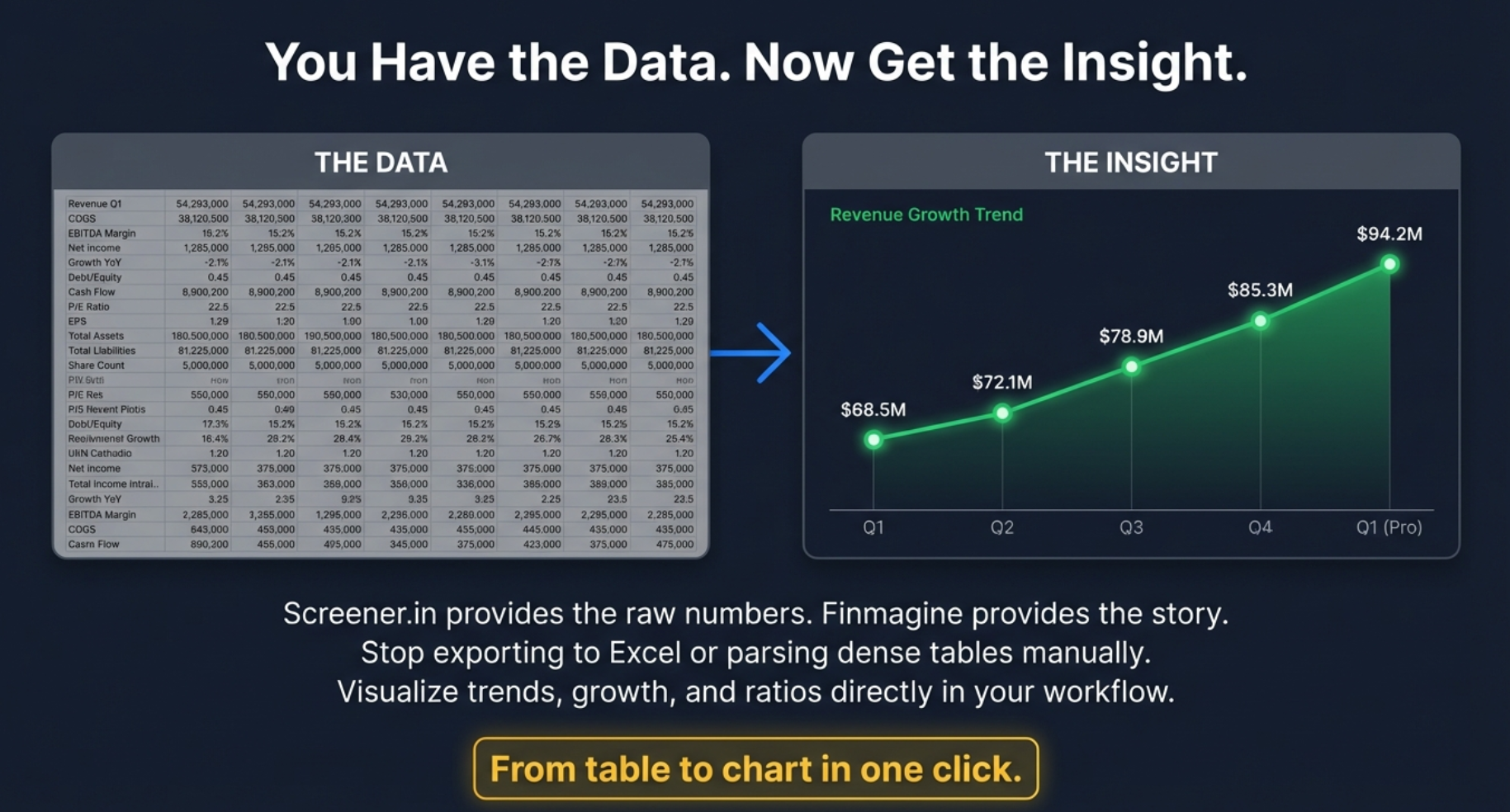
You Have the Data. Now Get the Insight.
The Cognitive Barrier: Why Tables Fail
Image 002 illustrates the fundamental problem with tabular financial data presentation. On the left side, you see what Screener.in provides: a dense grid of numbers spanning multiple years, quarters, and metrics. Revenue Q1, COGS Q2, EBITDA Margin for March 2018, Net Income for fiscal year 2020—row after row, column after column.
This is what cognitive scientists call "cognitive overload." The human brain didn't evolve to spot patterns in grids of numbers. We evolved to recognize visual patterns: the shape of a predator in tall grass, the arc of a thrown spear, the curve of a familiar face. When we force our visual cortex to process tabular data, we're using the wrong tool for the job.
The Visual Transformation: Pattern Recognition in Action
The right side of Image 002 shows the same data transformed into visual form: a clean line chart showing revenue growth trending from $68.5M to $94.2M across five quarters. The insight is immediate and visceral:
- Trajectory: Growth is accelerating (the line curves upward)
- Consistency: No major disruptions or reversals (smooth progression)
- Magnitude: Nearly 40% growth over the period (impressive for most businesses)
- Projection: Momentum suggests continued strength into Q1 (Pro)
All of this information was technically present in the table on the left. But extracting it required mental calculation, row-by-row comparison, and deliberate pattern detection. The chart delivers the same insight in under one second of viewing time.
From Table to Chart in One Click: The Tagline Promise
The golden call-to-action button at the bottom—"From table to chart in one click"—encapsulates the entire value proposition. This isn't about reducing eight steps to four steps. It's about collapsing the entire workflow into a single action. One click stands between you and visual understanding.
Stop Exporting, Stop Parsing, Start Visualizing
The subtitle in Image 002 delivers three specific anti-patterns that Finmagine eliminates:
Stop Exporting to Excel
Every export creates friction and risk. The file becomes stale the moment it's downloaded. If the company announces earnings tomorrow, your spreadsheet doesn't update—Screener.in does. By visualizing in-browser, you're always working with live data. Plus, you avoid the Excel scale problem: trying to plot 10,000 crore revenue alongside 15% margin on a single axis creates useless charts.
Stop Parsing Dense Tables Manually
Manual parsing is error-prone and exhausting. You're checking row 23, column H against row 23, column D to calculate margin expansion. Then you're scrolling up to compare Q3 2024 with Q3 2023. Your eyes are darting across the screen, your working memory is maxed out tracking six different numbers, and you're one misread cell away from a flawed conclusion. Visual charts eliminate parsing entirely—the pattern is the data.
Visualize Directly in Your Workflow
This is the killer insight: visualization shouldn't be a destination you travel to. It should be ambient, available whenever you need it. You don't leave Screener.in to visualize. You don't open another application. The chart appears in-context, overlaid on the same page where you're reading company descriptions, checking valuations, and reviewing management quality. Your analytical flow remains unbroken.
The Psychology of Instant Gratification in Analysis
There's a deeper behavioral insight here. When visualization requires 8 steps and 10 minutes, you only visualize when you're fairly certain the effort will pay off. This creates confirmation bias: you chart what you expect to be interesting. But the best insights come from unexpected patterns—the company you assumed was boring but shows accelerating margin expansion, the steady grower whose cash flow is diverging from earnings.
When visualization is instant, you chart everything. You become promiscuous with your curiosity. And promiscuous curiosity is the foundation of alpha generation in financial markets.
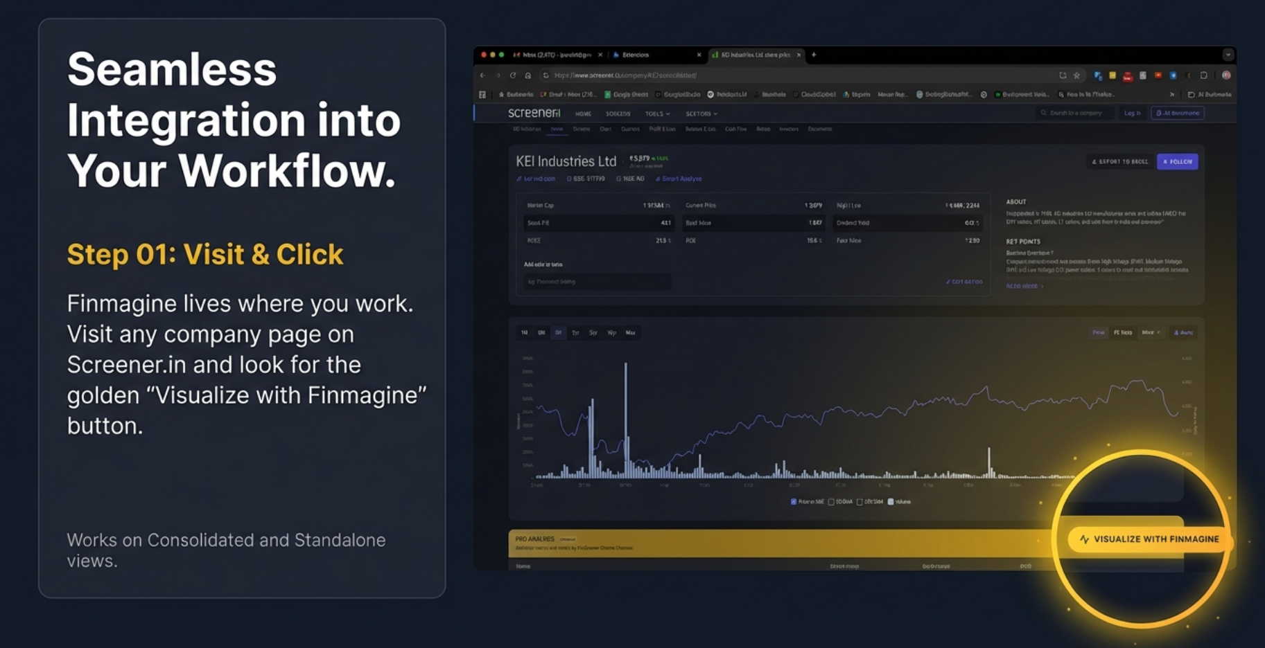
Seamless Integration Into Your Workflow
Step 01: Visit & Click - The Power of Contextual Activation
Image 003 reveals the elegance of Finmagine's integration philosophy. Unlike tools that require you to navigate away from your research environment, Finmagine embeds itself directly into the Screener.in interface. This is integration done right: invisible until needed, instantly available when desired.
The Golden Button: Visual Design as User Experience
Notice the distinctive golden "Visualize with Finmagine" button in the screenshot. The color choice is deliberate—gold stands out against Screener.in's darker interface without being jarring or distracting. It's present but not intrusive, available but not demanding attention.
The button appears consistently in the same location across all company pages, creating muscle memory. After using it a few times, your cursor knows exactly where to go. This consistency eliminates decision fatigue: you never need to hunt for the feature or wonder if it's available for a particular company.
Works on Consolidated and Standalone Views
Screener.in offers two data views: consolidated (showing parent company plus subsidiaries) and standalone (showing only the parent company). Many tools only work with one or the other, forcing you to switch views depending on whether you want consolidated or standalone analysis. Finmagine works seamlessly with both, respecting your analytical preference without imposing constraints.
Finmagine Lives Where You Work
The tagline "Finmagine lives where you work" is a profound statement about tool design philosophy. Bad tools force you to adapt to them. Good tools adapt to you. Finmagine doesn't create a separate dashboard you must visit. It doesn't require exporting data to another platform. It exists exactly where you're already doing your research, making visualization a natural extension of viewing rather than a separate activity.
The Single-Click Activation Pattern
Image 003 highlights the single most important interaction: the click. Not "download then open," not "export then import," not "copy and paste." Just click. This single-click activation is the embodiment of zero-friction design.
Behind this simple interaction lies sophisticated engineering. When you click that button, Finmagine must:
- Parse the HTML structure of the Screener.in page (which can vary by company type)
- Extract financial data from multiple tables simultaneously
- Identify metric types (currency vs percentage vs count)
- Align time periods across different reporting cadences
- Present an organized selection interface
- All in under one second
You don't see any of this complexity. You just see a clean interface ready for metric selection. That's engineering excellence serving user experience.
The Screenshot Analysis: Real-World Integration
The screenshot in Image 003 shows KEI Industries Ltd, a real company with actual financial data. This isn't a sanitized demo—it's showing the tool working in its natural habitat. Notice several key details:
- Stock Price Chart Visible: The extension doesn't hide or interfere with Screener.in's native functionality
- Navigation Remains Intact: All Screener.in menus and navigation elements remain accessible
- PRO Analyses Section: Premium content sections are unaffected
- Button Placement: Positioned in a non-intrusive location that's easily accessible
This demonstrates co-existence rather than replacement. Finmagine doesn't try to reinvent Screener.in's excellent data organization—it augments it with visualization superpowers.
Cross-Browser Compatibility and Performance
While designed primarily for Chrome (and Chromium-based browsers like Edge and Brave), the extension is engineered for minimal resource consumption. It doesn't slow down page loads or create lag when browsing between companies. The activation is on-demand—the extension only processes data when you explicitly click the button, ensuring zero performance impact during regular Screener.in browsing.
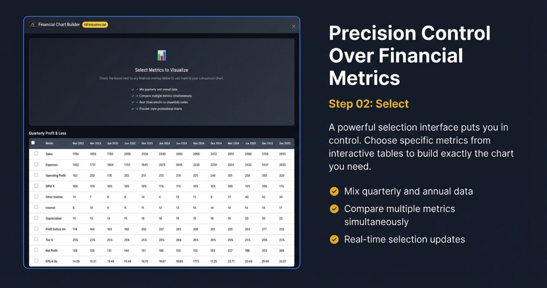
Precision Control Over Financial Metrics
Step 02: Select - The Power of Granular Control
Image 004 reveals what happens after you click the golden button: you're presented with the Financial Chart Builder interface showing the actual data tables from Screener.in, now transformed into an interactive selection environment. This is where analytical precision meets user-friendly design.
The Checkbox Interface: Simple Yet Powerful
Every single line item in the Profit & Loss statement becomes a selectable metric. Sales, Expenses, Operating Profit, OPM %, Other Income, Interest, Depreciation, Profit before tax, Tax %, Net Profit, EPS—each one has a checkbox. You're not forced to visualize pre-configured metric bundles. You build exactly the analytical view you need, metric by metric.
This granular control solves a common frustration with financial charting tools: they either show you everything (creating visual chaos) or show you fixed combinations that might not match your analytical question. Finmagine gives you the precision of custom selection with the simplicity of checkbox interaction.
Quarterly Profit & Loss: Time Series at Your Fingertips
The screenshot shows quarterly data spanning from Dec 2022 to Dec 2025—over three years of reporting periods. Notice the time period headers: Sep 2023, Jun 2023, Jun 2024, Sep 2024, and so on. Each column represents a discrete reporting moment, and each row represents a metric tracked across time.
The beauty of this interface is that you can compare any metrics across any time periods. Want to see if Sales growth in Q3 2024 maintained margin consistency? Check Sales and OPM%. Want to see if interest expense is growing faster than revenue? Check Sales, Interest, and maybe add Profit before tax to see the impact. The interface accommodates exploratory analysis, not just confirmatory charting.
The Four Key Features: Why This Matters
✓ Mix Quarterly and Annual Data
This is huge. Most charting tools force you to choose: either quarterly OR annual, never both. But real financial analysis often requires mixing time horizons. You might want to see 10 years of annual revenue to understand the business's structural growth, overlaid with the last 8 quarters to see if momentum is accelerating or declining.
Finmagine handles the time period alignment automatically. You don't need to manually map "March 2024 annual" to "Q4 FY2024." The tool understands fiscal year boundaries and quarters automatically, creating a unified timeline that makes chronological sense.
✓ Compare Multiple Metrics Simultaneously
You're not limited to two or three metrics. Want to compare Sales vs Expenses vs Operating Profit vs OPM% vs Net Profit vs EPS all at once? Go ahead. The dual-axis system ensures that absolute values (Sales, Expenses) and percentages (OPM%, Tax%) coexist intelligently without scale conflicts.
This multi-metric capability enables sophisticated pattern detection. For example, if Sales and Operating Profit are both growing but Net Profit is flat, checking Interest and Depreciation instantly reveals whether financial leverage or asset base expansion is consuming profitability. Without simultaneous visualization, catching this pattern requires mental gymnastics across multiple tables.
✓ Real-Time Selection Updates
Check a box, see the chart update. Uncheck it, watch the metric disappear. This instant feedback loop transforms charting from a planned activity into an exploratory conversation. You're not building charts—you're asking visual questions and getting immediate answers.
The psychological impact of real-time updates is profound. There's zero cost to experimentation. "I wonder what happens if I add Depreciation?" Click. See it. "Nope, not relevant." Unclick. Move on. This frictionless iteration encourages deeper exploration.
✓ Automatic Time Period Alignment
Behind the scenes, Finmagine is solving a surprisingly complex problem: different metrics might have different available time periods. Some companies report half-yearly until 2020, then switch to quarterly. Some have incomplete quarters for the most recent period. Some have restated historical numbers.
The tool intelligently aligns everything onto a coherent X-axis timeline. March 2023 annual appears at the correct chronological position relative to Q1 2023, Q2 2023, and so on. You never see misaligned dates or confusing overlaps. The timeline just makes sense, allowing you to focus on the data rather than the infrastructure.
The Top Control Panel: Global Options
Above the tables, Image 004 shows key selection features:
- "Select Metrics to Visualize" Header: Clear communication of the interface's purpose
- Checkbox to Mix Quarterly and Annual Data: Explicit opt-in for timeline mixing
- Compare Multiple Metrics Simultaneously: Reinforcement that multi-metric selection is supported
- Real-Time Selection to Standardize Series: Technical feature enabling data normalization
- Fiscal.ai-Style Professional Charts: Quality promise delivered with every visualization
These aren't just feature bullets—they're a contract with the user about what this interface enables and how it will behave. Transparent communication builds trust and reduces cognitive load during analysis.
Professional Visualization Without the Spreadsheet
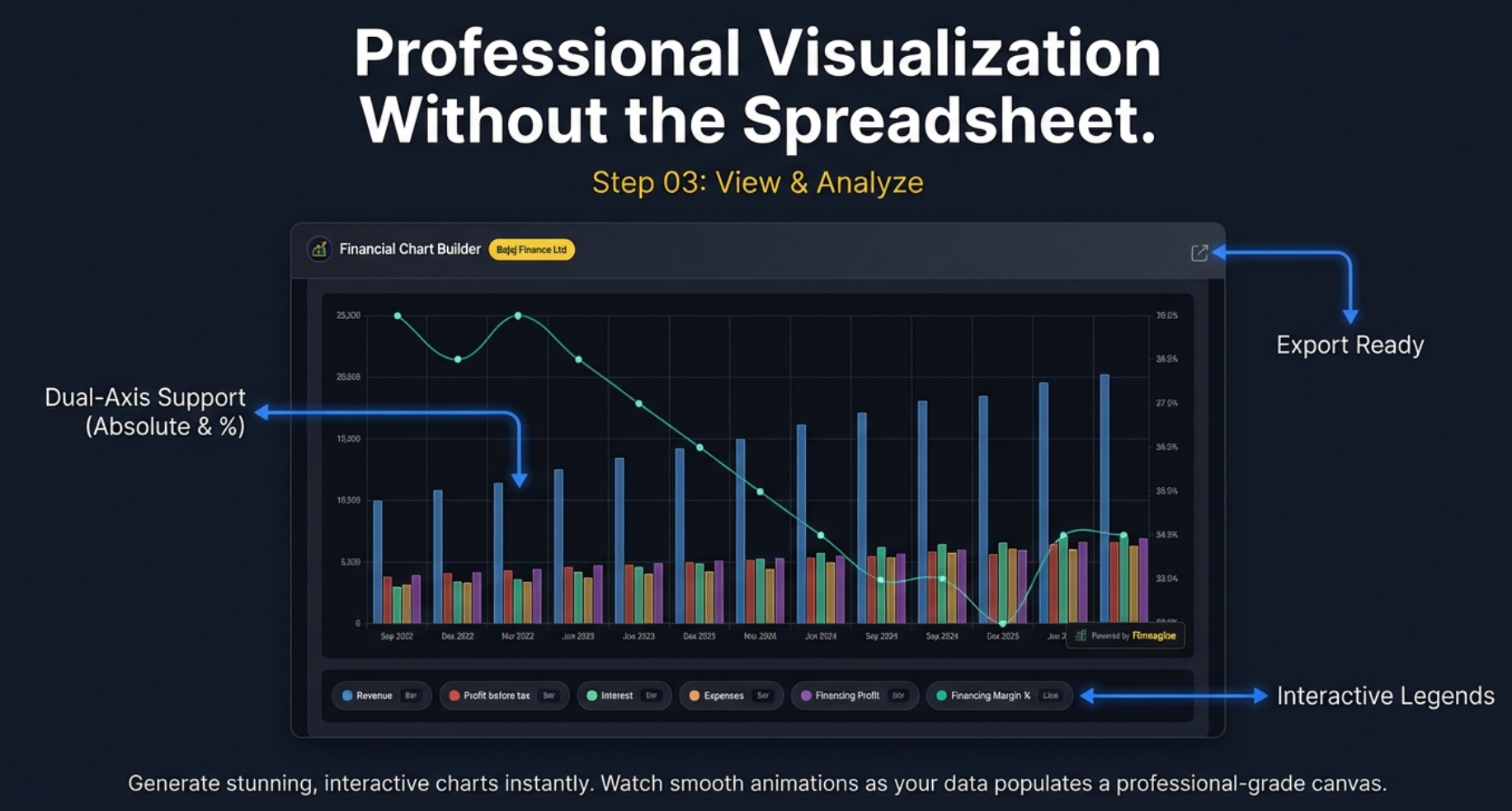
Step 03: View & Analyze - Where Selection Becomes Insight
Image 005 shows the culmination of the Finmagine workflow: the actual chart, rendered in real-time based on your metric selections. This is where data transforms into decision-making ammunition. Let's dissect every element visible in this professional visualization.
The Chart: Bajaj Finance Example
The screenshot features Bajaj Finance Ltd, one of India's premier non-banking financial companies (NBFCs). The chart spans from Sep 2022 to Dec 2025, covering three years of quarterly performance. This real-world example demonstrates Finmagine's capability to handle complex, multi-metric financial visualizations.
Dual-Axis Mastery: The Foundation of Financial Visualization
The most technically impressive aspect of this chart is the dual-axis implementation, highlighted explicitly in Image 005. This isn't a cosmetic feature—it's the solution to one of the hardest problems in financial charting.
The Scale Problem
Consider what's being visualized simultaneously:
- Revenue (Blue Bars): Values ranging from approximately 10,000 to 20,000+ (in crores)
- Financing Margin % (Cyan Line): Values ranging from approximately 25% to 28%
If you plot 20,000 and 27 on the same axis, the 27 becomes an invisible flat line at the bottom of the chart. The entire margin trend—which might be the most important analytical insight—disappears into visual noise. This is the "apples and oranges" problem of financial visualization.
The Dual-Axis Solution
Finmagine automatically detects when you're mixing absolute values with percentages and creates two Y-axes:
- Left Axis (0 to 25,000): For absolute currency values like Revenue, Profit before tax, Expenses, and Financing Profit
- Right Axis (23.0% to 29.0%): For percentage-based metrics like Financing Margin %
Now both metrics occupy the full vertical height of the chart, making trends equally visible. You can immediately see that while Revenue (blue bars) is growing strongly, the Financing Margin % (cyan line) is actually declining—from around 28% in late 2022 to closer to 25% by late 2024. This is a critical insight: Bajaj is growing revenue but sacrificing margin to do so, possibly through competitive pricing pressure or lending to lower-margin customer segments.
Visual Encoding: Bars vs Lines
Notice the deliberate design choice: absolute values are rendered as stacked bars, while percentages are rendered as lines. This isn't arbitrary—it's cognitive design:
- Bars: Convey magnitude, volume, and composition. When you see stacked bars showing Revenue, Expenses, and Profit components, your brain automatically processes "how much" and "what portion."
- Lines: Convey trends, direction, and rate of change. When you see the Financing Margin % line declining, your brain processes "going down" and "losing ground."
Using the wrong visual encoding makes comprehension harder. A line chart for absolute revenue doesn't convey magnitude as effectively. A bar chart for margins doesn't convey trend direction as cleanly. Finmagine gets this right automatically.
Interactive Legends: The Hidden Power Tool
At the bottom of the chart in Image 005, notice the row of interactive legend items: Revenue, Profit before tax, Interest, Expenses, Financing Profit, Financing Margin %. Each has a small "Bar" or "Line" indicator and a colored dot.
Click to Toggle Visibility
These aren't just labels—they're interactive controls. Click any legend item to hide that metric from the chart. Click again to bring it back. This simple interaction enables sophisticated comparative analysis:
- Scenario 1: Hide all expense-related metrics (Interest, Expenses) to focus purely on top-line Revenue vs bottom-line Profit before tax. Does the gap between them narrow or widen over time?
- Scenario 2: Hide Revenue and Profit to isolate Financing Margin % trend. Is it steadily declining, or are there quarters where it stabilizes?
- Scenario 3: Show only Interest and Financing Margin % to test the hypothesis that rising interest expense is compressing margins.
This toggle capability turns a static chart into an analytical playground. You're not looking at someone else's pre-configured view—you're dynamically exploring different analytical lenses on the same dataset.
Export-Ready Quality: Professional Aesthetics Matter
The "Export Ready" annotation in Image 005 points to a crucial feature: these charts aren't just for personal use—they're designed to be shared, presented, and published.
What Makes a Chart "Export-Ready"?
- Professional Typography: Clean, legible fonts that render well at different resolutions
- Optimal Spacing: Adequate padding between elements prevents visual crowding
- Dark Theme: The fiscal.ai-inspired dark background looks sophisticated in presentations and reduces eye strain
- Color Harmony: The color palette (blue, teal, pink, orange, cyan) provides clear differentiation without garish clashing
- Grid Lines: Subtle gridlines aid value estimation without creating visual noise
- Finmagine Watermark: A discreet "Powered by Finmagine" attribution adds credibility
You can screenshot this chart and drop it directly into a PDF report, PowerPoint presentation, or LinkedIn post. No additional formatting needed. This is Bloomberg Terminal-grade visual quality, available for free in a browser extension.
Smooth Animations: The Details that Delight
The subtitle mentions "Watch smooth animations as your data populates a professional-grade canvas." While static in this screenshot, the actual user experience involves gentle animations as bars grow from zero and lines draw across the chart. These animations aren't just eye candy—they serve a cognitive purpose:
- Direction Attention: Your eyes follow the growing bars, naturally scanning from left to right across the timeline
- Change Tracking: When you toggle metrics on or off, the animated transition helps you track what changed rather than forcing you to re-parse the entire chart
- Feedback Confirmation: The animation confirms that your click registered and the system responded
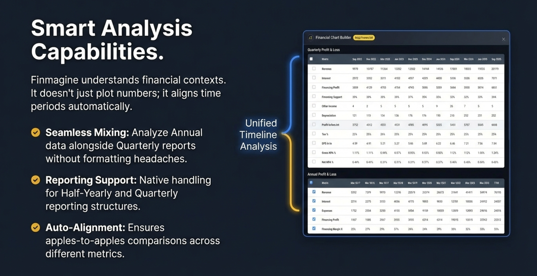
Smart Analysis: Beyond Simple Plotting
Finmagine Chart Builder doesn't just plot numbers—it understands financial contexts and provides intelligent features that make complex analysis straightforward.
Unified Timeline Analysis
One of the most frustrating challenges in financial analysis is comparing metrics across different time periods. The extension handles this automatically through:
- Seamless Mixing: Combine quarterly data with annual trends on the same chart
- Automatic Alignment: Intelligent mapping ensures apples-to-apples comparisons
- Reporting Flexibility: Support for Half-Yearly, Quarterly, and Annual reporting structures
Comprehensive Data Coverage
If Screener.in tracks it, Finmagine can chart it:
- Profit & Loss Statements: Revenue, Expenses, Operating Profit, Net Profit, EPS
- Balance Sheet Metrics: Assets, Liabilities, Equity components
- Cash Flow Analysis: Operating, Investing, and Financing cash flows
- Financial Ratios: ROCE%, OPM%, Debtor Days, Inventory Days, Cash Conversion Cycle
- Shareholding Patterns: Promoter holding, FII/DII participation over time
- Banking Metrics: Financing Margins, Gross NPA%, Net NPA% for financial companies
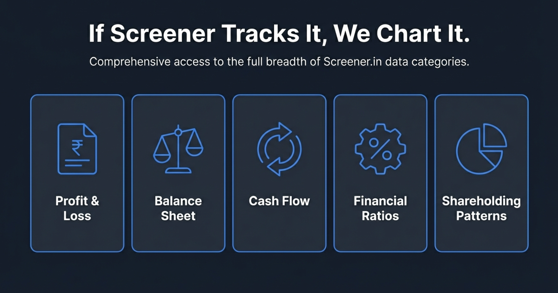
Complete Financial Coverage: Five Core Categories
The extension provides comprehensive visualization support across all major financial statement categories available on Screener.in. This ensures you can perform complete fundamental analysis without ever leaving the browser.
Each category supports intelligent visualization based on data type—percentages appear as lines, absolute values as bars, and efficiency ratios as appropriate visual elements. The tool automatically determines the best representation for clear, actionable insights.
Design Philosophy: Built for Extended Analysis Sessions
Professional analysts and serious investors spend hours deep in financial data. The Finmagine Chart Builder's design reflects this reality with thoughtful choices optimized for sustained use:
Dark Theme Optimization
The dark theme isn't just aesthetically pleasing—it's specifically designed to reduce eye strain during extended analysis sessions. Financial data work often involves long hours of screen time, and the carefully calibrated color scheme ensures comfort without compromising clarity.
Smart Color Coding
Metrics are automatically assigned distinct, carefully chosen colors that maximize visual differentiation. Whether comparing Revenue, Expenses, Operating Profit, and Financing Margin simultaneously, each metric remains instantly recognizable at a glance.
Professional Typography
The Inter font with optimized spacing ensures maximum readability across all devices—from desktop monitors to tablets. Numbers, labels, and legends remain crisp and clear regardless of screen size or resolution.
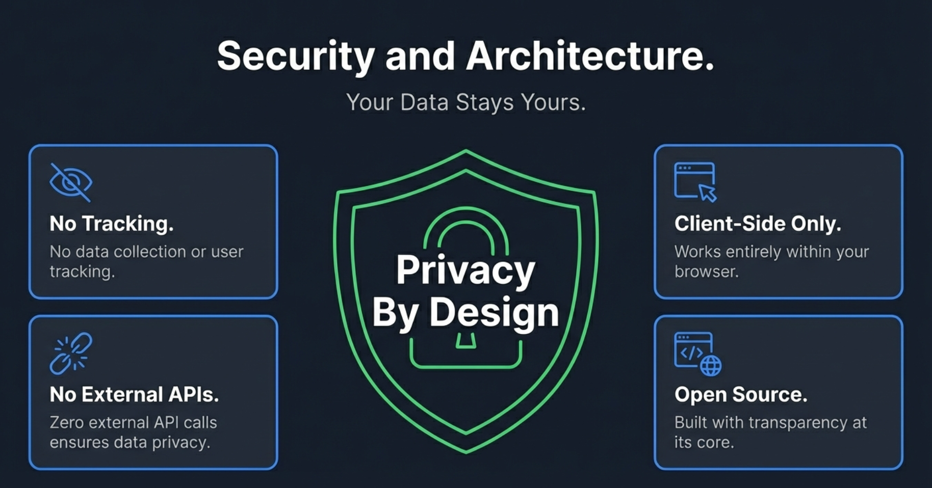
Privacy by Design: Your Research Stays Private
In an age where financial tools often collect extensive data about your research habits and investment interests, Finmagine Chart Builder takes a fundamentally different approach: complete client-side operation.
Local-First Privacy
- No Personal Tracking: Which companies you research, your analysis, and investment thesis stay entirely in your browser
- Fundamentals Cache: Stock metrics (ROCE, sector, etc.) from pages you visit are passively contributed to Finmagine's shared cache — anonymously, aggregate only
- Client-Side Processing: All chart generation happens locally in your browser
- No Research Profile: Finmagine never knows which stocks you analyze or builds a profile of your investment interests
Your competitive research, investment thesis development, and analytical work remain completely private. No personal profile is built, no research identity is tracked — the only data shared with Finmagine is anonymous aggregate stock fundamentals already publicly available on Screener.in.
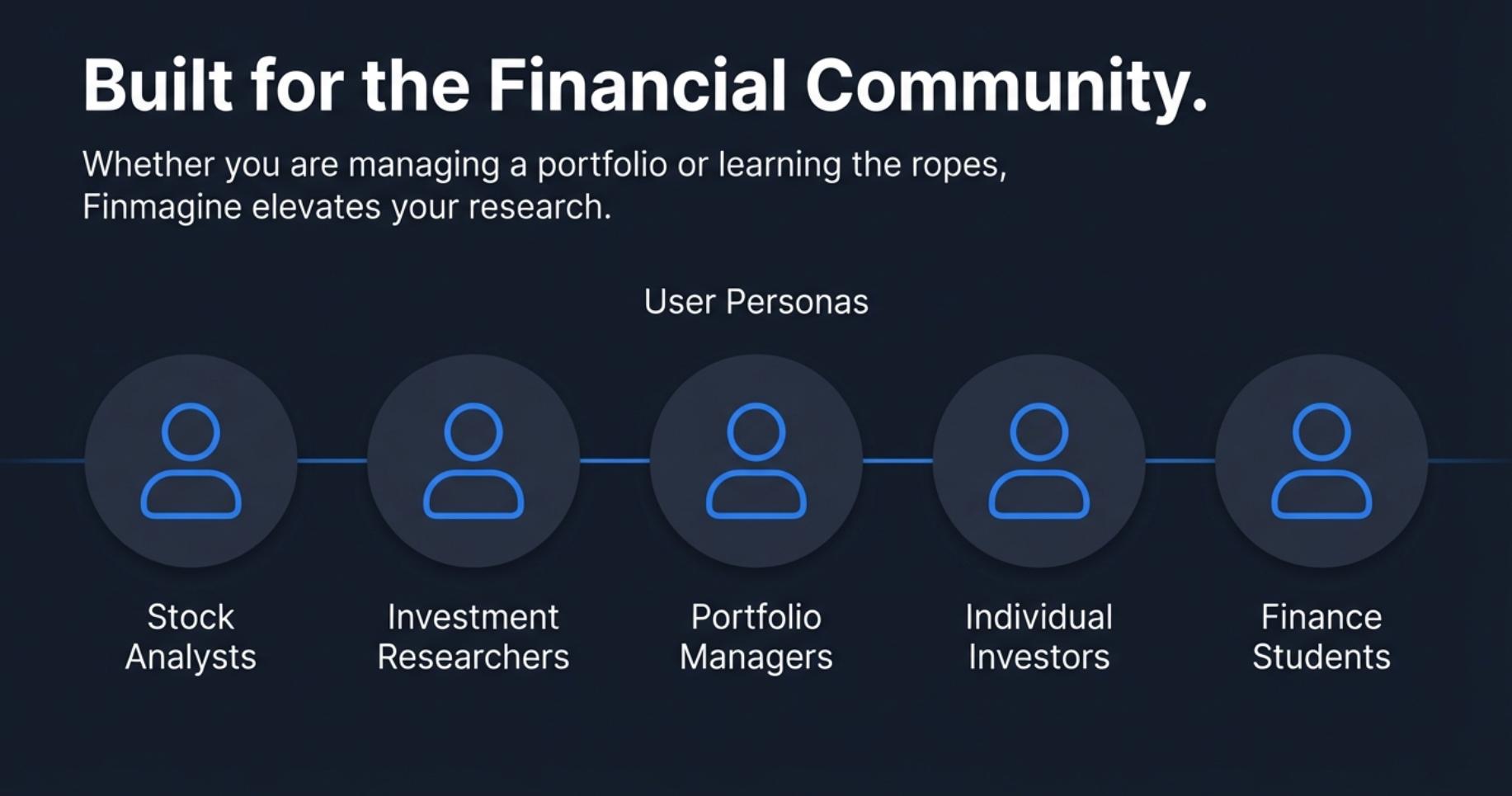
Who Benefits: The Financial Community
The Finmagine Chart Builder was designed with specific user personas in mind, each facing unique challenges that this tool addresses:
Stock Market Analysts
Professional analysts need to generate quick visualizations for reports and presentations. The export-ready quality and comprehensive metric coverage ensure every chart is client-ready without additional formatting.
Investment Researchers
Deep research requires comparing multiple metrics simultaneously across different time periods. The ability to mix quarterly and annual data while maintaining timeline accuracy is crucial for thesis development.
Portfolio Managers
Monitoring portfolio holdings requires quick access to trend analysis. One-click visualization eliminates friction, making it practical to regularly review all holdings visually.
Individual Investors
Serious individual investors deserve professional-grade tools without professional-grade price tags. The completely free extension democratizes visualization capabilities previously available only in expensive software.
Finance Students
Learning financial analysis requires seeing concepts in action. The ability to instantly visualize how revenue growth correlates with margin changes provides hands-on learning opportunities.
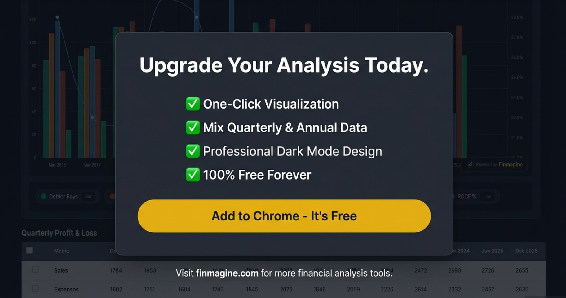
The Bottom Line: Transform Your Workflow
Every hour spent wrestling with Excel exports and manual chart formatting is an hour not spent on actual analysis. Every insight delayed by workflow friction is a potential opportunity missed.
The Finmagine Chart Builder eliminates this friction entirely. It's not about replacing Screener.in—it's about unlocking the full analytical potential of the incredible data already at your fingertips.
What You Get
- One-click professional visualization directly in your browser
- Mix quarterly and annual data without formatting headaches
- Dual-axis charts for comparing growth and efficiency metrics
- Complete privacy with zero data collection
- Export-ready charts for reports and presentations
- Support for all Screener.in financial categories
- Free forever—no subscriptions, no limitations
The extension is available now in the Chrome Web Store. Installation takes seconds, and you'll be creating professional financial visualizations within minutes.
Explore the Complete Chart Builder Hub
Discover all Chart Builder resources — tutorials, Google Finance integration, case studies, and more. Transform Screener.in & Google Finance data into professional charts.
Visit Chart Builder Hub →