Following along? Install the extension first
Finmagine Financial Chart Builder — free • no account needed • Chrome, Edge, Brave
Multimedia Learning Hub
Master the Price Analysis Tab through video tutorial, audio deep dive, comprehensive overview, and interactive knowledge testing
Complete Learning Path
This comprehensive tutorial teaches you how to use the Price Analysis Tab in the Finmagine Financial Chart Builder to decode stock valuations on Screener.in. You will learn a systematic 3-point framework that transforms the most expensive question in investing—"Is this stock actually worth buying right now?"—into a data-driven decision.
What You'll Learn:
- Lens 1 – Valuation: How the Price/Profit Growth Ratio reveals whether a stock is undervalued, fairly valued, or overvalued
- Lens 2 – Timing: How Cyclical Analysis detects seasonal profit patterns to time your entries
- Lens 3 – Safety: How Risk Metrics quantify your downside using 52-week range and Max Drawdown
- The Falling Knife Trap: A critical technique to distinguish genuine bargains from dangerous traps
- Real Case Studies: Bajaj Finance, Coforge, TVS Motor, Tata Elxsi, GRSE, Abbott India, and more
- The Decision Matrix: Combining all three lenses into actionable investment plays
Key Skills You'll Master:
- Instantly determine if a stock's price is justified by its earnings growth
- Identify seasonal quarterly patterns to buy during predictable dips
- Assess entry risk using Max Drawdown and 52-week positioning
- Spot falling knives before they destroy your capital
- Build a repeatable screening process at ~10 seconds per stock
- Transform market anxiety into a data-driven strategy
Tutorial Contents:
- The Problem: The gap between seeing a price and understanding the context
- The Philosophy: Valuation in Three Lenses – the conceptual framework
- Lens 1: Price vs Fundamentals – the valuation engine
- Case Studies: Bajaj Finance (Catching Up) vs Coforge (Running Ahead)
- The Falling Knife: Why "Catching Up" isn't always a buy signal
- Lens 2: Cyclical Analysis – timing your entry using seasonality
- Lens 3: Risk Metrics – the 52-week range and Max Drawdown
- Synthesis: The Deep Value Setup vs The Momentum Trap
- The Analyst's Cheatsheet: Your quick-reference decision framework
Watch the Complete Tutorial
Follow along with this deep-dive video breaking down the Price Analysis 3-point framework with real stock examples.
Video Title: Stop Guessing Stock Prices | Decode Value with FinMagine Price Analysis (3-Point Framework)
Complete video breakdown with real company examples: Bajaj Finance, Titan, Coforge, Tata Elxsi, and more
Listen to the Audio Deep Dive
Prefer to listen? This in-depth audio discussion covers the entire Price Analysis framework, case studies, and investment strategies in a conversational format.
Duration: Full deep dive | Format: Conversational discussion
Deep dive audio exploring the Price/Profit Growth Ratio, cyclical analysis strategies, risk metrics, and the falling knife trap
Test Your Knowledge
Click any flashcard to reveal the answer. Use the search box to find specific topics.
The Most Expensive Question in Investing
You know the feeling. Your finger is hovering over the buy button on your brokerage app. You're staring at a ticker symbol—maybe it's a massive compounder like Bajaj Finance, or a momentum darling like TVS Motor—and the stock price is just sitting there, blinking at you. And that nagging voice in your head is asking what has to be the most expensive question in the history of finance: Is this thing actually worth it?
Usually, we answer that question with terrible shortcuts. The chart's going up and to the right, so it must be a winner. Or it dropped 10%, so it must be on sale—time to buy the dip. That's about as scientific as picking a racehorse because you like the colour of the jockey's silks.
The problem is a massive information gap between seeing a price and understanding the context of that price. Standard tools like Google Finance or your broker's app are fantastic at showing you the price. But they are terrible at telling you whether that price is justified by fundamentals, whether the stock usually crashes at this time of year, or how much pain you might suffer if you buy at exactly the wrong moment.
That is the gap the Price Analysis Tab in the Finmagine Financial Chart Builder is designed to bridge. It takes the raw data already on your Screener.in page and synthesises it into three actionable lenses—all running client-side in your browser with complete privacy.
Today, we are doing a complete deep dive into this tool. We'll break it down into a practical 3-point framework that answers the only three questions that matter before you buy any stock:
- Is the price justified? – Is it worth what they're charging?
- Is it the right time? – Am I buying at the best seasonal window?
- What are the hidden risks? – How much pain might I suffer if I'm wrong?
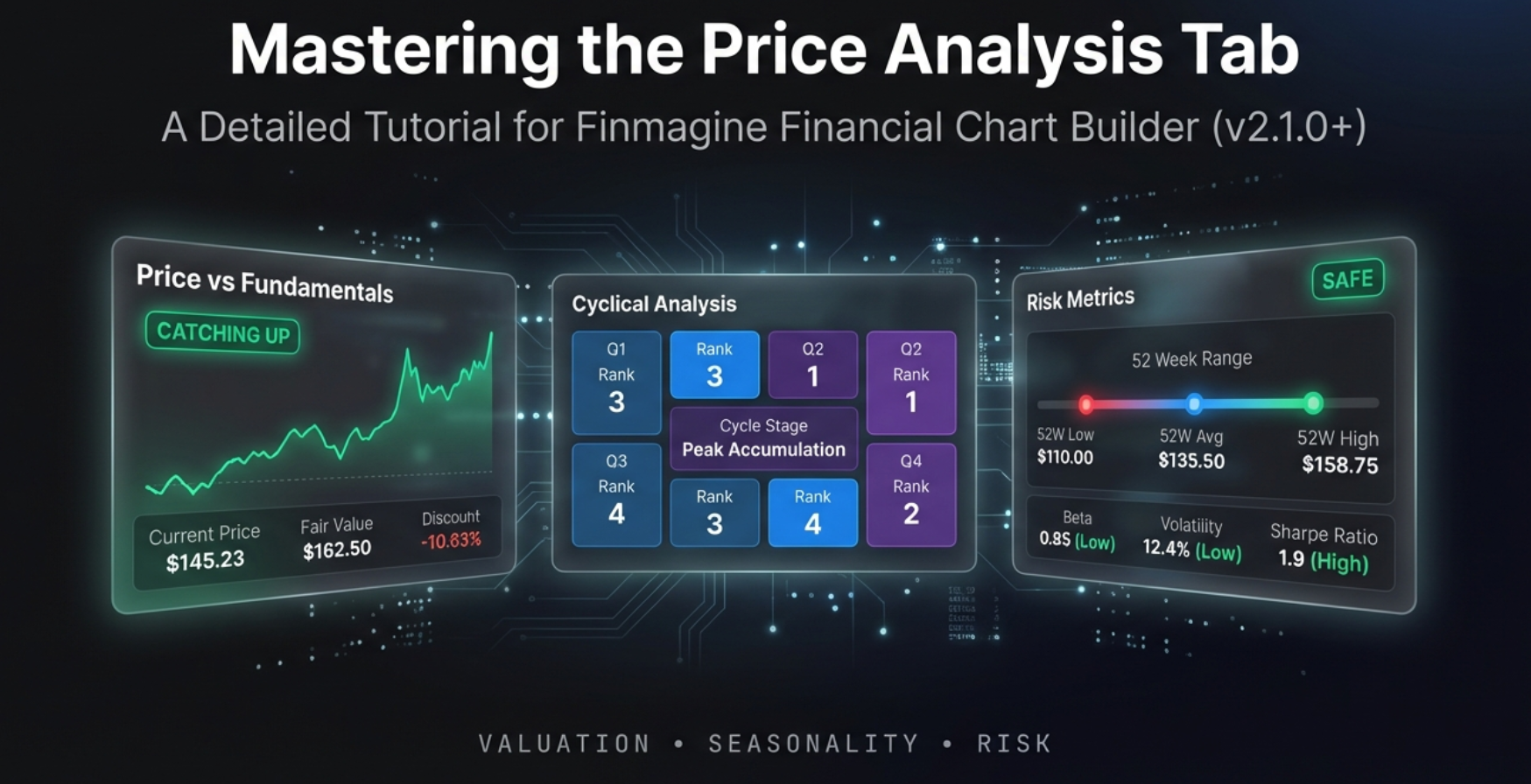
The Philosophy: Valuation in Three Lenses
The Price Analysis Tab is built on a simple but powerful philosophy. While Screener.in provides raw tables of financial data, this tab synthesises that data into three distinct analytical lenses, each answering a different dimension of the investment decision.
Lens 1: Valuation
Question: Is the price justified by profit growth?
This is the Price vs Fundamentals panel. It compares how fast the stock price is growing against how fast the company's profits are growing. If price is running ahead of profits, you might be paying too much. If profits are outpacing price, you may have found a bargain.
Lens 2: Timing
Question: Is there a predictable seasonal pattern?
This is the Cyclical Analysis panel. It groups historical quarterly profits by month and identifies repeatable seasonal patterns. Knowing which quarters are typically strong or weak lets you time entries and—just as importantly—avoid panic selling during predictable dips.
Lens 3: Safety
Question: What is the risk of entry at this level?
This is the Risk Metrics panel. It shows where the current price sits within the 52-week range, calculates the maximum drawdown, and helps you understand how volatile the stock is. This is your "pain threshold" gauge.
Accessing the Price Analysis Tab
The Price Analysis Tab is available only on Screener.in because it requires data that Google Finance does not provide: Stock Price CAGR, Compounded Sales and Profit Growth rates, detailed quarterly profits, and 52-week High/Low prices.
Step-by-Step Access
- Navigate to any company page on Screener.in (e.g.,
screener.in/company/BAJFINANCE/consolidated/) - Click the Finmagine floating button in the bottom-right corner
- You'll see four tabs: Charts | Quick Analysis | Calculated Ratios | Price Analysis
- Click the Price Analysis tab (marked with a NEW badge)
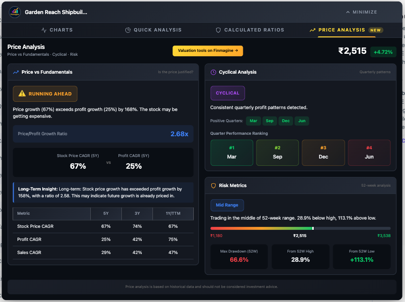
The tab opens into a clean two-column dashboard. On the left is the heavy lifter—the Price vs Fundamentals panel with the CAGR Comparison Table below it. On the right are two stacked panels: Cyclical Analysis on top and Risk Metrics on the bottom. The current stock price with daily change is displayed prominently in the header.
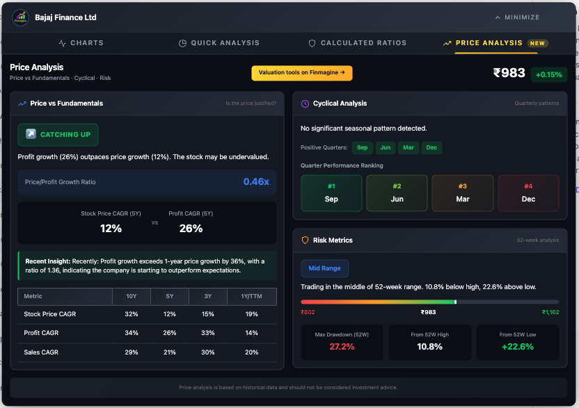
Price vs Fundamentals: The Valuation Engine
This is the heart of the Price Analysis Tab. It answers the million-rupee question: Is the stock price justified by the company's fundamental growth?
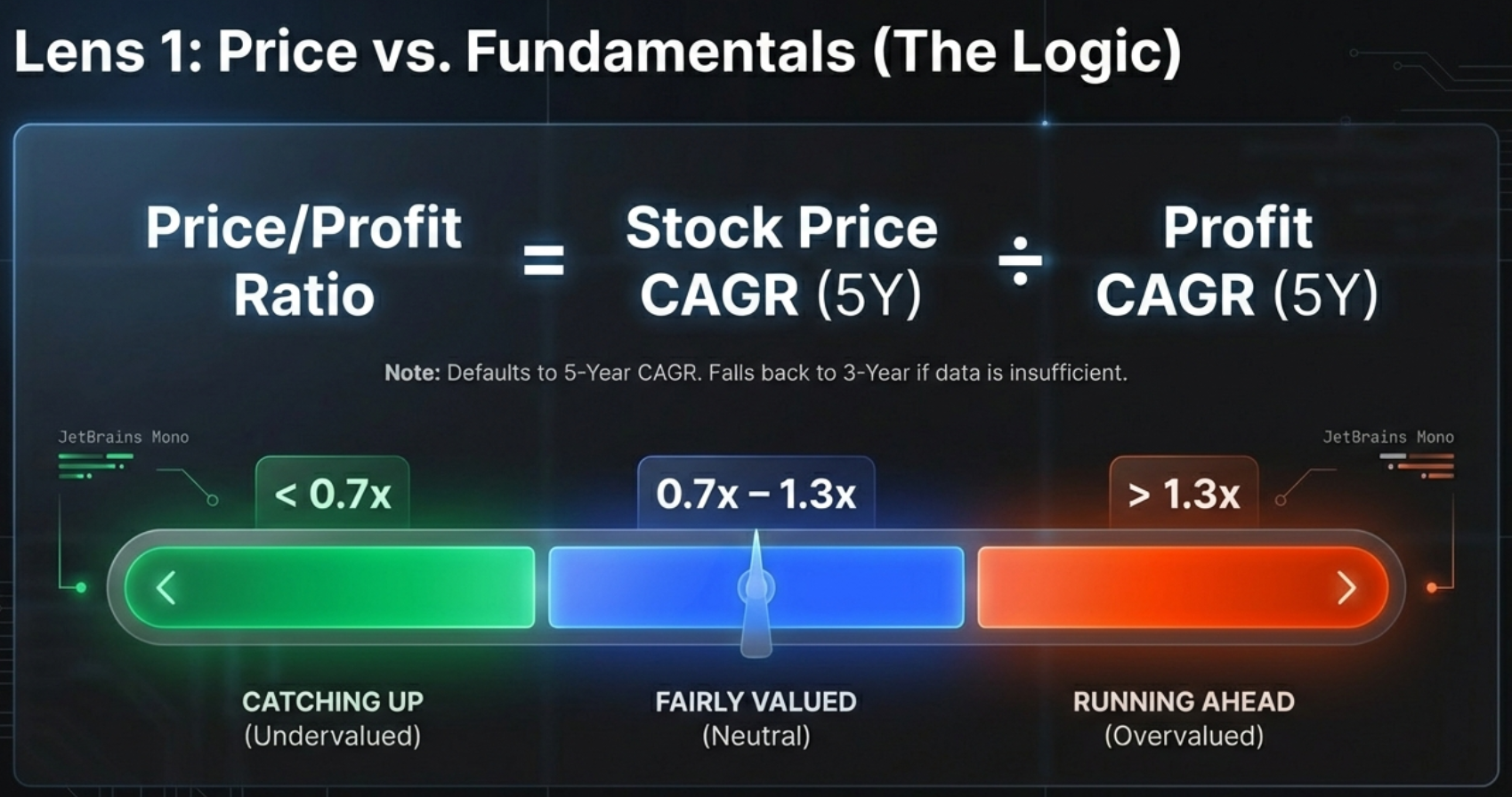
The Price/Profit Growth Ratio
The core metric is surprisingly simple but incredibly powerful. It takes the Stock Price CAGR (Compound Annual Growth Rate) and divides it by the Profit CAGR, primarily using a 5-year timeframe to capture full business cycles.
Think of it like walking a dog. The company's profit growth is the owner walking steadily forward—that is reality, the solid ground. The stock price is the dog on the leash. Sometimes the dog runs way ahead (hype, overvaluation). Sometimes it lags behind, sniffing a bush (fear, undervaluation). But eventually, the dog has to come back to the owner. This ratio measures how far the leash is stretched.
The Traffic Light System
Based on the ratio, the tool assigns one of three status badges:
| Badge | Ratio | Meaning | Investor Action |
|---|---|---|---|
| CATCHING UP | < 0.7x | Price growth lagging behind profit growth | Research for potential undervaluation |
| FAIRLY VALUED | 0.7x – 1.3x | Price and profits growing at similar rates | Neutral – focus on future expectations |
| RUNNING AHEAD | > 1.3x | Price growing 30%+ faster than profits | Caution – verify growth sustainability |
Case Study: Bajaj Finance vs Coforge
Let's make this concrete with two real-world examples that illustrate the opposite ends of the spectrum.
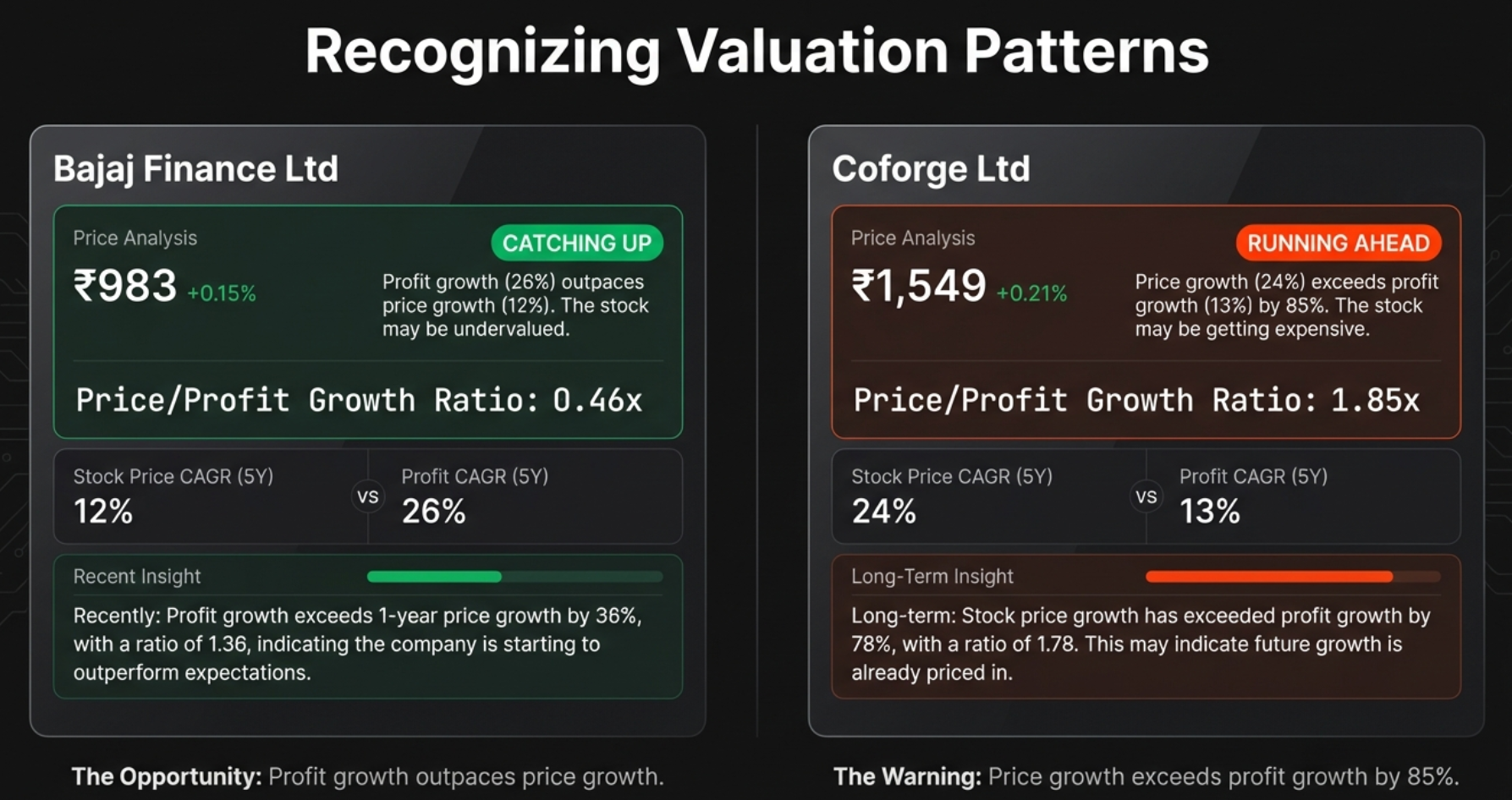
Bajaj Finance: The Textbook "Catching Up"
Bajaj Finance's profits have been growing at an extraordinary 26% annually over the last five years. The business is effectively doubling in size every three years. But the stock price? It has only grown at 12% annually over the same period.
The ratio: 12 ÷ 26 = 0.46x. The owner (profits) is sprinting at 26 mph, but the dog (price) is jogging at 12 mph. The tool flags this as CATCHING UP—fundamentals are outpacing the hype. The thesis is that eventually that gap has to close, and when it does, you get significant price appreciation.
Coforge: The Classic "Running Ahead"
Now look at Coforge—the inverse of Bajaj Finance. The stock price has been zooming at a 24% CAGR. It looks like a superstar on any chart. But profits? They've only been growing at 13%.
The ratio: 24 ÷ 13 = 1.85x. Investors are paying a massive premium for future growth that hasn't materialised yet. They're pricing in years of perfect execution. The tool flags this as RUNNING AHEAD.
The CAGR Comparison Table
Below the badges, you'll find the CAGR Comparison Table—the truth-teller of the dashboard. It shows growth rates across multiple timeframes so you can see the full picture:
| Period | What It Tells You |
|---|---|
| 10Y | Long-term structural growth (if available) |
| 5Y | Primary comparison period – captures full business cycles |
| 3Y | Medium-term trend – useful for newer companies |
| 1Y / TTM | Recent momentum – critical for detecting acceleration or collapse |
Patterns to Watch
- Price CAGR > Profit CAGR across all periods: Consistently expensive—multiple expansion
- Price CAGR < Profit CAGR across all periods: Consistently undervalued—multiple compression
- 1Y Price CAGR >> 5Y Price CAGR: Recent rally—verify fundamentals support it
- 1Y Profit CAGR >> 1Y Price CAGR: Fundamentals accelerating—potential opportunity
The "Falling Knife" Trap: When "Catching Up" Lies to You
This is where the tutorial can genuinely save you money. A green CATCHING UP badge is not always a buy signal. Sometimes it's a trap that can cost you dearly.
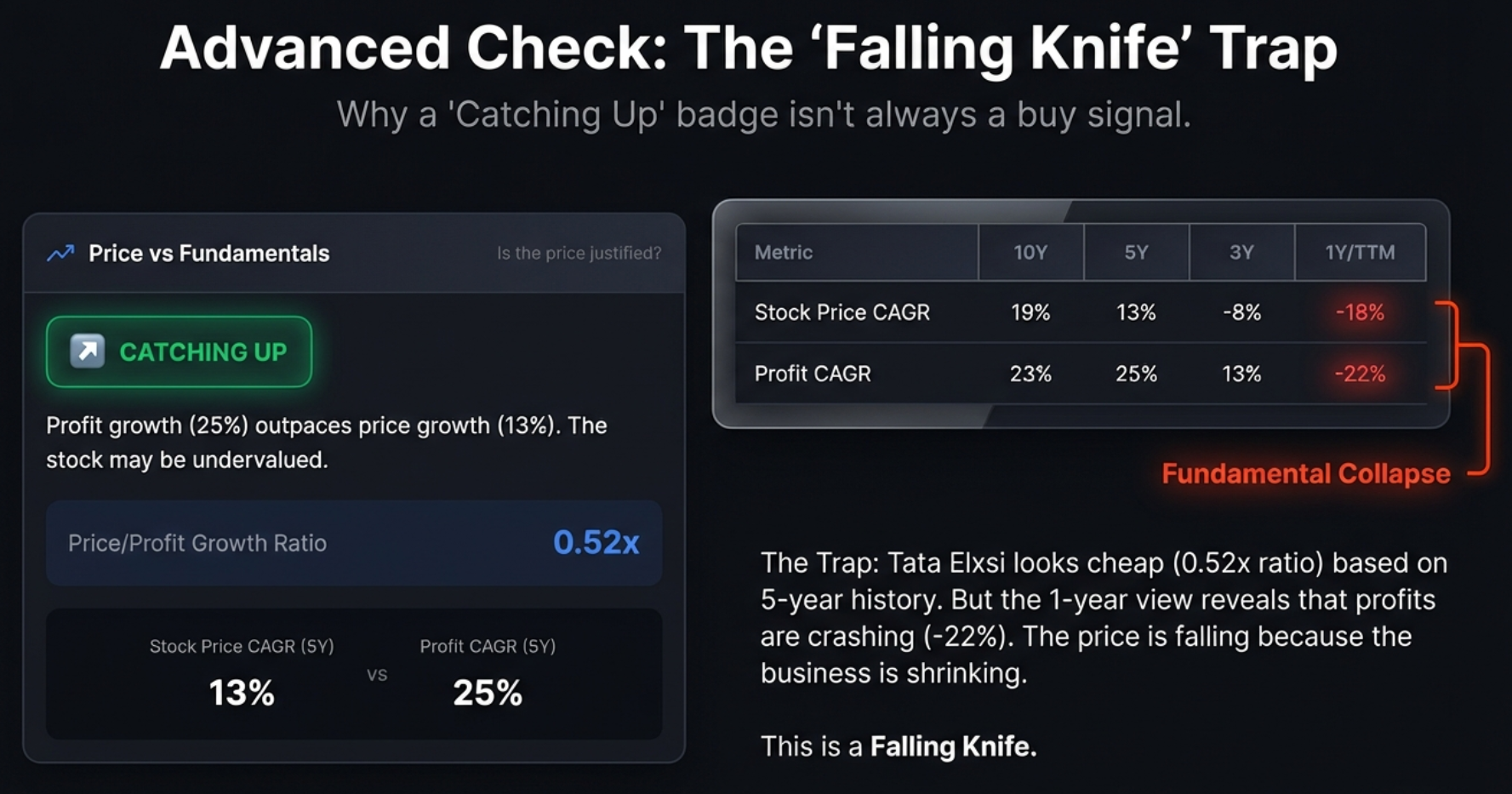
How the Trap Works
A falling knife is a stock that looks cheap because it used to be great, but is crashing because the business is dying right now. The five-year average still looks strong because it's propped up by four good years. But in year five, everything collapsed.
The tool sees the price dropping hard, compares it to the still-strong five-year profit average, and assigns a green "Catching Up" badge. On the surface, it looks like a hidden gem. In reality, you're about to catch a falling knife.
The 10-Second Check That Saves You
The fix is one simple comparison in the CAGR table at the bottom of the panel:
Real Examples: Tata Elxsi vs Abbott India
Tata Elxsi: The Falling Knife
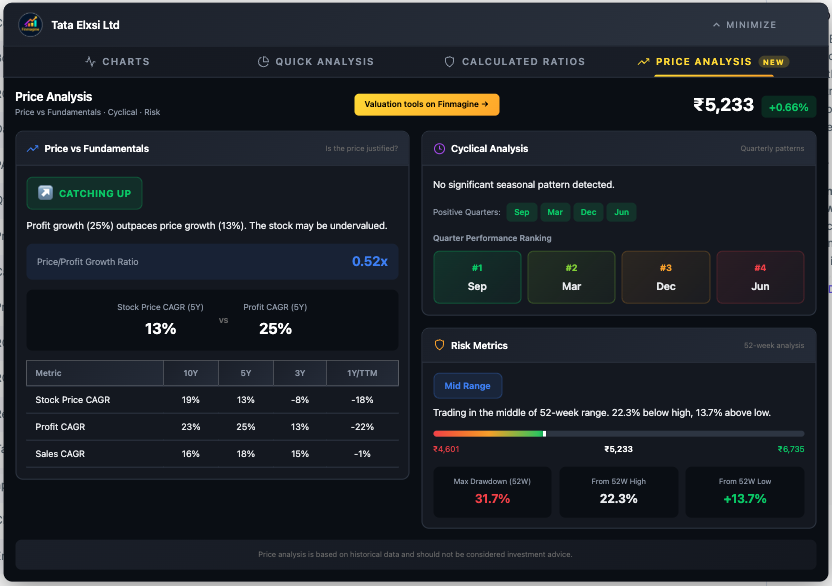
On the surface, Tata Elxsi looks like a dream for value investors. Five-year profit growth is a spectacular 25%. Price growth is only 13%. The ratio is 0.52x. Green badge, catching up, looks like a steal.
But then you scroll down to the CAGR table and check the 1Y/TTM profit growth: -22%. The business has shrunk by more than a fifth in the last year. The stock isn't lagging because the market is ignoring a gem. It's crashing because earnings have collapsed. This is a textbook falling knife.
Abbott India: The Value Opportunity
Abbott India also has a "Catching Up" badge and is trading near its lows. Looks similar on the surface. But the CAGR table tells a completely different story: 5Y profit growth is 19%, and 1Y profit growth is 17%. The profit engine is still humming at nearly the exact same speed. The price drop is likely just market sentiment, not business deterioration.
The Quick Decision Matrix
| Signal | Value Opportunity (Buy) | Falling Knife (Avoid) |
|---|---|---|
| Valuation Badge | CATCHING UP (Green) | Could be Catching Up too (deceptive) |
| 1Y vs 5Y Profit | 1Y stable or accelerating | 1Y negative or collapsing |
| Max Drawdown | Moderate (<30%) | High (>40-50%) |
| Reason for Drop | External (market sentiment) | Internal (broken fundamentals) |
Cyclical Analysis: Timing Your Entry Using Seasonality
Knowing a stock is worth buying is only half the battle. The second question is: When? There's almost nothing worse than buying a great company and watching it do nothing—or drop—for three months because you bought at the wrong time of year.
The Cyclical Analysis panel quantifies something that is usually just gossip or anecdotal evidence. You hear people say "auto stocks always do well around Diwali" or "infrastructure companies have a strong March quarter." But is that actually true? This panel runs the actual numbers.
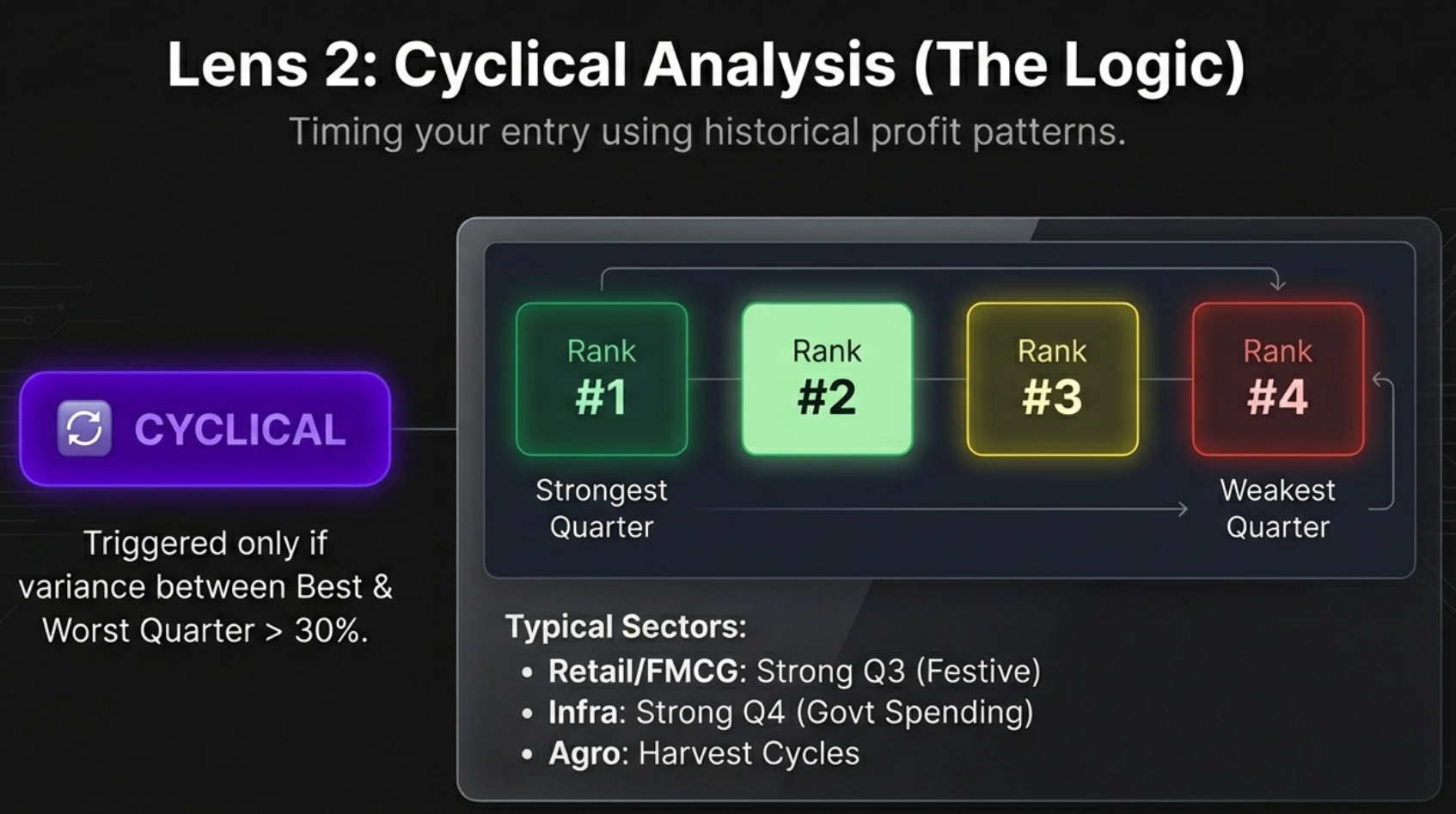
How Cyclical Analysis Works
- Groups quarterly profits by month: All March quarters together, all June quarters, all September quarters, all December quarters
- Calculates average profit for each quarter type across multiple years to smooth out one-time anomalies
- Measures variance between highest and lowest quarter averages
- Assigns the CYCLICAL badge only if variance exceeds 30% of the mean
That 30% threshold is an important filter. If the difference from best to worst is only 5%, that's random fluctuation, not a pattern. But if one quarter is consistently 30%+ more profitable than another, that's a structural seasonal pattern you can exploit.
Quarter Performance Ranking
The tool ranks each quarter from #1 (strongest) to #4 (weakest), with colour coding: dark green for #1, light green for #2, yellow for #3, and red for #4. This ranking is your timing compass.
Case Study: Garden Reach Shipbuilders (GRSE)
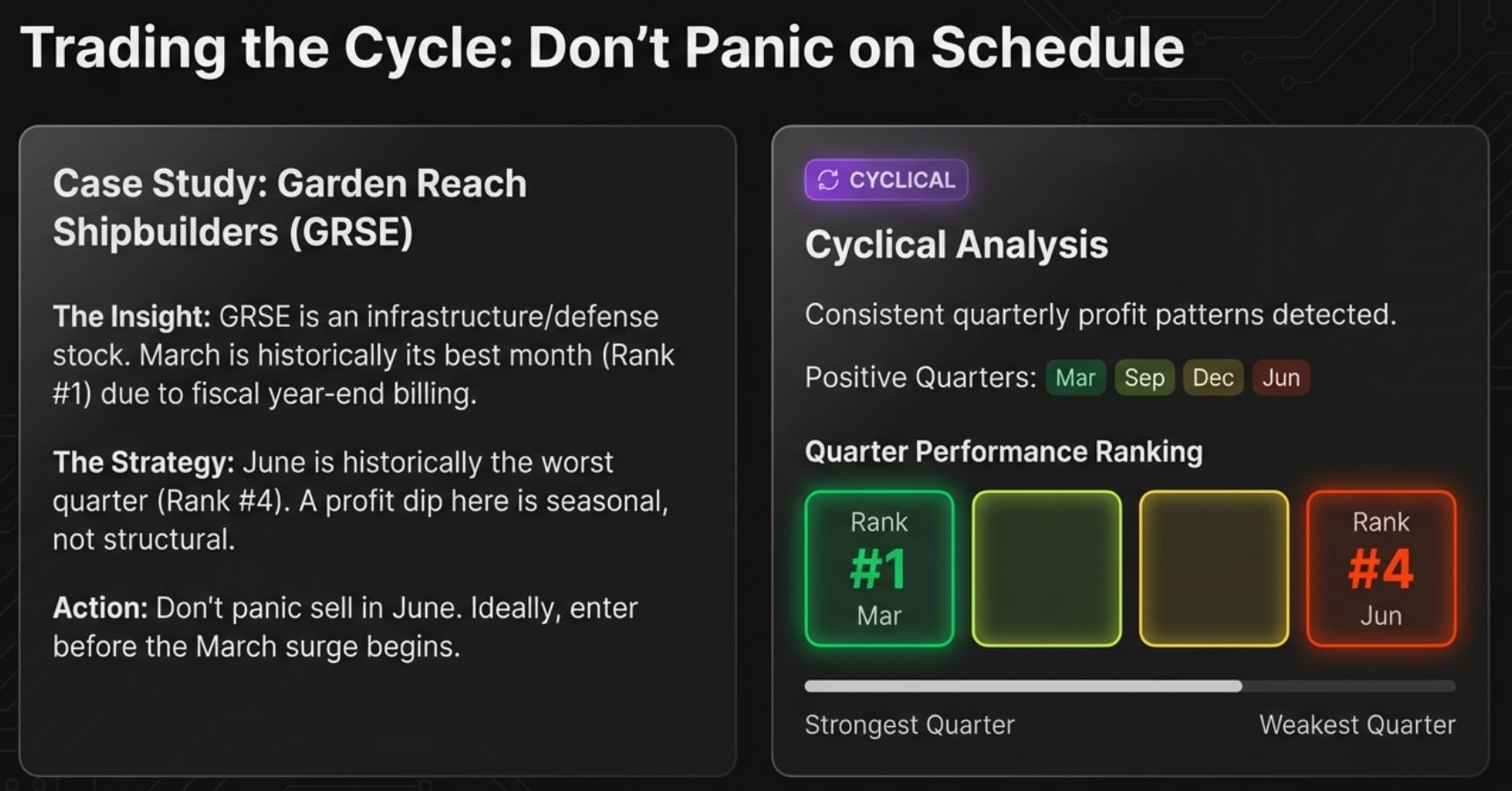
GRSE is in the infrastructure and defence shipbuilding space—a sector heavily driven by government spending and billing cycles.
- #1 Ranked Quarter: March. End of the fiscal year in India. Every government department rushes to get bills cleared and projects signed off. Profits spike.
- #4 Ranked Quarter: June. The hangover. The new budget cycle is just starting. Bureaucracy slows down. Everything grinds to a halt.
Two Ways to Use Cyclical Data
1. Expectation Management (Don't Panic)
If you own GRSE and the June quarter results look terrible, the tool lets you stay calm. June is always the worst quarter for this company. It's not a business failure, it's a calendar feature. You don't panic sell at the bottom of a predictable cycle.
2. Entry Timing (Buy the Seasonal Dip)
If March is the peak when hype is highest, you probably don't want to buy in late February. Instead, look at GRSE during the May/June weakness when sentiment is low and position yourself for the next upcycle. You're using data to buy fear and sell greed.
Industries with Typical Cyclical Patterns
| Industry | Typical Peak Quarter | Driver |
|---|---|---|
| Infrastructure & Construction | Q4 (March) | Government budget spending and fiscal year-end billing |
| Retail & FMCG | Q3 (Oct-Dec) | Diwali, festive season, and holiday shopping |
| Automotive | Q2 (Sep) & Q4 (Mar) | Festive demand stocking and year-end sales incentives |
| Agriculture | Seasonal | Harvest cycles and monsoon patterns |
| Paints | Q1 (June) | Pre-monsoon exterior painting season |
Risk Metrics: Quantifying Your Pain Threshold
The final lens answers the scariest question: How much pain might I suffer if I'm wrong? This panel is built around two key concepts: the 52-week price range and the Max Drawdown.
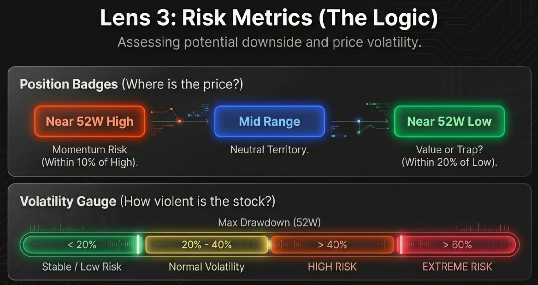
The 52-Week Range Bar
A simple horizontal bar shows exactly where the current price sits between its yearly low and yearly high. The tool classifies this position into three zones:
| Zone | Condition | Psychology | Risk Profile |
|---|---|---|---|
| Near 52W High (Yellow) | Within 10% of yearly peak | Momentum / FOMO zone | "Consider if valuation is justified" |
| Mid Range (Blue) | Between the extremes | Neutral / Safe accumulation | Balanced risk-reward |
| Near 52W Low (Green) | Within 20% of yearly bottom | Value or Falling Knife? | "Could be opportunity or trap" |
Max Drawdown: Your "Pain Tolerance" Number
Max Drawdown answers one brutal question: If I had the worst possible luck and bought at the absolute highest price last year, how much money would I have lost when it hit the absolute lowest?
| Drawdown | Risk Level | Interpretation | Strategy |
|---|---|---|---|
| < 20% | Low | Highly stable, shallow corrections | Safe for momentum entries / breakouts |
| 20% – 40% | Moderate | Normal market volatility | Standard entry rules apply |
| 40% – 60% | High | Significant volatility, deep corrections | Avoid buying at highs; wait for pullbacks |
| > 60% | Extreme | Extreme instability or fundamental issues | Requires strict stop-losses or avoidance |
The "Danger Zone" Matrix: Suicide Entry vs Safe Floor
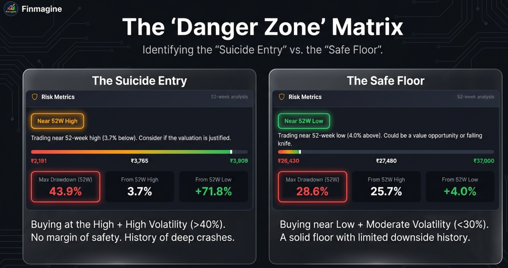
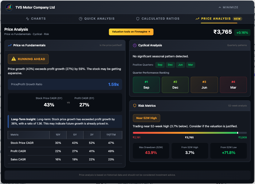
The Suicide Entry: TVS Motor
TVS Motor presents the classic "Triple Threat" of risk factors hitting simultaneously:
- Position: Near 52W High (just 3.7% below its peak)
- Valuation: RUNNING AHEAD (Price CAGR 43% vs Profit CAGR 27%)
- Volatility: Max Drawdown of 43.9%
You're buying at the absolute top of the price range, the price is already running far ahead of fundamentals, and the stock has a documented history of crashing by nearly 44%. That is a genuinely terrifying combination. You're walking a tightrope without a safety net.
The Safe Floor: Abbott India
Contrast this with Abbott India: trading Near 52W Low, with a much more modest Max Drawdown of 28.6%. Abbott rarely falls more than 30% from its peak, so if you find it near its low, you're likely standing on solid concrete, not quicksand. The downside from there is historically limited.
Putting It All Together: The Decision Framework
Now we combine all three lenses into concrete, actionable investment plays. Here is how the dashboard elements work together to produce clear verdicts.
The Deep Value Setup: High Conviction Buy
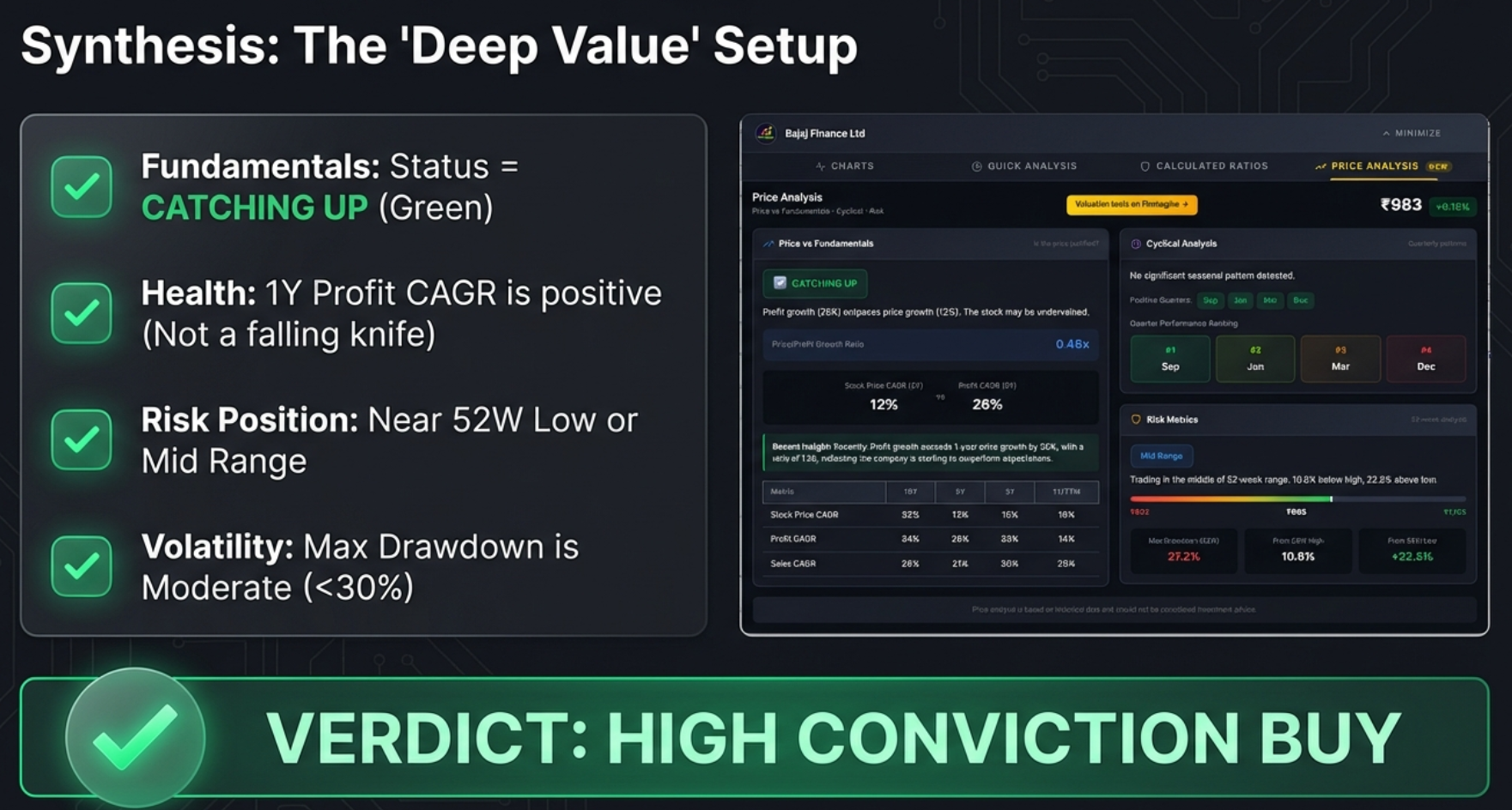
The checklist for the ideal value setup:
- Fundamentals: Status = CATCHING UP (Price lagging profits)
- Health: 1Y Profit CAGR is positive and stable (not a falling knife)
- Risk Position: Near 52W Low or Mid Range
- Volatility: Max Drawdown is Moderate (<30%)
Example: Bajaj Finance checks every single box. It's Catching Up (ratio 0.46x), the one-year fundamentals are stable, it's sitting in the Mid Range (22.6% above low, 10.8% below high), and the Max Drawdown is a manageable 27.2%. For a long-term value investor, that's a textbook setup.
The Momentum Trap: High Risk / Avoid
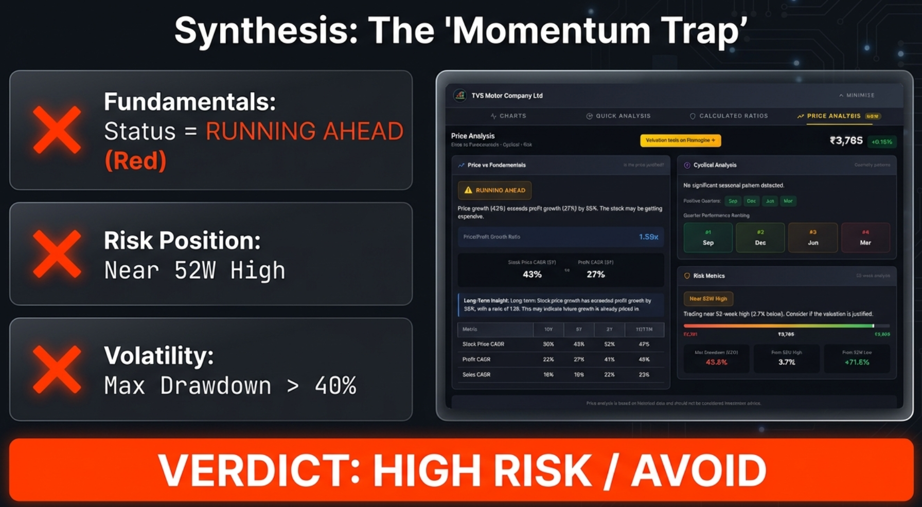
The checklist for the dangerous setup (the Triple Threat):
- Fundamentals: Status = RUNNING AHEAD
- Risk Position: Near 52W High
- Volatility: Max Drawdown > 40%
Example: TVS Motor checks all the bad boxes. It's a perfect storm of high valuation, peak pricing, and high volatility. If you own it, consider taking profits. If you don't own it, stay away until valuation and price cool down.
The Complete Decision Matrix
| Entry Zone | Valuation Status | Max Drawdown | Verdict |
|---|---|---|---|
| Near 52W Low | CATCHING UP | < 30% | Strong Buy Consideration |
| Mid Range | CATCHING UP | < 40% | Safe Accumulation |
| Near 52W Low | Any | > 50% | Risky (Potential Falling Knife) |
| Near 52W High | RUNNING AHEAD | > 40% | Dangerous Entry / Avoid |
| Near 52W High | FAIRLY VALUED | < 20% | Safer Momentum Play |
Three Plays You Can Run on Any Stock
Play #1: The Treasure Hunt (Finding Undervalued Stocks)
- Status badge must be green: CATCHING UP
- Price/Profit ratio well under 0.7x (lower is better)
- Scroll to CAGR table: 1Y profit growth must be positive and stable (falling knife detector)
- Check range bar: Near 52W Low or Mid Range
Play #2: The Shield (Avoiding Losers)
- Status badge is red: RUNNING AHEAD
- Position on range bar is yellow: Near 52W High
- Drawdown is high: anything over 40%
- If you own it: consider taking profits. If you don't: stay away.
Play #3: The Quick Screen (Triaging 20 Stocks in Minutes)
- Open company page on Screener.in
- Click the Finmagine button, go to Price Analysis tab
- Ask three questions in 10 seconds:
- What's the badge colour? Green = watchlist. Red = caution. Blue = neutral.
- Where is it on the range bar? Left (value) or right (expensive)?
- What's the drawdown? Under 30% = safe. Over 40% = scary.
- Move to the next stock. ~10 seconds per company.
The Analyst's Cheatsheet
Keep this quick-reference table handy whenever you're using the Price Analysis tab.
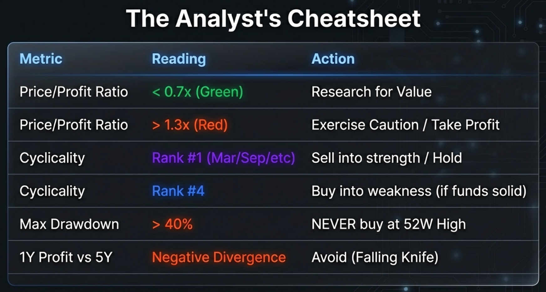
| Metric | Reading | Action |
|---|---|---|
| Price/Profit Ratio | < 0.7x (Green) | Research for Value |
| Price/Profit Ratio | > 1.3x (Red) | Exercise Caution / Take Profit |
| Cyclicality | Rank #1 (Mar/Sep/etc) | Sell into strength / Hold |
| Cyclicality | Rank #4 | Buy into weakness (if fundamentals solid) |
| Max Drawdown | > 40% | NEVER buy at 52W High |
| 1Y Profit vs 5Y | Negative Divergence | Avoid (Falling Knife) |
Technical Notes & Troubleshooting
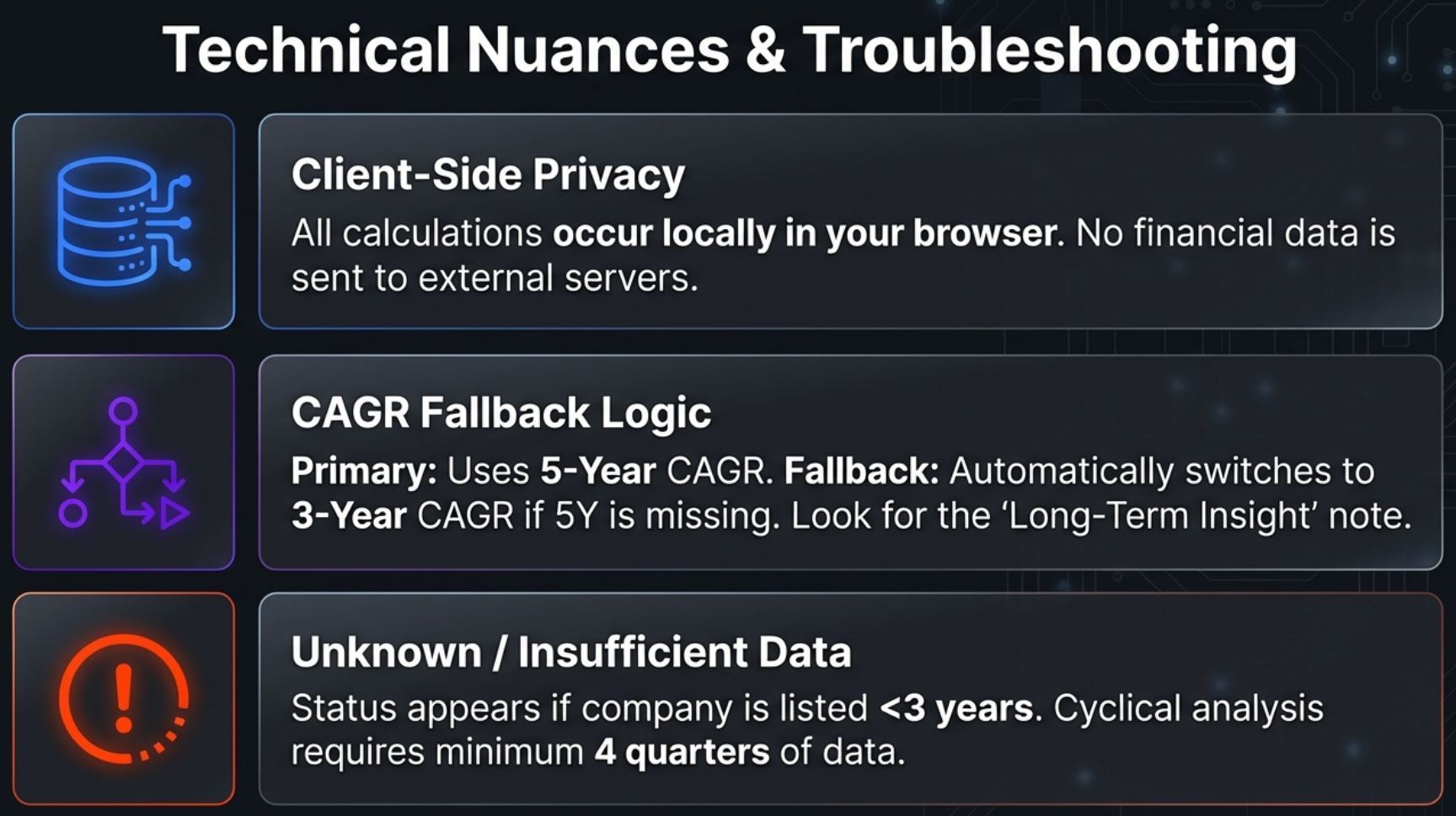
Local-First Privacy
All calculations occur locally in your browser. Your research habits and analysis results stay private. Stock fundamentals from pages you visit are passively contributed to Finmagine's shared cache to improve load speed for all users — but no personal data or research identity is ever tracked. In an era where every app wants to harvest your data, this is a refreshing commitment to privacy.
CAGR Fallback Logic
The tool primarily uses 5-Year CAGR for valuation comparison. If 5Y data is unavailable (e.g., recently listed companies), it automatically falls back to 3-Year CAGR. The "Long-Term Insight" section notes which timeframe was used.
Common Issues & Solutions
"UNKNOWN" Status – No Stock Price CAGR
Cause: Company is recently listed (<3 years) or lacks Stock Price CAGR data on Screener.in.
Solution: Focus on Risk Metrics and Cyclical Analysis (these may still work). Use the Charts tab for visual comparison.
Cyclical Analysis Shows "Insufficient Data"
Cause: Less than 4 quarters of profit data available.
Solution: Check if the company is newly listed. Try consolidated vs standalone view.
Risk Metrics Not Showing
Cause: 52-week High/Low data not available on the page.
Solution: Ensure the company is actively traded. Refresh the page.
Wrong Values in CAGR Table
Verification: Scroll to Screener.in's growth boxes and compare. If there's a mismatch, refresh the page and reopen the extension. If Screener.in shows only "%" without a number, the extension correctly displays "-".
Data Requirements
| Data Point | Source on Screener.in |
|---|---|
| Current Price | Company header |
| 52W High / Low | Top ratios section |
| Stock Price CAGR | "Stock Price CAGR" growth table |
| Profit CAGR | "Compounded Profit Growth" table |
| Sales CAGR | "Compounded Sales Growth" table |
| Quarterly Profits | Quarterly P&L "Net Profit" row |
Turn Data Into Decisions
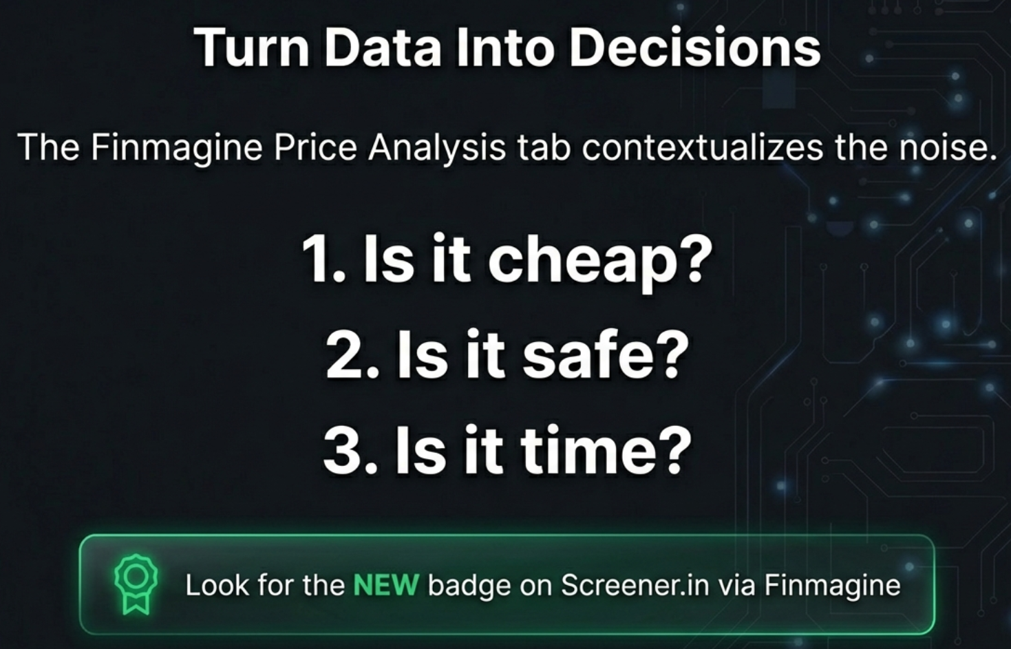
The Price Analysis Tab contextualises the noise. It transforms the most expensive question in investing—"Is this stock worth buying right now?"—into three simple, data-driven checks:
- Is it cheap? – Check the Price/Profit Growth Ratio and the valuation badge
- Is it safe? – Check the Max Drawdown and 52-week position
- Is it time? – Check the Cyclical Analysis for seasonal patterns
What You've Learned:
- How the Price/Profit Growth Ratio reveals whether a stock is undervalued, overvalued, or fairly priced
- The critical difference between "Catching Up" (value opportunity) and a falling knife (trap)
- How seasonal quarter analysis helps time entries and prevents panic selling
- How Max Drawdown quantifies your downside risk before you buy
- The complete decision matrix for combining all three lenses
- Three actionable plays: The Treasure Hunt, The Shield, and The Quick Screen
We often look at big price drops as failures, as something to fear. But what if you knew, based on data, that a great company always drops in June? Or that it always has a 40% crash from its peak before rallying to new highs? Would you still be scared of that drop? Or would you be waiting for it, patiently, with your checkbook ready?
That's the difference this tool makes. It transforms market anxiety into market strategy.
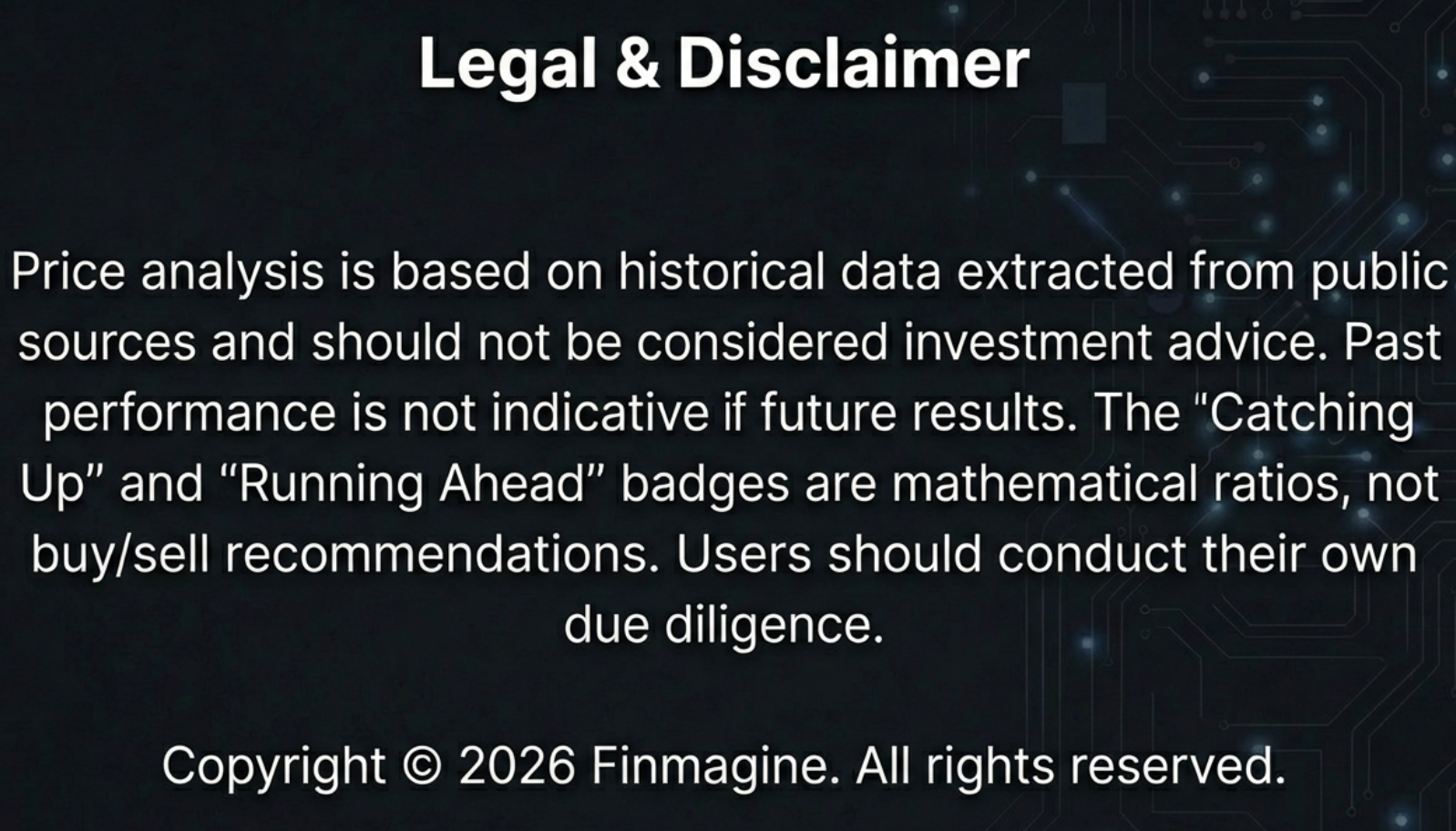
Price analysis is based on historical data extracted from public sources and should not be considered investment advice. Past performance is not indicative of future results. The "Catching Up" and "Running Ahead" badges are mathematical ratios, not buy/sell recommendations. Users should conduct their own due diligence.
Free Chrome Extension
Ready to try this yourself?
Install the Finmagine Financial Chart Builder and transform any Screener.in, Google Finance, or stockanalysis.com page into interactive charts in one click.
Install from Chrome Web Store →No account required • Works on Chrome, Edge, Brave, Opera
Explore the Complete Chart Builder Hub
Discover all Chart Builder resources — tutorials for the Charts Tab, Quick Analysis, Calculated Ratios, Google Finance integration, and more.
Visit Chart Builder Hub →