Following along? Install the extension first
Finmagine Financial Chart Builder — free • no account needed • Chrome, Edge, Brave
Multimedia Learning Hub
Master Quick Analysis through video tutorial, audio deep dive, comprehensive learning overview, and interactive flashcards
Complete Learning Path for Quick Analysis
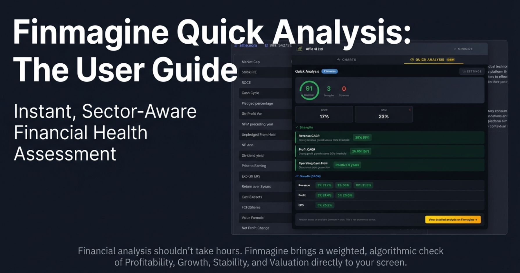
This tutorial teaches you how to use the Quick Analysis feature in Finmagine Chart Builder to get instant, expert-level financial health assessments for any company on Screener.in. No more drowning in spreadsheets—get a 0-100 health score in seconds.
What You'll Learn:
- The Health Score System: Understanding the 0-100 composite score and what each color range means
- The Four Core Pillars: ROE, Debt/Equity, Revenue Growth, and Operating Margin—the vital signs every investor must track
- Sector Intelligence: Why banking analysis differs from IT, and how the tool automatically adjusts
- CAGR Analysis: 3-year, 5-year, and 10-year growth trends that reveal the company's trajectory
- Customizable Thresholds: Conservative, Moderate, and Aggressive presets for different investment philosophies
- Strengths & Concerns: Instantly identify what's working and what's risky
Why Quick Analysis is Different:
- Screener.in Exclusive: Requires 10+ years of comprehensive financial data
- Sector-Aware: Banking and NBFC get different rules than IT or Manufacturing
- Client-Side Processing: Your data never leaves your browser—100% private
- Instant Results: No waiting for cloud servers—analysis happens in milliseconds
Why This Matters:
- Filter Faster: Say "no" to weak companies in seconds, not hours
- Focus Your Research: Spend time only on companies that deserve deep analysis
- Align With Your Style: Value investors and growth seekers can customize thresholds
- Sector Context: A 1.97% ROC is terrible for IT but might be acceptable for infrastructure
Watch the Complete Tutorial
Follow along with this comprehensive video demonstration of the Quick Analysis feature with real company examples.
Video Title: Instant Stock Health Check: Analyze Any Company's Financial Strength in Seconds
Complete demonstration covering health scores, sector analysis, CAGR trends, and customizable thresholds
Listen to the Audio Deep Dive
Prefer to listen? This comprehensive audio exploration covers the Quick Analysis philosophy, sector intelligence, and practical investor workflows.
Duration: Full tutorial | Format: Conversational deep dive with examples
Comprehensive audio exploration covering the health score algorithm, sector-specific analysis, and investment strategy alignment
Test Your Knowledge
Click any flashcard to reveal the answer. Use the search box to find specific topics. 50 questions covering everything from basics to advanced sector analysis.
Quick Analysis transforms complex financial data into an instant, actionable health score
The Problem: Drowning in Financial Data
You know the feeling. You hear about a company—maybe a hot tip from a colleague, or a product you love, or a ticker scrolling on the news. That little spark of opportunity hits. You fire up the browser, navigate to a financial website, load the company page and... BAM!
You hit the wall. Rows and rows of spreadsheets. Ten years of balance sheets. Profit and loss statements. Cash flow from operations, investing, financing. Ratios you haven't thought about since that one economics elective in college. It's like staring at the matrix code, but instead of enlightenment, you just get a migraine.
The Paradox of Modern Investing
We live in an era where data accessibility is at an all-time high. You can get the quarterly report of a small manufacturing company in rural India just as fast as Apple's 10K filing. But here's the paradox: we aren't starving for data anymore—we're drowning in it.
The question is no longer "Can I find the numbers?" It's "What do the numbers mean, and can I figure that out before my coffee gets cold?"
What You'll Learn
- How the 0-100 health score is calculated and what each color means
- The four core financial metrics every investor must track
- How sector intelligence prevents false positives and false negatives
- Using CAGR trends to spot companies losing momentum
- Customizing thresholds for your investment philosophy
- A practical workflow for faster, smarter company screening
Prerequisites
- Extension Installed: Finmagine Chart Builder v2.0+ from Chrome Web Store
- Browser: Chrome, Edge, or Brave (Chromium-based)
- Platform: Screener.in (Quick Analysis requires comprehensive financial data)
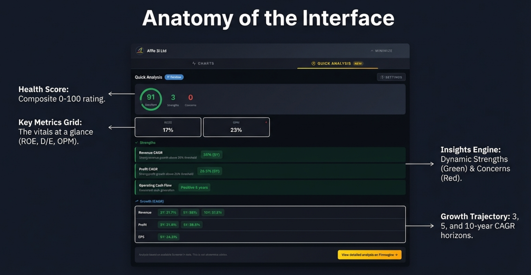
The Health Score: Your First Impression
The very first thing you see when opening Quick Analysis is a single number—the Health Score. For a strong company, it might be 91 out of 100. For a struggling one, maybe 36. No jargon, no complicated formulas. Just one score that immediately tells you the story.
The color-coded health score provides instant readability: Green signals strength, Red signals danger
Color-Coded Health Tiers
| Score Range | Color | Interpretation |
|---|---|---|
| 80-100 | Green | Excellent financial health—the gold standard |
| 60-79 | Light Green | Good health, a B+ or A- company—solid but not perfect |
| 40-59 | Yellow | Average—caution flag, some concerns present |
| 20-39 | Orange | Below average—significant concerns, flashing warning light |
| 0-19 | Red | Poor health—stop and investigate immediately |
What Goes Into the Score?
This isn't a random "vibe check" or black box. The health score is calculated using a transparent, weighted algorithm:
| Category | Weight | What It Measures |
|---|---|---|
| Profitability | 30% | ROE, ROCE, Operating Margins—is the company making money? |
| Growth | 25% | Revenue and Profit CAGR over 3, 5, and 10 years |
| Stability | 25% | Debt/Equity, Interest Coverage, Cash Flow consistency |
| Valuation | 20% | Price-to-value attractiveness relative to growth |
The Points Mechanism: How Each Signal is Scored
Under the hood, the algorithm starts at a neutral baseline and adjusts up or down for every signal it detects across the company's financials:
| Trigger | Points |
|---|---|
| Starting baseline (neutral) | 50 |
| Each strength identified (strong ROCE, consistent CFO, low debt, etc.) | +5 |
| Each concern identified (declining margins, high debt, negative FCF, etc.) | −7 |
On top of the per-signal adjustments, additional bonus points are awarded when the company hits sector-specific performance thresholds:
| Achievement | Bonus Points |
|---|---|
| Revenue CAGR meets sector target | +8 |
| Profit CAGR meets sector target | +8 |
| ROE above sector threshold | +10 |
| ROCE above sector threshold | +8 |
| Multiple years of positive Cash Flow from Operations (CFO) | +10 |
| Positive Free Cash Flow (FCF) | +5 |
| Zero debt (fully debt-free company) | +10 |
| Manageable, low debt | +5 |
The Four Core Metrics: Vital Signs for Investors
Underneath the health score, you'll find a compact grid showing the four metrics that really matter. Think of these as the vital signs of a company—the blood pressure, heart rate, temperature, and oxygen levels of the corporate body.
The four metrics that tell you whether a company is healthy at a glance
Metric 1: Return on Equity (ROE)
Is the company using your money effectively? Think of it as the "bank interest rate" on the money invested in the company. If you put a dollar into a savings account, you might get 4-5% back. ROE tells you what return the company is generating on shareholders' equity.
Metric 2: Debt to Equity (D/E)
How much risk is the company taking on? This measures leverage—how much of the company is funded by debt versus actual ownership. High debt is like a high mortgage: it's fine as long as you have income, but if things go wrong, you're in trouble.
Metric 3: Revenue Growth
Is the company growing its sales? Pretty straightforward—is the pie getting bigger? A company with stagnant revenue is at best treading water.
Metric 4: Operating Margin
Core profitability. Before the accountants get creative with taxes and depreciation, is the company actually making money on what it sells? This is the lie-detector of the income statement.
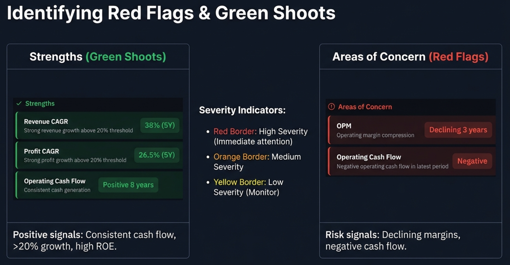
Strengths & Areas of Concern: Your Triage System
The Quick Analysis dashboard doesn't just give you scores—it highlights specifically what's working and what's broken. This is your triage system for investment research.
The difference is stark: a healthy company (left) vs one facing challenges (right)
Strengths Section
Green-highlighted items that indicate positive characteristics:
- High profitability ratios
- Strong growth trends
- Low debt levels
- Positive cash flows (e.g., "Consistent positive 8 years")
- Consistent dividend payments
Areas of Concern Section
Items flagged as potential risks, color-coded by severity:
| Severity | Border Color | Meaning |
|---|---|---|
| High | Red | Requires immediate attention—structural flaw possible |
| Medium | Orange | Notable but not a deal-breaker on its own |
| Low | Yellow | Minor concern to monitor over time |
CAGR Analysis: The Truth Serum for Growth
Averages can lie. Year-over-year growth can be volatile. But Compound Annual Growth Rate (CAGR) smooths it out. What's unique here is that the tool tracks three distinct timelines simultaneously.
| Period | What It Shows | Use Case |
|---|---|---|
| 3-Year CAGR | Recent trend | Is the company accelerating or slowing down right now? |
| 5-Year CAGR | Medium-term consistency | Is growth sustainable through a business cycle? |
| 10-Year CAGR | Long-term sustainability | What's the company's historical pedigree? |
Why All Three Matter
The Narrative Arc
A company might have a stellar 10-year record—maybe they dominated in 2015-2017. That 10-year number still looks good because of that history. But if the 3-year CAGR is zero or negative, the glory years might be over.
Conversely, a turnaround story might have a terrible 10-year average because they nearly went bankrupt seven years ago. But the 3-year CAGR is skyrocketing because new management fixed the business.
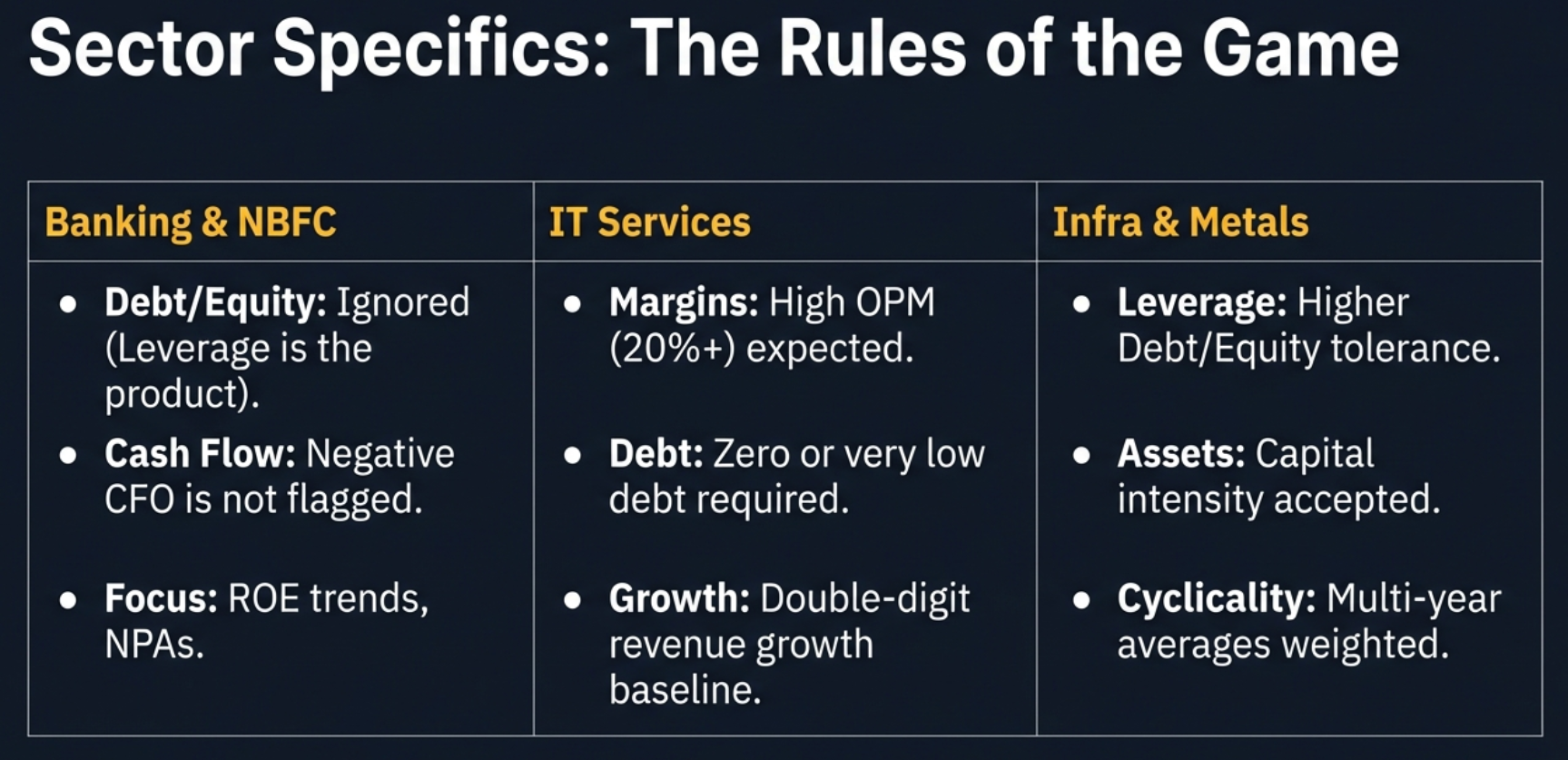
Sector Intelligence: Context is Everything
Here's where Quick Analysis becomes truly intelligent. A high level of debt might be a massive red flag for a software company, but it's totally normal for a bank. The tool knows this. It automatically adjusts its analysis based on the company's sector.
The same metrics are judged differently depending on the industry context
Banking & NBFC: The Special Case
| Metric | Standard Rule | Banking Rule |
|---|---|---|
| Debt/Equity | High D/E = Red flag | Ignored—leverage is the business model |
| Cash Flow (CFO) | Negative CFO = Concern | Not flagged—cash is "raw material" for lending |
| Focus Metrics | Standard margins | ROE Trend, NPA levels, CASA ratio |
IT Services: The Asset-Light Standard
- Operating Margins: Expected to be 20%+ (stricter than general)
- Debt/Equity: Must be very low—you shouldn't need debt to write code
- Growth: Double-digit revenue growth expected
Infrastructure & Metals: The Capital-Intensive Reality
- Debt Tolerance: Higher D/E ratios are acceptable (capital-intensive)
- Cyclicality: Multi-year averages weighted to account for boom/bust cycles
Pharma: The Innovation Factor
- R&D Spending: Factored into margin analysis (not just treated as cost)
- Patent Pipeline: Qualitative consideration in assessment
The tool supports 18 distinct sectors, each with tailored evaluation criteria
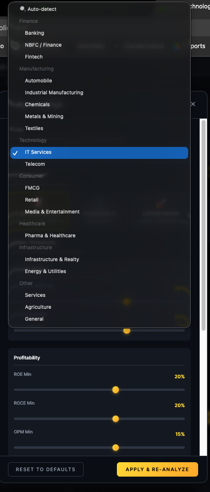
Customizing Your Analysis: Conservative, Moderate, Aggressive
Quick Analysis understands that you have a unique investment style. A value investor is looking for completely different things than a growth investor. Your analysis should reflect that.
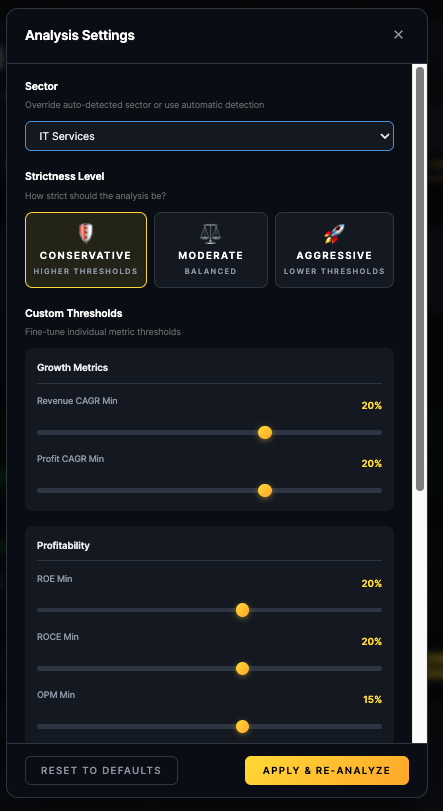
Three one-click presets instantly adjust all thresholds to match your investment philosophy
The Three Presets
| Preset | Philosophy | Best For |
|---|---|---|
| Conservative | Strict standards, higher thresholds | Value investing, blue-chip hunting, retirees protecting nest eggs |
| Moderate | Balanced approach (default) | General analysis, most investors |
| Aggressive | Lenient standards, growth-focused | Startups, turnaround stories, momentum plays |
What Changes?
Conservative Preset Example:
- Min ROE: Raised to 20% (vs 12% default)
- Max D/E: Lowered to 0.5x (vs 1.0x default)
- Min Promoter Holding: Set to 60%
- Max Pledge: Set to 5%
Result: A company that scored 65 (Good) on Moderate might drop to 50 (Average) on Conservative.
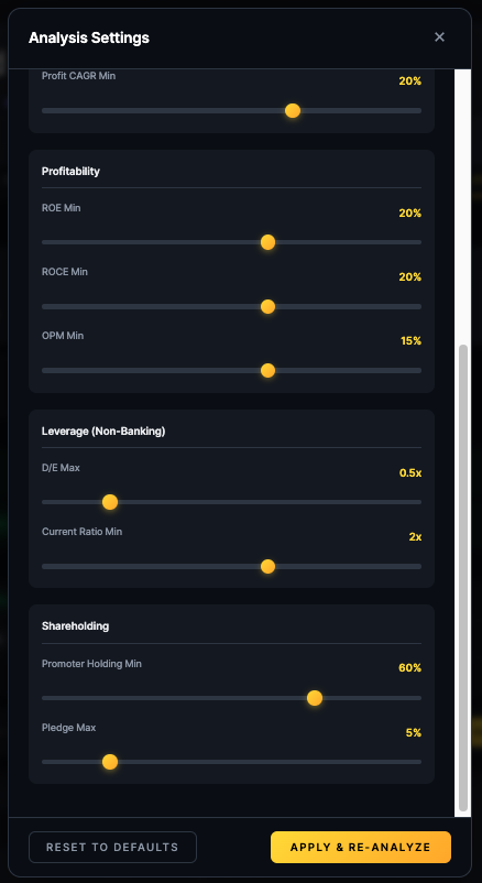
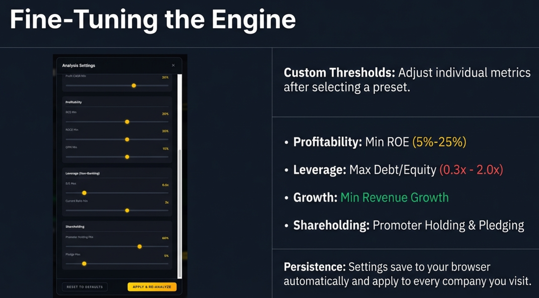
Fine-tune individual thresholds after selecting a preset
Fine-Tuning Individual Thresholds
After selecting a preset, you can manually adjust specific sliders:
- Min ROE: Range 5% to 25%
- Max D/E Ratio: Range 0.3x to 2.0x
- Min Operating Margin: Range 5% to 25%
- Min Revenue Growth: Range 5% to 30%
Your Investor Workflow: Putting It All Together
Let's synthesize everything into a practical, repeatable workflow for your research sessions.
The 7-Step Quick Analysis Workflow:
- Open Screener.in and navigate to a company page
- Click the Finmagine button (bottom-right) and select "Quick Analysis" tab
- Verify the sector—is the tool applying the right rules?
- Look at the Health Score—Green, Yellow, or Red?
- Scan the Concerns section—look for red borders and declining trends
- Check CAGR trends—is the 3-year better or worse than 10-year?
- Adjust settings if needed—Conservative for safety, Aggressive for growth
This entire workflow takes about 30 seconds once you're comfortable with it. The goal: say "no" faster so you can spend more time on the companies that actually deserve deep analysis.
A repeatable process for faster, smarter stock screening
Real-World Analysis: The Good, The Bad, The Context
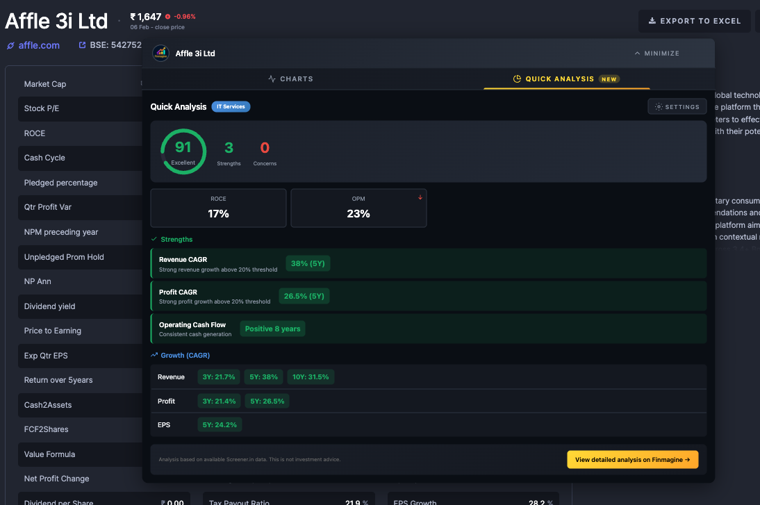
Example 1: The High Performer (Score: 91)
A green circle, three strengths, zero concerns—the valedictorian of stocks
Looking at a high-scoring company:
- Revenue CAGR (5Y): 38%—the company quintupled in half a decade
- Profit CAGR (5Y): 26.5%—growth isn't just vanity, it's profitable
- Operating Cash Flow: Positive for 8 consecutive years—the business model works
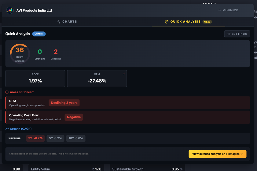
Example 2: The Struggler (Score: 36)
Orange circle, zero strengths, two concerns—a company facing serious challenges
A different story entirely:
- ROC: 1.97%—you'd literally be better off with a savings account
- OPM: Negative 27.48%—losing money on every sale, before taxes
- Hidden trap: 5-year revenue growth looks positive (8.2%), but 3-year is much lower—growth is slowing
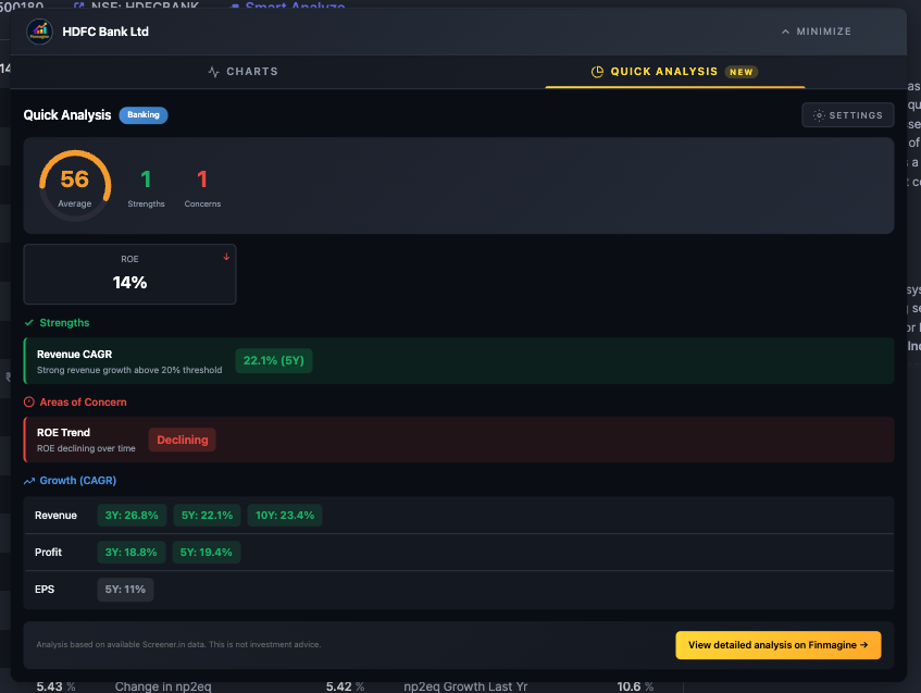
Example 3: The Banking Context (Score: 56)
A major bank with average score—declining ROE trend dragged it down
Even a giant bank can show as "Average" if its efficiency is declining:
- The tool correctly ignored the bank's high debt (it's deposits, not real debt)
- But it flagged declining ROE trend as a high-severity concern
- Strong revenue growth (22.1%) wasn't enough to overcome the efficiency decline
Troubleshooting Common Issues
Problem: Quick Analysis tab not appearing
- Quick Analysis is Screener.in only—it won't appear on Google Finance
- Ensure you're on a company page (URL contains
/company/) - Refresh the page and reopen the panel
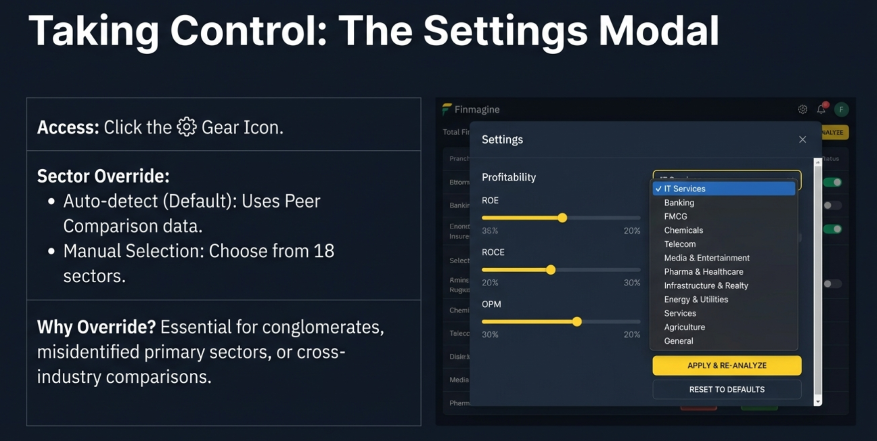
Problem: Sector shows wrong industry
- Check the "Peer Comparison" section on Screener.in—that's where the extension reads sector
- Use Settings > Sector dropdown to manually override
- Common with conglomerates and multi-segment companies
Problem: Health score seems too low/high
- Try a different strictness preset
- If analyzing a startup, switch to "Aggressive" preset
- If analyzing blue-chips with suspiciously high scores, switch to "Conservative"
Problem: "Insufficient data" for long-term metrics
- Newer companies/recent IPOs won't have 10 years of data
- The tool will show 3-year and 5-year data if available
- This is expected behavior, not a bug
Problem: Settings not saving
- Ensure browser allows localStorage
- Check for privacy extensions blocking storage
- Don't use incognito mode—settings won't persist
The Power of the "No Faster" Philosophy
This tool doesn't tell you what to buy. It's not a stock picker. It doesn't predict the future. What it does is tell you the quality of what you're looking at right now.
The advantage in modern investing belongs to the person who can filter information the fastest. The question is no longer "Can I find the data?"—it's "Can I trust my filter?"
Your Challenge
Go to your favorite "safe" stock. The one you think is invincible. The one you've owned for years. Put Quick Analysis on Conservative mode. See if it stays green.
You might be surprised. That company you love might just be "average" when you look at it through a really strict lens. A stress test for your portfolio.
Key Takeaways
- One Score: 0-100 health score gives you instant first impression
- Four Pillars: ROE, D/E, Revenue Growth, Operating Margin—the vital signs
- Sector Intelligence: Banking, IT, Pharma, Infrastructure all get different rules
- CAGR Trends: 3Y vs 10Y reveals momentum direction
- Customizable: Conservative for safety, Aggressive for growth
- Private: All analysis runs client-side—your data stays with you
Ultimately, a tool like this transforms financial analysis from something that feels like a chore into a process of discovery. It gives you the power to screen companies quickly, focus your research where it matters, and make more informed decisions.
So the only question left is: what are you going to discover first?
Want to Visualize Financial Charts Too?
Quick Analysis is just one part of the Finmagine Chart Builder. Learn how to create professional financial charts from Screener.in and Google Finance.
Screener.in Tutorial → Google Finance Tutorial →Free Chrome Extension
Ready to try this yourself?
Install the Finmagine Financial Chart Builder and transform any Screener.in, Google Finance, or stockanalysis.com page into interactive charts in one click.
Install from Chrome Web Store →No account required • Works on Chrome, Edge, Brave, Opera
Explore the Complete Chart Builder Hub
Discover all Chart Builder resources — tutorials, case studies, Quick Analysis, and more. Transform financial data into professional charts and instant health checks.
Visit Chart Builder Hub →