🌟 Finmagine Portfolio Manager — Now on the Chrome Web Store
Multi-broker tracker: Indian & global stocks, MFs, ETFs • Decision Journal, History Chart, Corporate Actions • Free
🎙 Multimedia Learning Hub
7 per-AC chart types + 5 Overview charts — when to use each, what each reveals — 25 interactive flashcards
What You Will Learn
The Charts tab in Finmagine Portfolio Manager is not a decoration. Each chart type was designed to answer a specific question about your portfolio that numbers alone cannot surface. This guide walks through every chart — what it shows, what question it answers, and when to use it in your portfolio review workflow.
- Composition, P&L, XIRR
- Journey, Brokers/Platforms
- Sector Invested, Sector Profit
- By Class: Now, By Class: Cost
- All: P&L, All: XIRR
- All: Journey
- Row 1: chart type chips
- Row 2: broker/platform scope
- Lazy render on click
- One chart at a time
- Re-renders on price refresh
- Prices unavailable → invested ₹ fallback
Video Walkthrough — Coming Soon
A video walkthrough of all chart types with a real portfolio will be published at launch.
Audio Deep Dive — Coming Soon
Audio guide coming at launch.
Test Your Knowledge — 25 Flashcards
Click any card to reveal the answer.
Table of Contents
How the Charts Tab Works
Charts in Finmagine Portfolio Manager are designed around two principles: on-demand rendering and zero blank charts.
On-demand: Charts are not pre-computed and cached. When you click a chart type chip, the chart renders from the current state at that moment. The previous Chart.js canvas instance is destroyed and a new one renders. This prevents memory leaks and ensures you always see the current portfolio state.
Zero blanks: If live prices are not yet loaded (first open, before a refresh), the extension falls back to invested ₹ as the chart value. The Composition chart shows your allocation by cost, not current value. The P&L chart shows zero P&L lines rather than nothing. You never see a broken or empty chart.
The Charts tab also re-renders automatically when you press ⟳ Refresh and prices update, if the Charts tab was the last active tab. Your visual view of the portfolio updates immediately alongside the numbers.
The 7 Per-Asset-Class Chart Types
These 7 chart types are available for Indian Equities, Global Equities, Indian MF, and Global Funds. (Sector charts require sector data from Screener.in and are only available for IN_EQ. IN_MF and GL_MF show "Platforms" instead of "Brokers".)
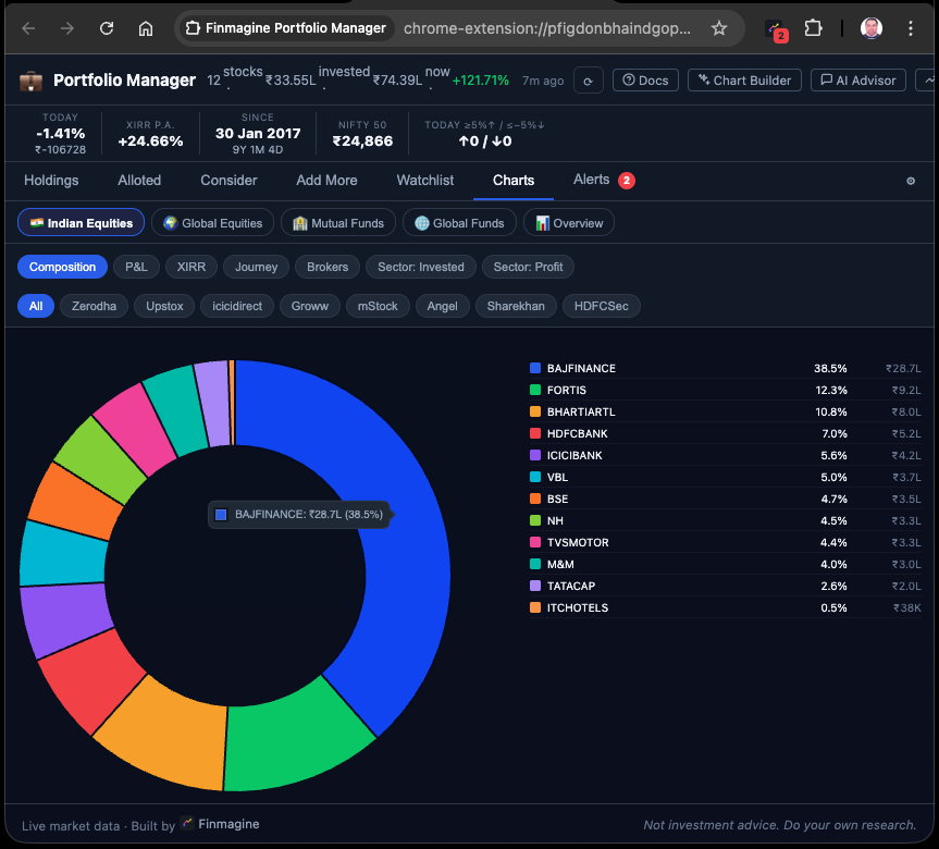
Composition Donut
Question: What am I concentrated in?
Shows current portfolio value (₹) by stock, as a donut chart with the top 10 holdings labeled and smaller positions grouped into "Others (N)". If prices are unavailable, falls back to invested ₹ by stock.
When to use: Start every portfolio review here. High concentration (>20% in one stock) is immediately visible. If the top slice is dominant, check if it is intentional conviction or unintended drift from a runner.
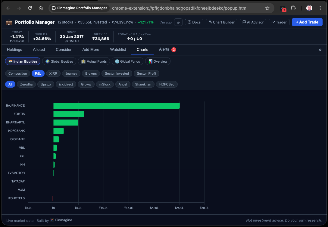
P&L
Question: Who are my winners and losers?
Horizontal bars sorted descending by absolute ₹ P&L. Green bars extend right (profit), red bars extend left (loss). The chart makes the scale of wins and losses immediately comparable — a stock up +50% on ₹20,000 vs a stock up +8% on ₹5,00,000 are very different ₹ outcomes.
When to use: When you want to see where the money is actually being made and lost in absolute terms, not percentage terms. A 3% loss on a ₹10L position is a ₹30,000 loss. The bar chart makes this visceral.
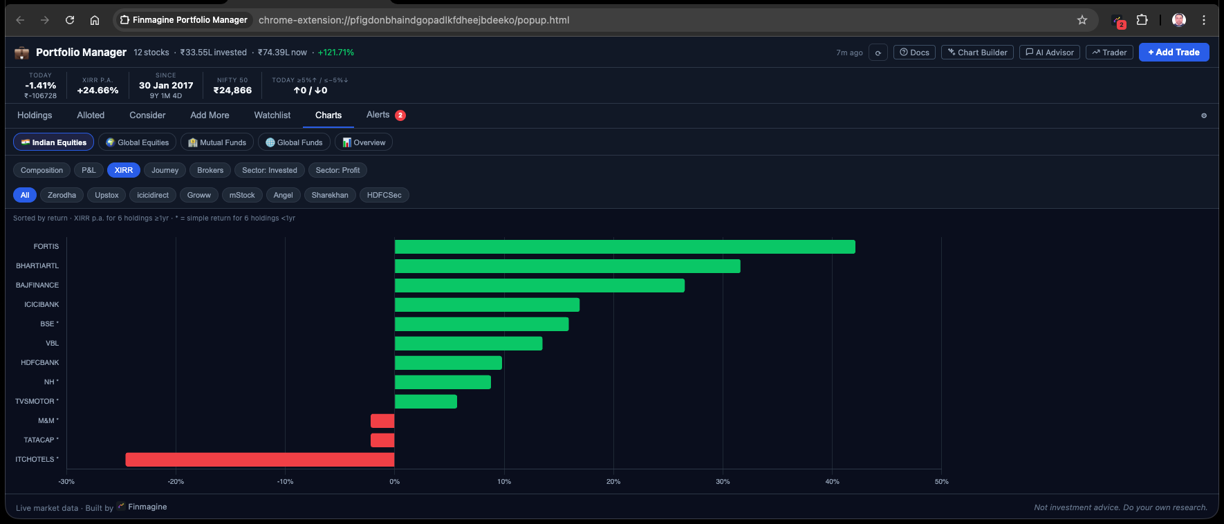
XIRR
Question: What are my best and worst annualised returns?
Horizontal bars sorted descending by XIRR%. Only holdings with at least 1 year of history are included (younger holdings have unreliable annualised rates). A note is shown when holdings are excluded for this reason.
When to use: Portfolio quality audit. Your top XIRR stocks are your best capital allocations. Your bottom XIRR stocks are where capital is compounding most slowly. Cross-reference with Index Beat to identify which low-XIRR stocks are also below-index-return holdings.
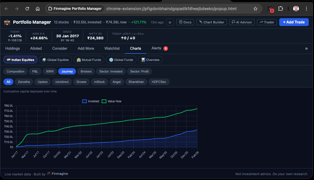
Journey Area Chart
Question: How did I deploy capital over time?
An area chart showing cumulative invested ₹ by calendar month from your first trade to today. Two lines: Invested (cost, stacked over time) and Value Now (current worth of those investments). The gap between the lines represents your total unrealised gain.
When to use: To understand your investment pace and capital deployment pattern. Were you investing steadily or in lumpy batches? Did you invest more during the COVID crash or the 2023-24 rally? The Journey chart makes your deployment story visual.
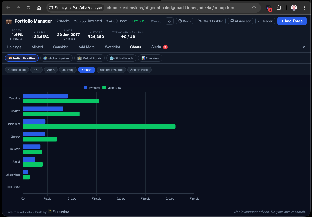
Brokers / Platforms
Question: How is my money distributed across brokers, and how is each broker performing?
A grouped bar chart with one group per broker (or platform for MF/GL_MF). Each group has two bars: invested ₹ (dark) and current value ₹ (light). The taller the light bar relative to the dark bar, the better that broker's portfolio is performing. The scope row is hidden for this chart type (it shows all brokers by definition).
When to use: When you want to understand your per-broker capital exposure and relative performance. If you suspect your Groww portfolio is performing differently from your Zerodha portfolio, this chart makes it visual in seconds.
Sector Invested Donut
Question: What sectors am I exposed to by ₹ deployed?
A donut chart showing total invested ₹ by sector (from Screener.in fundamentals data). Requires sector data to be loaded — the extension fetches sector/industry from Screener.in for every new stock entered and caches it for 90 days.
When to use: Sector concentration check. If 40% of your invested capital is in Banking and 30% in IT, a sector-specific headwind (RBI policy, global tech sell-off) could affect a large portion of your portfolio simultaneously. The sector chart surfaces this risk.
Sector Profit Donut
Question: Which sectors are driving my gains?
A donut chart showing total unrealised P&L ₹ by sector. Requires both prices and sector data. Only shows sectors with positive P&L (loss-making sectors are excluded from the profit donut and noted separately).
When to use: After viewing Sector Invested, compare with Sector Profit. If Capital Goods is 15% of your invested allocation but 35% of your profits, it is punching above its weight. If IT is 25% of your allocation but only 8% of your profits, it is a drag on sector-adjusted returns.
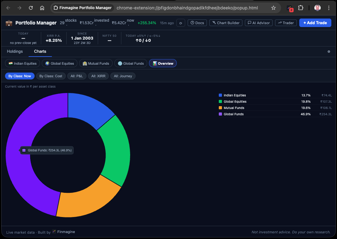
The 5 Overview Charts — Cross-Asset-Class Analytics
When you switch to the Overview pill (📊), the Charts tab shows 5 special chart types that aggregate across all 4 asset classes simultaneously. All USD values are converted to ₹ at your configured FX rate.
| Chart | Type | Question It Answers |
|---|---|---|
| By Class: Now | Donut | How is my overall portfolio value split across IN_EQ, GL_EQ, IN_MF, and GL_MF? |
| By Class: Cost | Donut | How is my invested capital split across the 4 asset classes? |
| All: P&L | Horizontal Bar | Which individual holdings (across all asset classes) have made or lost the most in ₹? |
| All: XIRR | Horizontal Bar | Which individual holdings (across all ACs) have the best and worst annualised return? |
| All: Journey | Area Chart | How has total capital deployment (across all 4 ACs, in ₹) built up over your full investment timeline? |
The "All: XIRR" Overview chart is particularly powerful: it ranks every individual holding across all 4 asset classes by annualised return. A Fidelity mutual fund (GL_MF) competing alongside TITAN (IN_EQ) alongside SBI Bluechip (IN_MF) on a single bar chart gives you a true cross-asset quality view of your capital allocation.
The 5-Minute Weekly Chart Review Workflow
Here is a practical weekly chart review sequence using the 12 chart types:
- Composition (IN_EQ) — Is any single stock drifting above 20% of my Indian equity portfolio by value?
- Sector Invested (IN_EQ) — Is any sector above 35% of deployed capital? If yes, is this intentional?
- P&L (IN_EQ) — What are the biggest ₹ losers? Cross-reference with Alerts tab — are any already in breach?
- XIRR (IN_EQ) — Any holdings below 8% XIRR that are also negative on Index Beat? Flag for rotation review.
- Journey (ALL) — In Overview, has capital deployment been healthy or have I been sitting on cash?
- By Class: Now (ALL) — Has the cross-AC allocation drifted from my intended mix?
This sequence takes about 5 minutes and answers every major portfolio health question visually. The Holdings numbers tell you the "what". The charts tell you the "so what".
Finmagine Portfolio Manager — Article Series
📚 8-Article Series
- 1
- 2
- 3
- 4You are here: The Portfolio Charts Playbook
- 5
- 6
- 7
- 8
Finmagine Portfolio Manager
Per-broker stop-loss discipline, live prices, XIRR, Index Beat, Charts — for Indian Equities, US Stocks, Mutual Funds & Global ETFs. Local-first portfolio tracking, optional cloud backup.
Learn More about Portfolio Manager →