Following along? Install Finmagine Trader first
Free NSE momentum scanner — no account needed • Chrome, Edge, Brave
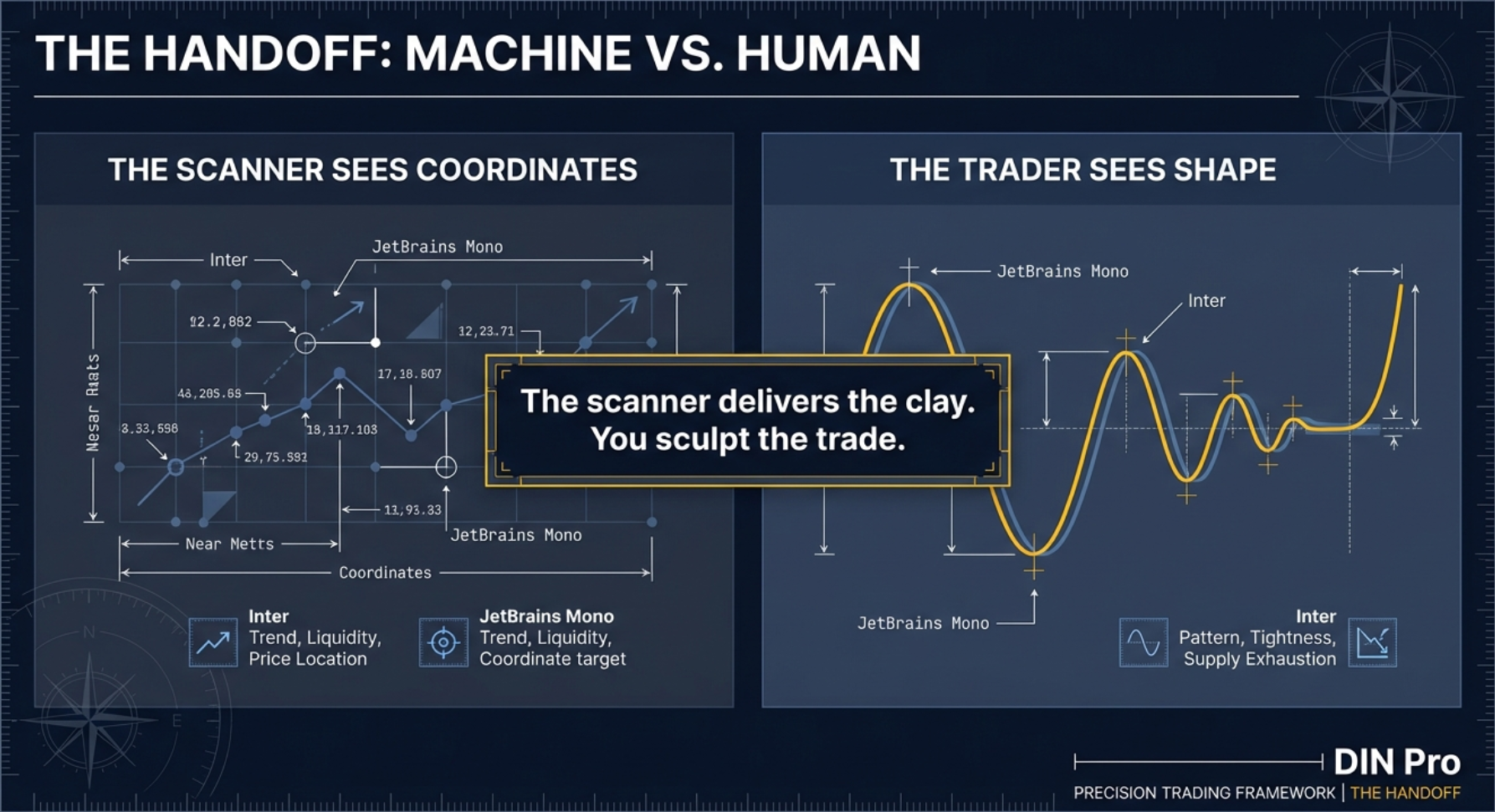
Multimedia Learning Hub
Master the Volatility Contraction Pattern for Indian small-caps — coiled spring mechanics, all eleven scanner conditions decoded, visual audit techniques, execution playbook, and 61 interactive flashcards
VCP Breakout: The Complete Framework for Indian Small-Caps
Mark Minervini's Volatility Contraction Pattern is among the most studied pre-breakout patterns in momentum trading. Before the most explosive stock moves, the price range compresses in successive bases — each smaller than the last — before an expansion on above-average volume. Think of it as a steel spring being compressed: the more tightly it is squeezed, the more explosive the release when it finally lets go. Finmagine Trader's VCP tab quantifies all the criteria for every NSE small-cap, delivering the candidate list in one click.
- Successive contracting price bases
- Supply absorbed by institutions
- Volume dry-up in final base
- Breakout on expanding volume
- Within 25% of 52W High
- Above 52W Low (sanity check)
- Price ₹100 – ₹3,000 band
- Market Cap ≤ ₹30,000 Cr
- Golden Alignment (3 SMA rules)
- RSI(14) > 50
- Volume > 50,000 shares
- Positive daily session
- Non-F&O, non-ETF only
- Lower free float
- Faster supply exhaustion
- Asymmetric % moves
- Cleaner non-F&O volume signal
The VCP Breakout Scanner Playbook — Watch
Watch the complete VCP Breakout Scanner Playbook: coiled spring mechanics, supply absorption, Parle-G biscuit factory analogy, all scanner conditions decoded, visual audit techniques, and the full execution workflow from candidate list to trade trigger.
Title: "The VCP Breakout Scanner Playbook | Find Explosive Stocks Before They Move"
Audio Deep Dive: VCP Breakout Scanner Playbook
This deep dive covers: the needle-in-haystack problem — coiled spring mechanics and supply absorption — the Parle-G biscuit factory analogy for supply exhaustion — all five scanner gates decoded — Visual Audit: Basketball Rule, Volume Truth Detector, and Lifetime High Anomaly — the Execution Playbook with pivot point, stop placement, and the Free Ride technique.
VCP Breakout Scanner Playbook — Audio Deep Dive
Ideal for commute or post-market review
Test Your Knowledge — VCP Breakout Analysis — 61 Flashcards
Click any card to reveal the answer. Search by topic to focus on a specific area. All 61 flashcards cover every key concept — from Minervini's background and the three VCP elements to each scanner condition, the visual audit rules, the execution playbook, and the Free Ride technique.
Mark Minervini and the Volatility Contraction Pattern
Mark Minervini won the US Investing Championship in 1997 with a 155% return for the year — an exceptional result in a year that was good for the market overall, but not one that passively explained triple-digit returns. Over 5.5 years of competition participation, his annualised return exceeded 35%. He subsequently distilled his methodology in the 2013 book Trade Like a Stock Market Wizard, which introduced the Volatility Contraction Pattern to a broad audience of active traders.
The core observation behind the VCP was deceptively simple: before the most explosive stock moves, the stock went quiet. Price range compressed. Volume dried up. Then — on above-average volume — it broke out to new highs. Other traders had noticed similar phenomena, but Minervini was precise about the structure. It was not just one quiet period. It was a sequence: each successive consolidation base had a smaller price range than the one before it. A 25% pullback, then a 15% pullback, then a 10% pullback, then a 6% contraction. The pattern contracted systematically toward a breakout point.
"The VCP is the market's way of telling you that the smart money has already bought and the weak hands have already sold. What's left is a coiled spring."
The insight that unified this observation was supply absorption. Each pullback in the pattern represented another wave of selling — investors who bought earlier, lost patience, and sold. Institutions that had identified the stock's thesis were absorbing that selling quietly, week by week. Each successive pullback became smaller because fewer sellers remained. The supply available at current prices was being systematically removed. By the time the final contraction completed, supply was nearly exhausted. A relatively modest increase in demand was sufficient to trigger a disproportionate price move — because there were almost no sellers left to meet that demand.
When institutions build positions quietly into weakness over weeks, each pullback becomes smaller because fewer sellers remain. By the breakout, the stock is a pressure vessel with nearly all supply removed. A small increase in demand triggers a large price move because almost no supply exists to absorb it. This is the fundamental mechanism that makes VCP breakouts explosive relative to random breakouts.
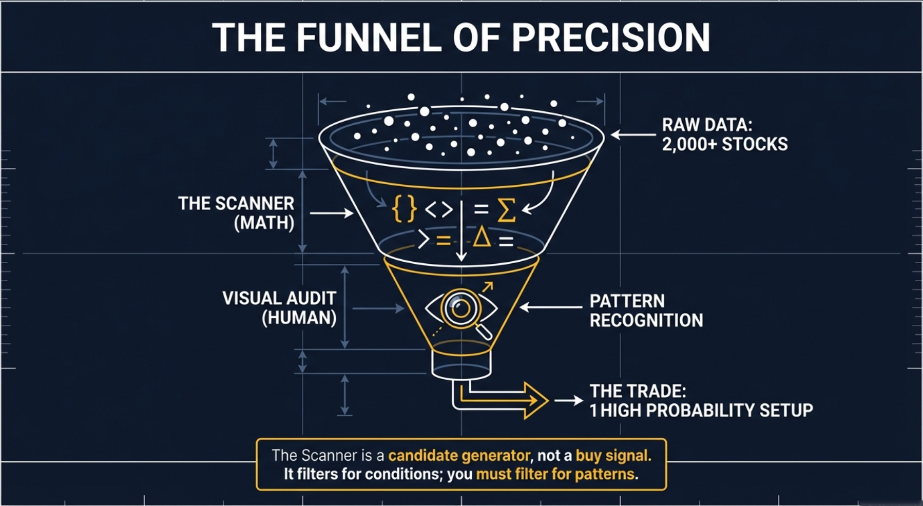
This is why the VCP is not simply about a stock being near its highs. It is about the specific process that brought it there — a measurable compression of volatility over successive bases that indicates systematic institutional accumulation rather than coincidental price drift. The pattern structure is the evidence of the process. And in a universe of 2,000 to 3,000 listed NSE stocks, maybe 20 at any given time are genuinely coiled springs. Finding them manually would take days. The scanner finds them in seconds.
The Coiled Spring — Why VCP Setups Are Different
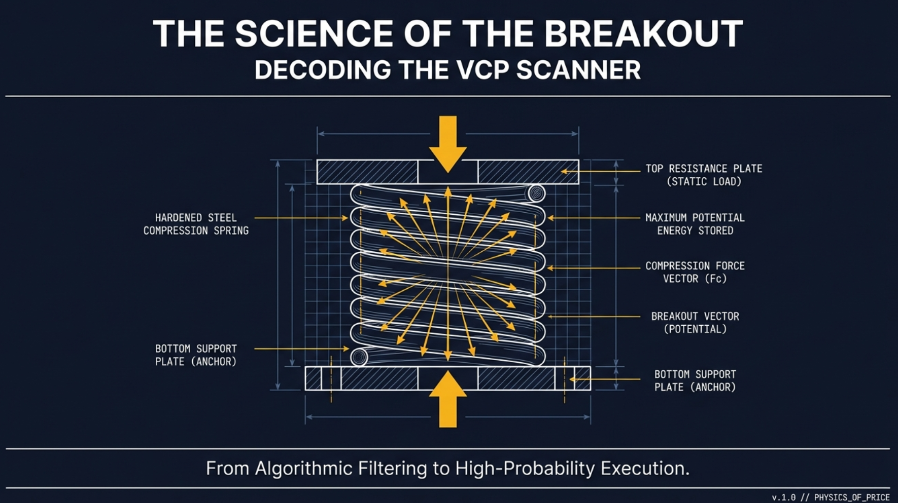
Consider a steel spring. When relaxed, it contains zero potential energy. You can see its full length and judge its size easily. Now compress it. Push the coils together until the spring is half its original height. It looks smaller. It appears less impressive. But it is now loaded with potential energy — a compressed weapon. The moment you release the compression, that stored energy converts instantly to kinetic energy in a burst far more powerful than anything the spring could produce in its relaxed state.
This is precisely what is happening during a Volatility Contraction Pattern. The stock's price range is the spring. Each successive base — tighter than the last — is another turn of compression. The stock is not going sideways out of weakness. It is being compressed by deliberate institutional accumulation. And the more that spring gets squeezed, the more explosive the release is going to be when it finally lets go.
"We want compression BEFORE we buy, not action. A compressed spring looks smaller and less interesting than a fully extended one — but it has far more power stored inside. The moment most traders notice a VCP is the moment after the release, when the move is mostly done."
This is why the counterintuitive instruction — do not buy a stock as it is actively moving; wait for it to consolidate and compress — is actually the correct one. Most traders are drawn to motion. They want to see momentum, news, analyst upgrades, price action. But the best time to enter a VCP candidate is during the quiet phase before the motion — specifically, just as the compression completes and the breakout trigger fires.
The key distinction between a VCP and a random sideways consolidation is that the VCP's compression is systematic and progressively tighter. Random sideways trading produces inconsistent ranges. Distribution patterns produce gradually widening ranges (selling pressure increasing, not decreasing). Only genuine accumulation produces the precise progressive narrowing that defines the VCP — smaller base after smaller base, until the spring is fully loaded.
At any given time, 2,000–3,000 stocks trade on NSE. Of these, maybe 20 are genuinely coiled springs — VCPs with properly formed contracting bases, exhausted supply, and imminent breakout potential. Finding them manually would require reviewing hundreds of charts daily — a full-time job. The mathematical scanner solves the needle-in-haystack problem: it applies all eleven conditions simultaneously across the entire market and returns only the candidates that pass every filter. This is the Funnel of Precision: 2,000+ stocks to ~20 candidates in one click.
Supply Absorption — The Parle-G Factory Analogy
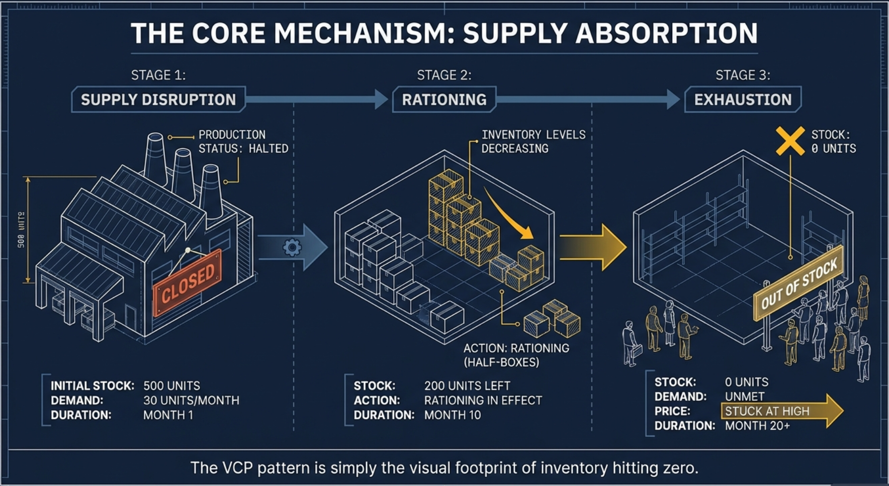
To understand why VCP breakouts can produce such dramatic price moves, it helps to step away from stock charts for a moment and think about something everyone in India understands: Parle-G biscuits.
Imagine a Parle-G biscuit factory serving a city. The supply chain works in four phases:
The factory runs at full capacity. Warehouses are full. Distributors have large stocks. The corner kirana shop has ten packets on the shelf. Price: standard market rate. Supply is plentiful, demand is steady, price is stable.
The factory breaks down. New stock stops arriving. Warehouses begin depleting. Distributors start receiving fewer shipments. The shop gets two packets instead of ten. Price: starting to firm up. Fewer sellers at old prices.
Distributors start hoarding what stock remains. They stop selling at old prices — holding out for higher prices. Shop has one packet on the shelf. Same number of customers walking in every day. Price: rising noticeably. Supply is becoming scarce.
One packet left in the city. Ten buyers want it. The price goes vertical. Not because Parle-G biscuits suddenly taste better. Not because a new biscuit review went viral. Purely because supply evaporated. Supply is gravity. Remove gravity, things float up.
In the Parle-G analogy, prices skyrocketed not because the biscuits tasted better — purely because supply evaporated. Supply is gravity. Remove gravity and things float up. In the stock market, each VCP pullback is a wave of weak-hand selling being absorbed by institutional buyers. Each absorbed wave leaves fewer sellers in the market. By the time the final contraction completes, the stock is in Phase 4 — supply is nearly exhausted. Even a modest wave of new buyers sends price vertical because there are almost no sellers left at any price near current levels.
Connect this directly to the VCP chart structure. The first pullback (the largest base) is Phase 2 — supply is disrupted as the first wave of weak hands sells. Institutions absorb it quietly. The second base is Phase 3 — supply is rationing; fewer sellers at lower prices. The final tight contraction is Phase 4 — supply exhaustion. Volume dries up because there is almost no one left to sell. The price seems to "get stuck" at the high level — not because buyers are desperate, but because sellers have run out of shares to sell. The moment a catalyst or simply institutional demand steps in, price goes vertical through the breakout level because there is nothing to stop it.
The "price stuck" signal is one of the most reliable signals in supply absorption logic. When a stock sustains its price at a high level for days or weeks without pulling back significantly despite mediocre volume, that is not indecision. That is evidence that sellers have been exhausted. The supply is gone. The coiled spring is fully loaded.
The Three Elements of a Classic VCP
A classically formed VCP has three measurable, observable elements. Each can be confirmed on a price chart. Together they constitute the pattern — none alone is sufficient.
Multiple Bases
At least 2–3 successive consolidation periods, each smaller than the last. Each base represents another wave of weak-hand selling absorbed by institutions. A single consolidation is a rest. Multiple contracting consolidations are the pattern. Typically 2 to 4 contractions are visible on a clean VCP chart.
Volatility Contraction
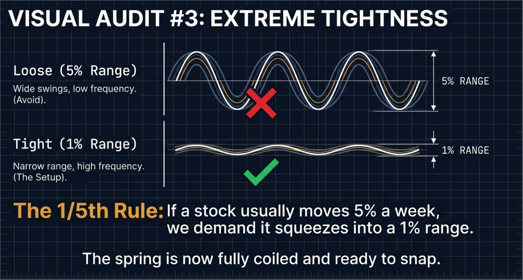
Each base has a measurably smaller price range than the preceding one. This is the "VC" in VCP. Quantified: range of base 2 < base 1, range of base 3 < base 2. The contraction must be observable, not inferred. A useful reference: if a stock's typical weekly range is 5%, that range should be squeezing toward 1% in the final base — the "1/5th Rule."
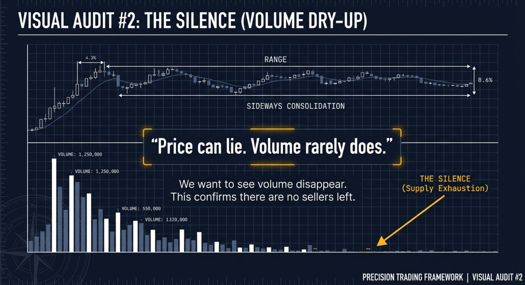
Volume Dry-Up
During the final contraction, volume drops to its lowest levels in weeks or months. This is "Silence" — the ghost town. Sellers are exhausted. When the breakout occurs on expanding volume, it confirms that institutions have stepped in decisively against the minimal remaining supply.
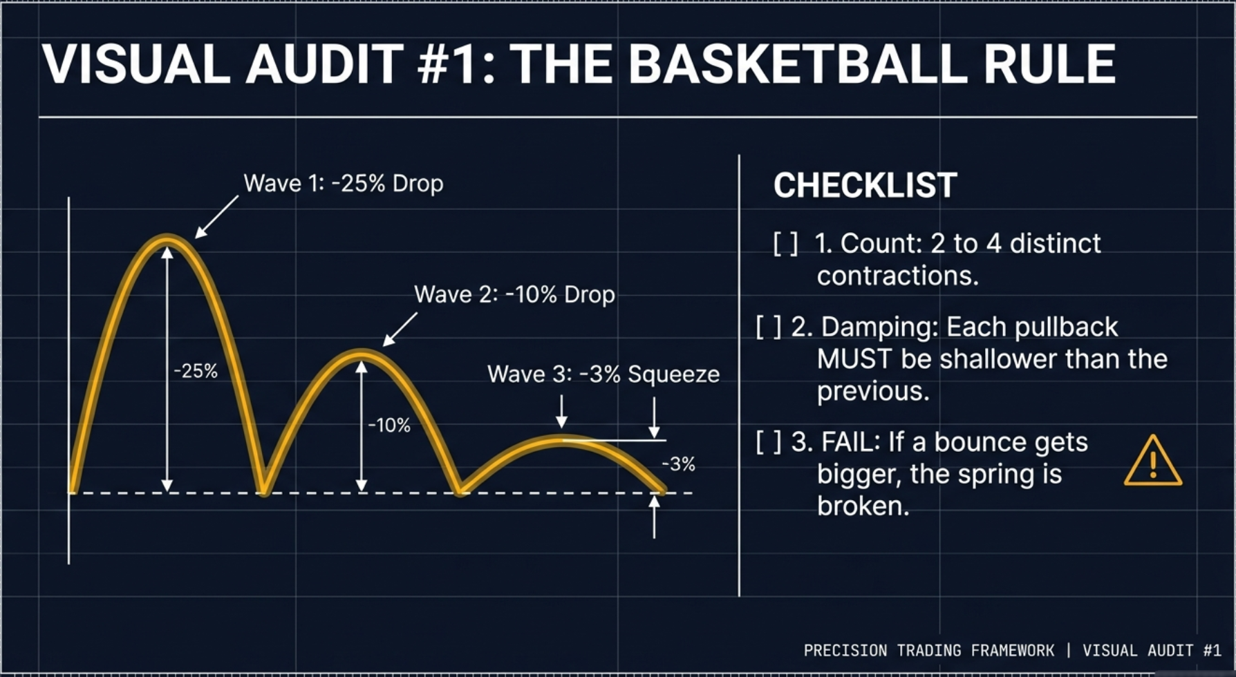
A quick mental model for checking whether successive bases are genuinely contracting: drop a basketball from shoulder height. Bounce 1 reaches your waist. Bounce 2 reaches your knee. Bounce 3 reaches your ankle. Then it rolls flat. That is the correct progressive diminution. In a VCP, T1 might be a 20% pullback, T2 a 10% pullback, T3 a 3–4% pullback — each wave noticeably smaller than the last. If the waves are getting bigger instead of smaller, that is a megaphone pattern — a loose cannon, not a coiled spring. Delete it from your list immediately. The full Visual Audit section covers this in depth below.
A stock at or near its 52-week high without successive contracting bases is not a VCP. Near-high price position is a necessary condition for the scanner criteria but is not the pattern itself. The pattern is the structure — the sequence of contracting consolidations visible on the chart. Many stocks in the VCP tab will be near their highs without having a classically formed contracting pattern visible. The scanner confirms the quantitative criteria; the chart confirms the pattern structure.
All 11 Scanner Conditions — Decoded in Plain English
The scanner applies eleven distinct conditions to every NSE stock. A stock must pass all of them to appear in the VCP tab. The conditions are organised into five logical gates, each encoding a specific dimension of the VCP logic. No mention is made of how the scanner is built technically — what matters is understanding what each condition checks and why it exists.
Gate 1 — The 52-Week Position Check (2 Conditions)
Close ≥ 52-Week High × 0.75 — "Stock must be in the top 25% of its annual range"
In plain English: the stock's current price must be at least 75% of its 52-week high. If the annual high is ₹200, the price must be above ₹150. The stock is in the top quarter of its yearly range — consolidating near highs, not recovering from lows.
The Head and Knees Analogy: Picture a human body. The 52-week High is the Head. The 75% level (0.75 × the annual high) is the Knees. The 52-week Low is the Feet. For a stock to qualify, its price must be standing tall — between the Knees and the Head. A stock trading below the Knees is crouching. It may be recovering, but it has not yet demonstrated the strength that precedes a VCP breakout.
Why it matters — the Overhead Supply Army: Every stock that traded at a higher price and then fell has what traders call "overhead supply" — investors who bought near the top, watched the stock fall, and are now sitting on losses. The moment the stock recovers to their entry price, they sell to break even. This creates a persistent "wall of selling" that stops rallies. The lower a stock is from its high, the larger the army of bag-holders desperate to exit at breakeven. A stock at its all-time high has zero bag-holders — every shareholder is profitable. There is zero overhead resistance. Blue sky. The 75% filter eliminates stocks that still have a substantial overhead supply army to contend with. "We don't buy stocks on sale. We buy stocks in heavy demand."
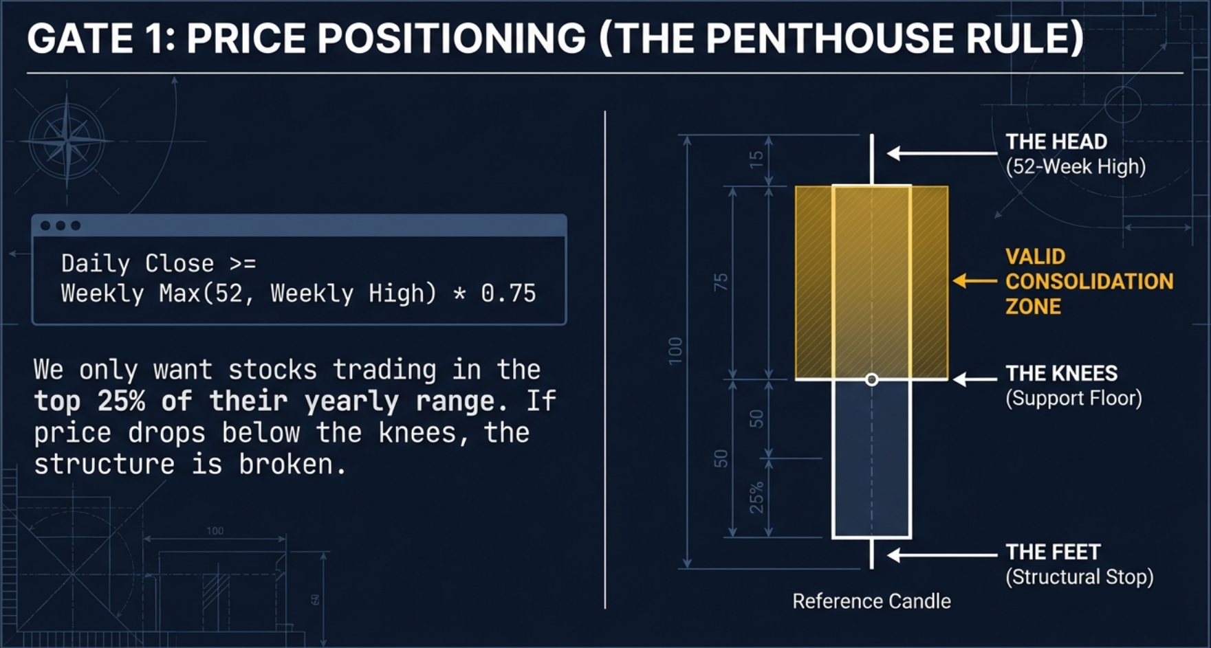
Close ≥ 52-Week Low — "Stock must be above its annual low"
In plain English: the stock's current price must be at or above its 52-week low. This is the sanity check — it eliminates stocks that are technically "near their 52-week high" because their 52-week high is only slightly above their 52-week low (i.e., a stock that has barely moved all year). Together with Condition 1, this confirms the stock has genuine range and is positioned high within that range.
Gate 2 — The Golden Alignment / Trend Stack (3 Conditions)
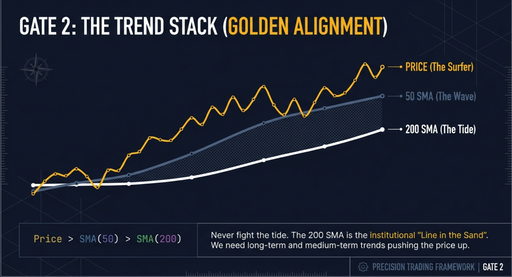
Close > SMA(200) AND Close > SMA(50) AND SMA(50) > SMA(200) — "Not just trending — properly, fully aligned"
In plain English: the stock's current price must be above both its 200-day and 50-day moving averages, AND the 50-day moving average must itself be above the 200-day. All three conditions together are called the "Golden Alignment" or Stage 2 Markup Phase. This is the trend stack — every layer of the trend is confirming the same direction.
The 200-Day SMA — Line in the Sand for Institutional Money: Many large fund mandates explicitly state in writing that they are not permitted to buy stocks trading below their 200-day moving average. This is not arbitrary — it reflects a well-established empirical observation that stocks below their 200-day tend to be in downtrends and carry higher drawdown risk. The consequence: below the 200-day SMA is a zone where the biggest buyers in the market literally cannot participate. Buying below the 200-day SMA means fishing where the big whales cannot swim. The moment a stock crosses above its 200-day SMA, it enters the zone where institutional money can and does participate. The scanner requires price above the 200-day precisely to fish where the institutional money is allowed to be.
Why all three conditions together: Price above the 50-day confirms the intermediate uptrend. Price above the 200-day confirms the macro uptrend. SMA(50) above SMA(200) confirms the Golden Cross — short-term momentum is above long-term trend. A stock where price is above both averages but the 50-day is still below the 200-day is in trend transition, not trend confirmation. The scanner requires the full trio: macro trend confirmed, intermediate trend confirmed, and the averages themselves aligned correctly.
Gate 3 — The Small-Cap Focus & Price Band (2 Conditions)
Market Cap ≤ ₹30,000 Crore — "Elephant in the bathtub, not marble in the ocean"
In plain English: the stock's total market capitalisation must be at or below ₹30,000 Crore. This is the small-to-mid-cap focus filter — the single most important structural reason why VCP breakouts produce asymmetric returns in smaller companies.
The Elephant in the Bathtub: Imagine the same ₹50 Crore buy order placed in two different stocks. In Reliance Industries (market cap ~₹18 lakh Crore), that ₹50 Crore is like dropping a marble into the ocean — imperceptible, instantly absorbed, zero impact on price. In a ₹2,000 Crore small-cap, that same ₹50 Crore is like an elephant jumping into a bathtub — the displacement is massive. In a company with ₹2,000 Crore market cap, a ₹50 Crore accumulation over several weeks represents approximately 2.5% of the entire company being taken off the market. When institutional buying removes 2.5% of available float during the VCP base formation, supply exhaustion follows quickly. On breakout, even modest retail participation finds almost no sellers and price moves sharply. We want to be in the bathtub when the elephant jumps in.

Close ≥ ₹100 AND Close ≤ ₹3,000 — "The ₹100–₹3,000 price band"
In plain English: the stock's price must be between ₹100 and ₹3,000.
The ₹100 floor: Penny stocks (stocks below ₹100) have a fundamental problem with percentage-based pattern analysis. In a ₹15 stock, a 5% price base is ₹0.75 — often within a single tick on many trading days. Bid-ask spreads as a percentage of price are wide enough to make the pattern analysis meaningless. The ₹100 minimum ensures that percentage-based criteria (a 5% base, a 2% breakout buffer) translate to meaningful absolute rupee values with reasonable bid-ask spreads.
The ₹3,000 ceiling: Very high unit-price stocks can produce distorted percentage readings in the opposite direction. The ceiling keeps the VCP tab focused on a price band where the percentage-based pattern criteria are both meaningful and practical for typical retail position sizes.
Gate 4 — The Clean Signal Filter (2 Conditions: Non-F&O + Non-ETF)
Non-F&O Stocks Only — "Volume must equal conviction, not derivatives noise"
In plain English: stocks that have Futures and Options contracts listed on them are excluded. Only cash market stocks qualify.
Why F&O volume is contaminated: In an F&O stock, institutions have multiple mechanisms to build exposure: buy futures instead of shares, sell puts to acquire shares below market, hedge existing positions by buying puts, execute cash-futures arbitrage. Every one of these activities generates volume in the underlying cash equity without any directional conviction in the stock itself. A volume surge in an F&O stock could be hedging, futures rollover, arbitrage, or options market-making. There is no way to know from the outside. In contrast, in a non-F&O cash market stock, there is only one reason to buy shares: to own them directionally. Volume equals conviction. We want to know beyond a shadow of a doubt that every share being bought is being taken permanently off the market. When volume in a non-F&O small-cap surges alongside contracting price bases, it is institutional accumulation — not derivatives noise.
ETFs Excluded — "ETFs follow index mechanics, not organic supply/demand"
In plain English: Exchange-Traded Funds are explicitly excluded from the scanner results. ETFs follow index mechanics — their price movements are determined by index weights and creation/redemption arbitrage, not by the organic supply and demand dynamics of individual companies. The entire supply absorption logic of the VCP — institutions quietly building a position, exhausting seller supply, creating a coiled spring — applies only to individual company stocks. ETFs have no equivalent dynamic to analyse.
Gate 5 — The Momentum Regime (3 Conditions)
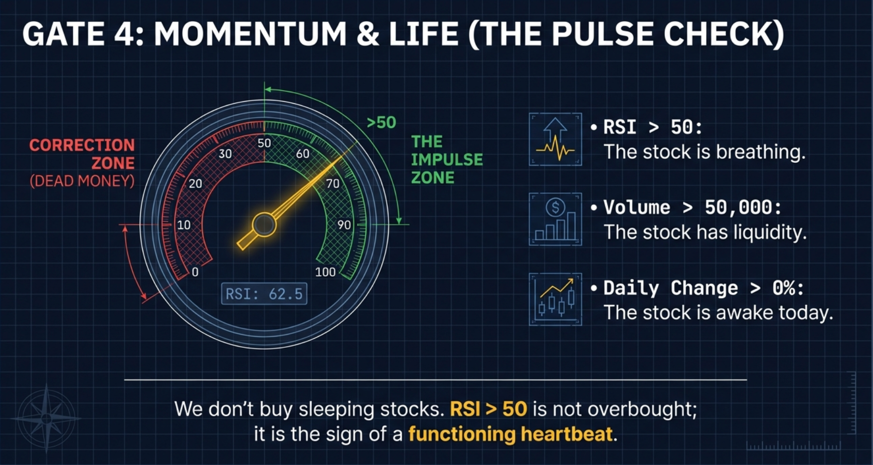
RSI(14) > 50 — "Above the equator — summer, not winter"
In plain English: the 14-period Relative Strength Index must be above 50. RSI 50 is not a high bar — it is the equator of momentum.
The RSI Equator: Think of RSI 50 as the equator dividing the world. Below 50 is the Southern Hemisphere — winter, sleeping, correction territory. Stocks below RSI 50 are in momentum deterioration. Above 50 is the Northern Hemisphere — summer, waking up, accumulation territory. The scanner requires RSI above 50 because a stock consolidating near its highs with RSI below 50 is showing internal weakness — the consolidation is distribution (institutions selling to retail buyers), not accumulation. This is NOT an overbought signal. Overbought starts at RSI 70. RSI above 50 simply means that of the last 14 periods, more were positive than negative — the baseline confirmation that internal momentum is tilted upward. The scanner is not looking for reversals. It is looking for continuation — stocks already in the upside momentum regime, building a coiled spring within that regime.
Volume > 50,000 Shares & Daily % Change > 0
Volume > 50,000 shares: The minimum liquidity floor. Stocks trading fewer than 50,000 shares daily are micro-cap illiquid names where a trader cannot execute even a modest position without causing significant market impact. This is not a signal filter — it is a practical execution prerequisite.
Daily % Change > 0 (Positive Session): The stock must be green on the current trading day. This eliminates stocks that are drifting sideways-to-down even when near their annual highs. A VCP candidate should be actively participating — accumulation is ongoing, buyers are present, the stock is not fading. A flat or negative day signals that buying interest is temporarily absent, even if all other conditions are met.
All 11 Conditions — Master Reference Table
| Gate | Condition | Plain English | Why It Exists |
|---|---|---|---|
| Gate 1 | Close ≥ 52W High × 0.75 | Top 25% of annual range | Eliminates overhead supply army; requires blue-sky positioning |
| Gate 1 | Close ≥ 52W Low | Above annual low | Sanity check; confirms genuine range and positioning |
| Gate 2 | Close > SMA(200) | Above macro trend | Institutional money can participate above the 200-day |
| Gate 2 | Close > SMA(50) | Above intermediate trend | Intermediate uptrend intact; not in correction phase |
| Gate 2 | SMA(50) > SMA(200) | Golden Cross confirmed | Full trend alignment; not transitional, fully confirmed |
| Gate 3 | Market Cap ≤ ₹30,000 Cr | Small/mid-cap only | Elephant in bathtub; same capital = larger % supply removal |
| Gate 3 | Close ≥ ₹100 | Above penny stock threshold | Bid-ask spreads meaningful; pattern % analysis reliable |
| Gate 3 | Close ≤ ₹3,000 | Below high unit-price cutoff | Controls for distortion in very high priced names |
| Gate 4 | Non-F&O stocks only | Cash market only | Volume = conviction; no derivatives contamination |
| Gate 4 | Non-ETF only | Individual companies only | ETFs have no organic supply/demand to analyse |
| Gate 5 | RSI(14) > 50 | Above momentum equator | Distinguishes accumulation from distribution masquerading as base |
| Gate 5 | Volume > 50,000 | Minimum liquidity floor | Ensures executable position size without market impact |
| Gate 5 | Daily % Change > 0 | Green on the day | Active participation; buyers present today |
All eleven conditions confirm quantitative eligibility. They do not confirm that a classically formed VCP is visible on the chart, that volume has genuinely dried up in the most recent base, or that the breakout is imminent. The scanner reduces 2,000+ stocks to ~20 candidates. Human visual audit — the next step — is what separates genuine setups from statistical false positives.
Why Small-Caps? The Asymmetric Reward Logic
Large-cap VCPs exist. They can be well-formed and technically valid. But they rarely produce the same percentage moves as small-cap VCPs — and the reason is structural, not coincidental. It comes down to free float, institutional accumulation mechanics, and what happens when supply is finally exhausted.
In a ₹5 lakh Crore market cap company, an institution allocating ₹500 Crore to build a position is buying 0.01% of the company. That buying is absorbed by the vast supply available at every price level. The accumulation footprint is minimal. When the breakout comes, there is still enormous supply overhead from the millions of investors who hold shares. The move is capped.
In a ₹2,000 Crore market cap company, an institution allocating ₹50 Crore to build a position is buying approximately 2.5% of the entire company. That buying over several weeks, spread across the price range, systematically removes supply. By the time the position is built, a meaningful fraction of the available float has been absorbed. On breakout, even moderate retail buying encounters almost no supply — and price moves sharply because there are very few sellers left at any price near the breakout level.
| Dimension | Small-Cap VCP | Large-Cap VCP |
|---|---|---|
| Market cap range | ₹500 Cr – ₹30,000 Cr | > ₹30,000 Cr (no limit) |
| Expected move % | 15% – 60%+ on clean setups | 5% – 20% typical |
| Institutional accumulation impact | High — removes meaningful % of float | Low — absorbed by deep float |
| Liquidity for entry/exit | Lower — use limit orders only | Higher — market orders workable |
| F&O status typical | Non-F&O (cleaner volume signal) | Often F&O (noisier volume) |
| Volume signal purity | High — volume = directional conviction | Low — derivatives contaminate signal |
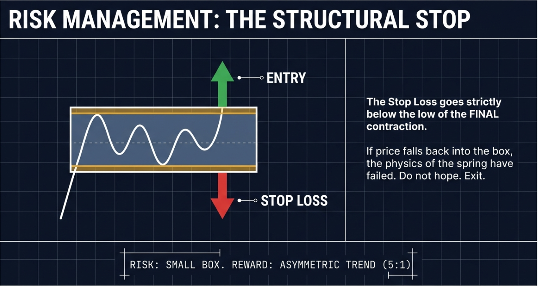
In a clean small-cap VCP, a typical entry is near the pivot with a stop 4% below. The typical target on a clean setup is 20% above entry — a 5:1 reward-to-risk ratio. In practice, this means a trader can be wrong four times in a row (losing 4%, 4%, 2%, 4% = 14% total) and still recover to profitability on a single winner (+20%). This is why asymmetric reward-to-risk is not just a preference — it is a mathematical necessity for a sustainable trading strategy.
The asymmetry works both ways. Small-caps have wider bid-ask spreads, lower daily liquidity, and sharper moves in both directions. Use limit orders on entry — market orders on low-liquidity small-caps often result in executions significantly above the intended price. Accept wider stops as a percentage of price than you would on large-caps, and compensate by sizing positions proportionally smaller. The reward-to-risk may be 3:1 or 5:1, but the absolute risk per share must be managed carefully.
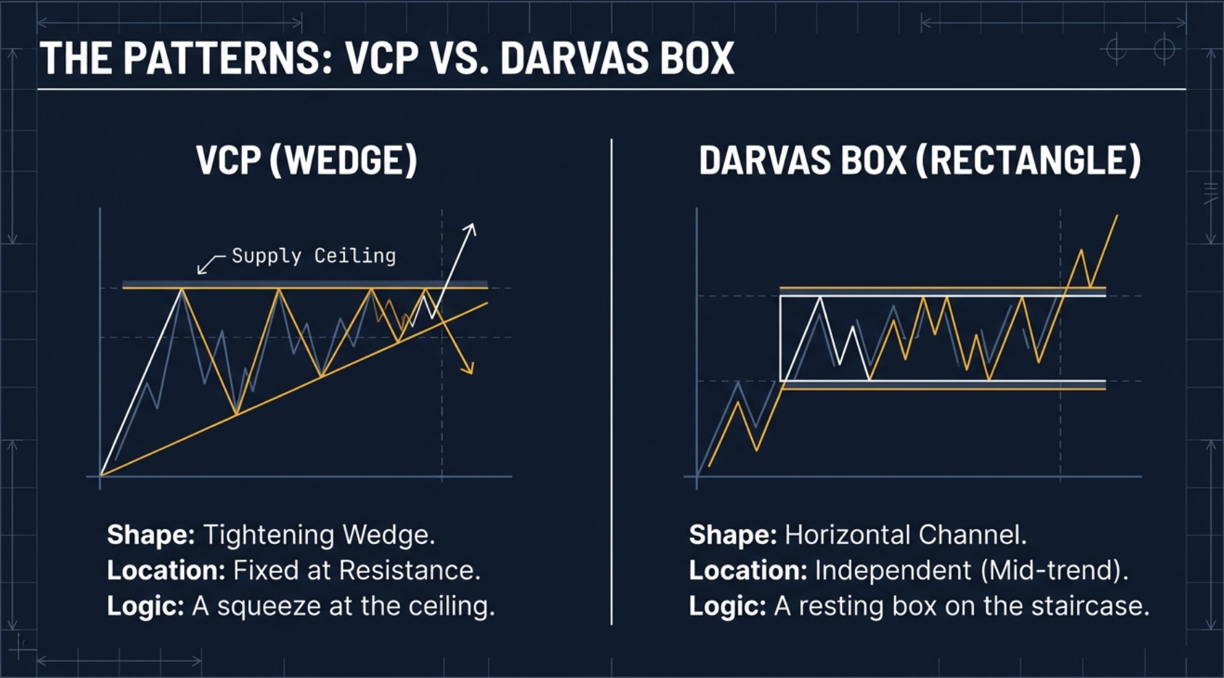
VCP vs Darvas Box — Two Different Pattern Languages
The Volatility Contraction Pattern and the Darvas Box are often mentioned together in discussions of pre-breakout consolidation patterns. Both represent supply compression before a move. Both produce tightness in price. But they are geometrically different, location-dependent in different ways, and biased differently in terms of trade direction.
The VCP (Minervini, 2013) is shaped like a wedge or triangle that progressively narrows. The price range gets tighter with each successive base. Critically, the VCP must form below a key resistance or supply area — it is location-specific. A VCP forming in the middle of a downtrend is not an opportunity; it is a continuation trap. The pattern carries a bullish bias only — we buy the upper breakout. The stop goes below the low of the final base.
The Darvas Box (Nicholas Darvas, dancer-turned-trader) is shaped like a rectangle — price ping-pongs between a clear floor and a clear ceiling. The box can form anywhere in a trend: at the bottom of a recovery, midway through a move, or near the top. It is location-independent. And it carries a bidirectional bias: if price breaks through the ceiling, buy; if it breaks through the floor, sell or go short. Both outcomes are valid trade signals in the Darvas framework.
| Dimension | VCP (Minervini) | Darvas Box (Darvas) |
|---|---|---|
| Shape | Wedge / triangle (progressively narrowing) | Rectangle (flat box, consistent floor and ceiling) |
| Pattern structure | Each base smaller than the previous | Price bounces between defined floor and ceiling |
| Location requirement | Must form below key resistance (location-specific) | Location-independent — anywhere in trend |
| Directional bias | Bullish only — buy the upward breakout | Bidirectional — buy upper break, sell lower break |
| Stop-loss placement | Below the low of the final (tightest) base | At the opposite side of the box (below floor for long) |
| Named after | Mark Minervini, 2013 book | Nicholas Darvas, dancer turned trader |
"Both the VCP and the Darvas Box represent a coiled spring — tightness equals potential energy. But they look different geometrically and appear in different locations. The VCP is a wedge that must sit directly below resistance for the supply absorption logic to apply. The Darvas Box is a rectangle that can appear anywhere. Knowing which pattern you are looking at changes where you place your stop, how you interpret the breakout, and whether you consider a bearish resolution as a trade or a failure."
The Visual Audit — What the Scanner Cannot See
The scanner is a mathematical filter. It can see numbers: closing prices, moving averages, RSI values, market capitalisation, volume counts. What it absolutely cannot see is the shape of the consolidation, the quality of the contraction, or whether the stock has a structural anomaly that makes the setup unsound. The scanner is blind to structure. That is why the visual audit — the human review layer — is not optional. It is the step that separates a genuine coiled spring from a statistical false positive.
There are three specific things to check during the visual audit. Each catches a different category of false positive.
Visual Audit Step 1 — The Basketball Rule
Drop a basketball from shoulder height. The first bounce reaches your waist. The second reaches your knee. The third reaches your ankle. Then it rolls flat. Each successive bounce is noticeably smaller than the previous one — this is the energy dissipating progressively.
On the VCP chart, this translates directly: T1 might be a 20% pullback, T2 a 10% pullback, T3 a 3–4% pullback. Each wave noticeably smaller than the last. This is what you are looking for on the chart — the progressive diminution.
If the pullback waves are getting bigger with each successive base — T1 is 10%, T2 is 15%, T3 is 20% — that is a megaphone pattern, also called a broadening formation. It is the opposite of a coiled spring. It is a loose cannon. It indicates increasing volatility, not decreasing. It is not accumulation — it is confusion and disagreement between buyers and sellers with neither gaining control. Remove it from your list immediately, regardless of how well it passes the mathematical scanner conditions.
Visual Audit Step 2 — The Volume Truth Detector
Volume is the Truth Detector of technical analysis. Look at the volume bars on the far right of the chart during the final contraction base. They must be dead — well below the 20-day average volume. Ghost town. The quieter the better. This is what supply exhaustion looks like on the volume axis: sellers have run out of shares to sell, so there is almost no one offering stock. The market is waiting.
If price is forming a tight range but volume is HUGE during the final base, that is NOT a coiled spring. That is churn — big buyers and sellers fighting invisibly inside the tight range. Institutions accumulating, other institutions distributing simultaneously. The outcome is uncertain. You do not know who is winning. This is not a safe entry. Only when volume dries up to ghost-town levels during the tight phase does it confirm that sellers have genuinely exhausted their supply. Volume drying up = empty warehouse = breakout potential. Wait for the silence before the storm.
Visual Audit Step 3 — The Lifetime High Anomaly
The scanner picks up stocks that are near their 52-week highs. Occasionally, this includes a stock that has been rocketing straight up to its all-time high without any consolidation at all — a vertical move that has only just arrived at the high. This is a trap.
Extension: The stock has been running straight up for weeks or months without pausing. The chart is nearly vertical as it reaches the high. This stock is "extended" — it has exhausted its near-term fuel supply. Buying an extended stock is boarding a train that is already moving at full speed. The risk of a sudden violent reversal (profit-taking by those who rode the entire move) is high. A 10%–20% correction from the extended high would not be unusual — and if you bought at the top, you absorb all of it.
Preparation: The stock ran up significantly, then stopped and rested at or near the high, building a contracting base. The consolidation is the preparation — the supply absorption process running. We want to be at the station when the train is loading passengers, not chasing it down the tracks after it has already departed. Look for preparation, not extension.
The Execution Playbook — From Candidate to Trade
The scanner has done its job. The visual audit has confirmed the setup. Now comes the execution: converting a chart confirmation into a precisely defined trade with a specific entry price, stop level, and target. This is not a discretionary judgment call — it is a protocol.
VCP Breakout Blueprint — Complete Execution Framework
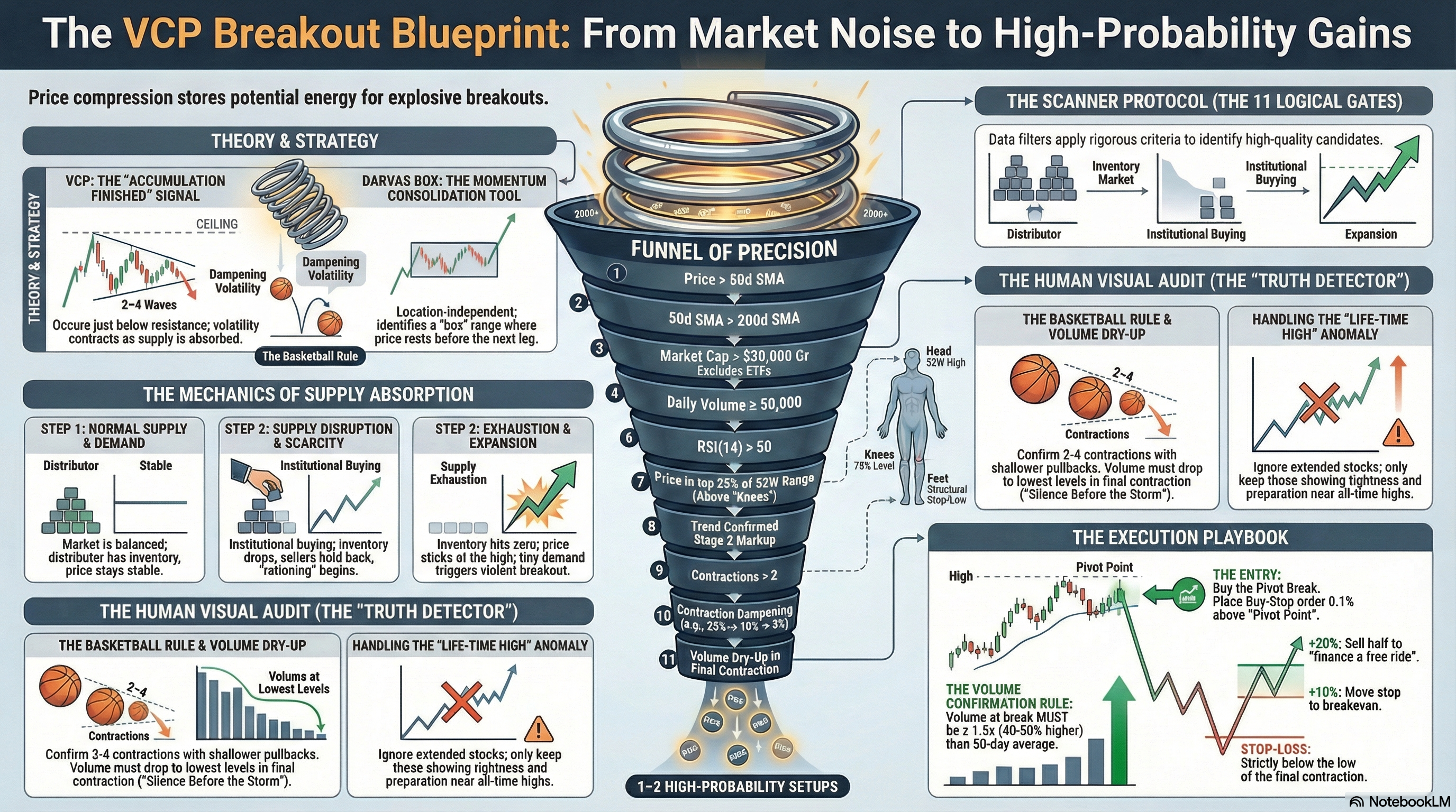
Step 1 — Identify the Pivot Point
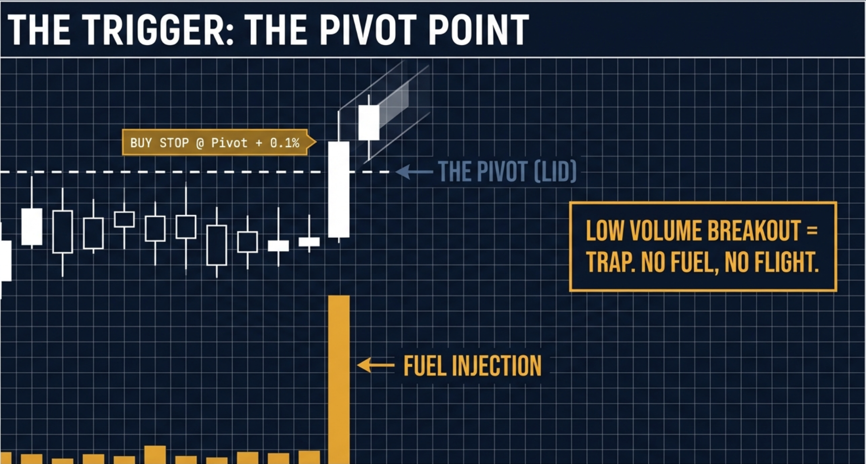
The pivot point is the absolute high of the final, tightest contraction base. Not the 52-week high. Not the current price. Not the high of the pattern overall. The high of the most recent, smallest base — the final compression before the release. This is your breakout level.
In a small-cap VCP, a few rupees of difference in pivot identification can mean the difference between a confirmed breakout and a false trigger. Mark the exact high of the final base on your chart. This is the line in the sand. Below it, you wait. Above it, you act.
Step 2 — Place the Buy-Stop Limit Order
Do not buy inside the base. Buying inside the contraction base is entering before supply absorption is confirmed as complete. The entire premise of the VCP execution is that the breakout itself — price clearing the pivot — is the confirmation signal.
Place a buy-stop limit order just above the pivot point with a small buffer of 0.1%–0.2%. Example: if the pivot is at ₹102, place the order at ₹102.20. This buffer ensures that the breakout has genuinely triggered before you are pulled in. The beauty of this approach: if the market ignores the stock and it never triggers, your order never fills and you have zero cost. If buyers rush in and the breakout fires, momentum itself pulls you into the trade at a controlled price.
Step 3 — Volume Confirmation
On the breakout day, volume must be at least 1.5 times the 20-day average volume. This is the institutional footprint. When institutions step in to buy the breakout, they move size — volume spikes. A breakout on below-average or average volume is a potential trap: retail buyers pushing price up with no institutional support. The move is likely to stall and reverse.
If price clears the pivot but volume is only at or below the 20-day average, do not enter. This is a squat — price is moving up but without the institutional backing that sustains a VCP breakout. Wait for volume. If the next day volume surges and price holds above the pivot, that is a belated confirmation. If price falls back below the pivot on continued low volume, the breakout has failed and the setup is no longer valid.
Step 4 — Stop-Loss Placement
The stop-loss must be placed strictly below the low of the final contraction base. This is the logic: if the pattern thesis was correct — that supply was absorbed and institutions accumulated — then price should not fall back below the level it was already trading at during the final base. If it does, the thesis is wrong. The supply absorption was incomplete, or worse, the pattern was distribution masquerading as accumulation. Exit without hesitation.
Example: pivot at ₹102, final base low at ₹98, stop at ₹97.90. Risk: approximately 4% from entry. Target at 2:1 reward-to-risk minimum = ₹110 (20% above entry on a 5:1 target). Define all three numbers before placing the order.
Step 5 — The Free Ride Technique (The Harvest Rule)
The Free Ride is the trade management rule that converts 20% trades into potential multi-baggers without the psychological cost of watching a winner turn back to breakeven.
When the stock reaches +20% from entry (the Harvest Rule): sell 30%–50% of your position at the open to bank profits. Simultaneously, move the stop-loss on the remaining shares to your exact entry price (breakeven). You have now locked in a guaranteed profit on the sold portion. On the remaining shares, the worst case is now breaking even at entry. You literally cannot lose money on this trade anymore. You are playing with house money.
Fear causes retail traders to sell winners too early. "I'm up 15%, I should lock it in." The Free Ride eliminates the fear by making the worst-case zero (breakeven). When you cannot lose, you can hold. And holding a genuine institutional VCP breakout through its natural extension — sometimes 60%, 100%, or 200% from the pivot — is how 20% trades turn into life-changing trades. The Free Ride technique is the structural bridge between short-term trading and long-term compounding.
The complete asymmetric math at work: risk 4% on entry, harvest 30–50% at +20%, run the remainder at breakeven stop toward a 60%–200% potential target. Even in a scenario where the trade only reaches the harvest level and then reverses to breakeven on the remainder, the net result is a meaningful positive return on the full initial position. And when the trade extends, the upside is uncapped.
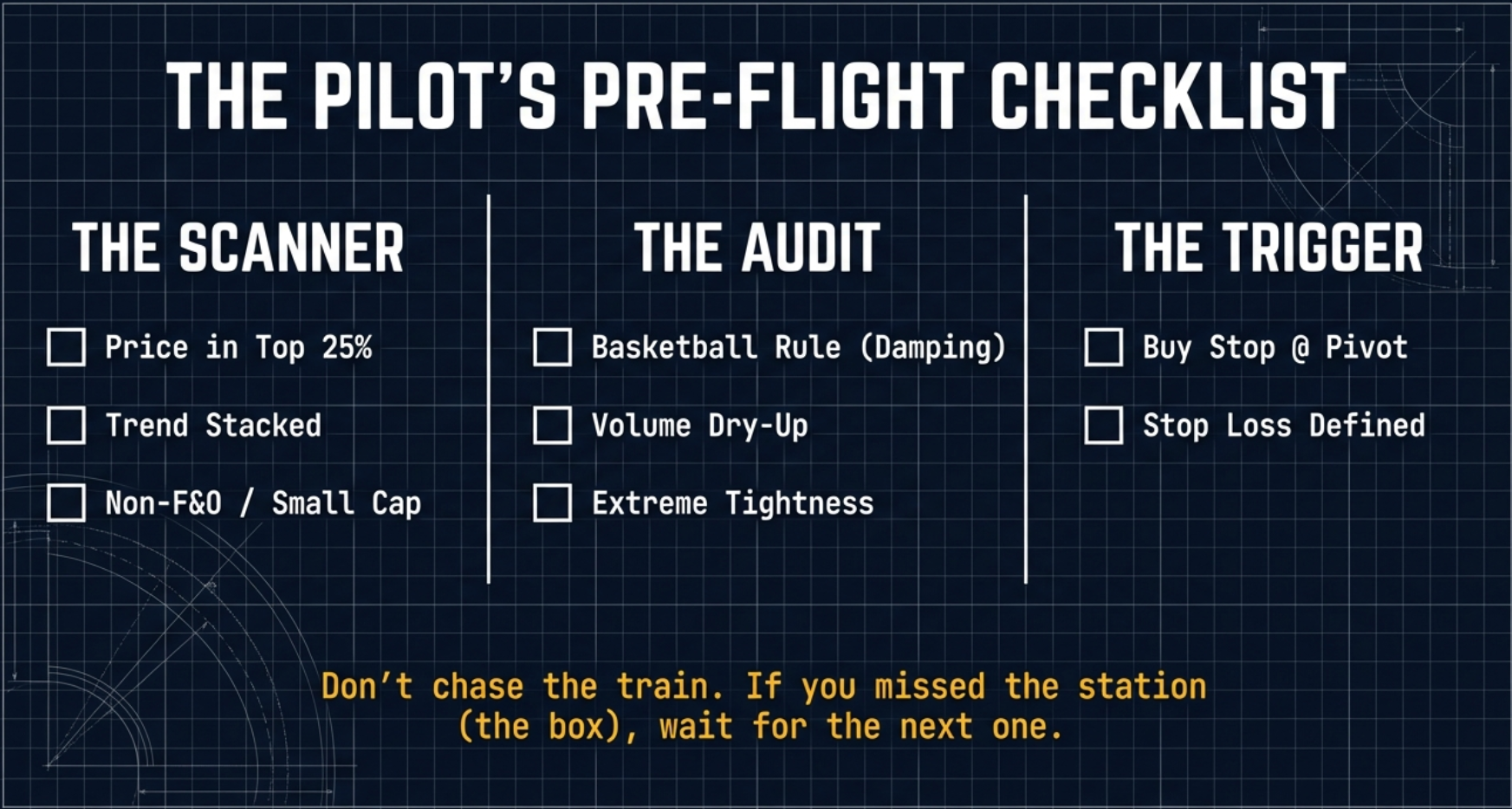
From VCP Tab to Trade Setup — The Morning Workflow
The scanner finds the coiled spring. The visual audit confirms its tension. The execution protocol converts confirmation into a live trade. Here is how these three phases connect into a practical pre-market morning workflow.
Sort by Score
Open the VCP tab in Finmagine Trader. Sort by Score descending. A Score of 3–4 means the stock qualifies for multiple tabs simultaneously — VCP criteria confirmed, Stage 2 uptrend intact, near its 52-week high, or high volume. Higher Score = broader signal confluence. Start your visual audit with the highest Score stocks first.
Confirm Pattern on Chart
For each candidate, click the TV button to open TradingView. Apply the three-step visual audit: Basketball Rule (each base smaller?), Volume Truth Detector (final base volume dying?), Lifetime High Anomaly (preparation, not extension?). Only stocks passing all three visual checks advance to Step 3.
Identify the Pivot Point
The pivot point is the high of the final (most recent, tightest) contraction base. Mark it on the chart. Place a buy-stop limit order at pivot + 0.1–0.2% buffer. Set the stop at just below the low of the final base. Calculate your 2:1 and 5:1 targets. All three numbers defined before the market opens.
Execute & Manage
Let the breakout trigger your entry — do not anticipate. Confirm volume on breakout day (≥1.5× average). At +20% gain, harvest 30–50% and move stop to breakeven. The scanner finds the spring. The chart confirms the tension. The breakout fires the release.
The scanner confirms eleven quantitative criteria. It does not confirm the chart shape, the quality of the contraction, or the imminence of the breakout. Pattern recognition on the chart is the human judgment layer between the screener result and the trade. Not every VCP tab stock will have a textbook setup. The scanner provides a mathematically filtered starting list of ~20 candidates. The visual audit narrows it to the 3–5 genuinely coiled springs worth watching for an entry trigger.
VCP vs Stage 2 — Two Different Setup Types
Finmagine Trader's VCP tab and Stage 2 tab are both momentum screeners, but they capture fundamentally different setup types. Understanding the distinction helps traders allocate their research time and size positions appropriately.
| Dimension | VCP Breakout Tab | Stage 2 Tab |
|---|---|---|
| Market cap focus | ₹30,000 Cr and below | No market cap limit |
| Typical stock count | 20–40 stocks | 100–200 stocks |
| Pattern type | Contracting base / breakout setup | Established uptrend |
| Time horizon | Positional (weeks to months) | Swing to positional |
| Risk profile | Higher (small-cap, lower liquidity) | Moderate |
| F&O exclusion | Yes — non-F&O only | No restriction |
| RSI requirement | RSI(14) > 50 | None |
| Best use | Asymmetric small-cap breakout plays | Broad momentum universe research |
A stock appearing in both the Stage 2 tab and the VCP tab — evidenced by a Score of 2 or higher — is forming a VCP pattern within a confirmed Stage 2 institutional uptrend. This combination means the macro trend is intact (Stage 2) and a specific breakout setup is forming within that trend (VCP). This is among the highest-quality setups available in the Finmagine Trader dashboard. When the VCP tab Score column shows 3 or 4, it means the stock also passes Near 52W High and/or High Volume criteria — the broadest possible confluence of signals.
Common VCP Mistakes in Indian Markets
The VCP methodology is well-documented but routinely misapplied. These are the most common mistakes observed when traders use the framework in Indian markets.
- Treating RSI > 50 as overbought. RSI 50 is the minimum positive momentum threshold, not an extended or overbought reading. Overbought in conventional analysis begins at RSI 70. A VCP candidate with RSI at 55 has only just crossed the positive threshold — it is not stretched. Many of the best VCP breakouts occur with RSI in the 55–65 range as the stock builds momentum through the base before the breakout.
- Entering before the breakout. Buying into the contraction base is buying before supply absorption is confirmed as complete. The whole premise of the VCP is that the breakout — on expanding volume above the pivot — is the signal that supply has been exhausted and institutional demand has taken over. Anticipating this by buying inside the base accepts higher time risk and does so without the confirming signal that justifies the trade.
- Chasing extended stocks instead of waiting for bases. Stocks running straight to all-time highs without a contracting consolidation are not VCPs. They are extensions. Buying an extended stock — one that has rallied 40% in six weeks without pausing — is buying at the point of maximum short-term risk, not minimum. Wait for the stock to pause and build a base before evaluating it as a VCP candidate.
- Using market orders on small-cap breakouts. Non-F&O small-caps have wider bid-ask spreads and lower daily liquidity than large-caps. A market order on a ₹200 stock with a typical spread of ₹2–3 means paying 1–1.5% above the quoted ask in a fast-moving breakout. Use limit orders at or near the breakout level to control execution price.
- Expecting every VCP tab stock to break out. The scanner identifies candidates, not certainties. Many stocks in the VCP tab will fail to produce a classically formed pattern on chart review. Of those that do have clean patterns, some will resolve downward rather than up. The screener reduces the search universe from 2,000+ stocks to 20–40. The hit rate within that filtered list depends on chart confirmation and broader market conditions.
- Applying large-cap stop-loss widths to small-cap trades. Small-caps have wider intraday ranges and more frequent false breaks. A stop placed as tightly as 2–3% below entry on a small-cap is likely to be triggered by noise. Use the low of the final base as the stop reference and compensate for the wider stop with a proportionally smaller position size.
- Ignoring the non-F&O nature of the position. In a large-cap F&O stock, a trader who wants to reduce exposure can buy puts or sell futures. In a non-F&O small-cap, the only exit is selling shares in the cash market. Plan exits explicitly before entering. Know the liquidity conditions at your intended exit price. Do not assume you can hedge your way out of a deteriorating position.
- Ignoring the Score column. A VCP tab stock with Score 1 passes only the VCP criteria. A stock with Score 3 or 4 also passes Stage 2, Near 52W High, or High Volume simultaneously. The additional signal confluence materially improves the quality of the setup. Prioritise Score 3–4 stocks for deeper chart analysis before moving to Score 1 candidates.
- Skipping the Free Ride technique. Many traders find a clean VCP, enter correctly, ride it to +15% or +20%, and then — gripped by fear of losing the gain — exit the entire position. This works fine when the trade goes to the harvest level and no further. But it eliminates participation in the rare trades that extend to 60%, 100%, or more. The Free Ride technique is specifically designed to solve this psychological problem: sell enough to eliminate fear, keep enough to capture the extended move.
Find Today's VCP Breakout Candidates
Finmagine Trader scans all NSE small-caps for Minervini's VCP criteria in real time — every qualifying candidate in one click, ready for visual audit and trade setup.
Open Finmagine Trader — FreeFree Chrome Extension
Ready to scan your first momentum list?
Install Finmagine Trader and scan 2,000+ NSE stocks for Stage 2 uptrends, VCP breakouts, near 52-week highs, and volume surges — in one click.
Install from Chrome Web Store →No account required • Works on Chrome, Edge, Brave • NSE stocks only
Continue the Finmagine Trader Series
Introducing Finmagine Trader All Three Signal Stage 2 Uptrend TradingView Workflow Tight Volatility Filter (v1.4.0)VCP Breakout — Frequently Asked Questions
The most common questions about the VCP tab and Minervini's Volatility Contraction Pattern in Indian markets, answered in detail. Click any question to expand the answer.