📚 Multimedia Learning Hub
Learn through multiple formats — read, watch, listen, and test yourself
What You'll Master in This Guide
📈 What Is a Streak?
How the Finmagine Trader extension tracks consecutive scan appearances and why durability matters more than a one-day signal
🔢 The Composite Score
How streak days across all active signals are summed into one composite score with a visual bar that shows relative strength at a glance
📊 All 5 Signals Explained
Stage 2, Near 52W High, VCP Breakout, 3-Week Tight, and IPO Breakout — what each scan means and what a streak in each implies
🎯 25 Flashcards
Interactive flashcards covering every concept — from composite score calculation to reading color-coded fundamental columns
📋 What You'll Learn:
- Why a stock with a 45-day Stage 2 streak is fundamentally different from one that appeared yesterday
- How the composite score is calculated and what a "high" score really means
- What the Peak column reveals that the composite score cannot
- How to use sort + fundamentals together to find high-quality momentum names
- What the HOLD badge tells you and why it matters for portfolio management
- How Add Qty + the Invest ₹ bar work together for position sizing
- A practical 5-step workflow to turn the Momentum Streaks tab into an actionable watchlist
🎬 Momentum Streaks Video Guide
A full video walkthrough of the Momentum Streaks tab — how to read the composite score, interpret signal badges, filter by fundamentals, and build a conviction watchlist — is coming soon.
Video Coming Soon
We are producing a full video walkthrough of the Momentum Streaks tab. In the meantime, the written guide below covers everything you need to get started. Subscribe to our YouTube channel to be notified when the video is published.
Planned Video Topics:
- Live walkthrough of the Momentum Streaks tab in the web app
- Interpreting composite score vs Peak column — they tell different stories
- Sorting by ROCE to find quality-momentum overlap
- Using Add Qty for position sizing in one click
- How streaks connect to the Finmagine Trader extension scans
🎧 Audio Deep Dive: Momentum Streaks
An audio commentary walking through the Momentum Streaks tab — perfect for listening while reviewing your portfolio or during your commute — is coming soon.
Audio Commentary Coming Soon
We are recording a detailed audio commentary for this guide. In the meantime, the full written article below covers every concept and column in depth.
Planned Audio Topics:
- The philosophy of durability — why consecutive days matter more than volume spikes
- Walking through a real composite score calculation step by step
- How to read Signals column badges and their individual streak days
- The 5-step workflow for using Momentum Streaks as a research starting point
- Common mistakes: confusing high streak score with a buy signal
🎯 Test Your Momentum Streaks Knowledge
Master every concept with 25 interactive flashcards. Click any card to reveal the answer. Use the search box to find specific topics.
📈 What Is a Momentum Streak?
Every day, the Finmagine Trader Chrome extension runs automated scans across 2,000+ NSE-listed stocks through ChartInk's technical screening engine. Each scan checks whether a stock meets specific technical criteria — Stage 2 uptrend, proximity to 52-week highs, Volatility Contraction Pattern, 3-Week Tight structure, or IPO Breakout conditions. When a stock passes a scan on a given day, it gets one day added to its streak counter for that scan.
A momentum streak is the count of consecutive trading days a stock has appeared in a given scan without dropping out. If IREDA passed the Stage 2 scan on Monday, Tuesday, Wednesday, Thursday, and Friday of the same week — that's a 5-day Stage 2 streak. If it continues passing every day for the next two months, that's a 45-day Stage 2 streak.
The Momentum Streaks tab in the Finmagine Portfolio Manager web app at https://finmagine.com/portfolio/ surfaces this information in a single ranked table. Instead of scrolling through daily scan results from Finmagine Trader and trying to remember which stocks have been showing up repeatedly, the tab does the work for you: it aggregates streak data across all signals, computes a composite score, and ranks stocks from highest to lowest durability.
The result is a curated shortlist of stocks whose momentum is not a flash in the pan — it is a sustained technical structure worth paying attention to.
How Streak Data Is Collected
The Finmagine Trader extension runs its ChartInk scans whenever you open the Trader popup, and also runs background auto-refresh scans every 6 hours even when the popup is closed. Each scan result is timestamped and stored. The Portfolio Manager web app reads this accumulated history to compute streak lengths: for each stock and each signal, it counts how many consecutive days the stock has appeared, stopping the count as soon as there is a gap day where the stock did not appear in that scan.
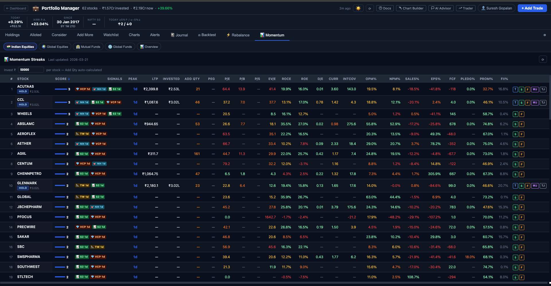
🔢 The Composite Score — One Number to Rule Them All
The most prominent column in the Momentum Streaks tab is the Score column. This is the composite score — a single integer that summarises a stock's total momentum durability across all active signals.
How Is the Composite Score Calculated?
The composite score is the sum of streak_days across all signals currently active for that stock. Each signal in which the stock is currently appearing contributes its individual streak length to the total.
Stock: IREDA
Stage 2 streak: 45 days → contributes 45
Near 52W High streak: 30 days → contributes 30
VCP streak: 0 (not currently active) → contributes 0
3-Week Tight streak: 0 (not currently active) → contributes 0
IPO Breakout streak: 0 (not currently active) → contributes 0
Composite Score = 45 + 30 = 75
A stock can theoretically score in all five signals simultaneously if it is in a Stage 2 trend, near its 52-week high, forming a VCP pattern, showing 3-week tight closes, and breaking out of an IPO base all at once. In practice, Stage 2 + Near 52W High often co-occur since both indicate an uptrending stock near the top of its range. VCP and 3-Week Tight occasionally co-occur because both are volatility contraction patterns, just measured differently.
The Score Bar
Alongside the numeric score in the Score column, there is a horizontal bar visualisation. The bar's width represents this stock's composite score as a proportion of the highest composite score among all stocks currently in the table. The stock with the highest score gets a full-width bar; every other stock's bar is scaled relative to it.
The Peak Column
The Peak column shows the longest individual signal streak for that stock — the maximum streak across all five signals. This is different from the composite score in an important way: composite score rewards breadth (appearing in many signals), while Peak rewards depth (dominating a single signal over a long period).
Consider two stocks:
- Stock A: Stage 2 streak = 50, Near High streak = 48. Composite = 98. Peak = 50.
- Stock B: Stage 2 streak = 90, Near High streak = 5. Composite = 95. Peak = 90.
Stock A has a slightly higher composite score. But Stock B has been in a Stage 2 structure for 90 consecutive days — an extraordinary run that suggests a very established uptrend. The Peak column surfaces this. When you see a Peak that is far above any comparable stock, it is worth investigating that specific signal more carefully.
🚦 The 5 Signals Tracked
Each signal in the Momentum Streaks tab corresponds to a specific ChartInk technical scan run by the Finmagine Trader extension. Here is what each signal means and what a sustained streak in each implies:
S2 Stage 2 — The Uptrend Core
Stage 2 is Mark Minervini's stage analysis framework applied to NSE stocks. A stock is in Stage 2 when it is in a clear uptrend: price is above both SMA50 and SMA200, SMA50 is above SMA200 (golden cross confirmed), and the stock is trading near its 52-week high rather than wallowing near lows. Stage 2 represents institutional accumulation and sustained price appreciation.
A Stage 2 streak of 30+ days means the stock has been maintaining all of these technical conditions for over a month — not a brief pop. This is the foundation of a genuine uptrend, not a short squeeze or a one-week momentum burst. Most multi-bagger moves in the Indian market have come from stocks that spent months in Stage 2 before being noticed by retail investors.
NH Near 52-Week High — Proximity to Breakout
The Near 52W High scan identifies stocks trading within a defined proximity of their 52-week high — typically within 5–8% of the peak. This matters because stocks near their 52-week high have already cleared most of the overhead resistance that would otherwise act as a ceiling. Buyers who bought at lower prices are sitting on profits, not waiting to sell at breakeven.
Counterintuitively, buying near 52-week highs has historically produced better returns than buying near 52-week lows. A stock hitting new highs in a market context where most stocks are struggling is exhibiting relative strength — the sign that institutional money is persistently flowing in.
VCP Volatility Contraction Pattern — The Minervini Setup
The VCP is Mark Minervini's signature pattern: after a strong price advance, the stock enters a series of progressively tighter pullbacks. Each pullback is shallower than the previous one — 10%, then 6%, then 3% — and each recovery happens on lower volume than the decline. This "spring coiling" structure indicates that sellers are exhausted and buyers are absorbing every dip at progressively higher prices. The VCP resolves in a sharp, high-volume breakout from the tightest part of the contraction.
A VCP streak of 15–25 days means the stock has been in the tightest part of its contraction structure for an extended period, building energy for the eventual breakout. When the VCP streak finally breaks (either with a breakout or a breakdown), it typically does so decisively.
TW 3-Week Tight — The Quiet Before the Move
Three consecutive weekly closes within 1.5% of each other, while the stock is in a Stage 2 uptrend (SMA50 > SMA200). This is the market equivalent of a held breath — after a run-up, the stock consolidates in an extremely tight range for three weeks, absorbing supply without giving ground. The tightness of the range indicates institutional holders are not selling despite having substantial profits — they expect more upside.
The 3-Week Tight is measured on weekly closes, making it immune to intraday or daily noise. When a stock holds three weekly closes within 1.5%, it is a deliberate accumulation pattern. The breakout from a 3-Week Tight tends to be sharp and persistent.
IPO IPO Breakout — Fresh Names, Fresh Momentum
The IPO Breakout scan identifies recently-listed stocks that are breaking out of their initial post-listing base — near their 52-week high with volume above their 20-day moving average, but without yet having an SMA200 (too recently listed). These are stocks that have absorbed all the initial selling pressure from pre-IPO investors and are now moving on their own fundamental merits.
IPO breakouts carry both opportunity and risk: there is no SMA200 for structural confirmation, and analyst coverage may be thin. But when a recent IPO has been appearing in the breakout scan for 10+ consecutive days, it is demonstrating sustained institutional interest beyond the listing day excitement.
📋 Every Column in the Momentum Streaks Table
The Momentum Streaks table is dense with information. Here is a complete reference for every column and what it tells you:
| Column | What It Shows | How to Use It |
|---|---|---|
| # | Composite score rank (1 = highest score) | Quick scan of the leaderboard — #1 is today's most sustained momentum name |
| Stock | NSE ticker symbol, with HOLD badge if the stock is in your portfolio | HOLD badge = you already own this; use Invested column to see exposure |
| Score | Composite streak score with relative bar visualisation | Bar width shows relative rank at a glance; number shows absolute score |
| Signals | Active signal badges (S2, NH, VCP, TW, IPO) with individual streak days per badge | Multiple concurrent signals = higher conviction; individual streak days show which is most durable |
| Peak | Longest single-signal streak, in days | High Peak vs low composite = one dominant signal. Equal Peak and composite = one signal driving everything |
| LTP | Last Traded Price (live from Yahoo Finance) | Used by Add Qty to calculate share count; also useful for quick price reference |
| Invested | Amount you have invested in this stock (only visible for portfolio holdings) | Helps you see your existing exposure before adding more |
| Add Qty | Number of shares you can buy at your current Invest ₹ setting | Math.ceil(invest_amount ÷ LTP) — rounds up to whole shares for Indian equities |
| PEG | Price/Earnings to Growth ratio | Below 1 is generally attractive; above 2 is rich relative to growth |
| P/E | Price-to-Earnings ratio | Compare to sector averages; lower is better, but context matters |
| P/B | Price-to-Book ratio | Below 1 = trading below book value; key metric for banks and asset-heavy businesses |
| P/S | Price-to-Sales ratio | Useful for loss-making companies; below 2 is generally reasonable for most sectors |
| EV/E | EV/EBITDA ratio | Enterprise value relative to operating earnings; below 15 is often considered fair value |
| ROCE | Return on Capital Employed (%) | Above 15% is good; above 25% is excellent. The single best measure of capital efficiency |
| ROE | Return on Equity (%) | Above 15% is good; compare to ROCE — if ROE far exceeds ROCE, check leverage |
| D/E | Debt-to-Equity ratio | Below 0.5 is conservative; above 1 warrants scrutiny; above 2 is high-risk territory |
| CurR | Current Ratio (current assets ÷ current liabilities) | Above 1.5 = comfortable liquidity; below 1 = potential short-term stress |
| IntCov | Interest Coverage Ratio (EBIT ÷ interest expense) | Above 3 is safe; below 1.5 means the business is struggling to service its debt |
| OPM% | Operating Profit Margin (%) | Higher is better; look for improvement over time, not just absolute level |
| NPM% | Net Profit Margin (%) | Compare to OPM — large gap may indicate high interest or tax burden |
| Sales% | Revenue growth rate (%) | Momentum in a flat-sales business is harder to sustain than in a growing one |
| EPS% | Earnings-per-share growth rate (%) | The key driver of long-term price appreciation; look for consistent double-digit growth |
| FCF | Free Cash Flow (₹ Cr) | Positive FCF = business generating real cash. Negative FCF = watch capex cycle carefully |
| Pledg% | Promoter pledge percentage | Above 30% is a red flag; above 50% is a serious warning — pledged shares can be force-sold |
| Prom% | Promoter holding percentage | Above 50% = promoters have majority stake. Very high (>75%) limits float. Declining trend warrants investigation |
| FII% | Foreign Institutional Investor holding percentage | Rising FII% = increasing foreign interest. High FII% in a momentum stock adds credibility |
| S / F / WJ / TJ | Action buttons: Screener.in, Finmagine report, Watchlist Journal, Trade Journal | S = open Screener.in page; F = Finmagine report; WJ/TJ = journal entries (portfolio holdings only) |
🎨 Understanding the Color Coding
The fundamental columns (PEG, P/E, P/B, ROCE, ROE, D/E, etc.) are color-coded to help you instantly assess the quality of a momentum stock without reading every number carefully. The color system uses four levels:
Critically, the color direction depends on whether lower or higher is better for that specific metric:
- Valuation ratios (P/E, P/B, P/S, EV/EBITDA, PEG, D/E): Lower is better. Green = low (attractive). Red = high (stretched or dangerous).
- Quality ratios (ROCE, ROE, OPM%, NPM%, Sales%, EPS%, FCF, Interest Coverage, Current Ratio): Higher is better. Green = high (strong). Red = low (weak).
- Risk ratios (Pledg%): Lower is better. Green = low pledge. Red = high pledge.
- Ownership (Prom%, FII%): Informational. Color indicates whether the level is within normal ranges.
Key Thresholds to Know
While the colors do the work for you, internalising the approximate thresholds helps you reason more quickly:
- ROCE: Below 10% = red (poor capital allocation). 10–15% = amber. Above 15% = green. Above 25% = strong green.
- D/E: Above 1.5 = red (elevated leverage). 0.5–1.5 = amber. Below 0.5 = green (conservative balance sheet).
- Interest Coverage: Below 1.5 = red (debt-service risk). 1.5–3 = amber. Above 3 = green (comfortable).
- Pledg%: Above 30% = amber. Above 50% = red. Below 10% = green.
- FCF: Negative = red. Small positive = amber. Strongly positive relative to market cap = green.
↕️ Sorting — Your Most Powerful Research Tool
Every column in the Momentum Streaks table is sortable. Click a column header once to sort ascending; click again to sort descending. This transforms the table from a momentum leaderboard into a flexible multi-dimensional screener.
Useful Sorting Patterns
Multi-Step Research Using Sort
A practical workflow using sort:
- Start with default sort by composite Score — identify the top 10 by momentum durability.
- Re-sort by ROCE descending — see which of your top-10 momentum names are also quality businesses.
- Re-sort by D/E ascending — confirm that the quality-momentum names also have clean balance sheets.
- Re-sort by Pledg% ascending — eliminate any that have significant promoter pledge overhang.
- The names that consistently appear in the top half across all four sorts are your highest-conviction research candidates.
💰 The Invest ₹ Bar and Add Qty Column
Above the Momentum Streaks table, there is an Invest ₹ input bar. This is where you set the amount of money you want to deploy per stock. Once you enter an amount, the Add Qty column automatically calculates how many shares you can buy at the current LTP.
Invest Amount = ₹50,000
LTP of Stock = ₹1,240
Add Qty = Math.ceil(50,000 ÷ 1,240) = Math.ceil(40.32) = 41 shares
For Indian equities (IN_EQ), Add Qty always rounds up to the nearest whole share using Math.ceil — you can only buy whole shares on NSE. For fractional instruments like mutual funds or US ETFs in other asset class tabs, the calculation uses three decimal places.
The Invest ₹ bar is separate from your Holdings tab's invest amount — changes here do not affect your Holdings position sizing settings. It is a temporary working figure for research purposes.
🏷️ The HOLD Badge and Action Buttons
The HOLD Badge
If a stock appearing in the Momentum Streaks table is already in your portfolio Holdings tab, it will display a HOLD badge next to its ticker in the Stock column. Alongside this, the Invested column will show the total amount you have currently invested in that stock across all your broker accounts.
The HOLD badge serves as a quick sanity check at a glance: when you see a HOLD badge next to a stock with a high composite score and strong fundamentals, it means your existing position is in a stock with genuine sustained momentum — a positive signal. Conversely, if a stock in your portfolio does not appear in the Momentum Streaks table at all (or appears with a short streak), it may be worth reviewing whether the technical momentum that initially attracted you to it is still present.
The Action Buttons
At the end of each row, there are action buttons that connect the streak data to deeper research tools:
- S (Screener.in): Opens the Screener.in page for this stock in a new tab. Use this to do your own full fundamental and technical due diligence after the Momentum Streaks tab has surfaced the name.
- F (Finmagine Report): Opens the Finmagine company analysis report for this stock, if one exists. This gives you access to the full 44-ratio financial analysis, Finmagine scoring, and investment recommendation prepared by the Finmagine Research Team. Available for premium users.
- WJ (Watchlist Journal): Opens the Watchlist Journal entry for this stock. Available if the stock is on your watchlist — lets you record your research notes, thesis, and observations directly within the Portfolio Manager.
- TJ (Trade Journal): Opens the Trade Journal entry for this stock. Available for portfolio holdings — lets you record why you originally bought it, what your current thesis is, and any thesis changes. Helps you avoid holding positions based on stale reasoning.
🗺️ The 5-Step Workflow: From Streaks to Conviction
The Momentum Streaks tab is a research starting point and durability filter, not a buy signal generator. A high composite score means a stock has demonstrated sustained technical momentum over many days — it does not guarantee future performance. Here is the recommended workflow for turning streak data into actionable investment decisions:
Score + Peak: Find Sustained Momentum
Start by looking at Score and Peak. Focus on stocks where both the composite score and the Peak streak are high — not just one of them. A high composite score driven entirely by a single 2-day signal is not durable; a high composite score backed by a Peak of 40+ days reflects a stock that has been in a sustained structural move for over a month.
Fundamentals: Filter Out Weak Businesses
Check the fundamental columns. A momentum stock with ROCE below 10%, D/E above 2, and negative FCF is riding a wave that fundamentals cannot support. These names often reverse sharply when the momentum narrative breaks. Focus on momentum stocks where the fundamentals are at least amber — preferably green in ROCE and D/E.
Signals: Single vs Multiple Concurrent
Look at the Signals column badges. A stock appearing in Stage 2 AND Near 52W High simultaneously is showing two independent scans confirming the same underlying strength. A stock in Stage 2, Near High, AND VCP simultaneously — the "All Three" combination — is the highest-conviction setup in the entire ecosystem. Multiple concurrent signals from different scan methodologies confirming the same stock is not a coincidence.
Deep Dive: Use the S and F Buttons
Once you have a shortlist of 3–5 names that pass the score, fundamental, and signal filters, use the S button to open each on Screener.in. Study the chart, check the quarterly results, read management commentary, and look at peer comparison. If a Finmagine research report exists, use the F button to access the full 44-ratio analysis and investment recommendation. The streak data has done the initial filtering — the deep dive is yours to do.
Position Sizing: Use the Invest ₹ Bar
Once you have decided to investigate a stock seriously (or add it to your watchlist), enter your per-stock invest amount in the Invest ₹ bar and note the Add Qty for your intended position. This is not a buy order — it is a planning step. Knowing exactly how many shares your investment amount translates to, at current prices, helps you think about position size before emotion enters the picture.
🔑 Premium Feature — Access via the Portfolio Manager Web App
The Momentum Streaks tab is a Premium feature of the Finmagine Portfolio Manager web app. It is available to premium subscribers at https://finmagine.com/portfolio/.
Data powering the Momentum Streaks tab comes from ChartInk scans run by the Finmagine Trader Chrome extension. The Trader extension is required for streak history to accumulate. Once installed, Trader runs background scans every 6 hours automatically — even when you are not actively using it — so streak data grows continuously without any manual action on your part.
What You Get with the Momentum Streaks Tab
- Daily-updated composite scores and individual signal streak days for all 2,000+ NSE stocks
- 18 fundamental data points per stock enriched live from Screener.in
- One-click access to Screener.in and Finmagine research reports
- HOLD badge integration with your portfolio Holdings tab
- Live position sizing via the Invest ₹ bar and Add Qty column
- Fully sortable table for custom filtering combinations
- Watchlist Journal and Trade Journal integration for portfolio holdings
The Momentum Streaks tab connects the momentum signals from Finmagine Trader with the portfolio management and fundamental data of the Portfolio Manager, creating a single workspace where you can move from "what is showing sustained momentum today" to "does this fit my portfolio" to "how much should I buy" without switching between multiple tools.
Ready to See What's Been Firing the Longest?
Open the Momentum Streaks tab in the Finmagine Portfolio Manager web app and find today's most sustained technical momentum names — enriched with fundamentals, ranked by durability.
Open Momentum Streaks Tab →