Following along? Open the live page
Finmagine — free to explore • premium for full access • no app needed
After reading this guide you will be able to:
- Understand what "CATCHING UP / RUNNING AHEAD / IN LINE" means and why it matters for valuation
- Read the Price/Profit Growth Ratio and know whether it suggests overvaluation or undervaluation
- Interpret the CAGR comparison table — Stock Price vs Profit vs Sales — across 10Y, 5Y, 3Y, 1Y
- Use Cyclical Analysis to identify seasonal revenue patterns and the strongest quarters
- Read the 52-week risk range slider and the three metric cards (Max Drawdown, From High, From Low)
- Know when a stock near its 52-week low is an opportunity vs. a value trap
What Is the Price & Growth Sub-Tab?
The Price & Growth sub-tab answers a question that Quick Analysis does not: is the stock price actually tracking the business performance? A company can have excellent CAGR numbers in the Quick Analysis tab while the stock price has run far ahead of fundamentals — or far behind them. Price & Growth surfaces this divergence explicitly.
It contains three sections: Price vs Fundamentals (the core CAGR comparison), Cyclical Analysis (seasonal quarterly patterns), and Risk Metrics (52-week positioning). Together they answer: is the price fair, is the business seasonal, and how much risk is currently embedded in the price?
Price vs Fundamentals: Is the Price Justified?
The first section compares Stock Price CAGR against Profit CAGR and Sales CAGR across four time periods. A verdict badge at the top summarises the relationship:
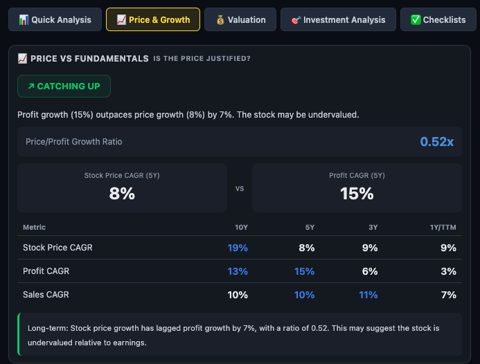
The Price/Profit Growth Ratio
Below the verdict badge, a single ratio number appears on the right — this is the Price/Profit Growth Ratio, calculated as:
In the example above: 8% ÷ 15% = 0.52x. This means price has grown at only half the rate that profits have grown over five years. Combined with the CATCHING UP label, this suggests the stock may be significantly undervalued relative to its earnings trajectory — assuming the profit growth is durable.
- Below 0.7x — significant gap. Price has lagged profits materially. Warrants investigation: is this a mispriced opportunity or is the market discounting future risk?
- 0.7x – 1.3x — broadly in line. Price is tracking fundamentals reasonably. Use absolute valuation multiples for further view.
- Above 1.5x — price has run ahead of profits. Multiple expansion has occurred. Acceptable only if the business quality has structurally improved (e.g. a sector re-rating or management change).
The CAGR Comparison Table
Below the ratio, a table shows three metrics — Stock Price CAGR, Profit CAGR, and Sales CAGR — across four time periods:
| Column | What It Shows | How to Use It |
|---|---|---|
| 10Y | Ten-year CAGR — the structural track record | Best for assessing whether this is a genuine long-term compounder. Watch the starting base year — a distressed 2014 base inflates 10Y numbers. |
| 5Y | Five-year CAGR — one full business cycle | The most balanced and reliable column. Use this for the headline comparison between price and profit growth. |
| 3Y | Three-year CAGR — medium-term momentum | Useful for seeing whether performance is improving or deteriorating relative to the 5Y base. A 3Y figure significantly higher than 5Y suggests recent acceleration. |
| 1Y / TTM | Last twelve months — very recent | Highly noisy. Use only to detect a sharp recent break from the trend — either a sudden acceleration (new catalyst?) or a sudden collapse (margin pressure?). |
The Long-Term Narrative
Below the table, a one-sentence summary in smaller text provides the interpretation in plain language — e.g. "Long-term: Stock price growth has lagged profit growth by 7%, with a ratio of 0.52. This may suggest the stock is undervalued relative to earnings." This is the machine-generated verdict; treat it as a starting point for your own analysis, not a recommendation.
Cyclical Analysis: Quarterly Patterns
The Cyclical Analysis section answers: does this business have seasonal patterns? Certain sectors are strongly seasonal — FMCG peaks in Q3 (festive season), agri-input companies peak in Q1 (kharif sowing), infrastructure companies often recognise revenue heavily in Q4 (government year-end spending). Knowing the seasonal rhythm helps you evaluate whether a weak quarter is structural or simply seasonal.
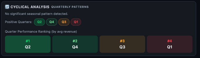
Positive Quarters Chips
Four chips labelled Q1 through Q4 are colour-coded by how consistently each quarter performs relative to the same quarter in prior years:
- Green chip — this quarter consistently delivers above-average revenue growth (YoY). It is the seasonally strong quarter for this business.
- Amber chip — moderate — this quarter is neither consistently strong nor weak. Results are mixed across years.
- Red chip — this quarter is seasonally the weakest — revenue or profit tends to be below other quarters in the year.
Quarter Performance Ranking
Below the chips, a four-box grid ranks Q1 through Q4 from best (#1) to worst (#4) by average revenue across historical years. Each box is colour-coded: green for the top-ranked, dark/muted for the lowest-ranked.
In the example: #1 Q2, #2 Q4, #3 Q3, #4 Q1 — this business generates its highest average revenue in Q2 (July–September) and its lowest in Q1 (April–June). This is the baseline for evaluating any individual quarterly result.
Risk Metrics: 52-Week Analysis
The Risk Metrics section shows where the current stock price sits within its 52-week high–low range, and how much the stock has drawn down from its peak. This is a price-risk lens — it does not evaluate business quality, but it helps you understand the entry-point risk embedded in the current price.
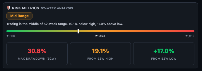
The Range Position Badge
A coloured badge at the top left of the section gives the position verdict:
- Near High (red) — the stock is trading close to its 52-week high. Limited near-term upside on a mean-reversion basis; risk of a pullback if fundamentals don't continue improving.
- Mid Range (amber) — the stock is in the middle of its 52-week range. Neither at a peak nor at a trough — a neutral entry-risk environment.
- Near Low (green) — the stock is close to its 52-week low. Either a potential opportunity (if fundamentals are intact) or a value trap (if fundamentals are deteriorating). Always verify with Quick Analysis before acting.
The 52-Week Range Slider
A horizontal colour gradient bar (red on the left at the 52W low, green on the right at the 52W high) shows the current price as a marker. The 52W low, current price, and 52W high are labelled. The marker position is visual — the closer to the right, the closer to the annual high; the closer to the left, the closer to the annual low.
The Three Metric Cards
- Max Drawdown (52W) — the largest peak-to-trough decline within the last 52 weeks. In the example, 30.8% means the stock fell up to 30.8% from its yearly high at some point during the year. This is your worst-case annual loss if you bought at the top. High drawdown signals high price volatility — important for position sizing.
- From 52W High — how far the current price is below the 52-week high. 19.1% below the high means the stock has pulled back significantly from its peak but has not recovered yet. This is the potential upside if the stock simply returns to its previous high.
- From 52W Low — how far the current price is above the 52-week low. +17.0% above the low means the stock has already recovered 17% from its worst point this year — it is not at the bottom of its range.
How to Use Price & Growth in Your Research
Step 1 Check the verdict badge first. CATCHING UP is the most interesting signal — a business whose profits are outpacing price. RUNNING AHEAD warrants caution about valuation. IN LINE means you need absolute valuation multiples from the Valuation sub-tab to decide.
Step 2 Read the Price/Profit Growth Ratio. Below 0.7x with CATCHING UP is a strong indicator of potential mispricing. But verify that the profit CAGR is real — cross-check in the Financials tab (CFO vs PAT quality).
Step 3 Compare 5Y and 3Y columns. If 3Y Profit CAGR is significantly higher than 5Y, growth has recently accelerated — investigate what changed. If 3Y is lower than 5Y, growth is decelerating — investigate whether it is cyclical or structural.
Step 4 Check whether the business is seasonal. If the Cyclical Analysis shows a strong Q3 pattern and you are looking at a weak Q3 result, that is a genuine concern. If Q3 is normally the weakest quarter and results are weak, that is expected — do not overreact.
Step 5 Use Risk Metrics for sizing and timing. Near Low + High Drawdown = higher entry risk but potentially larger upside if recovery occurs. Near High + Low Drawdown = lower entry risk but less near-term upside on mean reversion. Mid Range is typically the most neutral entry zone.
| What You See | What It Means | Next Step |
|---|---|---|
| CATCHING UP + ratio < 0.7x | Profits growing faster than price — potential undervaluation | Verify profit quality in Financials (CFO vs PAT), then check Valuation sub-tab |
| RUNNING AHEAD + ratio > 1.5x | Price has re-rated significantly above profit growth | Check Valuation sub-tab for PE/PB vs. historical range — is the premium justified? |
| Sales CAGR > Profit CAGR | Margin compression — growing topline but losing on bottom line | Financials tab → OPM trend chart to see if margins are recovering or still falling |
| Strong seasonal pattern, weak result in peak quarter | Genuine underperformance vs. the company's own historical seasonal pattern | Concall transcript in Documents tab for management commentary |
| Near Low + Max Drawdown > 30% + CATCHING UP | Potentially mispriced — price fell more than fundamentals deteriorated | Quick Analysis for health score, then Forensics sub-tab to rule out accounting issues |
Ready to Analyse Indian Stocks Like a Pro?
Finmagine gives you 30+ computed financial ratios, sector benchmarks, FII/DII flows, the Finmagine Score, and AI-powered analysis — all in one place.