Following along? Open the live page
Finmagine — free to explore • premium for full access • no app needed
After reading this guide you will be able to:
- Read the health score gauge and know what "Excellent / Good / Average / Poor" actually means
- Understand how Strengths and Areas of Concern are selected from the full ratio set
- Decode "ROE below sector benchmark (12%)" — what that 12% is and where it comes from
- Read the Growth CAGR table and tell whether a company's growth is recent or sustained
- Interpret Trend Analysis labels — Increasing / Inconsistent / Declining — and why they matter
- Know when Quick Analysis is enough and when you need to go deeper
What Is Quick Analysis?
Quick Analysis is the first sub-tab inside the Analysis tab on every stock page. It is designed as a triage tool — a structured first read that helps you decide in under two minutes whether a stock is worth deeper investigation.
It does not replace the Ratios, Financials, or AI Advisor tabs. It surfaces the most important signals in one view so you can quickly calibrate: is this a high-quality compounder, a cyclical story, or a structurally challenged business?
The Summary Strip
The top strip of Quick Analysis contains four elements in a single row:
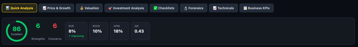
The Health Score Gauge
A circular gauge displays a score from 0 to 100. The score colour (green, amber, red) and label (Excellent / Good / Average / Poor) give the top-line verdict at a glance. A score of 86 with "Excellent" label means the majority of computed ratios for this stock land in the Excellent or Good classification band.
Strengths and Concerns Count
Two numbers sit beside the gauge — Strengths (green) and Concerns (red). These are the count of ratio-level positives and negatives surfaced for this stock. In the example above: 6 Strengths, 6 Concerns. A high Strengths count with a low Concerns count drives a higher health score; equal counts at 6-6 result in a moderate-to-good score depending on the weight of the ratios involved.
Key Metrics Strip
Four metrics appear as mini-cards to the right of the gauge. These four are chosen because they appear most frequently in investment analysis decisions:
Strengths Panel
The Strengths panel (green header with a ✓ tick) lists the most significant ratio-level positives for the company. Each row shows:
- Ratio name — e.g. "Working Capital Cycle", "Receivables Turnover Ratio"
- Classification or explanation — e.g. "Excellent" or "Good profit CAGR"
- Value badge — the actual number, colour-coded: blue for CAGR-type metrics, green for classification-based ratios
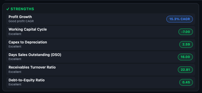
How the Strengths List Is Built
Finmagine evaluates two groups of inputs:
- DB-classified ratios — all 30+ ratios in the database are classified. Those rated "Excellent" or "Good" with a non-zero value are candidates. Sector-specific exclusions apply: for FMCG companies, a low payables turnover is not flagged as a concern (because FMCG companies structurally negotiate delayed payment terms with suppliers — it is a strength, not a weakness).
- Key-metric evaluation — ROE, ROCE, profit CAGR, and FCF are evaluated against sector-specific thresholds. If they pass the threshold, they enter as strengths.
The two groups are merged and deduplicated. Up to 6 total items appear in the Strengths panel.
Areas of Concern Panel
The Areas of Concern panel (red header with a ⚠ triangle) mirrors the Strengths panel for negatives. Each item shows the ratio name, an explanation of the issue, and a red value badge.
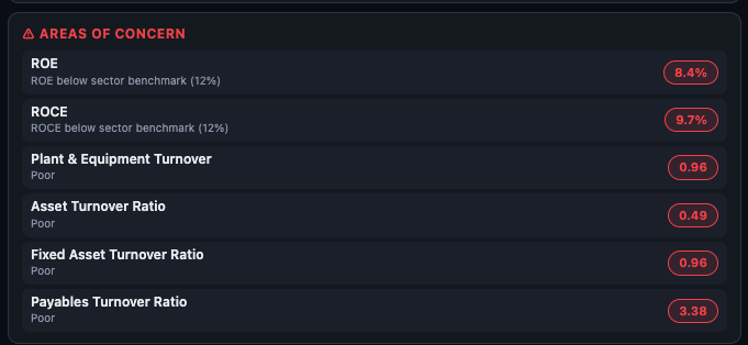
Understanding "Below Sector Benchmark (12%)"
When a key metric like ROE or ROCE falls below the sector threshold, the concern row reads: "ROE below sector benchmark (12%)". That 12% is the sector-specific ROE benchmark for this company's sub-sector — not a one-size-fits-all cutoff.
Here are some examples of how the thresholds vary by sector:
| Sector | ROE Benchmark | ROCE Benchmark |
|---|---|---|
| IT / Software | 20% | 20% |
| FMCG | 18% | 18% |
| Pharma / Healthcare | 15% | 15% |
| Banking | 15% | 10% |
| Auto / Manufacturing | 15% | 15% |
| Chemicals | 15% | 15% |
| Infrastructure | 10% | 10% |
| Telecom | 10% | 10% |
| General (catch-all) | 15% | 15% |
Company Insights
Below the Strengths and Concerns panels, the Company Insights section (🚀 rocket icon) translates ratio findings into plain-language narrative sentences. This is the most readable section for investors who are not fluent in ratio terminology.
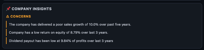
What the Insights Are
- Insights are auto-generated from the underlying data — they are factual observations, not analyst opinions.
- They use specific numbers and time periods: e.g. "The company has delivered a poor sales growth of 10.0% over past five years" or "Dividend payout has been low at 9.84% of profits over last 3 years."
- CONCERNS are shown in amber; STRENGTHS (if any) would be in green.
- The vertical bar on the left acts as a visual separator for each sentence.
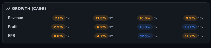
Growth (CAGR) Table
The Growth section shows a 3×4 table: Revenue, Profit, and EPS as rows; 1Y, 3Y, 5Y, and 10Y as columns. Each cell is colour-coded based on how the growth figure compares to the sector-adjusted threshold.
Colour Coding
How to Read the Time Periods
- 1Y CAGR — the most recent single year. Useful for identifying recent momentum or a sudden collapse, but highly susceptible to base effects. A terrible 1Y after exceptional prior years may just be normalisation.
- 3Y CAGR — covers a medium-term cycle. Good for seeing whether growth from the COVID-recovery boom has held.
- 5Y CAGR — covers a full business cycle. This is the most balanced view. A company with 15%+ revenue CAGR over 5 years is genuinely growing.
- 10Y CAGR — the structural compounder test. Companies that sustain 12–15%+ revenue and profit CAGR over a decade are rare. If you find this, investigate why the moat exists.
Trend Analysis: Consistency Over Time
The Trend Analysis block sits below the CAGR table. It evaluates how consistent the growth has been year by year, rather than just the average. A company can have a 10% 10Y CAGR with wildly inconsistent annual figures (5 good years, 5 bad years) — the Trend Analysis surfaces this.
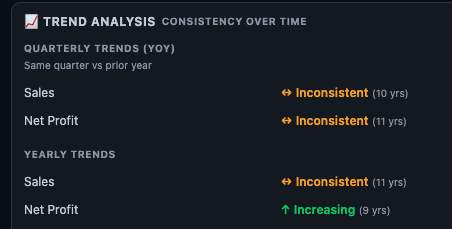
The Three Labels
Quarterly YoY vs. Yearly Trends
The section is split into two sub-groups:
- Quarterly Trends (YoY) — compares each quarter with the same quarter in the prior year. This removes seasonal bias. The number in brackets (e.g. "10 yrs") shows how many years of quarterly data were used. Sales and Net Profit are assessed separately.
- Yearly Trends — compares each full financial year with the prior year. A larger dataset than quarterly, and often more stable in its verdict.
How to Use Quick Analysis in Your Research
Step 1 Check the health score first. Is it above 75 (Excellent/Good)? If yes, this is a quality-tier company by ratio standards. If below 50, you need a specific reason to continue investigating.
Step 2 Count strengths vs. concerns. More than twice as many strengths as concerns is a strong signal. Equal counts (e.g. 6-6) means the company has visible positives and visible negatives — you need to understand which side matters more for your thesis.
Step 3 Read the sector benchmark in Concerns. If ROE is 9% and the benchmark is 12%, the gap is 3 percentage points — small, potentially fixable. If ROE is 5% against a benchmark of 18% (IT sector), the gap is structural and warrants deeper investigation.
Step 4 Check the CAGR table 5Y and 10Y columns. Recent 1Y growth is noisy. Look at the 5Y column first. If Revenue and Profit are both blue at 5Y and 10Y, this is a sustained compounder. If only 1Y is blue and 5Y is amber/red, recent performance is an outlier — investigate whether it is a genuine acceleration or a one-time boost.
Step 5 Read the Trend Analysis labels. "Increasing" in both Sales and Net Profit over 9+ years is the benchmark for a consistent compounder. "Inconsistent" is acceptable for cyclical sectors — note it, don't penalise it blindly. "Declining" in both metrics is a red flag that requires a strong contrarian thesis to override.
Step 6 Decide where to go deeper. If the CAGR looks good but ROE/ROCE are below benchmark → check Profitability ratios in the Ratios tab. If strengths outnumber concerns but insights flag dividend payout issues → check Cash Flow in the Financials tab. If trend is inconsistent → use the Price & Growth sub-tab next to see the visual growth bars by year.
| What You See | What It Means | Where to Go Next |
|---|---|---|
| High score, low concerns, Increasing trend | Consistent, high-quality compounder | Check Valuation tab — great businesses often trade at premiums |
| Good score but ROE/ROCE below benchmark | Solid on most ratios but capital efficiency lagging sector peers | Profitability section in Ratios tab; check if trend is improving |
| Strong 1Y CAGR, weak 5Y and 10Y | Recent recovery or one-time boost — not a compounder yet | Price & Growth sub-tab for year-by-year bars; check commodity or policy tailwinds |
| Inconsistent trend, cyclical sector | Business swings with macro — normal for metals, cement, chemicals | Investment Analysis sub-tab for cycle-adjusted valuation signals |
| Low score, many concerns, declining trend | Structurally challenged — needs a specific turnaround thesis | Forensics sub-tab to check for accounting red flags before considering |
Ready to Analyse Indian Stocks Like a Pro?
Finmagine gives you 30+ computed financial ratios, sector benchmarks, FII/DII flows, the Finmagine Score, and AI-powered analysis — all in one place.