Following along? Open the live page
Finmagine — free to explore • premium for full access • no app needed
After reading this guide you will be able to:
- Read every ratio card — value, trend, classification, and peer percentile
- Know which category each ratio belongs to and what it tests
- Use the "All" sortable list to quickly surface weak or strong ratios
- Understand what ⚡ Calculated ratios add beyond the standard set
- Correctly interpret Fin KPIs for banking and NBFC companies
- Know when Sector KPIs will appear and what they mean
Stop Trusting Financial Ratios (Until You See This)
How the Finmagine Ratios tab transforms raw numbers into classified, benchmarked, trend-aware signals — and how to use them to build an unassailable investment thesis.
🎧 How Peer Benchmarks Reveal Financial Health
A deep-dive conversation on why raw ratios mislead, how absolute thresholds and peer percentiles work together, and how to use Finmagine's six diagnostic categories to build a complete picture of any business.
Approx. 15–20 minutes · Financial education podcast · No investment advice
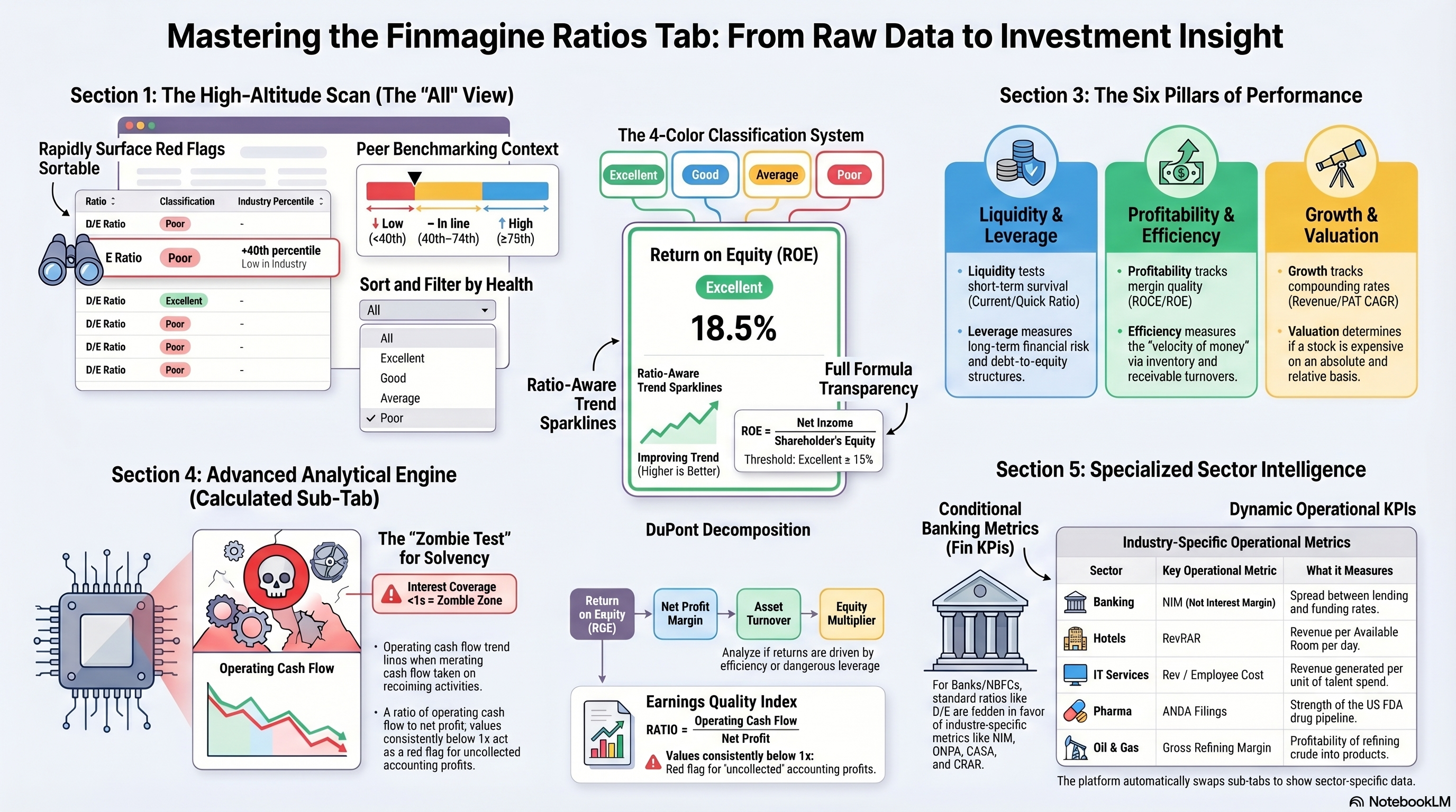
What Is the Ratios Tab?
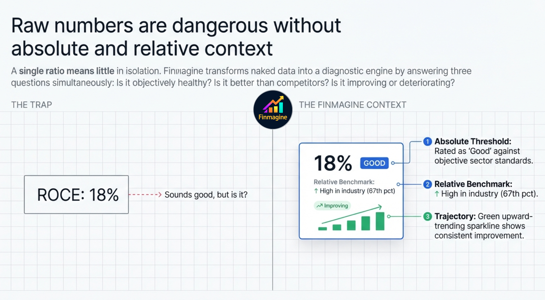
The Ratios tab is Finmagine's quantitative analysis engine. It computes 30+ financial ratios from a company's balance sheet, P&L, and cash flow data, then classifies each one as Excellent, Good, Average, or Poor against industry-standard thresholds — not arbitrary numbers.
Crucially, every ratio is also benchmarked against the company's sector peers using a percentile score. So you don't just know that a D/E of 0.4 is "Good" in absolute terms — you also know it's in the 80th percentile of its industry, meaning the company is less leveraged than 80% of its competitors.
The Sub-Tab Navigation
At the top of the Ratios tab you'll see between two and four sub-tab buttons depending on the company type:
| Sub-Tab | When It Appears | Access | What It Shows |
|---|---|---|---|
| All | Always | Premium | Compact sortable list of all ratios across every category |
| ⚡ Calculated | Always | All users | Derived composite ratios computed on the fly |
| 🏦 Fin KPIs | Banking & NBFC companies only | All users | NIM, GNPA, CASA ratio, CRAR, Cost-to-Income — banking-specific metrics |
| [Sector] KPIs — label changes per company | Selected sectors with data | Premium only | Tab label reflects the actual sector — "Oil & Gas KPIs" for Reliance, "IT Sector KPIs" for TCS, "Fin KPIs" for HDFC Bank. Operational metrics differ by sector. |
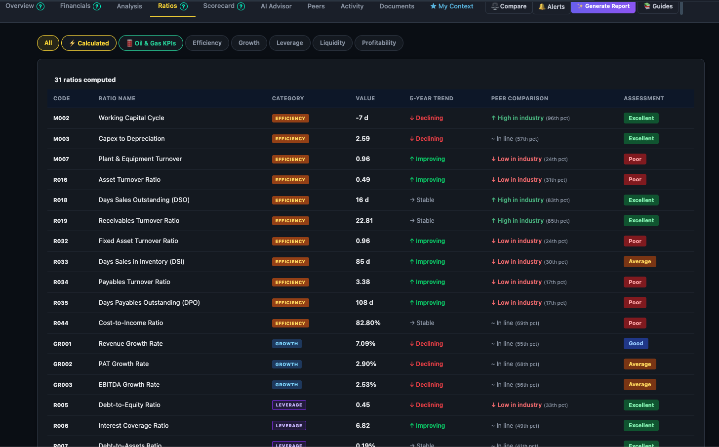
The "All" View — Rapid Scan Mode
When you click the Ratios tab, you land on the All view — a compact, sortable list showing every ratio at once. This is your high-altitude scan: find the weak spots and strong points before zooming in.
Peer Percentile Labels
Each row in the All view shows where the company's ratio sits relative to its sector peers:
- ↑ High in industry — 75th percentile or above: the company is better than at least three-quarters of its peers on this metric
- ~ In line — 40th to 74th percentile: broadly in line with the industry average
- ↓ Low in industry — below 40th percentile: a relative weakness vs peers
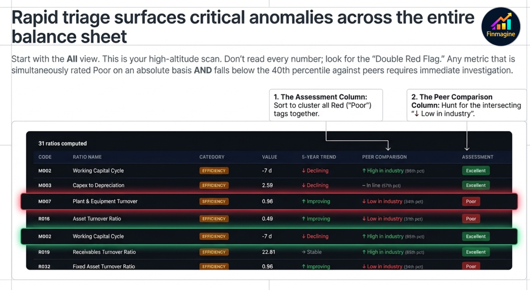
The Classification System
Every ratio is classified against pre-defined thresholds that are specific to that ratio and, where applicable, to the sector. The four classifications are:
Reading a Ratio Card
When you click a category (Liquidity, Leverage, Profitability, etc.), the view switches from the list to individual ratio cards — one per ratio in that category. Each card contains six pieces of information:
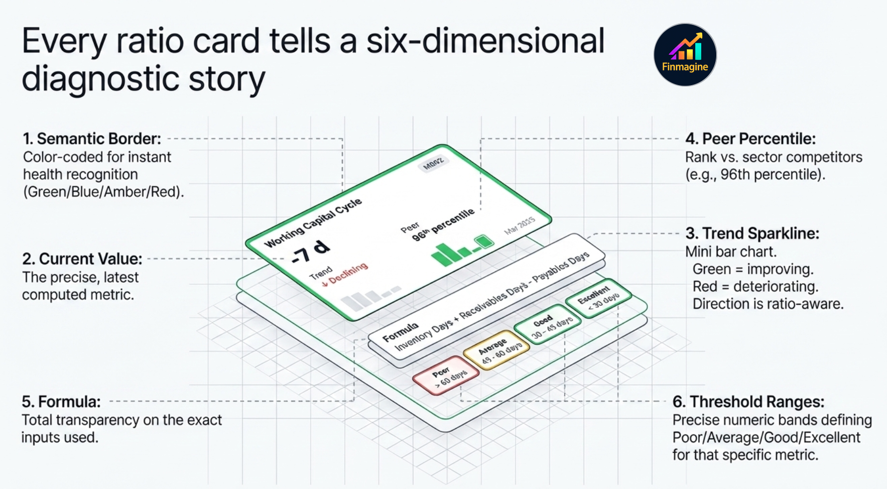
Card Elements
1 Border & Name Colour
The card border and ratio name are colour-coded to match the classification — green for Excellent, blue for Good, amber for Average, red for Poor. You can read the health of a ratio before reading a single number.
2 Current Value
The large number in the centre of the card — the ratio's latest computed value. Units vary by ratio type (e.g. times, %, days, ×).
3 Trend Sparkline
A mini bar chart showing how the ratio has moved over recent periods. Green bars = improving (moving toward Excellent). Red bars = deteriorating. Importantly, the direction is ratio-aware — for D/E, lower is better so a falling D/E shows green bars; for ROCE, higher is better so a rising ROCE shows green bars.
4 Peer Percentile
Shown below the value — ↑ High in industry / ~ In line / ↓ Low in industry, with the exact percentile in brackets. This tells you whether the company's absolute ratio is competitive within its sector.
5 Formula
The exact formula used to compute the ratio — fully transparent. If you want to verify the number against your own calculation or understand what drives it, the formula is always shown.
6 Threshold Ranges
The specific number bands used for classification — e.g. Current Ratio: Poor <1.0 · Average 1.0–1.5 · Good 1.5–2.0 · Excellent >2.0. You can see exactly where the company sits and how far it is from the next classification band.
The Six Ratio Categories
Ratios are grouped into six categories. Each answers a distinct question about the business:
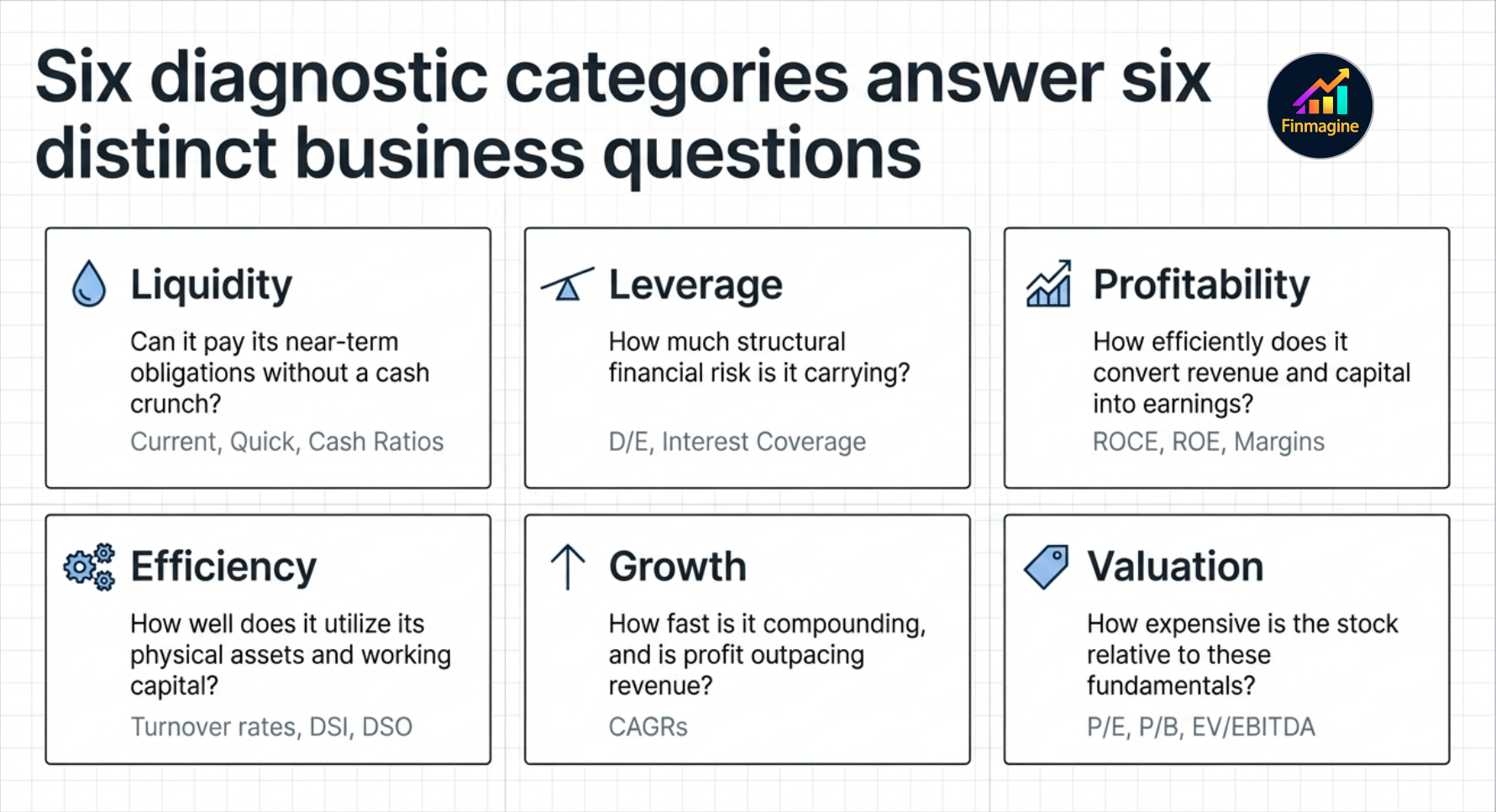
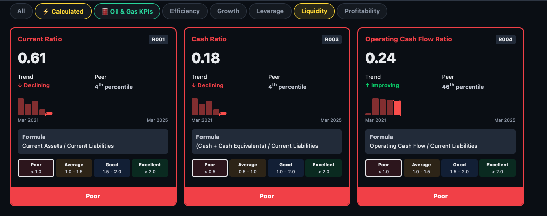
Liquidity Can it pay its near-term obligations?
Liquidity ratios test whether the company has enough short-term assets to cover short-term liabilities. A company with poor liquidity risks a cash crunch even if it is profitable on paper.
- Current Ratio — current assets ÷ current liabilities. Above 1.5 is generally healthy.
- Quick Ratio — strips out inventory (less liquid) from current assets. A stricter solvency test.
- Cash Ratio — only cash and equivalents vs current liabilities. The most conservative test.
Leverage How much debt is it carrying?
Leverage ratios measure financial risk. A company that grows through debt is not the same as one that grows through profits — leverage amplifies both gains and losses.
- Debt-to-Equity (D/E) — total debt ÷ equity. Lower is safer for non-financial companies.
- Interest Coverage — EBIT ÷ interest expense. How many times can it pay its interest bill from operating profit?
- Debt-to-EBITDA — how many years of EBITDA would it take to repay all debt?
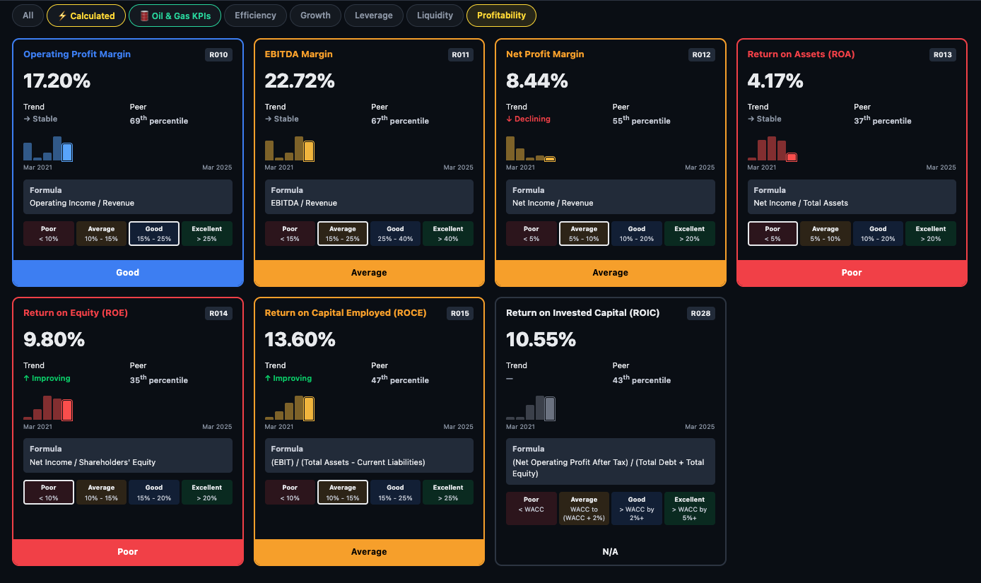
Profitability How efficiently does it earn?
The most watched category for long-term investors. Profitability ratios test whether the business converts revenue and capital into sustainable profit.
- ROCE — Return on Capital Employed. The single most important ratio for capital-intensive businesses — measures how efficiently every rupee of capital generates operating profit.
- ROE — Return on Equity. How much profit for shareholders per rupee of equity invested.
- OPM% — Operating Profit Margin. What percentage of revenue survives after operating costs.
- NPM% — Net Profit Margin. What percentage survives all the way to the bottom line.
- EBITDA Margin — earnings before interest, tax, depreciation, amortisation as a % of revenue.
- Gross Margin — revenue minus direct cost of goods, as %. Measures pricing power and input cost efficiency.
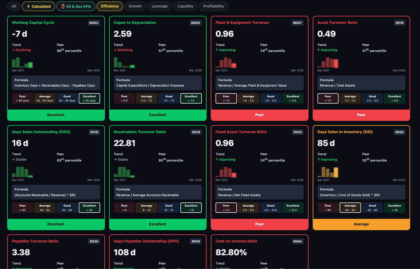
Efficiency How well does it use its assets?
Efficiency ratios measure operational discipline — how quickly inventory moves, how promptly customers pay, how much revenue the asset base generates.
- Working Capital Cycle — the cash conversion cycle in days. Negative means the company collects cash before paying suppliers — a sign of strong market position (common in retail and some IT firms).
- Asset Turnover Ratio — revenue ÷ total assets. Higher means the company squeezes more sales from every rupee of assets.
- Days Sales Outstanding (DSO) — average days taken by customers to pay. Rising DSO can signal collection problems or aggressive revenue recognition.
- Days Sales in Inventory (DSI) — how many days of inventory does it hold? Lower generally means better supply chain management.
- Capex to Depreciation — is the company investing more than it depreciates? Above 1x means the asset base is growing.
- Receivables Turnover — how many times per year receivables are collected. Higher is better.
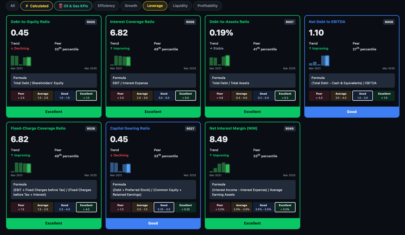
Leverage How much debt is it carrying?
Leverage ratios measure financial risk. The platform shows several angles on debt — the absolute load, the repayment coverage, and the structural mix between debt and equity.
- Debt-to-Equity Ratio — total debt ÷ equity. Lower is safer for non-financial companies.
- Interest Coverage Ratio — operating profit ÷ interest expense. How many times can it pay its interest bill from operations?
- Debt-to-Assets Ratio — what fraction of total assets is funded by debt.
- Net-Debt to EBITDA — how many years of EBITDA would it take to repay net debt? Above 3x is typically a concern.
- Finance Charge Coverage — broader than interest coverage, includes lease obligations.
- Net Interest Margin (NIM) — shown for applicable companies; spread between lending and borrowing rates.
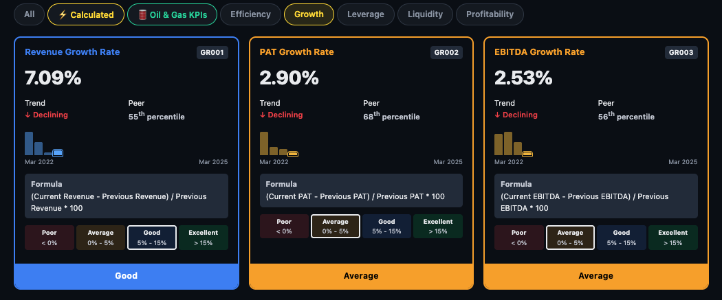
Growth How fast has it been compounding?
Growth ratios show the compounding rate of the business — separating genuine growth companies from stagnators. The platform shows 1-year, 3-year, and 5-year CAGR for each metric.
- Revenue Growth Rate — compounded annual revenue growth. The top-line trajectory.
- PAT Growth Rate — net profit CAGR. The critical check: is profit growing faster or slower than revenue? Faster = margin expansion; slower = margin compression.
- EBITDA Growth Rate — operating cash profit growth, stripping out tax and financing effects.
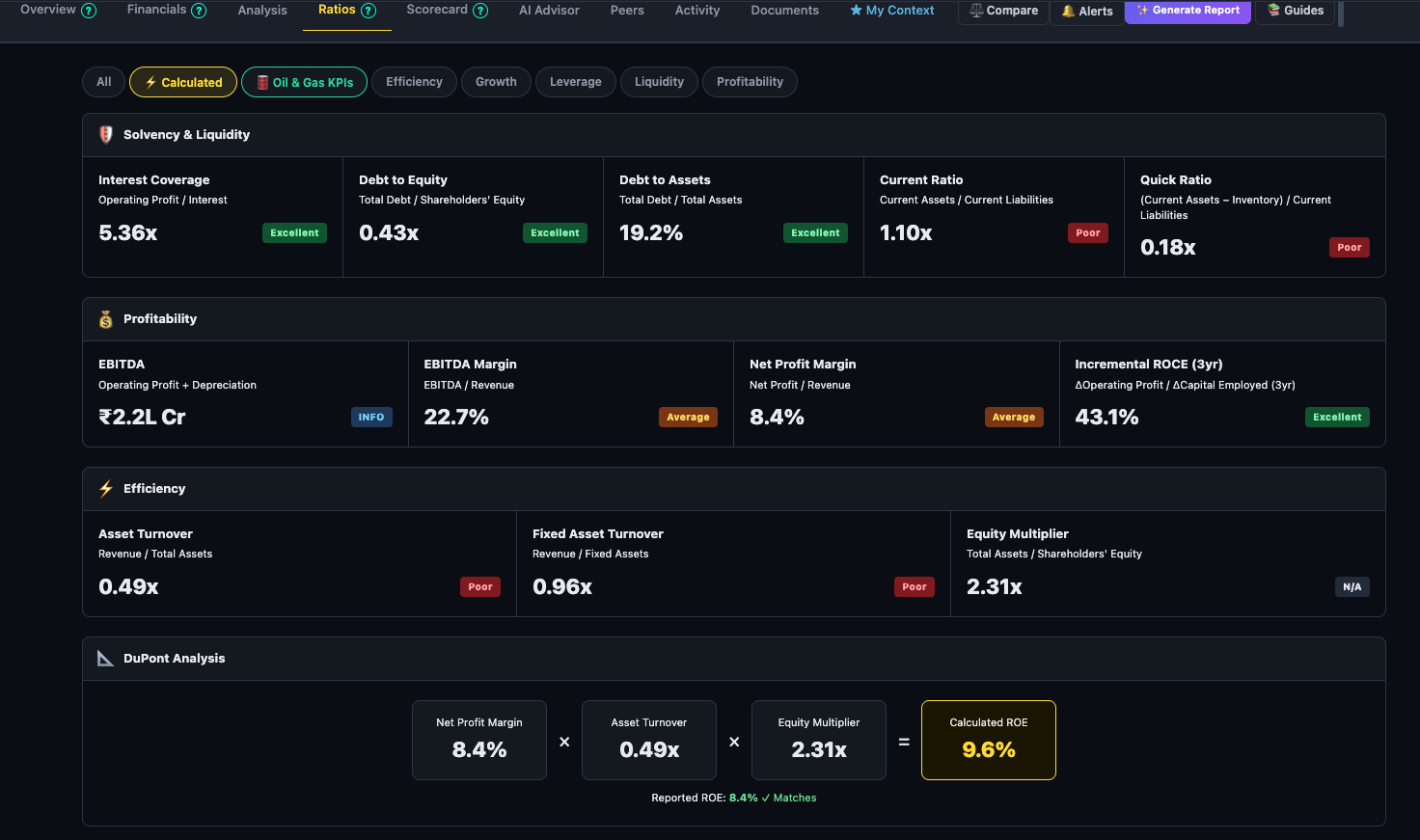
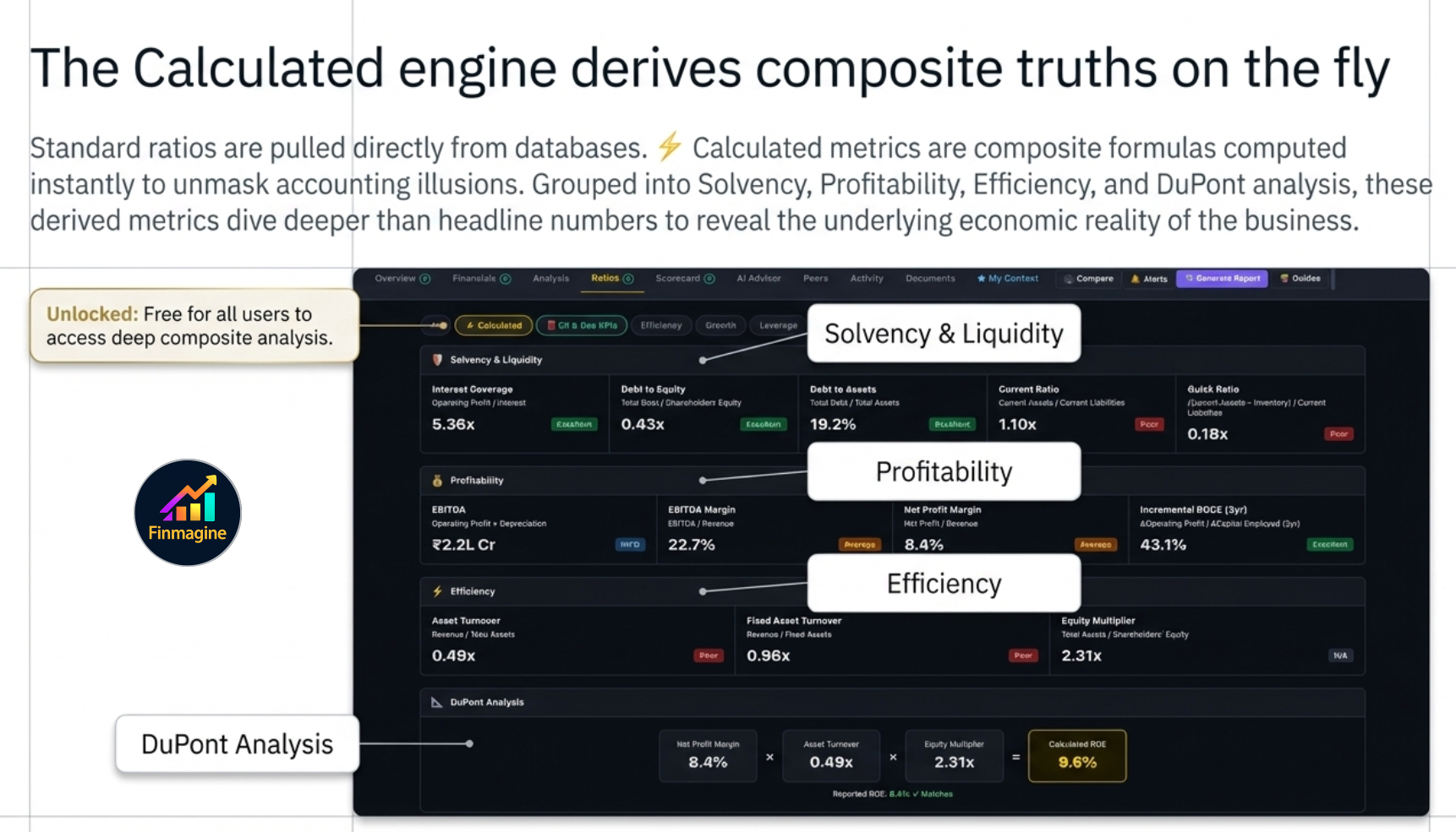
⚡ Calculated Ratios — The Analytical Engine
Most financial ratios are read directly from a database — they are pulled from filings and stored. The ⚡ Calculated sub-tab is different. These are derived composite metrics computed on the fly using multiple data points, and they are designed to answer deeper questions than any single ratio can. Unlike the main ratio grid (Premium-only), Calculated ratios are available to all users including guests.
The ratios are organised into four conceptual groups: Solvency & Liquidity, Profitability, Efficiency, and DuPont Analysis. Each card shows the current value, a classification badge (Excellent / Good / Average / Poor), a trend sparkline, the formula, and threshold ranges so you understand what "good" actually means for that metric.
1. The Zombie Test — Borrowing Time vs. Building Value
A company can appear healthy by every headline metric — revenue growing, PAT positive, dividends paid — and still be a zombie: an entity that survives only because it can keep borrowing, not because it generates real value.
The Zombie Test uses the Interest Coverage Ratio alongside operating cash flow trends to identify companies that are technically solvent but economically hollow. The core question: is the company earning enough from its operations to comfortably service its debt, or is it perpetually rolling over borrowings to stay alive?
- Interest Coverage > 5× — operating profit covers interest expense five times over. Healthy buffer.
- Interest Coverage 2–5× — serviceable but leaves little room for a demand shock or rate rise.
- Interest Coverage < 2× — most of the operating profit is consumed by interest. Any earnings miss and the company struggles to pay lenders.
- Interest Coverage < 1× — operating profit does not cover interest. The company is literally borrowing to pay lenders. This is the zombie zone.
Pair this with the trend: a company moving from 6× to 3× over five years is not a stable 3× — it is a deteriorating story. Finmagine's trend sparkline makes this trajectory immediately visible.
2. Solvency Analysis — Survival Metrics
Solvency is about the long run: can this company survive a prolonged downturn, a credit freeze, or a sector de-rating? The solvency metrics in Calculated ratios go beyond the simple Debt-to-Equity number you see in screeners.
- Debt-to-Equity (D/E) — total borrowings divided by shareholders' equity. A D/E of 1× means debt equals equity; 2× means debt is twice equity. Capital-light businesses (IT, consumer) typically run D/E below 0.5×. Asset-heavy businesses (infra, real estate) routinely run 2–4×. Context matters: compare within sector, not across.
- Debt-to-EBITDA — how many years of current operating earnings would it take to repay all debt? Under 2× is generally healthy; above 4× signals that debt has become structural rather than tactical.
- Net Debt / Equity — subtracts cash and liquid investments from gross debt. A company with ₹500 Cr debt and ₹300 Cr cash has net debt of ₹200 Cr. Net debt is a more honest measure of financial risk than gross debt.
3. The Profitability Paradox — Why EBITDA Can Mislead
EBITDA is popular with management teams and investment bankers because it is large — it strips out depreciation, amortisation, interest, and tax. The problem: all four of those items are real costs that real shareholders bear.
- Depreciation is not a cash expense today, but it represents the economic wearing-out of assets that will need to be replaced tomorrow. A cement company depreciating a ₹2,000 Cr plant over 20 years is telling you that ₹100 Cr per year is being consumed — it's just being consumed slowly.
- Interest is a direct transfer of value from equity holders to debt holders. Ignoring it flatters the equity picture.
- Tax is a real cash outflow. Companies with deferred tax assets may show lower effective tax rates temporarily, but the liability exists.
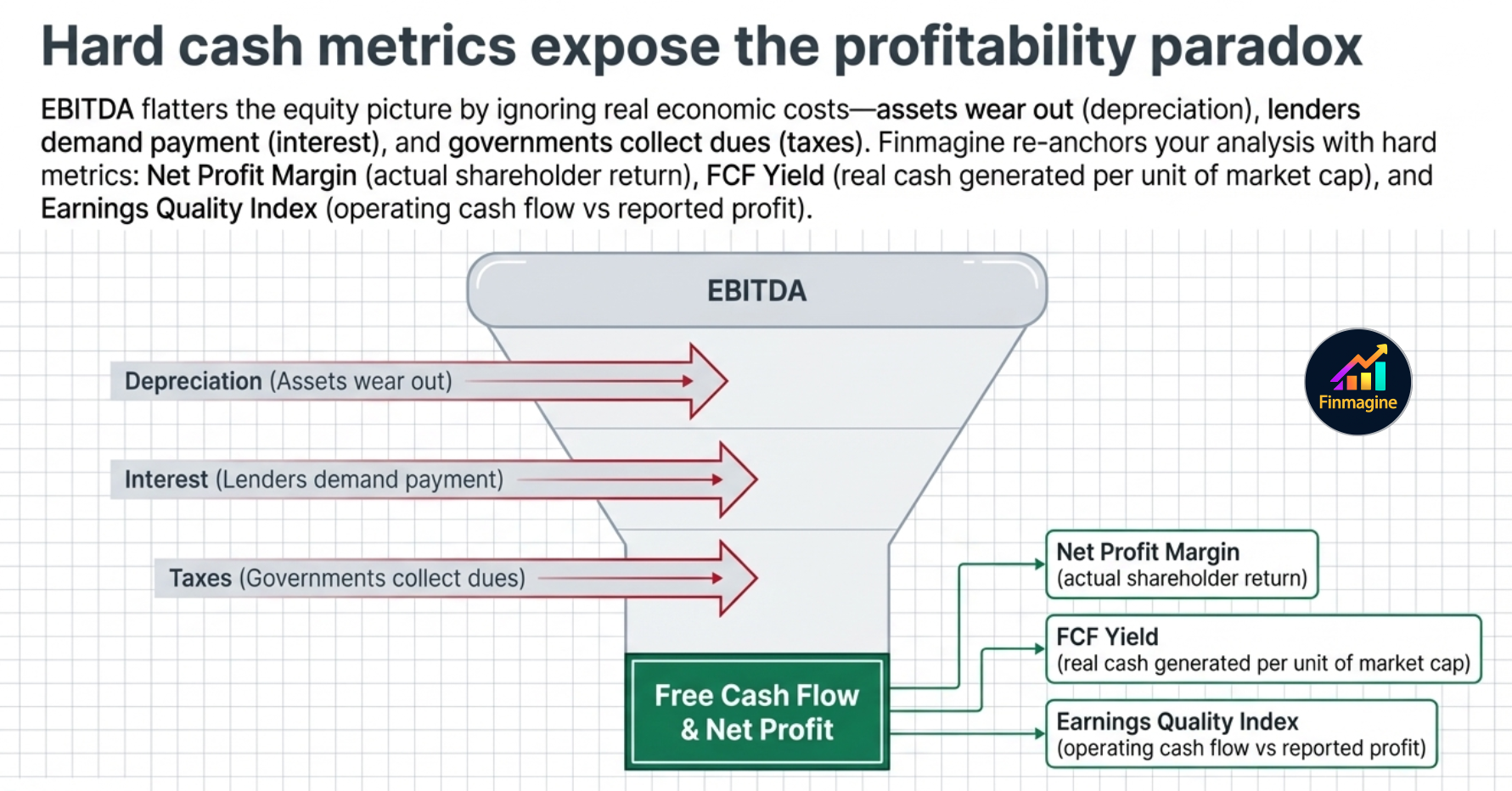
The Calculated ratios bring you back to earth with metrics based on Net Profit and Free Cash Flow:
- Net Profit Margin — after all expenses. This is what shareholders actually earned per rupee of revenue.
- FCF Yield — Free Cash Flow divided by Market Cap. A company with a 6% FCF yield is generating ₹6 in real cash for every ₹100 of market value. This is often more honest than P/E because it uses actual cash, not accounting profits.
- Earnings Quality Index — the ratio of operating cash flow to reported net profit. A ratio below 1× means the company is reporting profits it has not actually collected in cash. Consistently below 1× is a red flag: the company may be booking revenue that never becomes cash (receivables inflation, channel stuffing).
4. Efficiency Metrics — The Velocity of Money
Two companies can have identical profit margins and yet be radically different businesses. The difference lies in how fast they convert their assets into revenue — the velocity of money through the business.
- Asset Turnover — revenue divided by total assets. A ratio of 1.5× means the company generates ₹1.50 in revenue for every ₹1 of assets deployed. Higher is better for most businesses: it means the asset base is working hard.
- Inventory Turnover — how many times per year the company sells through its entire inventory. Slow inventory turnover means capital is tied up in warehouses — it inflates the balance sheet and hides margin pressure.
- Receivables Turnover / Debtor Days — how long it takes to collect cash from customers. A company with 90-day debtor days is effectively giving its customers a 3-month loan. If debtor days are rising year-on-year, the company may be relaxing credit terms to push revenue — a classic early warning sign.
- Working Capital Efficiency Score — a composite metric combining inventory days, debtor days, and payable days into a single cash conversion cycle score. A shorter cycle means the business needs less capital to sustain the same level of operations.
5. DuPont Decomposition — Breaking ROE Into Its Parts
Return on Equity (ROE) is one of the most quoted metrics in investing — but its headline number hides more than it reveals. Two companies can both show 18% ROE with completely different underlying stories.
The DuPont framework decomposes ROE into three multiplicative components:
= (Net Profit / Revenue) × (Revenue / Total Assets) × (Total Assets / Equity)
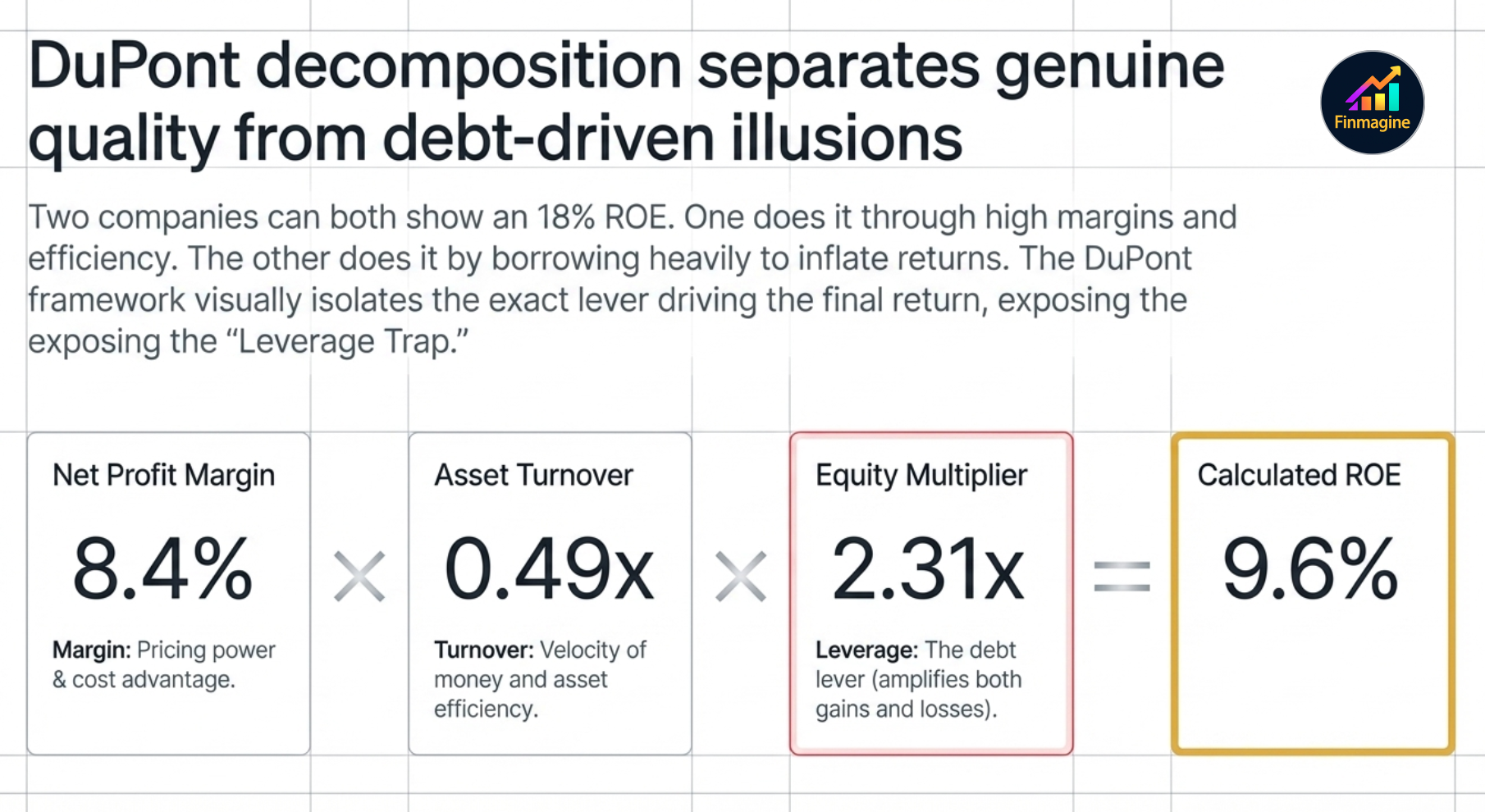
- Net Profit Margin — how much profit does the company extract from each rupee of sales? High margins come from pricing power, brand, or structural cost advantages.
- Asset Turnover — how productively is the asset base deployed? High turnover comes from capital-light business models or operational efficiency.
- Equity Multiplier (Financial Leverage) — total assets divided by equity. This is the debt lever: the more a company borrows, the larger this number, and the more it amplifies the first two components — in both directions.
Why this matters in practice:
- A consumer goods company typically has high margins, moderate turnover, low leverage. ROE is genuine.
- A retail company has thin margins but very high asset turnover (inventory cycles fast). ROE is driven by velocity, not margin.
- A leveraged conglomerate may show high ROE purely because the equity multiplier is high — it is borrowing to inflate returns. Strip out the leverage and the underlying business may be mediocre.
Finmagine's DuPont card shows all three components side-by-side with trend sparklines so you can see in seconds whether ROE is improving because the business is getting better, or because management is taking on more debt.
6. The Leverage Trap — How Debt Creates Illusions
Debt is a multiplier. When a business earns more on its assets than it pays in interest, debt amplifies equity returns — this is the foundation of sensible financial leverage. When it earns less, debt destroys equity value at an accelerating rate.
The trap is that leverage looks excellent in the good years. A company that earns 12% on assets funded 50% by debt at 8% interest is earning something like 16% ROE — versus 12% if it had used only equity. Impressive. But the same leverage in a downturn year where asset returns drop to 6% flips to a loss situation: the interest obligation is fixed, the returns are not.
Watch these signals in the Calculated ratios to identify the leverage trap before it springs:
- Rising D/E with flat or falling ROCE — borrowing is growing faster than the returns on what's being borrowed. The company is using debt to fund expansion that isn't paying off.
- High Equity Multiplier with thin margins — the DuPont tells the full story: ROE is cosmetically high only because of financial leverage, not business quality.
- Interest Coverage declining over 3–5 years — even if coverage is still above 1×, a deteriorating trend means the safety buffer is shrinking.
- FCF negative while PAT is positive — the company is booking profit but consuming cash. At some point, lenders notice.
7. Quality Compounder Profile — What Sustainable Growth Looks Like
At the opposite end from the zombie company is the quality compounder: a business that grows consistently, earns high returns on capital, carries little debt, and converts profits reliably into cash. The Calculated ratios let you build a 5-point health check that distinguishes genuine compounders from businesses with a good-looking recent quarter.
- ROCE > 15% and improving — the company is earning well above its cost of capital. Growth creates value, not just scale.
- D/E < 1× and stable or falling — growth is funded by retained earnings, not borrowed money. The balance sheet is a strength, not a liability.
- Earnings Quality Index > 1× — profits are converting to cash. Revenue is real, not just accounting entries.
- Asset Turnover stable or improving — the business is not becoming less efficient as it scales. Operational leverage is working.
- Interest Coverage > 5× and not deteriorating — even in a stress scenario, the company can service its debt without strain.
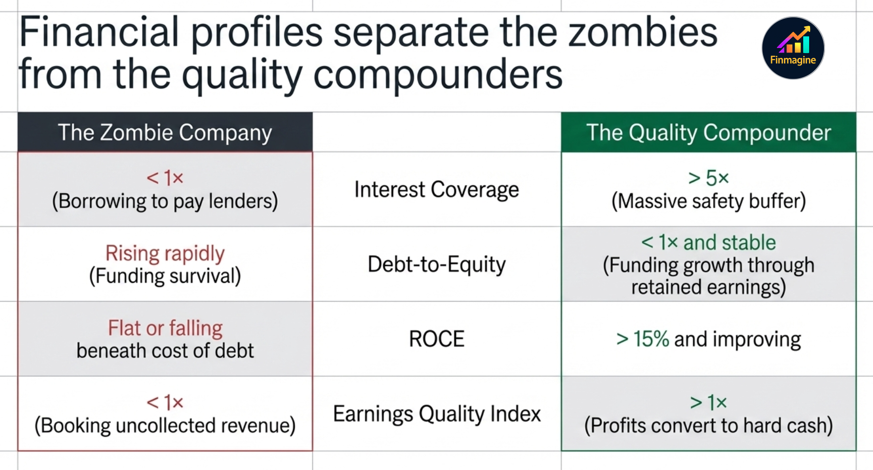
A company that passes all five over a 5-year period is not guaranteed to be a great investment at any price — valuation still matters. But it has the financial architecture of a compounder: it earns well, grows without excessive debt, and turns those earnings into real cash. That combination is far rarer than headline ROE numbers suggest.
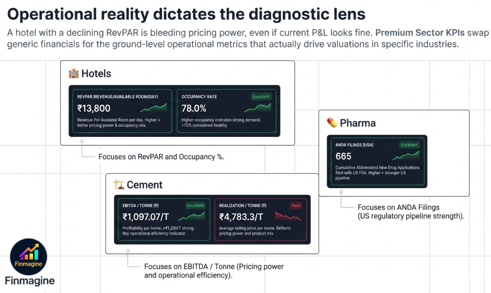
Sector KPIs — The Tab That Changes Per Company
The platform shows a sector-specific KPI sub-tab for companies where operational metrics matter as much as financial ratios. The tab label itself changes to reflect the company's sector — you will never see a generic "Sector KPIs" label. Instead:
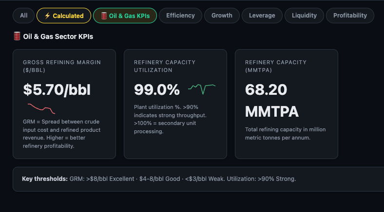
- RELIANCE → 🛢️ Oil & Gas KPIs
- TCS / Infosys → 💻 IT Sector KPIs
- HDFC Bank / ICICI Bank → 🏦 Fin KPIs
- Sun Pharma / Dr Reddy's → 💊 Pharma KPIs
- Bharti Airtel → 📡 Telecom KPIs
The tab only appears when data is available for that specific company. If you don't see it, either the company's sector has no operational KPIs defined, or data hasn't been populated yet.
🏦 Fin KPIs — Banking & NBFC Companies
For banks, NBFCs, and other financial institutions, the sector KPI tab is labelled Fin KPIs and is visible to all users (not just Premium). It replaces the standard ratio metrics that are structurally inapplicable to lending businesses.
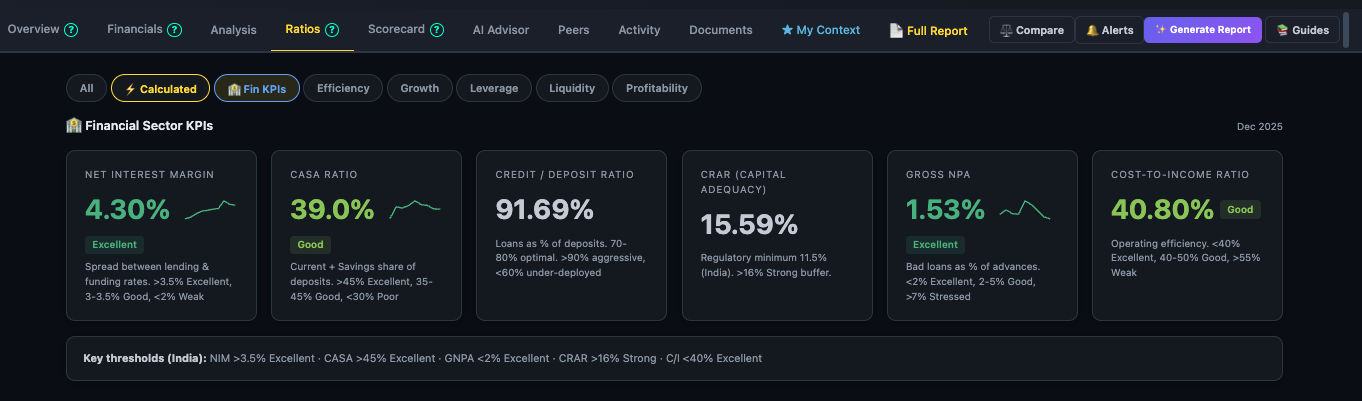
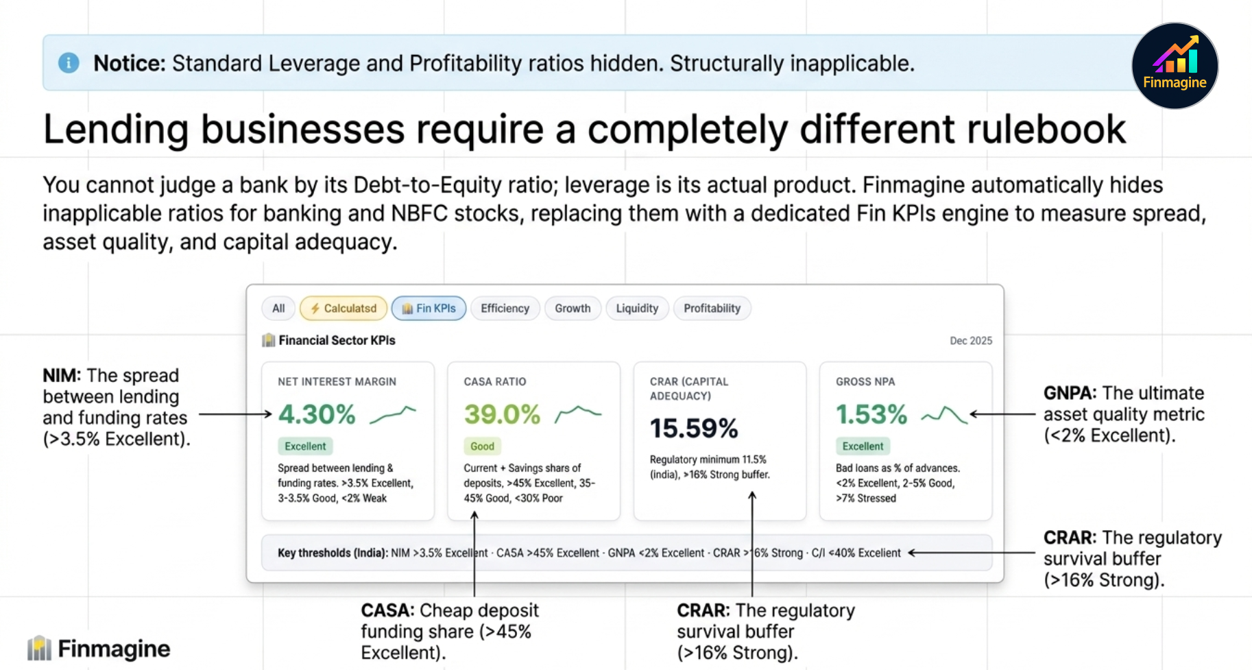
Key banking metrics shown:
- NIM (Net Interest Margin) — the spread between what the bank earns on loans and pays on deposits. The banking equivalent of gross margin.
- GNPA% — Gross Non-Performing Assets as a percentage of advances. The key asset quality metric — higher means more bad loans.
- CASA Ratio — Current Account + Savings Account deposits as a % of total. Higher CASA = cheaper funding cost.
- CRAR — Capital to Risk-weighted Assets Ratio. The regulatory capital adequacy measure — must stay above RBI mandated minimums.
- Cost-to-Income — operating expenses as a % of income. Lower is more efficient.
Each metric includes a trend sparkline covering recent quarters, so you can see whether NIM is expanding or compressing and whether GNPA is improving or worsening.
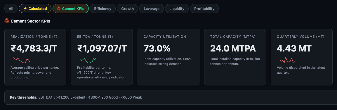
Other Sector KPIs — Operational Metrics PREMIUM
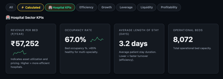
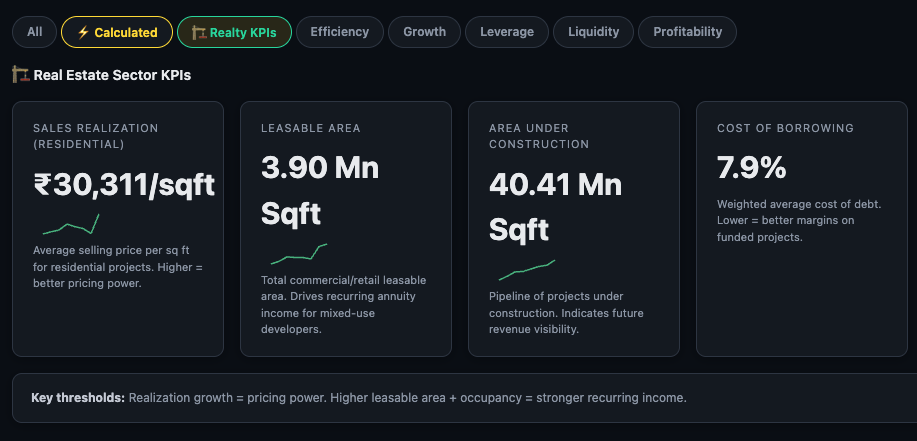
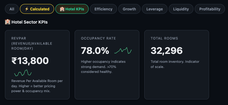
For companies in sectors with meaningful operational metrics — Hotels, Hospitals, Pharma, IT, Telecom, Insurance, Cement, Auto, Oil & Gas, and Realty — the sector-specific KPI sub-tab appears with a label matching that exact sector.
Examples by sector:
- Hotels — RevPAR (Revenue per Available Room), Occupancy %
- Hospitals — Revenue per Bed, Occupancy %
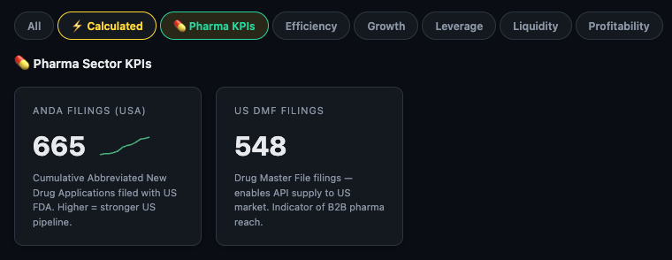
- Pharma — ANDA filings, US DMF filings
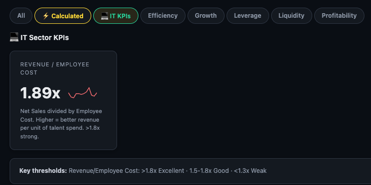
- IT — Revenue per Employee Cost ratio
- Telecom — ARPU (Average Revenue Per User)
- Auto — Total vehicles sold by category
- Cement — Realization per tonne
- Oil & Gas — Production volumes (crude, gas, LPG)
Here's how the tab looks across a handful of sectors — notice how the tab label and the specific metrics shown are entirely different for each company:
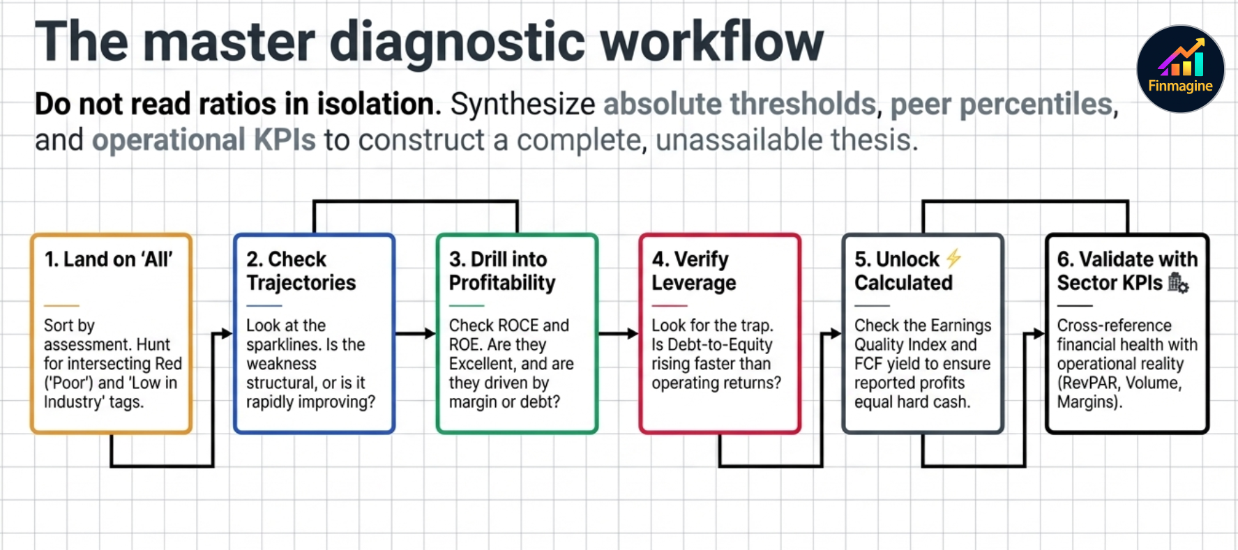
Recommended Ratios Tab Workflow
Step 1 Land on "All" — scan the full ratio list. Count how many Poor ratings appear and check if any are also "↓ Low in industry". That's your red flag list.
Step 2 Check the trend direction on the Poor ratios. A Poor ratio that's been improving for three consecutive periods is very different from one that's deteriorating.
Step 3 Drill into Profitability — ROCE and ROE are the two ratios that most reliably separate good businesses from bad ones over the long term. Are they Excellent or Good? Are they improving?
Step 4 Check Leverage — especially if the company has been growing fast. Is debt rising faster than equity? Is interest coverage healthy?
Step 5 Read Valuation last — a great business at a poor valuation is still worth investigating. A terrible business at a cheap valuation is usually a trap. Use the Valuation category to understand what you're paying for what you're getting.
Step 6 Open ⚡ Calculated for the composite metrics — these often surface earnings quality issues that the standard ratios miss.
Ready to Analyse Indian Stocks Like a Pro?
Finmagine gives you 30+ computed financial ratios, sector benchmarks, FII/DII flows, the Finmagine Score, and AI-powered analysis — all in one place.