Following along? Open the live page
Finmagine — free to explore • premium for full access • no app needed
Multimedia Learning Hub
Master the Stock Overview tab through a complete learning path, video walkthrough, audio deep dive, and interactive flashcards
What You Will Master
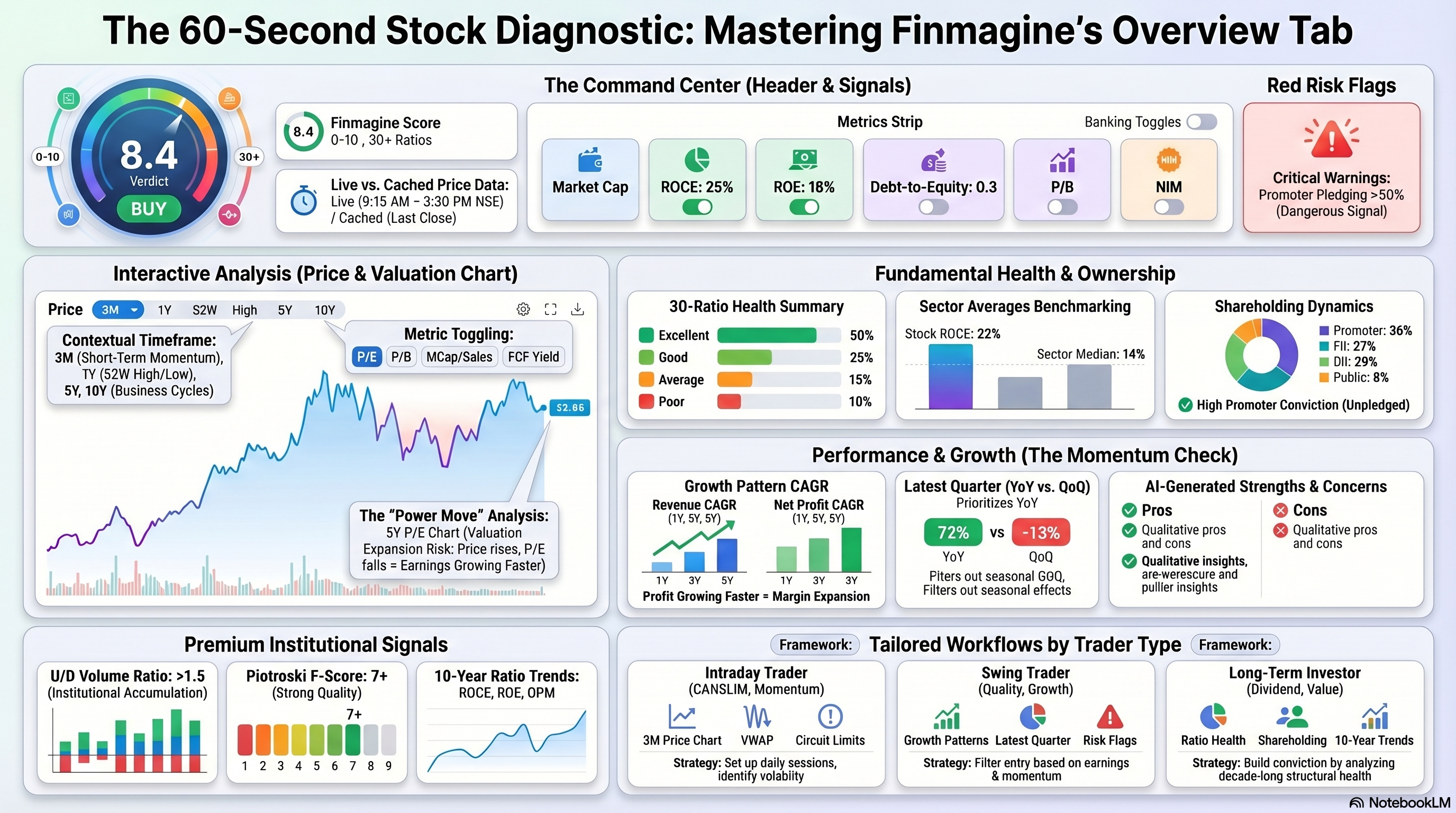
The Overview tab is the starting point for every stock you analyse on Finmagine. It gives you a comprehensive snapshot — from live price and 10-year price history, to a 30-ratio health score, shareholding breakdown, strengths and concerns, sector benchmarks, and the most recent quarterly result — all before you click a single other tab.
What This Guide Covers:
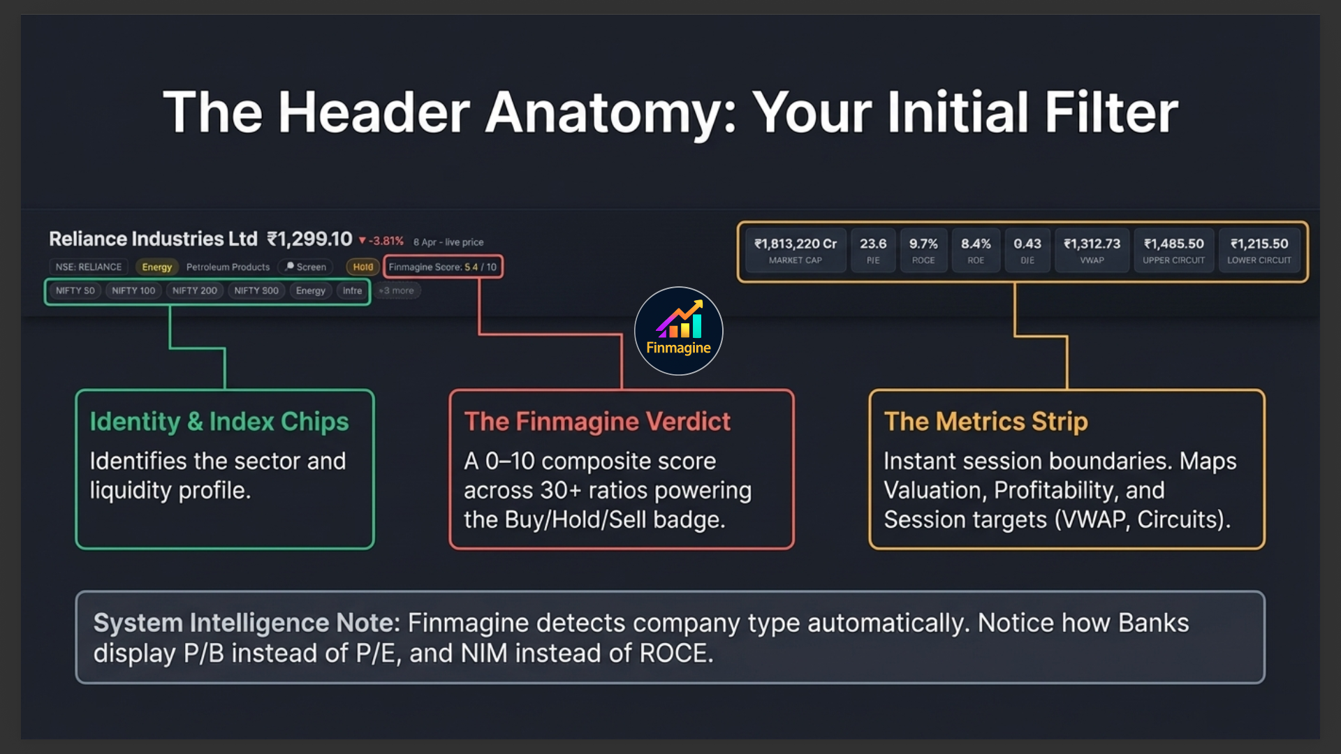
- The Stock Page Header — company name, live price, Finmagine Score, sector badge, index membership, and the key metrics strip
- The Price Chart — range buttons (3M to 10Y) and the metric toggle (Price · PE · PB · MCap/Sales · FCF Yield)
- Signal Badges — scan qualifications, trend direction, risk flags, and investment theme chips
- Ratio Health Summary — the Excellent/Good/Average/Poor breakdown across 30+ ratios
- Shareholding Pattern — promoter, FII, DII, and public holdings
- Strengths & Concerns — AI-generated pros and cons
- Key Ratios Snapshot & Sector Averages — how this stock compares to its peers
- Growth Pattern — revenue and profit CAGR across 1Y, 3Y, and 5Y
- Latest Quarter Results — revenue, operating profit, net profit with QoQ and YoY badges
- Premium cards — Historical Valuation Range, U/D Volume Ratio, 10-Year Ratio Trend, Annual EPS & Price Range
Who This Is For:
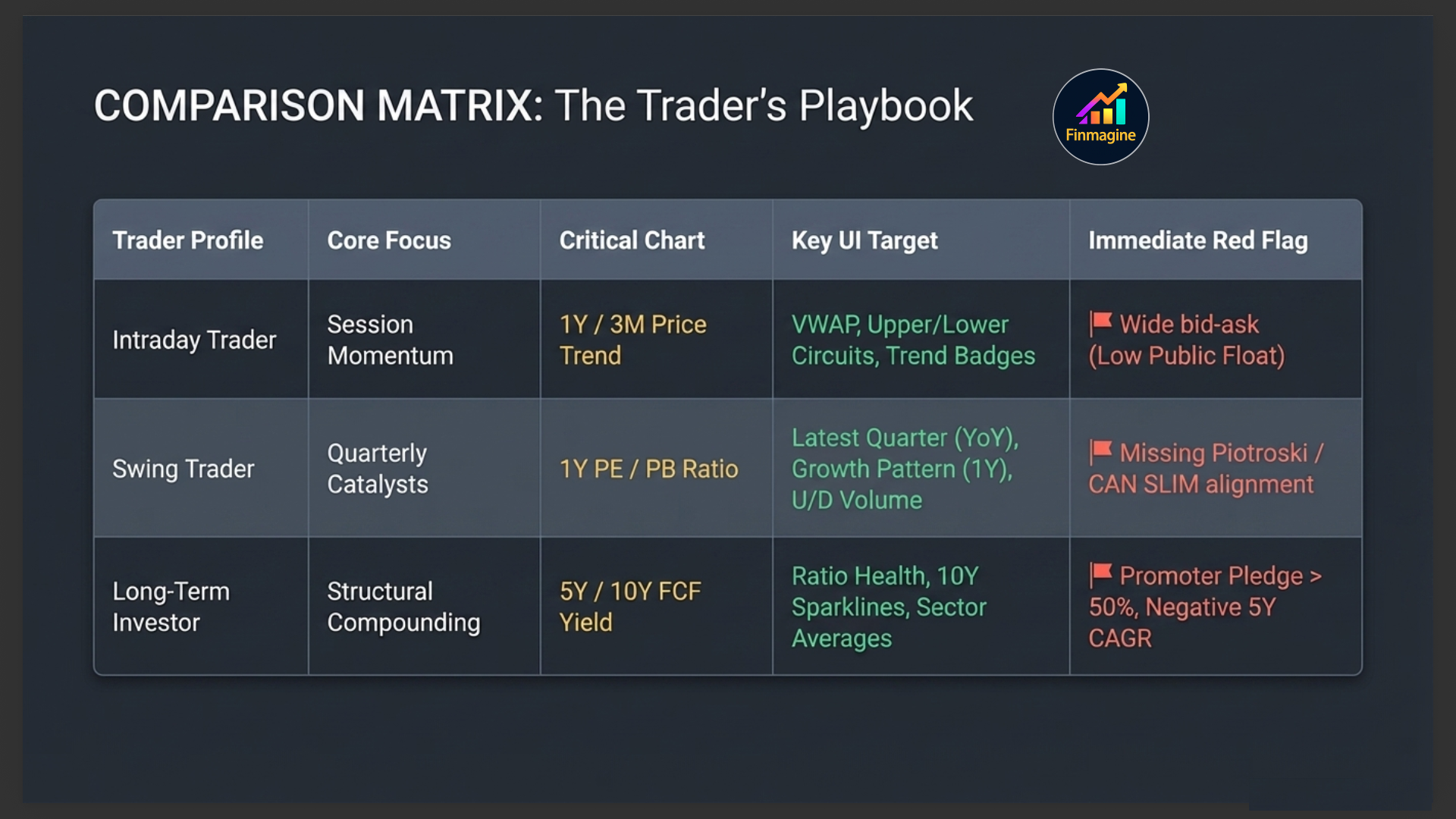
- Intraday traders — use the price chart (1Y range), VWAP, Upper/Lower Circuit, and trend badges to set up for the session
- Swing traders — use the Growth Pattern, Latest Quarter, and Risk Flags to filter entry candidates
- Long-term investors — use Ratio Health, Sector Averages, Shareholding, Strengths/Concerns, and the 10-Year Trend to build conviction
Video Walkthrough — 60-Second Stock Triage
Watch this complete walkthrough of the Finmagine Stock Overview tab. Learn how to apply the top-down triage system — from the Finmagine Score and Verdict in the header, through the price chart and signal badges, down to the Ratio Health engine, shareholding pattern, and the 60-second workflow that filters good ideas from bad ones rapidly.
- How the Finmagine Score integrates 30+ ratios into a single Buy/Hold/Sell Verdict
- The correct eye-tracking path across the Overview tab
- How to use the PE Ratio overlay on the 5-year chart (the Power Move)
- Reading signal badges and spotting structural red flags instantly
- The exact 60-second triage sequence used by serious investors
Audio Deep Dive — The 60-Second Stock Workflow
A detailed audio walkthrough covering every section of the Stock Overview tab — from reading the header and price chart to interpreting ratio health, shareholding patterns, strengths and concerns, and the full triage workflow. Listen while you trade or commute.
- Why the Overview tab functions as a top-down filtration system
- The exact header anatomy — Identity, Verdict, Index chips, Metrics strip
- How to move between chart time ranges for different trader types
- Understanding signal badges and the Promoter Pledge cascade risk
- Reading the 30-ratio health engine and the shareholding conviction engine
- How strengths and concerns form an automated due diligence checklist
- The full eye-tracking path and 60-second triage workflow
Test Your Knowledge
Click any card to reveal the answer. Use the search box to find a specific topic.
Understanding the Stock Page Header
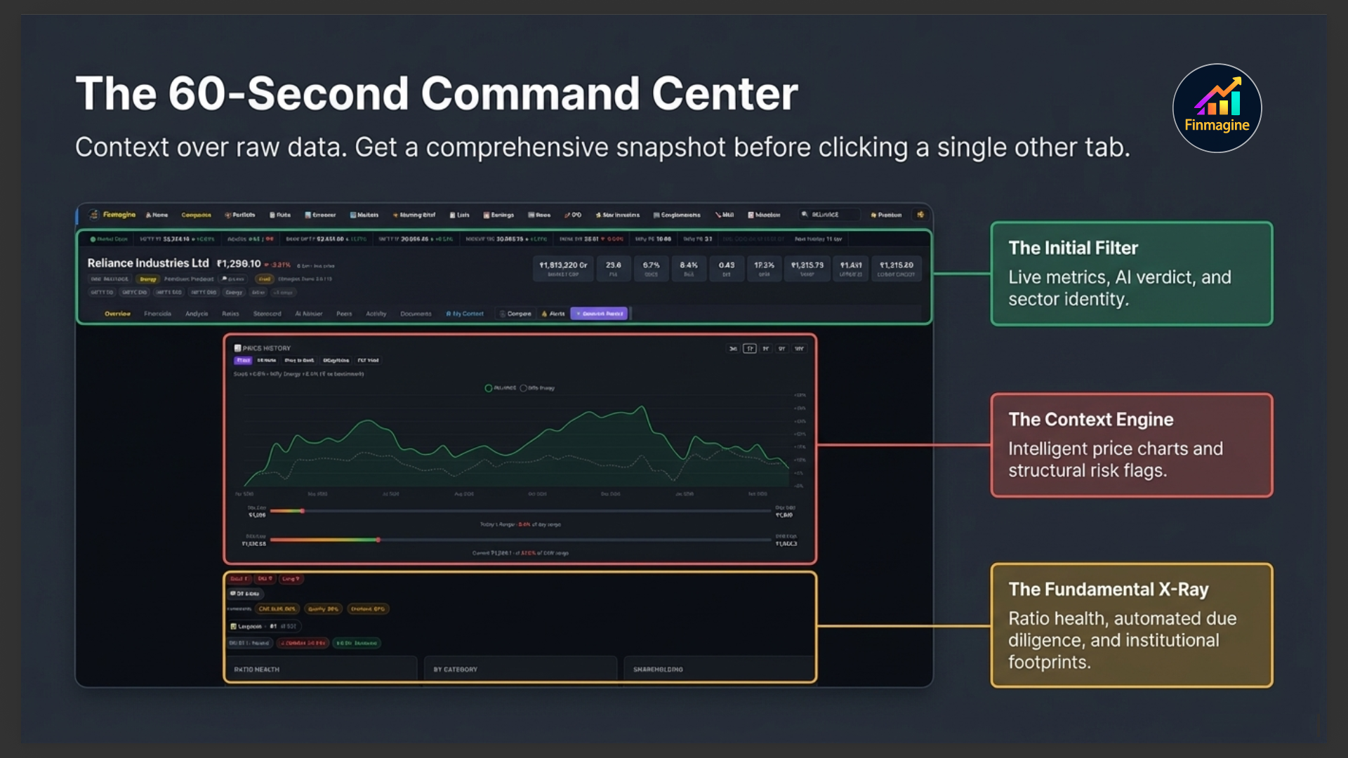
Before you even look at the Overview tab content, the header gives you a complete snapshot of the company. Every stock page on Finmagine has the same header structure — understanding it once means you can read any stock instantly.
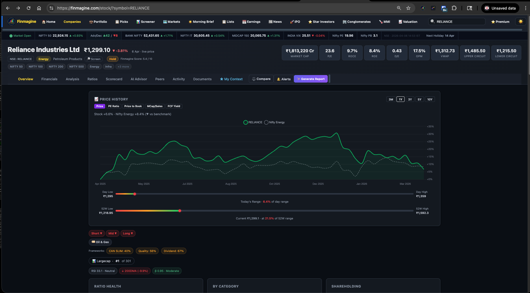
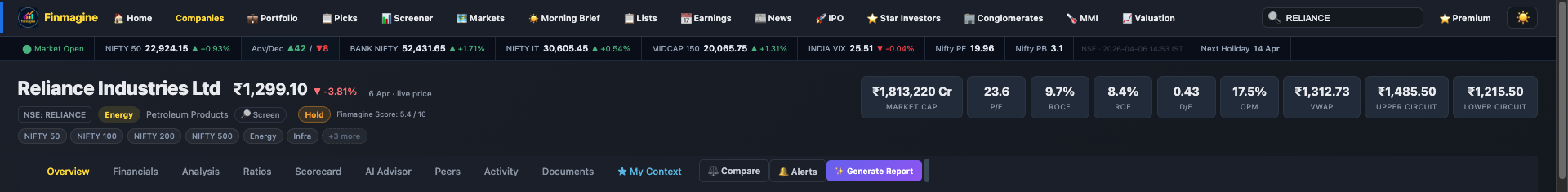
Company Name, Price & Change
The top-left shows the company's full legal name, live market price (updated in real time during market hours), and the percentage change from the previous close in green (up) or red (down). Below the price you'll see the date and whether it's a live price or a cached price from the last trading session.
The Classification Row
Below the price you'll see a row of badges that tell you exactly what kind of company this is:
| Badge | What It Means | What To Do With It |
|---|---|---|
| NSE: SYMBOL | The stock's NSE ticker | Use it to search on any platform |
| Sector (e.g. Energy) | Broad market sector | Click to screen all stocks in that sector |
| Type badge (e.g. IT, NBFC, Pharma) | Derived sub-type from industry data | Tells you which ratios to prioritise |
| 🔎 Screen | Link to screener filtered to same sector | Find peers instantly |
| Buy / Hold / Sell | Finmagine Verdict based on Score | Starting point for your own thesis |
| Finmagine Score x.x / 10 | Composite score across 30+ ratios | Higher = stronger fundamentals overall |
Index Membership Chips
The row of chips (NIFTY 50, NIFTY 100, NIFTY 200, NIFTY 500, sector indices) shows which indices this stock belongs to. This matters because index inclusion drives passive fund buying and affects liquidity. A stock in NIFTY 50 has very different institutional ownership dynamics than one that's only in NIFTY 500.
The Metrics Strip
The right side of the header shows the most important fundamental and technical numbers at a glance:
The Price Chart
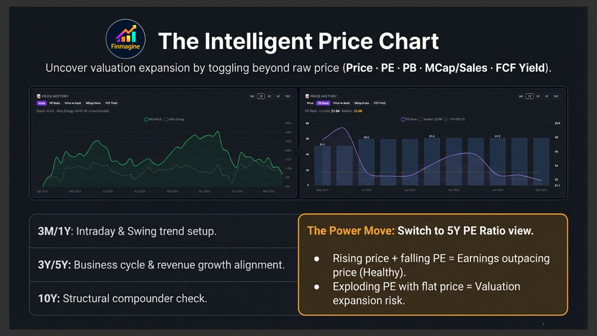
The first thing you see when you land on the Overview tab is the price chart — a clean, interactive line chart showing the stock's price history. This is your context engine: before you look at any ratio, you want to know where this stock has been.
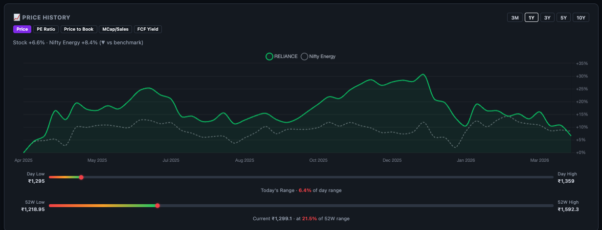
Time Range Buttons
Five buttons let you control the time window:
| Range | Best Used For |
|---|---|
| 3M | Intraday and short-term swing setups — recent momentum and trend |
| 1Y (default) | Annual trend, 52-week high/low context, typical swing trader view |
| 3Y | Medium-term business cycle — revenue/profit growth reflected in price |
| 5Y | Full business cycle, CAGR context, long-term investor view |
| 10Y | Structural compounder check — has price compounded with earnings over a decade? |
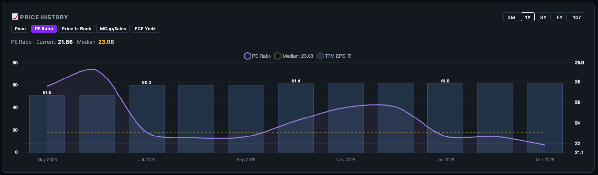
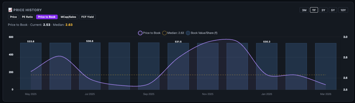
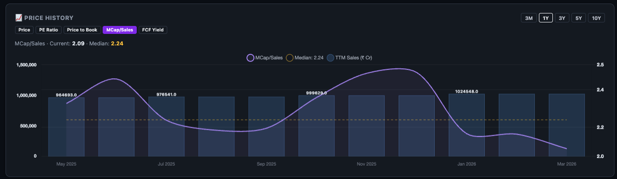
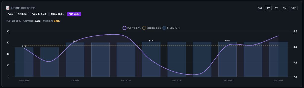
The Metric Toggle — Beyond Just Price
This is where the chart becomes genuinely powerful. Instead of just tracking price, you can overlay valuation metrics to answer much deeper questions:
| Metric | Question It Answers |
|---|---|
| Price (default) | Where has the stock been? What is the trend? |
| PE Ratio | Is the stock more or less expensive than it has historically been? |
| Price to Book | How does the market value the company's net assets over time? |
| MCap / Sales | Is the market pricing in too much or too little revenue growth? |
| FCF Yield | Is the free cash flow attractive relative to the price? |
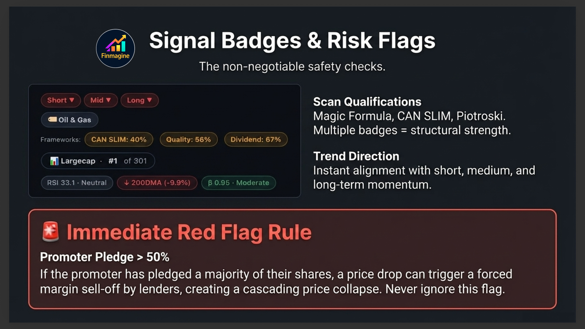
Signal Badges & Chips
Between the price chart and the main cards, Finmagine shows a row of contextual signal badges. These are computed automatically and tell you things that raw numbers cannot.
Scan Qualification Badges
If this stock qualifies for any of Finmagine's fundamental scans (Magic Formula, Graham Value, Piotroski proxy, Turnaround Watch, Hidden Champions, etc.), those badges appear here. A stock qualifying for multiple scans simultaneously is rare and worth investigating further.
Trend Direction Badges
Short-term, medium-term, and long-term trend direction badges (for logged-in users) show whether the stock is in an uptrend, downtrend, or consolidation across three different time horizons. This helps you align your trade direction with the dominant trend.
Risk Flag Chips
These are yellow and red warning chips that flag structural risks — high promoter pledge, declining revenue trend, deteriorating margins, high D/E, or recent significant insider selling. They appear on all pages, including for non-logged-in users.
Investment Theme Chips
These coloured chips show investment themes that this stock belongs to — Capital Expenditure Play, Export-oriented, Import Substitute, Government Order-driven, and so on. Themes help you understand the macro tailwind (or headwind) behind the business.
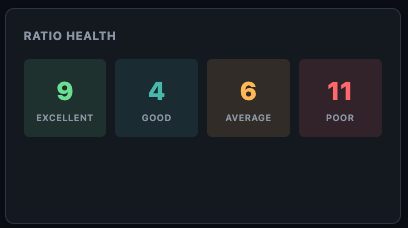
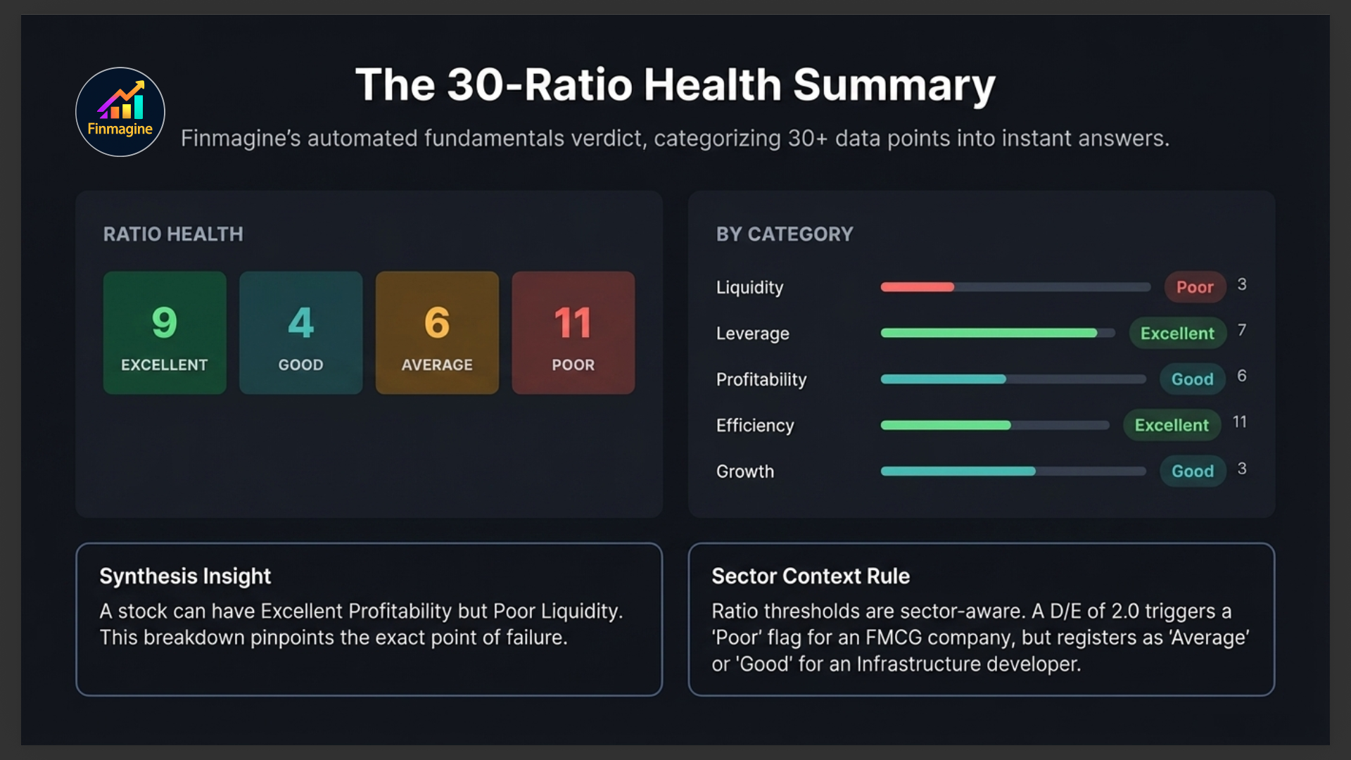
Ratio Health Summary
This is Finmagine's at-a-glance verdict on the company's financial health across 30+ computed ratios. Rather than making you read each ratio individually, it categorises every ratio into one of four buckets:
You'll see the count of ratios in each category — for example "Excellent: 12 · Good: 8 · Average: 6 · Poor: 4." A company with most ratios in Excellent and Good is fundamentally strong. A company with many Poor ratios needs careful scrutiny before investing.
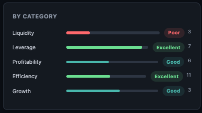
By Category Breakdown
The "By Category" card breaks the health rating down by ratio category — Liquidity, Leverage, Profitability, Efficiency, Growth, and Valuation. This pinpoints exactly where a company is strong and where it's weak. A company can have excellent profitability but poor liquidity — a common pattern in capital-intensive businesses with slow receivables.
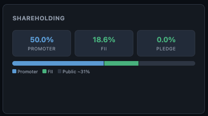
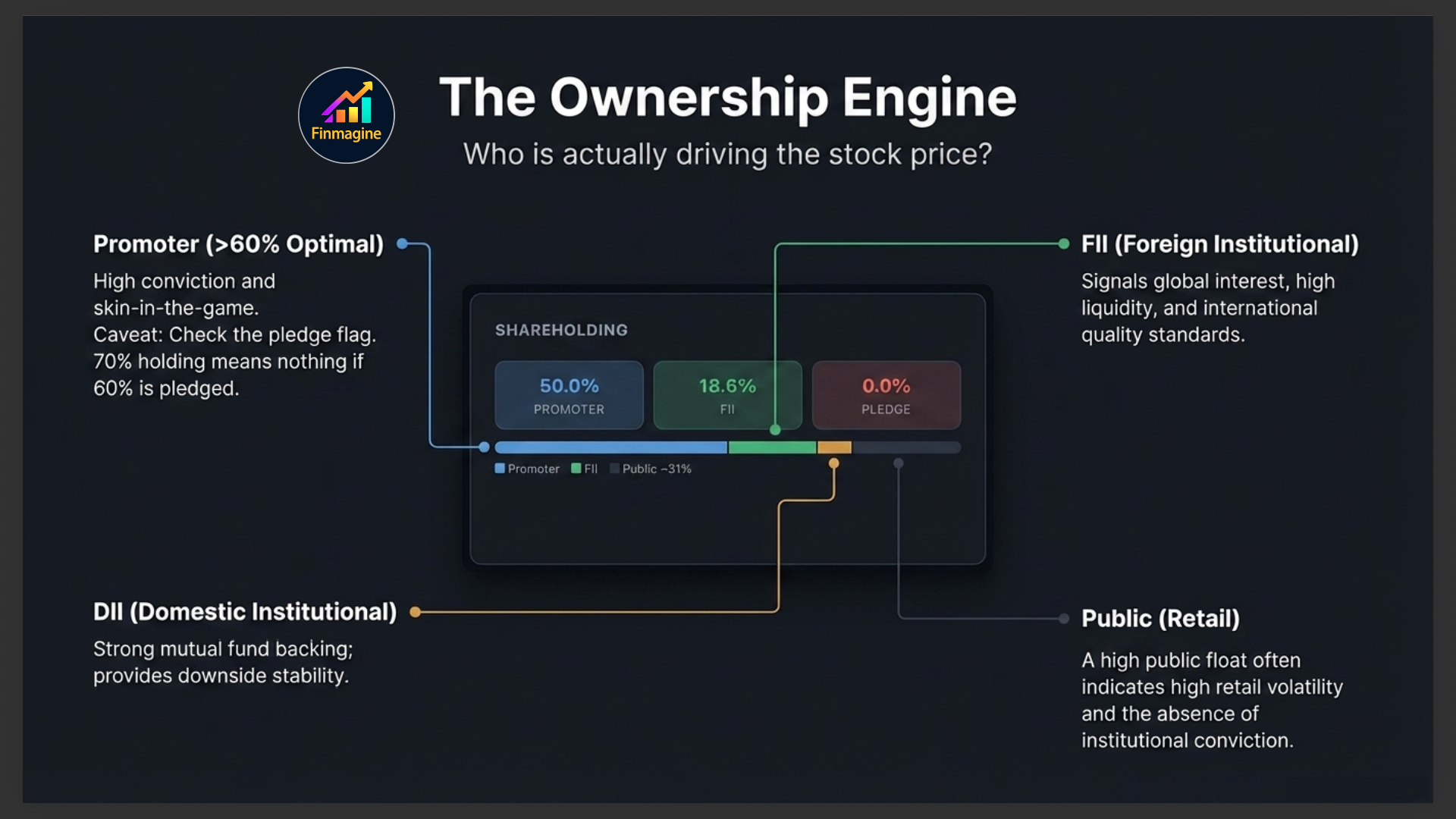
Shareholding Pattern
The Shareholding card shows the four main ownership categories as percentages:
| Category | What High % Means | What Low % Means |
|---|---|---|
| Promoter | High conviction in their own business. Above 60% is generally positive. | Below 40% raises questions about founder commitment |
| FII (Foreign Institutional) | Global institutional interest — often quality signal | May signal limited global appeal or market restrictions |
| DII (Domestic Institutional) | Indian mutual funds and insurance companies buying | Mutual funds may be absent due to liquidity or quality concerns |
| Public | Retail-heavy — more volatile, less stable ownership base | Low public float means thin trading, wider bid-ask spreads |
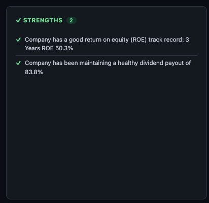
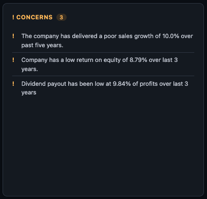
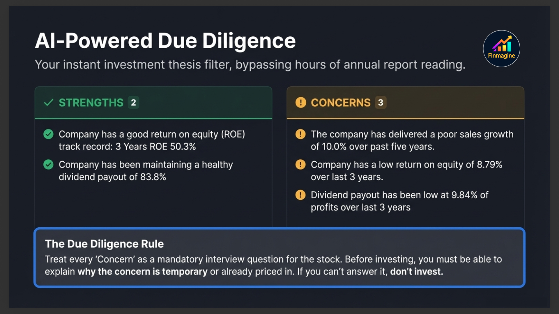
Strengths & Concerns
These two cards give you the qualitative picture — generated from the company's financial data and business profile. They save you the time of reading through 10 years of annual reports to form an initial investment thesis.
✓ Strengths
The Strengths list highlights what the company is doing well — consistent dividend payer, low debt, improving margins, high ROCE, strong revenue growth, FII accumulation, index inclusion, and so on. Each point is specific to this company's actual numbers, not generic praise.
! Concerns
The Concerns list flags genuine issues — declining promoter stake, high receivables, slowing revenue growth, margin compression, recent loss-making quarters, high working capital cycle, and similar red flags. These are the questions you should find answers to before investing.
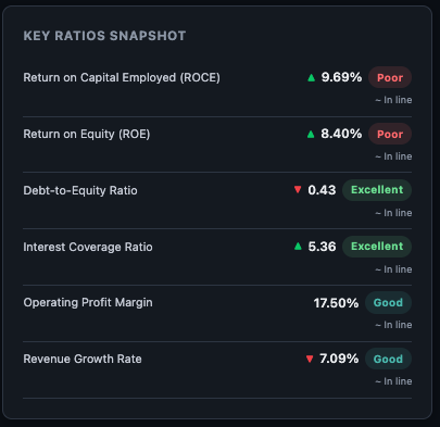
Key Ratios Snapshot & Sector Averages
Key Ratios Snapshot
A quick-reference grid of the most important ratios — PE, PB, ROCE, ROE, D/E, OPM, Revenue Growth, Profit Growth — in a single glance. This is the "dashboard view" before you dive into the full Ratios tab.
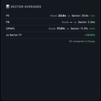
📊 Sector Averages
This card shows the median values for the same key ratios across all companies in the same sector. The comparison is immediate and powerful — if the company's ROCE is 22% and the sector median is 14%, that's a significant competitive advantage. If its PE is 40x but the sector median is 18x, you're paying a large premium and need to justify it with superior growth.
📈 Growth Pattern
The Growth Pattern card shows Revenue and Net Profit CAGR (Compound Annual Growth Rate) across three time horizons:
| Period | What It Tells You |
|---|---|
| 1-Year CAGR | Recent momentum — is the business accelerating or decelerating right now? |
| 3-Year CAGR | Medium-term trend — post-COVID recovery, business cycle positioning |
| 5-Year CAGR | Structural growth rate — the compounding engine that drives long-term returns |
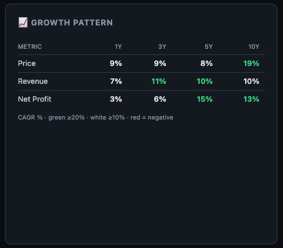
Reading the Colour Coding
Each CAGR cell is colour-coded to give you an instant verdict without reading the number:
Strong growth
Moderate growth
Declining
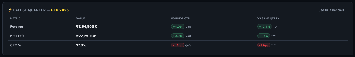
⚡ Latest Quarter Results
This full-width card shows the most recently reported quarterly results — the closest thing to "what happened last" that fundamental data can give you. It shows three core numbers:
- Revenue (Net Sales / Turnover)
- Operating Profit (EBIT / PBIT — not shown for banking stocks where NIM is more relevant)
- Net Profit (PAT — Profit After Tax)
Each number has two badges showing the trend:
- QoQ badge — Quarter-on-Quarter change: how did this quarter compare to the immediately previous quarter?
- YoY badge — Year-on-Year change: how did this quarter compare to the same quarter last year?
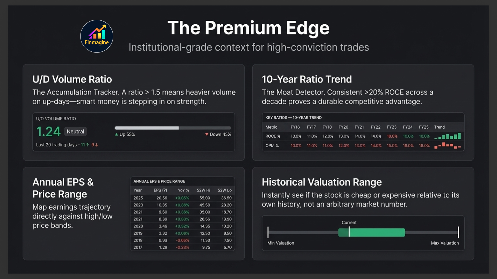
Premium Cards
Premium subscribers see additional cards in the Overview tab that add deeper context:
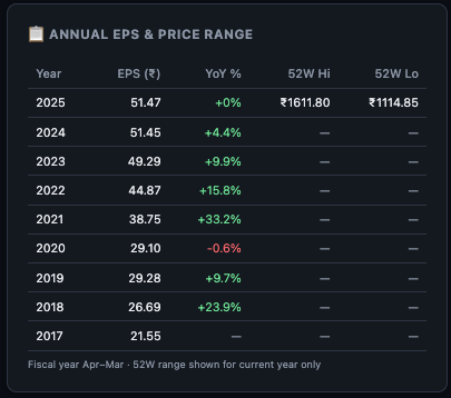
Historical Valuation Range & Annual EPS & Price Range
Shows the minimum, maximum, average, and current PE (or PB for banks) over the stock's history, with the current value highlighted on a range bar. Instantly tells you whether the stock is cheap or expensive relative to its own history — not relative to some arbitrary absolute number. The Annual EPS & Price Range table shows each year's EPS alongside the stock's annual high and low price.
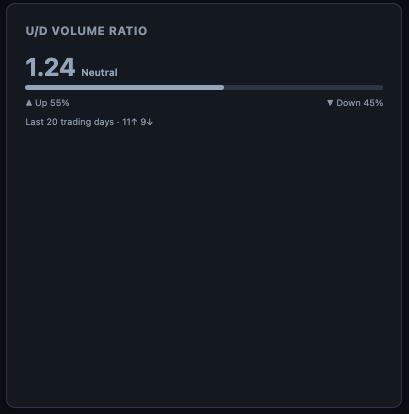
U/D Volume Ratio
Up-Down Volume Ratio: the ratio of volume on days the stock closes up vs. days it closes down. A consistently high U/D ratio means more volume is occurring on up-days — institutional accumulation signal. A low U/D ratio suggests distribution.
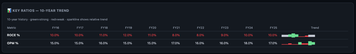
📊 Key Ratios — 10-Year Trend
Tracks 5 key ratios (ROCE, ROE, OPM, D/E, PE) over 10 years as small sparkline charts. This is the single fastest way to see whether a company's fundamentals are improving, declining, or cyclical over a full decade.
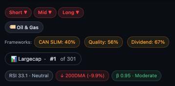
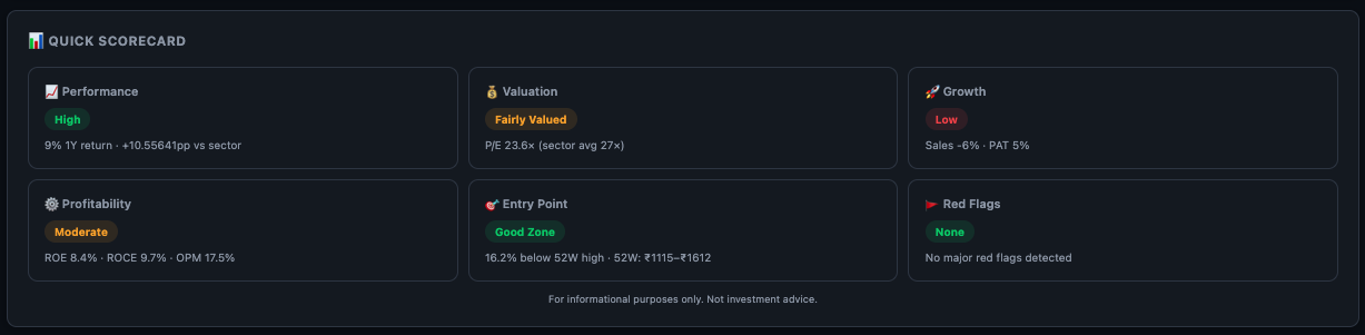
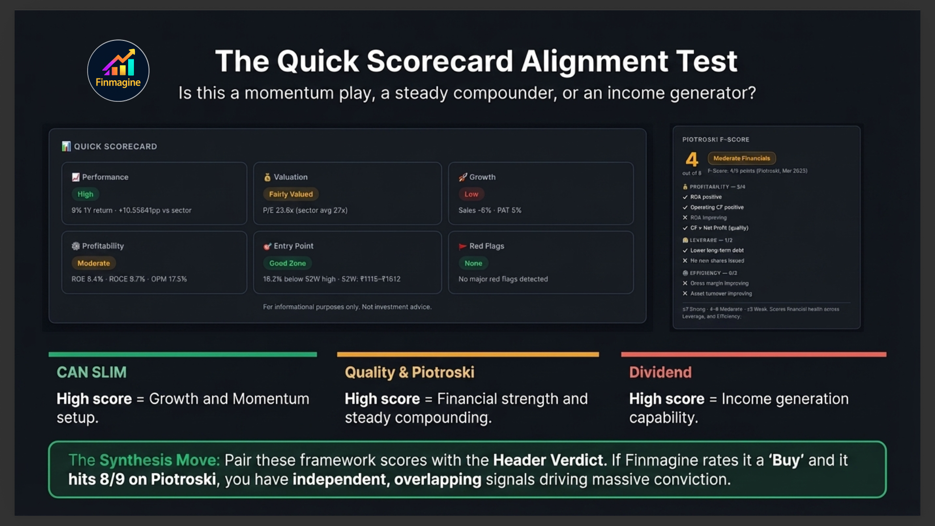
📊 Quick Scorecard
At the very bottom of the Overview tab, the Quick Scorecard provides a framework-level assessment of the stock across multiple investment lenses — CANSLIM, Quality Investing, and Dividend Investing criteria. Each framework shows a checklist of criteria and how many this stock passes.
This is not a buy/sell recommendation — it is a structured way to quickly determine which investment approach this stock aligns with. A stock scoring high on CANSLIM but low on Dividend is a growth play, not an income play. A stock scoring high on Quality and Dividend but low on CANSLIM is a steady compounder, not a momentum trade.
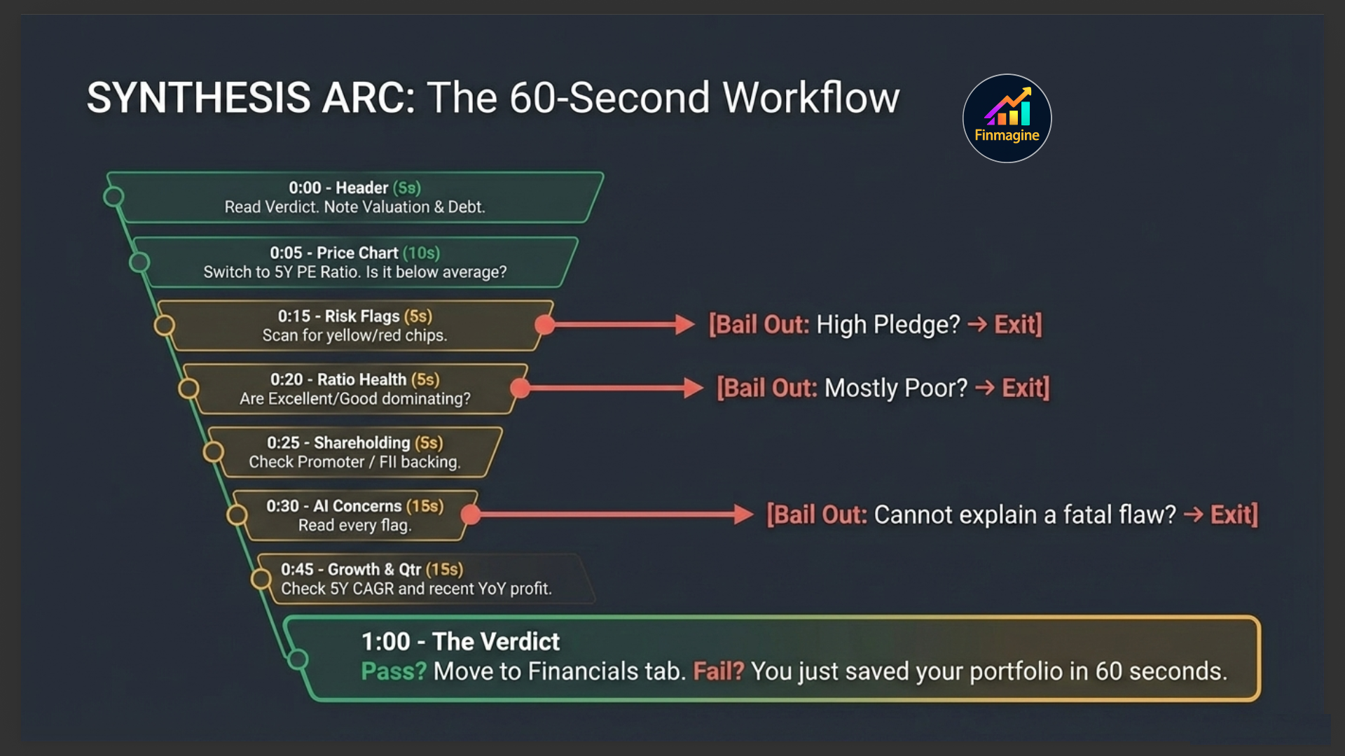
Your 60-Second Overview Tab Workflow
Here is the exact sequence to follow when you land on a new stock:
- Header (5 seconds): Read the Finmagine Score and Verdict. Check sector badge and index chips. Scan the metrics strip for P/E, ROCE, and D/E.
- Price Chart (10 seconds): Switch to 5Y view. Look at the overall direction. Switch to PE Ratio — is the current PE above or below its 5-year average?
- Risk Flags (5 seconds): Any red chips? If yes, read them before proceeding. High promoter pledge = extra caution.
- Ratio Health (5 seconds): Count the Excellent+Good vs. Average+Poor. More than half in Excellent+Good? Green light to proceed.
- Shareholding (5 seconds): Is promoter holding above 50% and unpledged? Is FII stake meaningful?
- Strengths & Concerns (15 seconds): Read all concerns first. Can you explain or dismiss each one?
- Growth Pattern (5 seconds): Is the 3Y and 5Y CAGR positive? Is profit growing faster than revenue?
- Latest Quarter (10 seconds): Green YoY badges on revenue and profit? If red, read the concerns again.
If the stock passes this 60-second filter, click into the Financials, Analysis, or Ratios tabs for deeper investigation. If it fails at any step, you've saved yourself from a bad investment in under a minute.
Ready to Analyse Indian Stocks Like a Pro?
Finmagine gives you 30+ computed financial ratios, sector benchmarks, FII/DII flows, the Finmagine Score, and AI-powered analysis — all in one place.