Following along? Open the live page
Finmagine — free to explore • premium for full access • no app needed
What You Will Master
Latest quarter, quarterly trend, CAGR cards, annual trend, and CFO vs PAT quality chart
Quarterly P&L, Annual P&L, Balance Sheet, Cash Flow, Financial Ratios — all in expandable tables
Values → YoY% → QoQ% → % of Sales — four analytical lenses on the same data
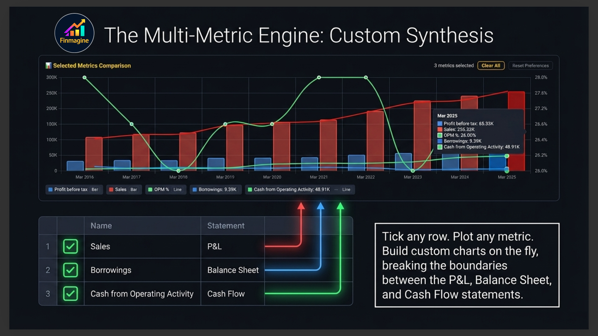
Tick any row to plot it — build custom multi-metric charts on the fly
Historical Quality Scorecard — 16 KPI tiles + ROCE/ROE trend, FCF chart, OPM consistency — all from 10 years of data
The Truth Inside Financial Statements
A real-world IT sector case study — how can revenue grow while profit collapses? This video walks through the complete Financials tab workflow to find exactly where the money leaked out, using Charts, display modes, CFO vs PAT, and the multi-metric comparison chart.
- Why net profit can be misleading — and what to read instead
- The difference between profit and cash flow, and why it matters
- How to use the 4 display modes (Values → YoY% → QoQ% → % of Sales) to diagnose a margin leak in 3 steps
- Why CFO is the ultimate test of earnings quality
- How to build custom multi-metric comparisons like a pro analyst
Audio Deep Dive — The Truth Inside the Financials Tab
A full audio walkthrough using a real IT sector case study — from reading the Charts sub-tab and spotting the revenue vs profit divergence, to diagnosing the exact cause using display modes and cash flow analysis. Listen while you trade or commute.
- The Charts-first, Statements-second workflow
- How to read quarterly trend, CAGR, and annual charts
- Why CFO vs PAT is the single most reliable earnings quality signal
- Using Values → YoY% → % of Sales to find the exact margin leak line
- Balance sheet receivables check and the cash flow reality test
- "Profit is an opinion. Cash flow is fact."
Test Your Knowledge — 81 Cards
Click any card to reveal the answer. Use the search box to find a topic.
The Financials Tab at a Glance
The Financials tab is where raw numbers live. Unlike the Overview tab which gives you a curated summary, Financials puts the full data in your hands — every quarter of revenue, every year of profit, every balance sheet line item, going back as far as the data exists.
The tab is split into three sub-tabs that work best in sequence:
| Sub-Tab | What It Does | When to Use It |
|---|---|---|
| 📈 Charts | Visual trend charts — quarterly, annual, and cash flow quality | First — get a visual picture before reading numbers |
| 📋 Statements | Full financial statements in expandable CB-style tables | Second — dig into specific line items and build comparison charts |
| 📊 Analytics | Historical Quality Scorecard — 16 pre-computed KPI tiles + ROCE/ROE, FCF, and OPM charts from 10 years of data | Third — validate quality at a glance before committing to a position |
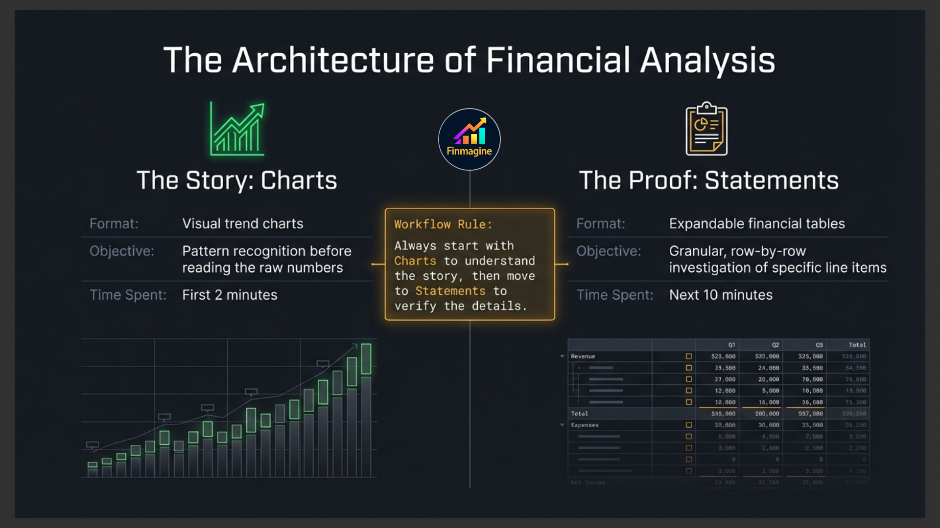
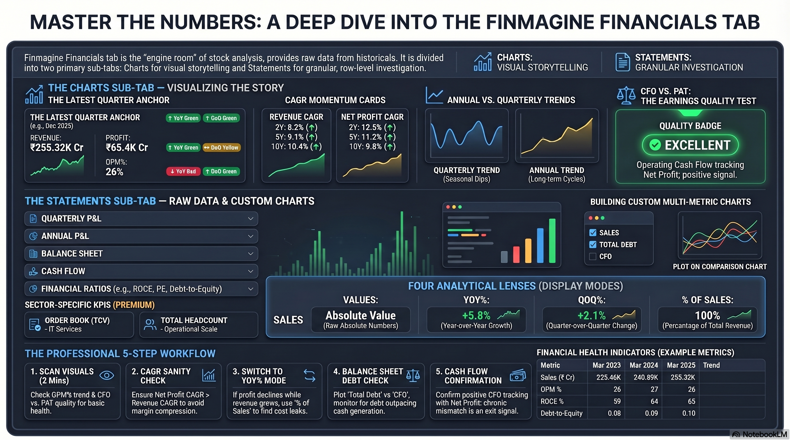
Charts Sub-Tab
The Charts sub-tab renders five visual components automatically when you open the Financials tab. No interaction required — just scroll down and read.
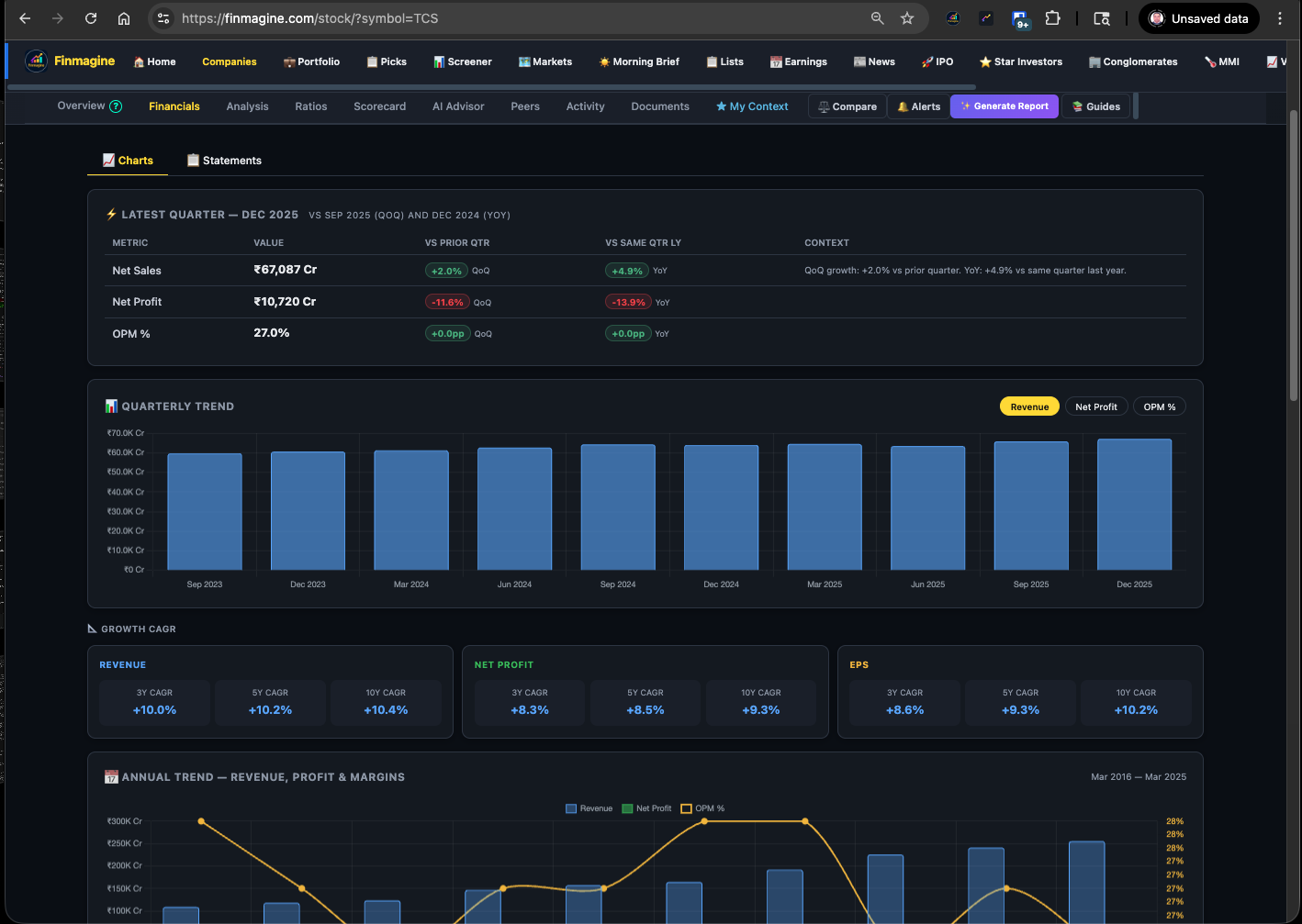
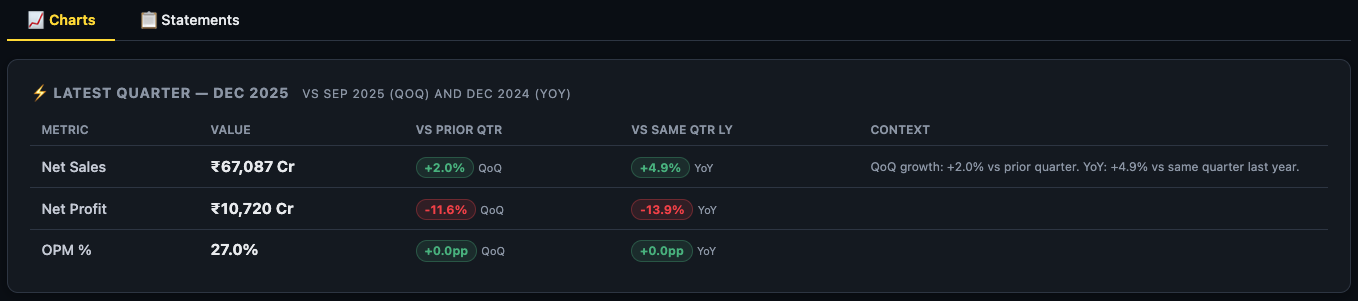
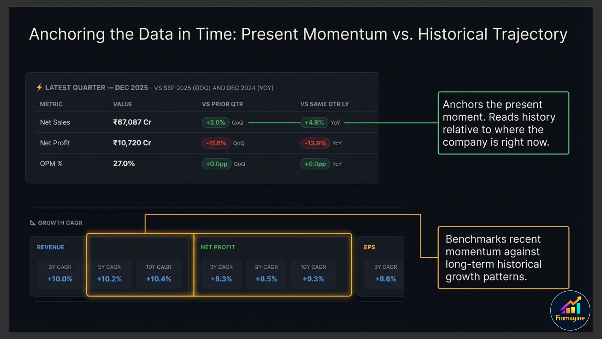
Latest Quarter Snapshot
The first card is identical to the Latest Quarter card on the Overview tab — Revenue, Operating Profit, and Net Profit for the most recent quarter with QoQ and YoY badges. It anchors everything below it in time: you're always reading history relative to where the company is right now.
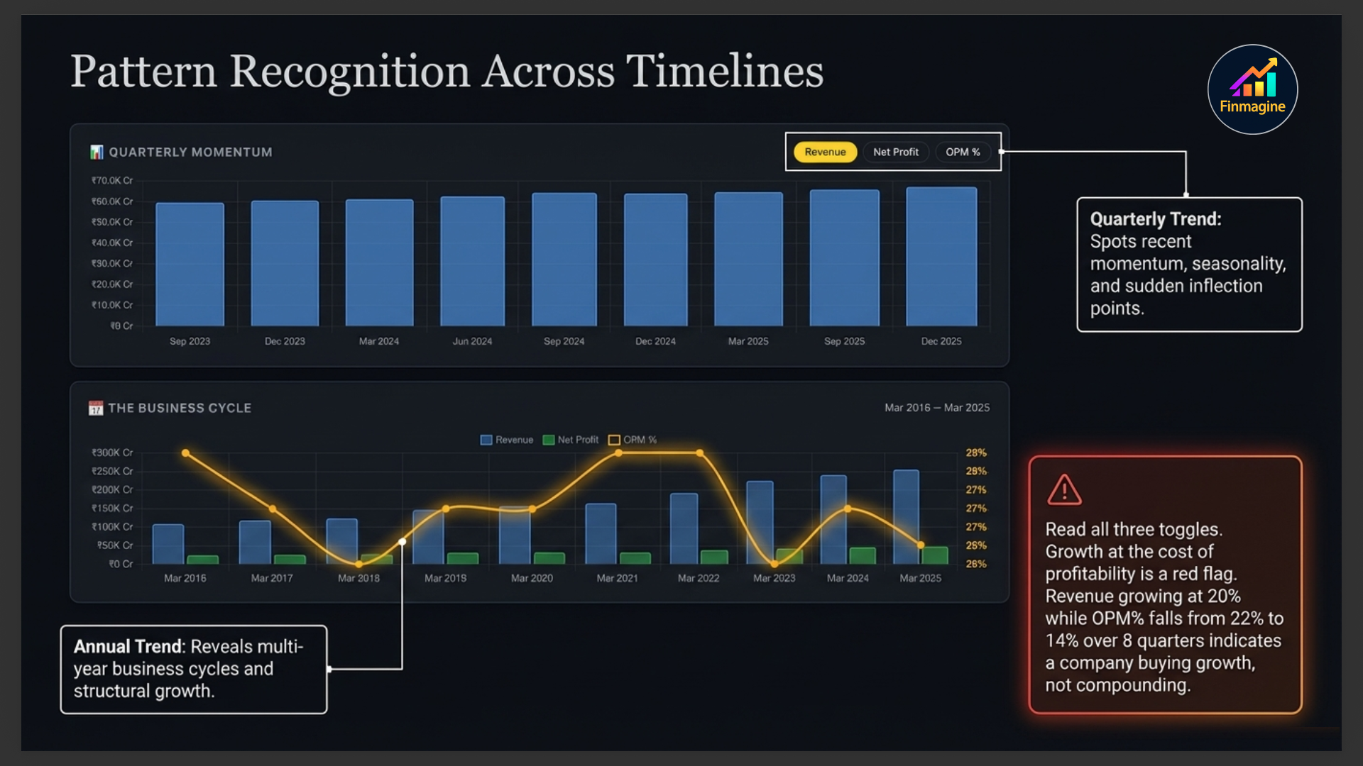
Quarterly Trend Chart
This chart shows performance across recent quarters with three toggleable metrics — Revenue, Net Profit, and OPM%. Switch between them using the buttons above the chart. This is your primary tool for spotting momentum, seasonality, and inflection points.
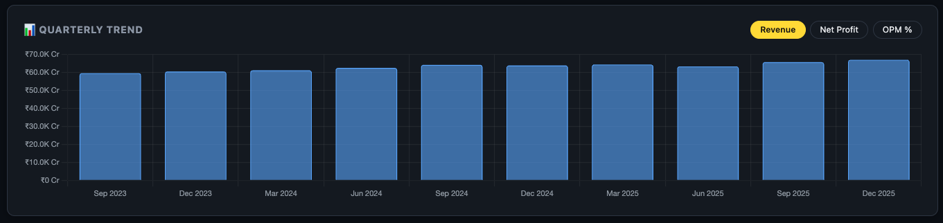
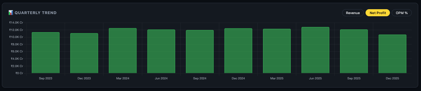
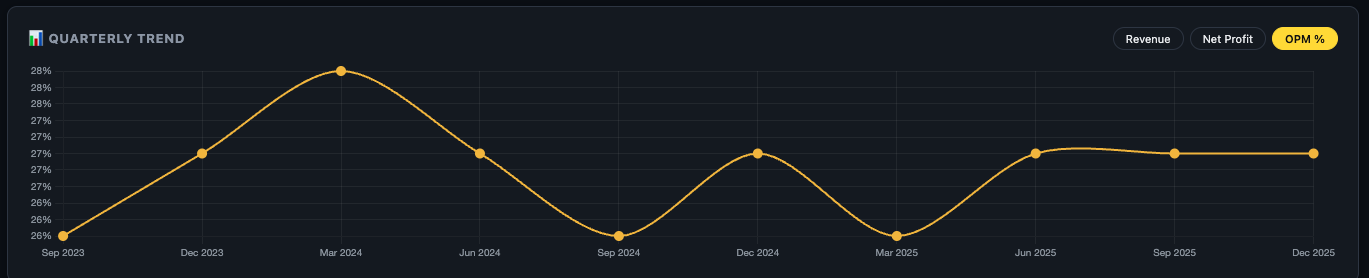
| Toggle | What to Look For | Red Flag |
|---|---|---|
| Revenue | Consistent upward trend with occasional seasonal dips | Flat or declining bars for 3+ consecutive quarters |
| Net Profit | Growing faster than revenue (margin expansion) | Profit declining while revenue grows — cost escalation |
| OPM% | Stable or expanding operating margin | Steady decline over 6+ quarters — pricing power erosion |
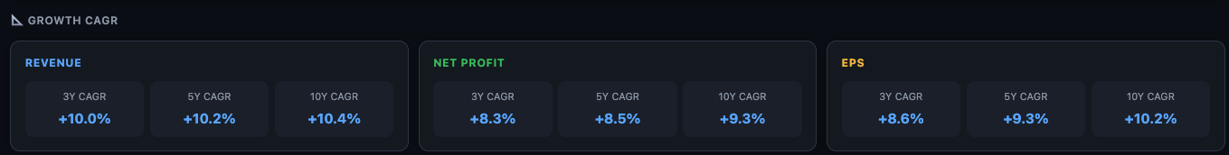
CAGR Summary Cards
Below the quarterly chart, three cards show the Compound Annual Growth Rate for Revenue and Net Profit across 1-year, 3-year, and 5-year horizons. These are the same numbers as the Growth Pattern card on the Overview tab, but here they live in context with the full financial data around them.
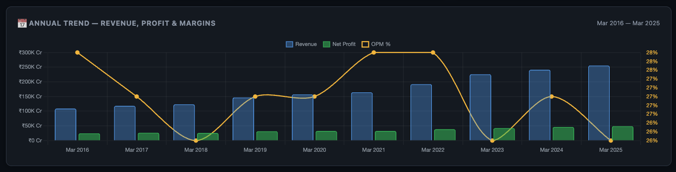
Annual Trend — Revenue, Profit & Margins
The annual chart shows full-year performance across multiple years — bar chart for Revenue and Net Profit, with OPM% as a line overlay. This gives you the long-term picture that quarterly charts can't show — business cycles, recovery trajectories, and structural growth rates.
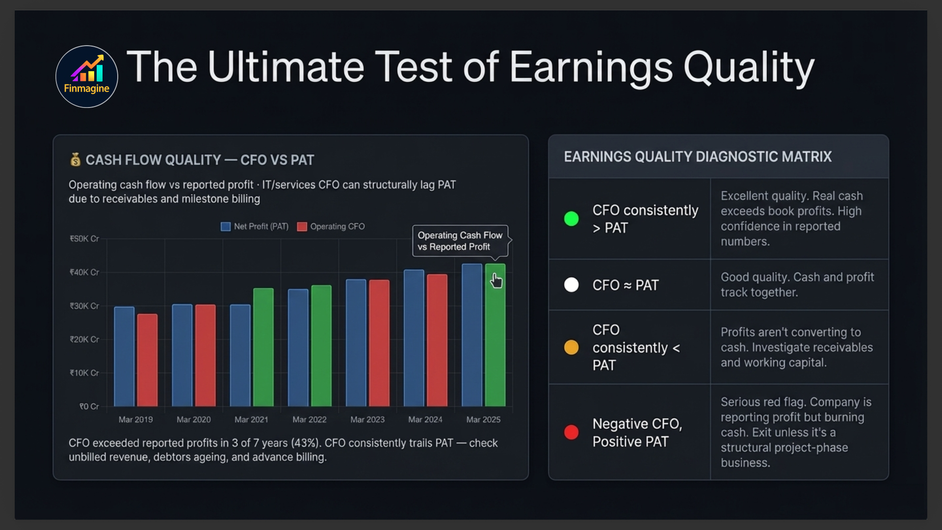
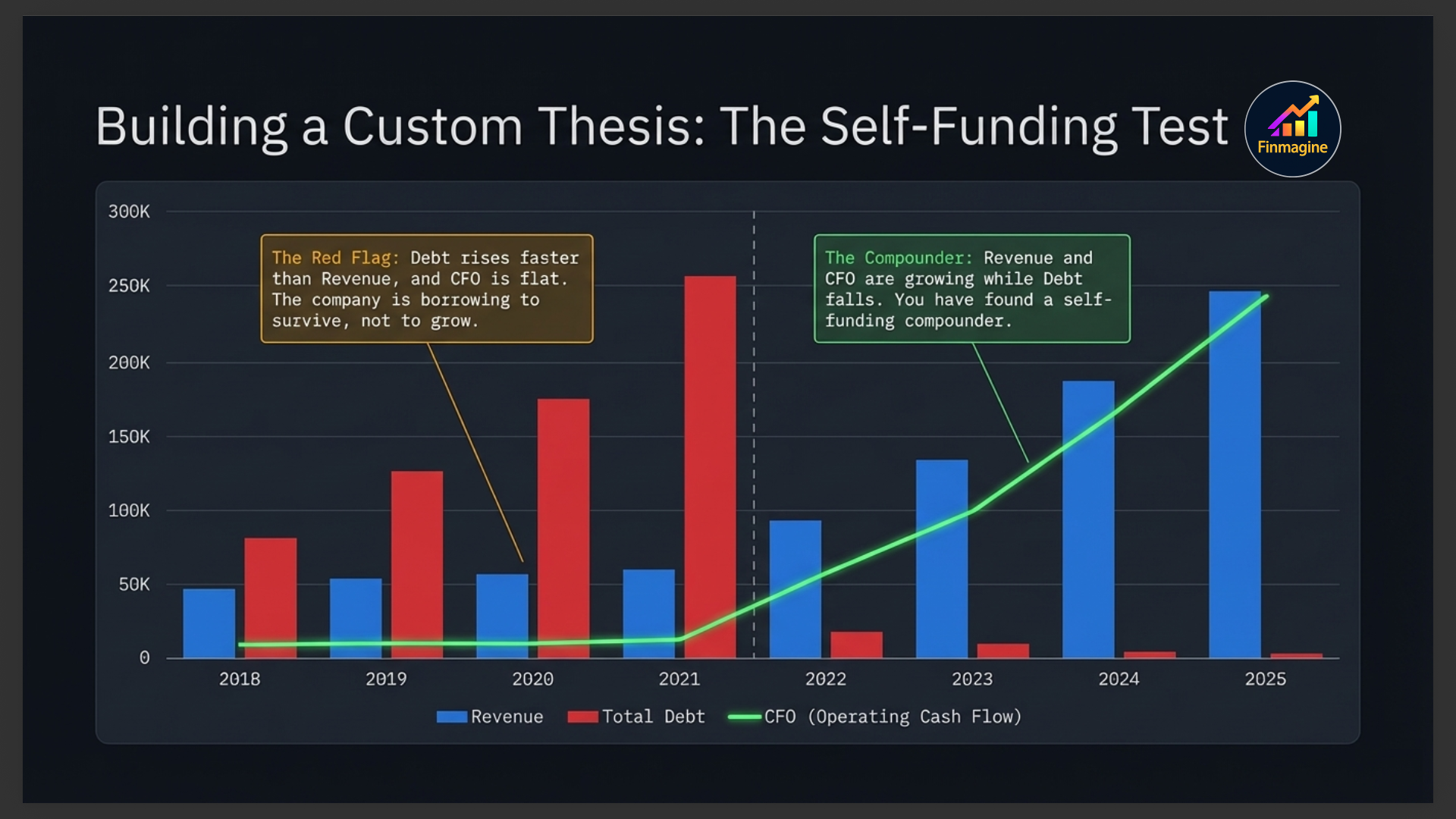
Cash Flow Quality — CFO vs PAT
This is the most powerful chart on the entire Financials tab. It compares Operating Cash Flow (CFO) against Net Profit (PAT) for each year. The quality badge in the top-right summarises the relationship: Excellent, Good, Weak, or Poor.
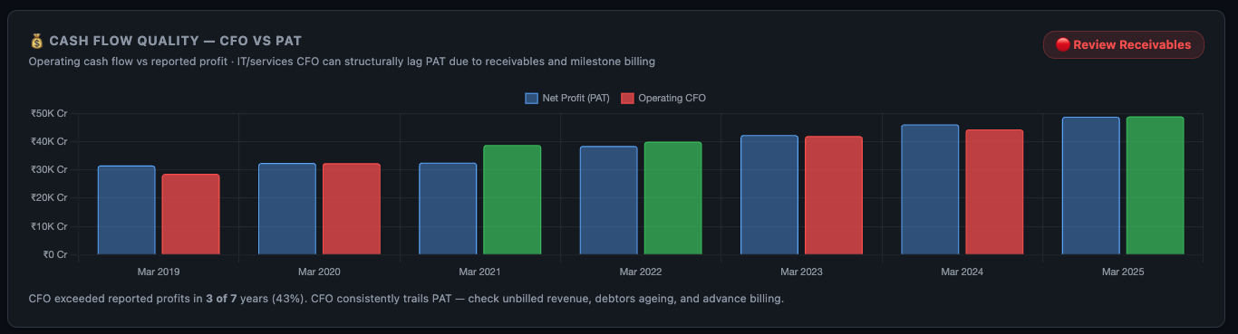
| Pattern | What It Means | Action |
|---|---|---|
| CFO consistently > PAT | Excellent earnings quality — real cash exceeds book profits | High confidence in reported numbers |
| CFO ≈ PAT | Good quality — cash and profit tracking together | Normal, acceptable |
| CFO consistently < PAT | Profits not converting to cash — possible aggressive accounting | Investigate receivables and working capital in Balance Sheet |
| CFO negative, PAT positive | Serious red flag — company reporting profit but burning cash | Check if it's a project-phase business or a structural problem |
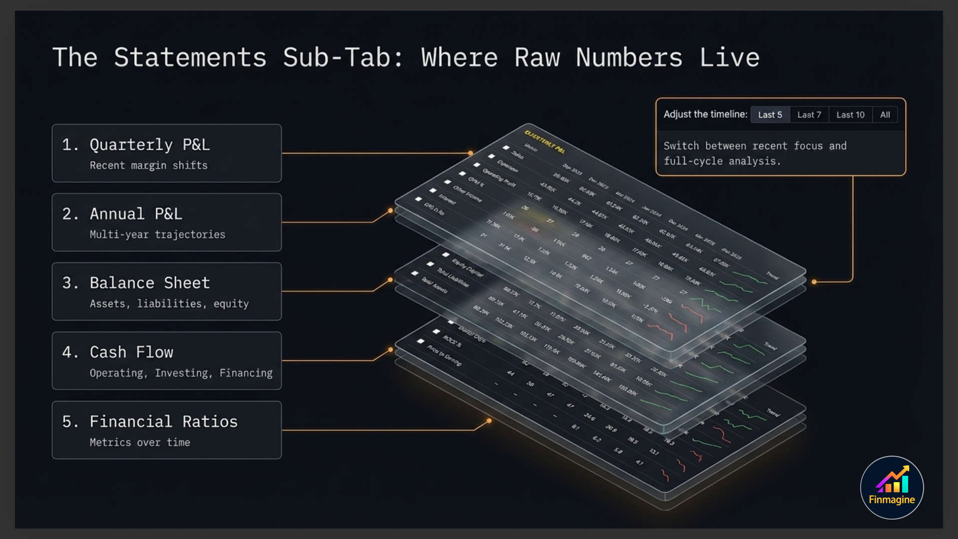
Statements Sub-Tab
The Statements sub-tab contains five expandable financial statement sections, a powerful display mode toolbar, a period filter, and a multi-metric comparison chart that builds itself as you select rows.
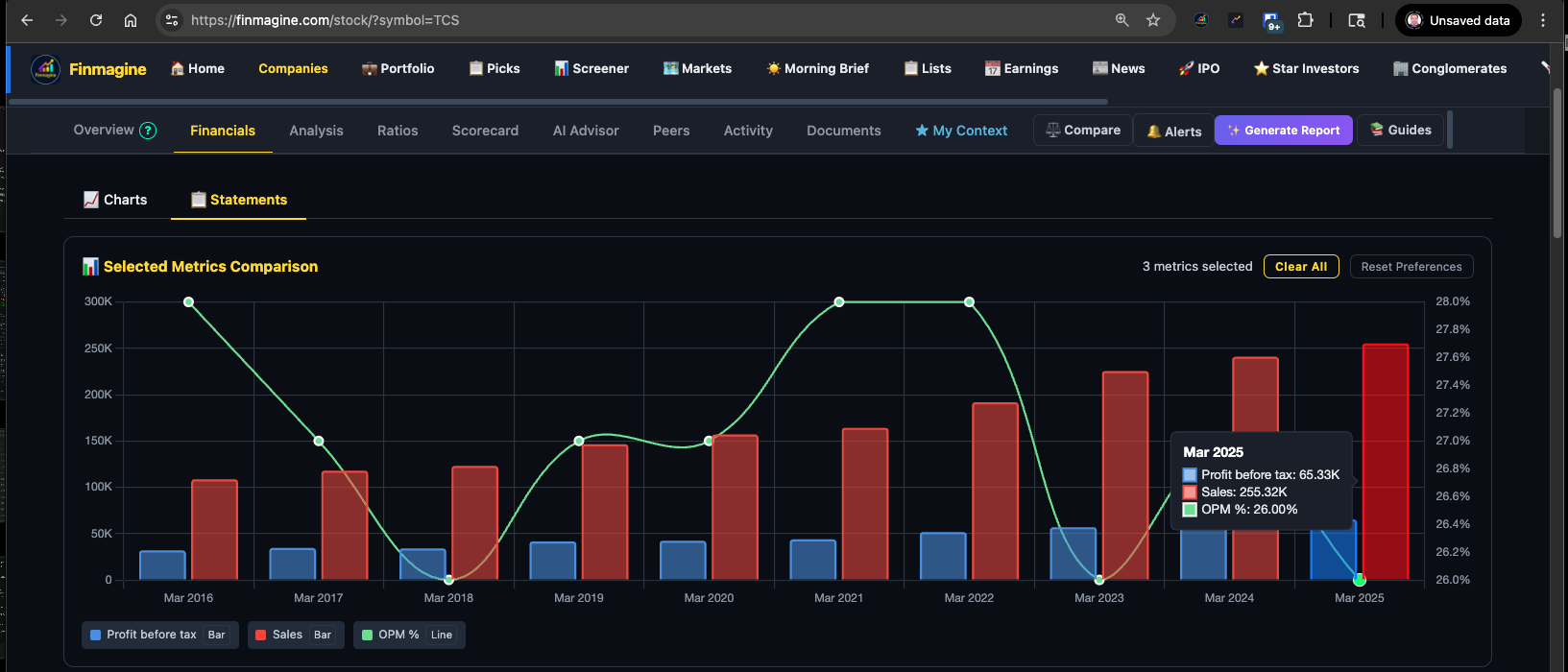
The Metric Comparison Chart
At the top of the Statements sub-tab sits an interactive comparison chart. It starts empty — it populates as you tick checkboxes next to any row in any of the five statements below. This lets you overlay any combination of metrics on a single chart: Revenue vs Net Profit vs OPM% vs Debt, all in one view.
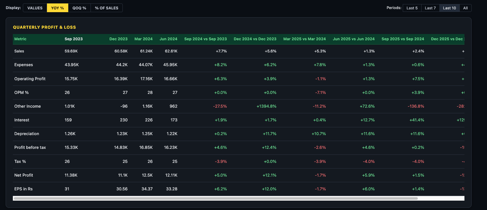
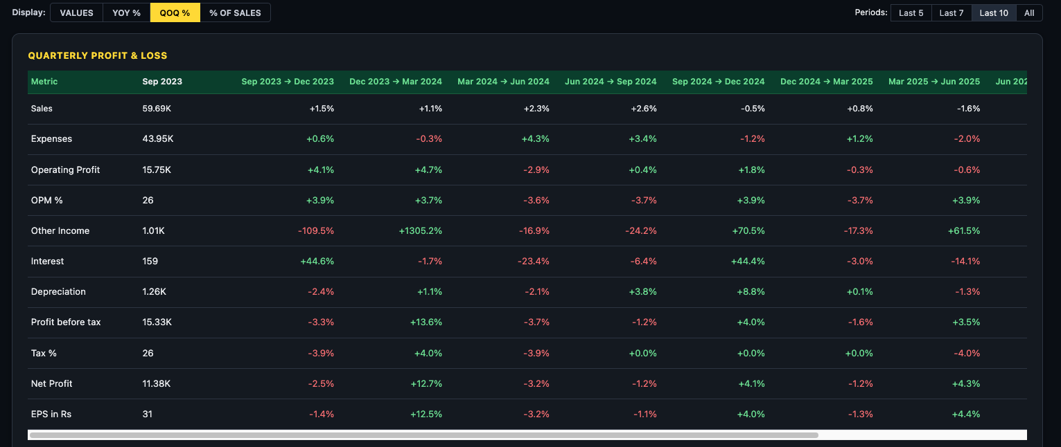
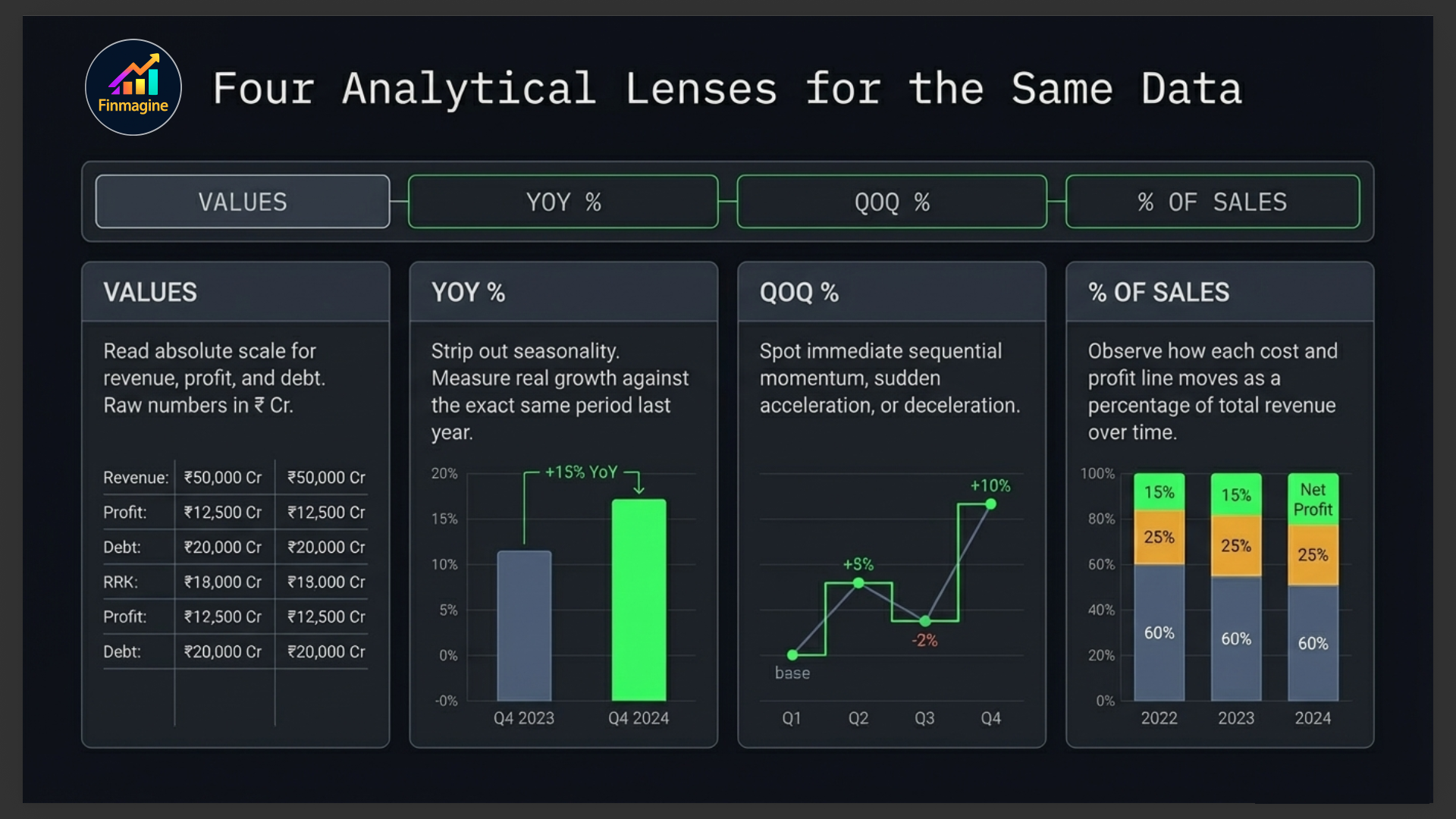
Display Modes
The toolbar above the statements gives you four ways to read the same data — switch between them freely without losing your place:
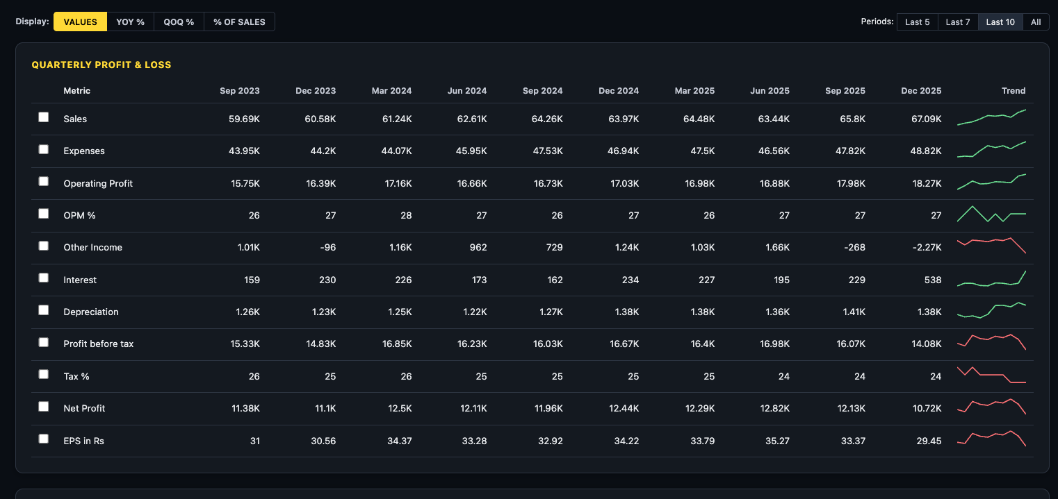
| Mode | Best Used For |
|---|---|
| VALUES | Reading absolute numbers — revenue, profit, debt in ₹ crore |
| YOY % | Growth rate vs same quarter/year last year — strips out seasonality |
| QOQ % | Sequential momentum — recent acceleration or deceleration |
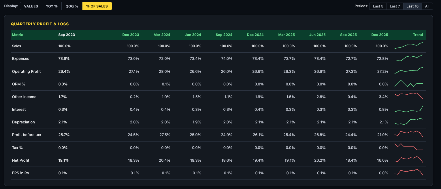
| % OF SALES | Margin analysis — how each cost and profit line moves as a % of revenue over time |
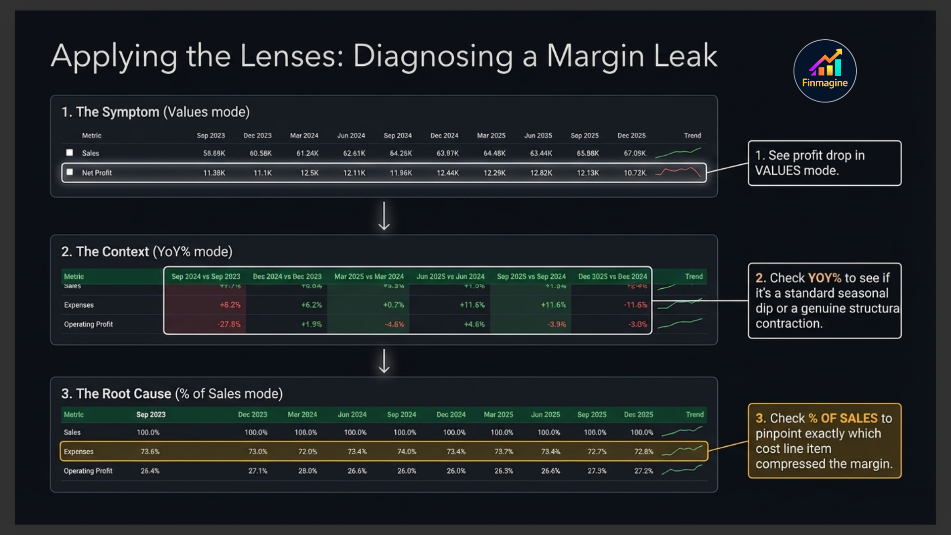
Diagnosing a Margin Leak — The 3-Step Method
When you see revenue growing but profit falling, apply these three steps in sequence:
- Step 1 — VALUES mode: Confirm the symptom. See the profit drop in absolute ₹ Cr terms. Quantify the gap between revenue growth and profit growth.
- Step 2 — YoY% mode: Provide context. Check whether expenses are growing faster than sales. If expenses YoY% consistently exceeds sales YoY%, the margin leak is structural, not seasonal.
- Step 3 — % of Sales mode: Find the root cause. Watch every cost line as a percentage of revenue across quarters. The line that is rising (even slightly, from 72.8% to 73.4%) is where the margin is leaking from.
Period Filter
Four buttons control how many columns are shown: Last 5, Last 7, Last 10 (default), and All. Use Last 5 for a focused recent view. Use All when investigating long-term structural trends or comparing across business cycles.
The Five Financial Sections
1. Quarterly Profit & Loss
The quarterly P&L shows Revenue, Operating Profit, EBITDA, Depreciation, Interest, Tax, and Net Profit for each quarter. This is your primary tool for spotting recent trends — margin changes, interest cost spikes, or one-off exceptional items that distort a single quarter's profit.
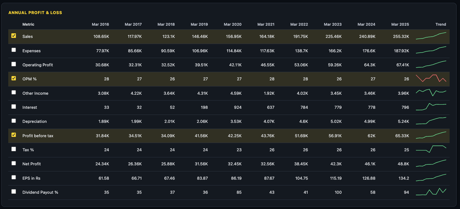
2. Annual Profit & Loss
The annual P&L aggregates by fiscal year. Use this to see the full year picture rather than quarterly noise, and to understand multi-year revenue and profit growth trajectories.
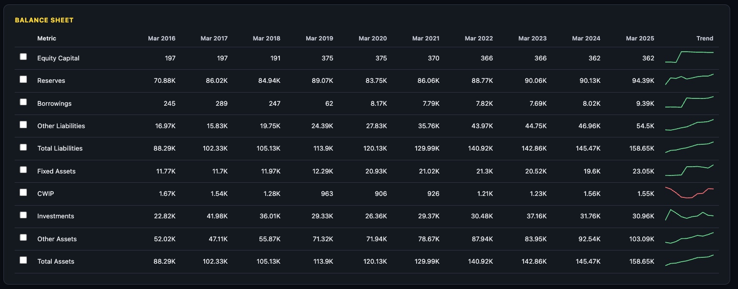
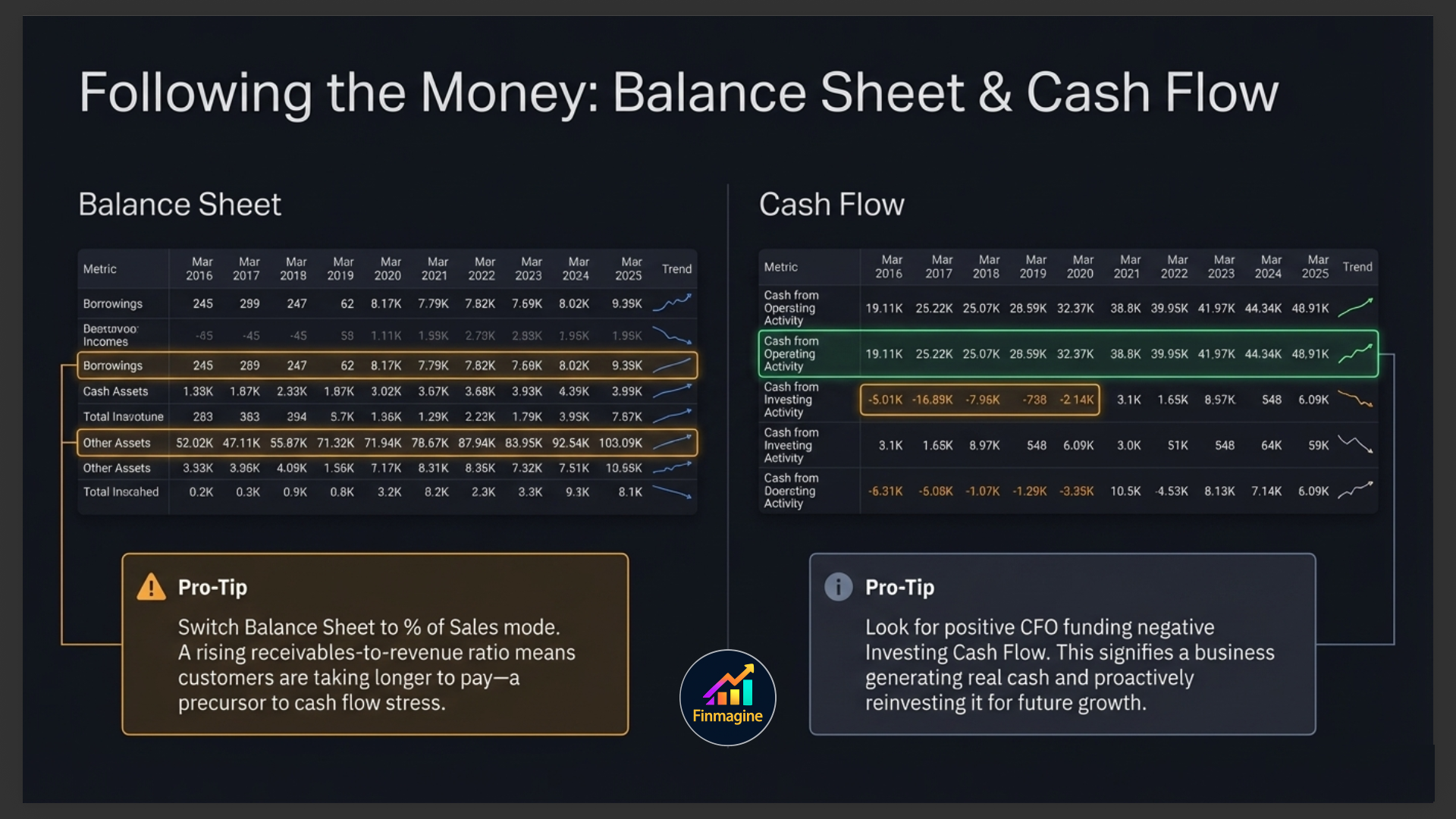
3. Balance Sheet
The Balance Sheet shows assets, liabilities, and equity at year-end. Key things to monitor: Total Debt (and whether it's rising or falling), Fixed Assets (investment in growth), Receivables (how long customers are taking to pay), Cash & Equivalents, and Reserves & Surplus (retained profit building up over time).
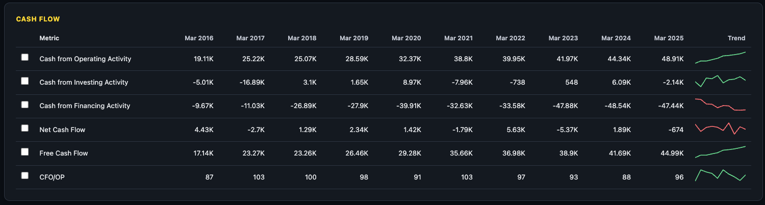
4. Cash Flow Statement
Three sections: Operating Cash Flow (CFO), Investing Cash Flow, and Financing Cash Flow. A healthy company has positive CFO, negative Investing Cash Flow (investing in assets for growth), and manageable Financing Cash Flow. This is the real-money view of the business — unlike P&L, it cannot be manipulated by accounting choices.
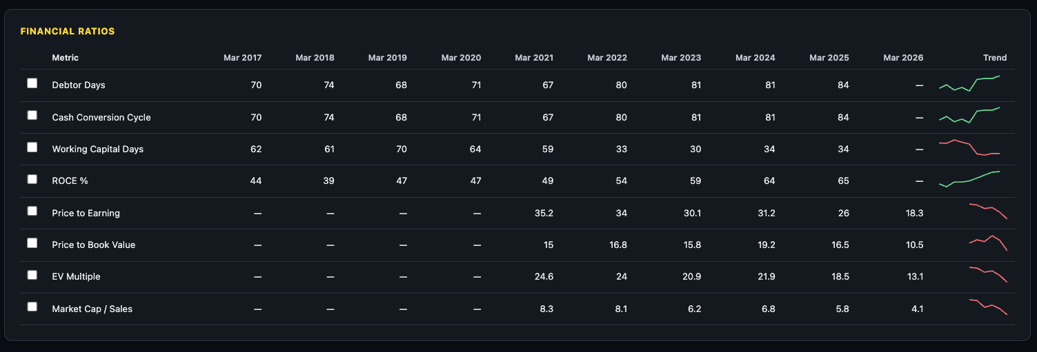
5. Financial Ratios
The Ratios section shows computed ratios over time — PE, PB, ROCE, ROE, D/E, Current Ratio, and more — directly in the statement table format. This lets you see how ratios have evolved across years rather than just their current values.
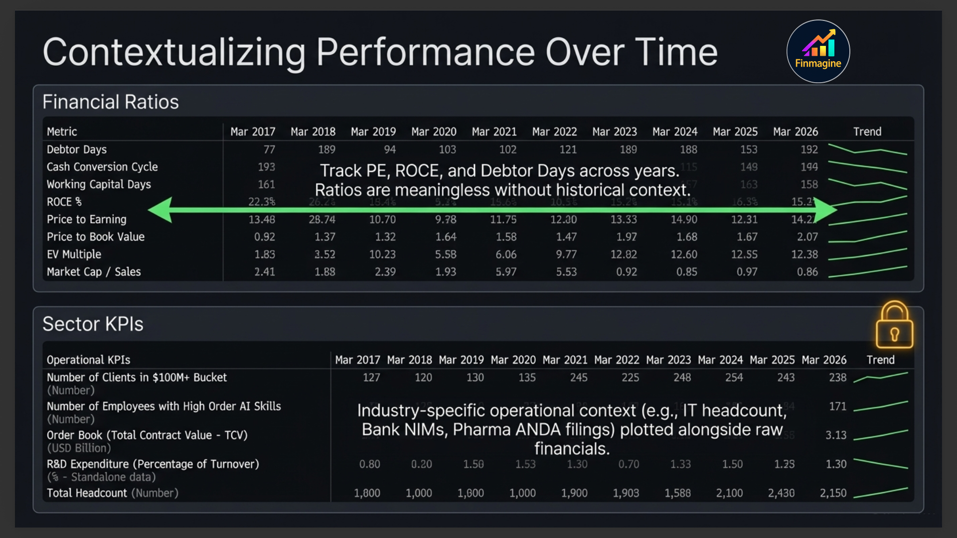
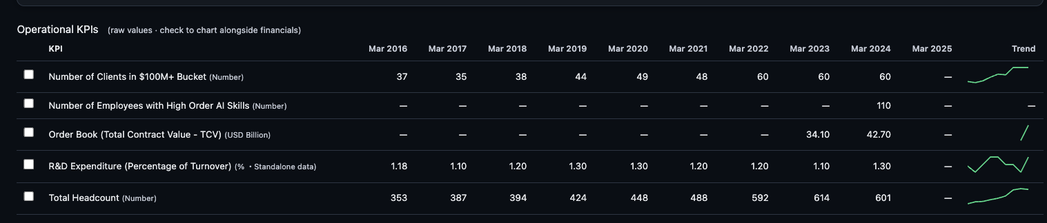
6. Sector KPIs (where available) PREMIUM
For companies in sectors with distinct operational metrics — IT (headcount, revenue per employee), Banks (NIM, GNPA, CASA ratio), Pharma (ANDA filings), Hotels (occupancy rate), Auto (volumes) — an additional KPIs section appears with those sector-specific numbers.
Analytics Sub-Tab
The Analytics sub-tab distils 10 years of financial history into a single, scannable quality dashboard. Rather than asking you to read through statements and compute ratios manually, Analytics pre-calculates the metrics that define a high-quality compounder — and surfaces them as a scorecard you can read in under two minutes.
Historical Quality Scorecard
The top section of the Analytics tab is a grid of 16 KPI tiles. Each tile is colour-coded — green for strong, amber for acceptable, red for concerning. The metrics span five quality dimensions:
| Dimension | KPI Tiles | What They Reveal |
|---|---|---|
| Growth | Revenue CAGR 10Y, PAT CAGR 10Y, EPS CAGR 3Y / 5Y / 10Y, Book Value CAGR 3Y / 5Y | Whether the business is genuinely compounding shareholder value over the long run |
| Profitability | OPM Median 5Y, ROCE Median 5Y, ROE Median 5Y | Median (not peak) returns — harder to inflate with a single exceptional year |
| Consistency | Profitable Years (out of 10), FCF+ Years (out of 10), ROCE Improving (3Y trend) | How reliably the company has delivered — survival through cycles |
| Cash Flow | FCF Yield, FCF CAGR 3Y / 5Y, OCF-to-PAT (5Y avg) | Whether reported profits are backed by real cash generation |
| Safety | Altman Z-Score, Dividend Years (out of 10) | Financial distress risk and income consistency |
ROCE & ROE 10-Year Trend
Below the scorecard, the first chart overlays Return on Capital Employed (ROCE) and Return on Equity (ROE) as bars and a line over the last 10 years. This is the single most important quality chart on the platform.
- Rising ROCE over a decade — the company is deploying each additional rupee of capital more productively. Classic compounders (Asian Paints, HDFC Bank, TCS in their growth phases) show this pattern.
- Stable ROCE in the 20–30% range — a mature quality business maintaining its moat. Returns aren't accelerating but they're not eroding either.
- Falling ROCE — competitive pressure, capital misallocation, or a business at peak cycle. This is the most important red flag on the chart.
- ROE persistently above ROCE — the company is using financial leverage to amplify returns on equity. Acceptable in banks; worth monitoring in industrials.
Free Cash Flow (FCF) Chart
The FCF chart renders annual Free Cash Flow as bars — green for positive years, red for negative years. Free Cash Flow is computed as Operating Cash Flow minus Capital Expenditure (i.e., CFO + CFI, since CFI is negative for investing businesses).
A badge in the top-right of the chart summarises the decade: Consistent FCF Generator (most years green), Cyclical (mix), or FCF Negative (predominantly red). A second badge shows the FCF CAGR over 3 or 5 years.
| FCF Pattern | What It Means | Context |
|---|---|---|
| Mostly green bars | Business generates more cash than it invests — self-funding | Ideal for long-term holders; no need for external capital |
| Red bars during a capex cycle, then green | Company was building capacity; now harvesting cash | Look for the inflection — when did capex peak? |
| Chronically red bars | Business consistently consumes more cash than it generates | Check if funded by equity raises or debt — both are dilutive or risky |
OPM Consistency Chart
The final chart plots Operating Profit Margin (OPM%) for each year over the decade, with a dashed horizontal line marking the median OPM. A consistency badge summarises whether margins have been stable, expanding, or volatile:
- Stable / Expanding: Bars hug the median line or trend upward — strong pricing power and cost discipline.
- Volatile: Large swings above and below the median — cyclical sector, commodity exposure, or pricing vulnerability.
- Contracting: Most recent bars consistently below the median — structural deterioration worth investigating.
How to Read the Analytics Tab in Under 2 Minutes
- Scan the scorecard (30 sec): Count the green tiles. A company with 12+ green tiles out of 16 is a high-quality compounder. Note any red tiles — they tell you what to investigate in Statements.
- Check the ROCE/ROE trend (30 sec): Is ROCE above 15%? Is the trend flat or rising over the decade? If ROCE is falling for 3+ consecutive years, ask why before investing.
- Read the FCF bars (20 sec): Mostly green = self-funding. Mostly red = capital dependent. Note where the inflection points are.
- Glance at OPM consistency (20 sec): Is the current OPM near the median? Are bars tightly clustered (stable) or scattered (volatile)? Volatile OPM companies require a higher margin of safety in valuation.
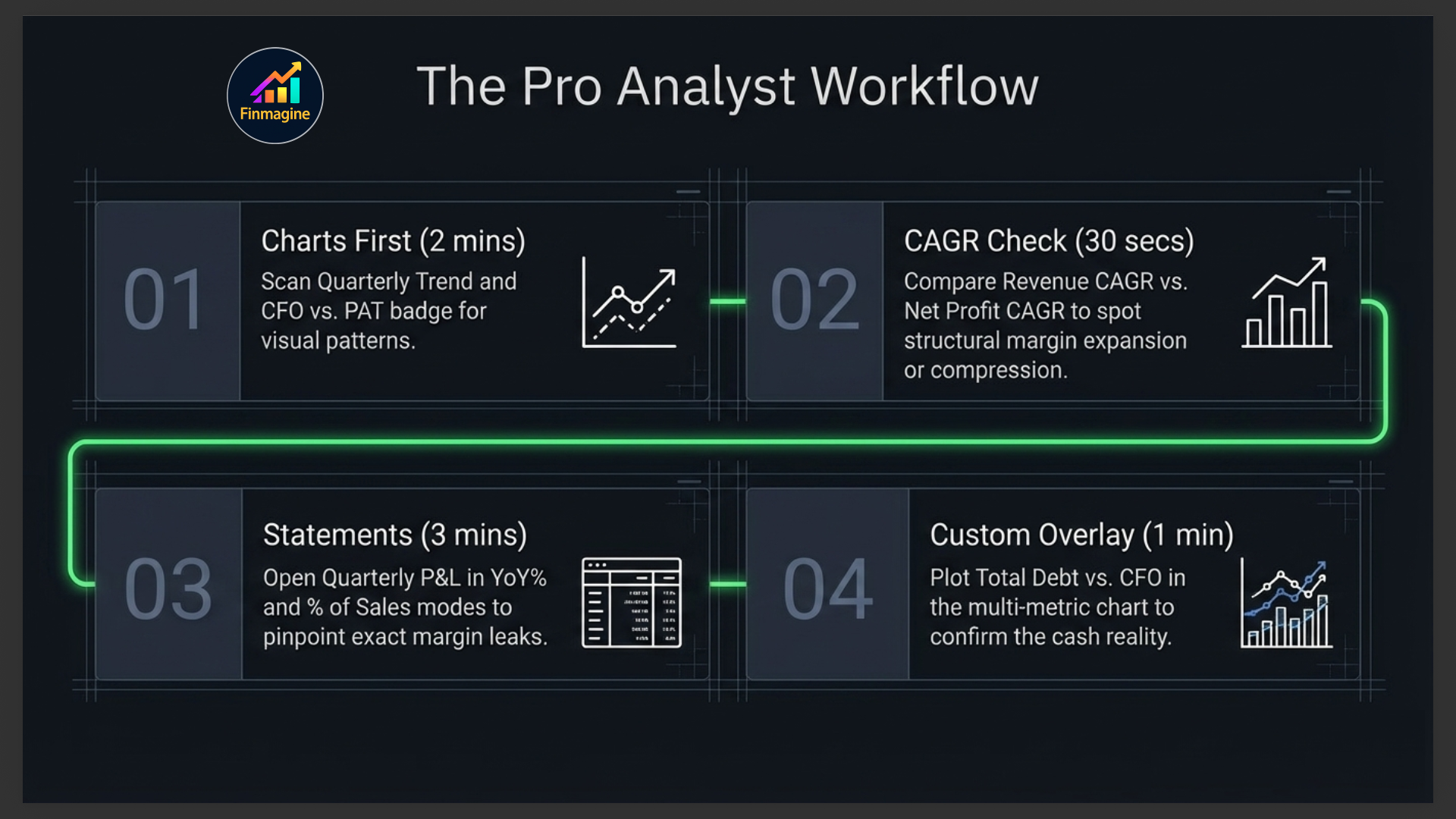
Your Financials Tab Workflow
Here is the sequence that extracts maximum insight in minimum time:
- Charts first (2 minutes): Scan the Quarterly Trend on Revenue and OPM%. Check the Annual Trend for the 5-year picture. Look at the CFO vs PAT quality badge.
- CAGR sanity check (30 seconds): Is the 3Y Revenue CAGR positive? Is Net Profit CAGR higher or lower than Revenue CAGR? Higher = margin expansion. Lower = margin compression.
- Switch to Statements (3 minutes): Open Quarterly P&L in YoY% mode. Look at the last 4 quarters. Are Revenue and Net Profit both green (positive YoY)? If profit is red but revenue is green, open % of Sales mode to find where margins are leaking.
- Balance Sheet debt check (1 minute): Is Total Debt rising? Plot Debt vs CFO in the comparison chart. If debt is growing faster than cash generation, investigate why.
- Cash Flow confirmation (30 seconds): Is CFO positive and growing? Does it track Net Profit? A mismatch here is your exit signal for further investigation.
- Analytics quality gate (2 minutes): Switch to the Analytics sub-tab. Count the green tiles in the scorecard — 12+ out of 16 is a high-quality compounder. Check whether ROCE has been rising or falling over the decade. Confirm the FCF pattern (mostly green bars = self-funding). Use this as a final quality gate before committing to a position.
Ready to Analyse Indian Stocks Like a Pro?
Finmagine gives you 30+ computed financial ratios, sector benchmarks, FII/DII flows, the Finmagine Score, and AI-powered analysis — all in one place.